Research:
I have considered many options for what I wanted to do.
Horticulturist:
A plant expert who could be a landscape designer too but focus more on the plant aspect.
https://www.sokanu.com/careers/horticulturist/
At first, I thought of using this type of terrarium to create some shapes of the letters.
Game designer:
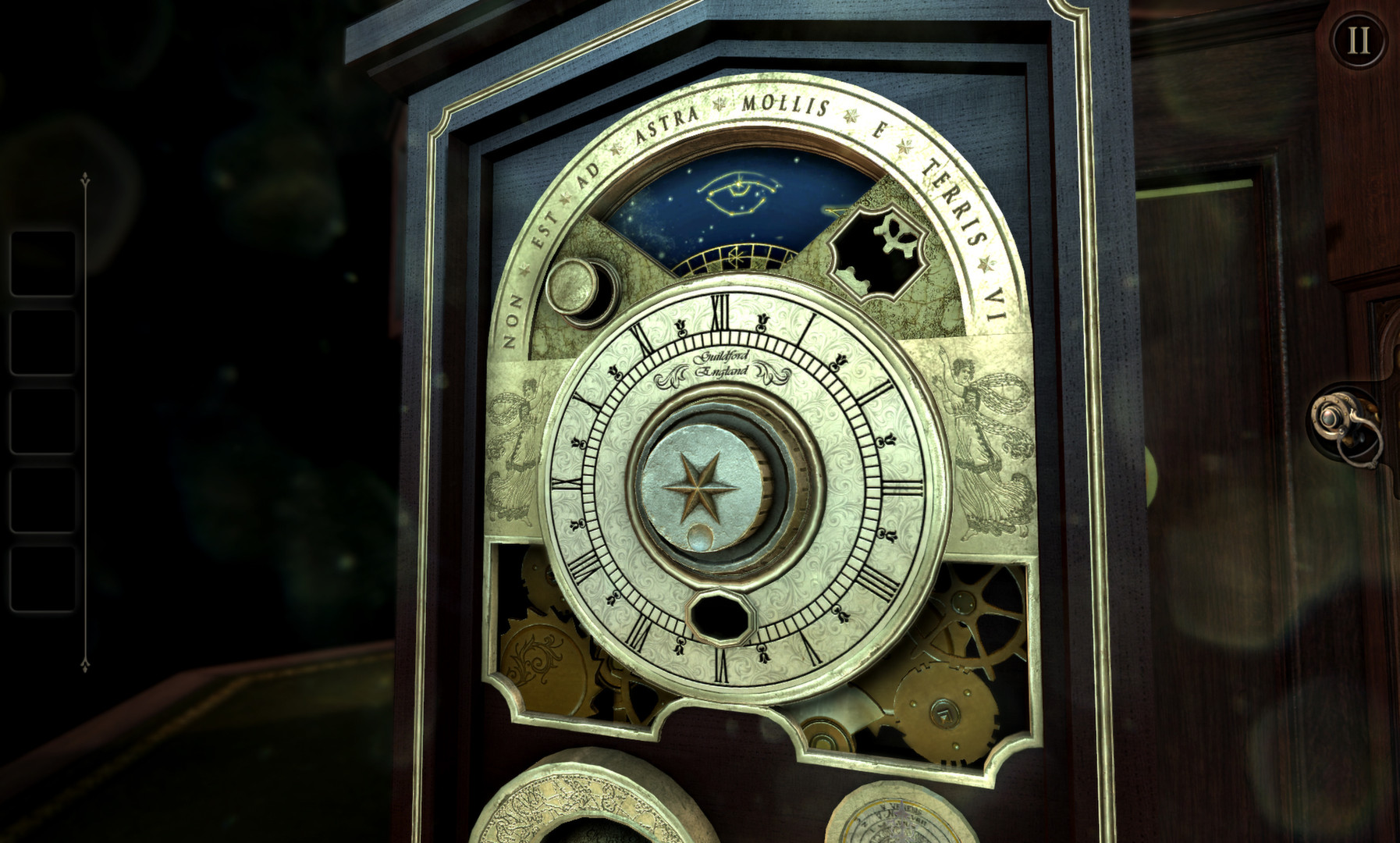
There is this game about puzzles called the room and there are these intricate wooden puzzles in the game. that’s why I have decided to use the concept to design my letters but Mimi had told me to use more common and popular examples.
Below are some pictures of

That’s why I decided to base my drawing on monument valley instead, with the bright colours and weird perspectives.
/cdn.vox-cdn.com/uploads/chorus_image/image/45224546/monument_valley_hero.0.jpg) Children book illustrator:
Children book illustrator:

Jimmy Liao has an art style that I admire, that’s why I decided to include him. but my design is partly based on his whimsical style.
Sculpture:
this idea came later when I saw a video online:
I had wanted to do on 3D modelling before but I thought it would be fun if I could play around with the shadows of a 3d object.
Process:
I did most of my things in school as my photoshop keeps crashing on my computer, making me lose all my progress which is why I do not have a record of my peer feedback, nor the teacher’s feedback. :'(
These are my initial designs:
I emailed mimi and she replied this:
Leave a Reply
You must be logged in to post a comment.