Reference artist: Jimmy Liao
Jimmy Liao is a children’s book illustrator. His colour schemes are able to bring out the mood of his drawings very well. He uses a combination of ink, watercolour and pen.

In this picture, he uses blue and yellow as the main colours and also a slight tint of orange to create the contast.

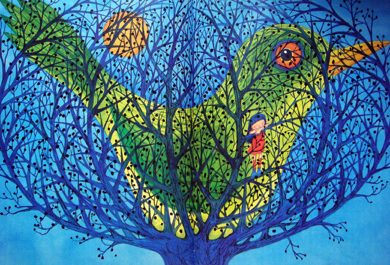
This was my inspiration for the cage in the final work.

At first I wanted to use fish to represent school but mimi had told me it was inconsistent so I had used a flock of birds instead to add the tree in.


The design was changed as I thought that it was strange that the food went sraight to the stomach not the mouth.
At first, I wanted to use complementary colours in separate pictures the combine them in the last picture but I realised it couldn’t work. It made the thumbnails become separate so, in the end, I used the same colour scheme for all the pictures. 

i had a hard time deciding which colour I wanted to use for the last one in the end I chose green and vermilion which gave a huge contrast to the mood and I had also changed the design to yin yang because it symbolised patience.


 For this second board, I wanted to shine a torchlight through it and show the different textures of the plastic and the uhu glue I had used to secure the last piece. For the first one, I used the leaf of a herb. and as my grandfather is a farmer, this is quite nostalgic to me as my dad had transplanted this herb from my grandparents’ garden. For the second one, I don’t like any articles talking about the economy and finance so I tore it to fine pieces at a fast speed to make it look like agitation. the difference between the third and the second one is the speed of tearing, the third one I tore it slowly to show more sadness rather than rage.


 We learnt how to create tones and show texture using tones in our second lesson.
