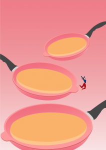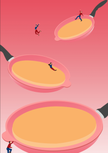
From the previous Project One’s idea of pancakes layering over each other, I decided to bring it over to Project 2 to explore more for my poster and utilise the same concept of Quantum’s Expanding Universe, General Relativity. I have already decided over the top of my head that I wanted to keep the simplicity and style of the previous mark created. The quantum theory was still kept the same with the idea of analogy, and figure-of-speech used as a representation for my project instead of going the abstract way. The analogy was that the pancakes would represent the universe and the elements on the pancakes would represent the galaxies. When the pancakes expand, the galaxies ie. blueberries do not expand but the distance between each blueberries do. Another element I knew I wanted to add back in this poster was the pan. The pan would represent the space. A general misconception that people have with this quantum theory is that the universe expands in a pre-existing space, which would mean that one day we will explode. However, that is not the case. The space is also expanding outwards together with the galaxies and universe. With this quantum in mind, I went back to the previous mind-map where I have already decided on some nouns and verbs to incorporate into my poster.
Previous Mind-map:

I derived some key terms from my previous mind map and further explored nouns and verbs that could be useful through the Ellen Lupton’s method. With this technique, I quickly realised that I wanted the elements represented on the pancakes to be doing the verbs through the poster. For instance, if my noun was a person, and verb was sticky, I wanted these terms to work through the direction of where my audience can read the poster. I wanted the noun chosen to do the verb and guide the eyes of the audience through wherever it should be.


I really wanted to explore with verbs that could be used by the elements in the poster so ie. bouncing, there is an element bouncing it in. I made use with a bunch of verbs that were rather essential in my poster ie. dripping, jumping, climbing. Each actions used should be purposeful, instead of just being there for the sake of being there. With that said, I explored further into my moodboard.
Moodboard:
I quickly looked at variations of pancakes to get inspirations on how I wanted the pancakes to look like ie. thick, stacked, dripping, broken, full, perfect, lopsided, coloured etc. Moving forward, I looked for other inspirations and references to get my ideation started and through Skillshare, I saw some elements that really intrigued me and I wanted to explore that in my work – use of gradient, simplicity and the stretched texts effect.


Most of the inspirations I got were illustration-based and very quirky and simplistic in style. As per my last inspiration, Francesco Ciccollela, I really wanted to use his style for my poster. Hence, most of the style and references made are quite similar. The final moodboard above was going to be some of my colour style for the posters. Below, there is a back-up style, for the print to be more abstract and not so representational. In case, my direction was not going well.
Ina approved of the quirky style and simplistic, representational style, so I went ahead with that. I relied heavily on the sketches beforehand to see which layout I should go for because I knew once I started digitising, that would most possibly be my final one. I showed a bunch of sketches to infuse the different techniques taught in the skillshare, mainly; a) activating diagonals, b) simplicity c) overlapping d) cutting image.
According to the sequence, the first one on the top left is of three pans stacking up against each other with maple syrup leaking down to the next pans. The second sketch had a huge jug pouring maple syrup and the humans onto a stacked pancake with people below it. The third sketch were three pancakes overlapped against each other to create a bigger negative space above it. As for the fourth sketch, I cut it down to two pancakes with a ladder for the human to climb up or down with ingredients to make pancakes floating around in the background.
Sketches:

The next sketch had a rather static and calmer feeling with the three pancakes being diagonal and parallel to each other. The 6th sketch would show a bouncing person on a souffle pancake and keep to the minimalistic style. The 7th sketch was more different than the rest as it is a top-down shot of three pancakes. And the final sketch consisted of three pancakes with two pancakes broken to create a sense of action throughout the pancakes.

I ended up choosing the first sketch to develop further.
For the first draft, I began by digitising them and choosing colours for the backdrop first because it’ll be easier for me to work when I have my colour palette down. As for the pans, I wanted to have it in pink so that the colour would not run too far off from the pancakes and I would have to use only a few colours to keep to its simplistic style.


Although I really liked the look of the simplistic solid backdrop, I decided to add gradients to incorporate some texture into the overall poster. It instantly created more dynamic and a sense of depth especially with the different sized pans from top to bottom.


I then infused in the various elements into the poster to see if it would work or if it might get too cluttered.


From then, I chose a gradient background and darken it to bring out the pancakes more. Adding in the elements and exploring more with the various layout to see which variation or layout would work better in the overall poster.


Finally, I decided that overlapping the pancakes would work the best as it would create more negative space and allowed for the type to be incorporated without cluttering the poster. I added in all the elements fully and moved onto adding the type onto the poster.
From there, I went ahead and try out the different type that could be incorporated into the poster but nothing seemed to work as it would make the poster look too messy considering the elements are already rather spaced out. I also added in the style shared on Skillshare of the stretch being pulled to see if it would work, however it looked too stretched out and would steal the spotlight from the pancakes.


The text was tricky because I wanted to keep its simplicity but also infuse in the stretched-text effect somewhere. Ultimately, I chose the one with the text smacked right in the center and Ina suggested to remove the red and blue shadows to keep it simple so I did.
Final Poster:
From the get-go, I already knew I wanted to keep it very simple like the references I have shown ie. Francesco Cicollela. With the initial pans quite spread apart but I overlapped them so that there is depth created within the 2D space. By tilting each pan and making it expand, as the eyes go lower, it subconsciously created a sense of balance as well as activate the diagonals. The eyes are led from the smallest pan to the biggest pan at the bottom. Together with the actions of the elements, the eyes will flow in its direction.
For instance, the man is slipping down the honey or maple syrup towards the next pan where the lady jumps down, people skateboards or slide down and are digging a hole to go to the next pancake, the bigger “universe”. And finally at the third pancake, we see people resting and jogging around, staying at their position. We also see a person climbing up possibly from another smaller universe to join the expansion. I felt that incorporating the sense of actions through the literal actions of the elements of the poster brought out the quirkiness of the poster even more.
The overall colours that were use were mostly triadic; red, blue and yellow and the complementary outfit colours of red & blue for the people make them stand out against the backdrop.
Digitisations of other sketches:


Final Poster:
Mockups:


Layout by Graphic Burger, Behance, Freepik – Antoniooli

You must be logged in to post a comment.