THOUGHTS ON CLASS ACTIVITY
For the first class activity, using materials given, we were tasked to mind-map a summary of our personality, traits and attributes of ourselves. Some attributes I’ve written down were that I am adventurous, open-minded, sociable, care-free, meticulous and philosophical (haha). Later on, we passed this piece of paper to our classmates and they would write something else that describes you/ add on to your work. My classmates wrote that I am pleasant, funny, nice, friendly, sweet, caring, I have nice vibes, I’m chill (NOT TRUE), good time management ^^, and that I had a lovely design style. I felt really touched to see all that! Thank you friends :’) Overall, I thought it was a really fun way to get to know yourself/ your peers more. I think that this exercise was rather personal too and it was nice to see the class expressing themselves openly.
The second class activity follows the same concept. However the question given to us was what our predictions were for the year 2020. Upon graduation, I would want to travel and start a career in the design industry (possibly in UK – I adore this company: Stranger & Stranger), save up for my future house and have strong relationships with my loved ones. Personally, I felt that I haven’t really thought much about my future and I have to definitely set more goals because 5 years is a short period of time! 🙁
Thirdly, we had to come up with some attributes that we would like to add (+), remove (-), and multiply (x) from ourselves. Some things I wrote initially were… (+) I want to be more positive and always think about the big picture. (-) Overthink/ worry less. (x) Be more enthusiastic with everything I do, strive for excellence. This is all I got so far but I’ll be brainstorming more for the next consultation. 🙂
5 COLOUR THEORIES
- Monochromatic Harmony – A monochromatic colour scheme uses a variety of lightness and saturation of a single colour harmoniously.
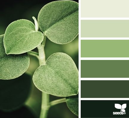
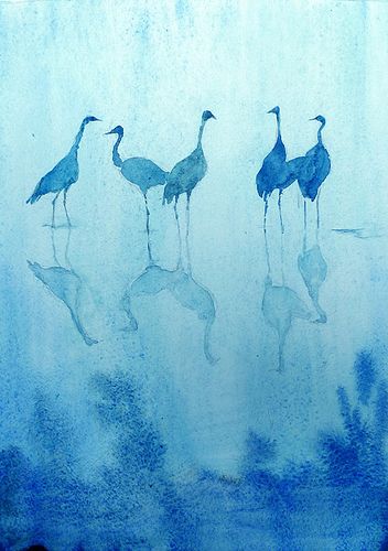
Images from – aunatural.tumblr.com and http://design-seeds.com/home/entry/leaf-greens2
- Analogous Harmony – Analogous colours are located next to one another on the colour wheel. The colours green and blue are analogous. The colours are matching and are pleasing to the eye. When choosing an analogous colour scheme, one colour will dominate and the second colour supports it.
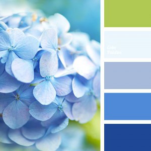
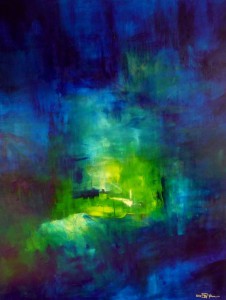
Images from – saatchionline.com and colorpalettes.net
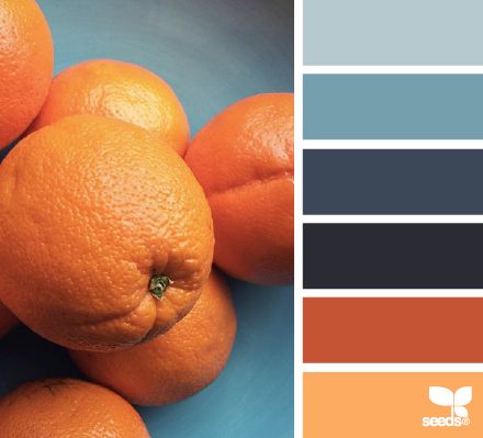
- Analogous Harmony Warm and Cool – Warm: Strong, energetic, bright colours. E.g. orange, red, yellow. Cool: Calming, soothing, mild, muted colours. E.g. blue, green, purple.
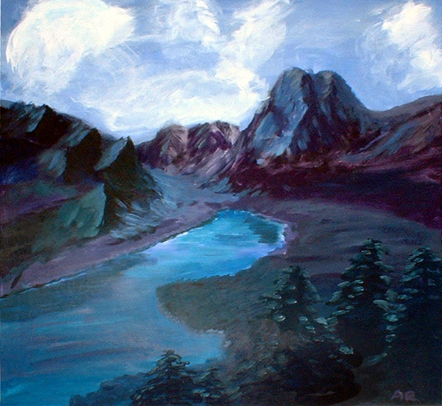
Images from – amandapowellsellars.weebly.com and blog.lili.farm
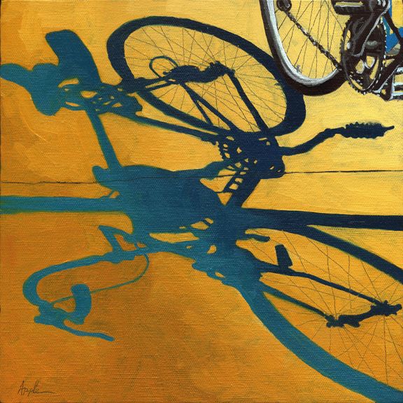
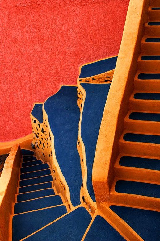
- Complementary Hues – Complementary colours are opposite one another on the colour wheel. For example red and green. They are highly contrasting and vibrant. They are used to draw attention to something in particular.

Images from – http://www.applearts.com/content/bicycle-morning-shadows and https://www.bloglovin.com/blogs/design-seeds-1753322/citrus-brights-4258012874
- Split Complementary – Split complementary colours uses two colours adjacent to its complementary base colour. The third colour to eases the eye despite the strong visual contrast.
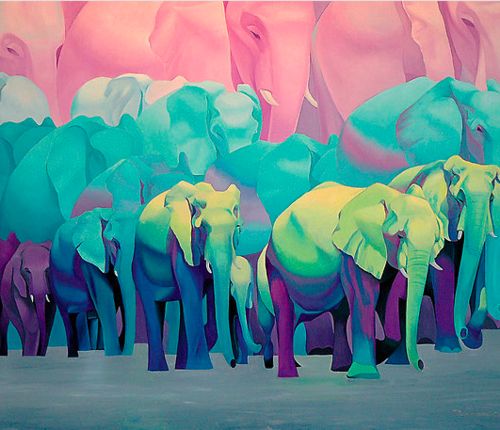
Images from – http://www.thejungalow.com/2012/08/elephantastic.html and https://500px.com/photo/32575387/steps-by-yiannis-pavlis
ARTIST REFERENCES (COLOUR + STYLE)
I found several illustrations with colour schemes and styles that I really like. Will be looking out for more! 🙂
Mimi Kim (Los Angeles, USA)
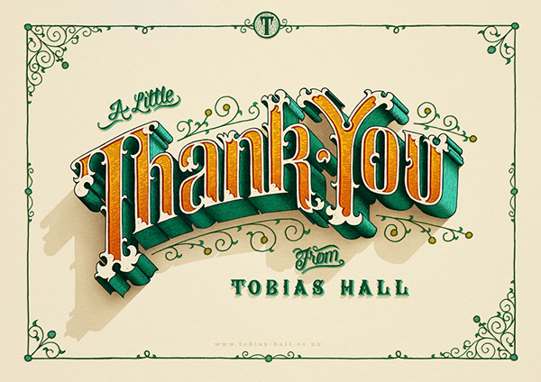
Tobias Hall (London)
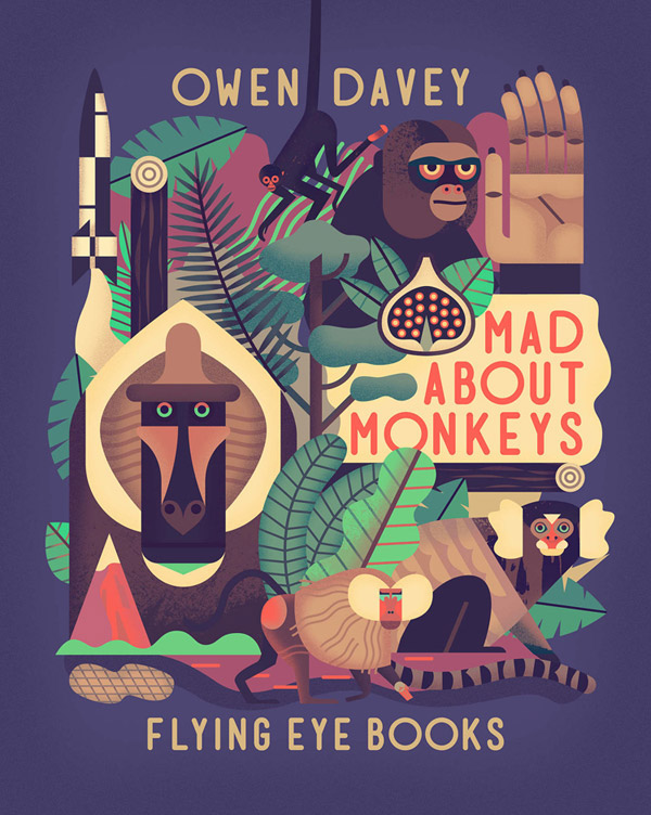
Owen Davey

Mar Hernandez (Spain) – Beer bottle label
Katerina Pytina (Russia)
You must be logged in to post a comment.