As per my previous post, since I already had reference photos which I took, I decided to base off those to start my illustration.
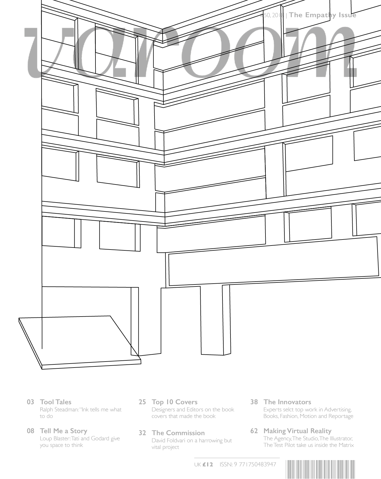
I started by vectoring out the HDB block, referencing the photo I took of the HDB. However when I completed it I felt that it was quite flat and there wasn’t much room to draw in more elements, so at this point I felt a bit stuck as to how I should continue.
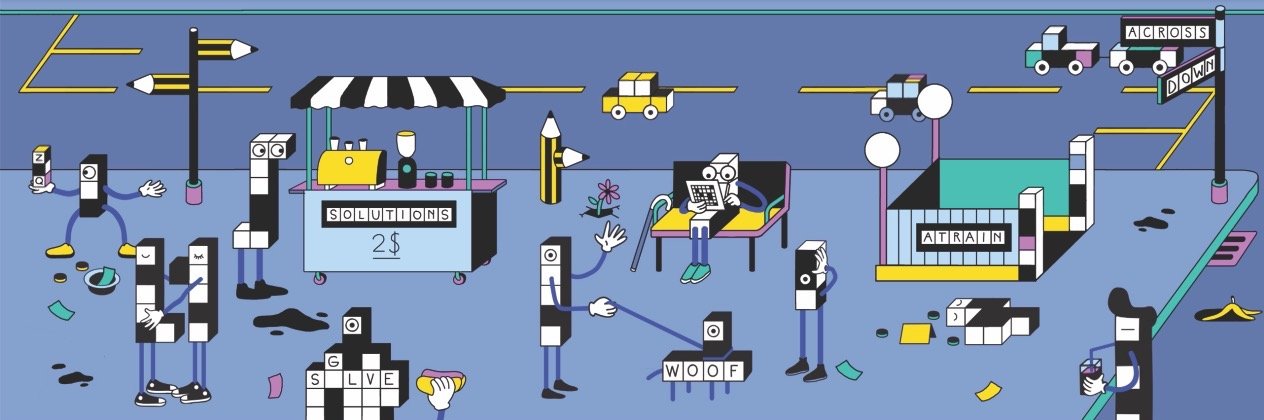
This is quite random but one day I was doing the New York Times crossword puzzle and I saw this illustration on the website. It actually inspired me in the way that it made me realise that I don’t have to draw everything properly to scale, I can actually play around with the scale of the elements and it can create a more interesting composition. With that in mind I decided to re-do my entire illustration!
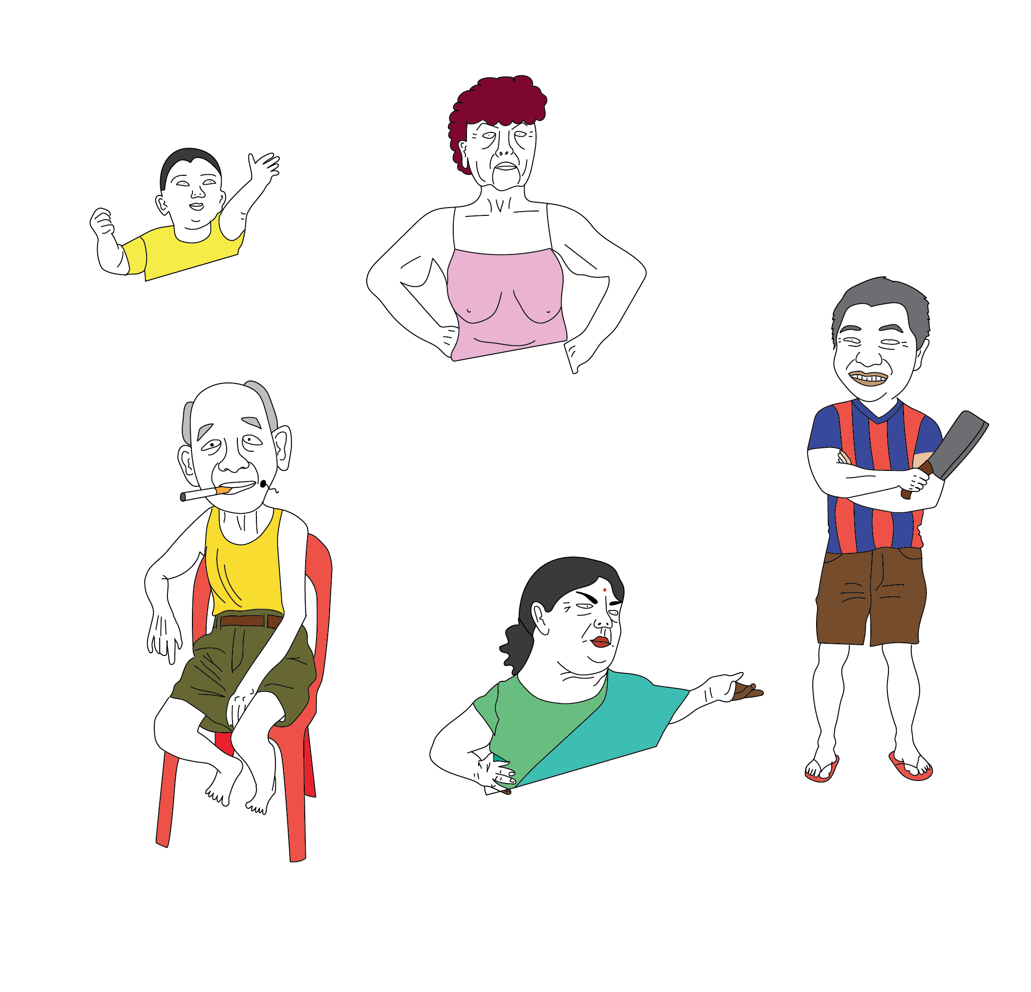
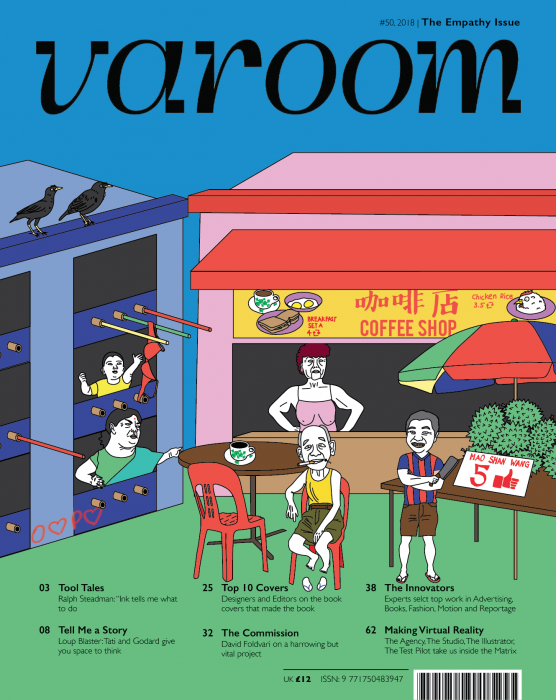
I started off my illustrating the characters that I wanted to have in my illustration. I wanted the people to be recognisable characters to Singaporeans, people that we see every day at our local coffee shop or hawkers centres, these people are our parents and grandparents and neighbours. So I had the annoyed aunty, the kopitiam uncle, the mischievous little boy, the durian seller, and the angry drink stall aunty!
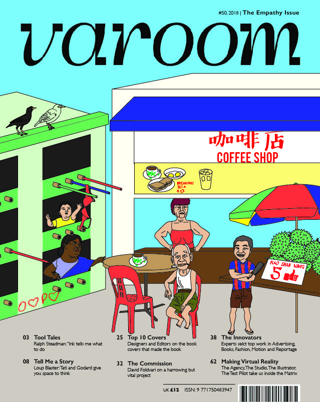
This is the composition and colour palette that I initially came up with. I added a lot of Singaporean elements, (the red coffee shop chair, durians, bamboo poles, the black mynah etc.) and I incorporated my idea of “people lacking empathy towards designers and paying us in exposure” by using the following elements:
- The typical “O$P$” sign, the $ symbol is changed to a heart to represent Instagram likes
- The durian is priced in Facebook likes (thumbs up)
- At the coffee shop, if you look at the sign board the food and beverage is priced as retweets instead of as money
I lowkey didn’t like it and I wasn’t vibing with the colour (OSS changed the colour and made it even worse but still) so I decided to change!
And here is the final composition which I came up with! I took Lisa’s advice to really focus on using less colours and focus just on primary colours and I think it made my illustration look much better. I decided the keep the humans as white because I feel that it makes them stand out more against the primary colour due to the contrast.
You must be logged in to post a comment.