With the projects and materials selected, I went on to think about the style I will employ for the zine. I started out trying out a collage-style composition with a marbling background, which turned out great. However, I felt that something was missing. I decided to try out a few textures to add depth to the composition. After trying out a few, I settled with a halftone texture as I feel that Pop Art and comic book art that is often associated with it similarly has bright saturated colours and strong linework, similar to my two projects.
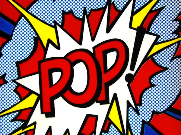
Roy Lichtenstein’s Cover Newsweek 1966
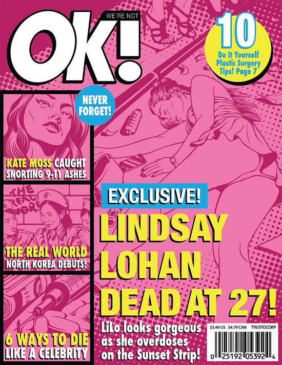
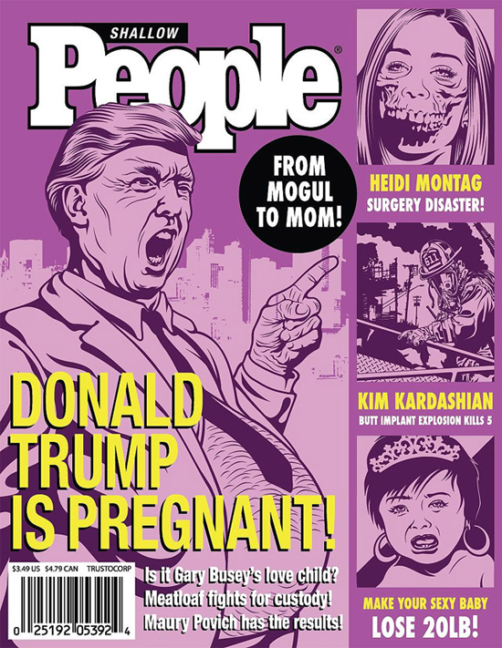
After using the texture, I realized that I liked the cheap and mass-produced look of it. I thought that it would be interesting if I format the collage like the cheap crass tabloids with eye-catching sensational deadlines. These tabloids often make use of sexualised images of women, all bras and undies with provocative poses. The headlines are often very provocative as well, and I feel that I could make a twist on this by using the format.
I edited some of the layout to make it look more like these examples.


As an artist reference, I also wanted to mix it with a more modern look, similar to these examples of vector art:
I edited a few existing linework and came up with a few new ones as well.


I decided that this look would be what I reference to during the course of making the zine.
You must be logged in to post a comment.