About
Making self publication at a budget. In the zine, we include things that we have learned throughout the semester or the year from 2D foundation class.
Concept
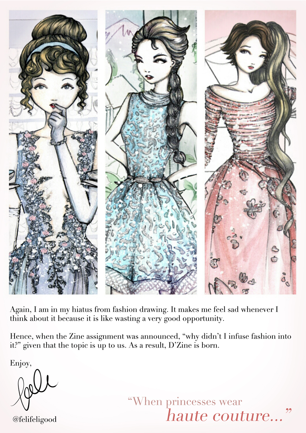
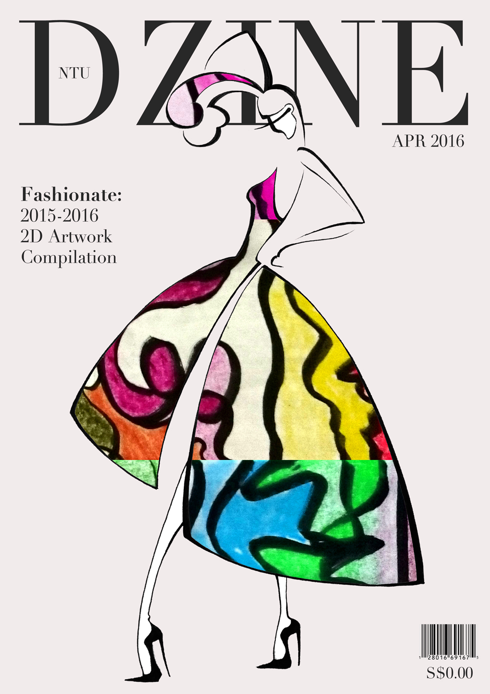
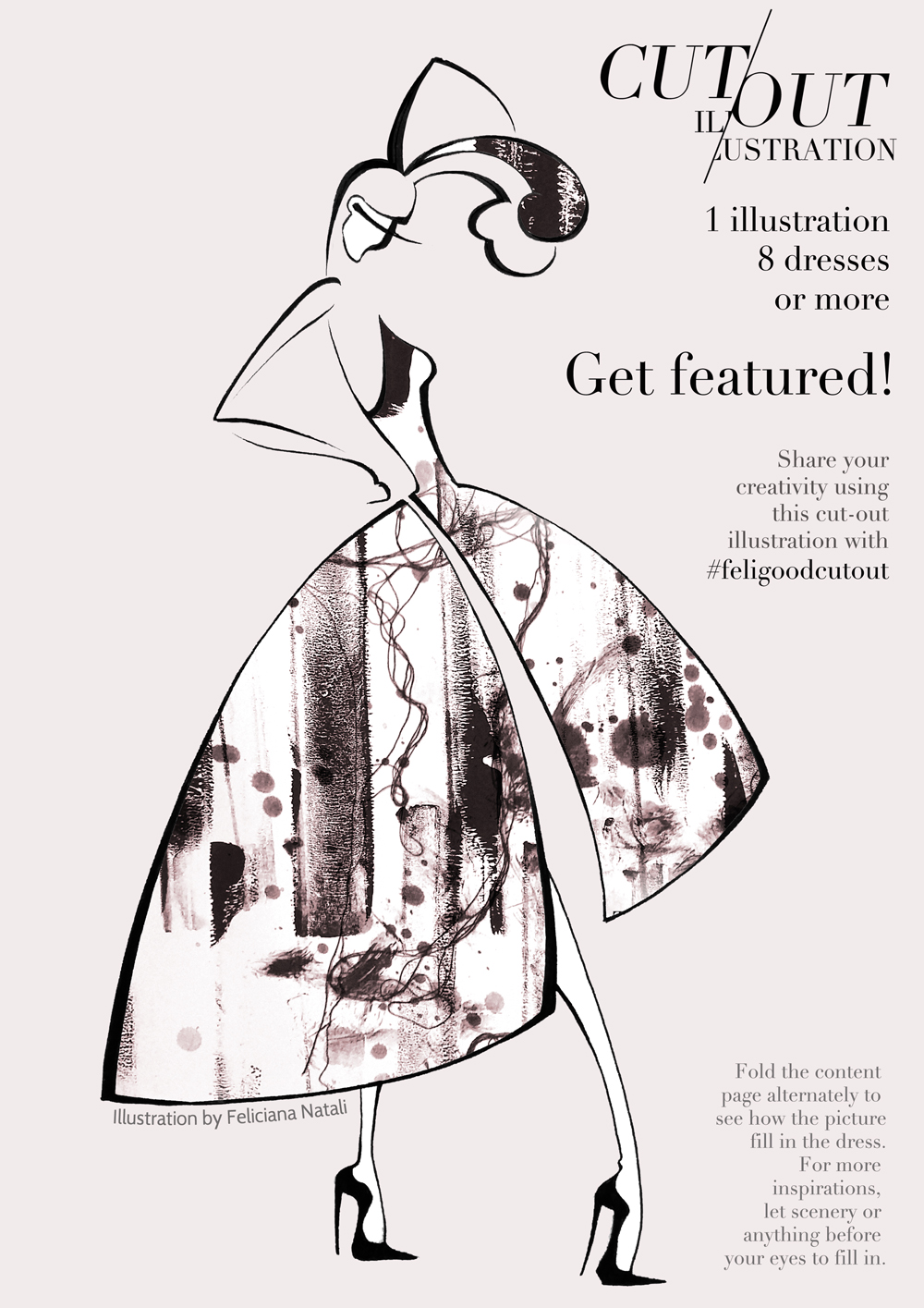
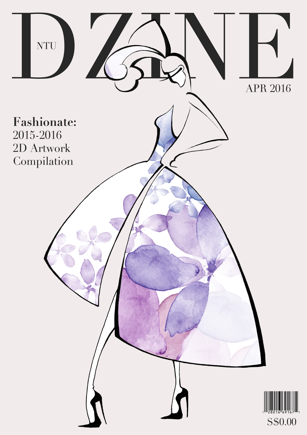
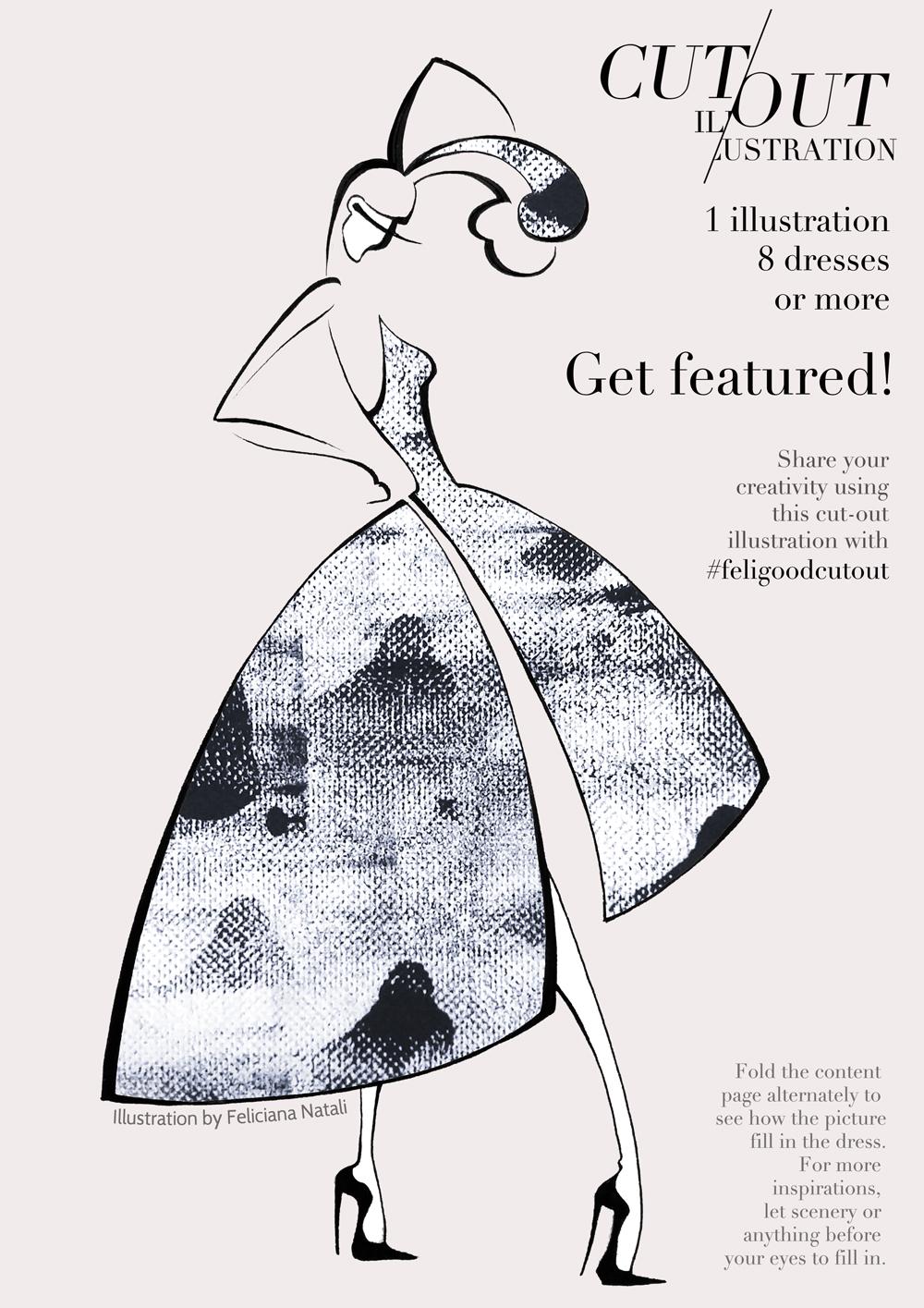
For this project, I want to use my 2D projects to create fashion art/fashion illustrations. In order to do so, I decided to use Shamekh Bluwi’s cut-out illustration as inspiration.

Research
Below are the research I did for the format of the zine.
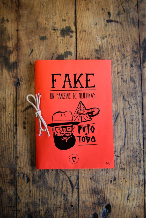
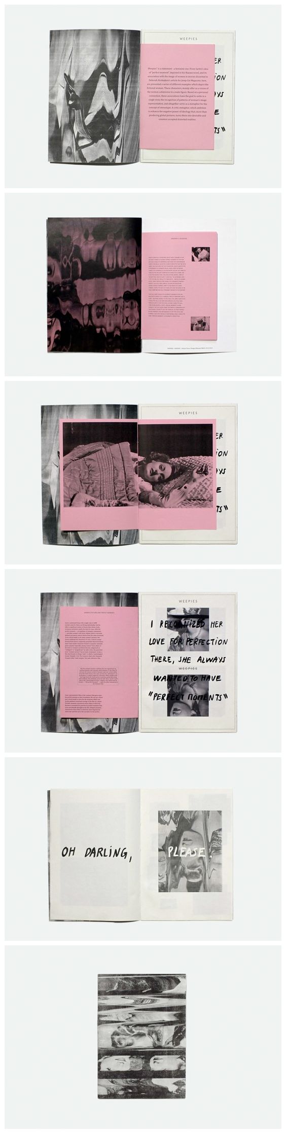
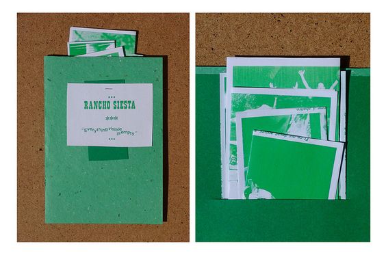
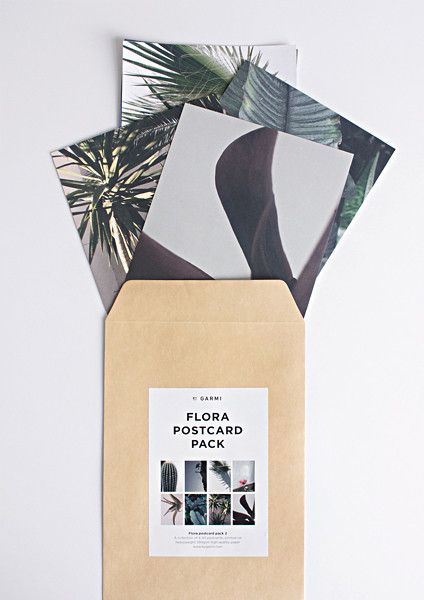
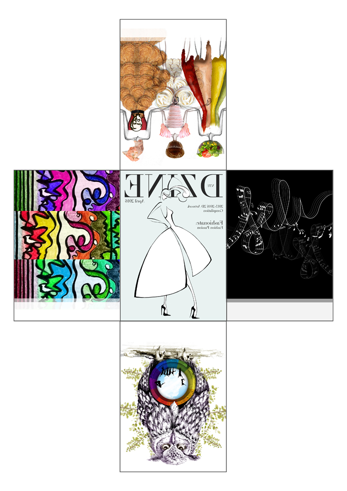
I wanted to do postcard styles, or binded-by-ring or ribbon style, however, I found it hard to do my concept in such a way. I want one cut-out illustration to have its dress filled in with all the 2D artworks I picked.
Formatting
Hence, the formatting is something that I created special for this zine. It would allow both sides of the cut-out illustration to be used, ‘filtering’ the pattern from other pages as the pages are folded alternately one by one.
It is kept in rectangular, A5 shape in order to give the magazine feeling.
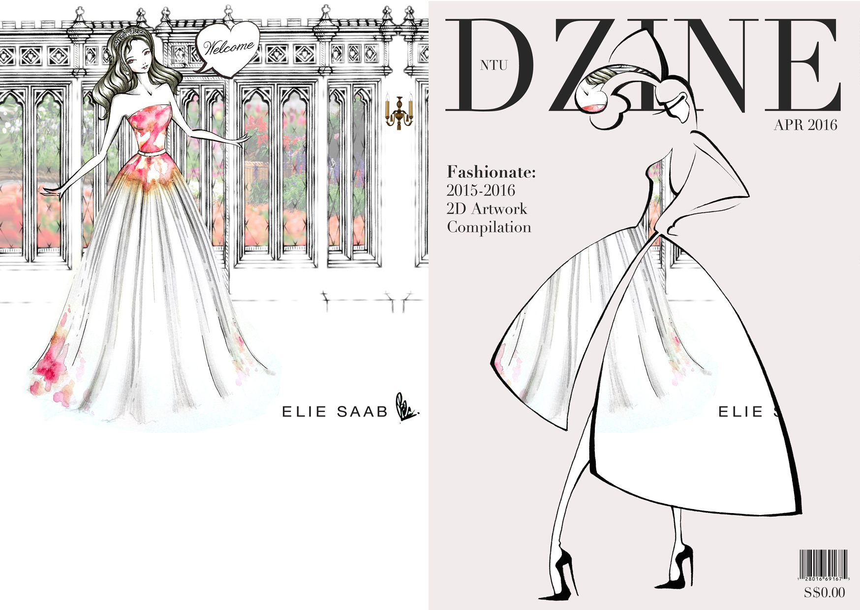
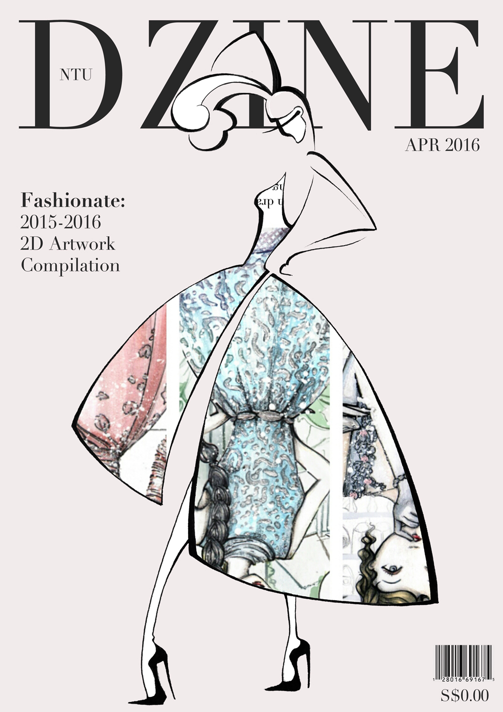
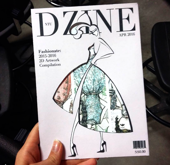
Cover

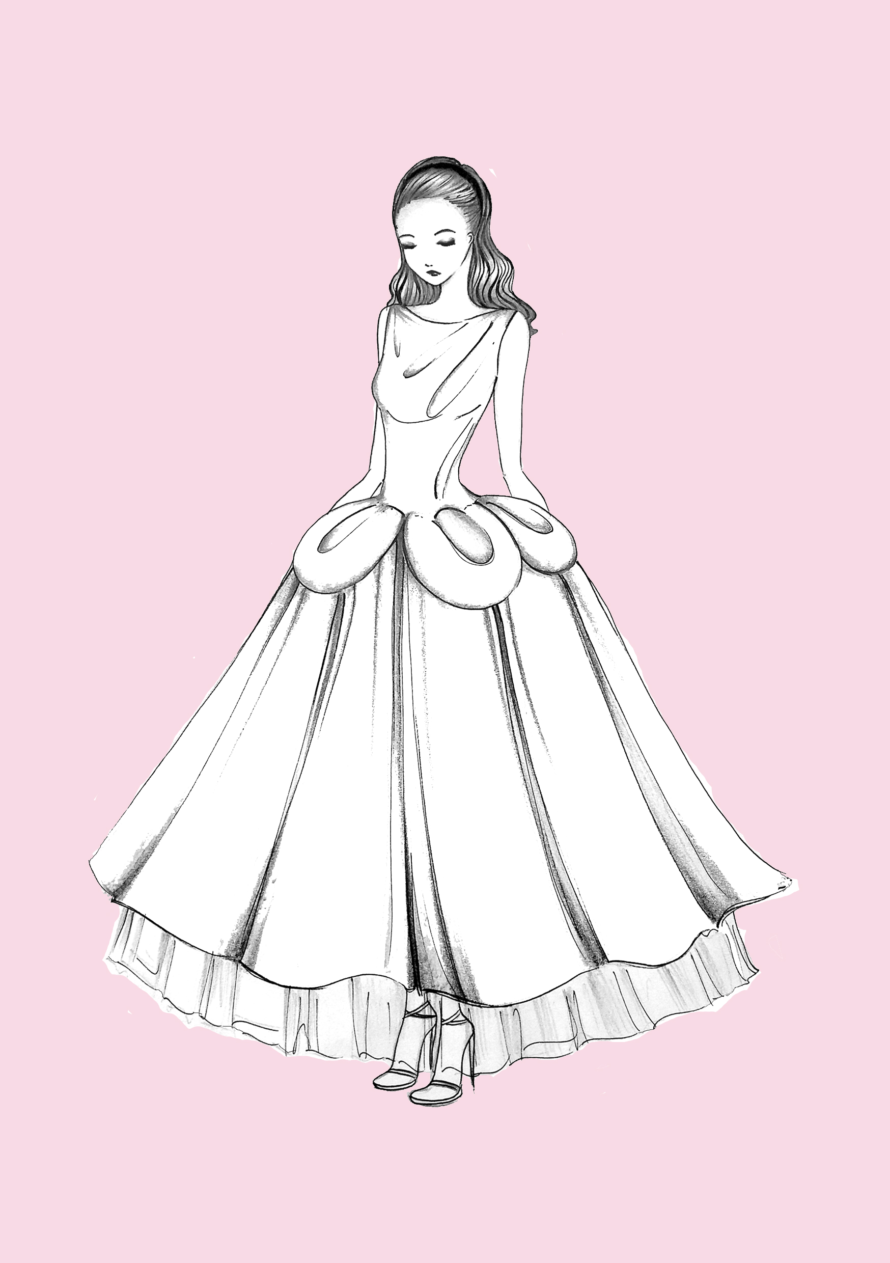

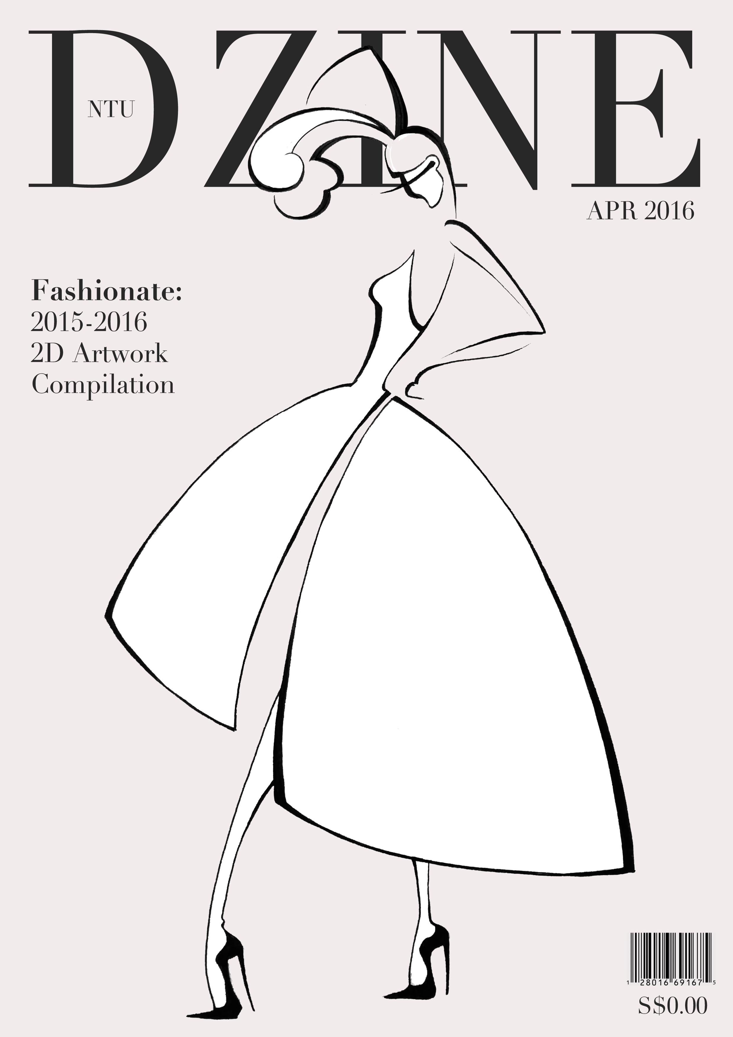
The first two are initial designs of the cover, but those cut-outs are not satisfying. it’s not classy enough. So, I decided to draw another original illustration. The simple and minimalist line give classy look and it simulates vintage Vogue cover. There are some changes in the text alignment.
Content
The challenge in deciding what pictures should be put in the content page is whether the image will fill in the dress well or not. So, a lot of trial and errors are made.
Below are the errors.

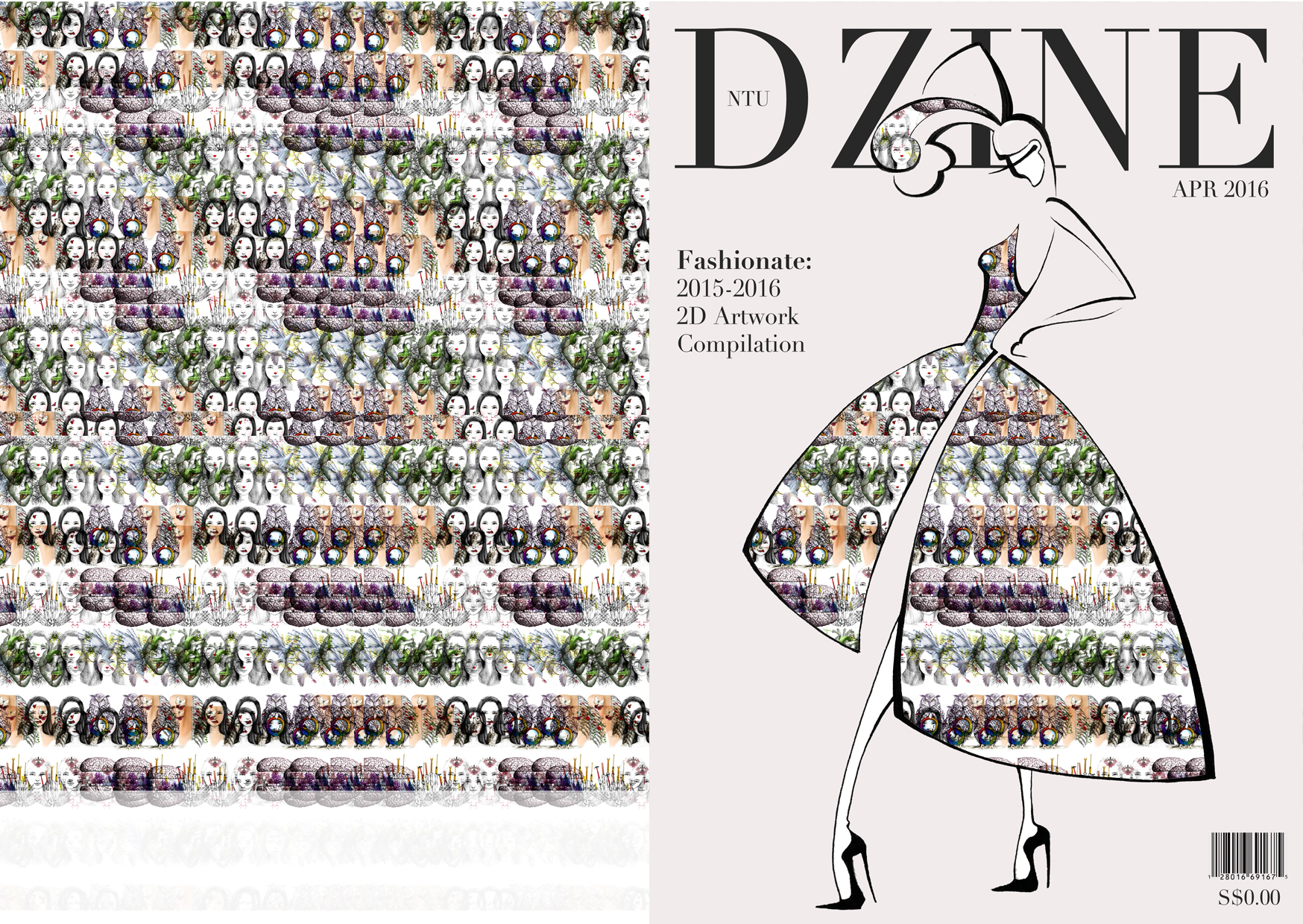
And after some more changes, the final content pages are:

So, when they all fill in the dress:


Oh and yeah some of the content pages can only fill in the dress of the cover or the back cover.
Reflection
Designing it is pretty tough because of the unusual format and unique idea. Sadly, the format that I used is only fit A1 size paper, which cause the printing to be bad. It’s not sharp to be printed using A1 printer. Thank God it still looks good tho.
Well, but the content pages contain too much words. I didn’t know that the font size of 10 can be soooo big on A1 size paper…