Two Sequential pages + 5 Drawings

Version 1:

Version 2:

I originally submitted version 1 thinking the deadline was earlier where in my initial OSS post, I lamented that if I had more time I would have added more details in and re-did some of the panels. Turns out, I HAD!

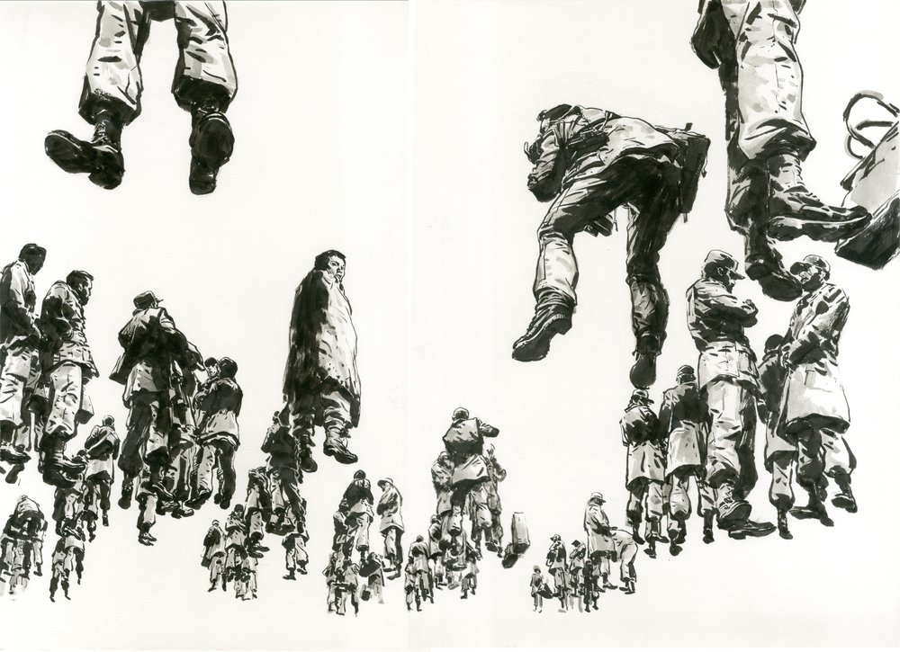
Having to do two pages, I really wanted each page to be distinct but with a purpose. The first page is meant to evoke a sense of familiarity/ recalling back to a specific time, hence the more “refined” approach with the shading, where the overall look is meant to look cleaner in comparison to page 2. For this version, I changed the last panel entirely because I found the first version’s to be uninteresting and did have the dramatic effect I wanted because the “camera” is pointing to the ground where it would’ve had been better if it was pointing upwards. The scenery is completely changed because I drew the 2nd version when I was at home, where the first was from my hall. For this page, I took inspiration from Mattero Pericoli , I noticed that although his work doesn’t necessarily has tone in the traditional sense, he makes up for it with the windows and bricks which in a way acts as its tones.

For page two, I wanted it to contrast, not only with the amount of darks I use but the overall composition as well, it’s lot more rougher and boxed in (which is beyond my comfort zone to be honest, but I wanted to be a little more experimental). The intention is ground page 2 more into reality in contrast to the more nostalgic approach I took in page 1. I changed the overall aesthetic for this page because I felt the first version was dull and lacked a distinct personality. Hence I tightened up the framing to give it a more “boxed” in feeling, which fits well into the new narrative of being unable to escape from something despite being self-aware. I changed this narrative because when I showed that to my friends, they were confused by the conflicting imagery as the monologue talked about food, but the visuals showed a completely different food. This would have worked better if the monologue and drawings were different enough. Hence, the change, which I feel works better. I also decided to ink it to make it more bold and gross to contrast the cleaner look of page 1 better (plus I also had fun inking page 1 and wanted to continue doing it haha). For this page, I took inspiration from Andre Wee , which was introduced by Noah’s post as the ones I picked weren’t “messy” enough.. but I guess that is the point of having us introduce each other various artists!

Class drawings: 


Not sure if we’re required to reflect but I’ll just do it anyways cause it feels weird posting class drawings without sharing some thoughts.

To be honest, I failed to keep up the habit of drawing during the semester break because of various reasons and commitments, which was why I decided to take up this module, to help me get back into it as well as to build on the foundation from year 1.

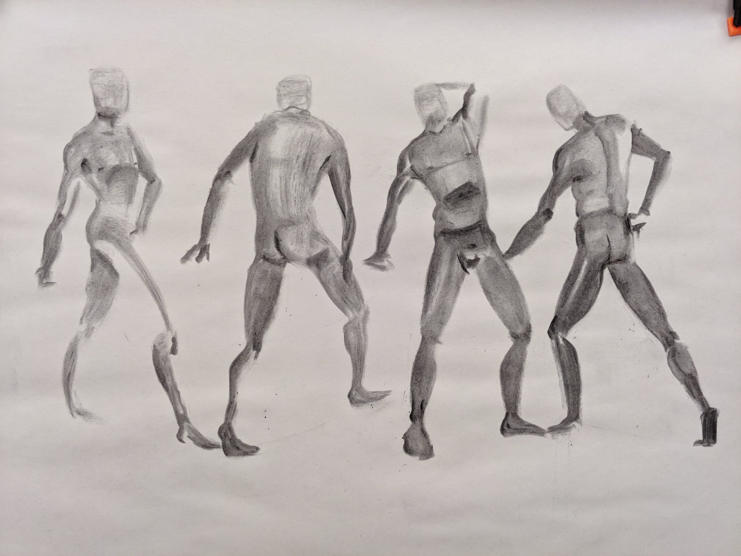
In the first drawing, my proportions are all over the place, and sketching them without line work made it even harder, which made me worried if this was the kind of output I’d have for every class so I squeezed in some time, whenever I can, to focus on anatomy and get back into the habit of sketching them quickly. Hence the vast improvement seen in picture 2 (at least I hope..).

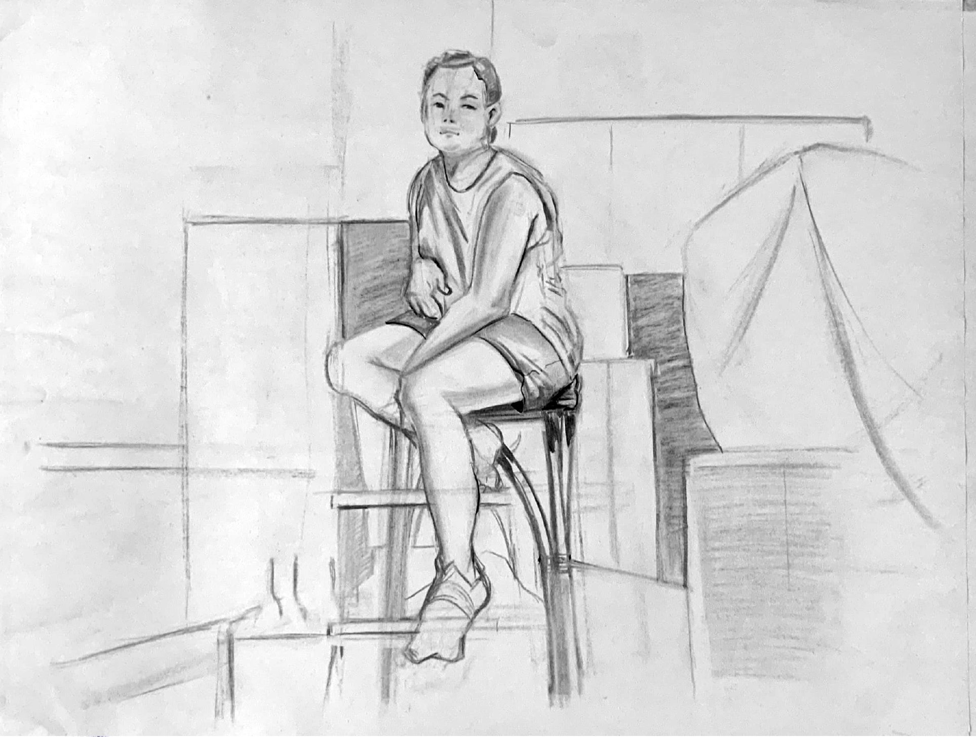
The biggest challenge posed is definitely the environment, while foundation year has helped me gotten a lot better at drawing people, I still had difficulty plotting the environment quickly. I consulted with prof Jesse on image 3 and have gotten lots of useful feedback that I kept in mind in subsequent classes (and especially for the final assignment). Some of these advises includes; don’t commit to a single object until I’ve laid out the environment, draw my ellipses properly and use the eraser as a drawing tool and not just a tool to undo mistakes.

Still have ways to go but am pleased by the overall improvements I’ve made this semester.

6 Composition sketches

 Still Life:

Voyeuristic:

^Now that I think about it..shading the person in the foreground along with the environment (leaving the background area brighter) to obscure this person would probably make it more Voyeuristic…

^Noah had a really good point about hiding a person’s face behind the glass to make it more Voyeuristic.

^Probably my least Voyeuristic sketch. I intended the clicker at the bottom to be distracting for the viewer, so like a form of interruption from the Ipad. One way to improve on this is probably have a hand on the clicker with a faint reflection of whoever’s opposite be on the Ipad?

Reflection:

Honestly, I’m quite pleased with these sketches, more so because I feel I’ve gotten faster in plotting stuff down before getting into the details. Areas I definitely need to improve on is my line weight and adding more values in my sketches to separate the foreground and background.

Edit: AHHHH Sorry Prof Jessie!! I put a timer to publish this on Monday but I set the wrong Monday!!!

5 Artist Research

For this research, 4 of 5 of these artist are ones I found in the ADM library.

Mattero Pericoli

What caught my attention with Mattero Pericoli is the immaculate detail he puts into his environment drawings. In these pictures, Mattero captures his environment through his view from a window. I love that he used the window grills as his framing device. If I were to focus on just part of a drawing, through one windowpane, it still looks like a complete piece of work that is nicely famed (something we also discussed in semester 1 during one our critic sessions!). The grills are more often the only one that’s “shaded” through cross-hatching, further emphasizing them as frames to his artwork.

His sense of perspective is also on point. Although these are drawings of buildings and/or structures, all of his lines are done freehand, which I felt gave his environment more life.

Abdelkader Benchamma

Another artist with I feel has fantastic intricate linework. Some of his works reminds me of the posters for this film called “Lobster”. That being how huge chunks are deliberately omitted in his artworks. It’s very interesting to me as through the empty spaces, it creates this moody tone of his composition. While his line works are extremely detailed, his overall composition can be broken down to shapes whereby Abdelkader successfully plants them in his layout with a clear idea as to where his details will go and where he’d leave it blank.


Ruth Gwily

Her artwork in this book is mainly humans. But the interesting part is how she chose to represent them in this performance-art sort of manner. Looking at her history, she seemed to be involved in costumes at some point, so it’s no surprised she used that as a theme for her illustration.

But before looking her up, what struck me the most about her is her choice to have her subject wear costumes like an oversize helmet/masked as opposed to exaggerating proportions. Which is interesting to me as while she’s grounding her work into reality, its still just as, if not, more wacky than if she chose to just exaggerate their proportions.

The reason why I feel she manages to pull this off is her strong sense of human proportions as well as a good understanding of scale and weight


Sun Xun

Probably the most different out of all the artists I’ve picked. What drew me to his work is this dark, somber, almost surrealistic tone he has going on in this paintings which he achieved through his dark lighting, composition and the subject of his painting. I also noticed that most of his works seems a similar composition. That being on eye level, which puts the viewer into the scene, as though they’re observing an event that’s happening before them.

(I couldn’t clearer pictures online so I took a picture from his book. The pages are also glossy so it’s hard getting a picture without any light reflecting..)


Kim Jung Gi 

One of my all time favorite artist. What drew me into his work is similar or a combination to some of the ones I mentioned above. The immaculate attention to detail, understanding of anatomy and perspective, and his rendering grabs my attention. Seeing him create his works can be a little demoralizing at first (when I was much younger) because of how effortlessly he draws and paints without any use of guides but now it’s much clearer to me that he’s able to do all that because of how hard and long he worked on his craft.


Pictures in full res: Click here