So as you probably saw my previous posts, my idea is basically a zine talking about good desserts you can get in Serangoon. Done some research to find some inspirations for this zine.
Initial Ideas
Actually, my first idea was to draw each desserts using watercolor. Then, give some reviews and locations. But, then, I myself am not confident since I don’t have that much experience of using watercolor. It’s just a careless ambition. I know I’m gonna mess up if I decided to use this medium.


Then, I was thinking of photographic-based zine. I know it’s a very safe form for food-related zines, so there’s nothing unique about it. I considered this method because I honestly was lost and can’t find good ideas. And I insist on doing a food-related topic for my zine. And as expected, it was too generic and not a good idea at all.


Enlightenment!
Truthfully, I was very inspired by my fellow classmate, Brenda, on doing illustrations on photographs. But, then again, how will I relate this to desserts? I tried to do some research to it and found some cool pictures. However, most of them features people.


So, I wondered, how do I associate this decorative element to food? Because random doodles together with food is a bit weird and don’t give any essence at all. And then I saw an instagram artist’s post which gives me the idea for my whole concept! Her username is @kaiami and here it is.
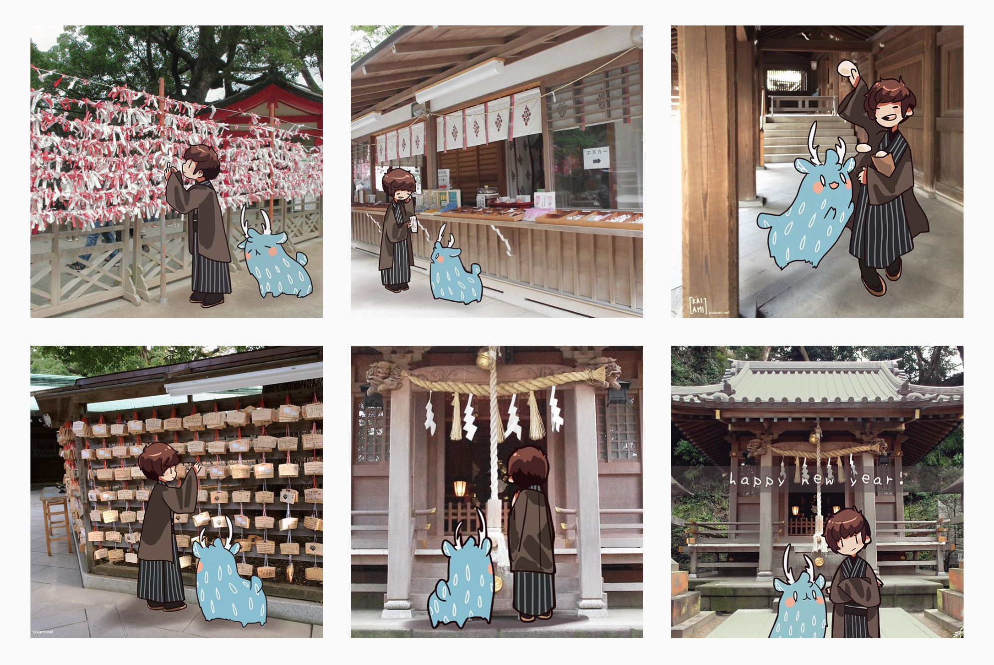
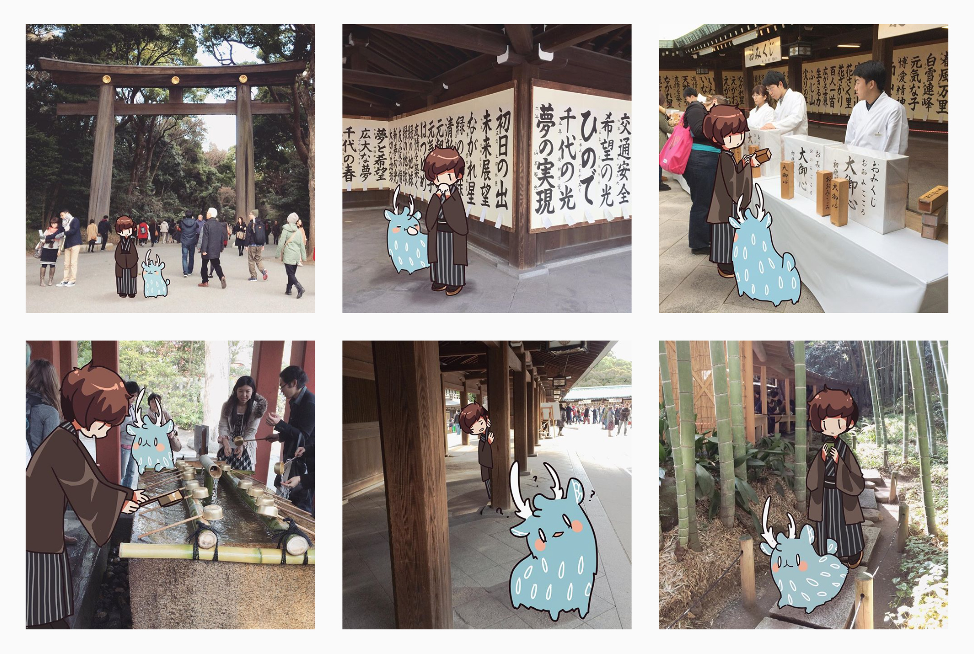
So she shared her experience in Japan by including her own original characters as guides, to make her posts unique and not boring. This inspired me to create my own character(s) to guide the readers as they go through the foods. I am deeply inspired by this which almost made me use this as the one and only reference. Such as I wanted to insert pictures with characters in it and then put some text on it, which is the review.
But I though there’s not much originality if I do that. So I do some research and I decided to use other elements such as collage, doodles, etc. But I strictly only use 3 main colors, not including the character.


There are also other main inspirations:
Hattie Stewart’s doodles on magazine’s covers


NBA Magazine Covers


Various Japanese Magazine Covers/Contents


Layouts
I wanted it to be a bit inconsistent, yet connected to each other with the colors.

Next up, process! Check my next post!