Tag: typography

2D II Proj 1 – Que Sera: FINAL

FINAL FOUR

final-yoga-instructor

final-spaceman

final-lawyer

final-white-hacker


OTHERS

wine-taster screen-shot-2017-02-06-at-4-56-48-am


Semiotics

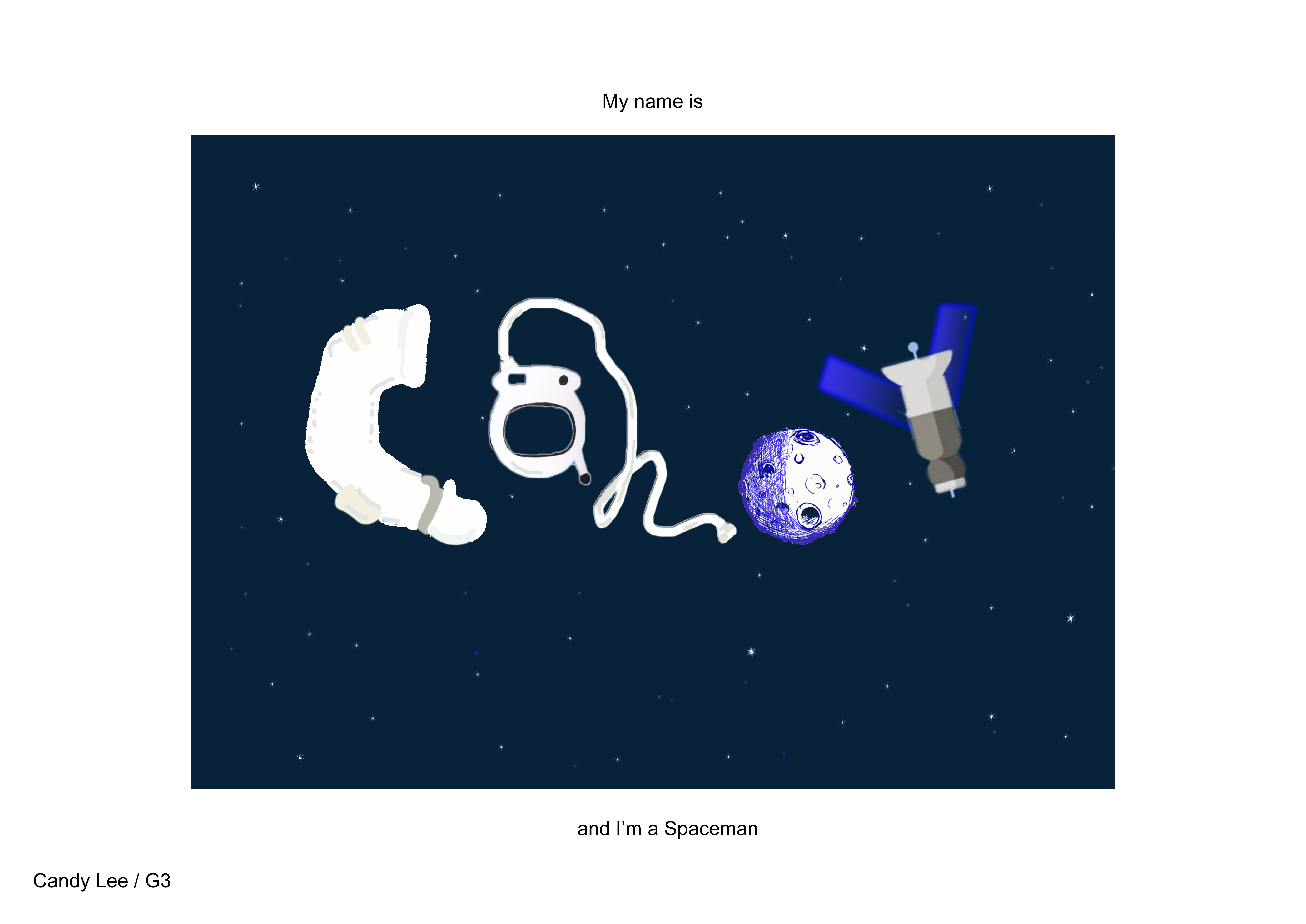
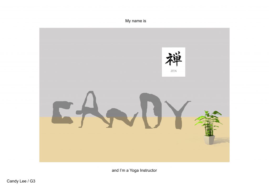
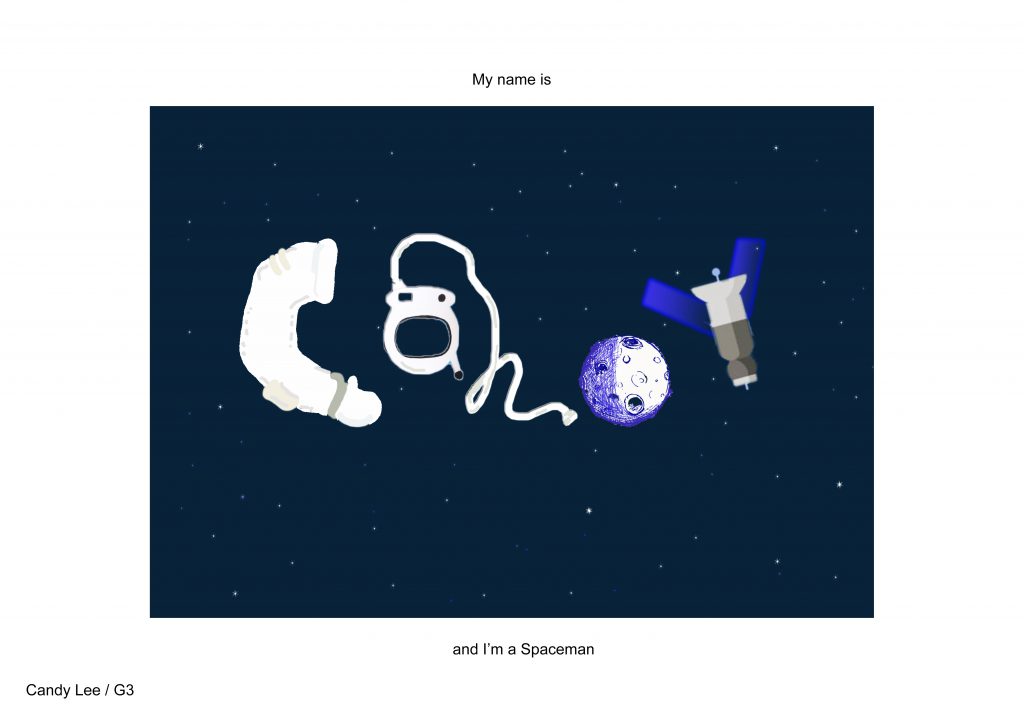
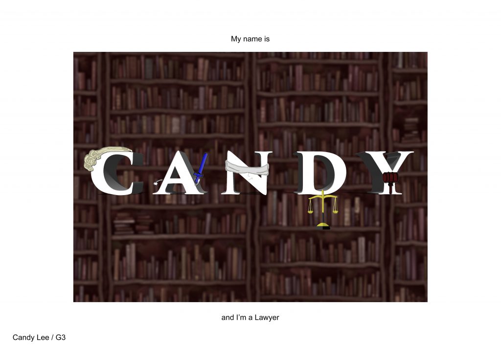
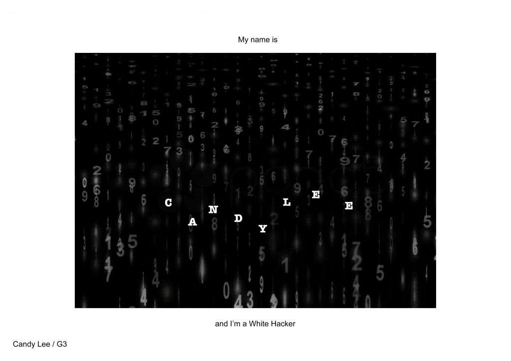
Understanding semiotics (signs, symbols, icons etc) have helped me get a better idea and association with the types of jobs. I can choose more appropriate graphics and symbols to link and represent the occupation I have in mind. For example, in the spaceman, I made use of the satellites and moon and spacesuit to draw association with the occupation, and in the white hacker, I had the idea of matrix.


Personal Take away

First lesson, I was being suggested to do always do sketches. I have never tried to do it for my idea making as I’m horrible at drawing. But I decided to try it, and indeed that would give me a better picture of my ideas, and able to allow me to think further and expand my ideas on-the-spot as I’m sketching it.

Also, this project has been a great learning experience as it allows me to experiment new things. I feel a sense of achievement as I produce works that are better each time. 


Challenges

I believe for most of us, the greatest challenge would be time and finding unique ways of assembling/rearranging the most typical items eg. symbols or icons. 

Personally, 2D has always been a very tough mod for me as I don’t even have knowledge about Art and Design. Naturally, I don’t know typography, semiotics… even all the designing softwares are so so new  to me and thus my greatest difficulty is to use these tools at my basic level to create the best works of my ability.
(I was in Science stream all the way, and had minimal contact with art and design. But I decided to pursue my passion in the media arts at NTU.)

I will continue to work hard and hopefully sharpen my design and software skills for KILLER WORKS in future! wink


2D II Proj 1 – Que Sera: Research

After discovering Project 1 will be mainly on typography, I was a little excited, but also panicking slightly!

I didn’t have much knowledge on TYPOGRAPHY so I googled and went on pinterest to know more about it, and for inspiration! 


picture2  picture1


Typography basically a style of arranging text. It can come in so many different forms such as arranging different icons/visuals to form text and even creating a whole new style of font. laughing


Visual References

I quickly brainstormed for my job ideas and looked up for visuals that could be associated with.


Lawyer

Hairwig | Balance | Hammer | Books | Court

Singer/musician

Musical notes | Piano | Music score sheet | Multi-instrumentalist

Doctor

Stethoscope | ECG | Medicine | White uniform | Organs | Blood Vessels

Director

Director’s chair | Slate | Camera Equipment | Studio Lighting | Loudspeaker

TaiTai

Poodle | Make-up | Bags | Nail Polish | Heels | Mahjong | Car Keys

Astronaut

Galaxy | Spacesuit | Rocket | Mars Rover | Moon | Asteroids | Satellite

Yoga Instructor

Yoga Poses | Zen | Clean 

Forensic Scientist

Matrix | Fingerprint | Lab 

Wine taster

Wine bottles | Cork | Corkscrew | Wine Glass | Lips | Tongue | Eyes

Sleeper

Bed | Counting sheeps | Zzz | Snoring | Pillows & Blankets | Dark Eye Circles

Dealer

Poker cards | Casino | Chips | Dealer gloves


Reference Artists/ Inspirations

For further exploration, I looked up different font styles and below are few which inspired me!


Typography on music notes
http://luc.devroye.org/music.html

picture3

Kuala Lumpur, Malaysia-based art director who made the music note-inspired typeface

I was then inspired to try and spell my name with this font!

img_3553


Human Typography
https://djstormsblog.com/2013/06/21/pinch-martin-tremblay-human-typography/

picture4

I am really passionate in film and photography, and when I first saw this I was so amazed. I love it! This is really creative, to use just our natural bodies to form alphabets. A great idea, and this has inspired me to include bodily gestures (in yoga).


Type Photography
https://www.visualnews.com/2013/03/08/architecture-b-c-a-photographic-alphabet/

picture5

Peter Defty produced amazing typography through the framing and composition of architecture in his photographs

 (Yes this was introduced to the class in my group’s presentation)

This piece is inspiring to me as it made me realise that alternatively to creating new fonts, we can make fonts out of already present things, and in Peter’s case, architechture. He makes use of negative space to create alphabets, opening many of our eyes to appreciate things in another way now 🙂