DF3009 Film Directing Assignment 1 – SCENE BREAKDOWN
Hi!
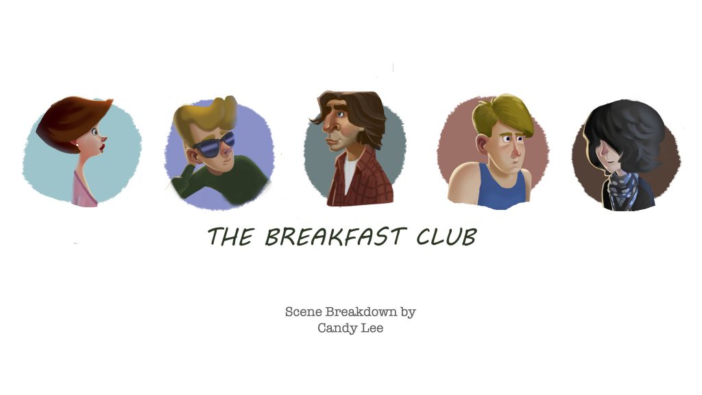
For this assignment, I’m excited to share a scene from this film: The Breakfast Club (1985) by John Hughes
Click here to view the scene breakdown 🙂
OPENING SCENE
The film starts off with a quote by David Bowie
and then shows cuts of B-roll – to help establish the setting and gives audience an understanding of the situation in the story
and then the main characters arrive at the school.
This is what I’m going to discuss.
[slides]
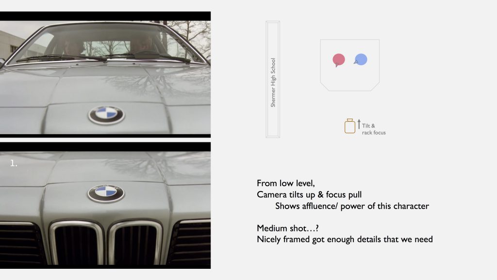
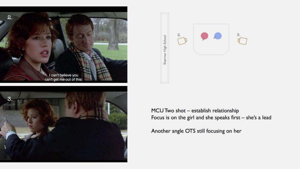
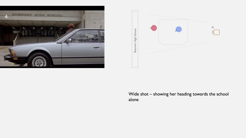
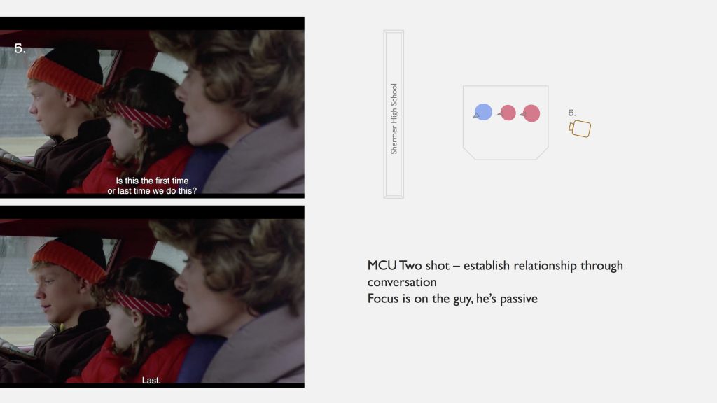
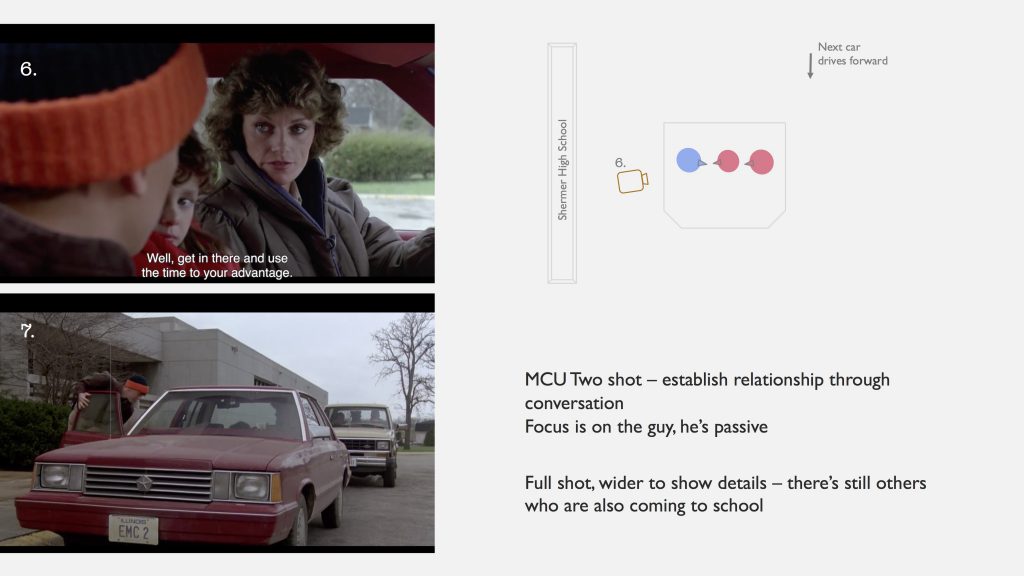

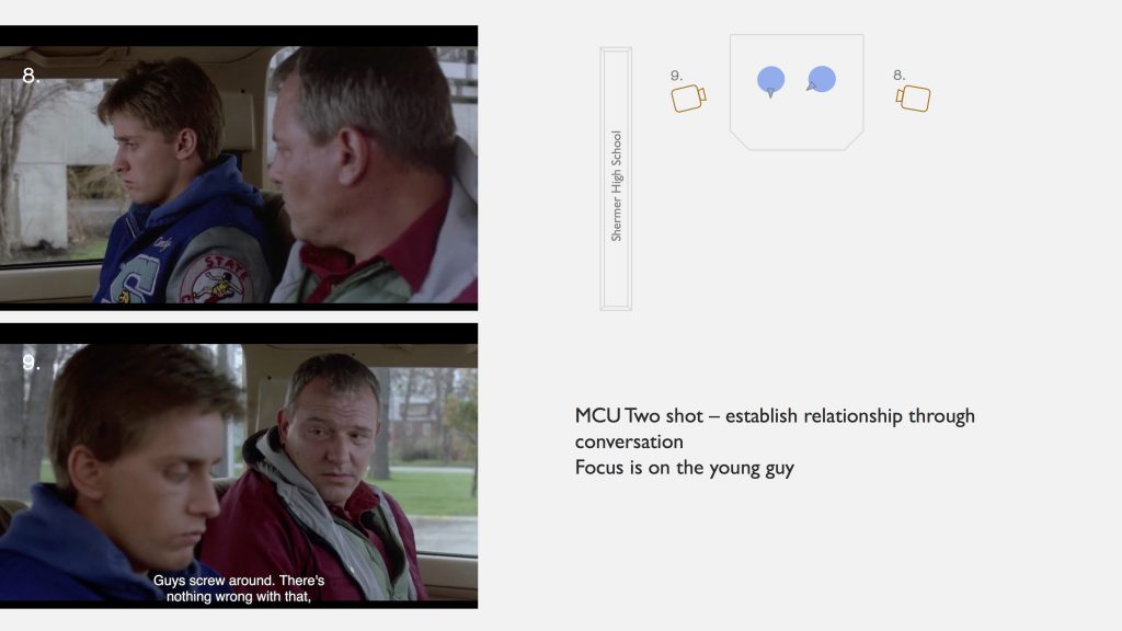
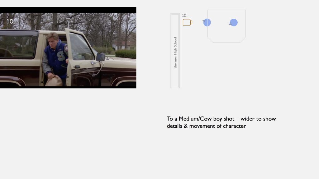
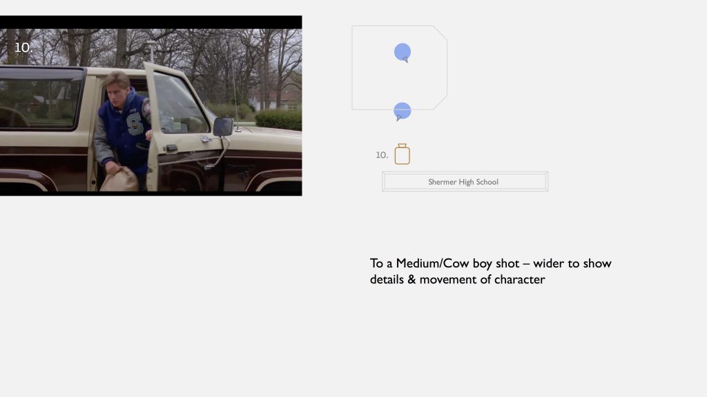
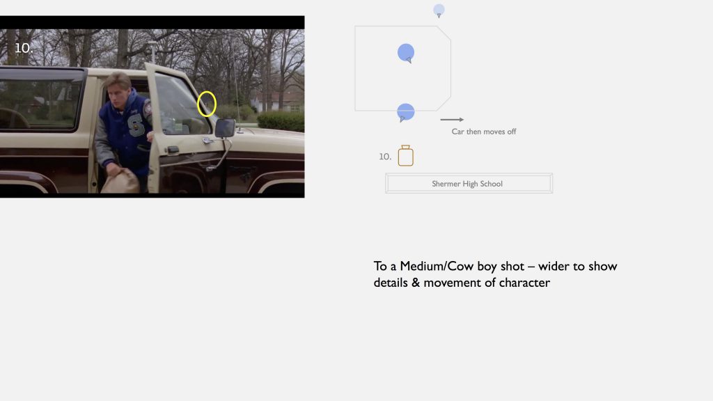
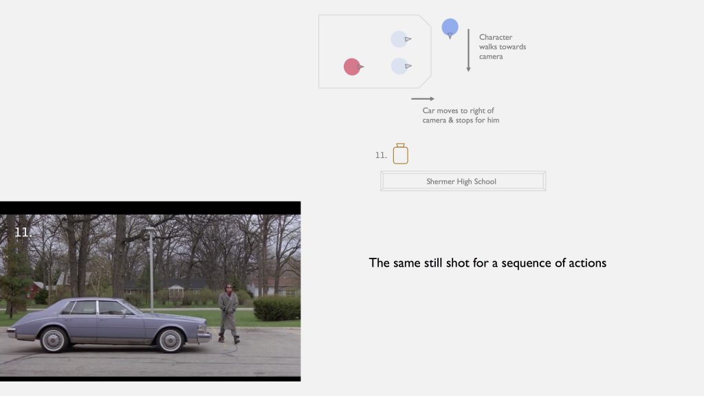
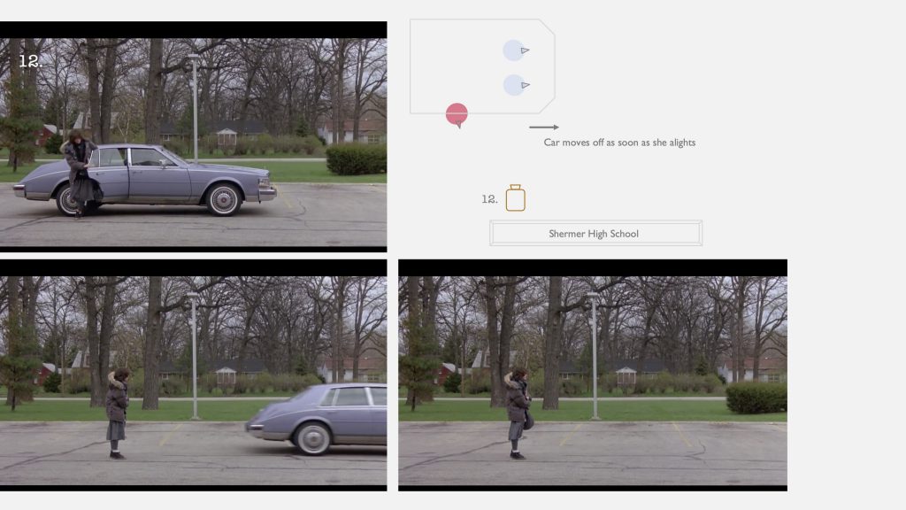
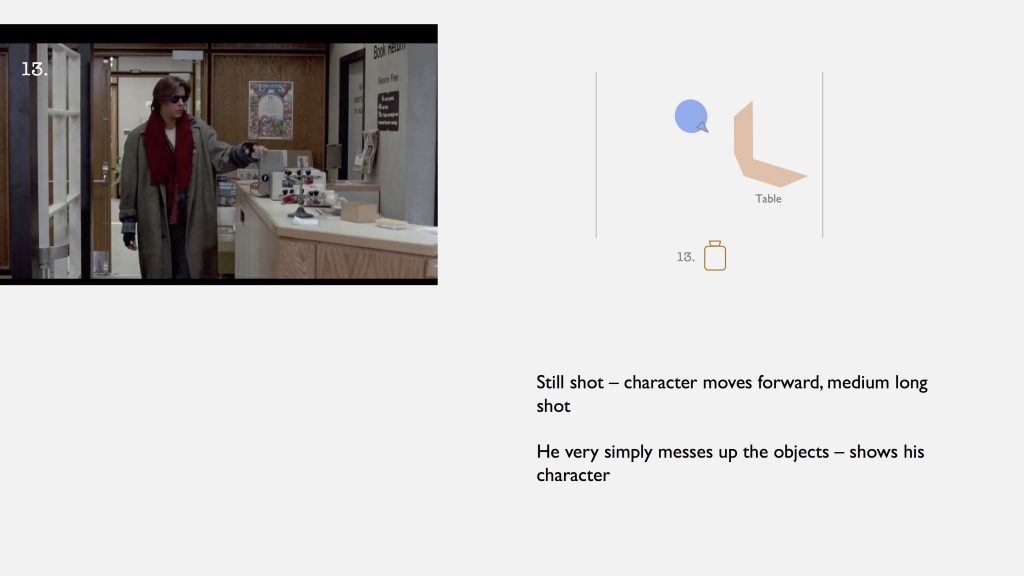
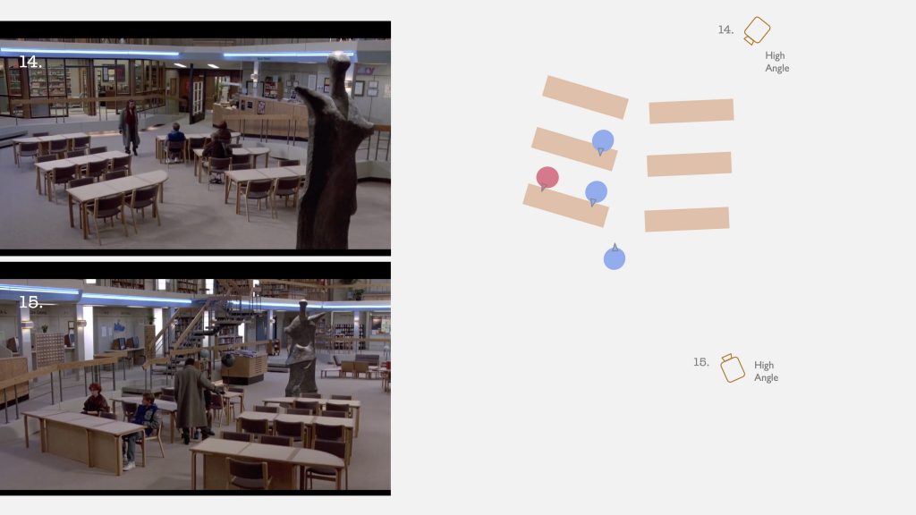
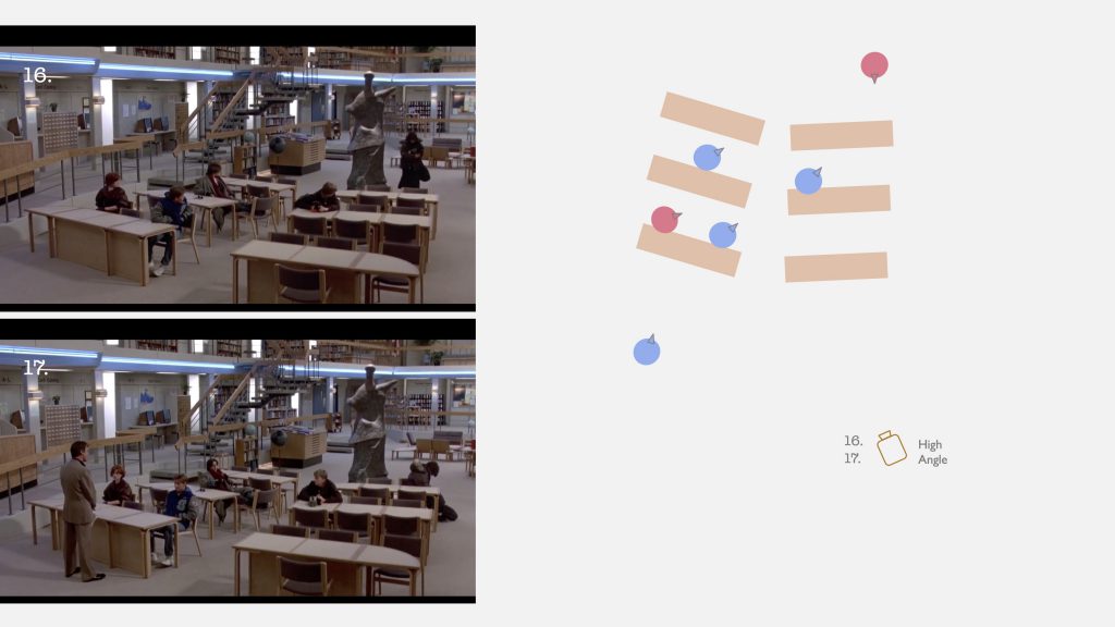
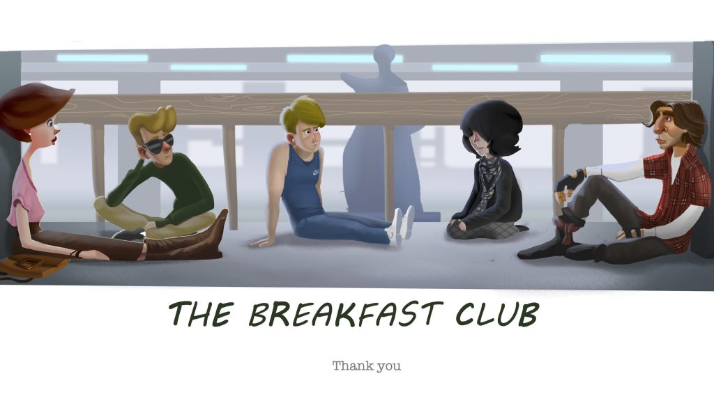
In relation to the story
- They are all very different, but also somehow similar
- they are seemingly different but we can tell that there is something they have in common – we realise this, but what exactly is it, is to be unraveled later in the film
- 5 different characters but we can tell that 1 stands out among them and he is going to be very special and different in the story
- They represent 5 common stereotypes of teens/ students in the school setting
- “the Jock, the Princess, the Brain, the Criminal and the Basket Case”
Btw,
Please feel free to comment and share your opinions with me!

Digital Film Production I – Pitch Ideas
PPT link: https://docs.google.com/presentation/d/1GEQe0Ruqr0n3xGew-4Z-PXGYBSMaTE2LHWMBqxPdjfI/edit?usp=sharing

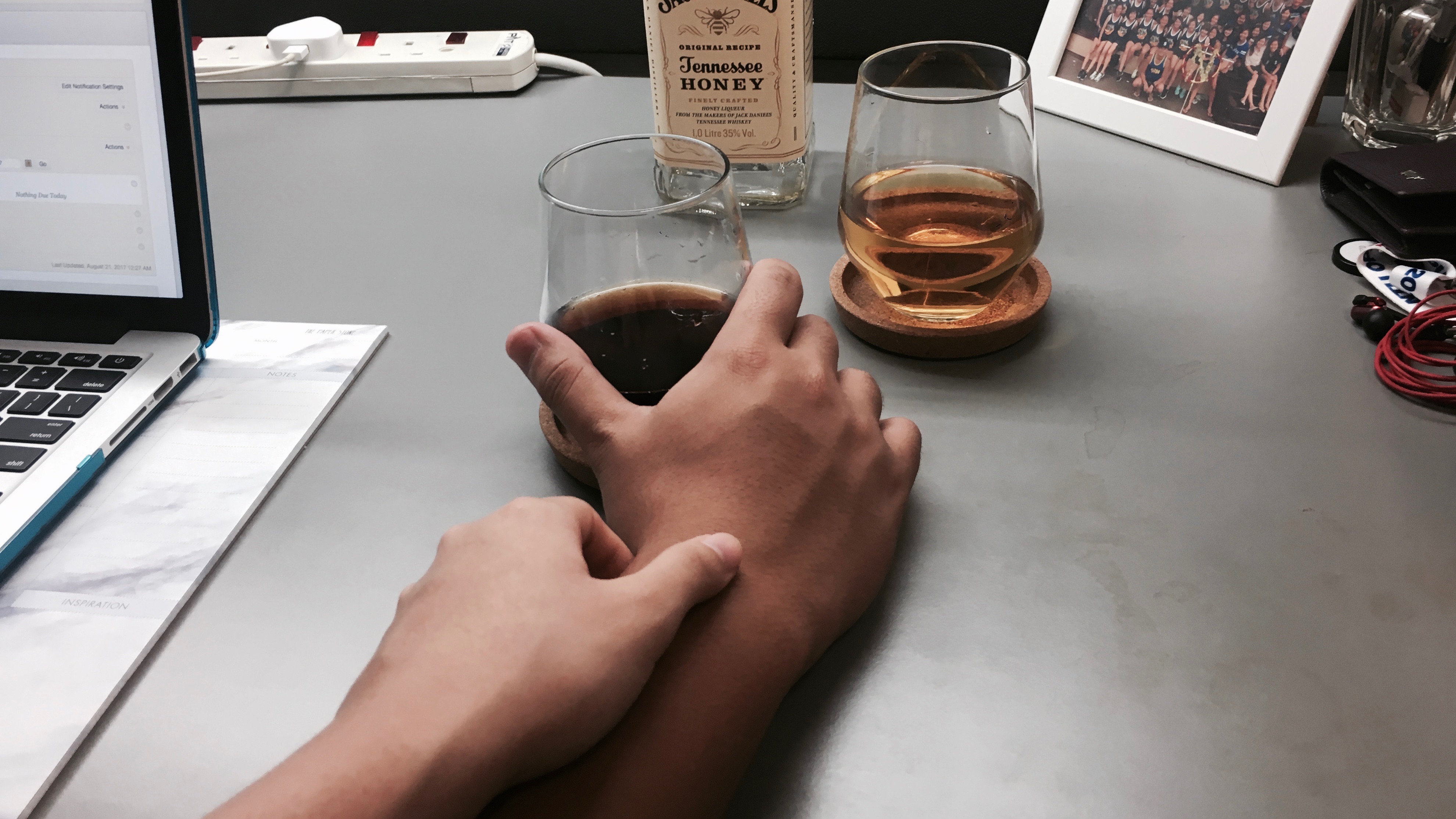
An extension from the sequence assignment the previous week.
4D II – Time, Space & Body [Sleep Debt]
View PDF version for easier reading!
or
Proposal
Aim:
The significance of this project is to highlight the issue of sleep deprivation through physical form, of how much sleep and rest we have sacrificed to keep up with the hustling lifestyle and school work. Participants are students in NTU. We thought that this should be brought up since such unhealthy lifestyle is increasingly perceived as a norm and hence students have been neglecting sleep since they do not see it as of importance to their health.
According to The Straits Times, a SingHealth Polyclinics study reflects that “more than 40 per cent of Singaporeans do not get enough sleep on weekdays”.
Project Execution:
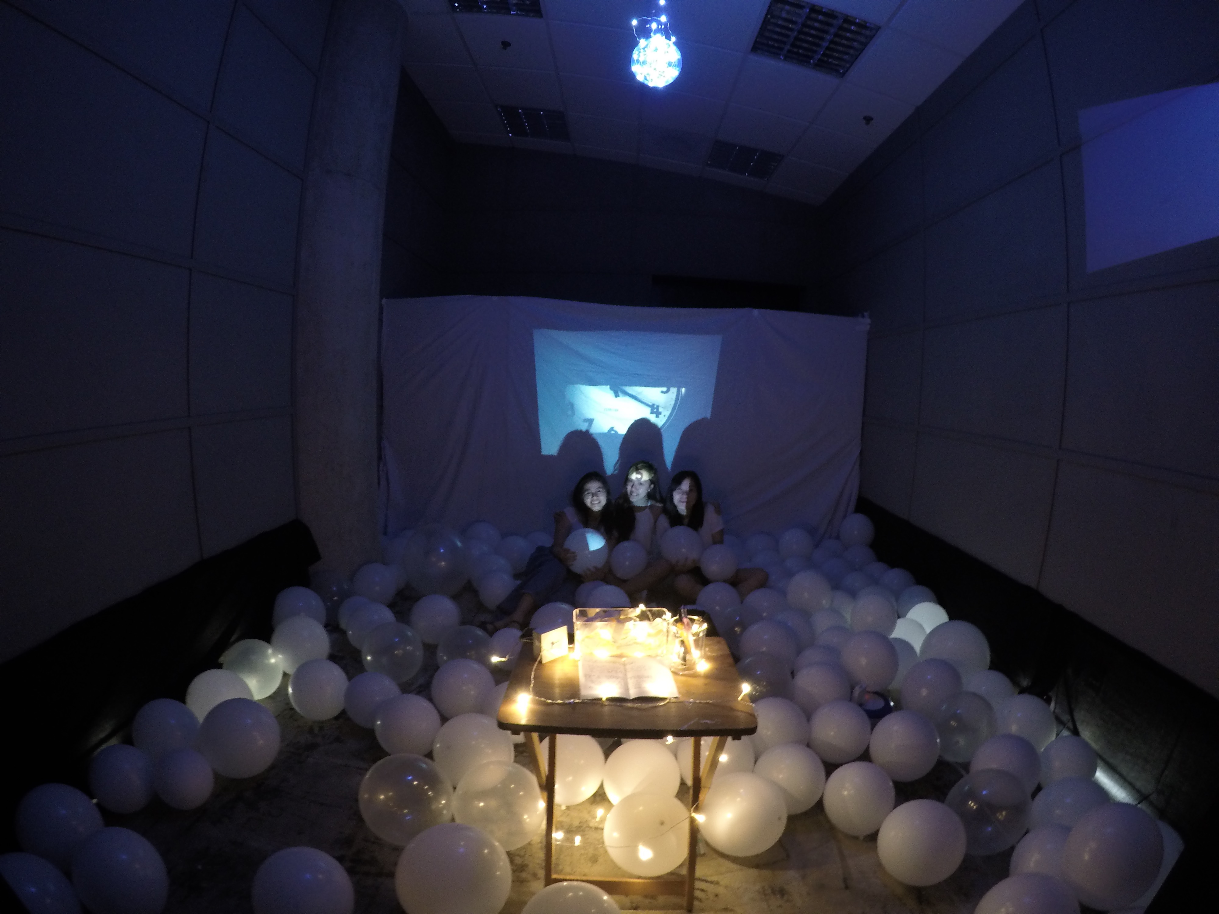
- In the dark room, the whole venue will be generally filled with white balloons on the floor.
- A table stands in the centre of the room. Above the set-up, a lamp droops over.
- We place a clock on the table in giving a sense of time.
- An exercise book will be placed on the table which includes the aim of this installation and also descriptions of what the participant can do – to blow the balloons corresponding to the number of hours of sleep they have missed.
- In front of the table on the wall will be a projected screen which will show a video.
- It shows participants who have responded to this project, recalling the number of hours of sleep they have missed on a particular day, setting the standard that one ought to have at least 7 hours of sleep in order to have adequate rest.
- While watching the video, the audience may contribute to the installation by blowing up balloons according to the amount of sleep they have sacrificed. (Over a period of time or on the day itself)
- One balloon in the room represents one hour of sleep that one has sacrificed.
- Another projector will screen a counter which shows a counter of the total sleep that everyone has sacrificed collectively.
- The room will show an accumulation of sleep debt collected over a period of time.
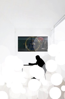
Rough Floorplan:
Ideation
We decided to work on the issue of Sleep Deprivation.
This idea came about when many of us were working very hard for our final submissions, often stretching work hours till late night. Dead beat, but we would still continue with work even having only about 4 hours of sleep each night. This is common in friends around us, that we lack rest as we burn midnight oil.
This topic, with its high relativity and creative potential, we found strong reasons to expand on it for our project.
Concept development
Having discussed, we agreed that we wish to bring attention to the issue of sleep deprivation; a potentially dangerous health concern, and hopefully bring about change in such unhealthy lifestyles. We question, “Is is really worth it?” to allow participants to think again, about priorities with consideration of health.
The primary aim of this project is to explore possibilities of Time, Space and Body.
To deprive oneself of sleep, is to owe one’s body the time to rest. We relate such ties in physical form – balloons!
It is an appropriate representation as it it similar to us. We accumulate all of these ‘sleep debt’ and as we continue not getting enough sleep each day, the balloon increases in size, showing how much it all adds up. Eventually we would reach a capacity, and our body would be like the balloon, bursting at its limit.
We conceptualised a balloon representing a unit of sleep lost (1 hour in this case), and the room would contain a certain number of balloons. We estimated a high number, and this would allow the audience to experience a room packed with balloons, to feel overwhelmed by the truth and a commonality sleep deprivation has become.
Also to raise awareness, we planned to project a video at the set-up in delivering our message. It also documented few of our friends and their accumulated hours of ‘sleep debt’.
The overall mood we put up, is the dreamy feeling most of us feel in the morning when we did not get enough sleep the last night. We created a slight sense of familiarity for participants to be able to relate to.
Inspirations/ References
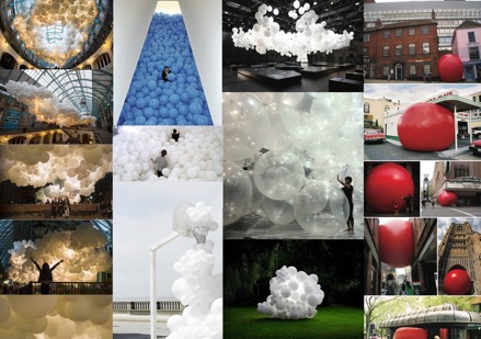
In order to develop our idea, we researched on the topic to understand it better and definitely referenced art works similar to our concept.
Wen Lei had also recommended us a project called A Journal of Insomnia.
It is a surreal interactive documentary, where participants ‘invest their night’ and experience real-time what other insomniacs go through as they observe visually via an online network.
It is an amazing idea, and the inclusion of interaction has definitely helped in pushing awareness and enhancing art experience.
Work – in-progress
Setting up:
Making a screen out of what we have 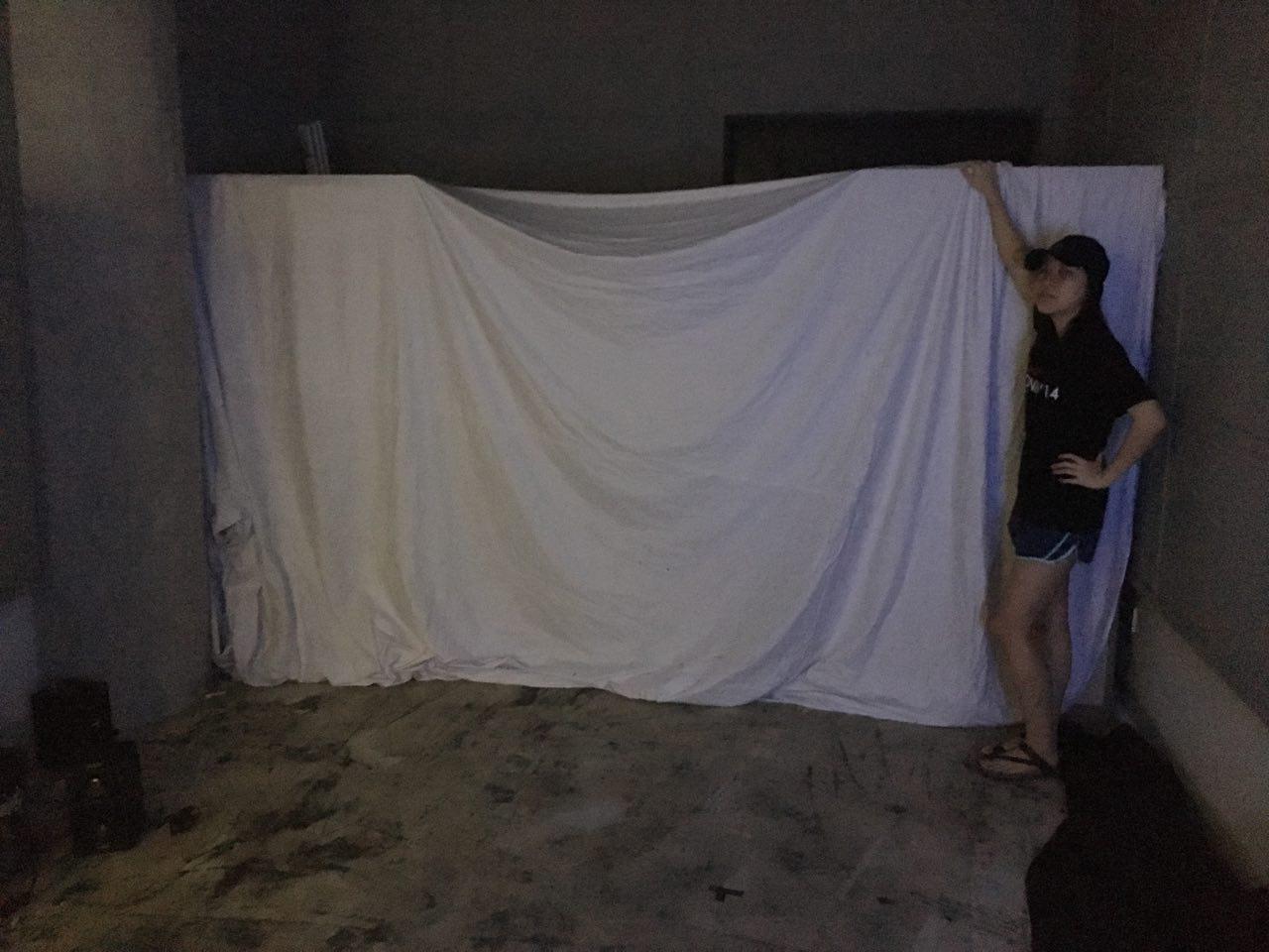
So danielle and jiaman handmade this super laptop stand… putting 3D skills to good use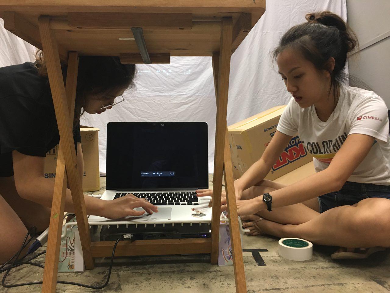
Our lights!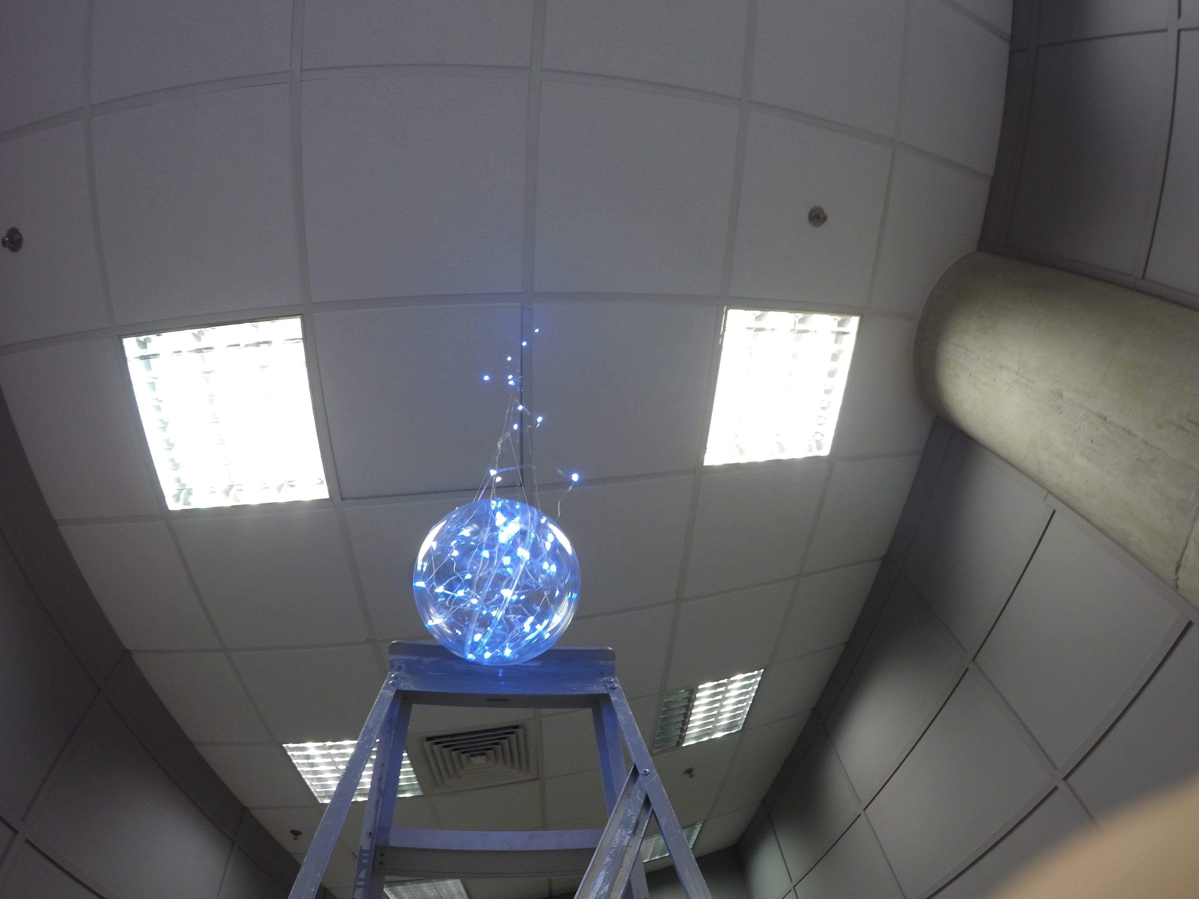
Setting up screens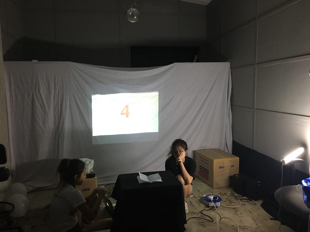
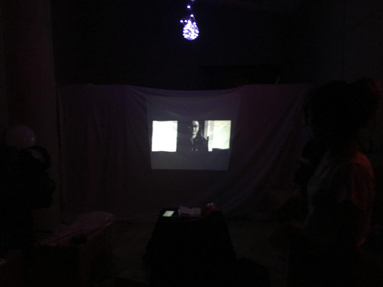
Friends from other classes came in and found our installation giving them a sense of horror due to the red text, and also found the balloons too brightly lit and it distracts them from the notebook on the table as well as the video… ): so we changed those!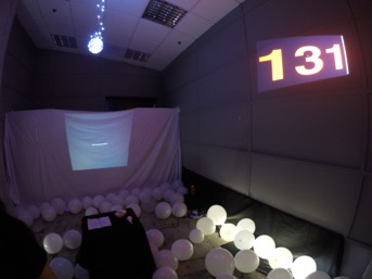

The table!
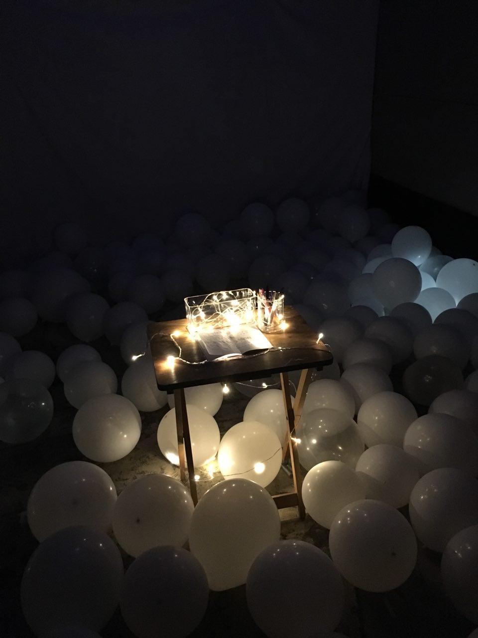
And the end result
Challenges
Our biggest challenge would be interactivity. We had to constantly make changes and fine-tune as we prepare ourselves for the many different possible reactions of participants. There were so many concerns and worries – how could we make use of different tools and aspects to engage the audience, how do we direct them to behave in a certain way?
It is a must to do test-runs and invite other friends to provide us with feedback and their experiences so we could improve and better prepare ourselves, to overcome this difficulty.
As for logistics, we planned to have a dark room but it was difficult to find a room of suitable size, and with as little furniture there is in it. In the end, we found a room smaller than ideal, but it insulates light and sound pretty well, so we decided to make use of that anyway!
Experience
Entering the space, the accumulated amount of sleep lost could be experienced visually, physically by moving through the many balloons and also emotionally from the atmosphere we built.
Here’s how it went!
(Password: Sleep)
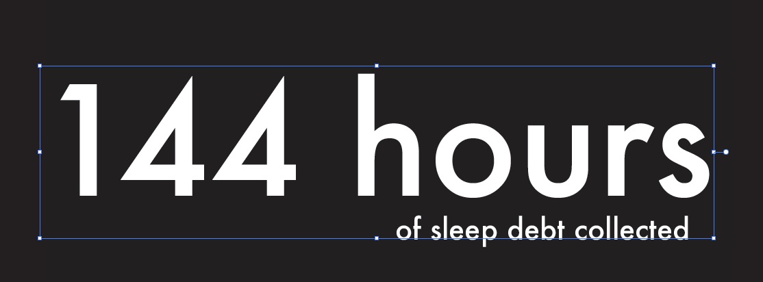
At the end of the class’ participation, there is a rise in number of hours of sleep lost collected from the previous number of 130.
The new number is
To watch the original video played at the set-up:
(Password: Sleep)
(PLEASE NOTE – The 1st and last minute of the video is only music.)
Reflections & thoughts
Danielle
After showing the installation, it is even more evident that this issue is prevalent amongst us due to the reactions of participants.
As the last line in the video appeared saying “is it really worth it?” as to sacrificing sleep, many still said it is worth it. This shows the significance people place on other aspects of their life, mostly work, and do not prioritise sleep. but at the end, I do still hope that our work had created some awareness and encourage them to improve their well-being.
Jiaman
I think I have underestimated “installation art” and the difficulty in adding in “audience participation”. Through this project, I have gain more respect and appreciation for installation art and the people behind them.
There are many factors that can change during an installation performance and that has made me really worried and anxious. A lot of work is needed to understand people behaviour and how they will react to an installation. Will they participate? Will they understand the installation? Will they hate it? Their reactions varies and cannot be predicted. Unlike designing a Zine or poster, we are designing a space. How a person reacts to a space, what will capture their attention, to be aware of sound and light and lastly TIME. What we predicted and vision our installation is very different when we finally set it up.
We made many changes and regarding time. People’s reaction to TIME is the hardest part for me. Overall, this was an interesting project and I really enjoyed it.
Candy
Initially, we had many ideas and it was a hard time deciding on which to work on. Then we finally decided to expand on this topic which we could all agree that it is fun, impactful and something we would be proud to put it in our portfolio. Now after completion, I am glad to say I have immensely enjoyed this experience producing this delicate interactive installation.
Though our result has shown as that people are generally still willing to sacrifice their own sleep time for work or for other reasons, I hope this situation would improve. Ultimately, our health matters most not only for ourselves, but for those who care and love us.
End.


2D II Proj 2 – Zine: Process
MAKING THE ZINE:
Using InDesign… I have 0 knowledge on how to work with this. But thankful for the InDesign tutorial workshop, I have learnt basic functions and that has definitely helped me in exploring just a bit of this new thing.
Style/concept:
Going for a notebook style – historical/ cultural
The back would be the sign off.

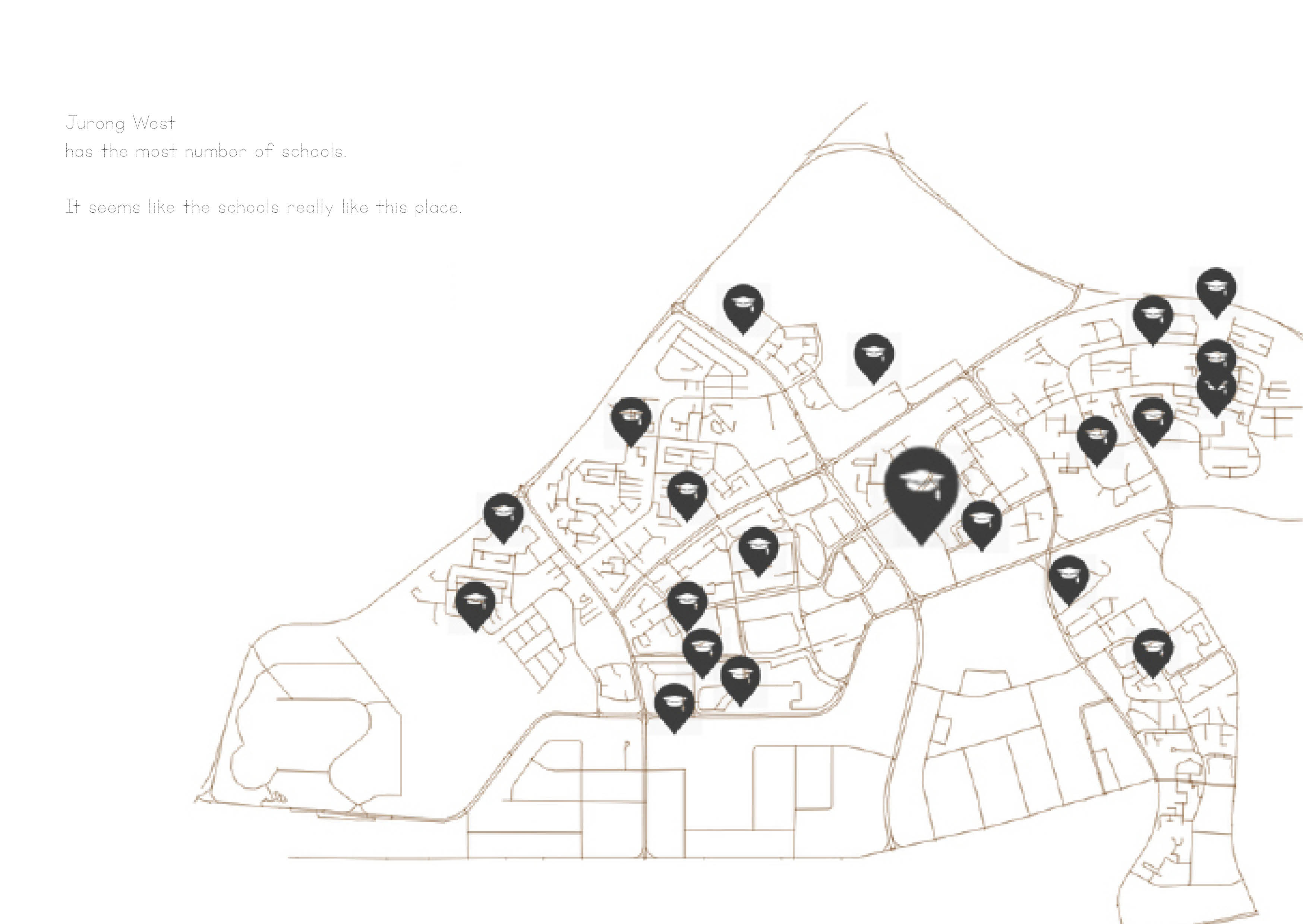
For the first page introducing the many many schools in Jurong West, I decided to make use of about 70% of the space spreading over 2 pages, with the remaining 30% filled with some words.

I wanted to introduce the dense distribution of schools in JW, and bring attention to the one interesting RVHS which is very unexpected to be located in the west.

After bringing attention to RVHS, I was trying to show the shift of its campus location 7 times since it was founded in 1956. It has finally settled on its permanent campus in Boon Lay, 2010 slowing moving towards the west. This is seen and represent by the dots (movement) and directing to the west.

Finally, this will reveal the reason I suggest for its relocation. Because of the beauty I found around it.
There is a little kampong feel spot, and with beautiful nature surrounding it. I simply fell in love with the environment, I liked it a lot, I took many photos and I felt really good and at ease.

I designed the images to be aligned more towards the top right corner of the spread to create a ‘sense of unevenness’ so that the focus would be at the opposite corner.

2D II Proj 2 – Zine: Research
Jurong West
A place where NTU students and staff cannot be unfamiliar about.
We all know, NTU is somewhere in the Jurong West/ Pioneer.
What else do we know about this area around us?
Come with me to find out 


Research Process:
Secondary
The first I did was to google search interesting things in Jurong West. After a long scroll… I discovered Jurong Hill! I was genuinely surprised to find out that there is a hill in Jurong West, and it has even welcomed a visit by Queen Elizabeth II.
Primary
After gaining a bit more knowledge through online research, I went to explore the different parts in Jurong West.
I visited Jurong Hill, Taman Jurong, Boon Lay avenue (where RVHS is currently located and its surroundings) – the popular and less known areas.


After being there at Jurong Hill, I was disappointed from its current deserted-ness. Yet, the view was still amazing as I could really get a good view of the whole area, seeing the industrial, residential and nature.  A pity that it was pouring when I got there, so I couldn’t get good pictures.

Upon visit, I found out that Jurong Hill was a site of heritage valued by the town. Together with it, were many other placed spread around Jurong. I was puzzled by “60 stalls” and decided on a trip there.


I feel very welcomed by the strong presence of art around this area. Even at the shopping centre opposite.


However, these may not be strong interesting points.
As I sulked on the bus ride back to NTU, I discovered I passed by many many schools…
And River Valley High School got me thinking.
Isn’t it located at River Valley?? So I went on to find out more.

And I realised why.


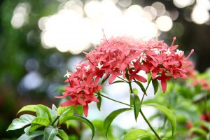

Nature is mesmerising


3D II – WK 11 [Installation in-Progress 2]
Moving on from the sealing of the plastic, we worked on the contents.
We aimed for a glowing water effect and then researched on how to produce that visual. There was a tutorial which taught us that by placing purple and blue cellophane paper over the light source, tonic water could appear as glowing!
So, we test it out!

For a test, we cut out small pieces of cellophane (in purple and blue),

Over the light source and in a dark space. We can see the light appearing different already!

Finally, it works with tonic water in a bottle! We were so excited.

Then, we transferred the water into the bag but due to contact with the air over a long time, the tonic water has lost its effect :'( So we had to give up the idea, and proceed with an alternative, and MOVE ON.
Our initial idea also included to clamp and suspend the structure so users could interact with it from under it.

Working on some wood.

Carpenters!!!

We were going to stick and nail 4 pieces of wood together as a clamping structure.

However, the suspension would cause water to only concentrate on the centre of the piece, causing huge pressure and a great reduction in fluidity ): This contradicts our central concept, so we decided to scrape this off.
The optimal solution we decided on was to lay flat on the table surface to allow almost full control of the movement of the water. To enhance the user experience, which is to allow him to feel the motion, we will create 2 layers: above & below the hand.
Which means… making one more water bag!!!

On this added piece, we mixed glitter and crystals into the water to contribute to a shimmering glowing effect of the relaxed water 

Looks cute!!!

Finally, we sealed the second piece. BUT TO OUR HORROR, when we tried to put the 2 pieces together, the first one has spilled!!!

It’s okay we took care of it.
Now that we have finished the 2 waterbeds, it’s time for the set-up: Lighting!
Using the same concept for the bar lights we produce a purplish-pink kind of gradient light which is reflected by the water.
This final piece appears like this:
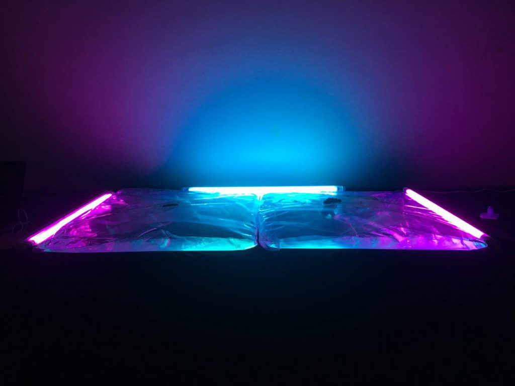
It looks absolutely amazing 
The ferroxide is then scattered over the surface, when the hand holds onto the magnet hook to interact with it.
