Sensual Lines Test 2:
So I did some thread tests on potential sensual lines that I posted about in the previous post- and it came out kinda weird^ ^”
I was inspired by this picture:
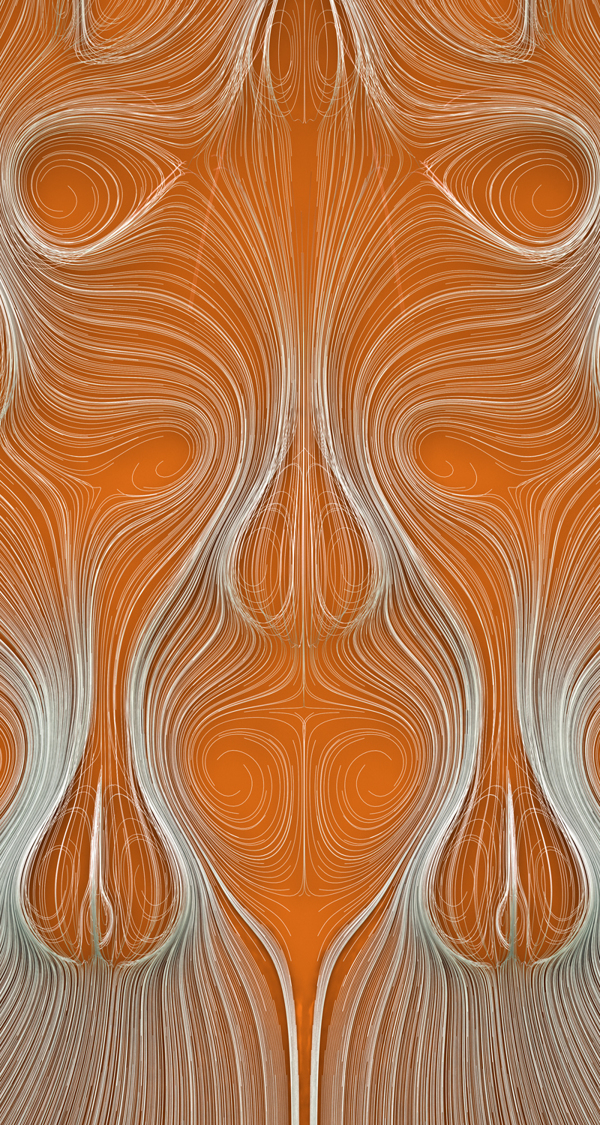
(Taken from https://www.behance.net/gallery/12322563/limm)
This work was done digitally.
It is INSANELY HARD to replicate this in real life. What I tried out first was covering a piece of paper in spraymount and then gently lowering the threads into position.
This is what I got:
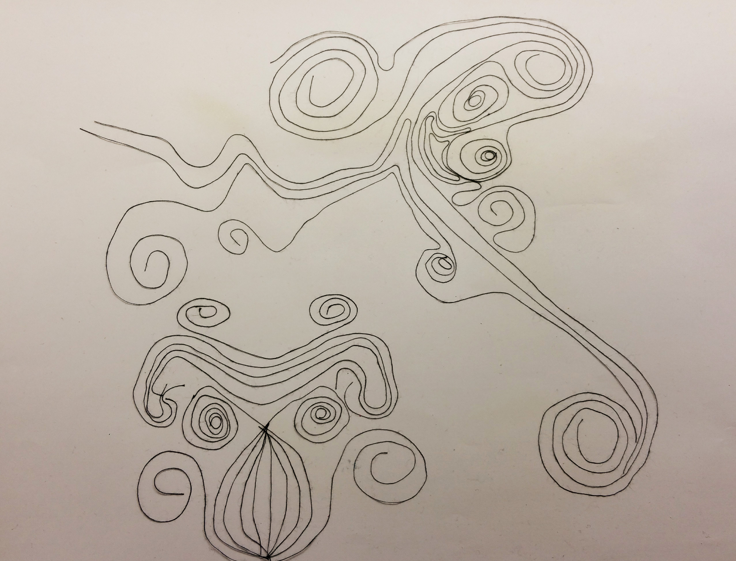
The result of my experiment with spraymount and thread.
It came out pretty wonky and shoddy. The lines weren’t as straight and clean as I wanted them to be because it was really difficult to get the lines to curve neatly and stick to the spraymounted paper. It was hard to get the shapes symmetrical as well. So I decided to stick to the braid for my sensual lines.
Paint-Glue Edits:
With regards to this piece (My lyrical lines), I decided to do my second layer of ripples/waves to make the work less flat and more 3-Dimensional.
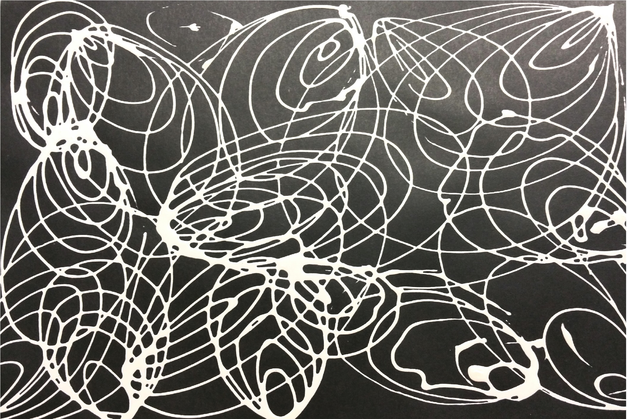
I created the second layer of paint on a layer of transparency and got this:
Because of the criss-crossing curves, the work looked more confusing and turbulent than lyrical.
Because of the criss-crossing curves, the work looked more confusing and turbulent than lyrical.

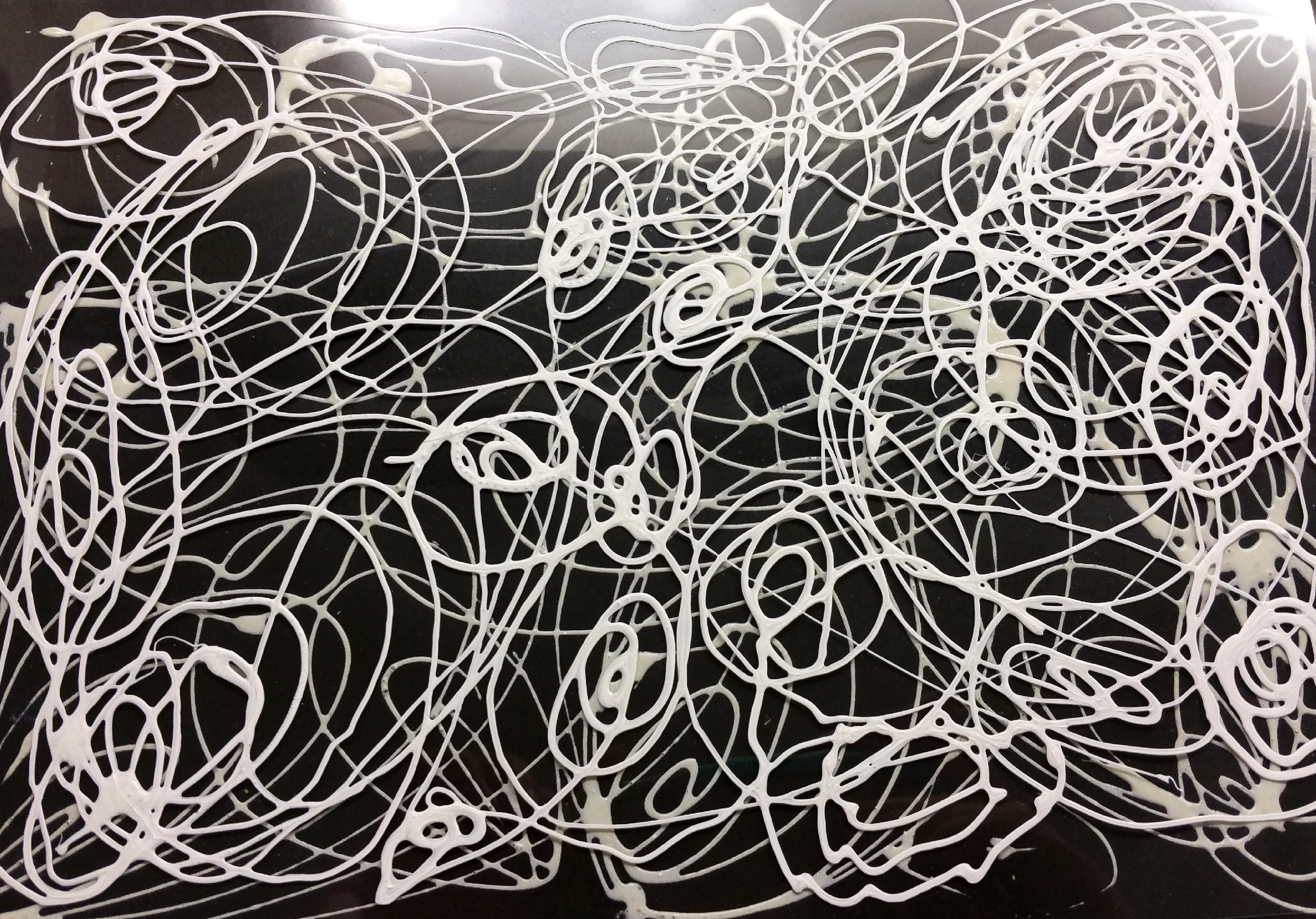
Thus, I decided to create another set of lines to give the ripples on the black paper more depth and complexity, rather than confusion and messiness. I made thinner lines and fanned them out to make bigger spirals, but this still seemed to make the work look very complex and confusion.
Thus, I decided to lift the piece of transparency and hold it above the initial work.
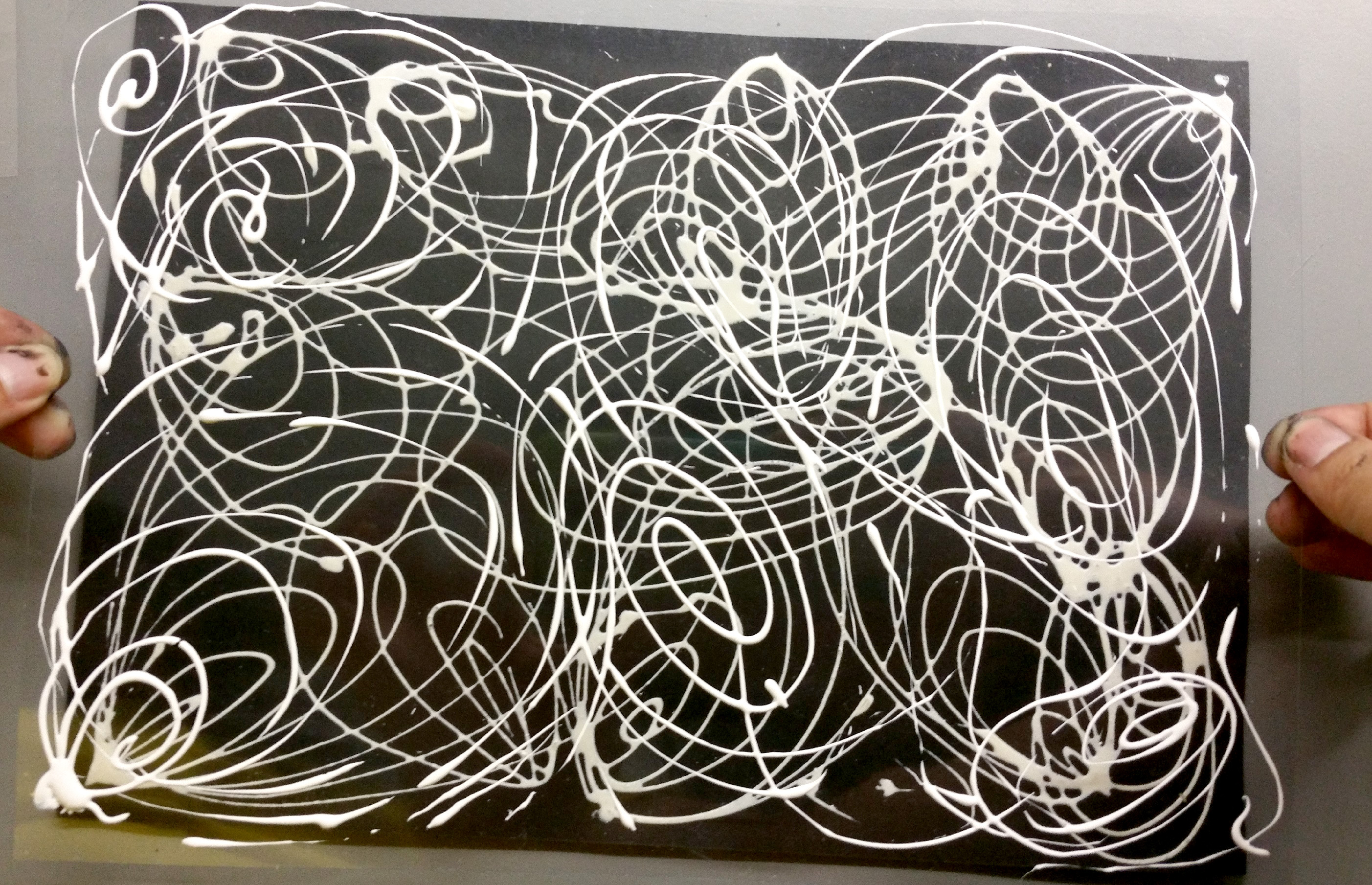
By lifting the transparency off the black paper, a greater sense of depth can be accomplished and also reduces the criss-crossing lines more. You can’t really see it on the picture, but it looks less messy than the other two that were flush against the black paper.

(Credits to Christy for helping me hold it up)
This is the space between the black paper and transparency- the gap will not be so big in the final, this was merely enlarged to dramatise the effect.
i know not all of them can be used in the final submission but i love all of these swirly lines ahaha
Hehe thanks Priya!:D