
Truth be told, I don’t have much process photos for Zine so I’ll be combining everything into one huge masterpost!
Even before I started on the Zine project, I always wanted to create a series of sketches akin to the Spiderwick Field guide (I keep bringing this up but I absolutely love the book and the sketches- they are one of my biggest inspirations to this day). When the Zine project was introduced to us at the start of the semester, I was so excited- I already knew exactly how I was going to do it and what it would include. Prof Ina had also been encouraging me to stick with my theme of mythological creatures and items throughout the year so that I would have lots of material for my zine (and I did- I had so much that I actually had to leave out alot of drawings or my zine would become a novel)
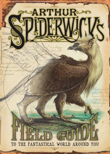
Arthur Spiderwick’s Field Guide (My eternal inspiration)
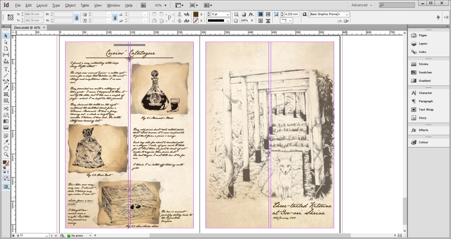
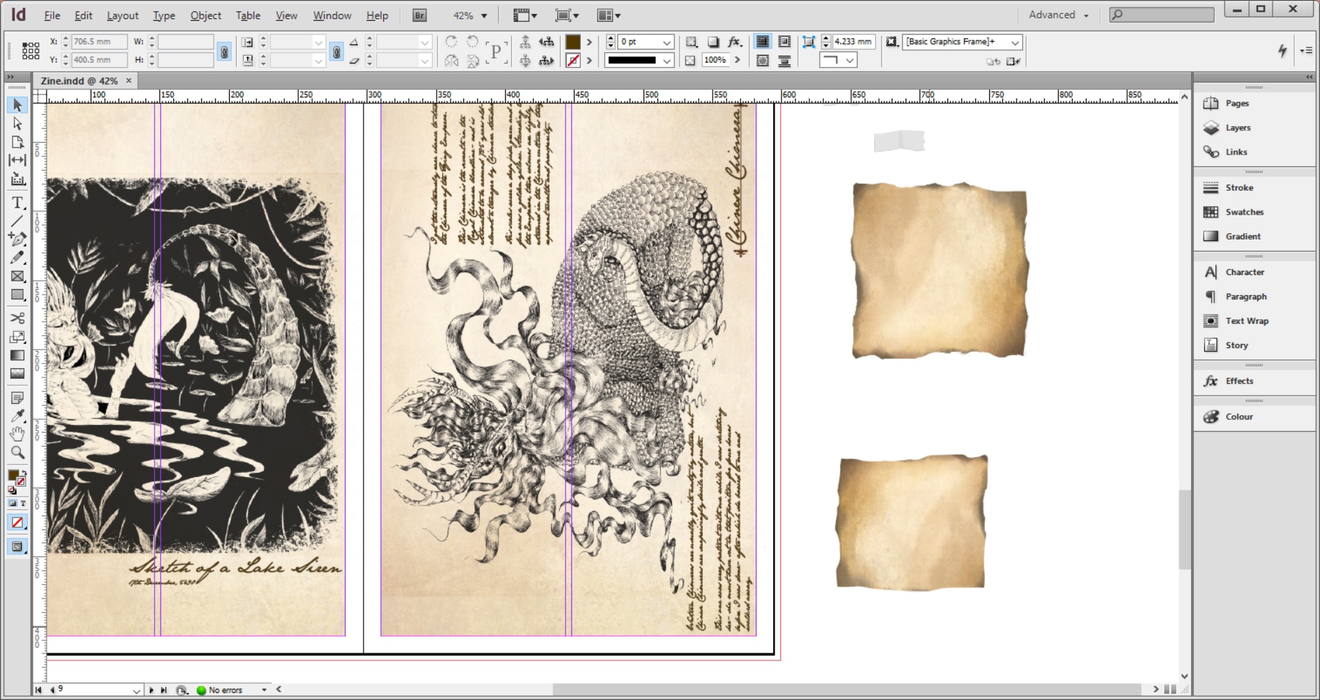
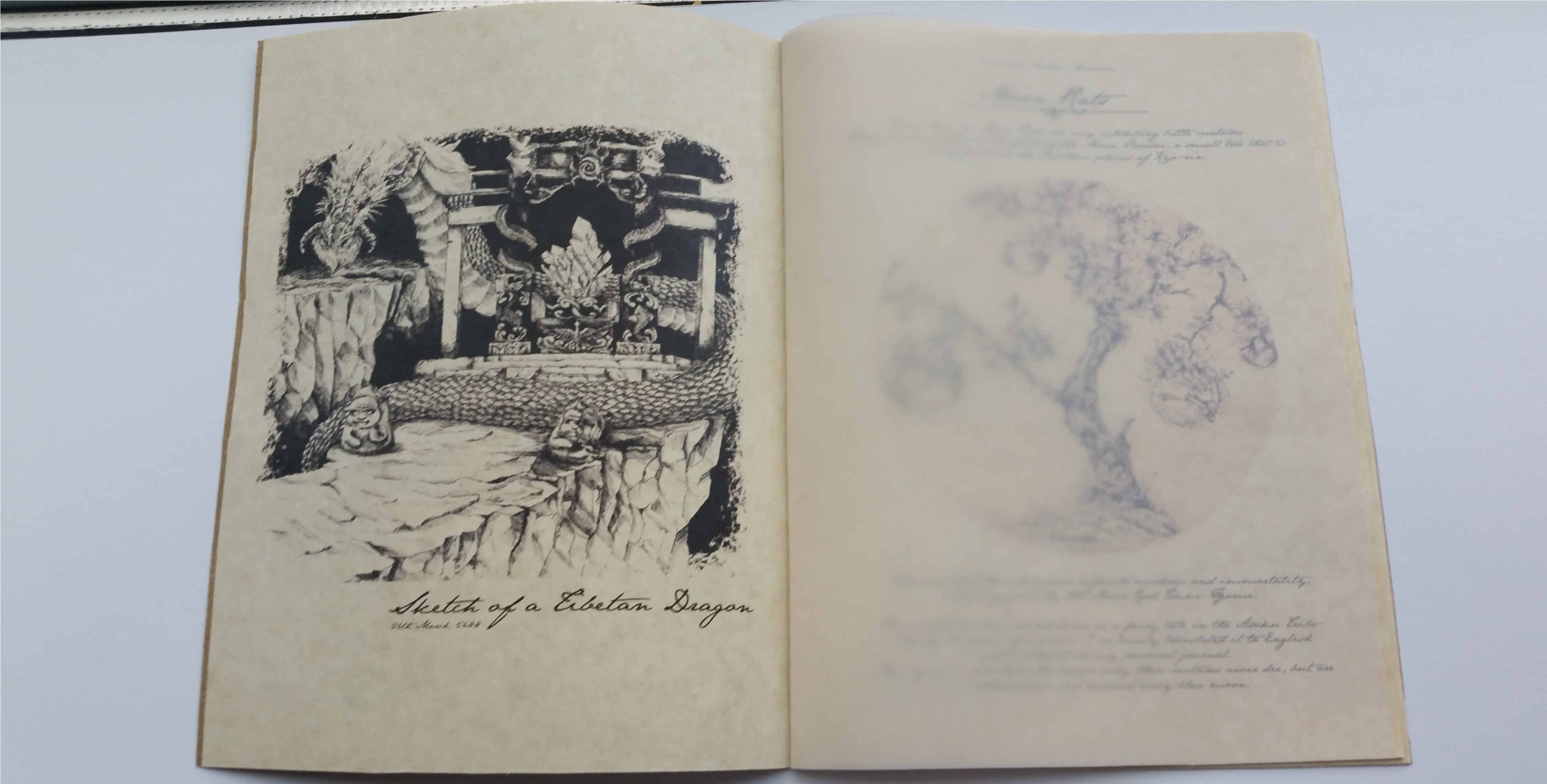
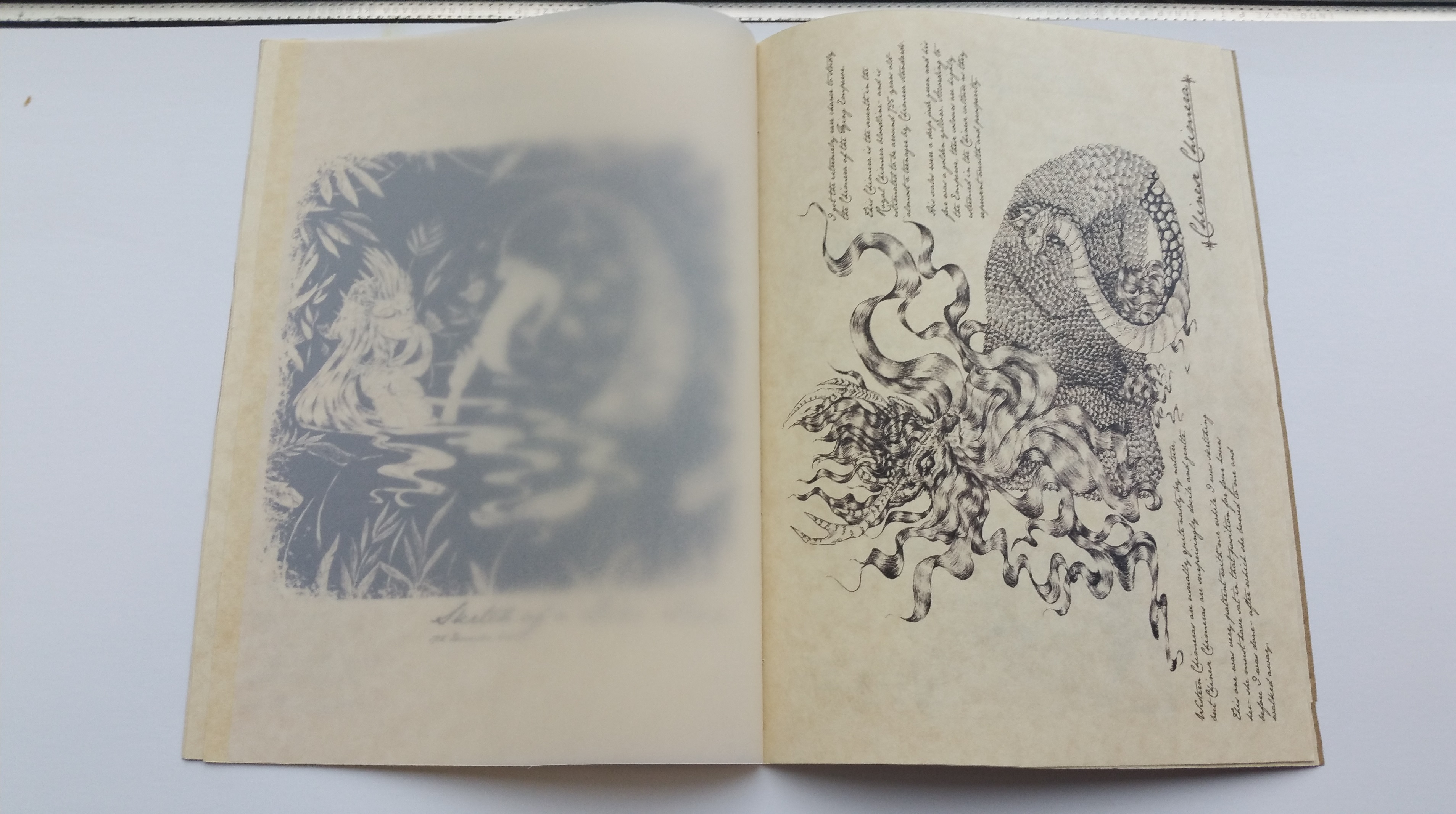
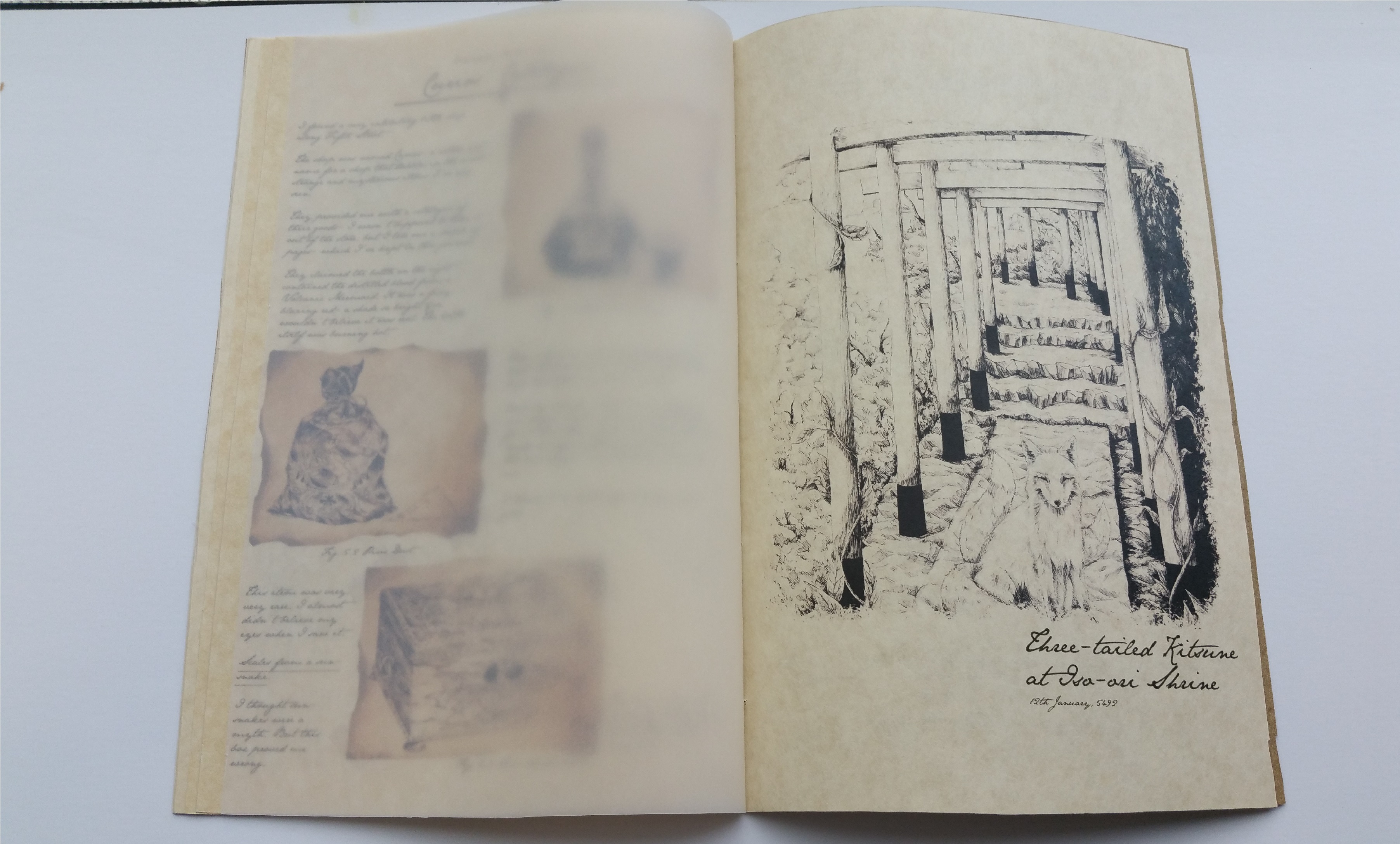
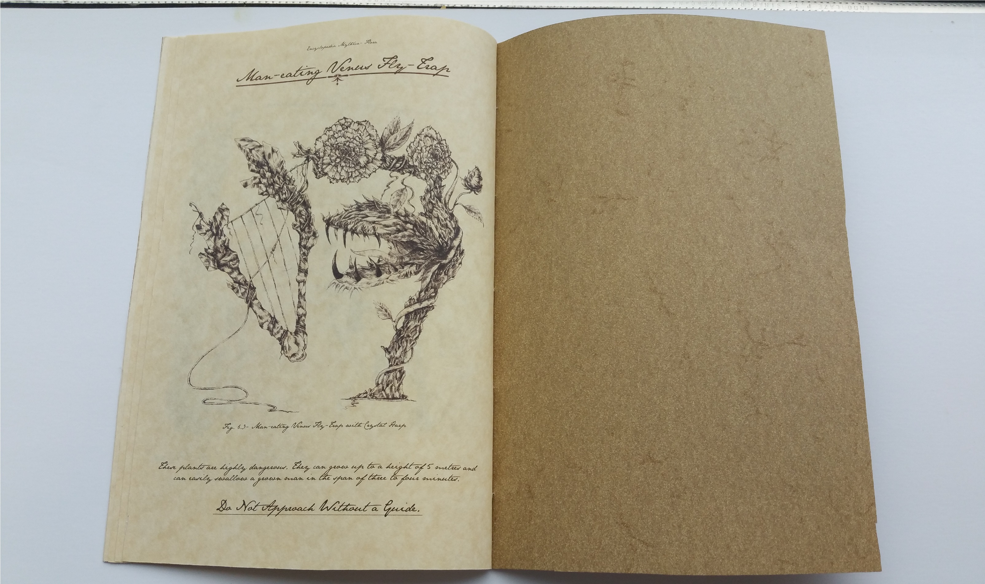
I decided immediately that the theme for my zine would be ‘an explorer’s field diary from his journeys and studies of mythological creatures’- and all of my drawings were actually themed after that. I made sure that they all linked together so that my zine would be as seamless as possible, thus I used similar creatures in my works (even though I didn’t manage to include all of them)
Here are a couple of screenshots from my process of putting the zine together!

A screenshot of all the zine files I have on my computer- I kept copying and editing so that I had backups of my previous work (but that also meant that I had to remember which files were which)
I initially put a brown background to see what the sketch would look like on brown paper- I wanted my final to be printed directly on weathered-looking paper, so I needed this as a form of visualisation.
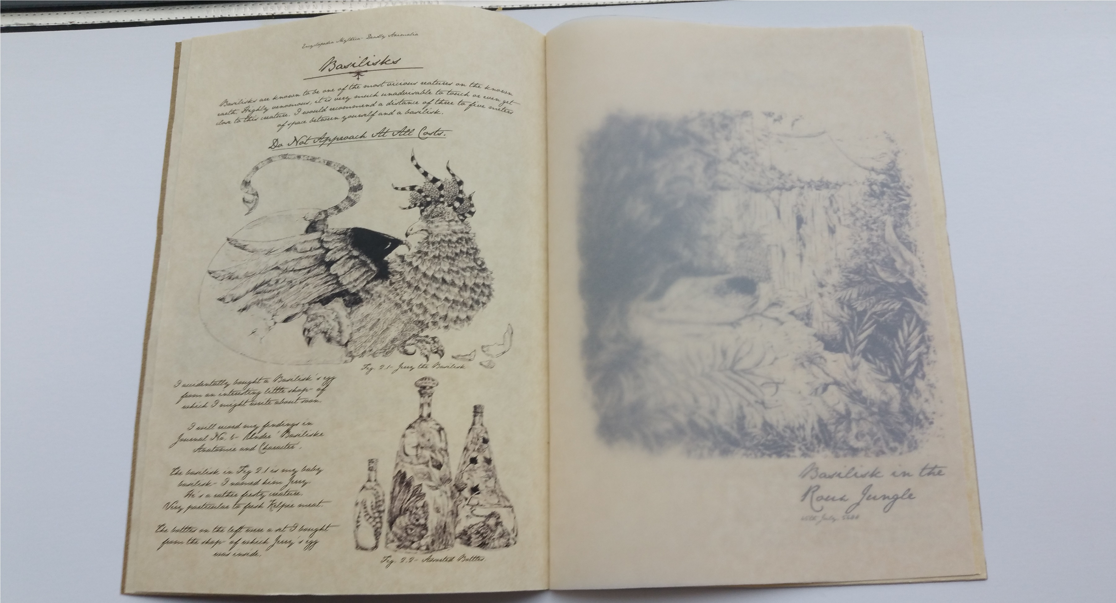
I actually had to photoshop the parchment paper on the right hand side for one of the pages (Curio’s Catalogue)- I also hand-drew the tape, edited it to ‘Multiply’ and tweaked the opacity to give it the effect of translucency.
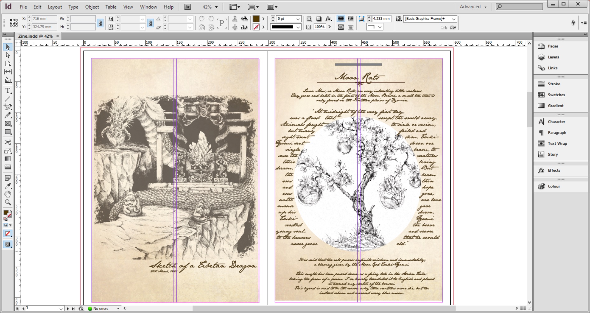
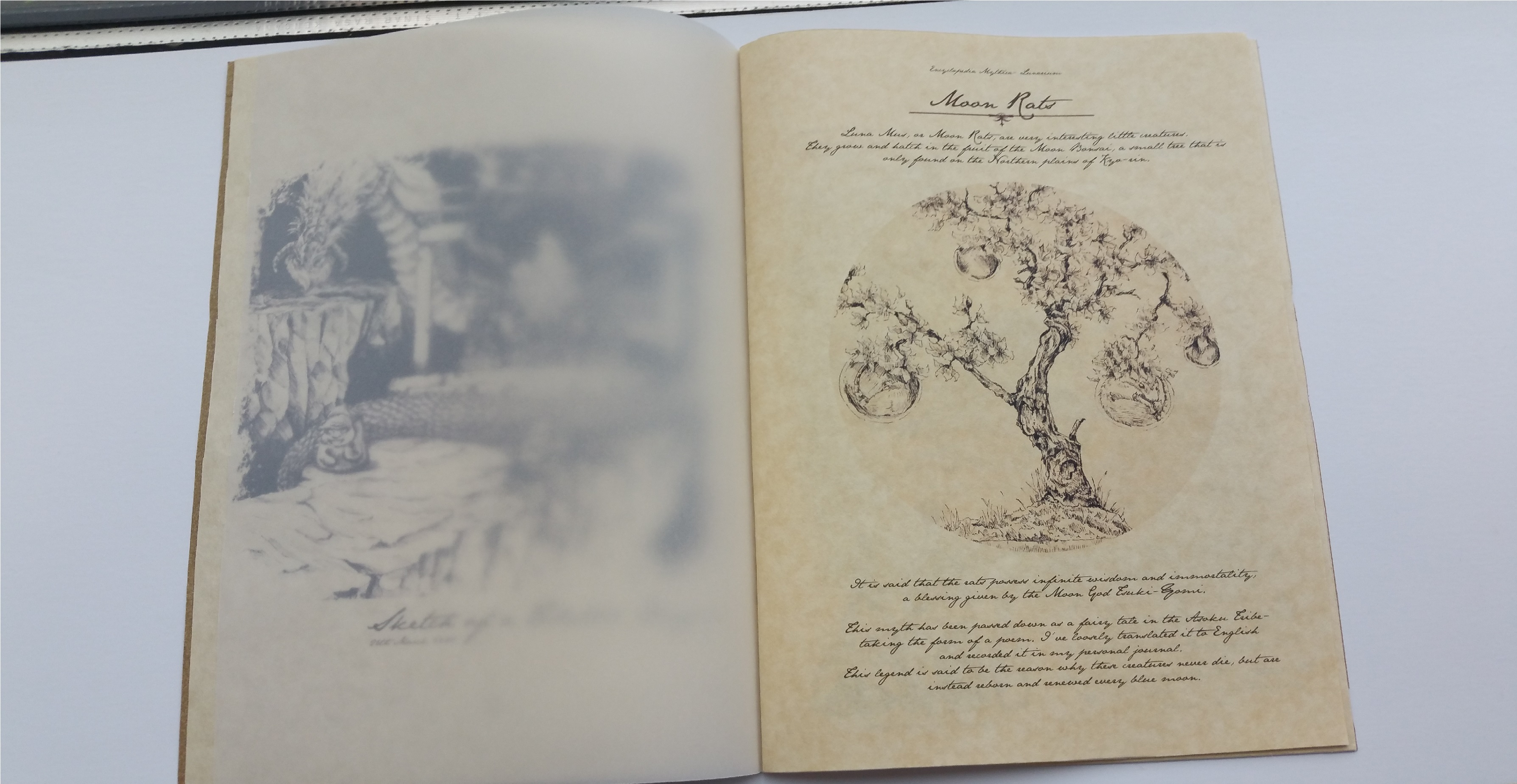
This was one of my initial designs for the Luna Mus page- I actually wrote a poem and set it around the circle. However, I decided that it looked too messy and cluttered. I did consider printing on transparency, but I still felt that the layout of the text wasn’t very reader-friendly and decided to scrap the idea completely.

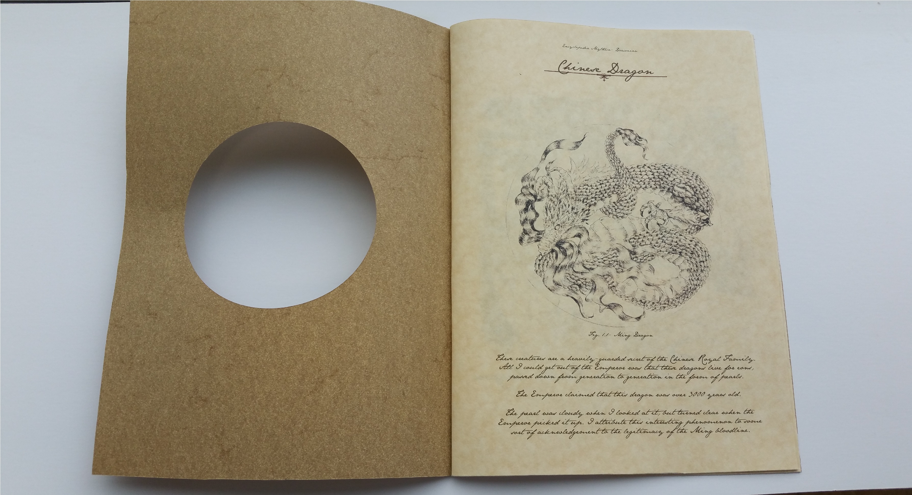
One of the pages from the final! I swapped the brown colour to the inside of the circle so as to give it more emphasis when it was printed on my final work.
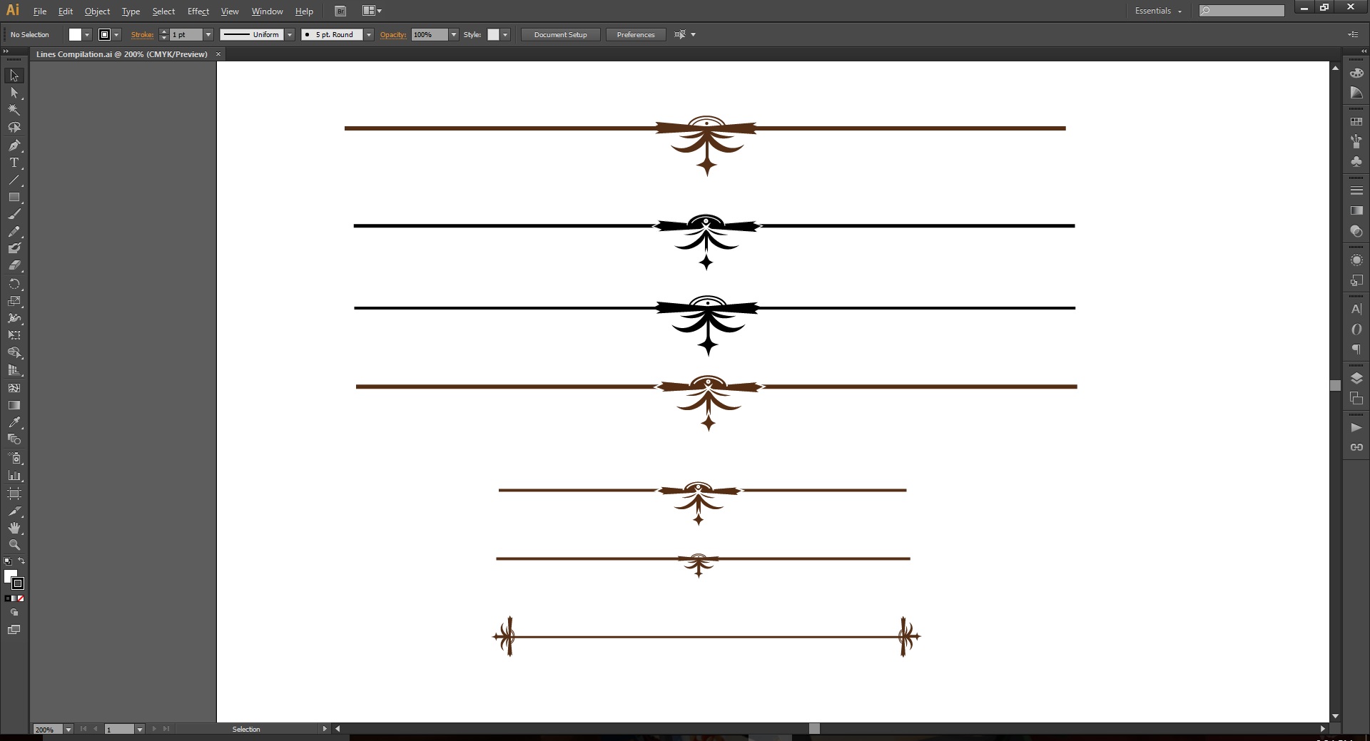
I also made some line breaks on Illustrator to give it a more rustic feel- I played around with colours, designs and length so as to come up with a few that fit my Zine the best.
Before going into my final, I actually printed several copies of test prints on white copier paper to make sure that the formatting and printing looked right. There were errors here and there, which made the test print incredibly helpful in pointing them out (as it’s easy to miss the errors when they’re on-screen). Errors ranged from formatting, grammar, spelling, alignment and even image quality (there was a bit of confusion when I realised that my Postscript file was converting to standard quality PDFs instead of high quality- and it took a while to figure out how to resolve that issue)
I forgot to take photos of my test prints (and I left them in school), so I will update this portion as soon as possible on Monday!
I decided to print two copies- one cut and bound by the printers, while the other was to be cut and bound by me. I wanted to see which one looked better and fit my theme the best.

This was the copy that was bound by the printers. It was very neat and nice, but I decided that I needed a cover for the zine instead of leaving it like this.

This was saddle-stitch bound with staple bullets, and I felt that it looked too modern for my zine- which was supposed to look hand-made and well-worn.
Ultimately, I decided that I would hand-stitch a cover onto my zine and use a circle cutter to cut a circle in the centre of the cover page so as to make it more lively.
Here are pictures of my final work!
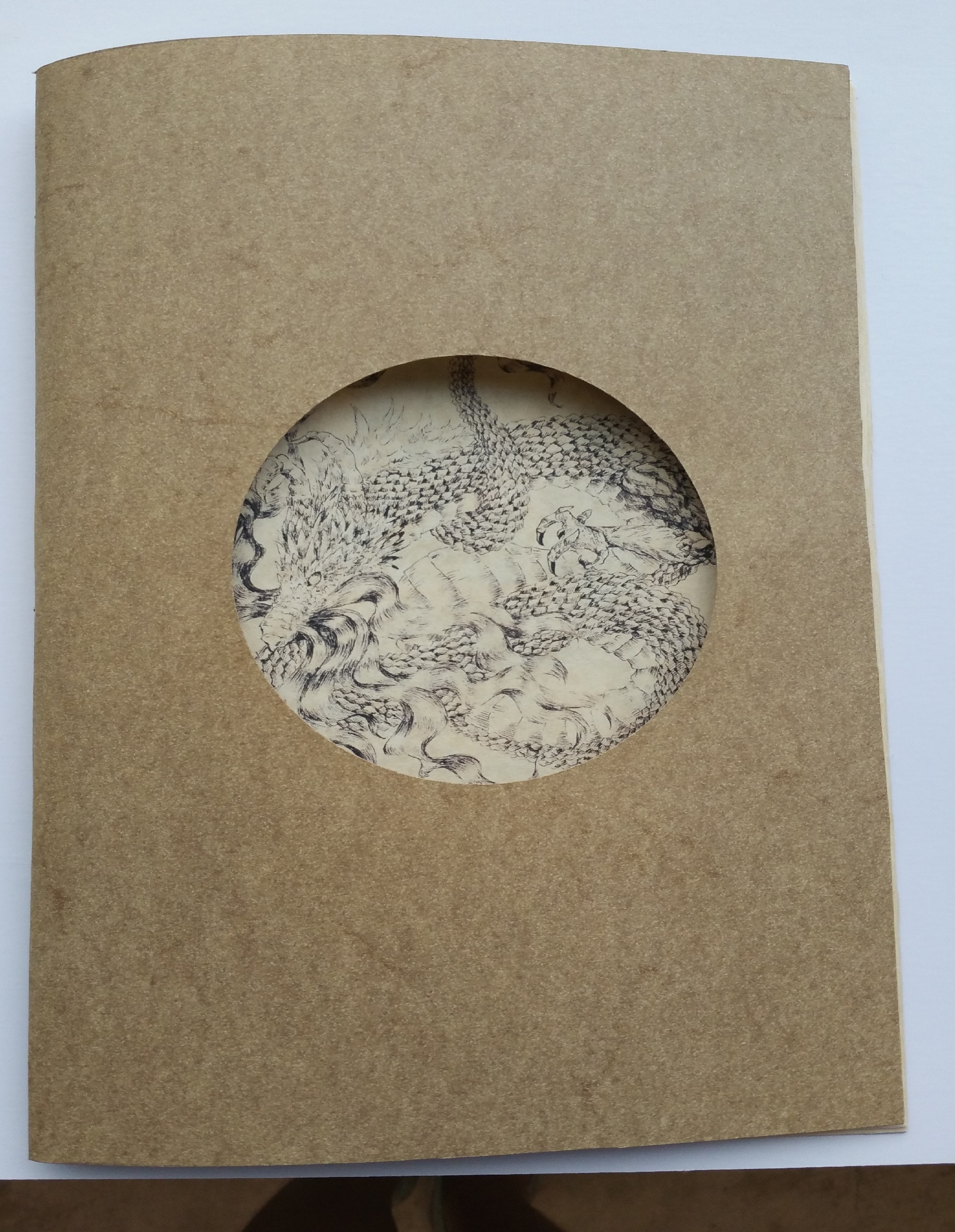
My cover page with the circle cut in the center. It took a lot of practice to figure out how to use the circle cutter, but I soon found a method that suited me best (and produced the best results).

As you can see, I saddle-stitched the center using yellow-gold thread. I think this was very frustrating because I spent around an hour and a half threading a beading needle with cotton thread (I bought the wrong needle)- but it worked out in the end and surprisingly the beading needle created really small holes (since it’s very thin)- which made the stitching look more seamless.

I also cut the book down to size myself, which did result in some small jagged edges. However, I did like the look a fair bit as I thought it added to the ‘hand-made’ charm that I was going for.