
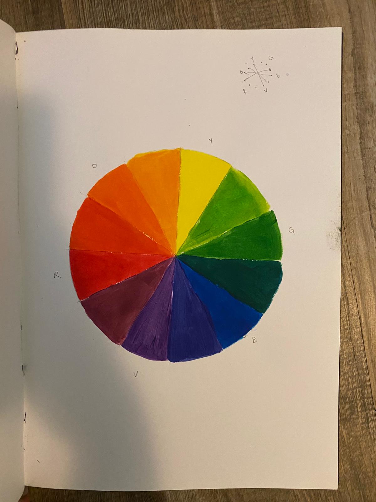
Colour wheel!! I tried to make it as clean as possible :’)


Exercise 1: The top one was the one I first created, but the difference in dull/bright of the red square wasn’t as big as I wanted. Hence, I created the second one. I chose a colour closer to orange. I also darkened the blue, which is opposite in the colour wheel, to try to make the orange seem brighter.
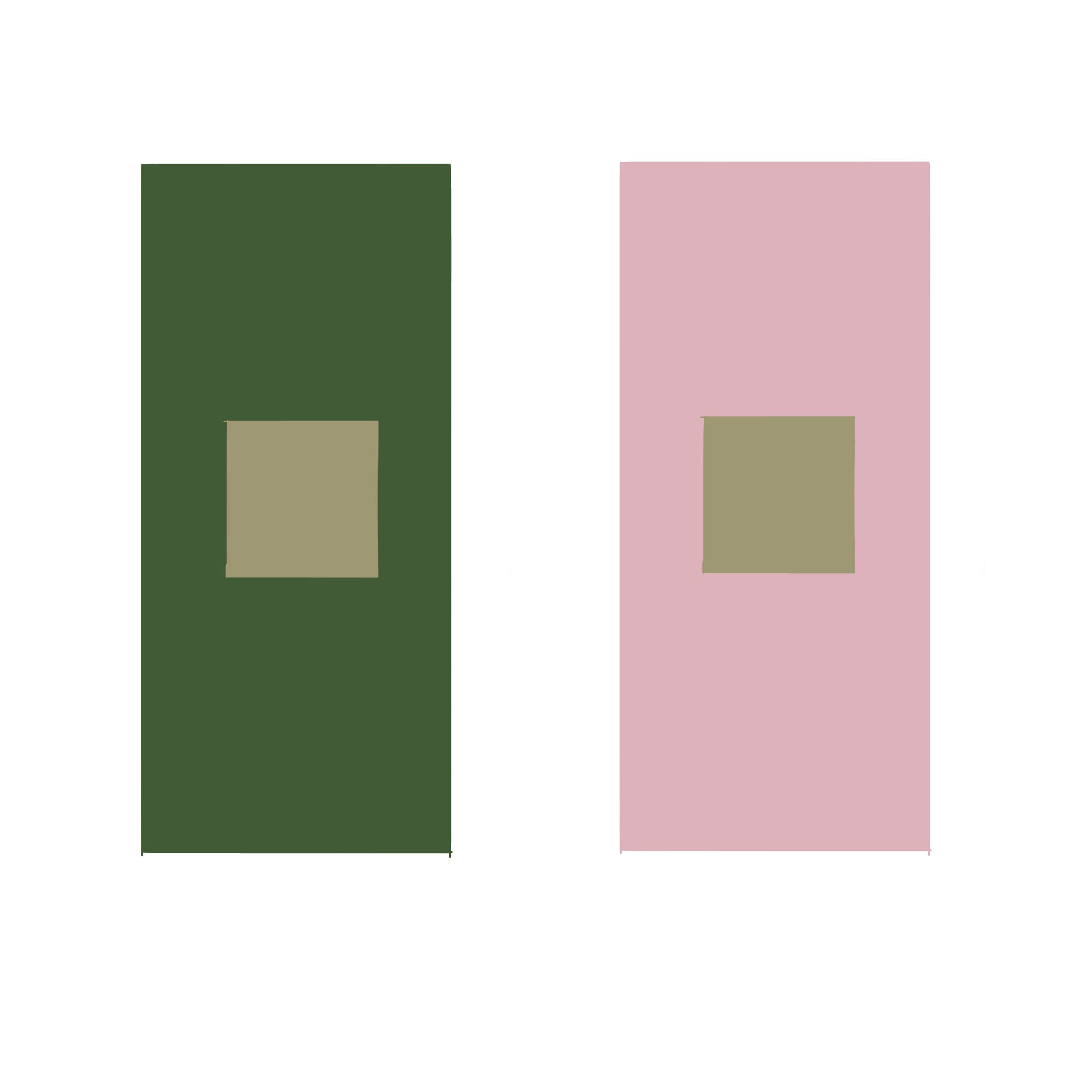
Exercise 2: Here I’ve experimented with another colour. I think this came out pretty successful as the green square looks like a brighter shade on the left.
For my future self:
- Select the colour to be compared
- Take the colour directly opposite to that on the colour wheel. Use this colour as a guide for the background colour.
- Repeat!!