Quiet Moments

This photo series aims to portray the beauty of quiet moments in my household. Growing up in a family of assertive and dominant individuals, I tend to withdraw and give in to my family members. This has caused an emotional barrier between me and them and sometimes I come across as cold and unbothered. Capturing my family members in the candid is something I’m not used to especially since I see them most of the time, and I feel that I’ve taken them for granted somehow. I hope for this series to show how much I treasure these quiet moments regardless of how I behave around them.
Before & Afters
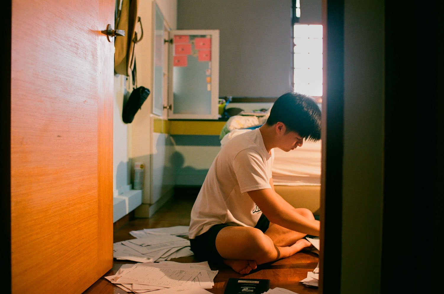
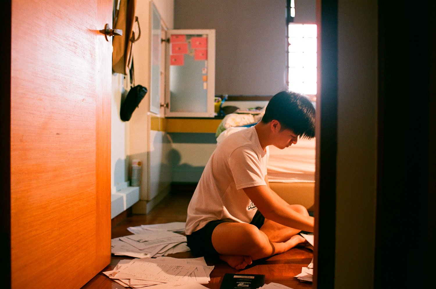
First Image

Second Image

Third Image
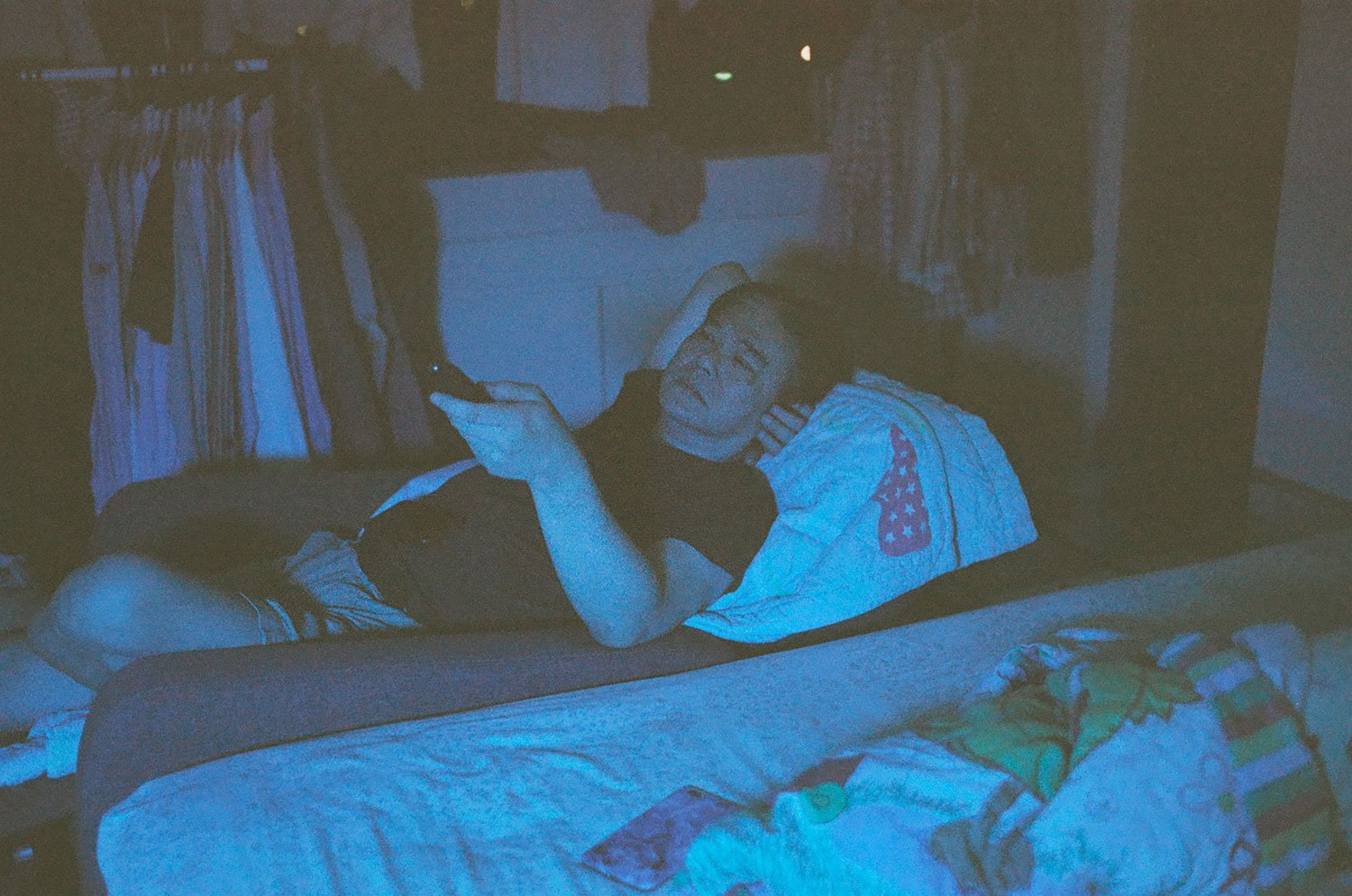
Fourth Image
Fifth Image
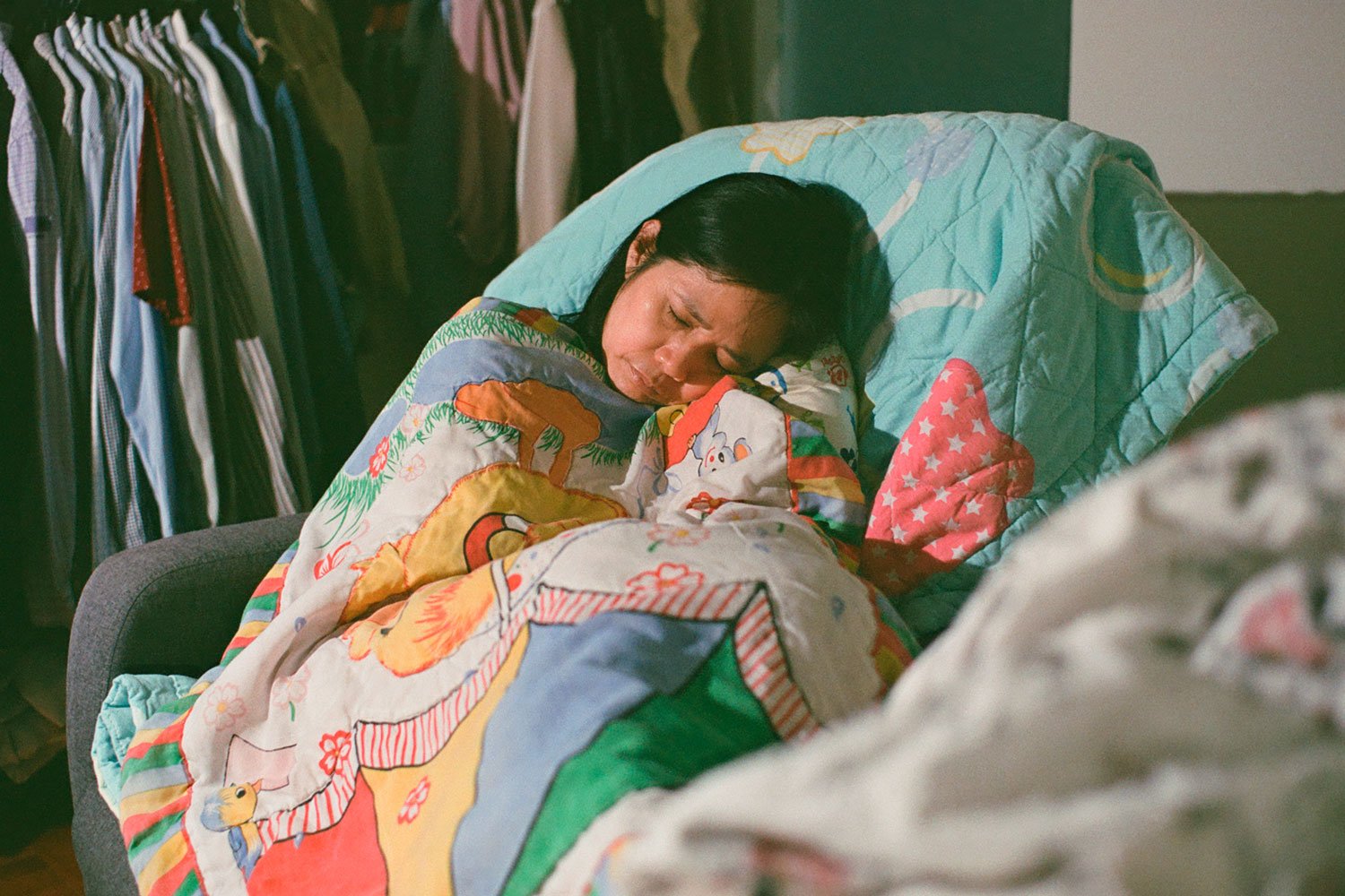
Sixth Image

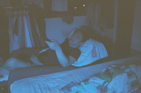
*Before (left) and After photographs (right)
Camera Processes
This entire series was shot on analogue film. I shot all my photographs on Fujifilm Superia Premium 400 film. For some of the photographs, I made use of speed lights and LED continuous lighting to light my subjects.
Digital Processes
First Image
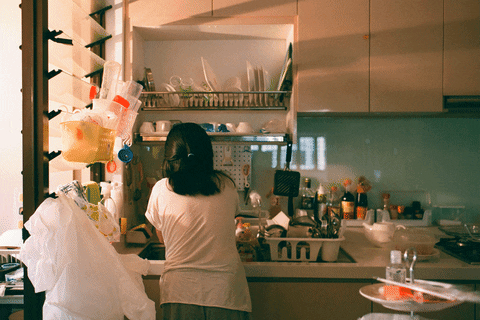
As the first image didn’t show my mother’s face, I skipped on separation frequency and jumped straight into cleaning. I cleaned out the reflection and smudges on the mirror that I found were distracting, as well as a few other minor details on the cupboard. I found the original image a little too reddish to my liking, but since the whole point of shooting on film was for the authenticity in its colour, I decided to tone down the reds using Hue/Saturation. I also made use of the Blue channel to adjust the exposure of the highlights and the shadows. I sharpened my photograph in the end to enhance the photo better.
Second Image

I was pleased with how this film turned out as it was greener than the other film pictures and I personally like the how the green hue makes the photo look almost “analogue-y”. What I did, however, was to tone it down a little, but not too much so as to retain the beauty of it, and I intensified the reds using Hue/Saturation to liven up my dad’s skintone.
Third Image

I didn’t feel that there was anything in particular I had to clean up with the healing brush and the clone stamp tool unlike the first picture. It wasn’t necessary to use the separation frequency here as well so I didn’t do it on my brother. Similarly, I reduced the reds hues using the Hue/Saturation adjustment layer but intensified the green just to give it more of a filmic look. In the end I added a gradient vignette to draw more focus onto the center that is my brother.
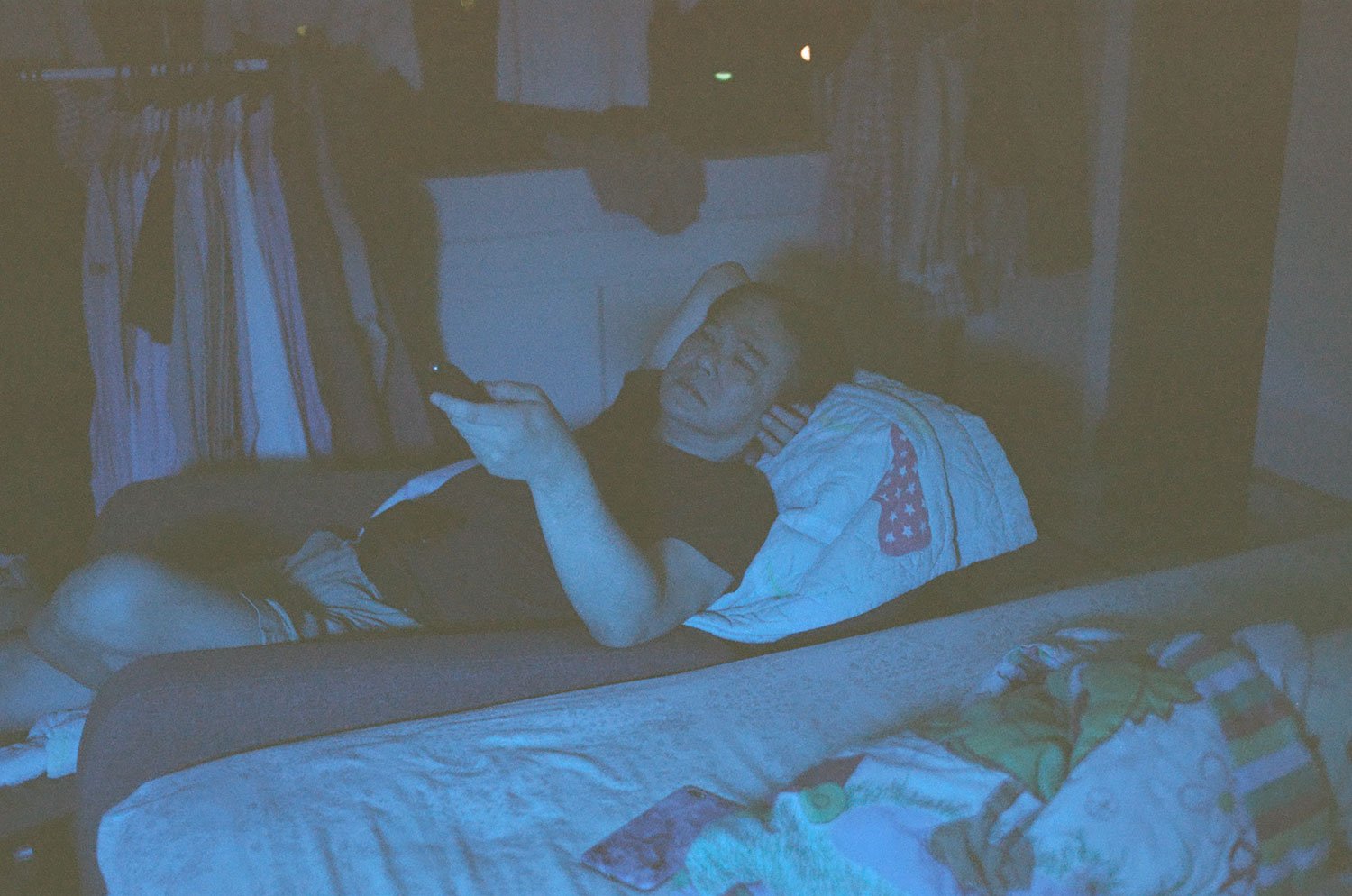
Fourth Image
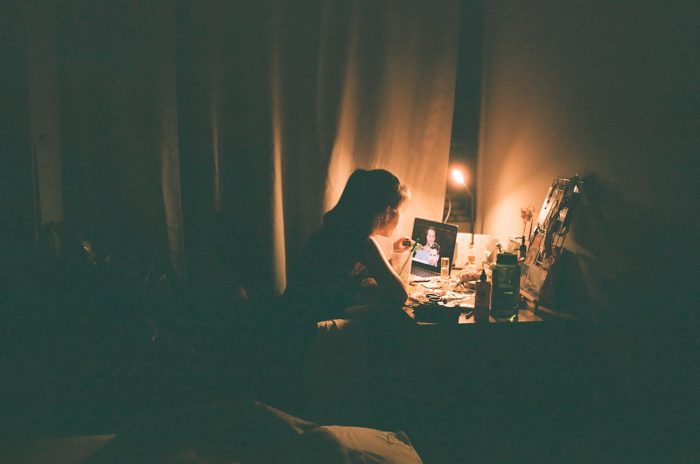
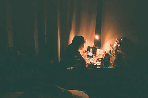
While this film picture stands out the most from the rest, I am personally glad I was able to capture this candid moment of my father. However, I found that the photo was underexposed and the blues looked almost washed out, so I made use of Curves to add constrast to the photograph and Hue/Saturation to intensify the blue hue coming from the television. I added a gradient vignette and sharpened the photograph to draw more attention to my father.
Fifth Image
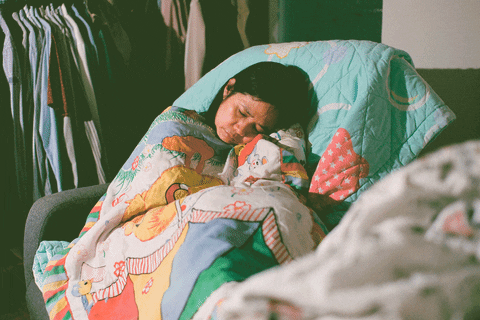
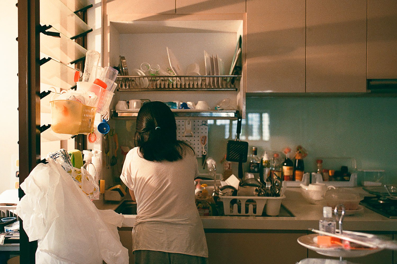
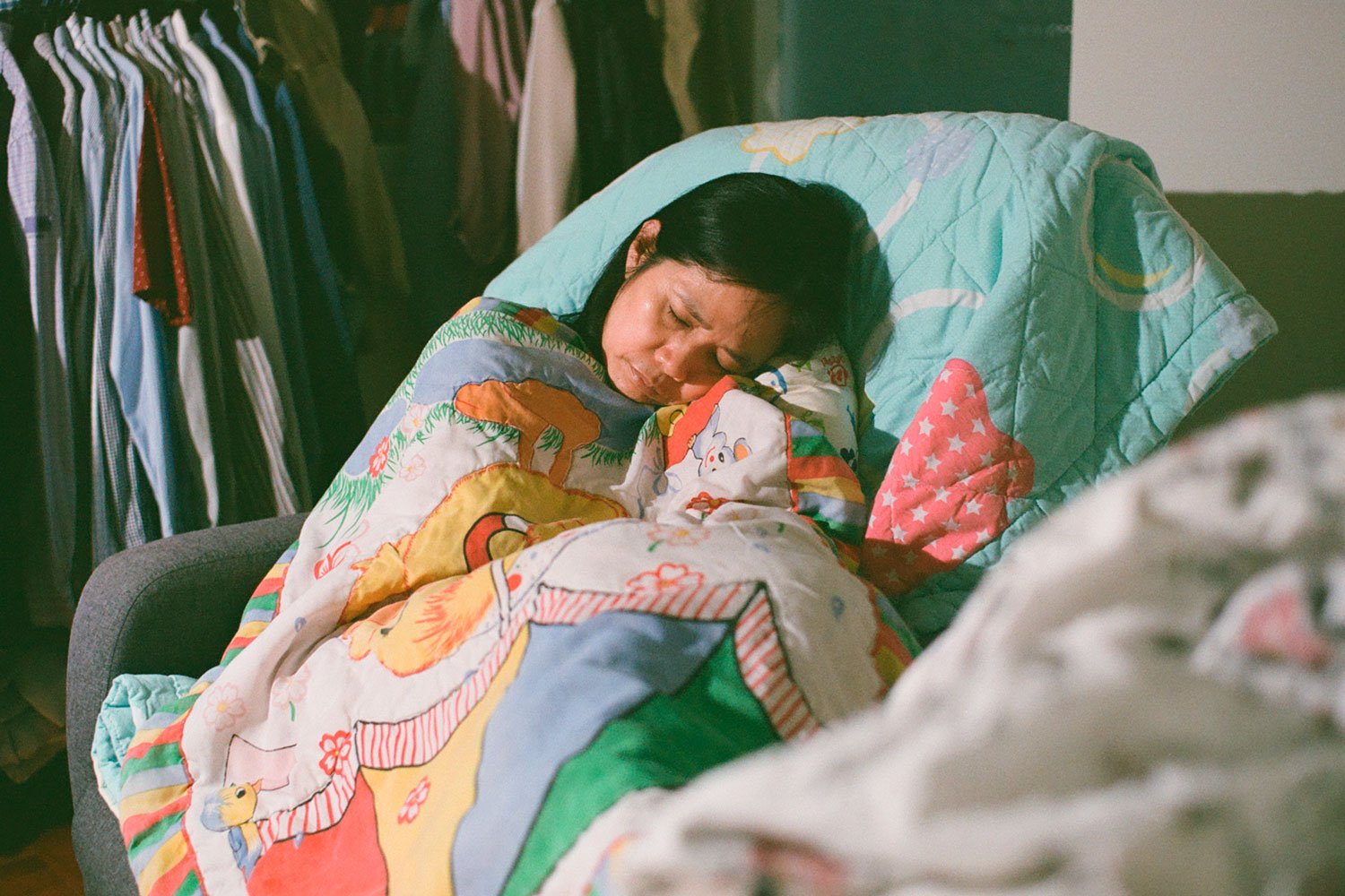
I used the healing brush and the clone stamp tool to clean up the glass door in the background as well as a few more minor details on the clothes rack. As my mother’s face is seen clearly this time round, I did a little bit of cleaning up of her face using separation frequency. However, since analogue film includes a grain overlay, there wasn’t much of texture I had to even out. The original photo had a really intense green hue to it so I toned down the highlights so the picture wouldn’t look so dramatic, and used selective colour to tone the whites to make them less magenta-y and more yellowy.
Sixth Image
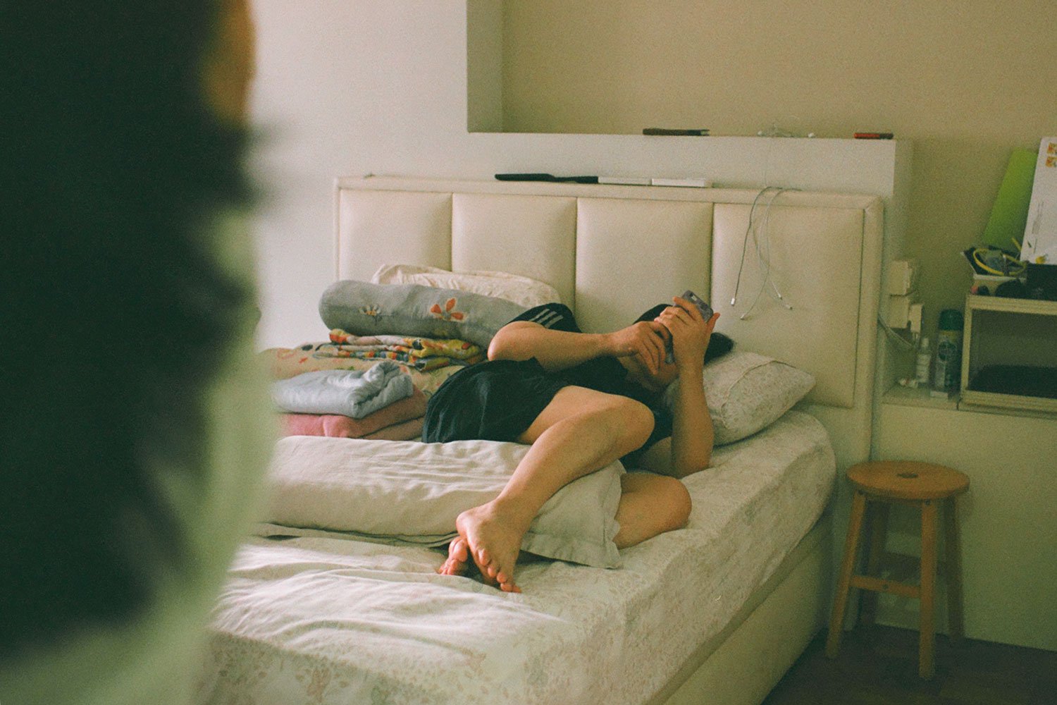
This is my personal favourite of the series. In fact, I didn’t feel the need to edit this photo much. What I did was just to tone down the greens using Hue/Saturation by a touch and made the reds more yellowy in the light area using selective colour. I found that the original could have been clearer so I sharpened the subject.
Alternative Presentation Ideas
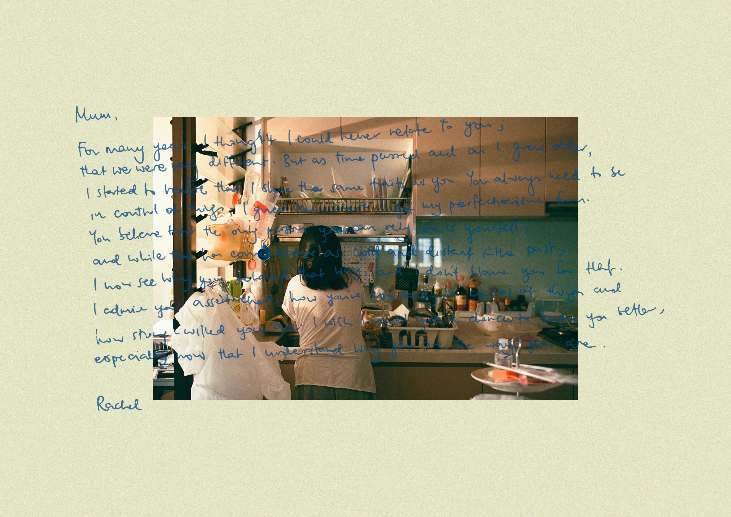
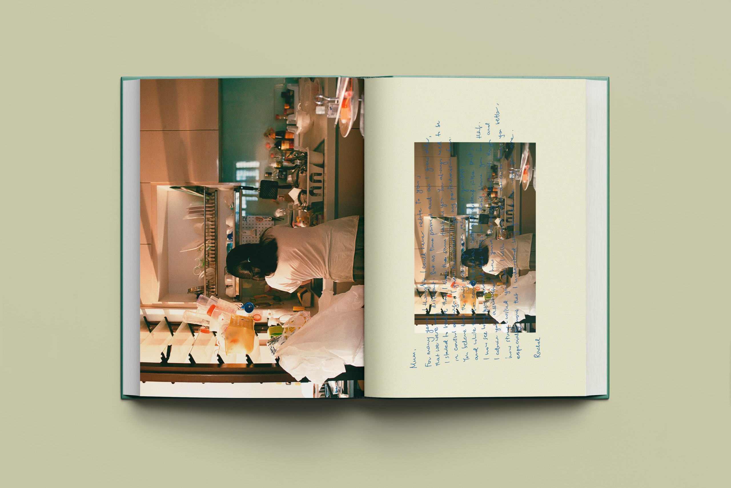
Ideally, I thought this series of my family would look great in a photo book. I initially wanted to write messages to each of my family members and overlapped them on top of the images, however I felt that it took away the focus from the photographs themselves. Hence, I did a little mock up of a photo book to see how that layout would look like if I were to ever want to print a photo book of this series.
Drive
https://drive.google.com/drive/folders/1KuCC0ogRdnQ6IWJnCzXInbCOHMrpTF90?usp=sharing
You must be logged in to post a comment.