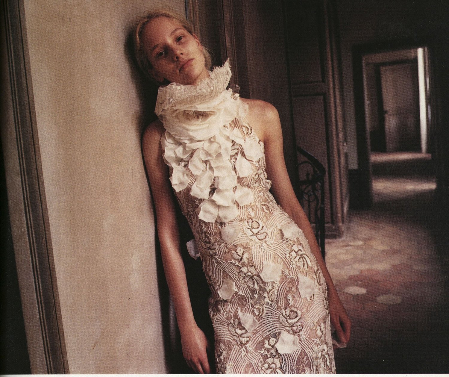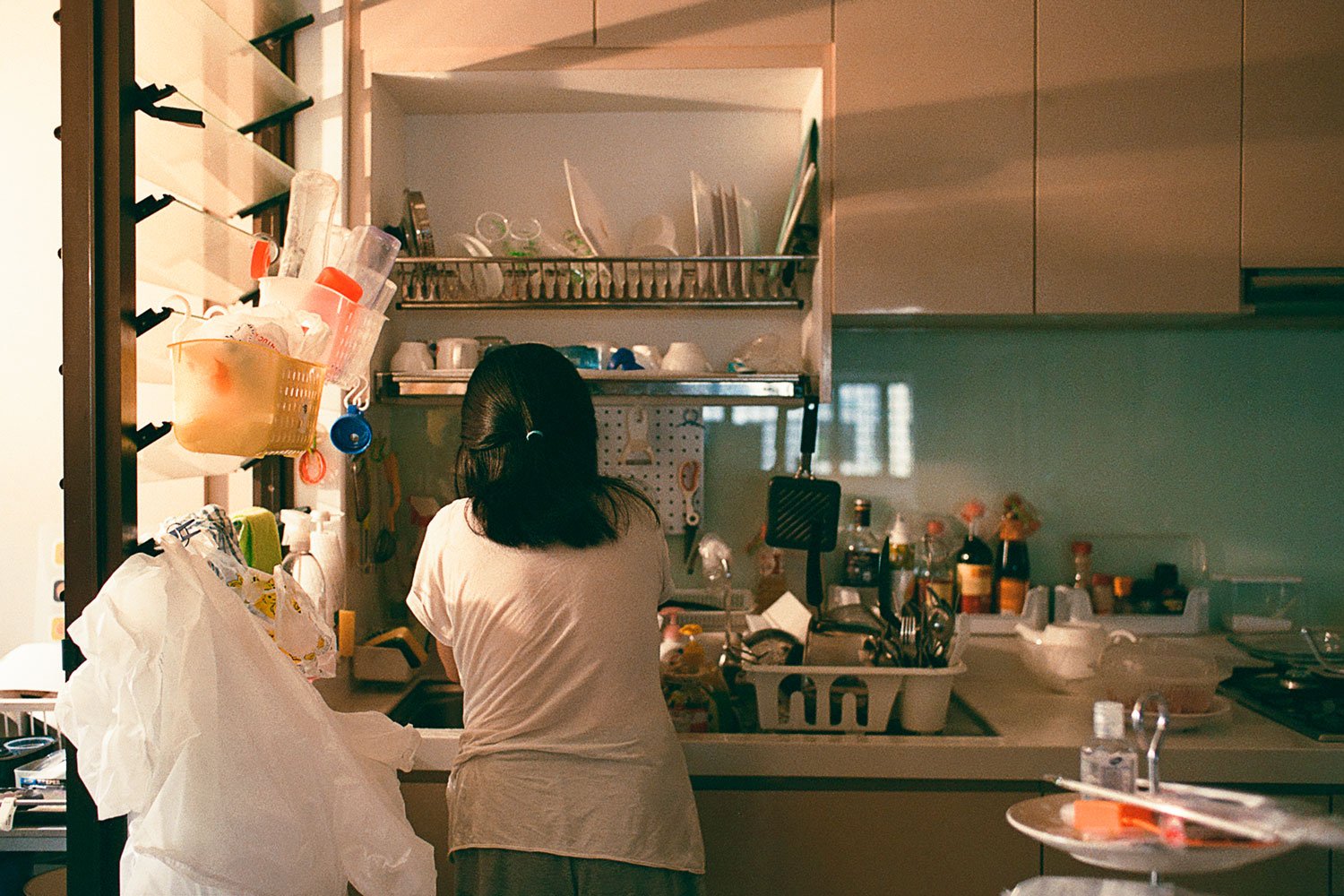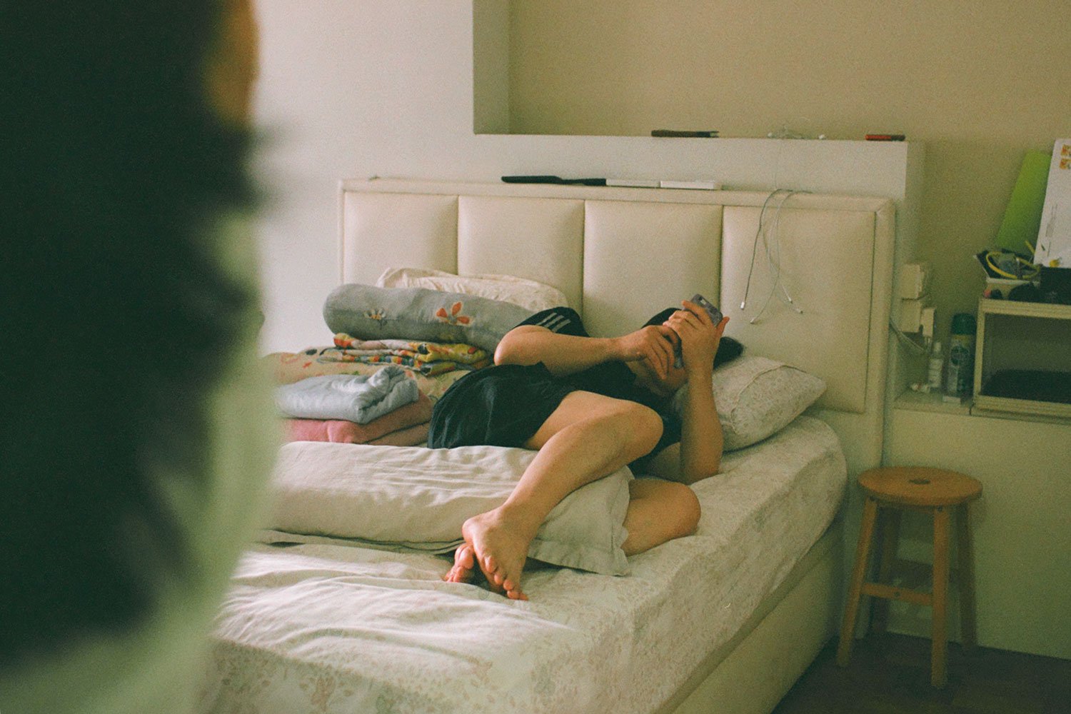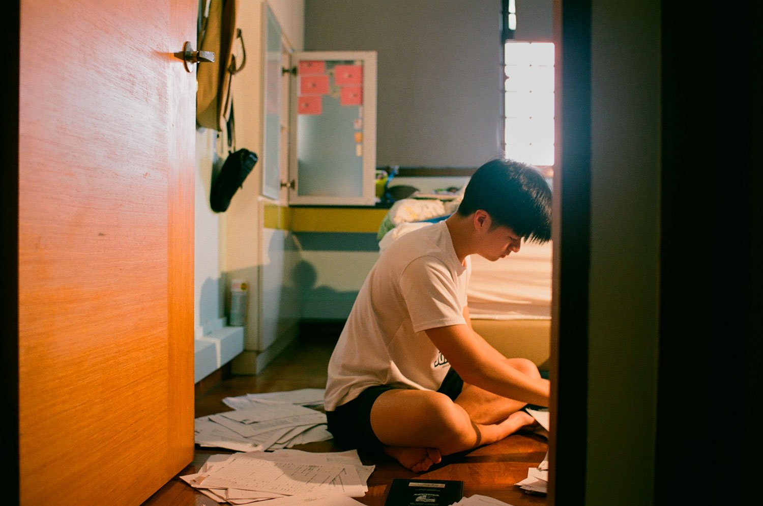
Déjà Vu
Singapore is the 11th most-surveilled city in the world, according to UK comparison website Comparitech, and 3rd most-surveilled outside of China. According to the rankings released by Comparitech on 15 August based on a study of 120 cities, Chinese cities have some of the highest number of CCTV cameras per person.
The Online Citizen
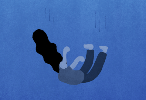
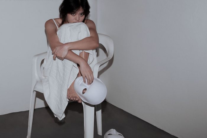
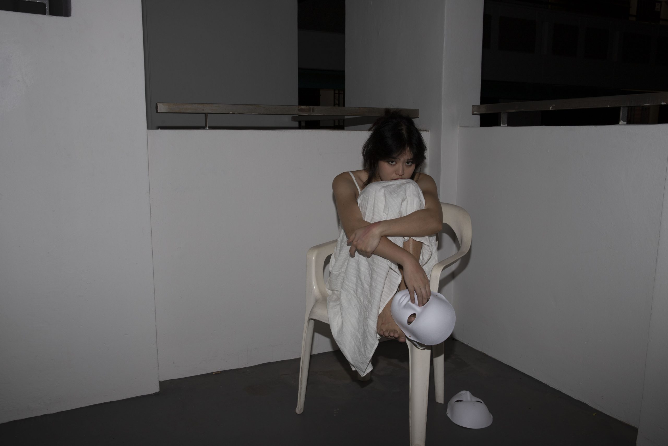
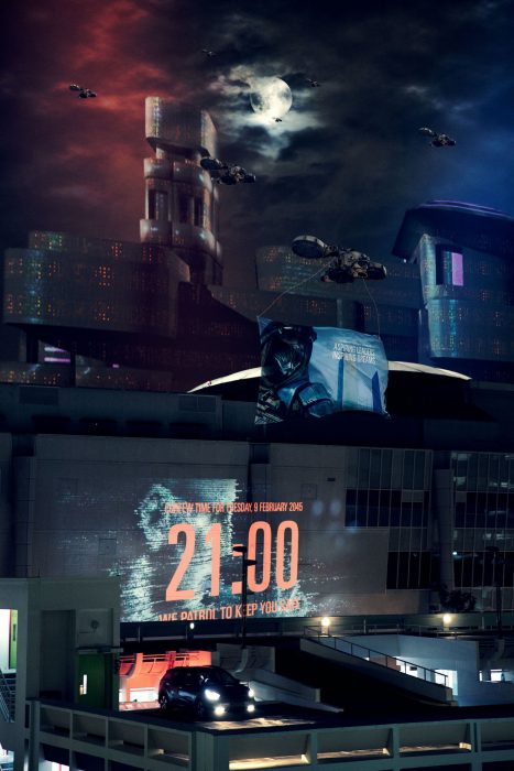
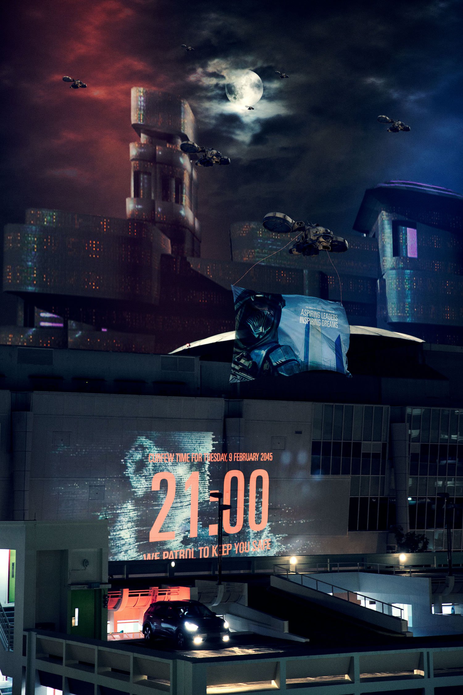
I had a recurring dream that Singapore had an islandwide lockdown due to a world war. As a result, a strict curfew of 9pm was enforced and anyone who broke the curfew was subjected to imprisonment or fine or both. Banners that promote Singapore Police Force and Singapore Armed Forces were flown around via drones for everyone to see from inside their homes. This project was initially meant to turn my dream into reality, but I also realised that it can be perceived as an exaggeration of our current reality, especially being one of the most-surveilled city in the world. Hence, Déjà Vu attempts to reveal to Singaporeans a reality that’s familiar to them, even though the projected reality doesn’t exist.
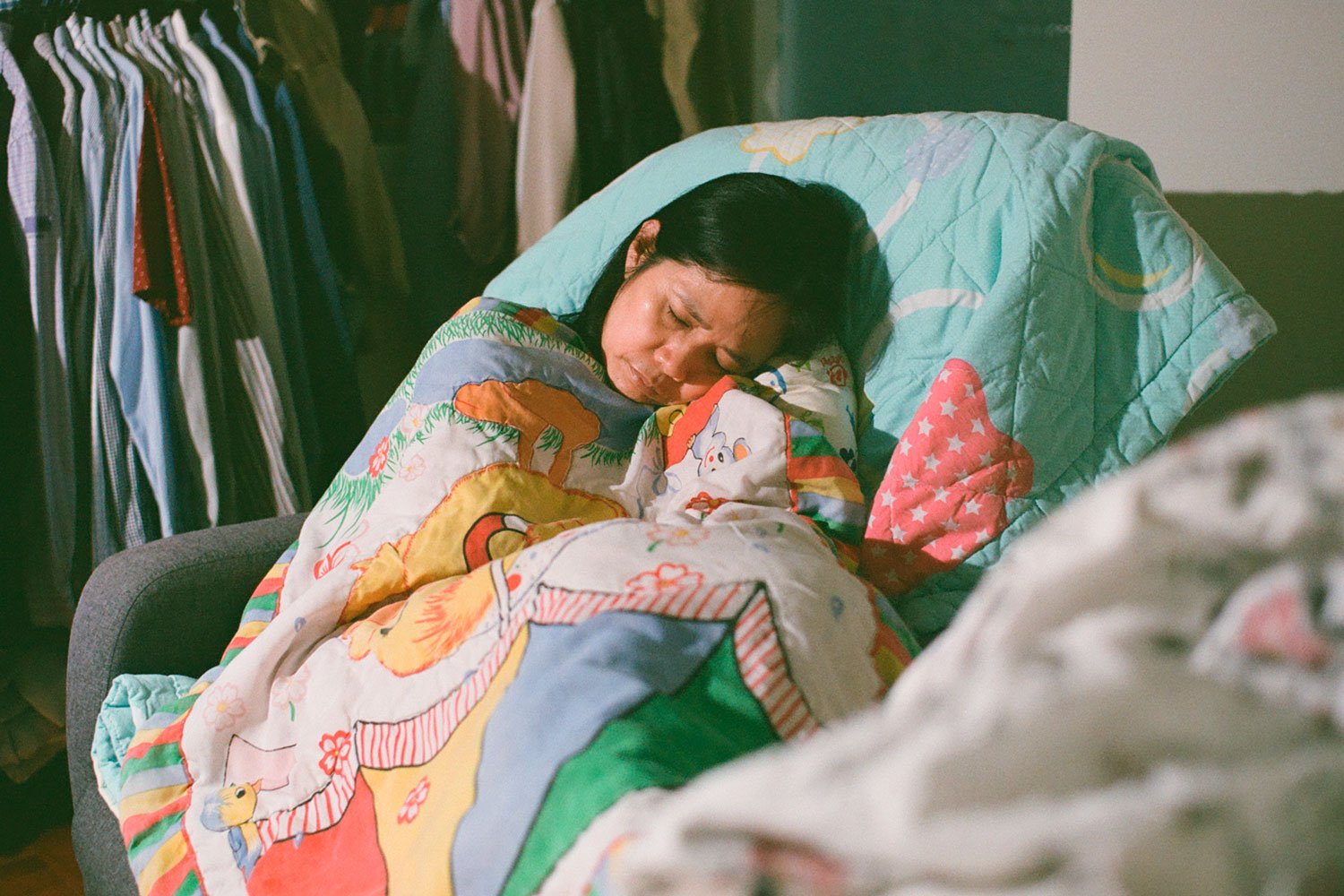
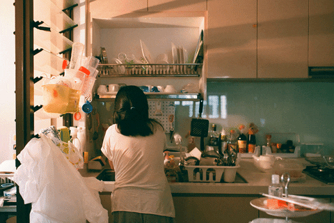
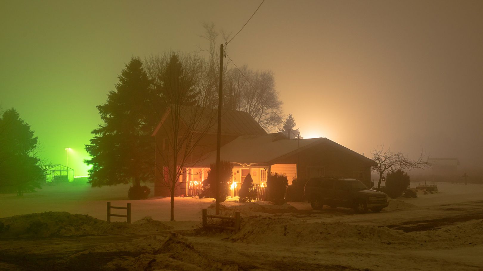
 Before
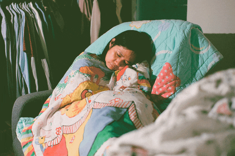
After
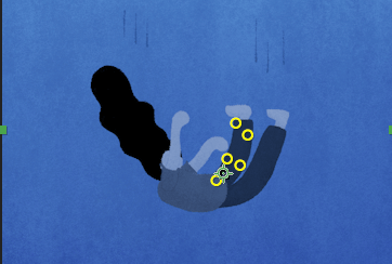
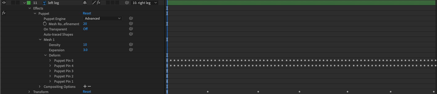
Camera Process
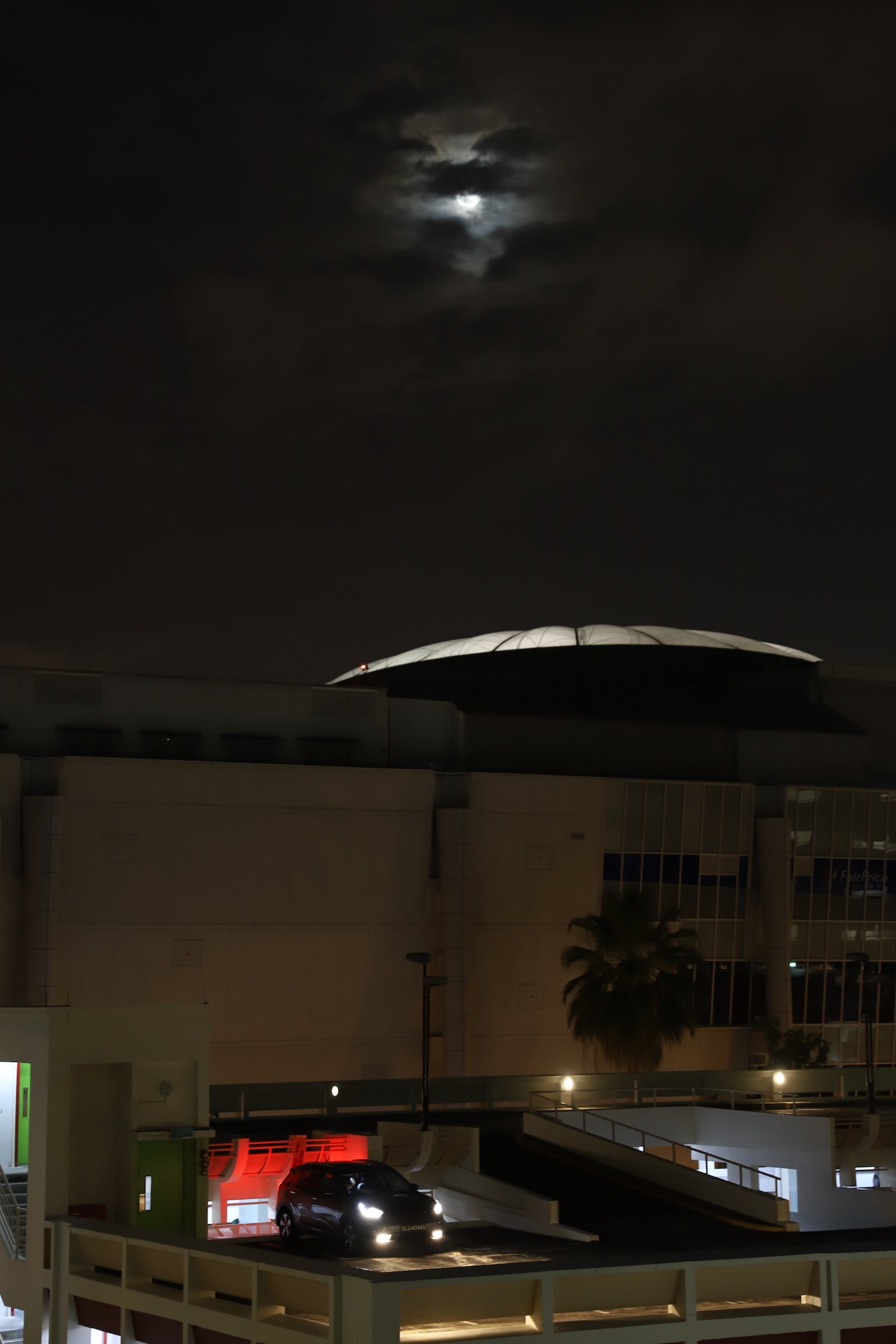
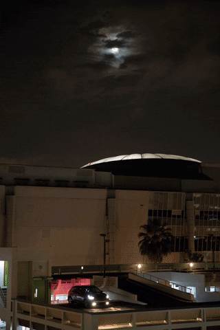
I’ve always admired how “futuristic” Eastpoint Mall looked at night. For this particular project, I shot the landscape of the multi-storey carpark nearest to Eastpoint Mall at night by placing it on a tripod and shooting it as a low ISO to avoid noise.
Digital Process
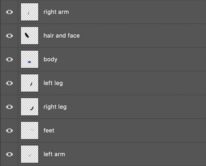
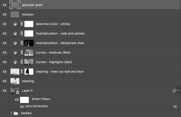
As I have many layers, I decided to break it down to the main segments.
The first main part I did was to clean up the palm tree that stood right in front of the mall. I also blocked out my dad’s car plate number as well as cleaned up the photograph a little. I ended up creating a stamp visible of the image to proceed with the digital manipulation.
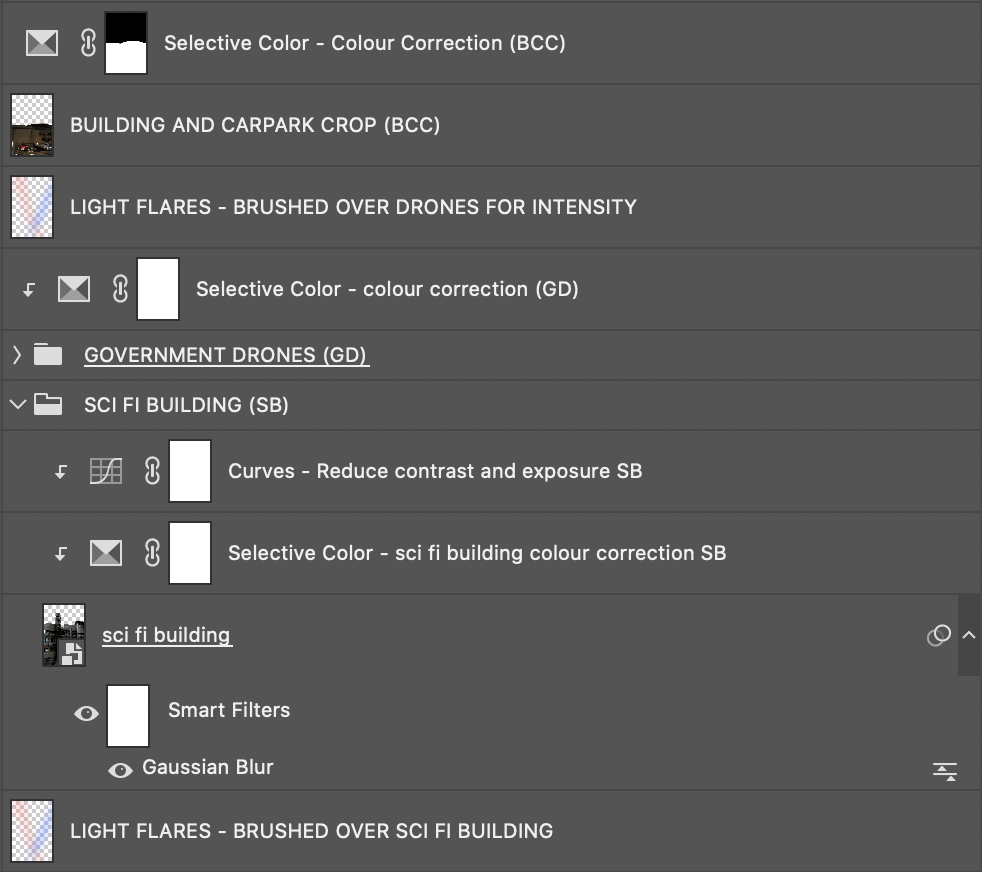
The second main part I decided to do was put in a “sci-fi” building landscape behind the mall so as to re-emphasise the futuristic era I was hoping to portray. I added a gaussian blur to the building landscape so as to make it look like it blended well with the image as well as colour corrected it using selective colour and curves. To hide the edge of the sci fi buildings, I created a mask for the carpark and mall using the red channel for curves and cropped it and placed it over the sci fi buildings layer.
I managed to get a drone from Google and duplicated it to show the multiple drones in my dream. I also colour corrected them using selective colour. Lastly, I added some red and blue light flares by using the brush tool in the blending mode “Screen” to brush over the landscapes, both above the sci fi buildings and government drones.
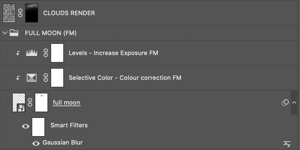
I thought the moon looked beautiful in the original photograph, but I decided to make it more obvious by adding a full moon PNG from Google. I gave it a slight gaussian blur to seam it well with the sky as well as colour corrected it to fit the sky colour using selective colour and levels. I added a clouds render layer just to brush it over the moon to hide it like how the clouds were originally blocking parts of the moon in the original image.
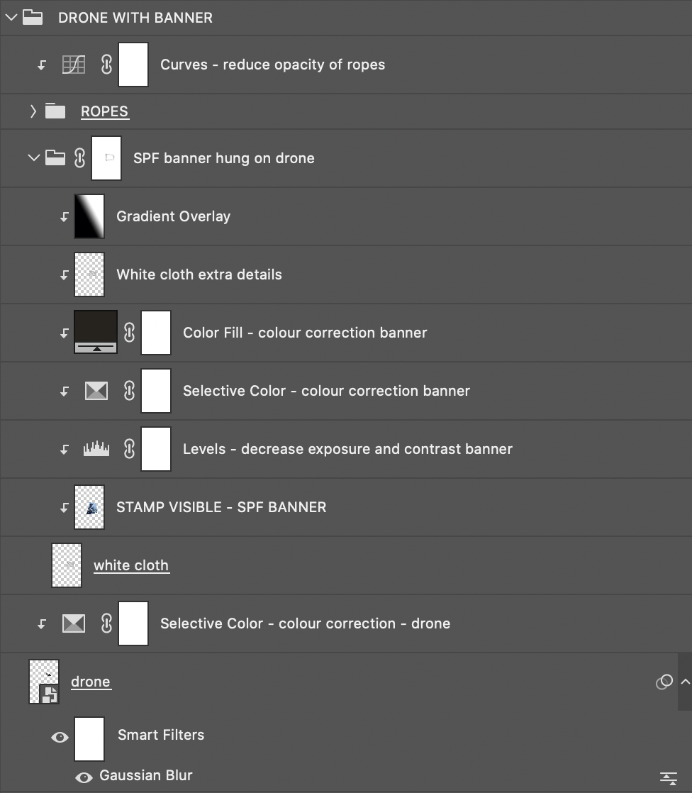
I had to improvise on the banners by searching for a realistic white flag PNG on Google and used pen tool to crop out the flag pole to get the cloth being blown by the wind effect. I edited another photo I took of a futuristic soldier off Google with a slogan used for an SPF scholarship, and created a clipping mask over the cropped flag. As the banner was too overexposed for the image, I had to colour correct it using levels, selective colour and a dark brown colour fill overlay. I then intensified the shadows a bit more by adding another layer of the shite cloth on top in the blending mode “Multiply” as well as added a gradient overlay over.
I found a rope PNG on Google as well, lengthened it and used Liquify to make it look as though it’s flying through wind. I then reduce the exposure and contrast of the ropes using Curves to seam it better into the image.
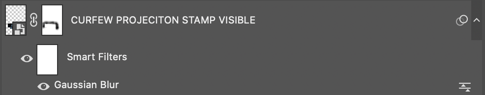
I created a stamp visible of a projection I took off Google as well as text that I wrote and gave it a light gaussian blur to better blend it in into the side of the shopping mall. I changed the blending mode to “Screen” and masked out the edges so it would look as though it’s projected onto the wall.
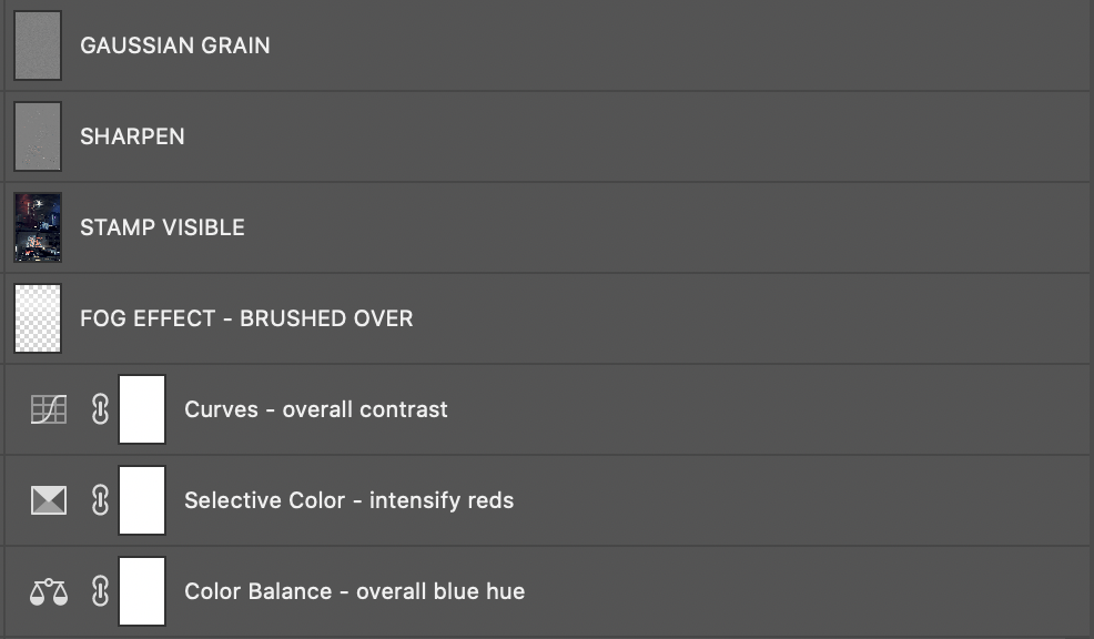
Lastly, I decided to give it an overall blue hue to the image. I used colour balance in shadows, midtones and highlights to intensify the cyans and blues, used selective colour to intensify the reds, and used curves to give the image an overall contrast. I created a new layer and added a fog effect by brushing white over the entire image and changed the blending mode to “Soft Light”. Lastly, I sharpened and added gaussian grain.
Process (GIF)
Artist References
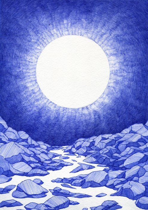
Sandara
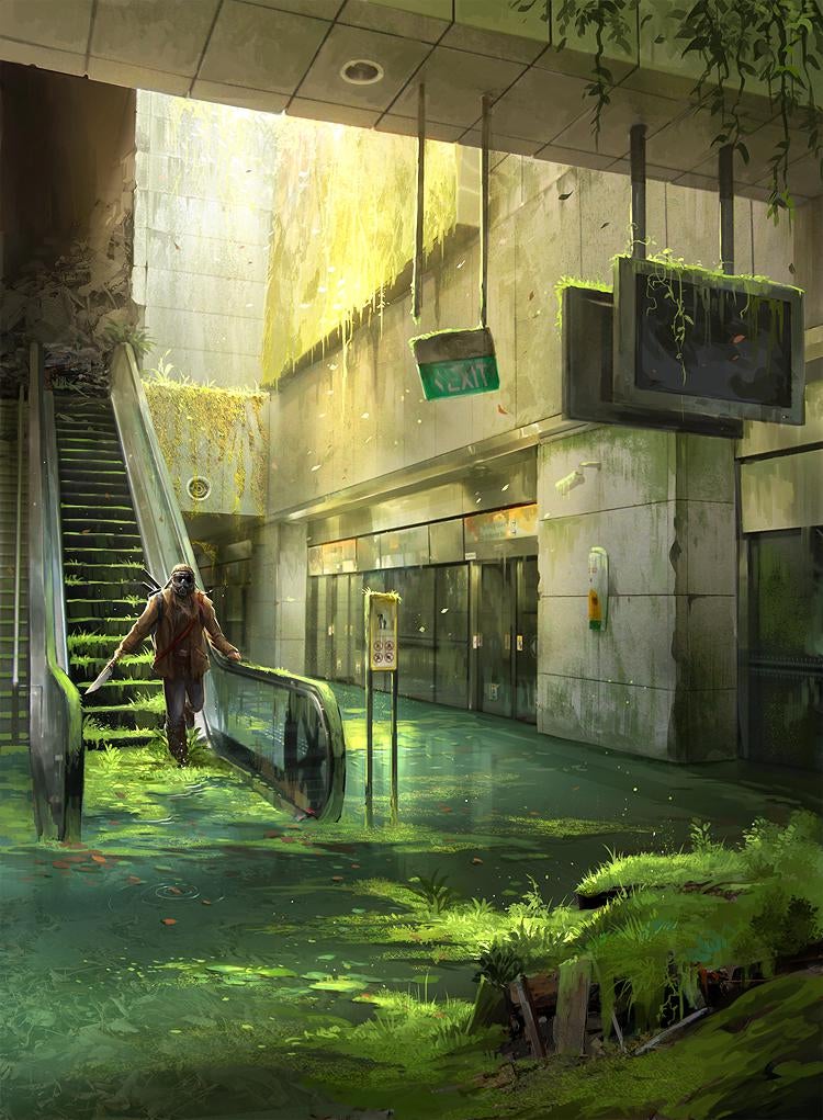
Sandara is a local artist most known for her works on Deviant Art. It was a few years ago when I chanced upon this piece of an abandoned One-North MRT on Pinterest. I was really impressed at the reality she was able to create from the simplicity of the train station, from the rendering of the mossy walls to the yellow cinematic hue she added to the image and I was inspired to recreate my dream using the landscape near my home – Eastpoint Mall.
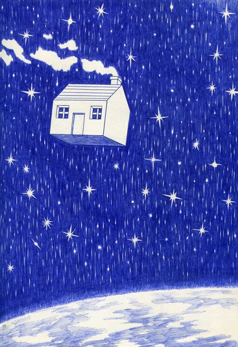
Michael McCluskey
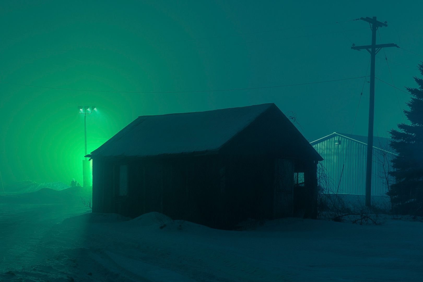
Another photographer I did some research on was Michael McCluskey, who is most well known for his “sci-fi cult classic” photographs. I was immediately drawn to the colours in these two images that create such an eerie and extraterrestrial effect on simple landscapes. This inspired me to make use of colour to better tell my narrative.
Google Drive Link
https://drive.google.com/file/d/1VvzzjeYuOea3E1FVJYqSbAkNQKxqDxiO/view?usp=sharing