Honestly, I was really excited to visualise my contact with liquids because I’ve been sick for the entire week. Which means that I’ve been taking in and giving out loads of unattractive, gross amounts of liquids.
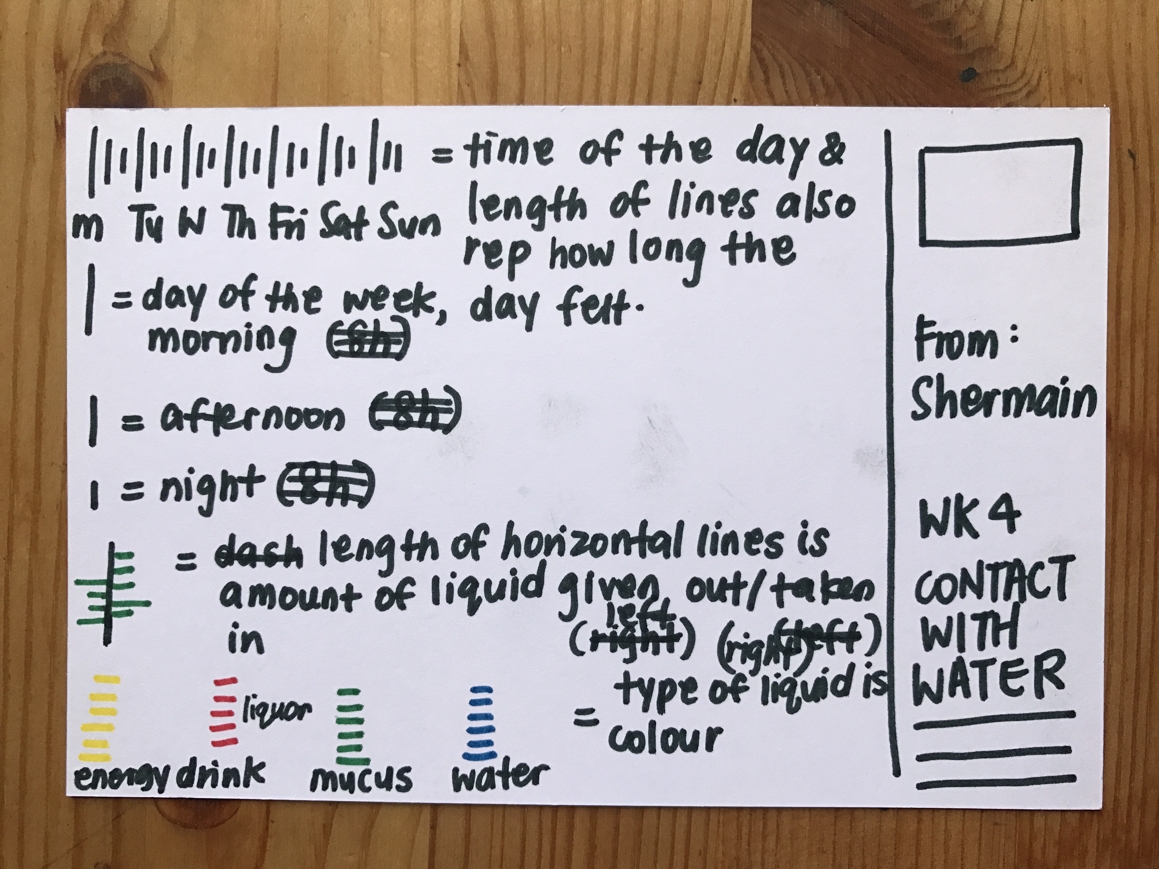
This visualisation did not turn out as clear as i would have liked to. But here’s how to read it: The three lengths of times represents the three different times of the day. Namely, the longest being morning, middle being afternoon and shortest being night. Because these were how my days felt when i was ill. The horizontal lines in different colours represents the type of liquids and its length represents the amount of liquid I was in contact with. Also, the direction of the horizontal line tells if the liquid was given out(left) and taken in(right). The closeness of each horizontal line also tells of how often I come in contact with the liquid.
An interesting pattern that I noticed was that, after consuming large amounts of water, the amount of mucus i was giving out was much, much lesser which proves that water is indeed really necessary for a sick soul! But in comparison, when I consumed 2 pints of beer on day 2, I definitely felt for its effects and paid for it because on day 3, I was blowing out humongous amounts of mucus.
I never knew info visualisation could be so funny and musing heh.


is this for vis com class or for fyp
…