ZINE RESEARCH
Main concepts: day vs night, creative space, a large canvas
- abstract visual qualities of your site’s uniqueness
- shophouses
- very colourful
- signages, soundscapes, motifs/patterns, the materiality of the space, tactility, architectural elements, the 5 senses
- soundscapes, audacity, make abstract patterns (hear)
- *”what are some ways I visually present my site’s uniqueness in an abstract manner?”
- mark making, scanning, risograph printing
Inspiration
- pictures, text, doodles
- sectioned parts of the page
- headline
- image vs illustration, contrast
- colours
Pinterest research ~~

First Consultation
During my consult with Joy, we discussed that Haji Lane can still be looked at as a creative space, but narrowing it down to a specific population. e.g. for business owners. using the 3 spread in the zine, it could be grouped to target 3 different groups/types of business owners.
- Bars, nightlife
- Boutique owners
- Mural artists (may change)
Aside from these points, some data that I wanted to work with visually was :
- sounds from the street – audacity (day vs night)\
- letterboxes from shop fronts – individual characters of the boutiques
- murals – patterns
- bars – unique cocktail names
- products sold at haji lane
First Group Consultation
The following images were what I shared during the first group consult. As an art direction, I was trying to work towards line illustrations with minimal text as well as some images. Considering that I was still rather new to illustrator, I was playing around with the image trace function to obtain various visual outcomes.
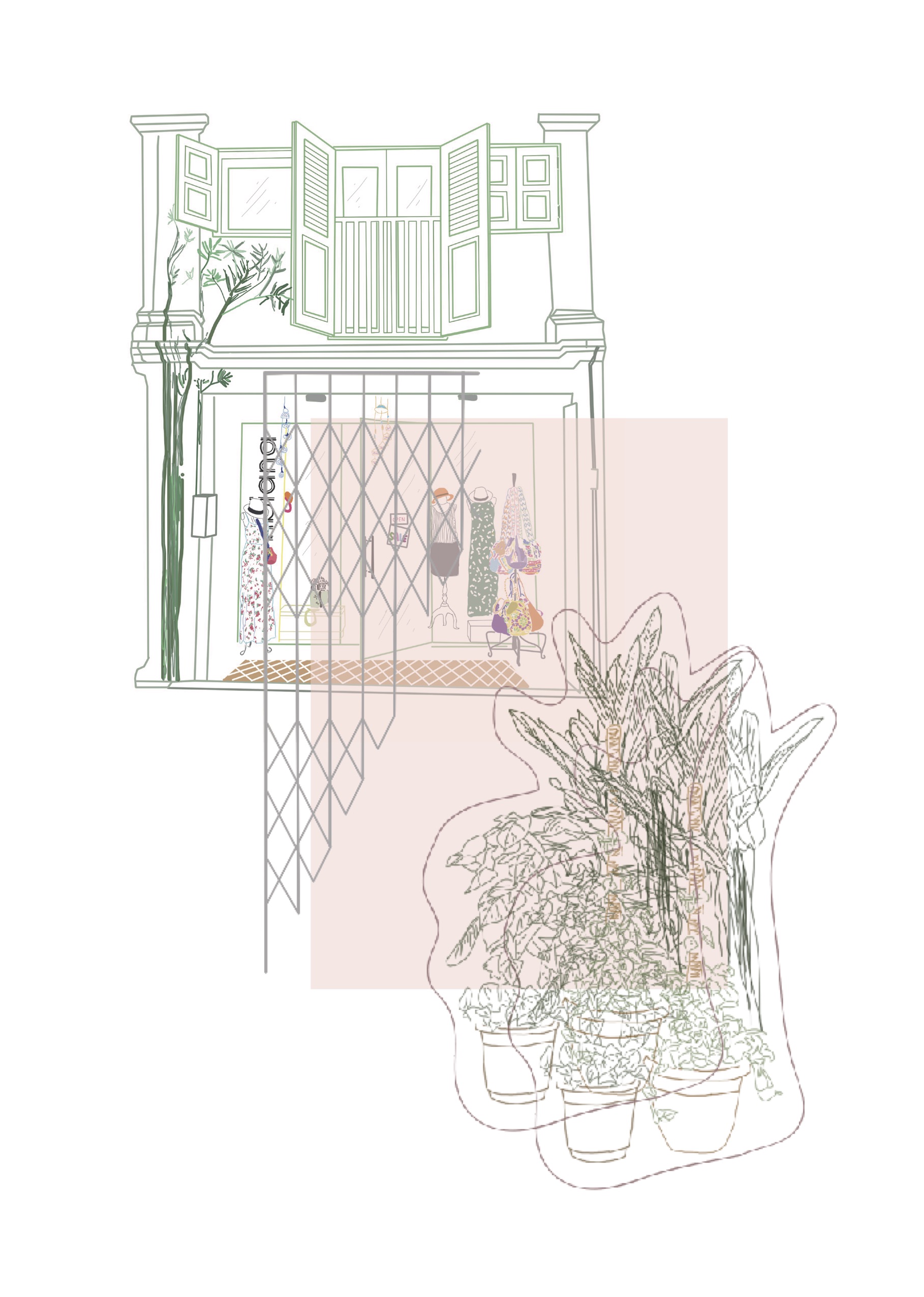
boutique spread
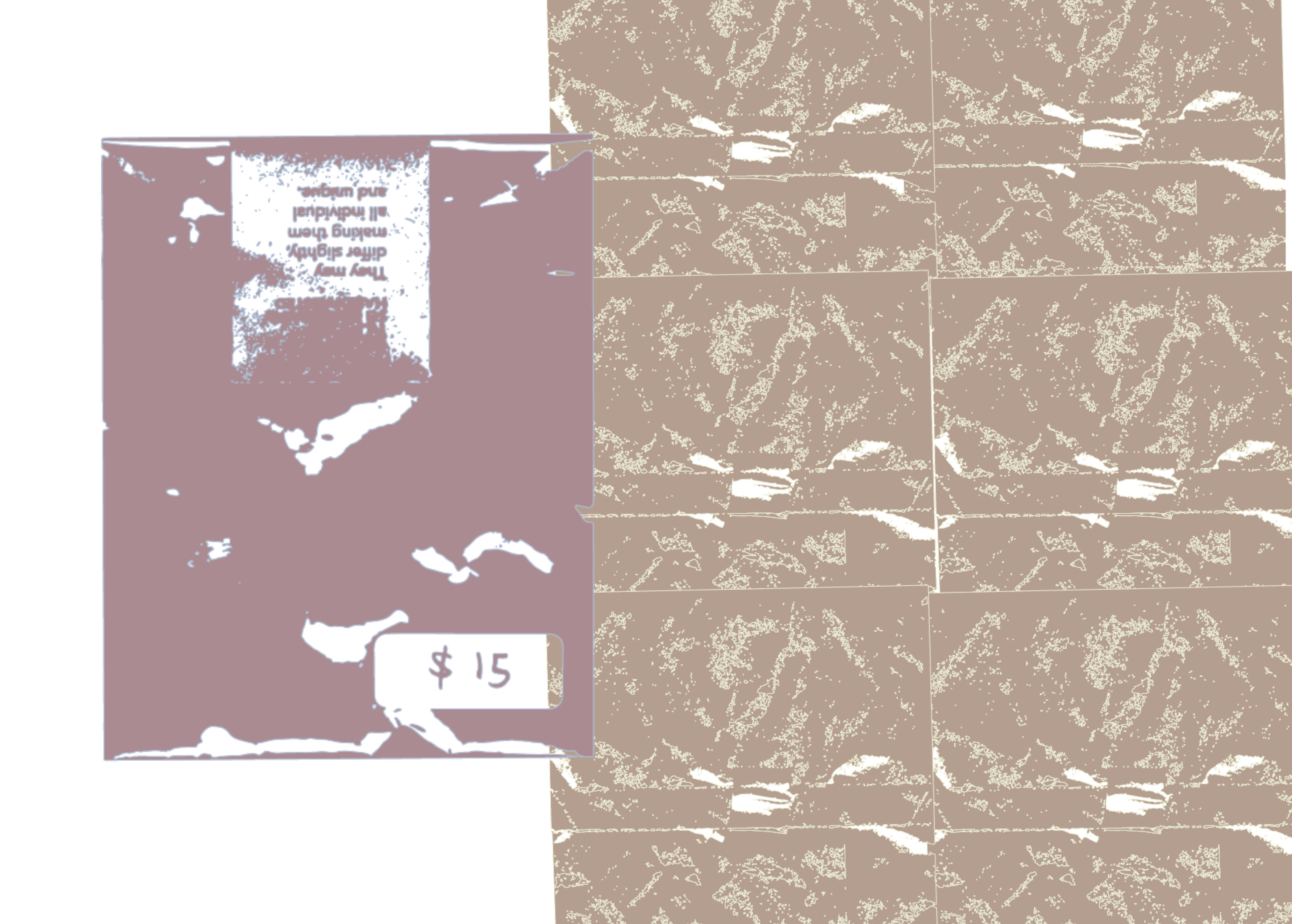
Layering of visual qualities that I noticed inside and outside of the boutique shops. Plants, gate, shophouse, etc…

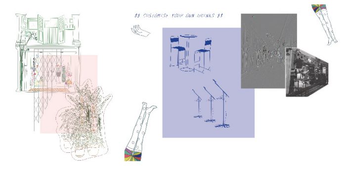
bar spread
Image of live gig, illustration of quirky mannequins outside the bars, stools, mic
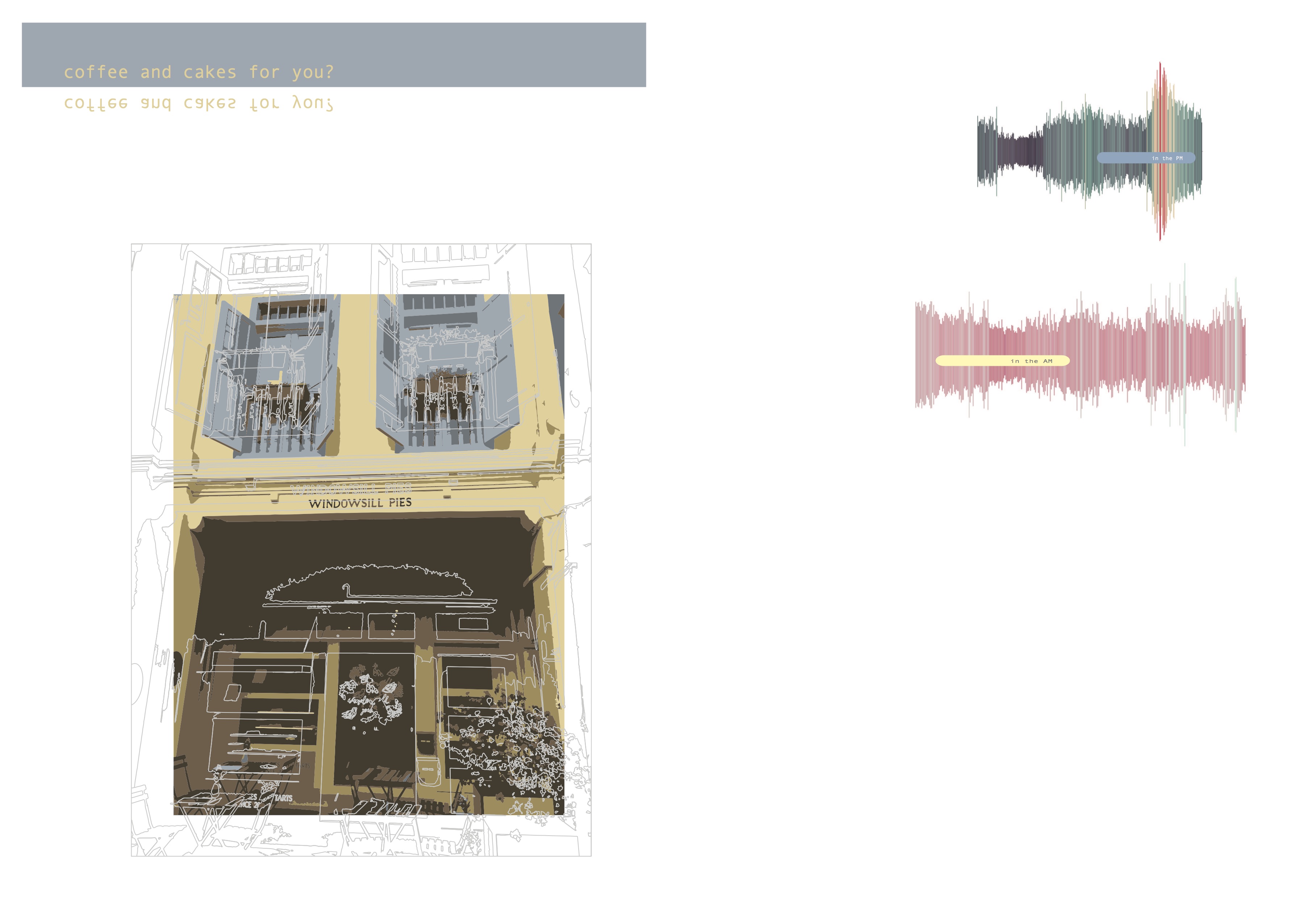
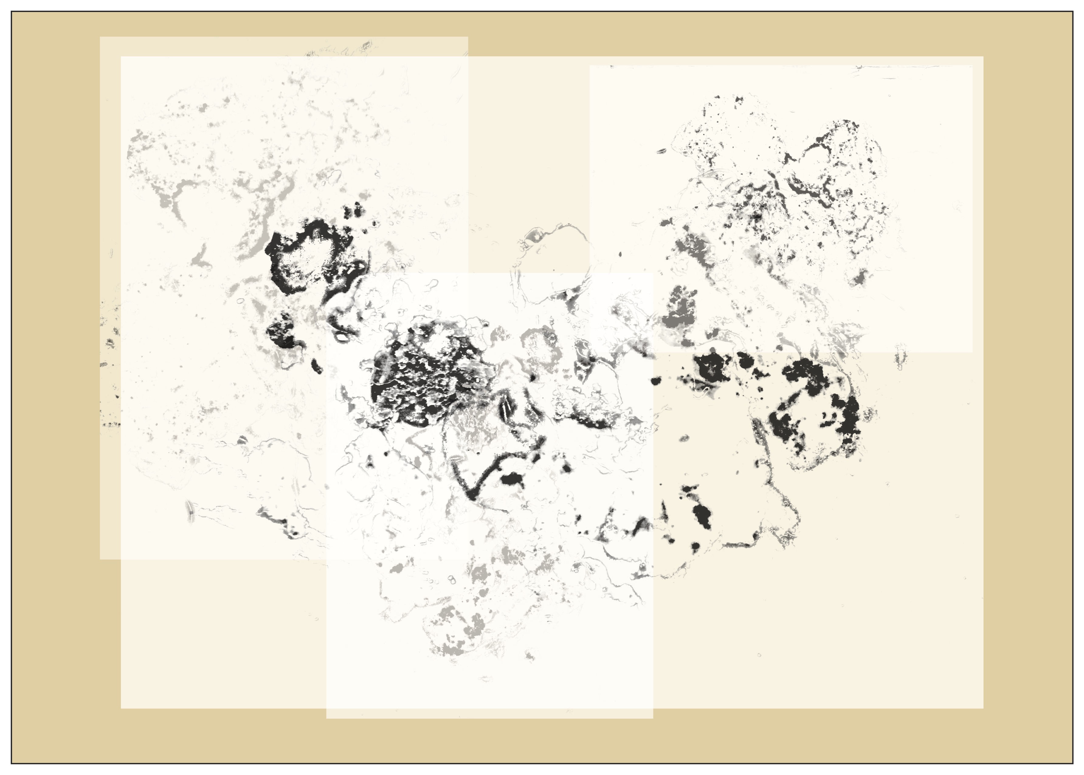
cafe spread
Manipulated image of windowsill pies, ‘coffee and cakes for you?’, exploration with visual soundscapes
For these spreads, I definitely interpreted the abstract part of our zine in the arrangement of visuals rather than an actual abstract representation of Haji Lane. The sharing of other’s work definitely helped me to understand the abstract direction that I should be working towards. Hence, I decided to start anew and reorganize my zine.
NEW PLAN
one main quality for each business + respective soundscape
Listing of new ideas aka revisiting Haji lane:
- Boutiques
- The concept of purchasing/buying
- scanning of barcodes?
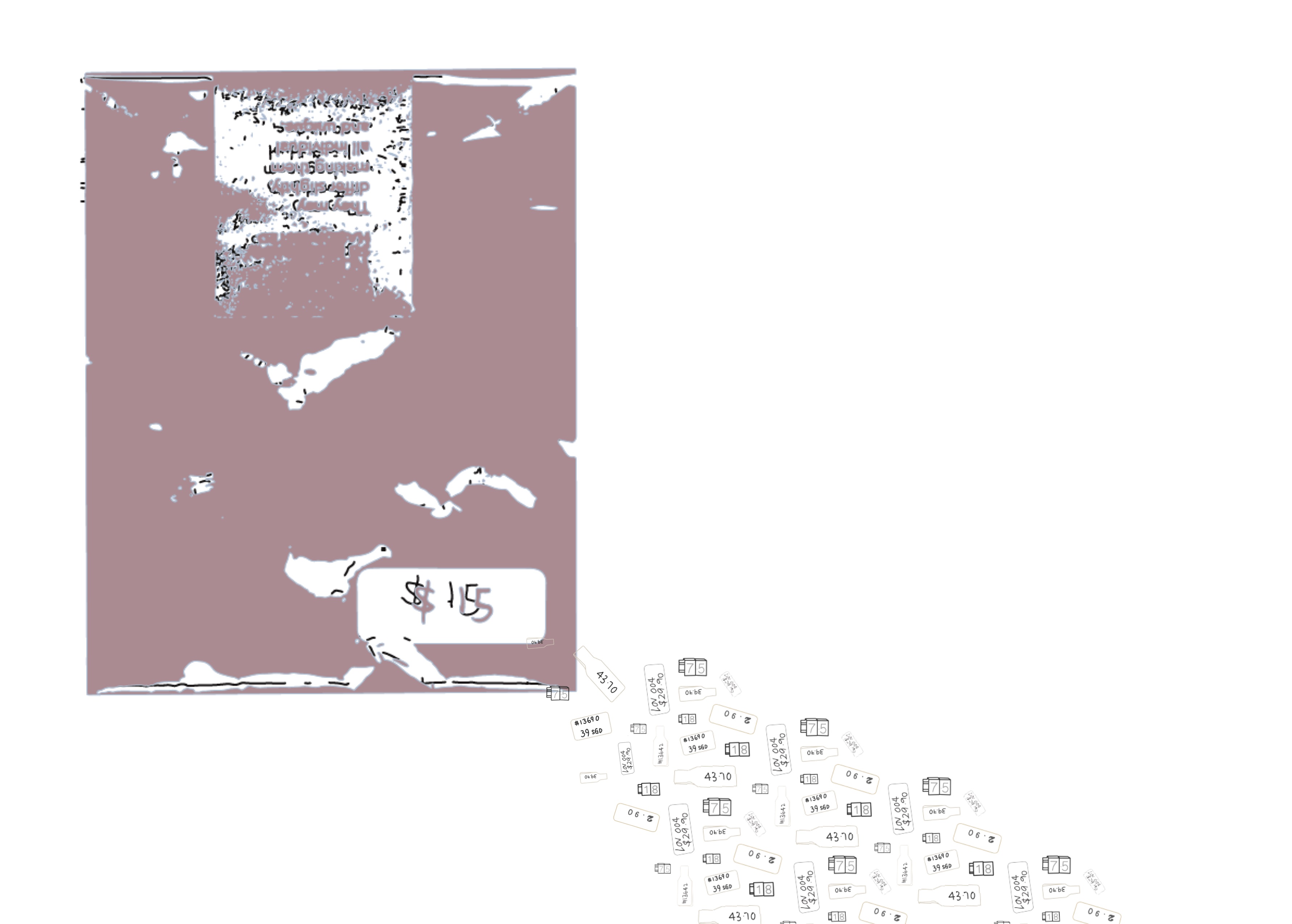
- personal packaging
- The concept of purchasing/buying
- Cafes
- Working with pastries
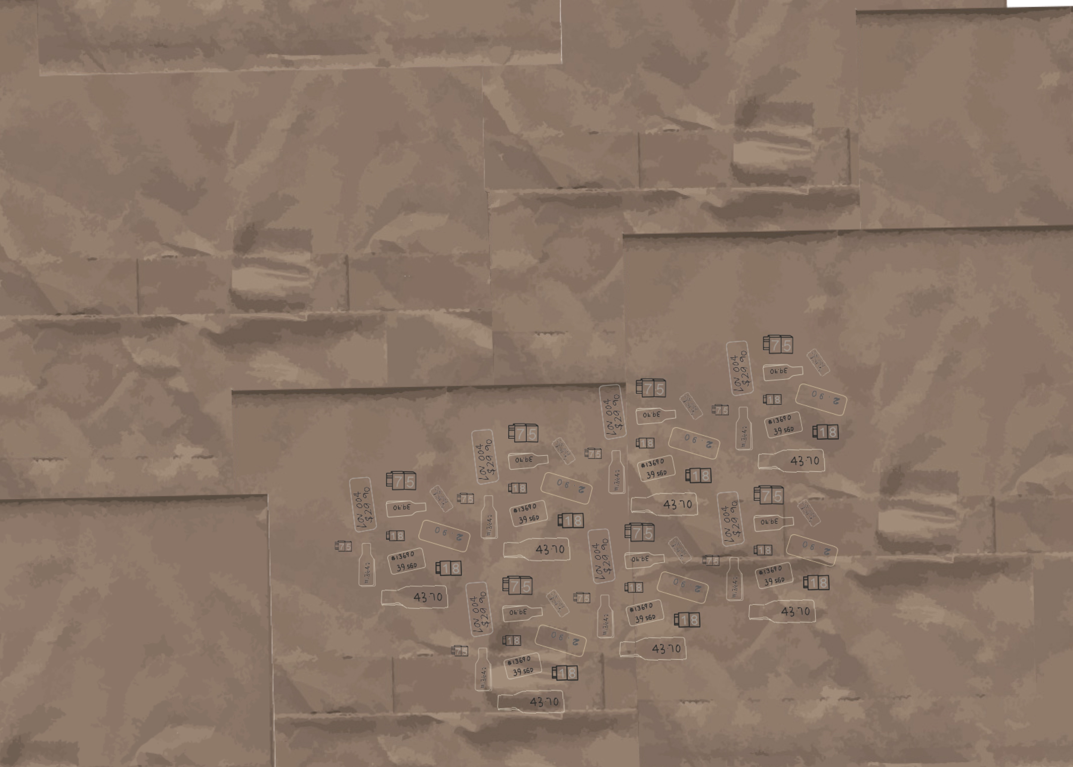
- scanning in crumbs
- drink stains
- receipts
- Working with pastries
- Bars
- Gigs
- lyrics
- drinks menu?
- Gigs
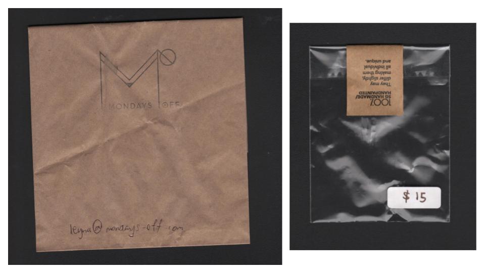
Sourced packaging materials and scanned them it for digital manipulations

Bought a pie from windowsill pies and scanned it. I also recorded sounds from the boutiques, bars and cafes. These sounds were later reflected in the composition fo each spread. Following the scanning of these resources, I experimented with them to create new spreads.
Second Consultation
Although I brought in more abstract qualities this time, there were definitely things that I could further focus on for each spread.
- Boutiques
- handwritten vs printed
- texture of tape
- focal point on the 100% text
- Cafe
- add texture of napkin
- maybe an image of a fork to give context
- Bars
- spilling of gigs onto the street
- street lighting?
- double yellow line
- darker background with neon touches (with reference to images taken)
Further alterations / explorations
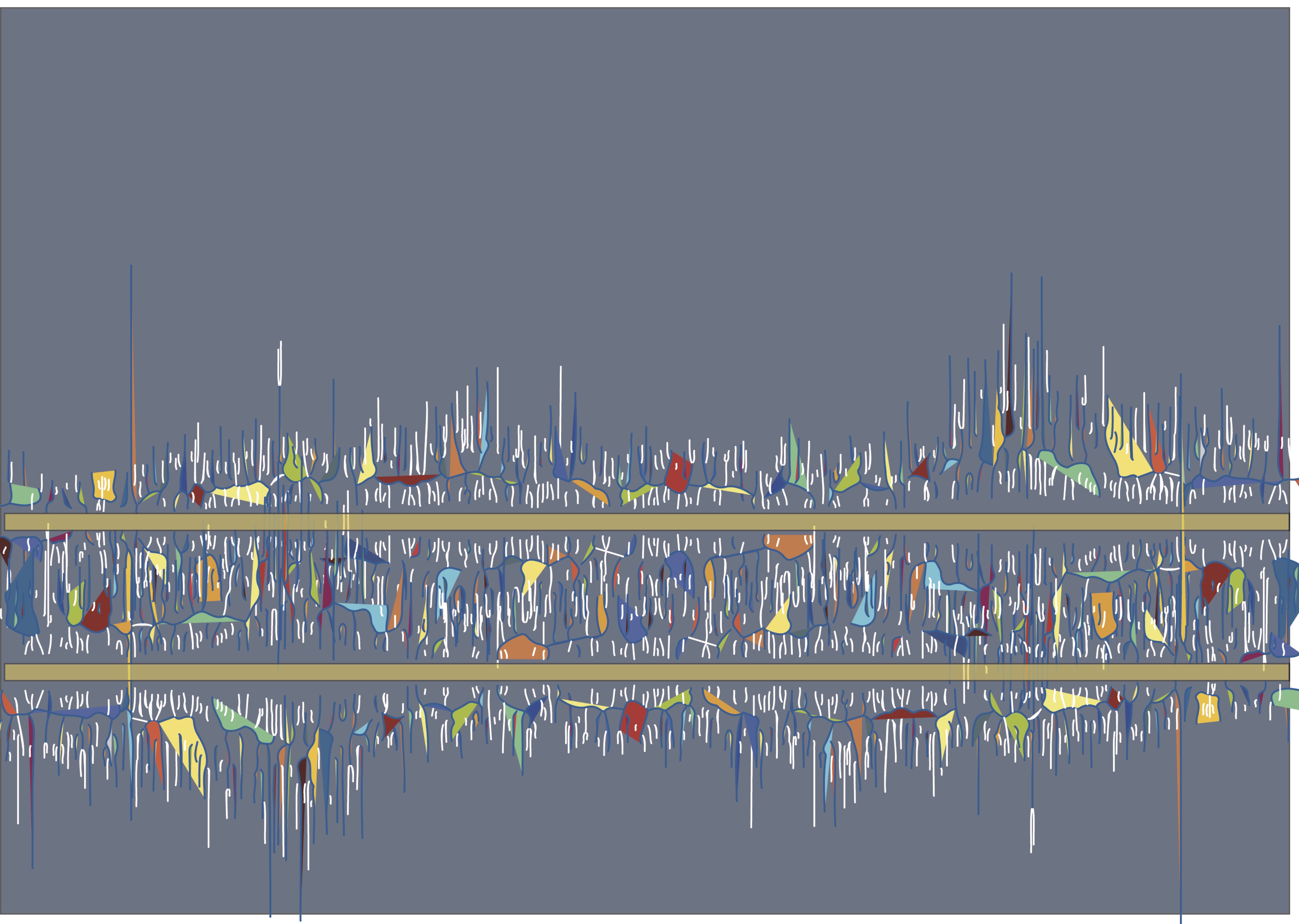
soundscape + double yellow line resembles street, solid colours abstracted from images of the nightlife at Haji lane with the eyedropper tool
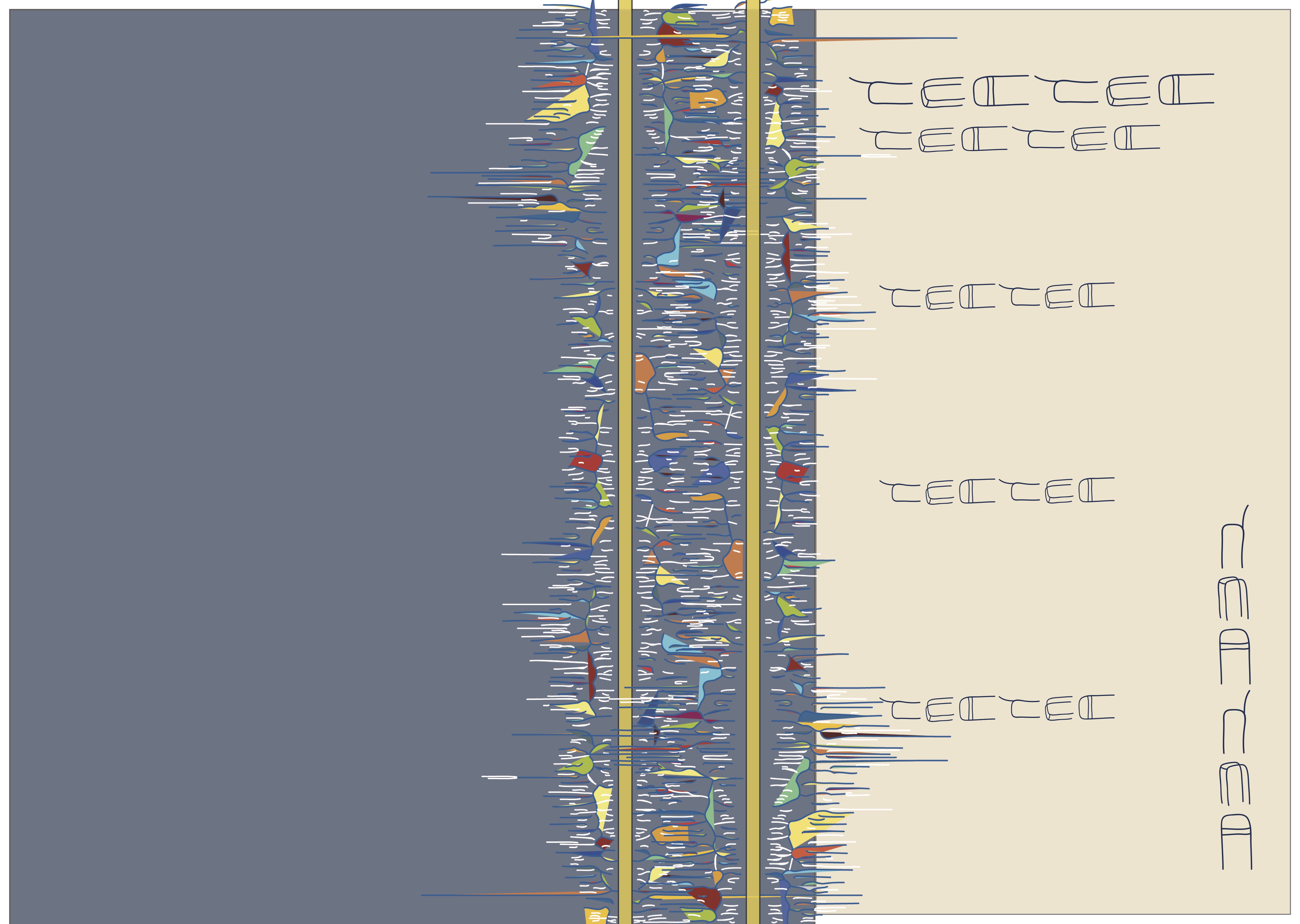
Abstract icons of barstools along the street, arranged in menu format, overlapping of soundscapes similar to the boutique spread where there is also overlapping
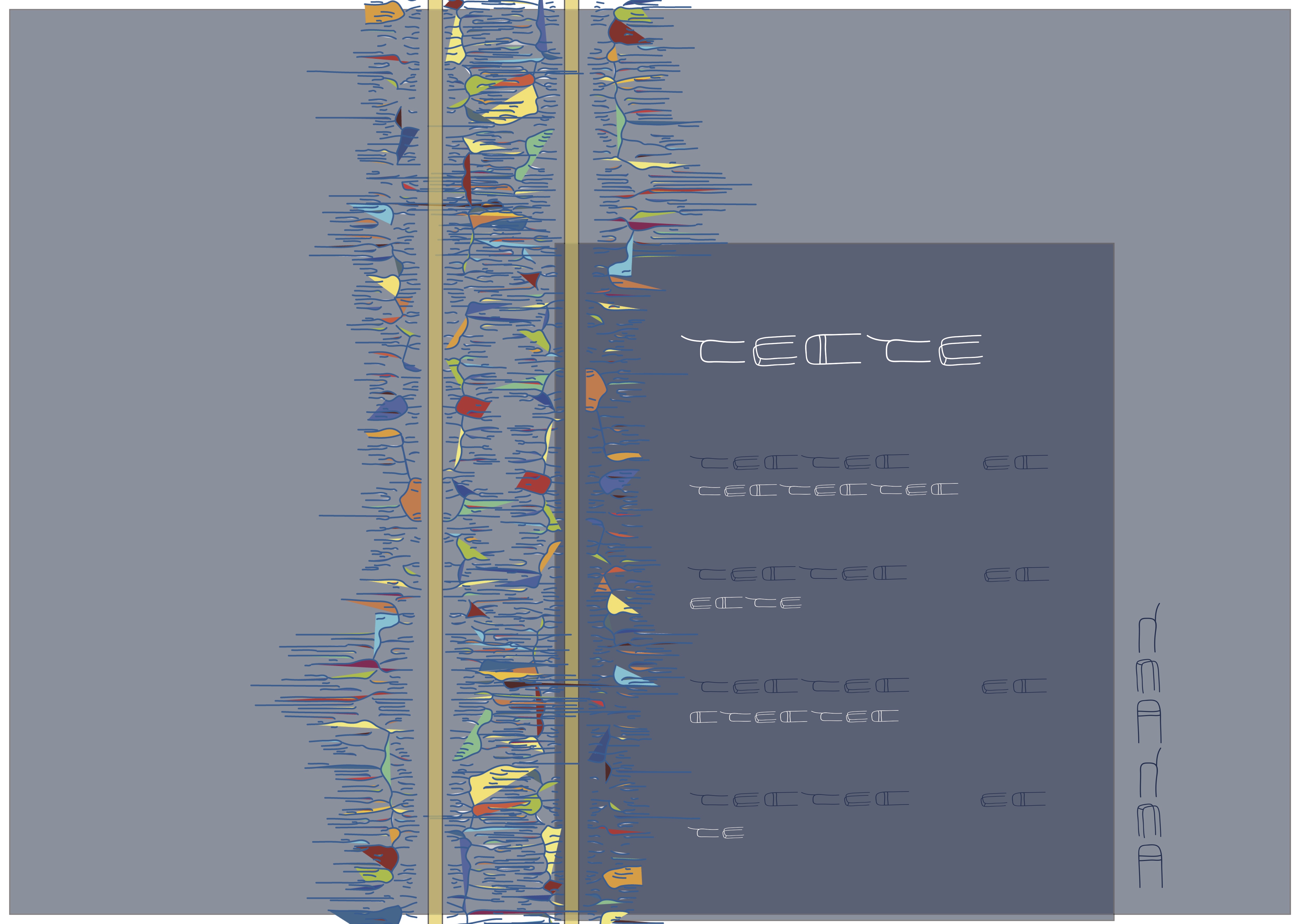
Re-arrangement with a frame since the other spreads also had some sort of framing going on. I lot of rearranging went into the process of this zine and it was definitely a challenge for me in terms of deciding which would be best not only to fit the concept but also aesthetically. The final spreads of my zine will be explained in another post 🙂
You must be logged in to post a comment.