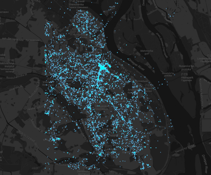
The Exceptional and the Everyday: 144 hours in Kiev (2014)
Click on image for higher resolutions.
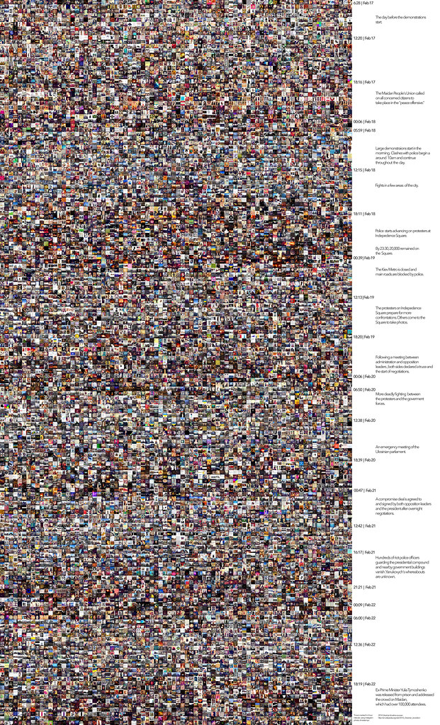
Alchemised by Lev Manovich, The Exceptional and the Everyday: 144 hours in Kiev is the first to analyze the use of Instagram during a social upheaval. Using computational and data visualization techniques, here is an exploration of 13,208 Instagram images shared by 6,165 people in the central area of Kiev during 2014 Ukrainian revolution (February 17 – February 22, 2014).
“When popular media covers exceptional events such as social upheavals, revolutions, and protests, typically they just show you a few professionally shot photographs that focus on this moment of protest at particular points in the city. So we were wondering if examining Instagram photos that were shared in the central part of Kiev would give us a different picture. Not necessarily an objective picture because Instagram has its ownbiases and it’s definitely not a transparent window into reality, but would give us, let’s say, a more democratic picture.”
– Lev Manovich
Manovich’s macroscopic point of view mirrors that of Infocomm Development (IDA). Manovic clairvoyantly pointed out that “after seven or eight years of social networks, there is a need for studying the social and the cultural through analysis of people’s data, in addition to the commercial use of consumer preferences.” IDA has $1.2bn is set aside for tech products, alongside the willingness to release data while crowdsourcing for ideas for innovation. Discover government data at OneMap and data.gov.sg.
Why Open Data? Open data is a massive yet untapped library of information that is available to the public. With the correct use of open data, significant benefits can be reaped such as improved measurement of policies, in-depth analytical insights and sharper business decisions.
(Source via Asia Data BootCamp)
Prof. Randall Packer pointed out a question that would be of interest to artists traversing different mediums in our time. The key to unlock storytelling with social media would be data visualization. Narrating data visualization does not have a name.
Edward Segel and Jeffrey Heer wrote on Narrative Visualization: Telling Stories with Data that most sophisticated visualization tools focus on data exploration and analysis.
In Net Appropriation: Sexy Data, Prof. Louis-Phillipe Demers challenges our experiment on Net Appropriation. “Data mining requires interpretation and analysis, but this is data scavenging,” said Demers. Co-founding partner of DataCraft, Mike Anderson who specialises in data analytics and IT architecture suggested that this is a mean comment. However, designer Petra Valdimarsdóttir describes an artistic process to which, incorporating strategic design.
“I was browsing the internet for archives on american culture I was actually looking for material related to cowboys. Out of no where came this beautiful archive of these native american tribe portraits. When you find something like that you just simply can’t let it go- so I started saving all the images and dissecting them, and finally translating it all into a book and an installation piece.”
– Petra Valdimarsdóttir
Read article on project Data Scavenging here on how “she scratches at copyright boundaries by re-appropriating information and images to reveal the raw humanity that belies it”.
So, how do we tell “data stories” effectively? Gershon notes that it “requires skills like those familiar to movie directors, beyond a technical expert’s knowledge of computer engineering and science”. Lev Manovich explained his choice of Instagram allows us to get a view of a different place of reality then what the journalists would get during times of protests.
Juan Camilo Gonzalez, whose research involves data visualization has great advisement. For the lack of better word, find Juan’s telepresence (very, very cool) and documentations here and check out his multiple award-winning film, SiSiSiSiSiSiSiSiSiSiSi (2011). In his sharing, Juan finds resonance with Robert Wilson’s mathematically conceived structure to allow for ideation process to be wild and free creatively. From his vast knowledge in the field of research, John Cages’ Notations was also pointed out to be an interesting extension in the idea. For which John Cage and his legacy, Prof. Randall brought up the use of I Ching in John Cages’ composition of music, writing and visual art.
The basic principle is to remove one’s own intention from the work and hand that over to the oracle. Intention is always to some extent circumscribed by one’s own tastes and personality, whereas non-intention moves beyond like and dislike and becomes something more resembling an act of nature.
(Source via Yijing Dao of Biroco: The Art of Doing Nothing)
As such, we have come to contemplate upon the idea that to build a narrative for data, a structure is necessary. There are insatiable amount of methods that a structure may be initiated, and that could highly be personal as to be impersonal. “… it’s the interplay between the structure and also the randomness of particular images,” says Lev Manovich.
“To me I think it’s a successful metaphor for how to speak about society today, when you think about all the traces you leave on social networks. I am trying to find the static visual forms to represent our new sense of society from seemingly random acts of individual people. So what I am trying to do is, ultimately, behind this kind of methodological, scientific veneer, I am an artist who is trying to find visual forms, which would represent what I see as central structures or central themes, relationships between individuals taken from random behavior.”