Response – Donald Norman’s The Design of Everyday Things, Chapter 1
Norman broke down the aspects of design into simple categories: Affordance, Signifiers, Mapping and Feedback. In each category, there is a simple consideration to design and it allows designers to think of them independently and yet see how they flow and work dependently with one another. While it was doable to think about these aspects separately, it was also about how one affected the other. To design something that could check off all the boxes was the difficult part.
“As I watched people struggle with technology, it became clear that the difficulties were caused by the technology, not the people.”
I was thinking about the ever shifting sort of common technology knowledge that everyone has (or at least those up to date). For example, knowing/realising a laptop is out of battery, and knowing how to charge it, something that any adult, teen or even primary school child could do, might not be as apparent to the grandfathers and grandmothers of today. It got me thinking about how we should take into account the different generations and their different levels of this common knowledge. However, as I read and I thought about it more, I realised that this had to do with interaction and experience with other technologies, and it was the good designs of the past that have develop this almost instinct reaction to know what to do. I saw that as technology improves, the design for it to be used practically and to be easily understood has to be improving as well. We should not be making excuses for ourselves and technologies.
Questions:
How large of a part does habit have/is able to play in the world of design?
Is relying on the idea of habit and contextual knowledge only sort of an “escapist” or “easy way out” mentality? Or is it also frequently, using design to affect habit? Will that be under “bad design forces the user to behave as the product wishes”? Do I also sound like a mad scientist trying to figure out how to control human behaviour? Maybe..
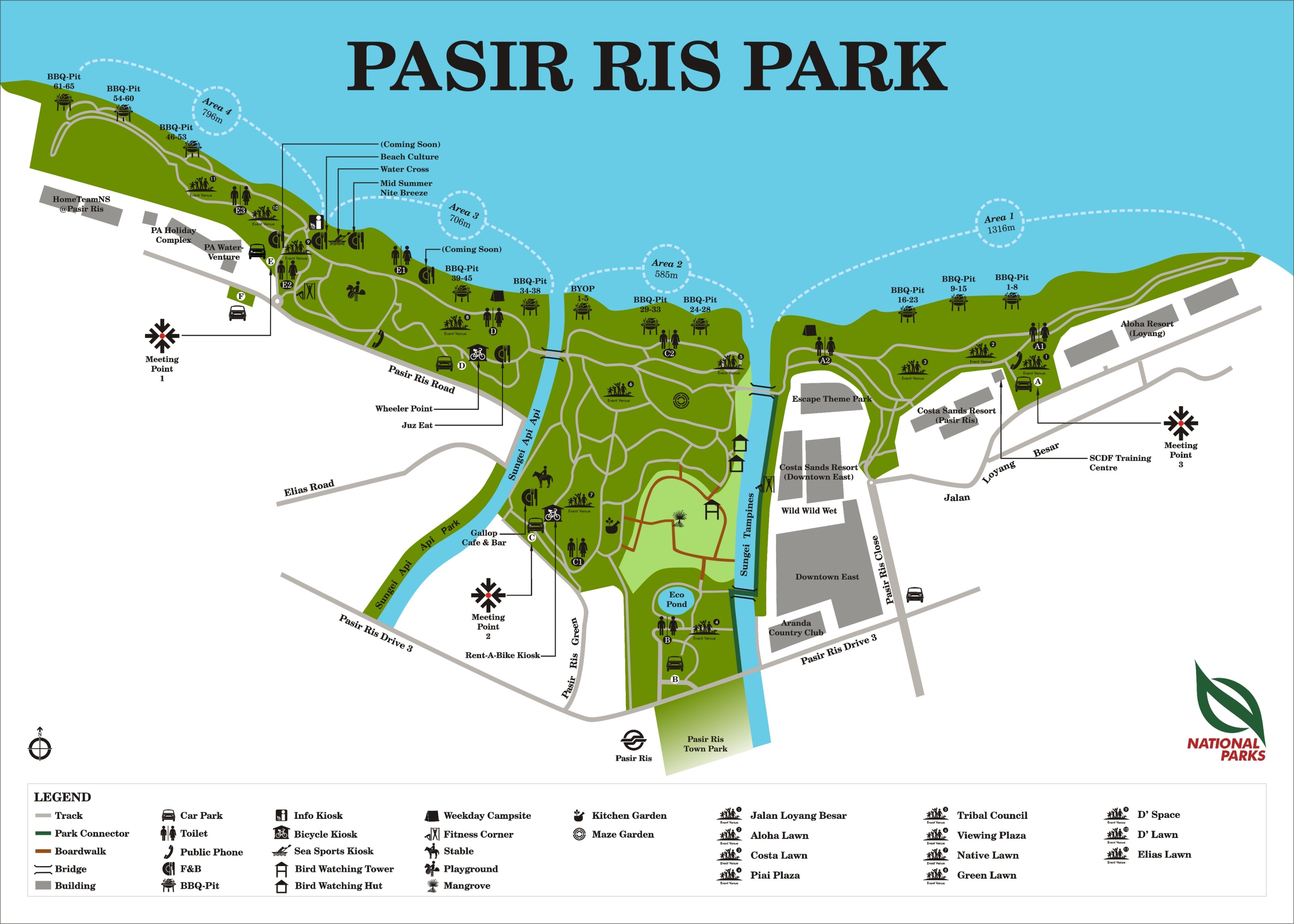
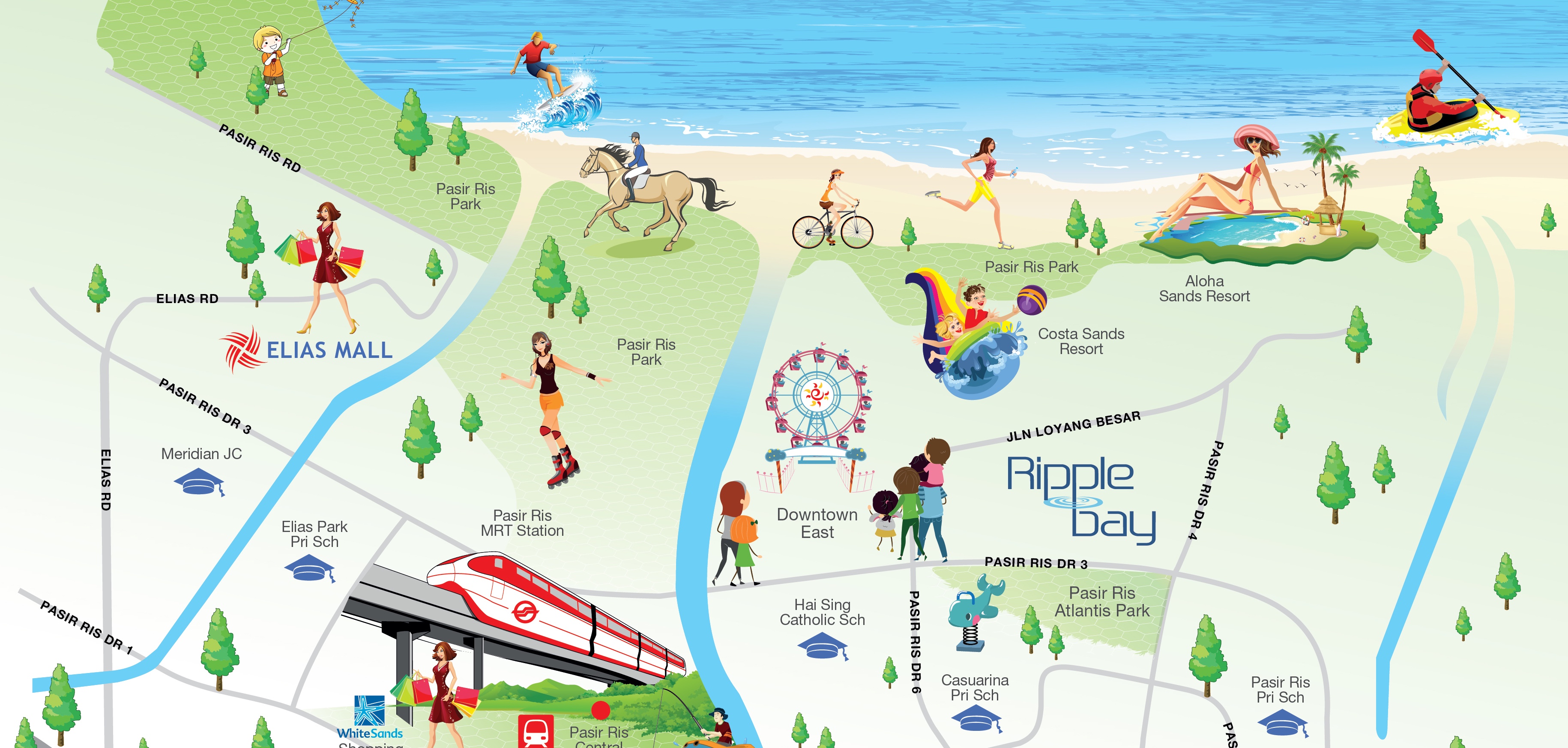
Map Assignment: Pasir Ris Park
Both maps presented have their own pros and cons, but clearly in terms of doing a better job, the first one is definitely a real map’s map. (lol jk) Its not amazing but it does a good job and accurately depicting the land mass, yet without being overly anal about the little details, which might have complicated it more. While the second map simplified itself as well, it was overdone and presents itself as too inaccurate. Furthermore, the first man has more information about Pasir Ris Park, while the second only highlights its main attractions, leaving out toilets, pavements and individual BBQ pits. Although the second map has a more interesting and eye catching aesthetic, it does sacrifice accuracy and details about the park.
Redesign Everyday Objects
I’ll get on that soon, promise.
You must be logged in to post a comment.