Zine – Initial Research
As someone who was already familiar with the concept of the zine before this project, I was really excited and really looked forward to it!
Upon receiving the brief, I first went online to find examples of zines and editorial styles that I wanted to try out.
(From http://hokkfabrica.com/create-your-own-zine-inspired-by-zinester/)
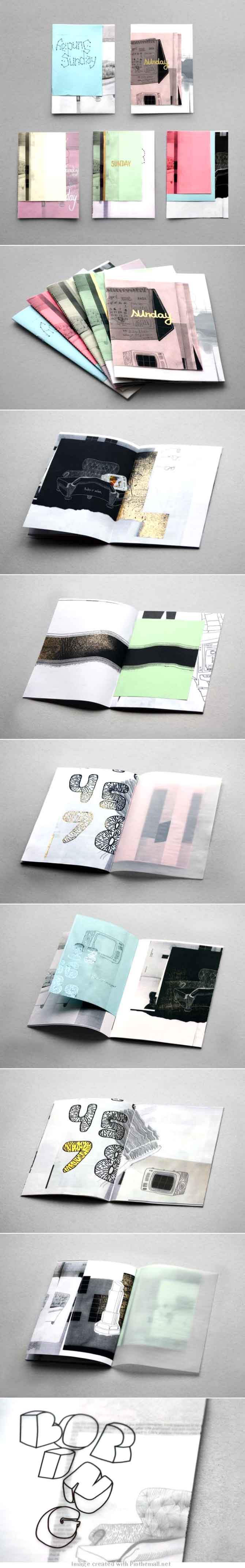
I was really inspired by this set of samples, especially of the photos of the usage of tracing paper/ mini inserts – so I tried to play around with layering different paper styles and textures for my zine. The samples also had a lot of layering text, which I decided to play around with by using rub on letter transfers in my work.
Concept
At first, I found it really hard to find a unifying factor/theme for all my works and so found it really hard to define a central concept for my zine. At one point, I seriously contemplated redoing all new works for this project (thank god I didn’t).
At one point, I remembered a little personal comic project that I did a long time ago – Sleeptalk (you can read the comics here. For a long time, I’ve been wanting to redesign a new logo for the series and so I decided to use this chance to do it! The concept of Sleeptalk also fitted well with my works (somehow).
The concept of Sleeptalk is basically – what I talk about when everyone is asleep. As a chronic night owl, I work into the wee hours of the morning and it’s then that I often have funny and weird thoughts. So Sleeptalk is basically a collection of these moments, both the weird and the scary and the introspective parts of my brain that works at night.
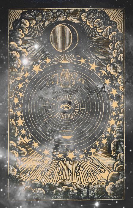
In the design of the logo, I referenced old vintage style tarot cards and eye logo designs – to convey the idea of being asleep/awake.
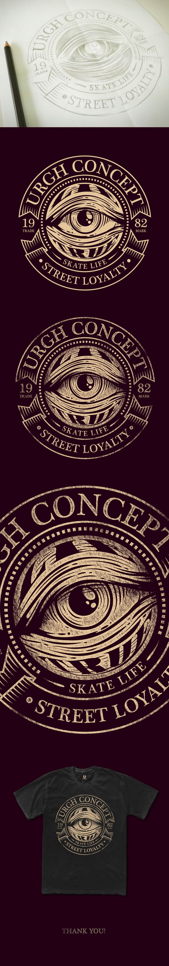
(From http://www.behance.net/gallery/Street-Loyalty-Artwork-Urgh/12407525)
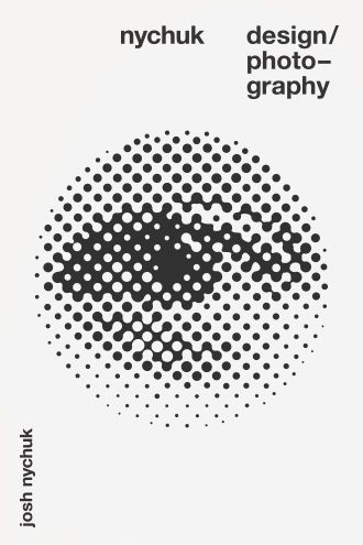
(From http://www.nychukdesign.com/)
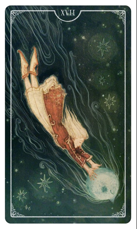
(From http://ostaratarot.tumblr.com/)
(From http://moonandtrees.tumblr.com/post/100754074616)
I wanted a slightly vintage, oldy look to the logo design that was at the same time easily readable in its motifs.
Eventually, I came up with the final iteration:
![]() I also did 2 more iterations of the design to create the eye opening/closing effect.
I also did 2 more iterations of the design to create the eye opening/closing effect.
Eye closed
Eye half opened
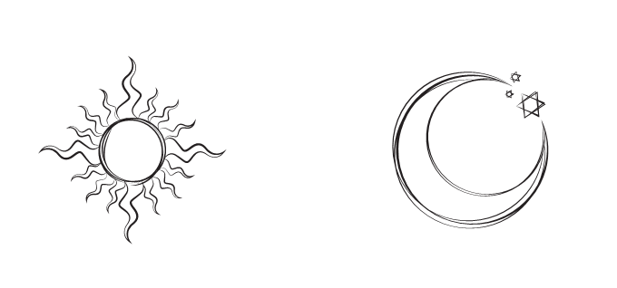
For the tarot style cover I was going for, I design a few motifs as well – mainly the sun/moon motifs to denote the shift between day and night:
Together, the tarot style composition looked like this:
![]()
You must be logged in to post a comment.