
QUE SERA SERA // IDEALISATION
First off, for my english name I will be using “ry” instead of “Ryan”, because it’s the nickname given to me by most of my friends.
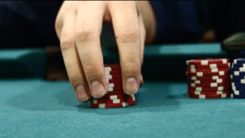
Initially, for this project, I wanted to do a gambling theme that was consistent throughout my 4 works.
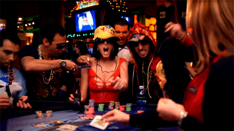
This was because I had a lot of avenues to insert my name and present it as typography. Examples include the face of playing cards, Mahjong tiles as well as poker chips.
I also initially wanted to compose my pieces through the use of photography, and then digitally alter them using photoshop afterwards. However, my camera was not functioning properly, thus I had to look towards using a different medium. Also, I felt that using such a similar theme through all 4 works created a lack of variation, and would seem to be boring.

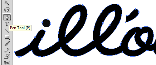
However, my camera was not functioning properly, thus I had to look towards using a different medium. Also, I felt that using such a similar theme through all 4 works created a lack of variation, and would seem to be boring. Hence, I decided on the use of illustrator (something that I’ve never done) and to branch out my overall theme. Due to the multiple failures, I decided to change the theme to ‘jobs that I’ll probably never achieve’. Yay?
Jobs chosen:
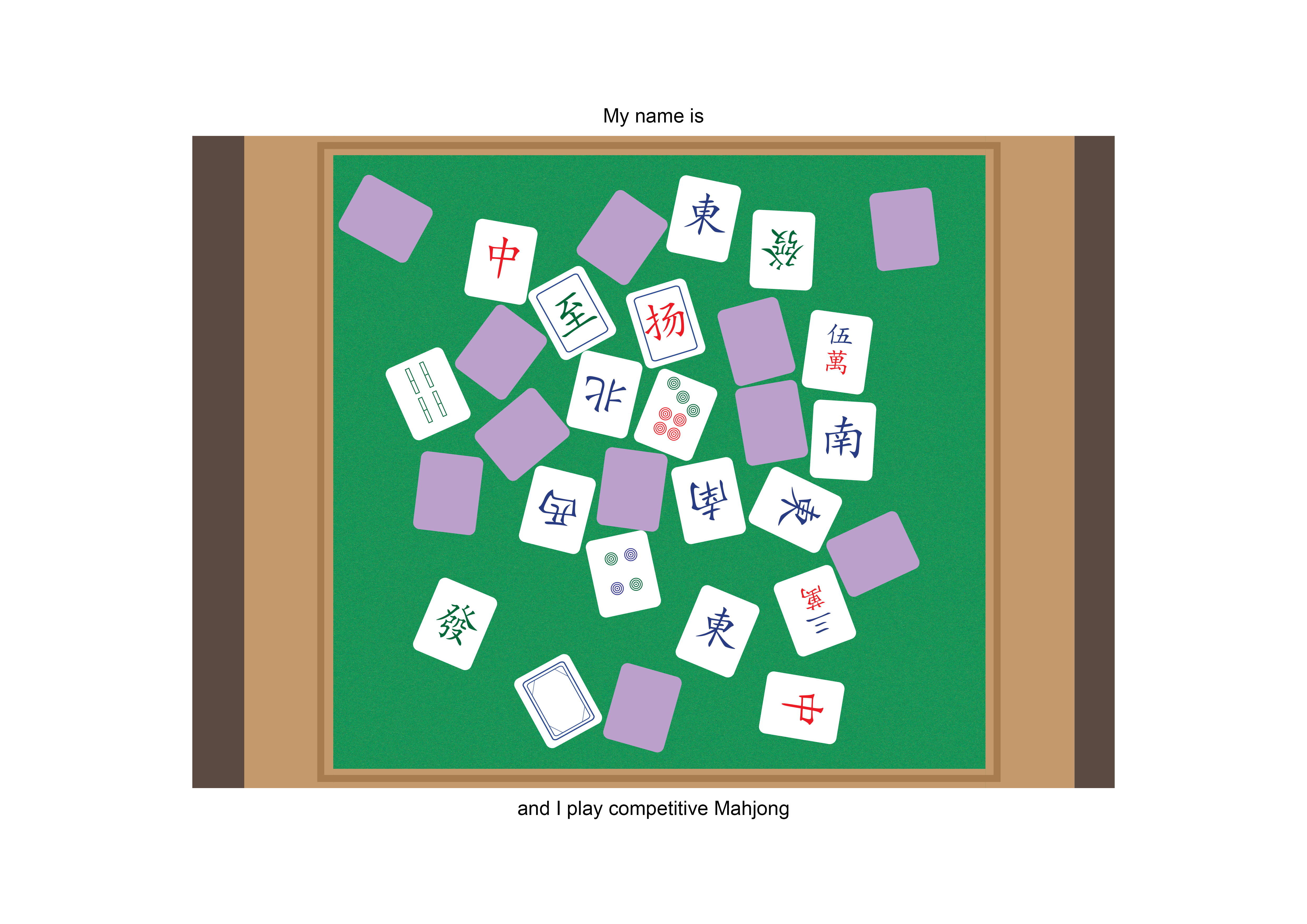
- Competitive Mahjong player
 Tiles.
 - Beer taster
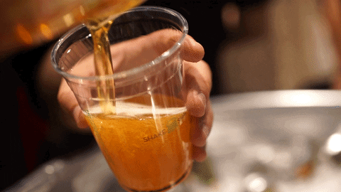 Bubbles? Condensation? Foam?
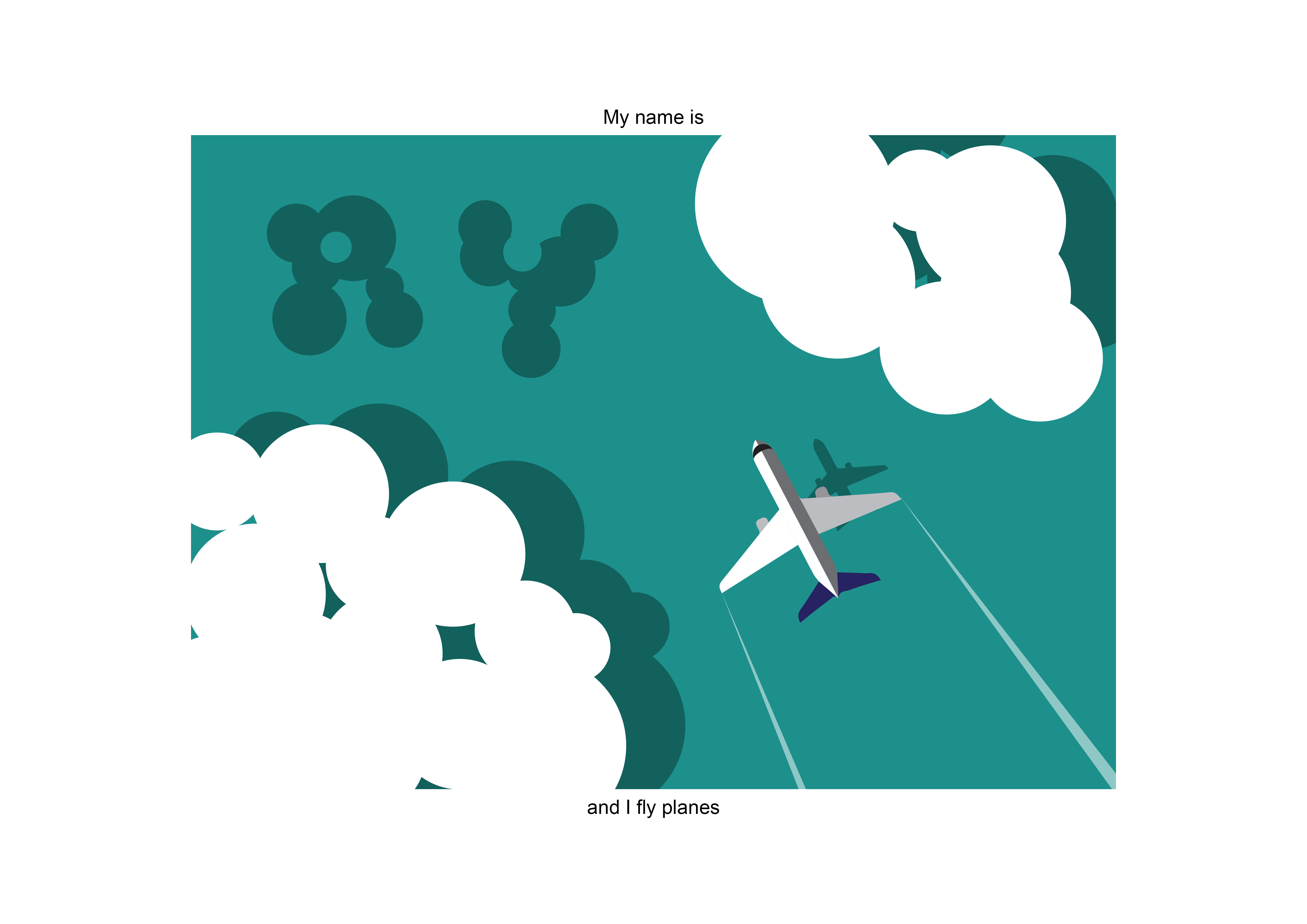
 - Pilot
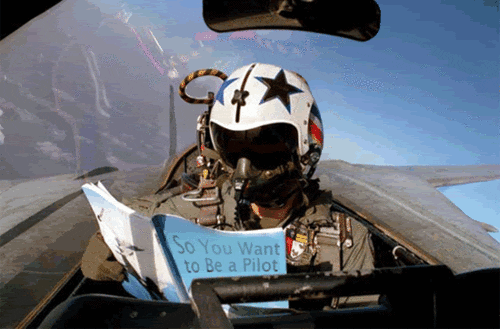 Plane? Clouds? Shadows?
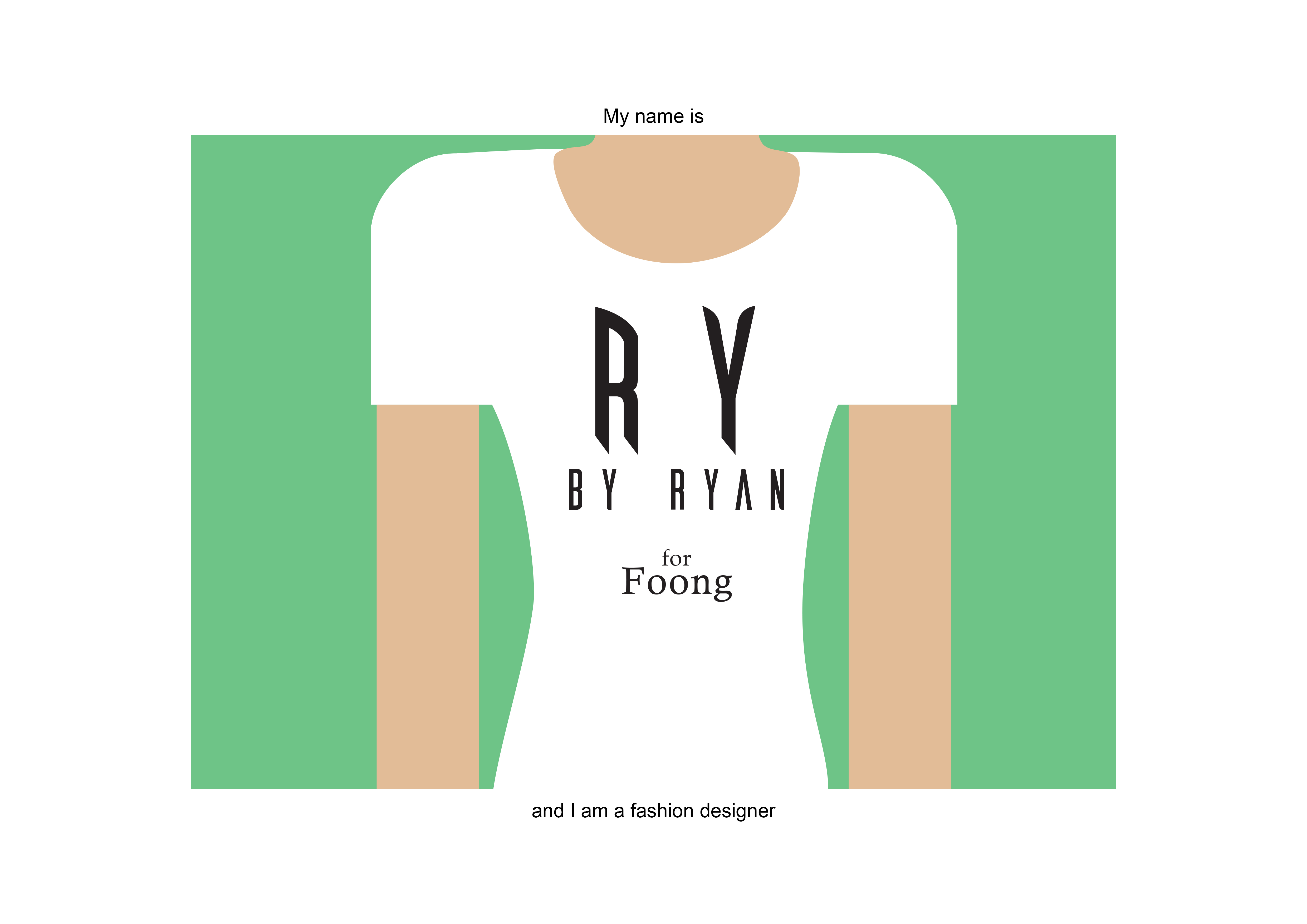
 - Fashion designer
 Measuring tapes? Prints? Cloth?
In doing my research, I learnt that a lot of clever typography that creates visuals that links the word to the actual object is called a calligram.
42 Clever Calligrams That Visualize The Meanings Of Various Words
On top of that, I decided to find more reference pieces that I want my works to look like, and hopefully they would turn out the same!

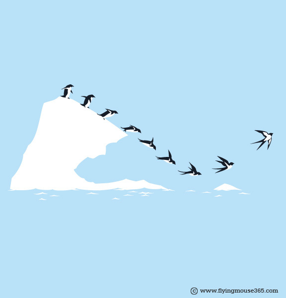

I liked how these works were minimal enough not to complicate the picture, yet it was complex enough to carry what it needed to say forward.
QUE SERA SERA // PROCESS
So I had several iterations of works, due to the process of trial and error on illustrator.
Work 1:
`
Work 2:
Work 3: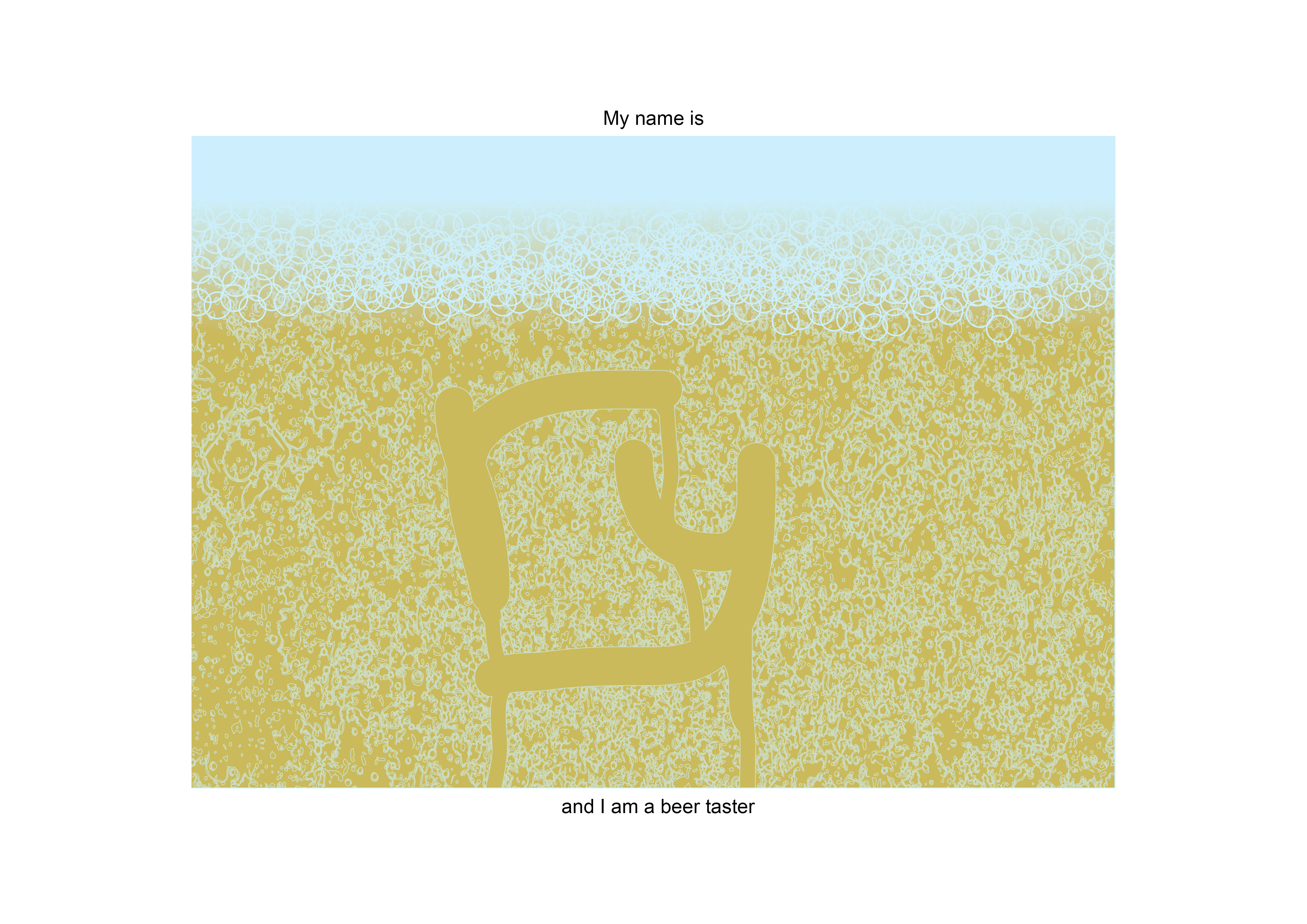
work 4:
QUE SERA SERA // CHALLENGES
Mainly, this whole project was quite challenging to me, because I don’t use illustrator, and it was quite tough for me to learn the ropes and produce 4 compositions by the end of the project.
Also, another challenge that I faced was that I was afraid to play around and modify the typefaces enough, which made it seem like I was using stock typefaces.
On the bright side, I managed to learn many new things from my classmates, one of my favourites is ‘drop shadow’. Now my mahjong tiles won’t look as flat!
P.S. Always remember to publish under the correct class and categories.
You must be logged in to post a comment.