2D II Update and Research (Part 1): Zines

zine

/zēn/

noun

informal
1. a magazine, especially a fanzine
i.e. a webzine.

So for our latest project for 2D, we were required to design a “zine” for a place that we have been allocated.

These places can be any major towns and districts in Singapore. Examples include Jurong, Paya Lebar, Pasir Ris, Marine Parade and Hougang. Karma struck me when I was teasing a friend to get Punggol, because of its really far location, and I got it instead. At first, I was a little disgruntled because of its relative location to where I stay. However, it took me long enough to realise I had an advantage because of the number of times I have visited the town. This was because my grandmother stayed there and I always visited on the weekend.

So I paid a visit to Punggol on one of the days where I had no class. Here are some of the photos that I took.


I really wanted to encapsulate the very peaceful and serene feeling I get when I visit this place. 

Zen GIF - Find & Share on GIPHY

Developing on my theme, because of how personal this place was to me, I wanted to show that by creating my zine in such a manner that it seems very personal to me.  I thought about it for awhile, and what better way to express my inner thoughts than through a diary entry? It can become a portal into my inner thoughts and feelings for my viewers; to see things that I see and feel what I feel.

Then, what would I write about? I wanted to speak about my grandmother, who was staying in Punggol. Unfortunately, she passed away on the first week of school. I wanted to dedicate this piece of work to her, and my memory of her. Hence, I wanted to recreate that sense of nostalgia that I felt whenever I think of her. I decided on designing it to seem old school, with a whole jotter book layout, just to make the viewer feel like they are travelling back though time.

With that, my designing began.

(End of part 1)

2D II Project 1 – QUE SERA SERA

QUE SERA SERA // IDEALISATION

First off, for my english name I will be using “ry” instead of “Ryan”, because it’s the nickname given to me by most of my friends.

Initially, for this project, I wanted to do a gambling theme that was consistent throughout my 4 works. 

This was because I had a lot of avenues to insert my name and present it as typography. Examples include the face of playing cards, Mahjong tiles as well as poker chips.

I also initially wanted to compose my pieces through the use of photography, and then digitally alter them using photoshop afterwards. However, my camera was not functioning properly, thus I had to look towards using a different medium. Also, I felt that using such a similar theme through all 4 works created a lack of variation, and would seem to be boring.

However, my camera was not functioning properly, thus I had to look towards using a different medium. Also, I felt that using such a similar theme through all 4 works created a lack of variation, and would seem to be boring. Hence, I decided on the use of illustrator (something that I’ve never done) and to branch out my overall theme. Due to the multiple failures, I decided to change the theme to ‘jobs that I’ll probably never achieve’. Yay?


Jobs chosen:

  1. Competitive Mahjong playerTiles.
  2. Beer tasterBubbles? Condensation? Foam?
  3. Pilot Plane? Clouds? Shadows?
  4. Fashion designerMeasuring tapes? Prints? Cloth?


In doing my research, I learnt that a lot of clever typography that creates visuals that links the word to the actual object is called a calligram.

42 Clever Calligrams That Visualize The Meanings Of Various Words

On top of that, I decided to find more reference pieces that I want my works to look like, and hopefully they would turn out the same!


I liked how these works were minimal enough not to complicate the picture, yet it was complex enough to carry what it needed to say forward.

QUE SERA SERA // PROCESS

So I had several iterations of works, due to the process of trial and error on illustrator.

Work 1:

`mahjong

Work 2:

pilot

Work 3:untitled-2


work 4:

fashion


QUE SERA SERA // CHALLENGES

Mainly, this whole project was quite challenging to me, because I don’t use illustrator, and it was quite tough for me to learn the ropes and produce 4 compositions by the end of the project.

Also, another challenge that I faced was that I was afraid to play around and modify the typefaces enough, which made it seem like I was using stock typefaces.

On the bright side, I managed to learn many new things from my classmates, one of my favourites is ‘drop shadow’. Now my mahjong tiles won’t look as flat!


P.S. Always remember to publish under the correct class and categories.

4D II Project 1 – Alter Ego


Storyline:

When I am alone, dancing, I feel like I can become those whom I admire when I practice. Their great qualities and abilities both amaze me and drive me. I can see myself in their likeness, in their footsteps. Sometimes it is as though I am them. With each time I practice, I feel as though I am growing, and will one day be able to surpass those I have revered.

I hope you will go through this journey with me, narrating my feelings from what I feel when I am practicing, and what you don’t usually get to see behind the scenes of a good performance.


Concept Development:

Because my theme is dance, I decided to stylise the entire video to be similar to a dance concept video. The transitions and the visual effects are all added in a bid to make it more similar to one.


Research:

In lieu of the upcoming project, I was nervous as I was worried I did not have the technical skill of pulling off the idea I had in my head at the time. Hence, I spent a lot of nights watching simple youtube videos to understand cinematography and the post production process.


Artist Reference:

Mannequin challenge by Kinjaz

Take Heart by Trevmonki

Koto by Strawhatz


Challenges:

One of the many challenges I had to face was the inconsistency of the shoot days. Due to the conflicting schedules of the cast members, it was difficult to keep the scene consistent throughout the entire video. Another problem I had was that because I used two different cameras, it was hard to do the colour correction to the best degree possible.


Storyboard:

Unfortunately, I am unable to do up a storyboard because of the nature of my video, especially so with the number of visuals that have been edited in.


Tasks:

Task 1: 5 figures of literature or fiction

  1. Harry Potter(Harry Potter trilogy): Bravery and courage
  2. Katniss Everdeen (Hunger Games trilogy): Wit and tact
  3. Pip (Great Expectations): Innocence
  4. Jane Eyre (Jane Eyre): Independent and strong conscience
  5. Henry DeTamble (The Time-Traveller’s Wife): Confident and sincere

Task 2: 5 public figures

  1. The Weeknd
  2. Ryan and Silvia
  3. Barack Obama
  4. Brian Puspos
  5. Christopher Martin

Task 3: 5 people I know/known

  1. My Mother
  2. My Sister
  3. My Grandmother
  4. My Roommate
  5. My Friends

Task 4: Top 2 of each list

  1. Harry because he knows exactly what needs to be done and he gets it done
  2. Katniss because she is not only smart but knows when to be smart
  3. Ryan and Silvia because I idolise them as my role models
  4. Christopher Martin because he creates art with his body
  5. My grandmother because she is one of the bravest people I’ve ever met
  6. My friends because of their talent and hard work that let them achieve such a great level of skill of dance


Here’s the link to the final video!

2D Project 3: Ego Final

With this, we have come to the end of my third project for 2D. For the project, we were supposed to come up with a total of 12 pictures. They are sorted into 4 rows, with each row having three pictures representing ourselves, a scenario or situation, and then the outcome when we put these two things together. In a way, it is supposed to show who we are as individuals, placed in scenarios and how we would “react” to it. For this project, I wanted to show the simple things in life that I feel I cannot live without. They are my “addictions”. Thus, from my first post, I have decided to represent them in the way like they are drugs. I feel like when you take any one of these elements away from me, I am lost, I feel a withdrawal. Without further ado, let’s get into it.

img_5913

img_5912

For my first row, I wanted to show how sleep is very important to me. Ever since stepping into university, I have been suffering from a lack of sleep in a bid to finish my assignments and do them well. As such, I often sleep late, or even not sleep at all, falling sick and missing lessons. It was a sacrifice that I never imagined myself making, hence suffering because of the lack of it.r6dk8

Here we have my three compositions from this line.

img_5908 sleep1 sleep2

sleep3

Here, in the first picture you can see me feeling the brunt of my nightly sacrifices in my facial expression. The one below is the same, just the digital file before I layered the transparency. This picture is supposed to represent my exhaustion from the semester. The paint symbolises me being pulled away, like half of me is gone. It shows how I’m only half the person I am at any given point of time, half my attention, half my being.

I then show the temptations of the bed in the second picture, showing how enticing the bed is when it’s late in the night, but I’m still completing my assignments.

The third is me when I can finally sleep, trying to readjust my sleep cycle. When I do, I take hormonal pills to coerce my body to fall asleep at regular timings. Hence, here I show how I “forcefully” inject sleep inducing drugs into myself, showing how addictive I find sleep. (No, I did not really inject myself for the picture, though I pricked myself several times. Yes, that is an actual drug in the syringe. It’s a liquid panadol.) For the third picture, because I didn’t really talk about it in my previous posts, I wanted to recreate the drug-induced high / psychedelic effect, hence I layered several pictures together and played around with the colours, staying true to my theme of layers. I believe that there are many complexities to people and layers beneath the surface, who is to say we cannot embrace them and present them in art?tumblr_this-is-the-thyme

tumblr_lbatl

For my next line, I did it on coffee. As I am very reliant on coffee to get me through the sleepless nights, I wanted to show just how addicted to caffeine I really am.

img_5909

coffee1 coffee2 coffee3

In my first and second picture, I show a composed face, which is what I feel when I do my work. I focus on getting the work done, as efficiently as possible. Here, I don’t use paint in the layering because I wanted to keep the doodle as pure as possible, without ruining the effect. The geometric design over my face is supposed to show how I strive for perfection. I am structured. I am constructed. I am constructed to do so.

The second is the scenario, I am working hard late into the night and sleepiness begins to set in. I am feeling the tiredness and I am slowly overwhealmed by it.

In a bid to fight it off, I take coffee. I take lots of it. Sometimes I feel it’s not enough I need to snort it.

giphy-1

Ok, I am only joking. I just drink my coffee. (But in all seriousness DO NOT accidentally snort coffee. It hurts and you will hate the smell of it for awhile.) In the picture I show the “buzz” from the caffeine from “consuming” it. However, I did not take that into overdrive, but I instead mellowed it down a little as well in the “lighter” more muted colours. This is to show how you have a caffeine crash after.

giphy-2 tumblr_nsfxu9mwwn1riv7swo1_500

In my next line, I show how often at times, I feel bored, I feel depressed. Sometimes, I feel both. This sense of ennui plagues me often, hence I look towards my friends to always bring a smile upon my face.

tenor

Ok. Here we go.

img_5910 pills1 pills2 pills3

For my first and second photos, I wanted to show how I was extremely bored, yet with the underlying tone of feeling depressed and listless. Thus, in combination with my facial expression, I used dark, cool hues to show the feeling of sadness and boredom. It is almost as if it surrounds me, creeping in, ready so swallow me whole.

The next is the scenario. I’m out with friends, having fun and laughing. it doesn’t matter what we do, but it’s the company that matters. (This is a candid by the way. It was on the way to lunch in school and my friend happened to capture the moment. We were laughing so hard I can’t even remember why.)

The last shows me consuming my “happy pills” (my friends). I wanted to show how I am very dependent on them, like a druggie on his pills. This picture is a little more light hearted then the other “outcomes”, as you can see with me cropping the faces of my friends in, making me literally consuming them as my happy pills.

giphy

For my final line, I wanted to express how I am a shopaholic at heart. Actually, no, not even shopaholic. I just spend money like no one’s business. I guess I am willing to spend on things that will make me happy. Whoever said that money can’t buy happiness, clearly didn’t know where to shop.

img_5911

money1-1 money1-2 money2 money3

So, this time, for my first picture of the row, there are three layers (technically). First would be me smiling, but my hands are covering it up as a representation of my unhappiness with my appearance. The second would be the paint, with the strokes appearing as though it’s trying to cover it up, in anger and dissatisfaction. Lastly, my smiling face, only drawn on top of my hand covered, paint laced face. This picture is supposed to show how I am not happy with the way I look, thus giving me a reason to spend money. (If only this was the only reason, then my bank account wouldn’t look like the Great Depression.)

The next photo symbolises the lures of online shopping, and holding my own debit card. These are the banes of my bank account, as it makes it so much easy to spend and shop. It is a test and call to my will-power.

But alas, I succumb to the lure of it, for it is too great. This last photo shows how I spend money, for it burns fast like the ember on a lit cigarette. The $50 note on it represents how my money just burns away from me. The mirrored effect shows how I think I’m spending $50 but in reality I don’t even know I have spent 4 times as much.

giphy

With this, I conclude my 2D journey for this semester! I hope you have enjoyed yourself on my page, following me in my artistical (is this even a word) journey so far! I hope to see you next sem! Oh, and below will be a TL;DR (Too long; Didn’t read) for you lazy people out there.

giphy-1

TL;DR – In summary, each of my lines represent an “addiction” in my life. The first photo of each line is always a portrait of myself, represented in different manners via facial expression and layering of transparency, depending on what I’m feeling. The second is the scenario which I am put in. It is often the “lure” to me taking my ” drug. The final picture is my ” drug”, my addiction. I use photoshop to make it seem as though you are on a psychedelic trip from taking drugs to make you feel what I feel when I have my addictions.

2D Project 3: Ego – Conceptualising

So, after my consultation with Shirley last week, I realised that many of the things that I want to represent about me and put into my work are things that can be “addictive”. Thus I decided to come up with the idea to show just how addictive they are – by using a drugs as a metaphor.

For example, while discussing how I wanted to show I cannot live without coffee, and how to show my addiction to it, instead of consuming it the normal way, it would be implied that I would snort it instead. Thus, associating it to cocaine and my addiction for it.

I also have decided to use photography and paint in combination to use mixed media for my final piece!

A further update will be added to this space soon!

2D Project 2: Forrest Gump

combined

Hi! For the past few weeks, we have been working on our 2D second project, Forrest Gump. Basically, we had to create a visual composition for movie quotes that we got to choose on our own! It was a very fun experience for me personally, and I got to pick up many skills such as photoshop and silkscreen printing.

1. Harry Potter and the Deathly Hallows: Part 2, 2011

composition-1

giphy-2

The context of the quote was about a man who revealed that he still loved his childhood crush, even many years after she died, a very classic quote for all Harry Potter fans. I wanted to capture the elements behind the meaning and the scene of the movie.

tumblr_ncqiu3qhil1qetk8mo3_500

giphy

Here we can see the inspiration for my back drop, I wanted to recreate the feeling of using a pensieve just like in the movie! When I’m doing this quote it really feels like I’m magically recalling a memory, as I watched this movie almost 5 years ago when it was shown in cinemas.

For the stag, it was the patronus that we got to see in the movie, the one that acted as a guardian to Harry, hence the “deer” from the heart of the Snape silhouette to Harry himself. The tears we see on Snape’s face are the ones that gave Harry the memories that he used in the pensieve, which showed how Snape came to confess “always”.635761617134511479-545289749_snapepatronus

giphy-1

And finally, at the bottom of the composition we see the silhouette of the very iconic Hogwarts castle. For this composition, not much thinking was required. Just like how the pensieve was used to recreate such a beautiful quote and moment in the movie, I wanted to use this composition to recreate a beautiful memory I had from an amazing movie.

Principle of design: BALANCE

With this composition, I bore in mind that it was difficult to keep balance in the composition when I had a lot going on at the bottom of the picture while the top remained fairly empty. Thus I let the “ink drops” be a little more detailed playing around with the threshold. For the bottom half, I kept the images simple, that way it would be easier for the eyes of the viewer, both the top and bottom.

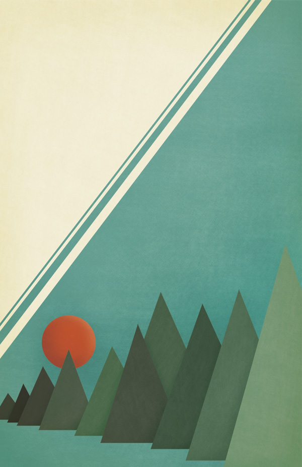
2. Spirited Away, 2001

composition-3

tumblr_n7zwnlukfp1rll7syo1_500

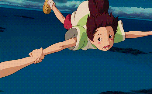
For this quote, I wanted to capture the very essence of the quote, the moment when Haku and Chihiro solidified their friendship. While flying on Haku, Chihiro suddenly remembered that she fell into a river as a kid, and she had a recollection of what the name of the river was. In the context of the story, names play an important role and represent identity in the film. Thus, Haku transformed back into his human form, both he and Chihiro clutching on to each other as they fell. It was a significant moment in the film and I wanted to capture that.

06728cb747dc7c5c97932cb5de96c27a

For the composition, the silhouette of a boy and girl free falling is easily seen in the foreground, thus representing the two main protagonists, easily symbolising their friendship. The dragon that soars above them in front of the moon represents Haku before his transformation back, and the streak is what represents the transformation. In a way, this composition guides the eyes of the viewer downward from the top. The moon is similar to the half moon found in the skies during their decent. The starry texture was added to showcase the twilight sky, while the clouds serve as a reminder that they are falling from a great height. This image summarises the friendship between the two well, telling the significant part of their story in a single composition.

Principle of design: HIERARCHY

By using different elements of the story and layering them in a descending sequence, I am able to guide the viewers eyes either from the top of the composition downwards, creating a visual link to the story line chronologically, or from the bottom up, piquing their curiosity with the causation of the moment.

3. Inception, 2010

composition-4

For this quote, I wanted to break away from a more narrative / story-telling manner of the composition, to a more literal composition. In a manner of speaking, I used the elements in which I think I could symbolise the quote well, bringing a different perspective to the table.

tumblr_odi4vf89zb1sqoxfvo1_500

In the quote “You mustn’t be afraid to dream a little bigger, darling”, I wanted it to have a more inspirational feel to it, rather than the sarcastic remark it was used during the movie.

For this composition, I first started out by masking out the facial silhouette of a woman (hair untied symbolising freedom and capability) to bring out the “darling” aspect of the quote. I then proceeded to alter the back ground of inside the silhouette, giving it the texture of a galaxy to show that the universe is your limit – touching on the “a little bigger” part of the quote. I then added in elements which I thought felt as though you are breaking through, giving it an encouraging feel to it. The skyline and the birds show how one can reach for the skies and you can land amongst the stars.

fireworks-animated-gif-7

The fireworks show how we have sparks and bursts of ideas and thinking, how great dreams begin. The flower shows the beauty in our ability to set goals for ourselves, the beauty of our mind. Finally, the sparkle in the eyes when you know you want to achieve your big dreams. Thus, “You mustn’t be afraid to dream a little bigger, darling”.

 Principle of design: UNITY/HARMONY

For this composition, I didn’t want any particular element to dominate the whole of the canvas, but rather, work hand in hand to bring forth a meaning greater than the sum of its parts. Hence, the layout of this composition took longer than the other 3, with a lot of thought processes put through, and a grueling 1 and a half hours of non-stop rearranging on photoshop.

4. The Dark Knight, 2008

composition-2

tumblr_m8tsw1jg5j1qa9jn1o1_500 tumblr_m8tsw1jg5j1qa9jn1o2_r1_500

For this quote, it was my favourite one as I chose how I got to manipulate the image of 2 most famed comic book entities and tie them together, merging them into a single identity. The quote “You either die a hero, or live long enough to see yourself become the villain” was coined(hur hur pun intended) by one of Batman’s most famed nemesis – Harvey Two-Face.

giphy-3

Batman was always praised as to how he always manages to keep Gotham safe, but one has to consider the fact that he holds a lot of power when it comes to crime, or rather crime-busting in the city. What if one day the good bat turns bad? Thus I wanted to orchestrate the visual image of the bats himself slowly turning into the last person he could ever hope to become – the Joker.

giphy-7

For this composition, I wanted to create a half and half face showcasing the halfway point where by the “hero” is seeing himself turn into the “villain”. However, after trying out (and failing) with the vertical halves (vertical halves are so cliche anyway), I realised that the Batman and Joker’s distintive visual traits weren’t distributed evenly downwards, but rather, sideways. This meaning that the most iconic characteristic of the Batman and the Joker, are top-centric and bottom-centric respectively. Hence, I decided on halving the faces horizontally. For Batman, his top half is most iconic, as that is where is famed bat-mask sits on his face, masking his identity. For the Joker, it is his scarred smile with the iconic red lipstick (or crayon) on the bottom half of his face (obviously because his mouth is there). I found reference images of the two icons and began trimming on photoshop which the combined became my main focus. Although the story of “The Dark Knight” focuses on Batman and the Joker, I didn’t want to draw the attention away from Two-Face too much as he was the one who originated this quote. This is where the coins come in. In the movie it was his most symbolic “weapon”, flipping the coin when deciding if someone should die or not. Much like the whole duality nature he has going on, especially his face.

giphy-5

Because of this, I knew that  I had to create a very strong sense of symmetry within this composition, maintaining the theme of the quote throughout the whole visual. I then added the very grungy texture as the background, creating this impending feeling that’s foreshadowing something. Also, it creates the mood of what Gotham usually feels like – somber and depressive. Lastly, I added a “J” and a “B” just to throw off the symmetry by a little to create an interest within the composition, lest it becomes too aesthetically neutral.

giphy-4

However, it did not break away from the symmetrical duality theme too much as due to the positions of the letters in a playing card, it simply created a diagonal symmetrical line, rather than the one down the middle of the composition. These letters recreate the image of a card, showing how Batman and the Joker are vying for the same card, the same body, the same entity simply resisting each other. This alludes to how they are in the comics itself as well. One cannot exist without the other. Without the hero, there is no villain, and without the villain, there will be no hero.

Principle of design: SYMMETRY

As if it was not obvious enough, the principle of design I decided to let my work focus on for this composition is symmetry. The whole theme of two sides and duality was very hard to miss and not focus on, thus I would not want to break away from that. By banking on that aspect, my composition essentially made itself.

giphy-6

Here are some photos that showcased my process while printing my selected composition onto the tote bag.

img_5014

img_5013 img_5012 img_4996 img_4995 img_4993 img_4992 img_4990

With that, I CONCLUDE MY 2D PROJECT 2. PROJECT 3 HERE WE GO.

BRING IT ON.

giphy-8