Following up on my previous post, this one will focus on how I have developed my zine with accordance to the theme of my grandmother and nostalgia, Mimi’s comments and my updated changes!
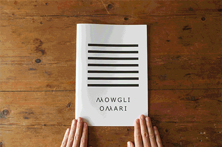
I went ahead with the said design of the jotter book. Thus, what came first in the design process was the cover pages. Noticeably, it is the most iconic part of the jotter book. This was what I came up with. Some of the detailing on the front cover I kept totally, like the blanks for you to fill out the details. Others, I changed to suit the idea of me creating my own zine and jotter book, adjusting things such as the dimensions written on the front cover to suit the A5 size of my zine.
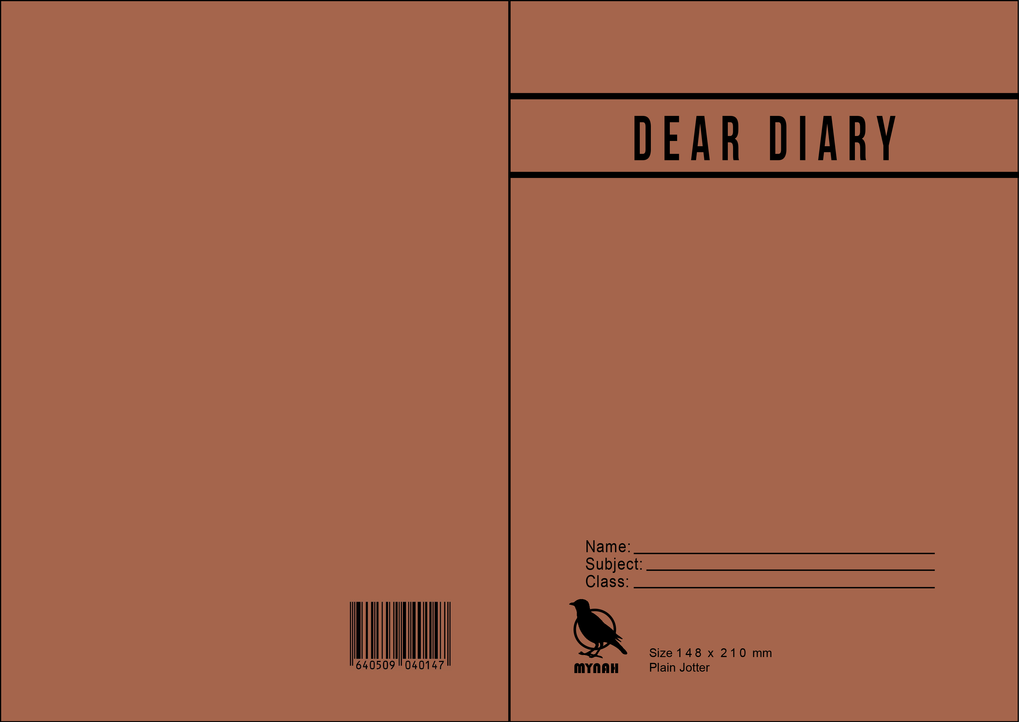
I added the subtle things like the barcode at the back, as well as the detailing of the size and the “Plain Jotter” description. The logo of the falcon has also been changed, to a Mynah because I wanted to choose a Singaporean bird. I also altered the JOTTER logo right at the top to be the title bar for my work, “Dear Diary”.
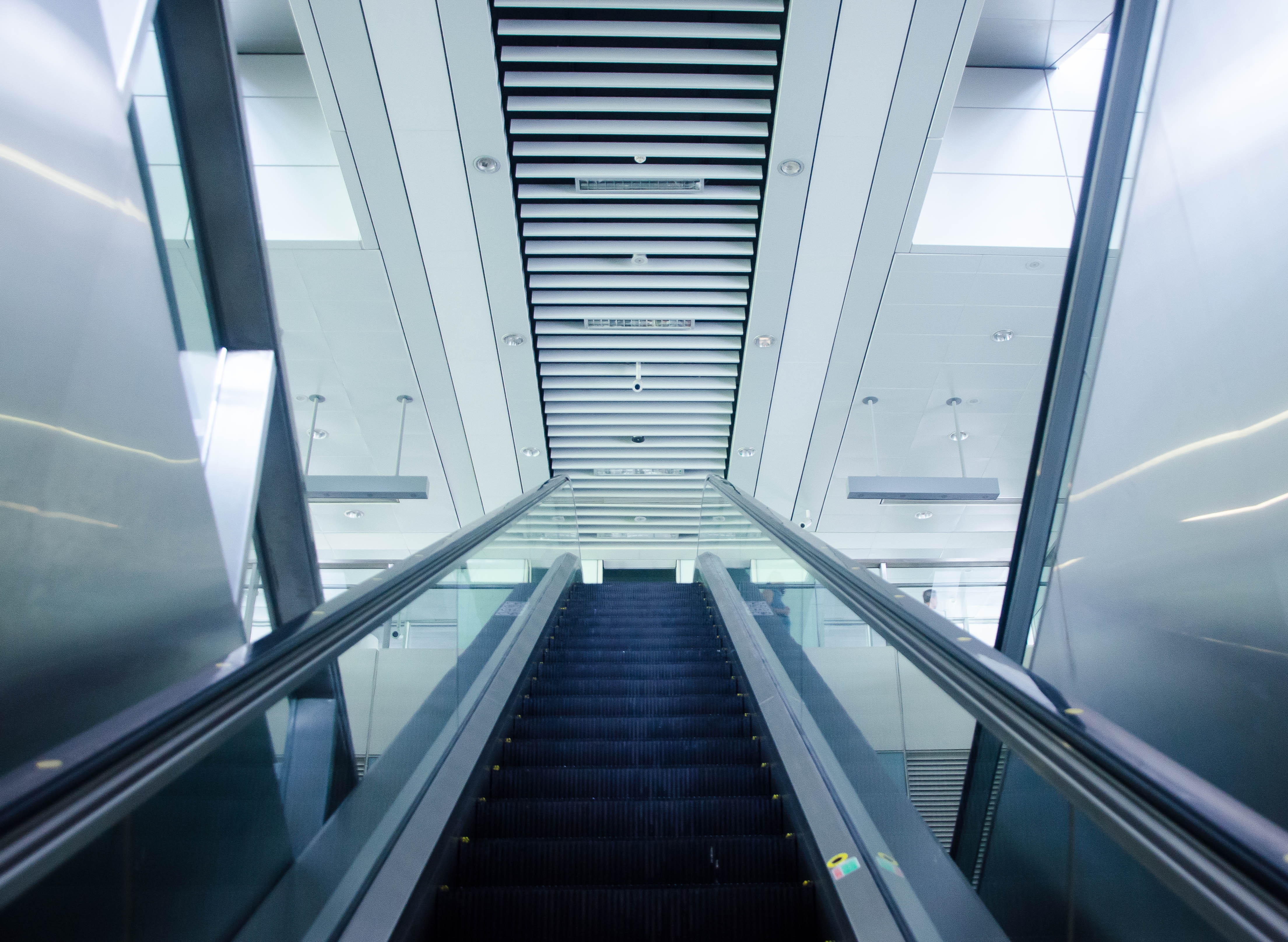
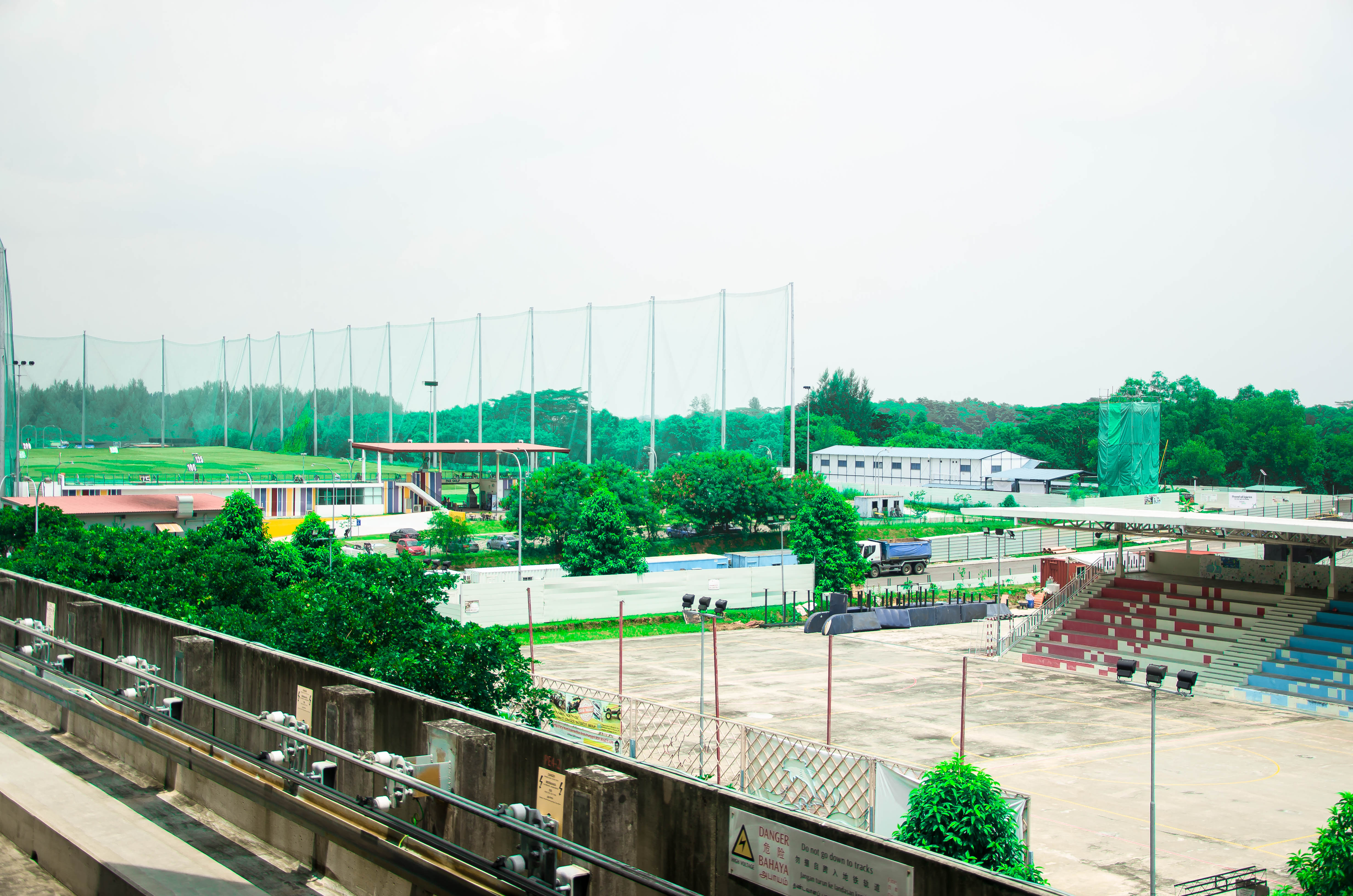
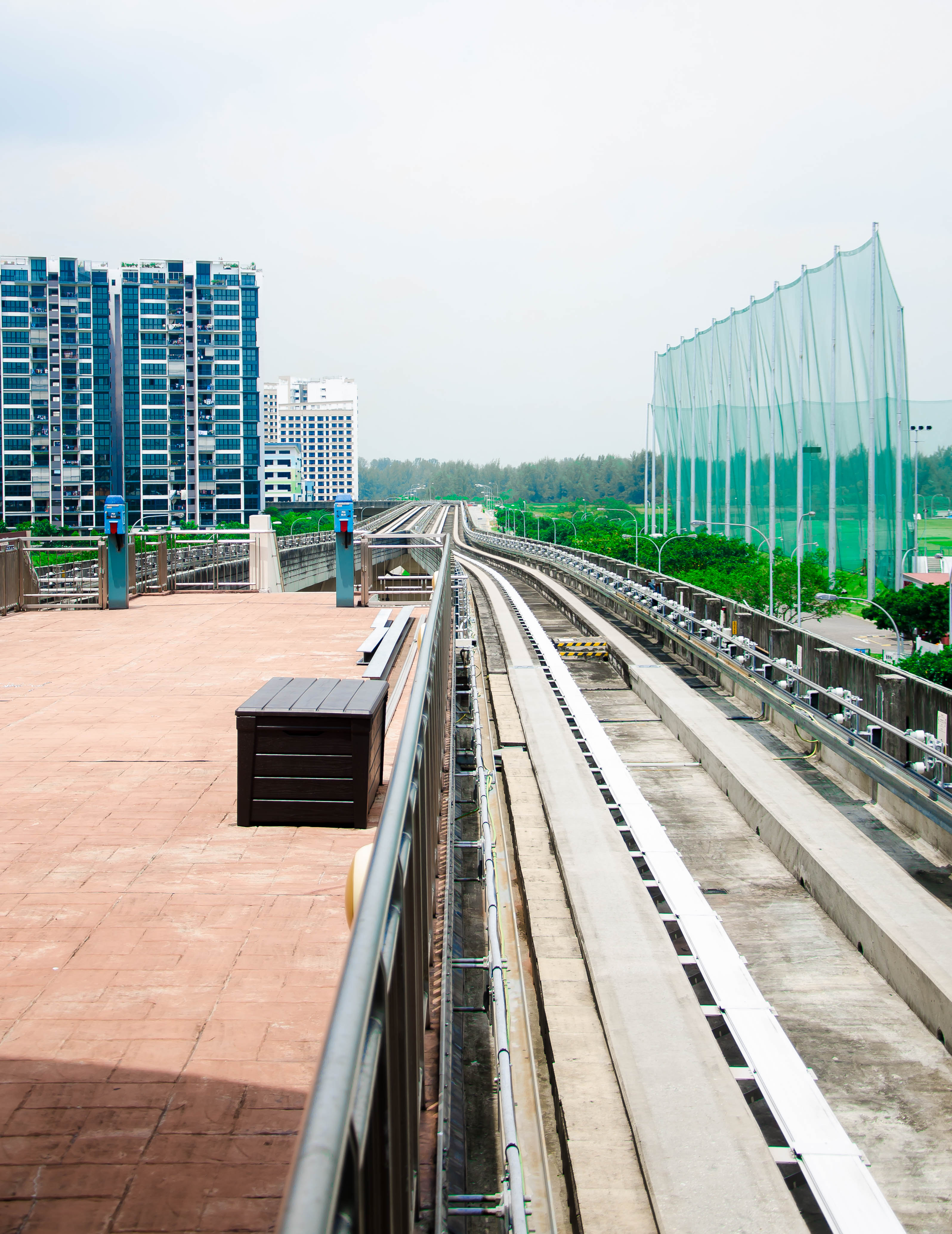
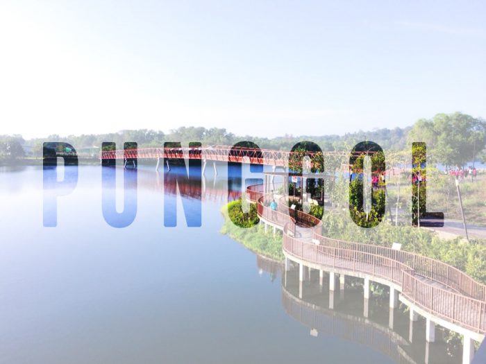
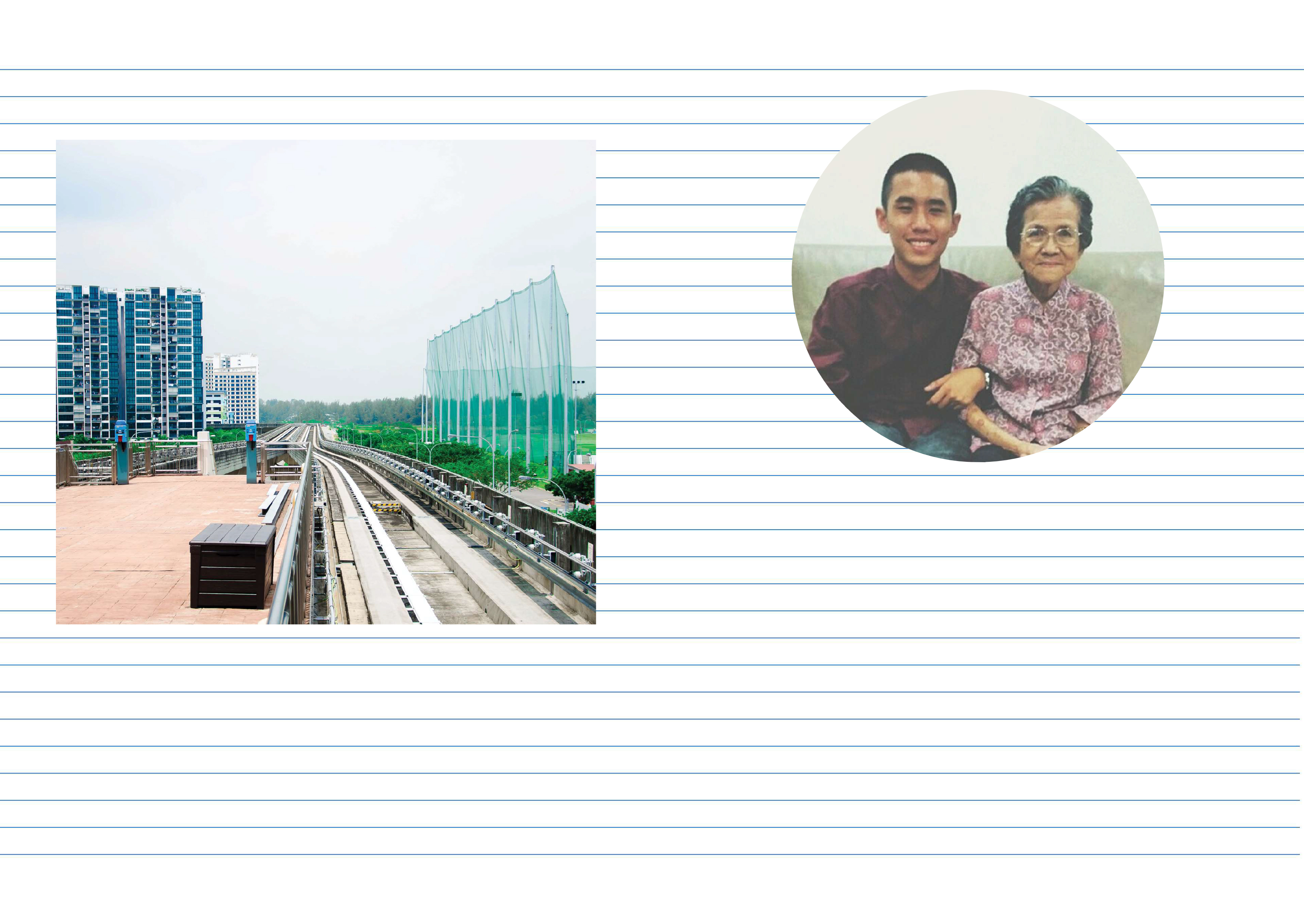
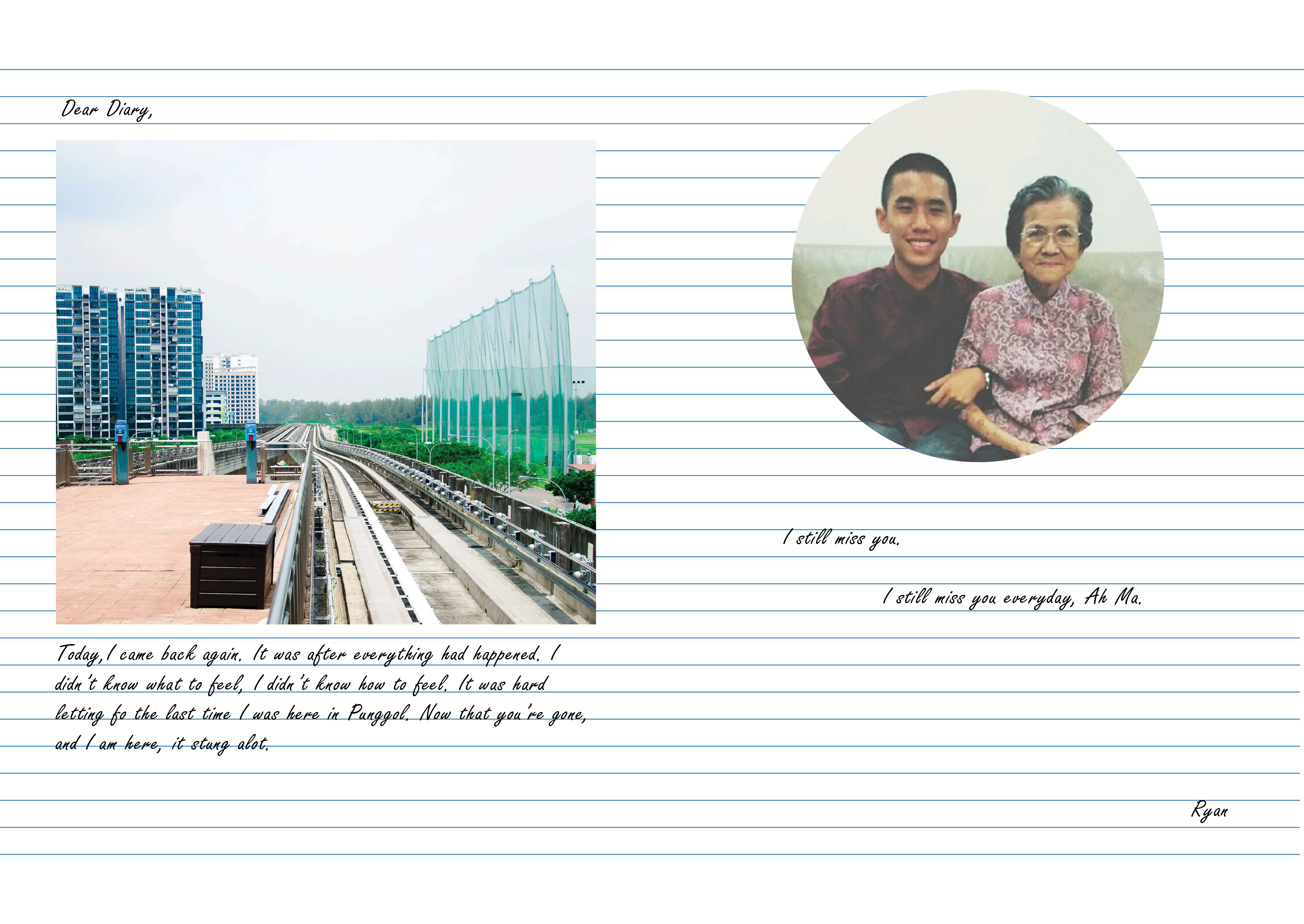
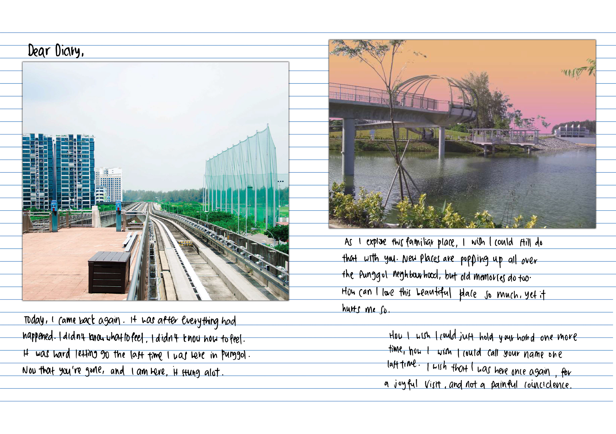
For page 2, I chose a picture of the LRT tracks because I wanted to show how I arrived in Punggol, also it was how I got to my grandmother’s house every Saturday, by taking the LRT after the MRT.
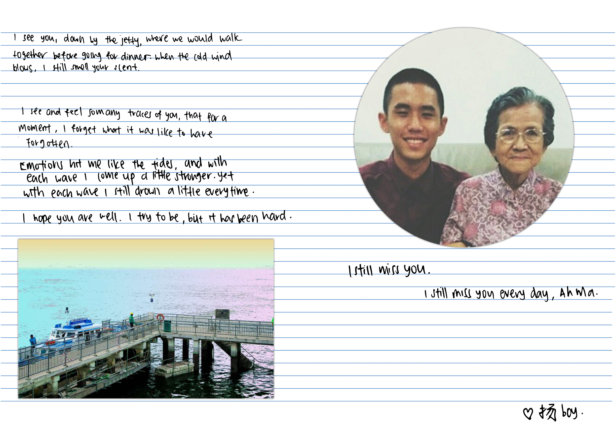
The facing page, page 7 was the final page before my back cover page. Up till that point, I did not mention who I was talking about in a bid to keep the viewers in suspense of who I was talking about.
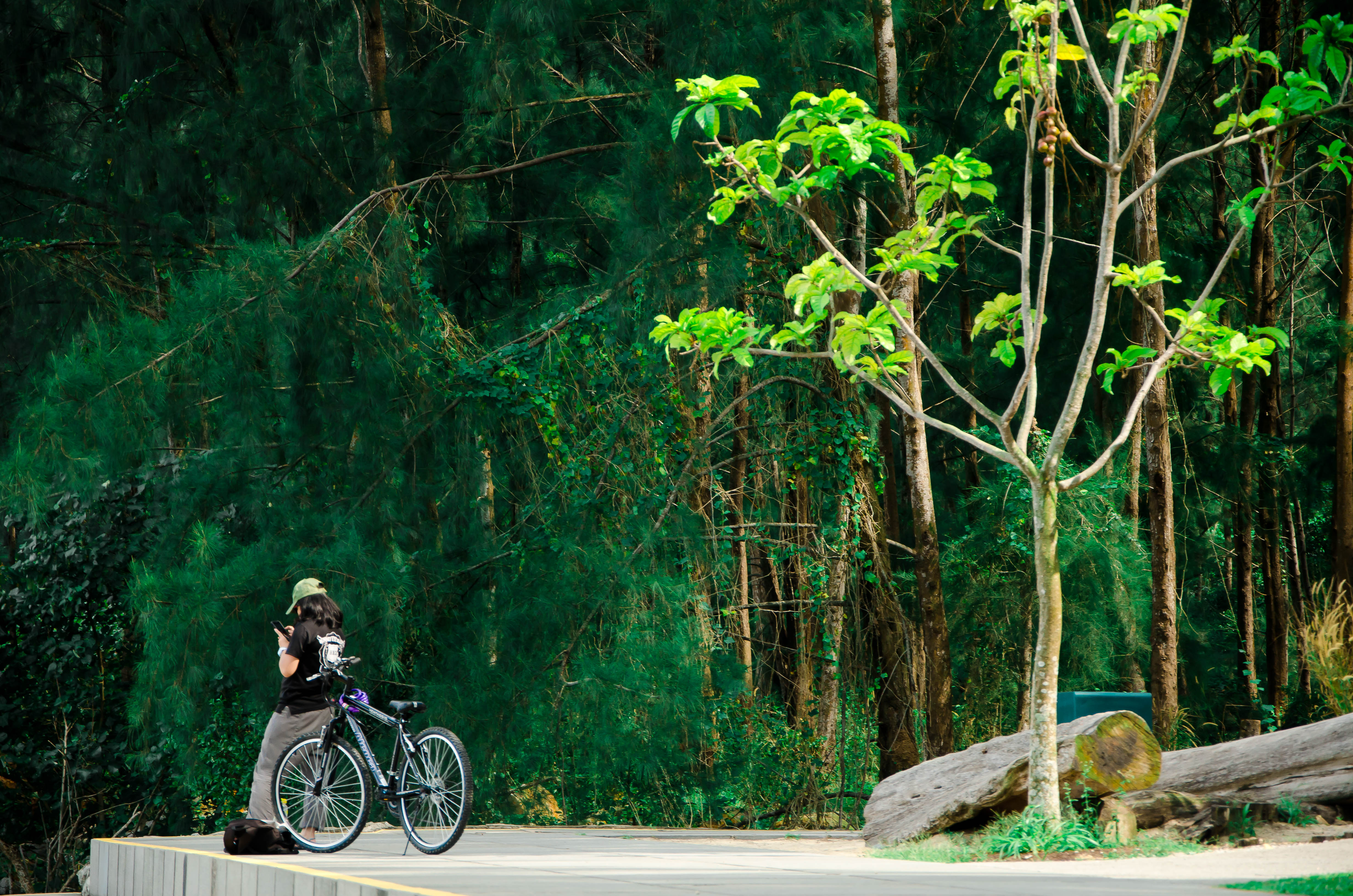
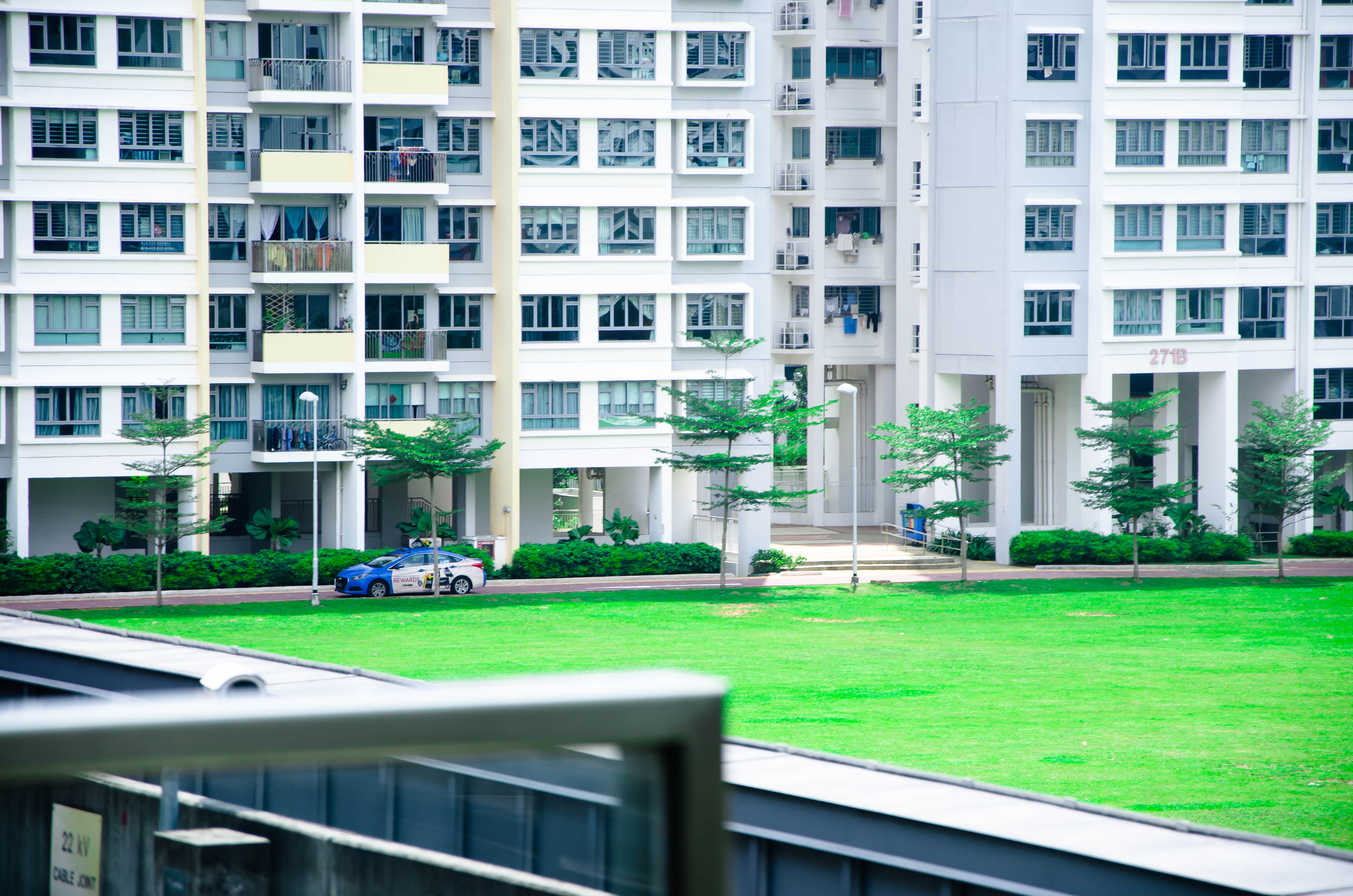
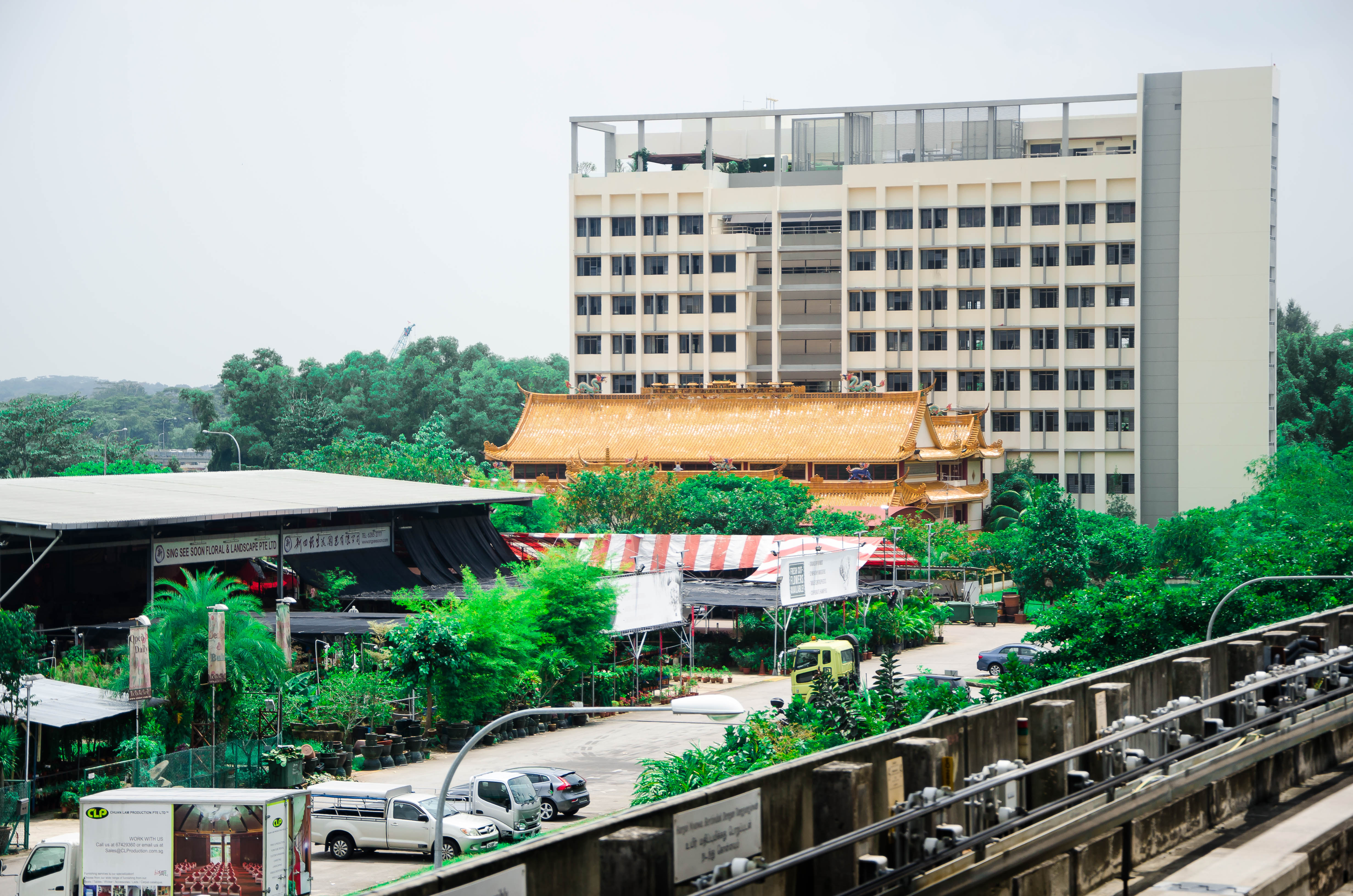
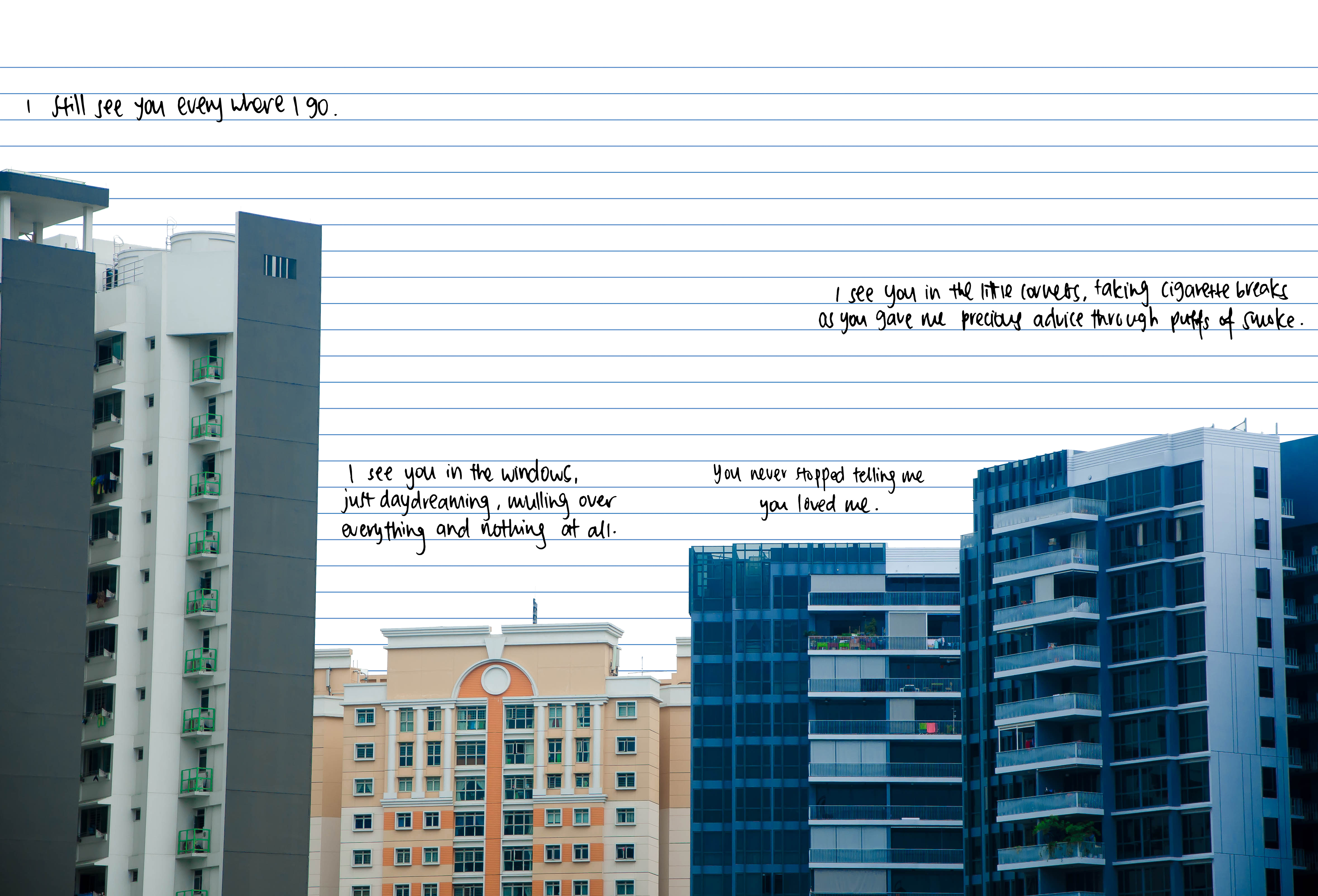
For page 3 onwards, I picked familiar sights to me in order to give the viewers an insight into my mind, of what I saw. I then used the text and narration to let them understand how I felt, and what I was feeling.
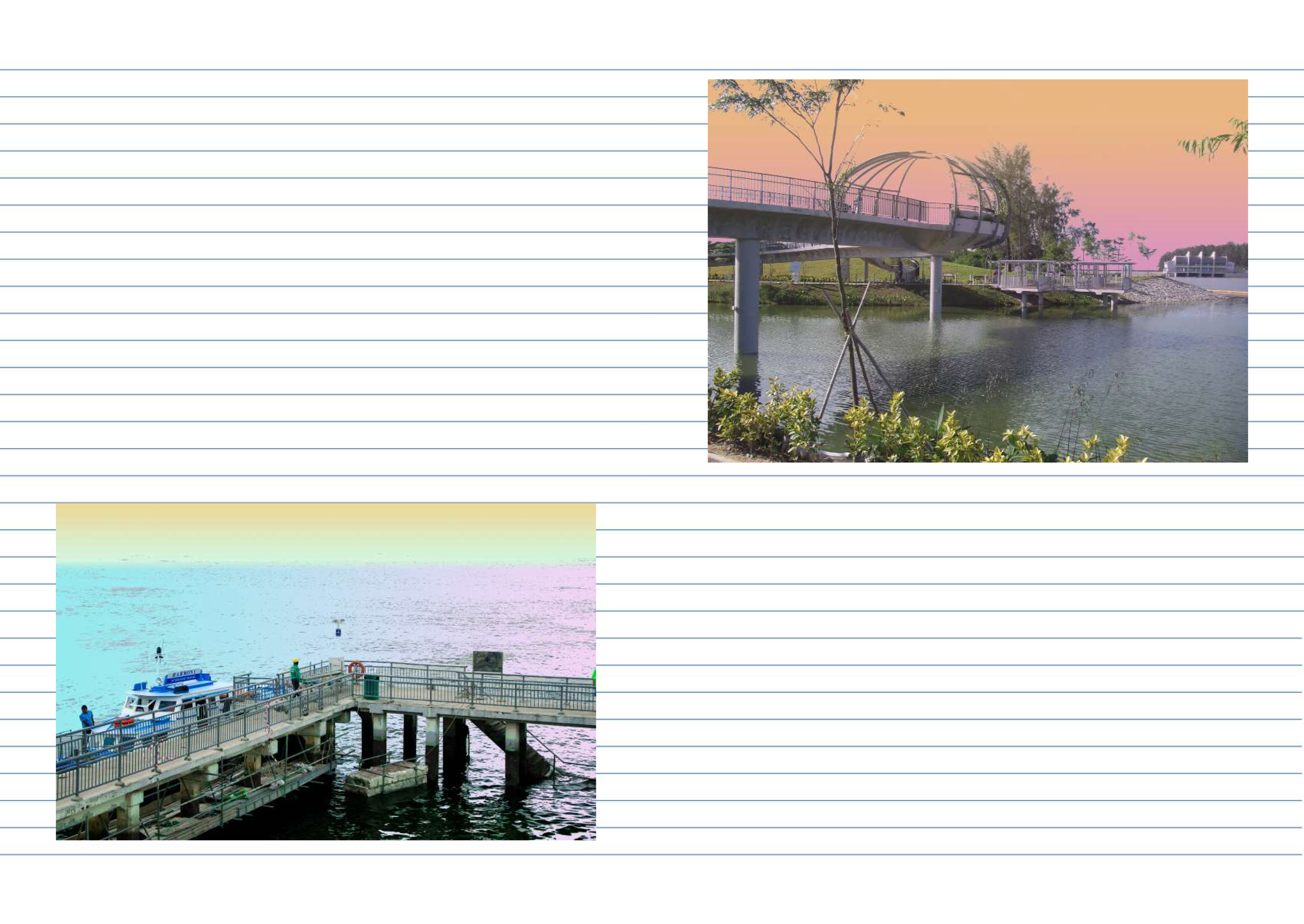
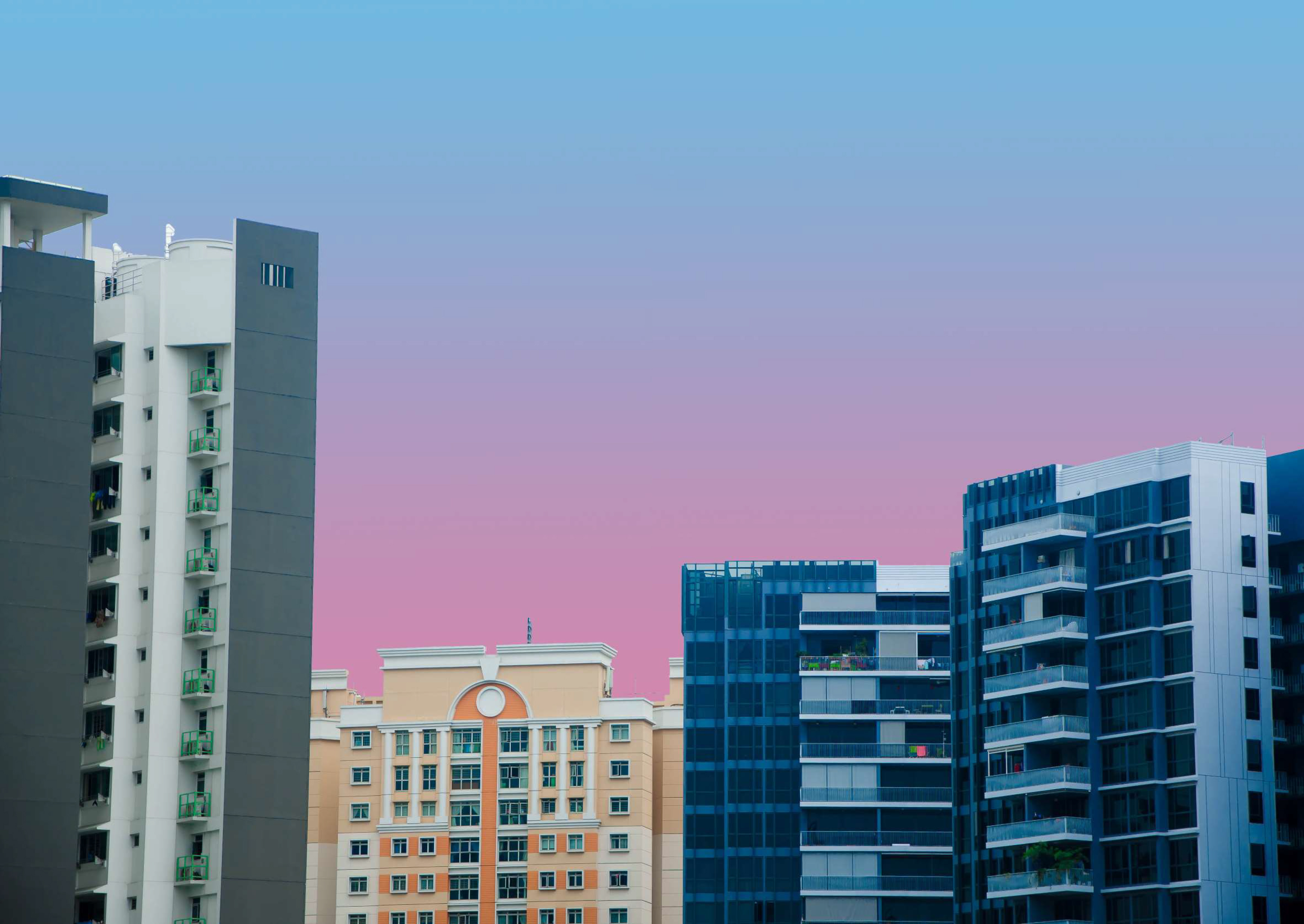
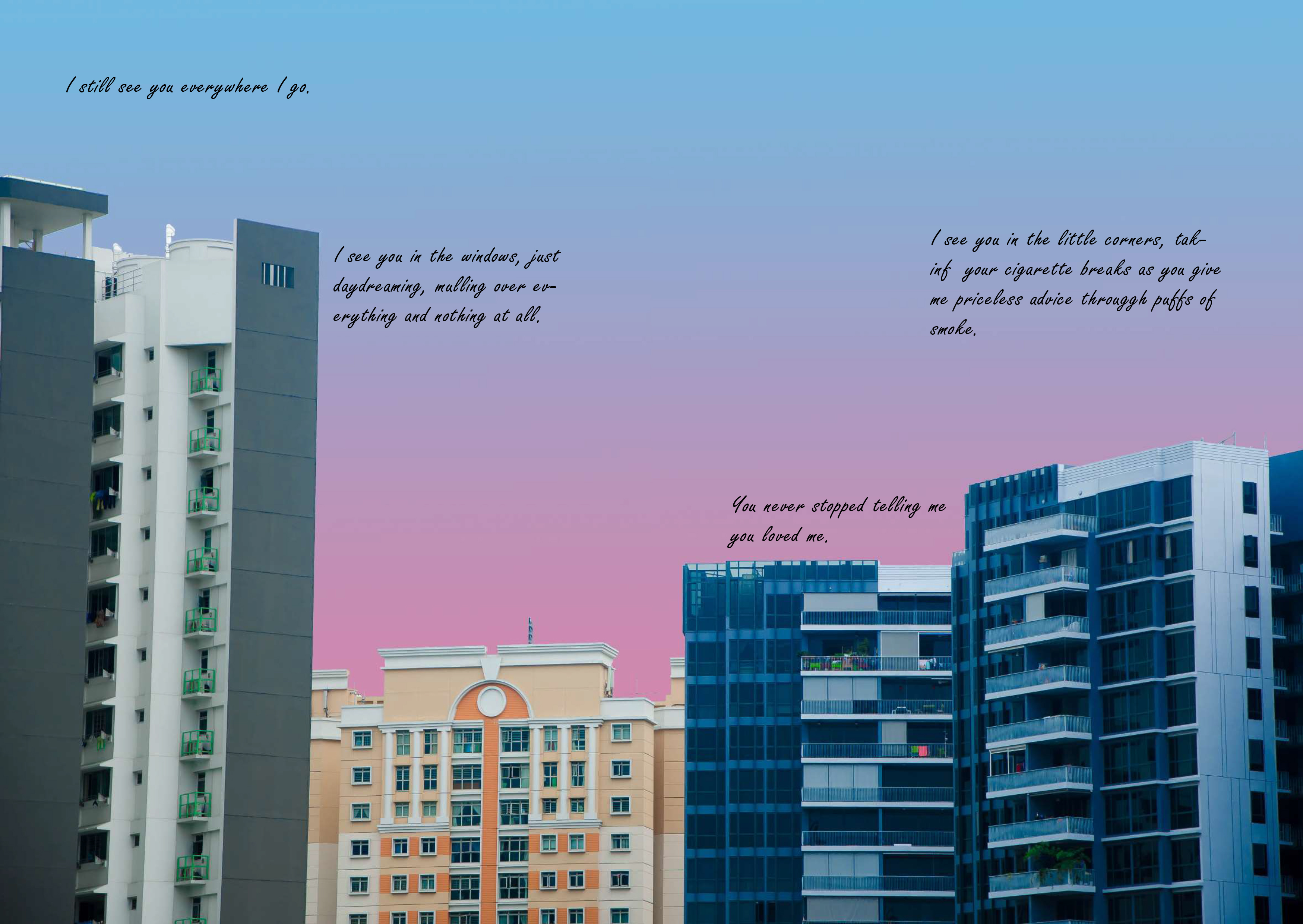
For pages 3/6 and 4/5, parts of the image were altered to have a different colour palette. It was mainly large blocks of the area like the sky or the sea. This was because I wanted a very ethereal effect to it as if the whole time it was like a daydream. Also, the colours chosen were quite light, the reason being these images initially were supposed to be superimposed as the backdrop for each facing page, and the text was supposed to go onto the picture directly. However, I decided against it as I felt like photography isn’t supposed to be the key focus of the zine, and it is also not my strong point either. Despite changing the layout, I decided to keep the altered photos anyway.
After which, I had to explore the font and how I should arrange the text, so that it is able to convey the subtle emotions within my narration through the whole zine. I asked Mimi if I was able to write directly onto the zine, which I can’t. Because my own handwriting makes the whole theme tie together as very personal, I had to work my way around that and figure out how I was supposed to do so.

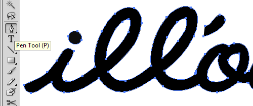
So I went on to ideas like creating a font with my own handwriting. I figured that I was able to do so through a website that gives you a template to write all the alphabets, which you then scan as a digital copy before uploading it onto the site, where it would convert your handwriting into a font! It was through myscriptfont.
This is an example of a template.

And this is an example of what it looks like after I filled out the blanks!

Because it was difficult for me to find a time to head to ADM to scan this template, I was not able to use my own font in time for the consultation with Mimi. Thus, I picked a script font that most similarly matched my handwriting, and play with the layout of all my texts.


For the consultation, Mimi seemed to like, or the very least was ok with the design because of the theme of it being a diary. However, 2 major opinions she felt needed to change was:
- The font (not only the script), but she felt it would be more personal if I managed to scan my own handwriting of the actual text before superimposing it on the image. Even creating my own font was not advised because the alphabets would be reused over and then that personal feeling might not be fully explored / conveyed.
- The images look very very flat (perfectly placed) on the pages, which is not something you would see in a real jotter journal. The photos should not feel like they are printed with the lines of the book, but rather it was intentionally placed there by me, like if I glued it on. She also suggested that if I really felt my visual elements are lacking, I could add details like scotch tape marks to make it seemed like I stuck on the pictures, and other decorative elements like bus ticket stubs or receipts to show when I was with her. However, she still reminded me that my text was the most important element for my zine and to focus on that mainly.
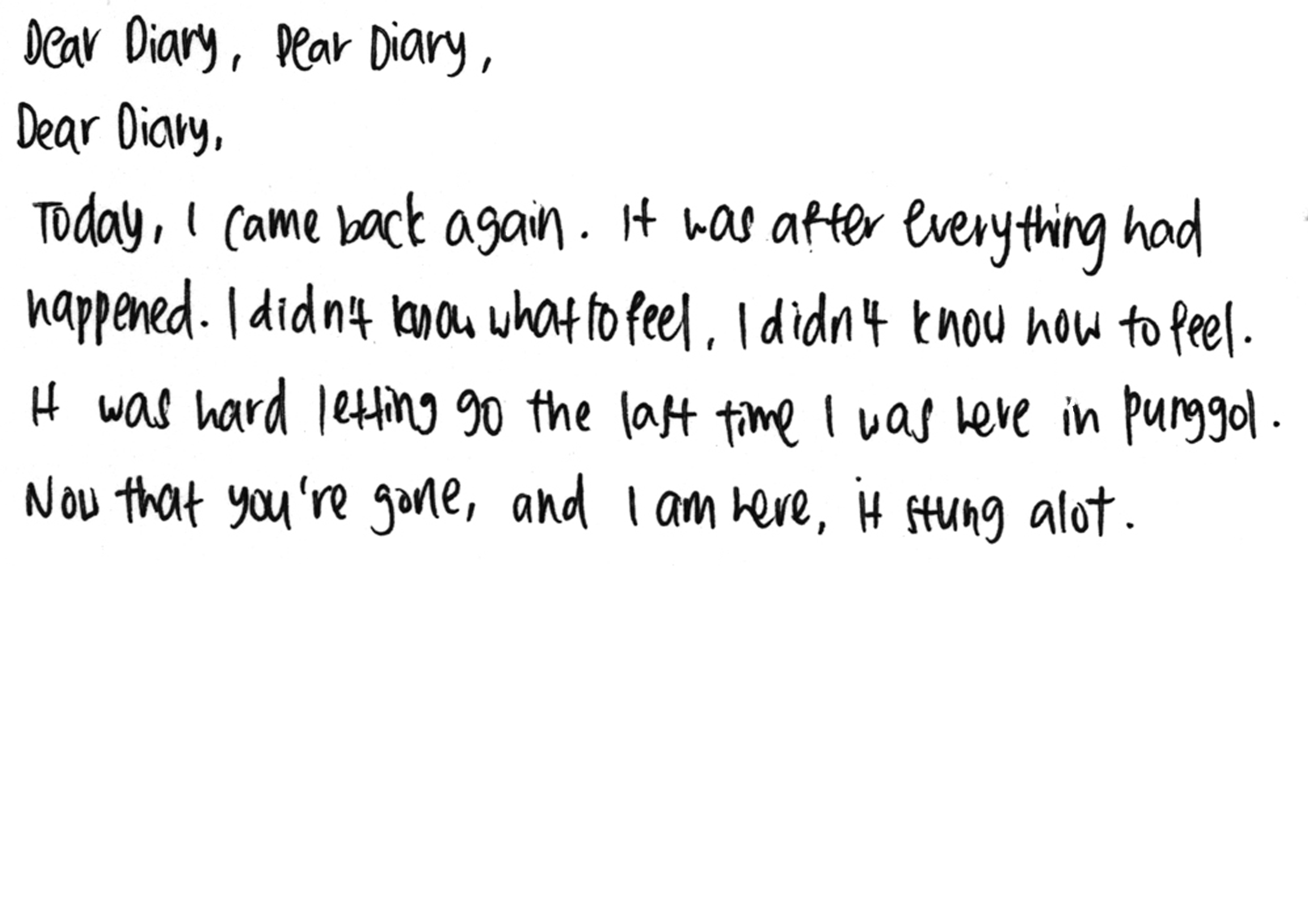
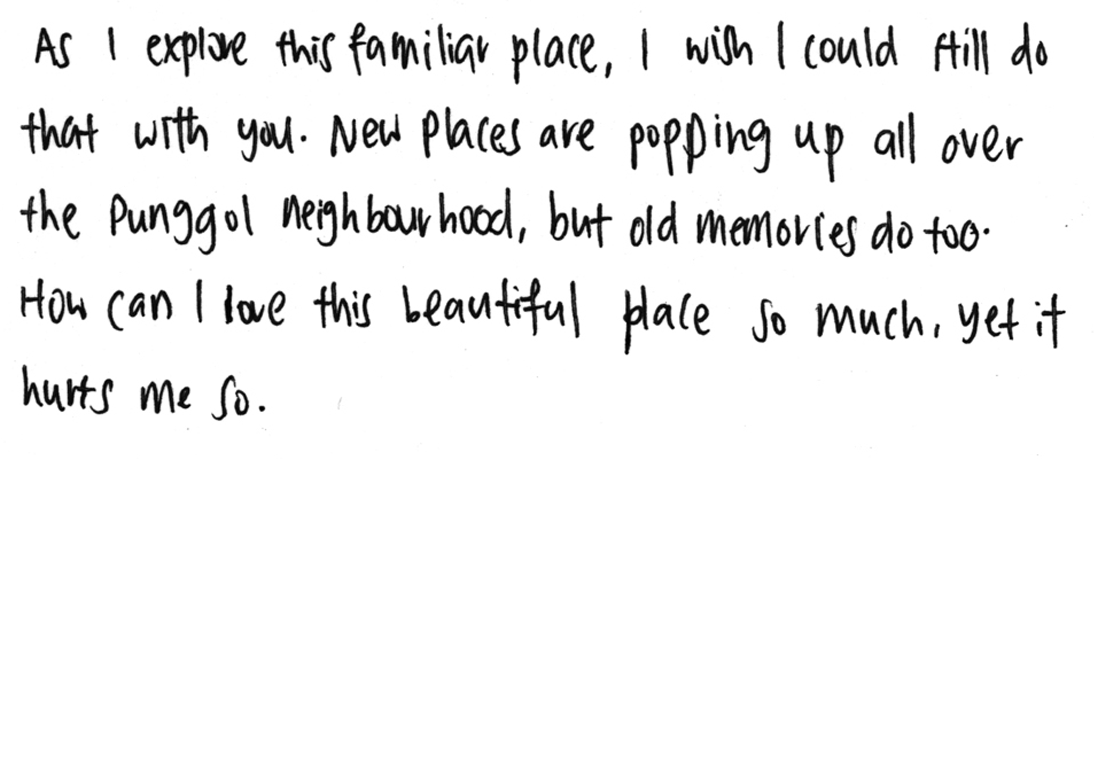
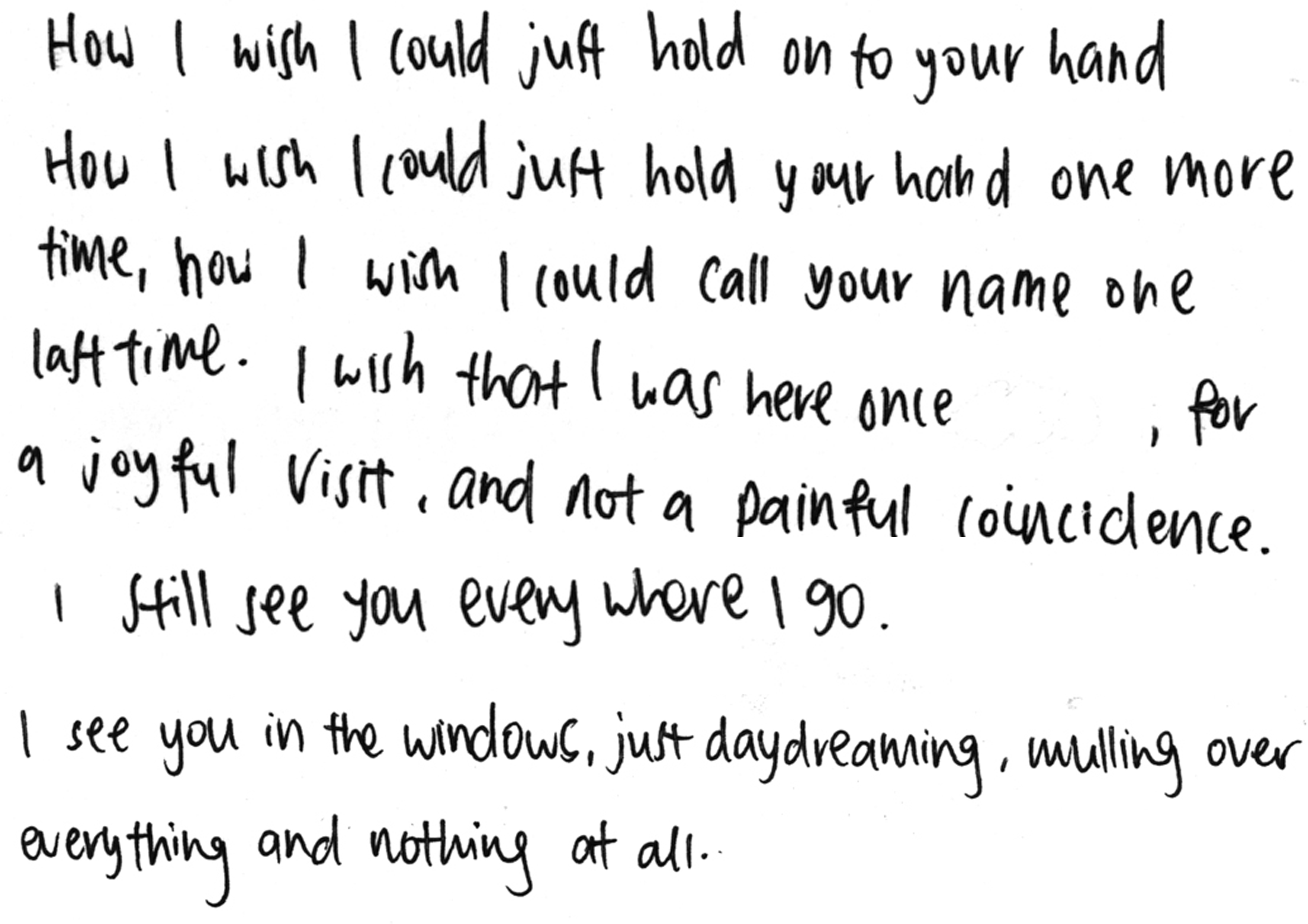
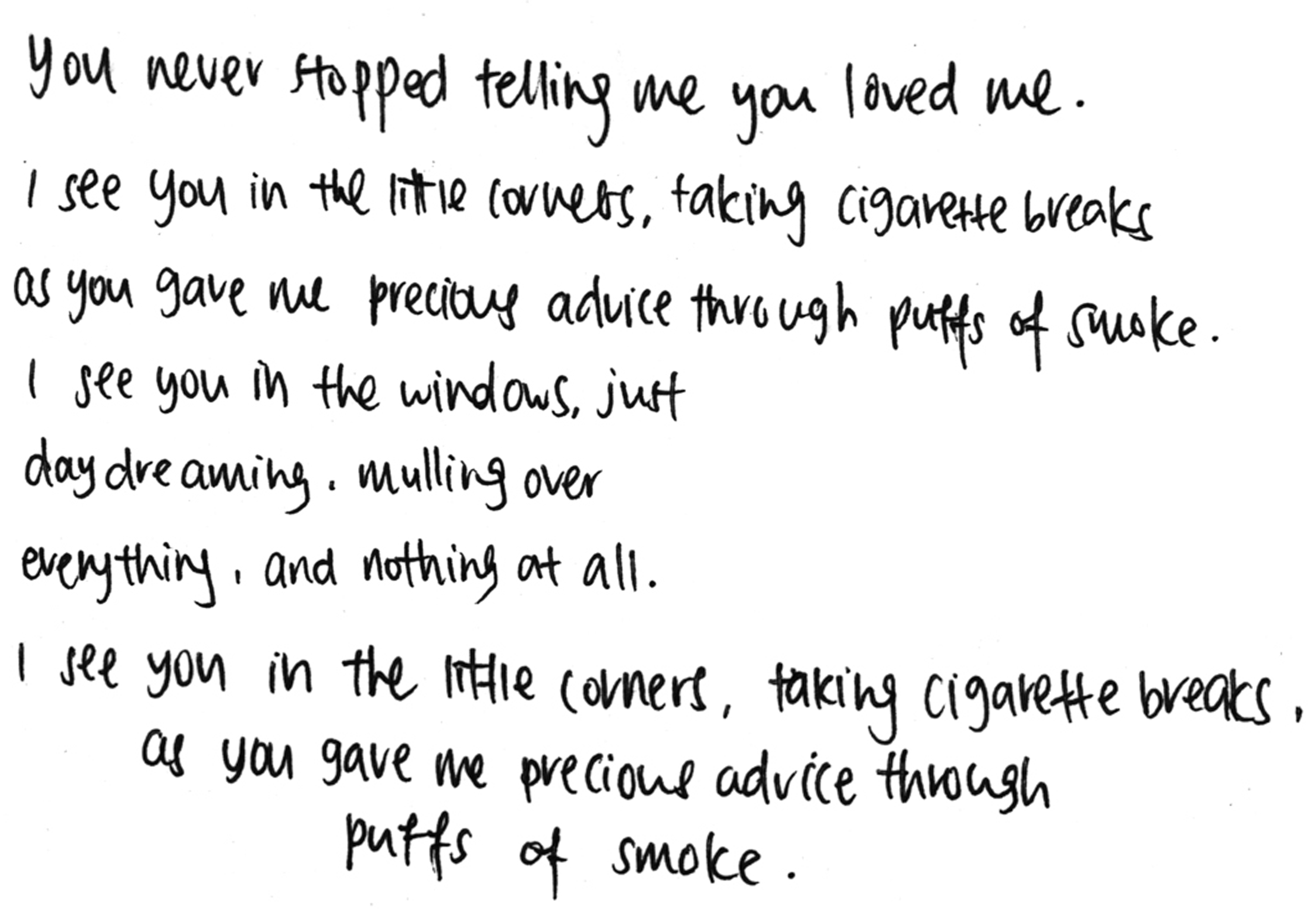
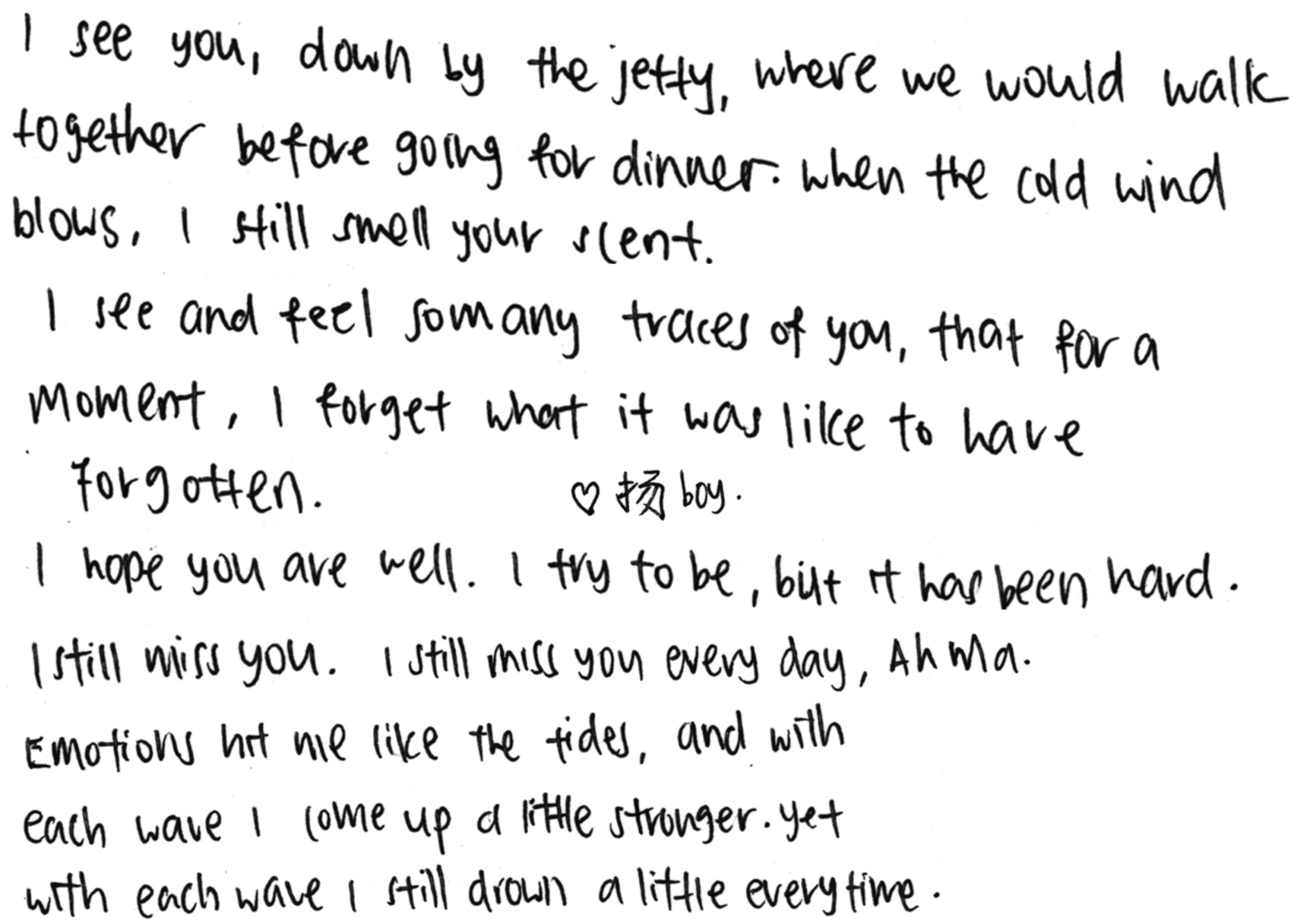
Some examples of my scanned handwriting:
After consideration, I did follow through with point 1, but for point 2 I only added drop shadows to the image to make it less flat. I did not add the decorative elements mainly was because I did not have any, and it seemed weird to me to fabricate some. For the scotch tape marks, I did not know how to properly add the visuals onto the image, nor did I have the time to explore before test printing, hence I did not go through with it in the end. I would rather exclude things that I cannot make look nice aesthetically, than to sloppily place something there to add more visual elements for my zine.
Thus, this is the final result of what my zine looks like.
For pages 4/5, Mimi also advised to remove the pastel background and replace it with the jotter lines to still keep the theme because for those pages, the lack of it made the whole zine seem off. Overall, I like the whole idea and layout of my zine, and I am very pleased with how it turned out in the end (:
And now, it’s only left the binding for my zine!
Stay tuned for my very final (probably very short also) post on ZINESSSS.