
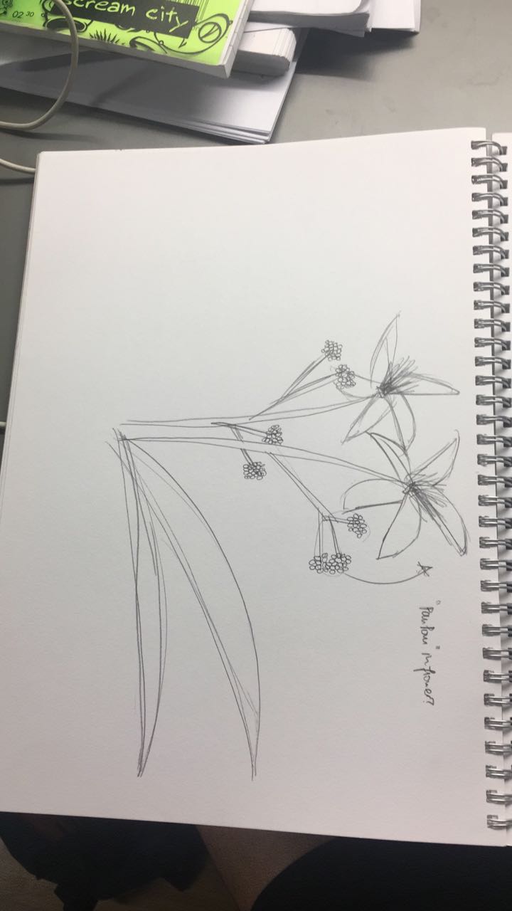
Shapes
There are 18 posts tagged Shapes (this is page 1 of 2).
2D Project 2: Forrest Gump

Hi! For the past few weeks, we have been working on our 2D second project, Forrest Gump. Basically, we had to create a visual composition for movie quotes that we got to choose on our own! It was a very fun experience for me personally, and I got to pick up many skills such as photoshop and silkscreen printing.
1. Harry Potter and the Deathly Hallows: Part 2, 2011


The context of the quote was about a man who revealed that he still loved his childhood crush, even many years after she died, a very classic quote for all Harry Potter fans. I wanted to capture the elements behind the meaning and the scene of the movie.


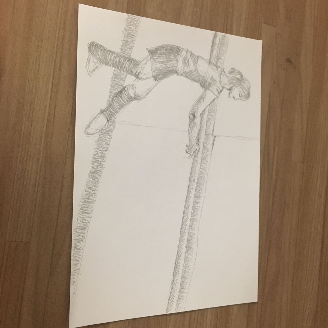
Here we can see the inspiration for my back drop, I wanted to recreate the feeling of using a pensieve just like in the movie! When I’m doing this quote it really feels like I’m magically recalling a memory, as I watched this movie almost 5 years ago when it was shown in cinemas.
For the stag, it was the patronus that we got to see in the movie, the one that acted as a guardian to Harry, hence the “deer” from the heart of the Snape silhouette to Harry himself. The tears we see on Snape’s face are the ones that gave Harry the memories that he used in the pensieve, which showed how Snape came to confess “always”.

And finally, at the bottom of the composition we see the silhouette of the very iconic Hogwarts castle. For this composition, not much thinking was required. Just like how the pensieve was used to recreate such a beautiful quote and moment in the movie, I wanted to use this composition to recreate a beautiful memory I had from an amazing movie.
Principle of design: BALANCE
With this composition, I bore in mind that it was difficult to keep balance in the composition when I had a lot going on at the bottom of the picture while the top remained fairly empty. Thus I let the “ink drops” be a little more detailed playing around with the threshold. For the bottom half, I kept the images simple, that way it would be easier for the eyes of the viewer, both the top and bottom.
2. Spirited Away, 2001

For this quote, I wanted to capture the very essence of the quote, the moment when Haku and Chihiro solidified their friendship. While flying on Haku, Chihiro suddenly remembered that she fell into a river as a kid, and she had a recollection of what the name of the river was. In the context of the story, names play an important role and represent identity in the film. Thus, Haku transformed back into his human form, both he and Chihiro clutching on to each other as they fell. It was a significant moment in the film and I wanted to capture that.

For the composition, the silhouette of a boy and girl free falling is easily seen in the foreground, thus representing the two main protagonists, easily symbolising their friendship. The dragon that soars above them in front of the moon represents Haku before his transformation back, and the streak is what represents the transformation. In a way, this composition guides the eyes of the viewer downward from the top. The moon is similar to the half moon found in the skies during their decent. The starry texture was added to showcase the twilight sky, while the clouds serve as a reminder that they are falling from a great height. This image summarises the friendship between the two well, telling the significant part of their story in a single composition.
Principle of design: HIERARCHY
By using different elements of the story and layering them in a descending sequence, I am able to guide the viewers eyes either from the top of the composition downwards, creating a visual link to the story line chronologically, or from the bottom up, piquing their curiosity with the causation of the moment.
3. Inception, 2010

For this quote, I wanted to break away from a more narrative / story-telling manner of the composition, to a more literal composition. In a manner of speaking, I used the elements in which I think I could symbolise the quote well, bringing a different perspective to the table.

In the quote “You mustn’t be afraid to dream a little bigger, darling”, I wanted it to have a more inspirational feel to it, rather than the sarcastic remark it was used during the movie.
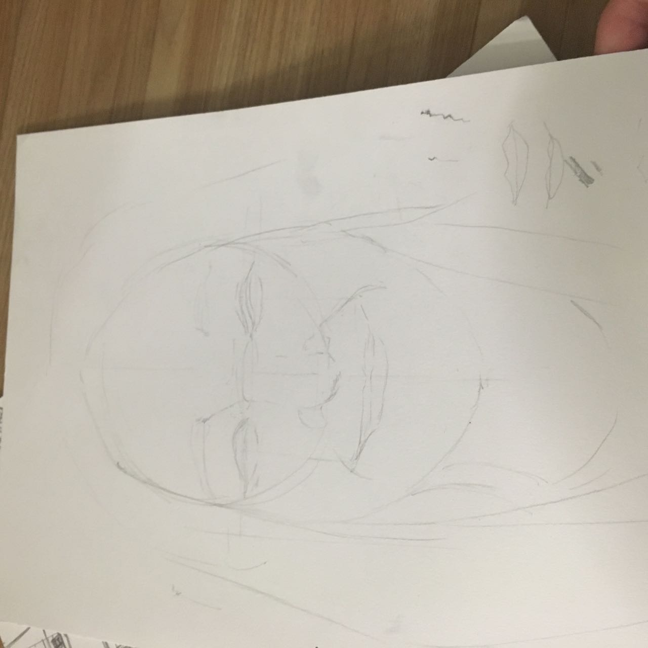
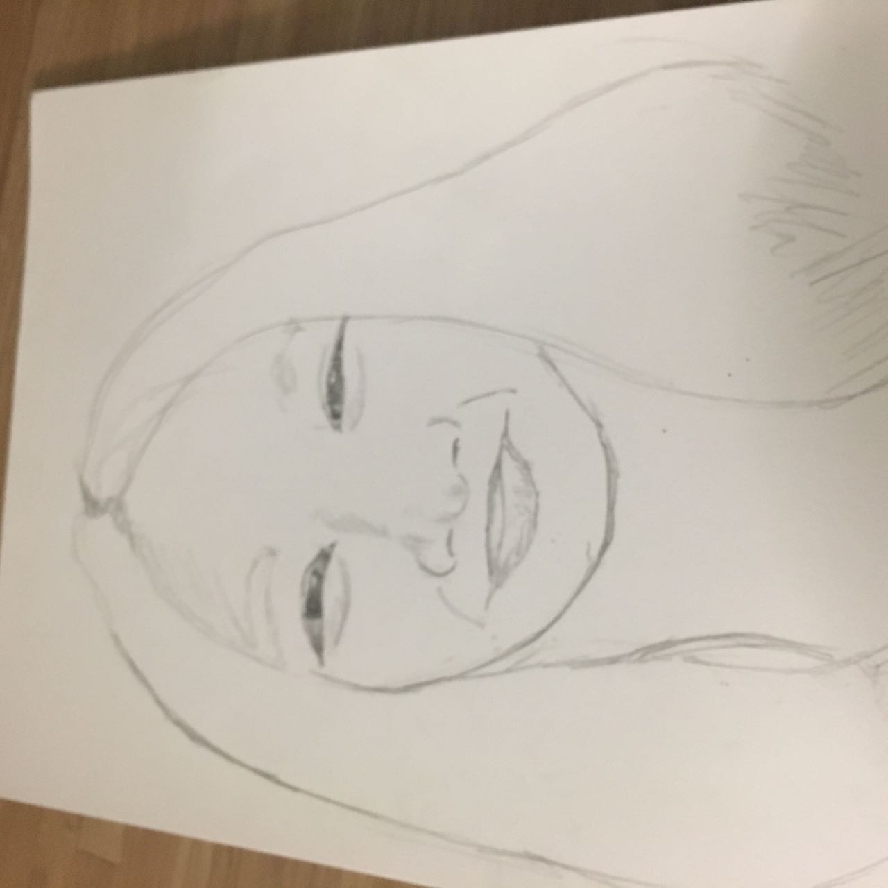
For this composition, I first started out by masking out the facial silhouette of a woman (hair untied symbolising freedom and capability) to bring out the “darling” aspect of the quote. I then proceeded to alter the back ground of inside the silhouette, giving it the texture of a galaxy to show that the universe is your limit – touching on the “a little bigger” part of the quote. I then added in elements which I thought felt as though you are breaking through, giving it an encouraging feel to it. The skyline and the birds show how one can reach for the skies and you can land amongst the stars.

The fireworks show how we have sparks and bursts of ideas and thinking, how great dreams begin. The flower shows the beauty in our ability to set goals for ourselves, the beauty of our mind. Finally, the sparkle in the eyes when you know you want to achieve your big dreams. Thus, “You mustn’t be afraid to dream a little bigger, darling”.
Principle of design: UNITY/HARMONY
For this composition, I didn’t want any particular element to dominate the whole of the canvas, but rather, work hand in hand to bring forth a meaning greater than the sum of its parts. Hence, the layout of this composition took longer than the other 3, with a lot of thought processes put through, and a grueling 1 and a half hours of non-stop rearranging on photoshop.
4. The Dark Knight, 2008


For this quote, it was my favourite one as I chose how I got to manipulate the image of 2 most famed comic book entities and tie them together, merging them into a single identity. The quote “You either die a hero, or live long enough to see yourself become the villain” was coined(hur hur pun intended) by one of Batman’s most famed nemesis – Harvey Two-Face.

Batman was always praised as to how he always manages to keep Gotham safe, but one has to consider the fact that he holds a lot of power when it comes to crime, or rather crime-busting in the city. What if one day the good bat turns bad? Thus I wanted to orchestrate the visual image of the bats himself slowly turning into the last person he could ever hope to become – the Joker.

For this composition, I wanted to create a half and half face showcasing the halfway point where by the “hero” is seeing himself turn into the “villain”. However, after trying out (and failing) with the vertical halves (vertical halves are so cliche anyway), I realised that the Batman and Joker’s distintive visual traits weren’t distributed evenly downwards, but rather, sideways. This meaning that the most iconic characteristic of the Batman and the Joker, are top-centric and bottom-centric respectively. Hence, I decided on halving the faces horizontally. For Batman, his top half is most iconic, as that is where is famed bat-mask sits on his face, masking his identity. For the Joker, it is his scarred smile with the iconic red lipstick (or crayon) on the bottom half of his face (obviously because his mouth is there). I found reference images of the two icons and began trimming on photoshop which the combined became my main focus. Although the story of “The Dark Knight” focuses on Batman and the Joker, I didn’t want to draw the attention away from Two-Face too much as he was the one who originated this quote. This is where the coins come in. In the movie it was his most symbolic “weapon”, flipping the coin when deciding if someone should die or not. Much like the whole duality nature he has going on, especially his face.

Because of this, I knew that I had to create a very strong sense of symmetry within this composition, maintaining the theme of the quote throughout the whole visual. I then added the very grungy texture as the background, creating this impending feeling that’s foreshadowing something. Also, it creates the mood of what Gotham usually feels like – somber and depressive. Lastly, I added a “J” and a “B” just to throw off the symmetry by a little to create an interest within the composition, lest it becomes too aesthetically neutral.

However, it did not break away from the symmetrical duality theme too much as due to the positions of the letters in a playing card, it simply created a diagonal symmetrical line, rather than the one down the middle of the composition. These letters recreate the image of a card, showing how Batman and the Joker are vying for the same card, the same body, the same entity simply resisting each other. This alludes to how they are in the comics itself as well. One cannot exist without the other. Without the hero, there is no villain, and without the villain, there will be no hero.
Principle of design: SYMMETRY
As if it was not obvious enough, the principle of design I decided to let my work focus on for this composition is symmetry. The whole theme of two sides and duality was very hard to miss and not focus on, thus I would not want to break away from that. By banking on that aspect, my composition essentially made itself.

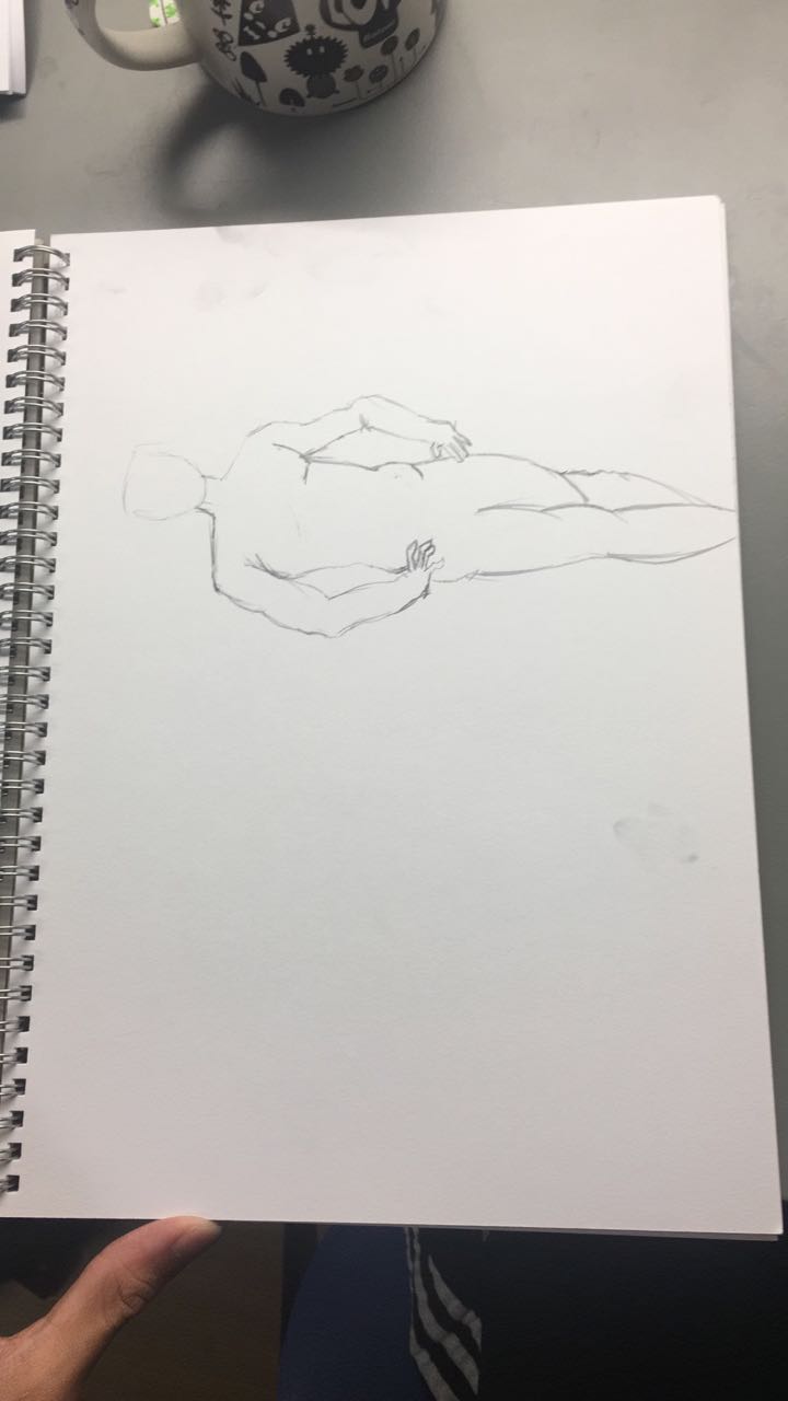
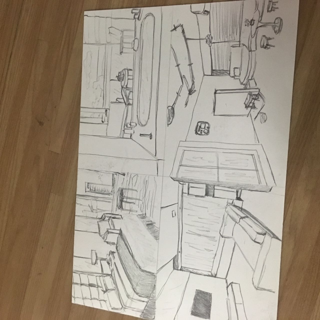
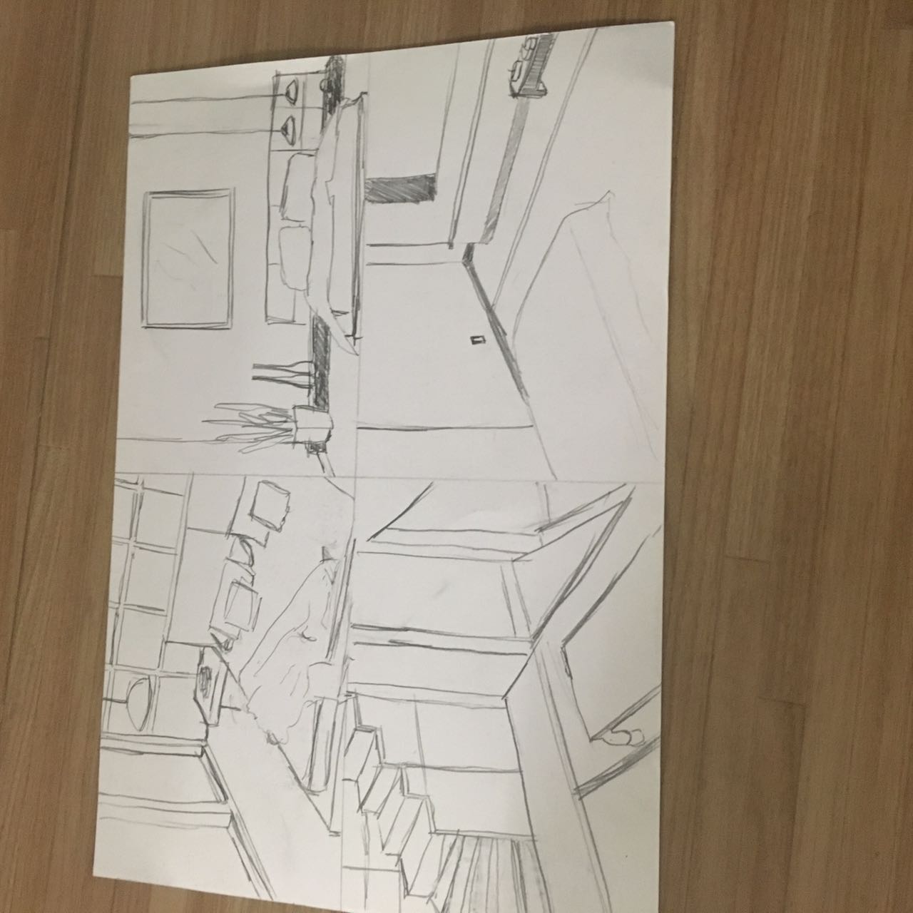
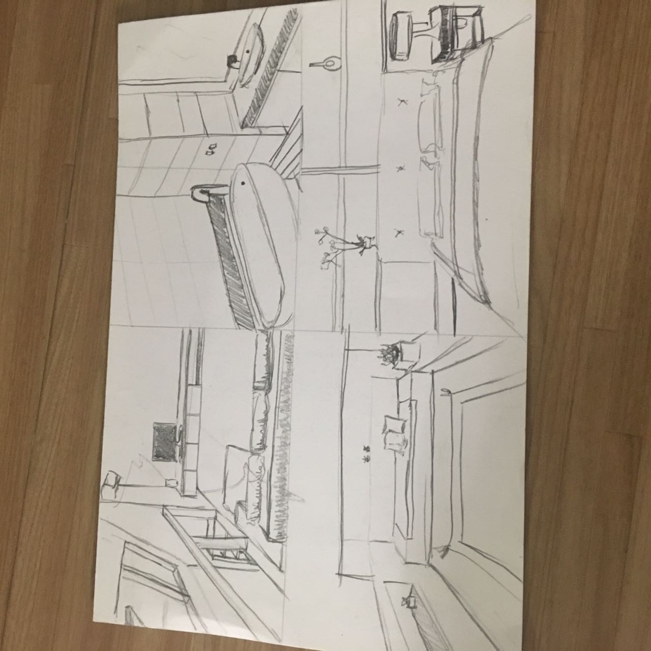
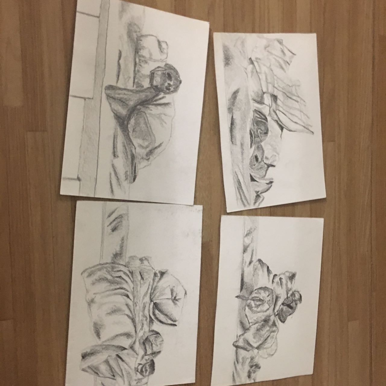
Here are some photos that showcased my process while printing my selected composition onto the tote bag.


With that, I CONCLUDE MY 2D PROJECT 2. PROJECT 3 HERE WE GO.
BRING IT ON.

My Line Is Emo – Emotion 18: Alienation

Alienation
/eɪlɪəˈneɪʃ(ə)n/
Alienation is when you feel left out. When you feel you don’t belong. When you are outcasted and you are ostracised.
I used a simple spray bottle to achieve the pokerdotted effect, representing the people who shun, while I smudged ink to show the vibes of sadness, creating one dot to represent the shunned.

My Line Is Emo – Emotion 17: Horror

Horror
/ˈhɒrə/
Horror is the intense feeling of fear and shock. When you are scared, when you don’t know what’s coming for you, what is after you. You are petrified and you cannot stop thinking. Too much.
I created this emotion by first using lino to create a grainy and unclear background. I then used a thin, flat surface with white ink to create the lines, smudging them and masking what lurks behind, to create that feeling for the viewer.

My Line Is Emo – Emotion 16: Distracted

Distracted
/dɪˈstraktɪd/
Being distracted is the lack of focus during a task. Being unable to concentrate means you cannot accomplish the task properly.
I used a flat, thin surface together with black lino ink to create the effect of the lines. First, they are properly spaced like somone concentrated would do, before eventually “messing up” the lines from losing focus, getting bored, being distracted.

My Line Is Emo – Emotion 15: Pity

Pity
/ˈpɪti/
The feeling of pity is emotional sympathy for someone else. You want to reach out and help, but you don’t know how, and they won’t see it as an act of kindness.
I used chinese ink and dripped it onto one side to create the effect of “reaching out”. The colour black symbolizes the way the person you pity views you as. I then used a .38 ink pen to draw out the “barriers” that the people you pity shut you out with. I then used chinese ink and shaving cream to create a vidid marble effect, whereby the poor soul, as represented by the doodle, basks in their sad state.

My Line Is Emo – Emotion 12: Longing

Longing
/ˈlɒŋɪŋ/
Longing is the yearning for something, usually someone else. It is the desire to transcend space and time to be with them. It is human to do so.
I wanted to express the human touch in the line, hence I used my own hands as the paintbrush. By creating this line white on black, it has a skeletal feel to it, symbolizing the innate human nature, reaching out for each other.

My Line Is Emo – Emotion 11: Infatuation

Infatuation
/ɪnˌfatʃʊˈeɪʃ(ə)n,-tjʊ-/
Infatuation is the sudden burst of excitement, passion, admiration and a lot of the time, love. This giant wave of energy just explodes, and makes you feel like everything, it makes you feel like you are bigger than the universe.
With this emotion, I wanted to recreate that feeling of a first crush, the feeling when you know what you want to do, the feeling of great motivation and excitement. I first blocked the whole paper black with lino ink to create the backdrop. This is to show the feeling of vastness, like the universe. Then, I used a glue gun to pepper the page to create a texture to feel, much like the tingling you get when you feel infatuated. I then used white paint with sponge to fill out the page like an explosion. Finally, to create the tiny bursts, I used a pen and the same white ink, adding even more texture and the visual element of spotting into the line. This helps me bring out both the “explosion” and “tingly” effect.

My Line Is Emo – Emotion 10: Pride

Pride
/prʌɪd/
Pride is when you feel satisfied with your outcomes and your achievements. Pride is the feeling you get for accomplishing what you set out to do, maybe more. It has an airy feeling to it, you feel light and dizzy with contentment.
I have relied on chinese ink and the calligraphy brush again for this emotion. However, with the chinese ink I first diluted it and used that mixture as a base layer, using water colour techniques, increasing in the concentration of the chinese ink. With the swirly patterns I wanted to give the feeling of airy, in combination with the layering, as well as portraying how “giddy” with excitement you feel. The final bold lines represents the confidence in yourself and your abilities when you feel proud.

Winning, Award, Trophy.
My Line Is Emo – Emotion 8: Anxiety

Anxiety
/aŋˈzʌɪəti/
Anxiety is the emotion of worry. It feels antsy, it slowly builds. You start to feel nervous and at an unease. You are uncertain and you cannot do anything about it as it grows and feeds off your worries.
I used lino ink and a big sponge for this emotion. By utilizing the “holes” of the sponge, I continously stamped onto the paper, careful to ensure the ink strength coincides with what I want to achieve with the “worry” build up. The dots created from the texture of the sponge helped me achieve my “worry” build up, adding the element of being antsy and a feeling of pacing, which you do when you are anxious.
