

zine
/zēn/
noun
So for our latest project for 2D, we were required to design a “zine” for a place that we have been allocated.
These places can be any major towns and districts in Singapore. Examples include Jurong, Paya Lebar, Pasir Ris, Marine Parade and Hougang. Karma struck me when I was teasing a friend to get Punggol, because of its really far location, and I got it instead. At first, I was a little disgruntled because of its relative location to where I stay. However, it took me long enough to realise I had an advantage because of the number of times I have visited the town. This was because my grandmother stayed there and I always visited on the weekend.
So I paid a visit to Punggol on one of the days where I had no class. Here are some of the photos that I took.
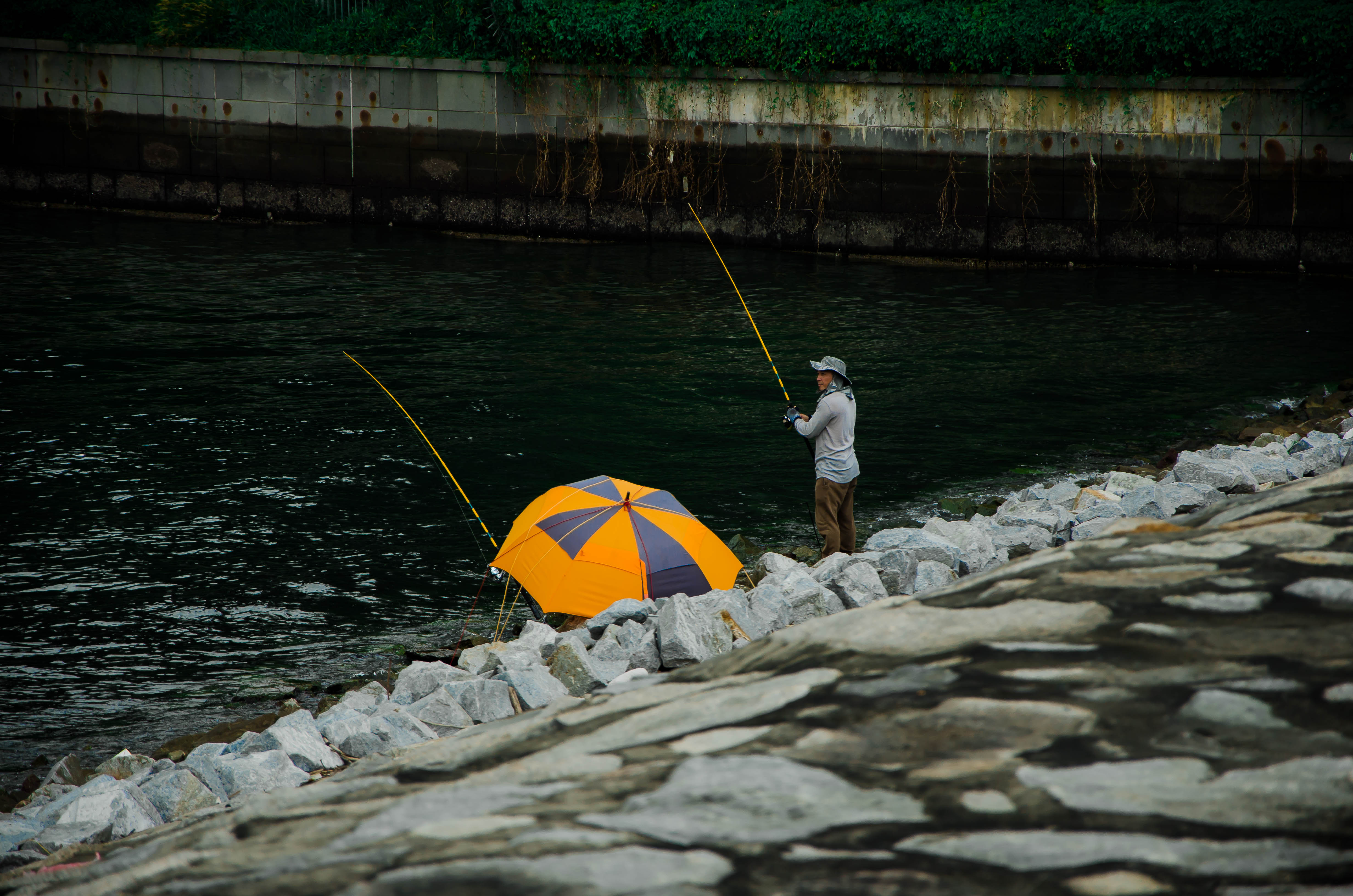
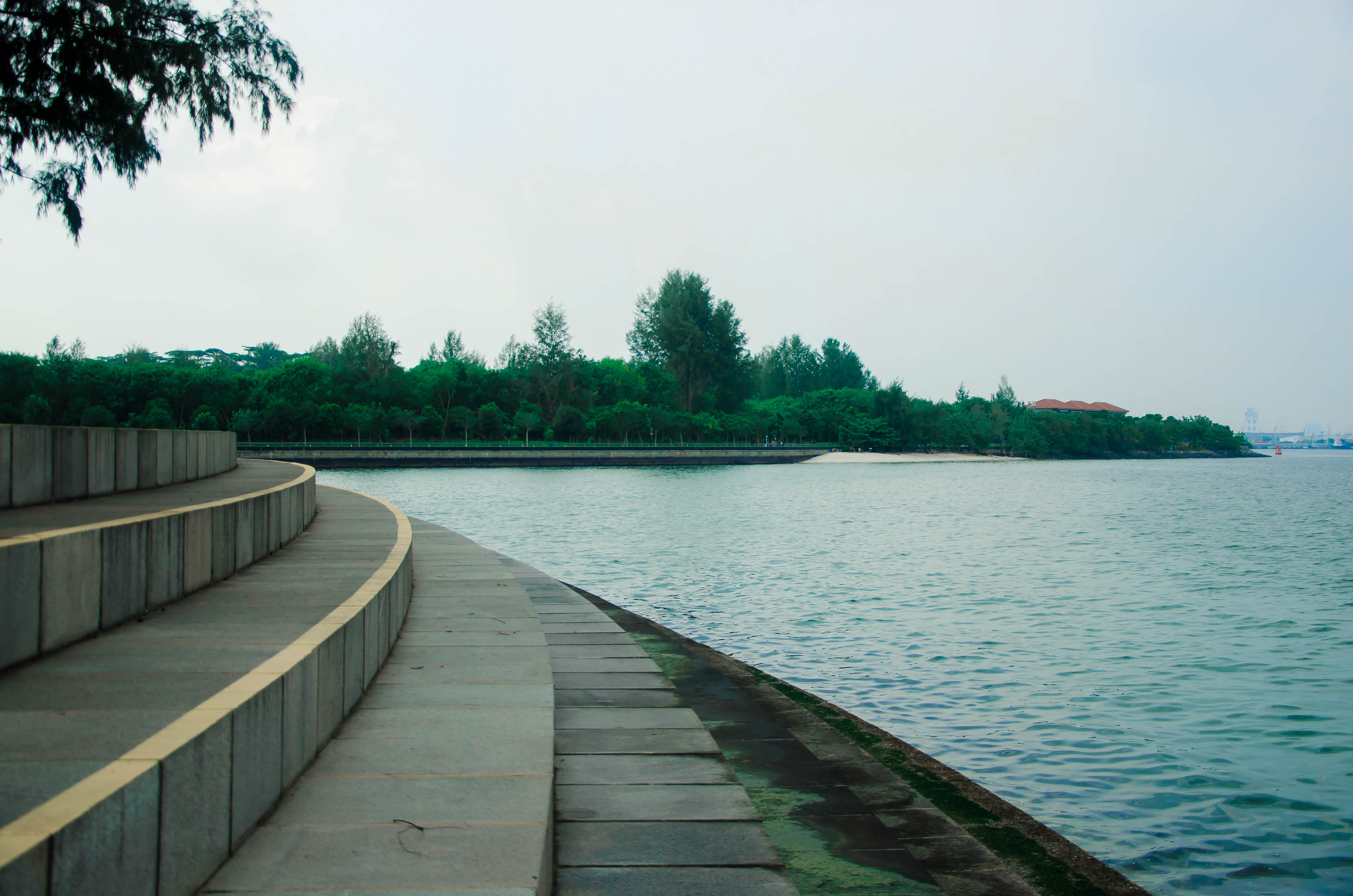
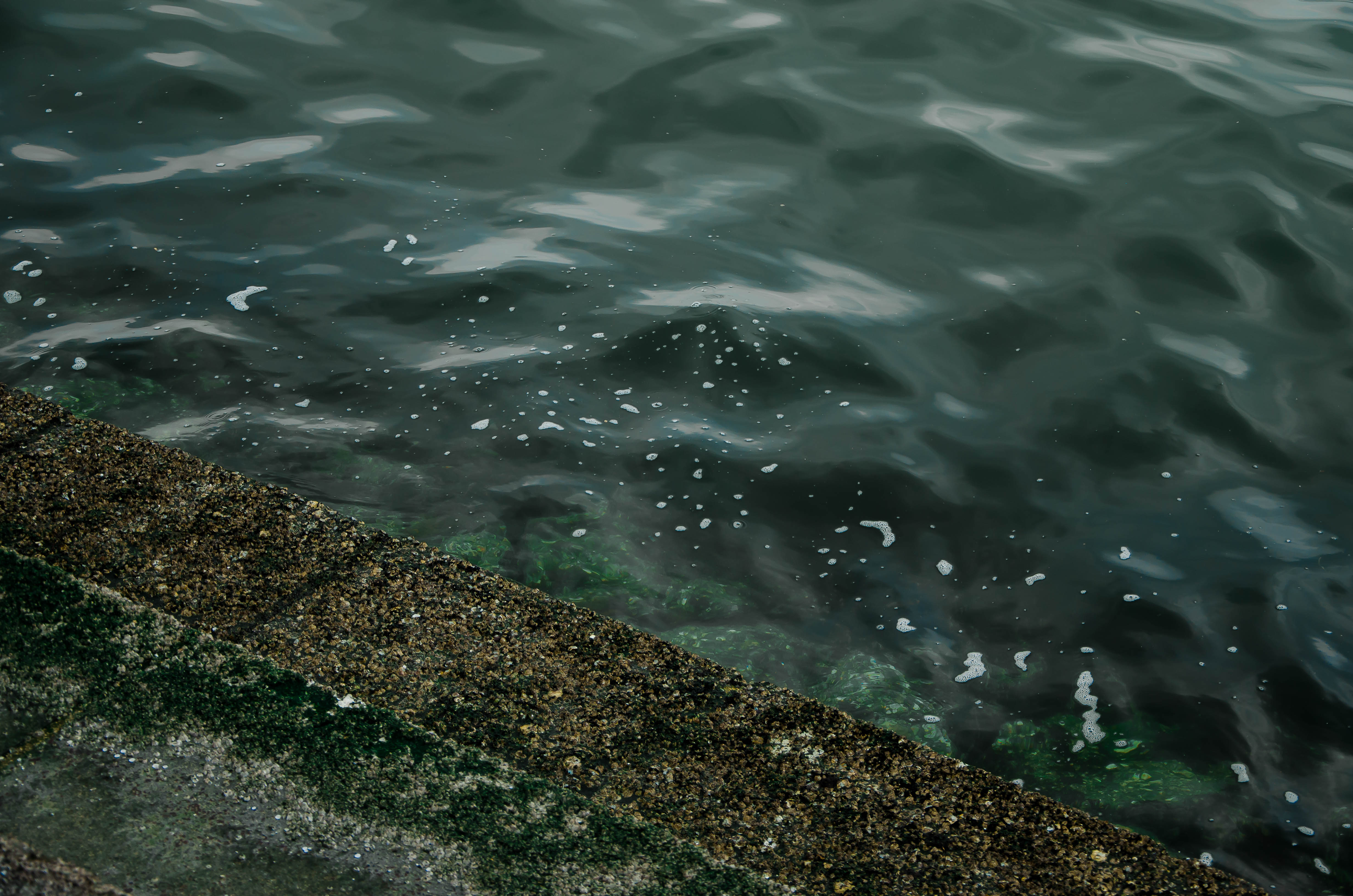
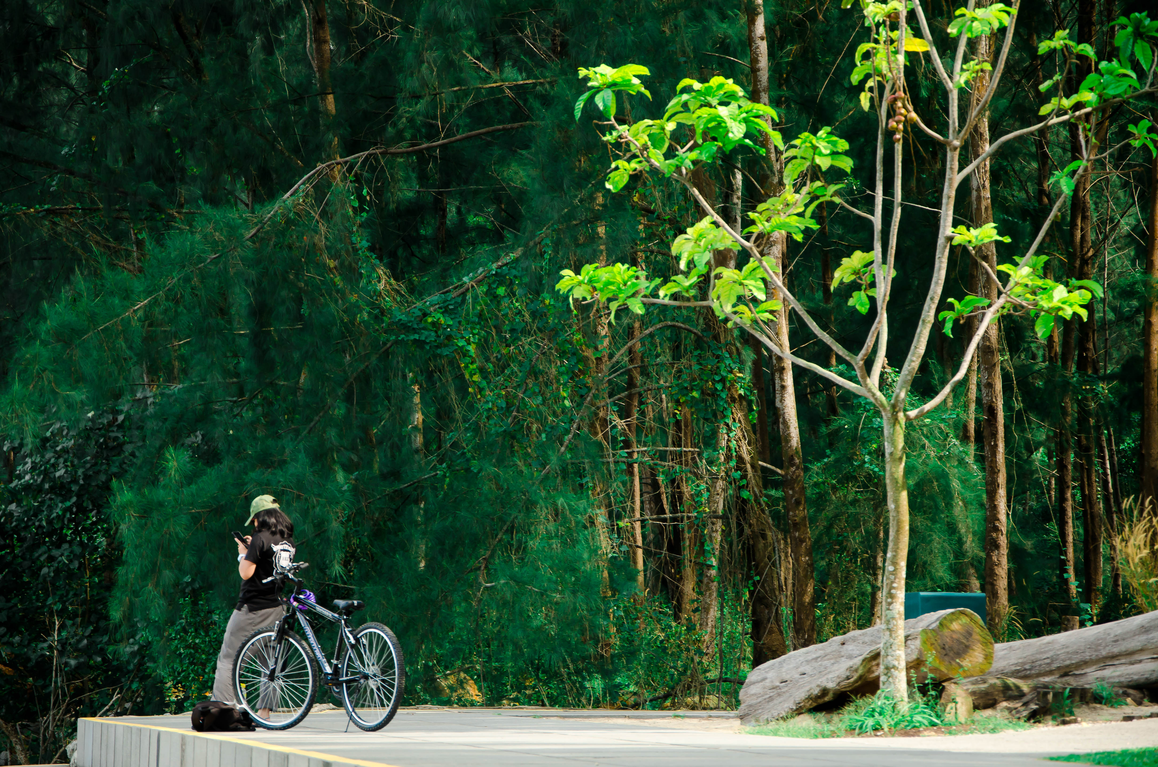

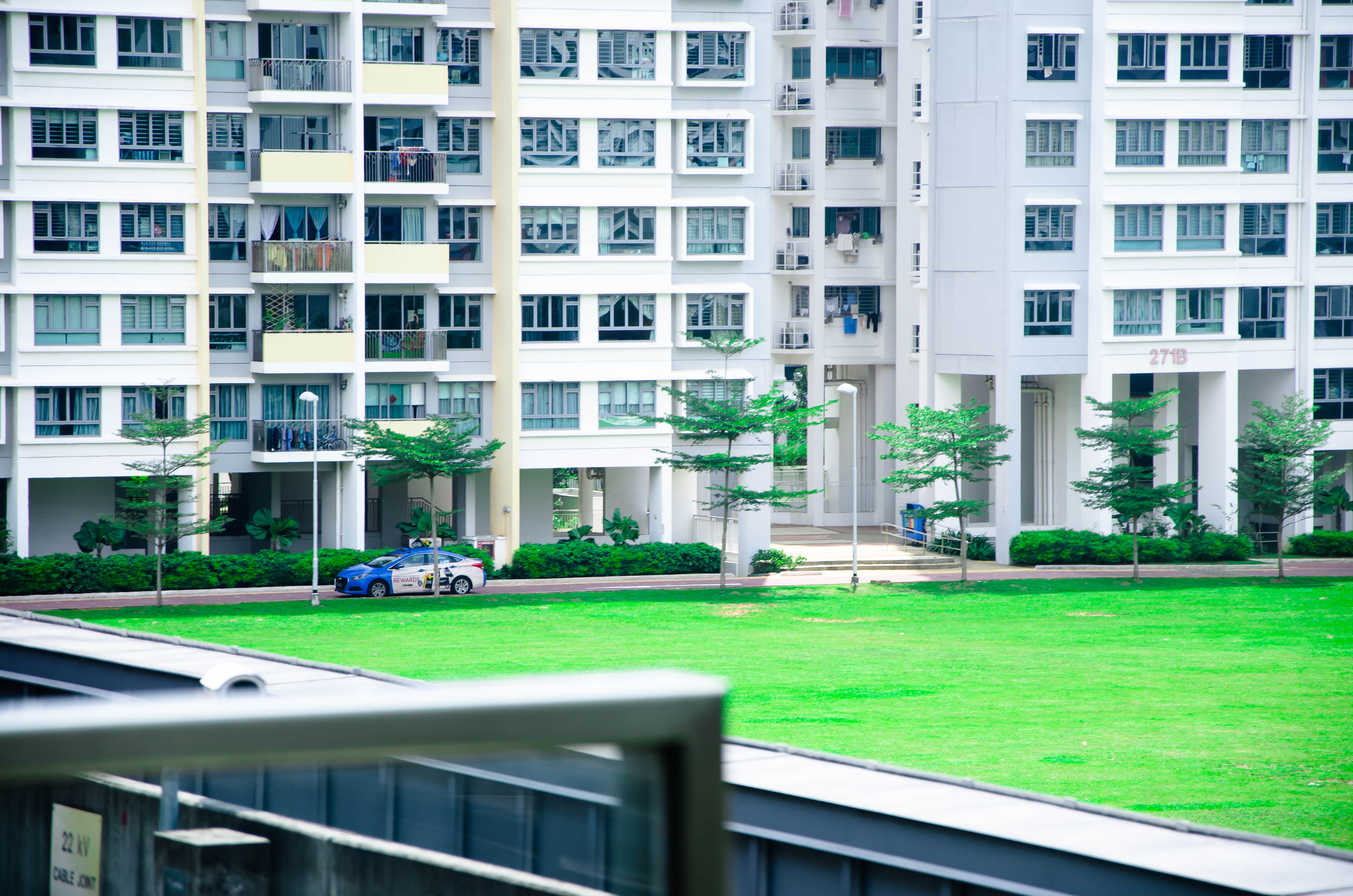
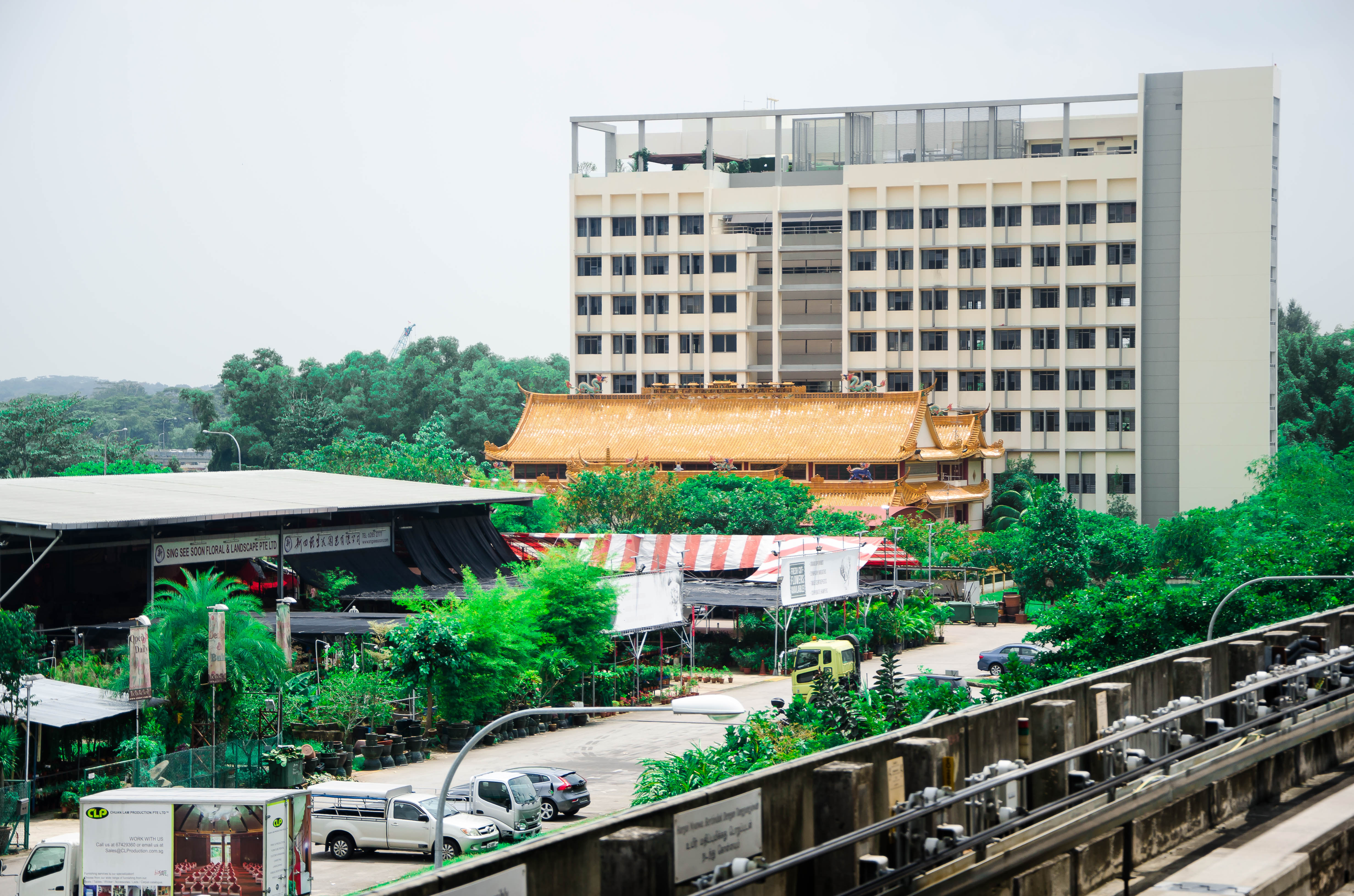
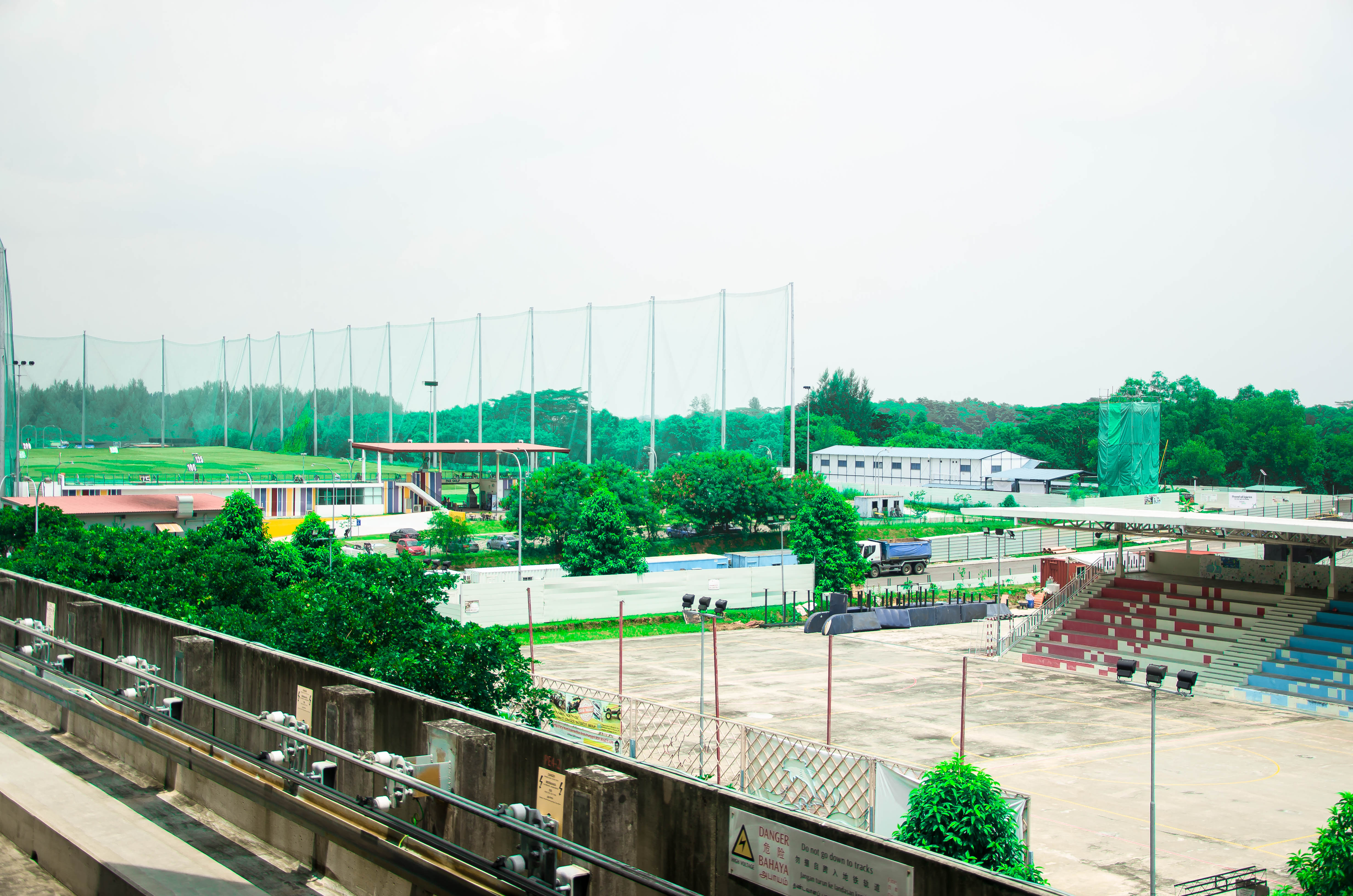
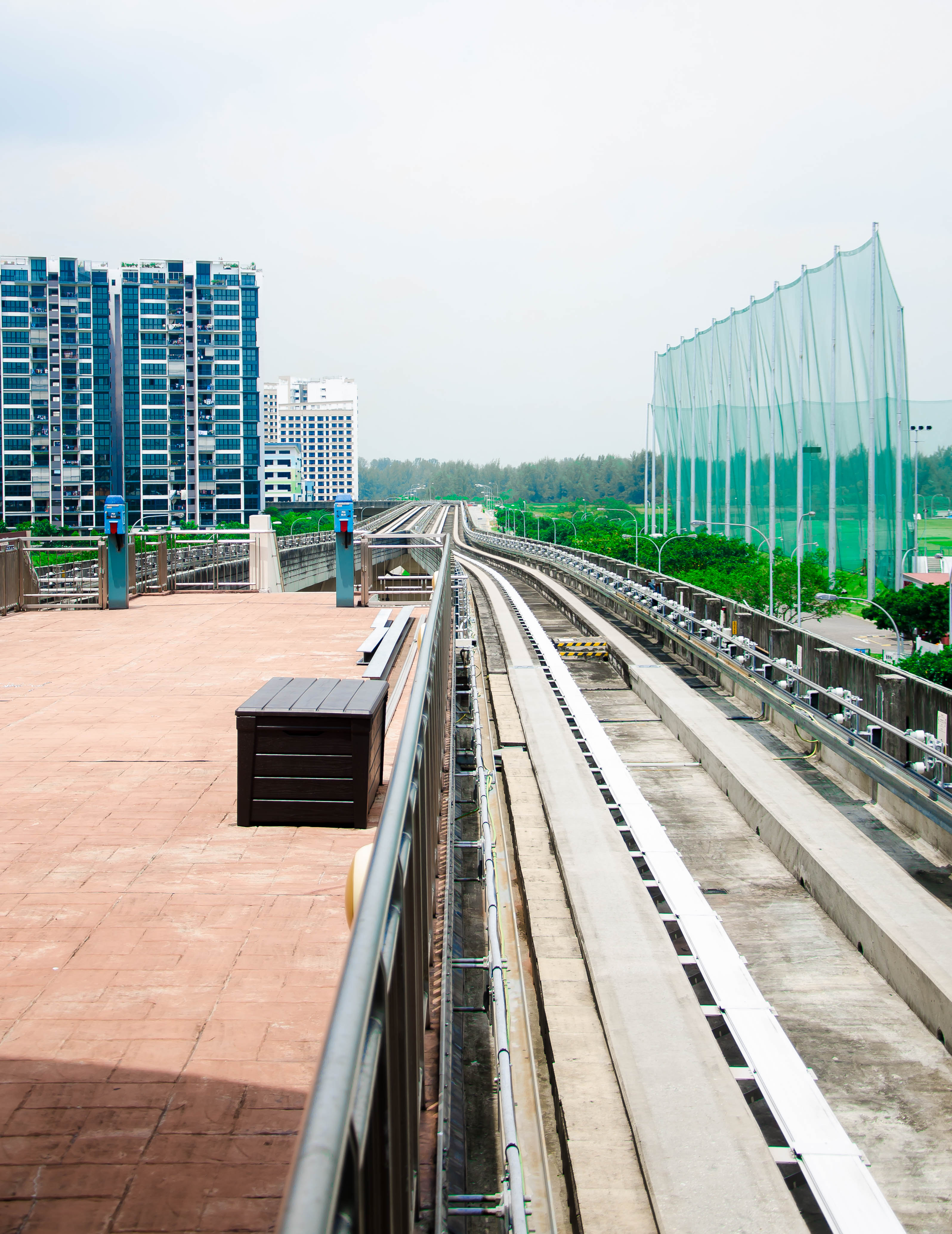
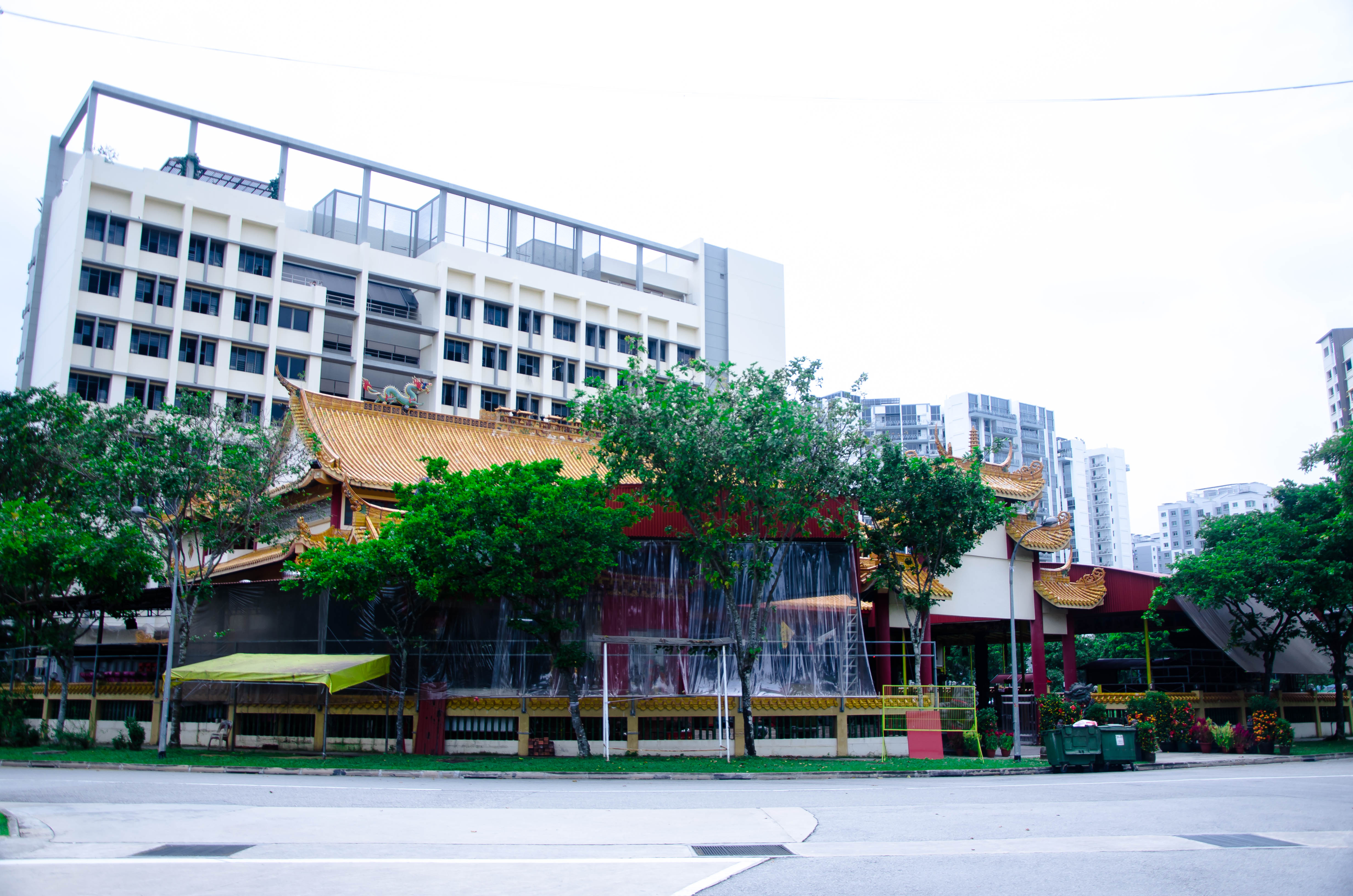
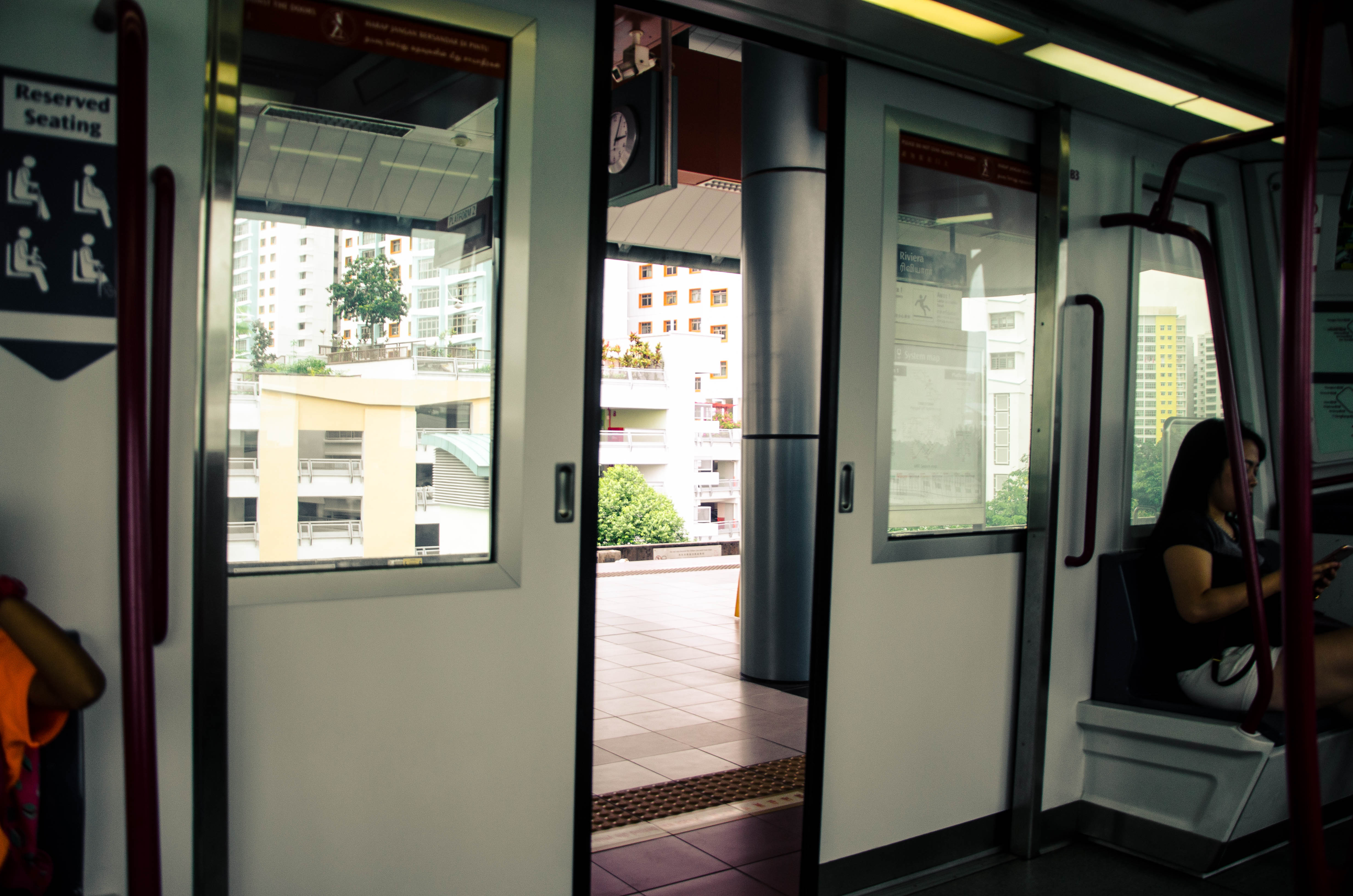
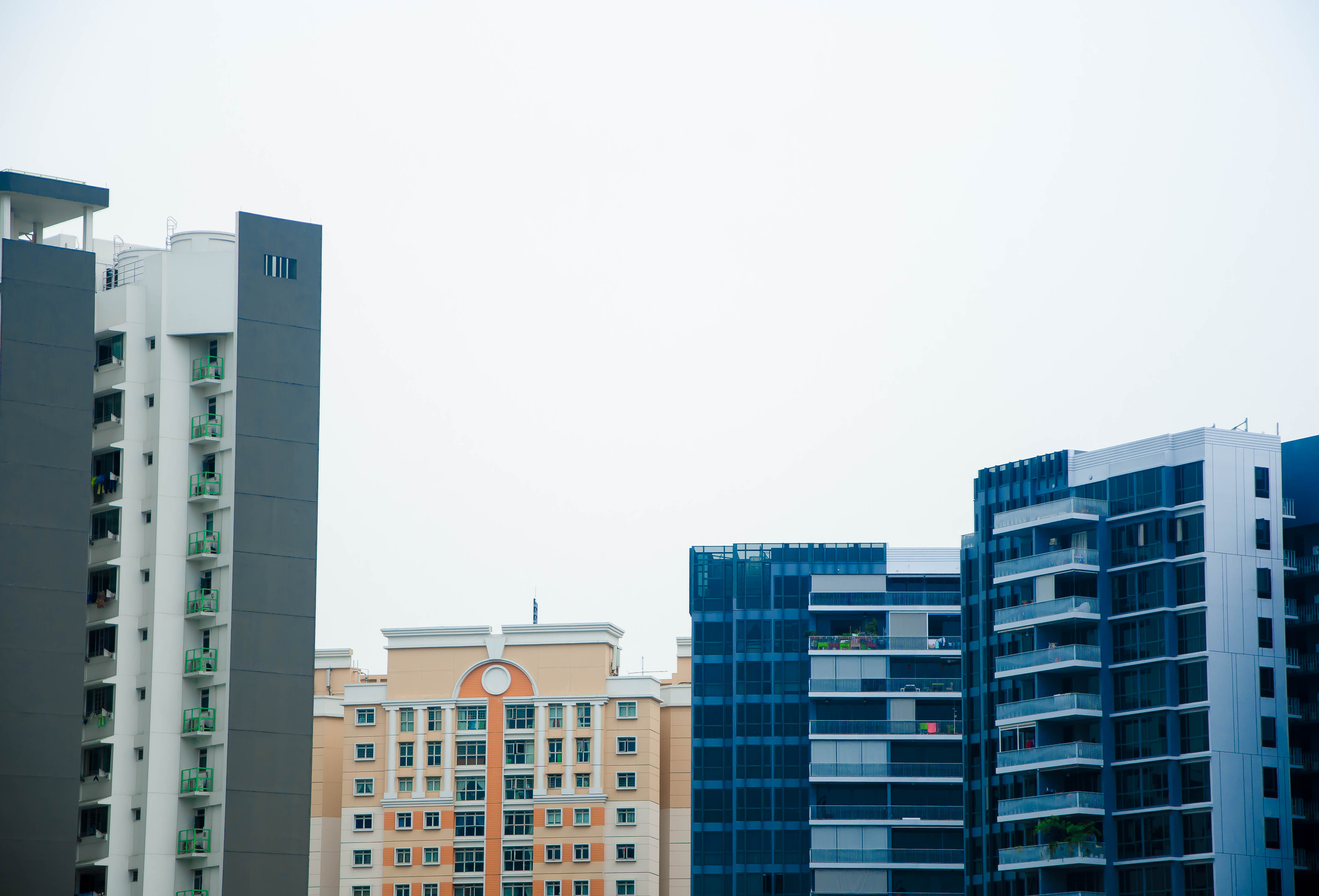
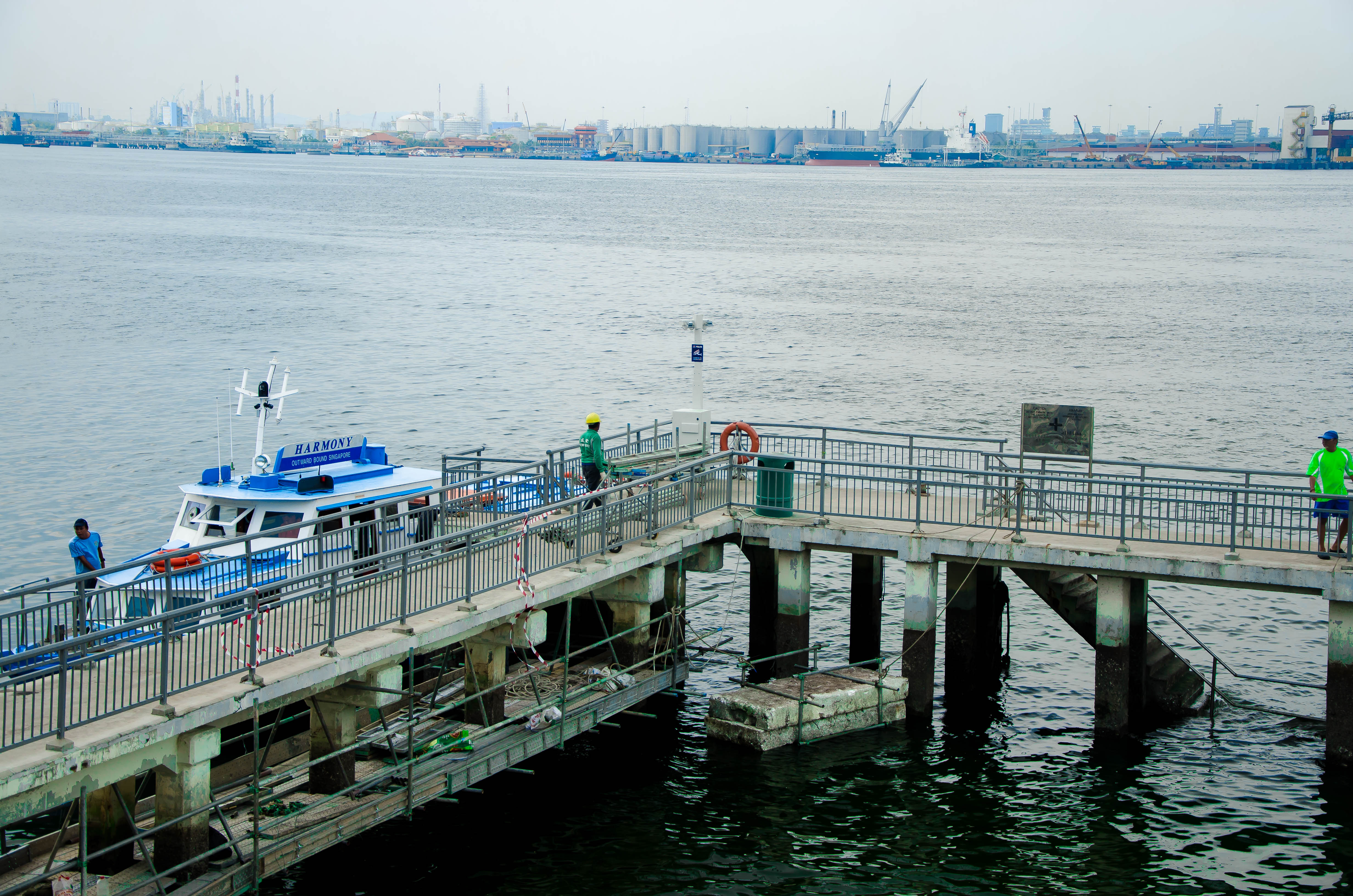
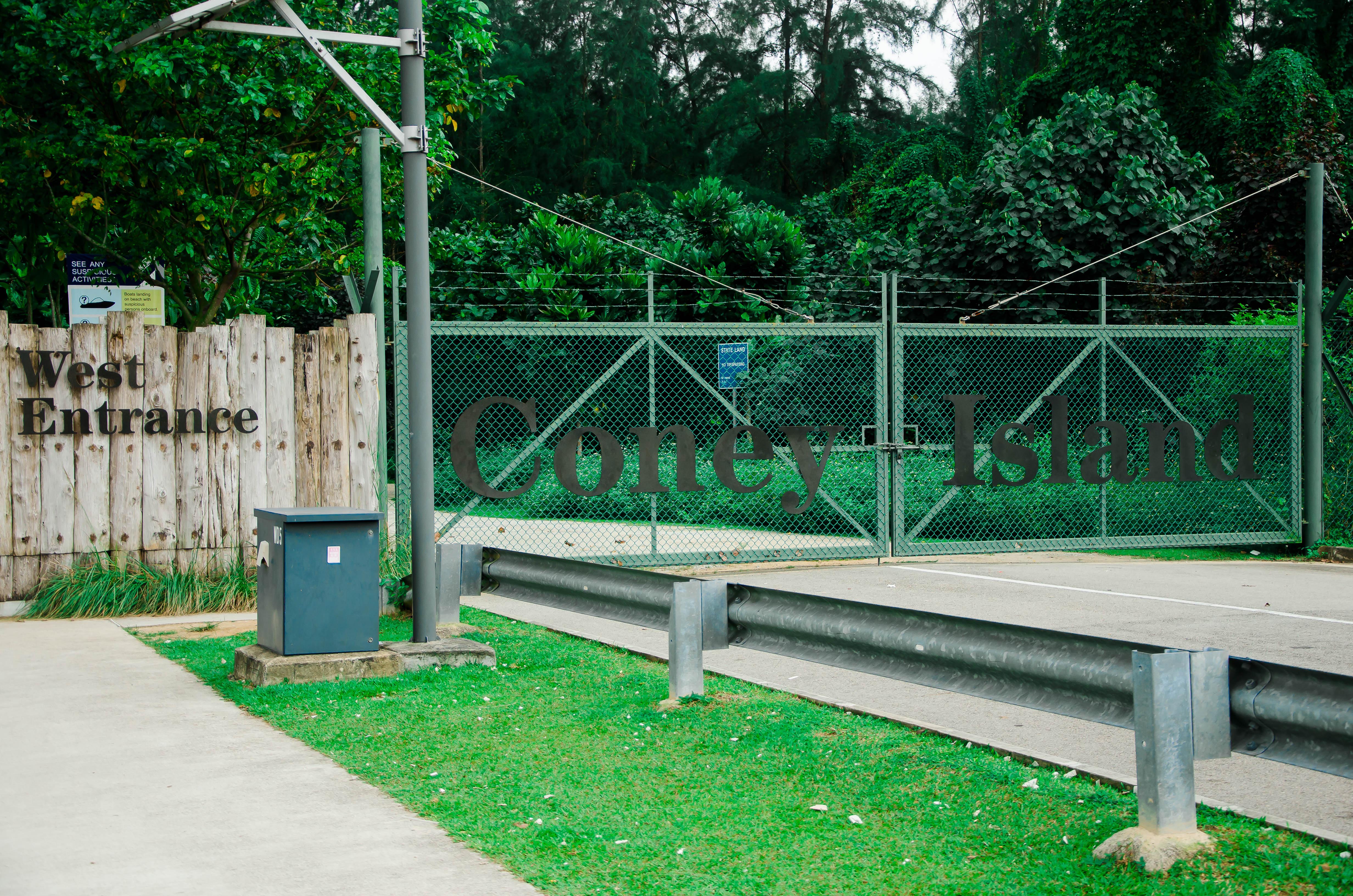
I really wanted to encapsulate the very peaceful and serene feeling I get when I visit this place.

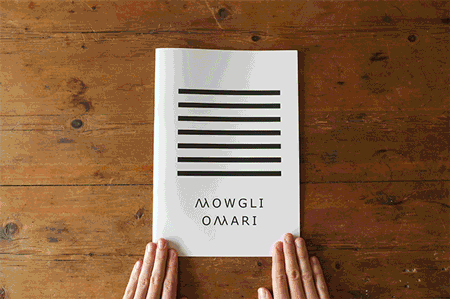
Developing on my theme, because of how personal this place was to me, I wanted to show that by creating my zine in such a manner that it seems very personal to me. I thought about it for awhile, and what better way to express my inner thoughts than through a diary entry? It can become a portal into my inner thoughts and feelings for my viewers; to see things that I see and feel what I feel.

Then, what would I write about? I wanted to speak about my grandmother, who was staying in Punggol. Unfortunately, she passed away on the first week of school. I wanted to dedicate this piece of work to her, and my memory of her. Hence, I wanted to recreate that sense of nostalgia that I felt whenever I think of her. I decided on designing it to seem old school, with a whole jotter book layout, just to make the viewer feel like they are travelling back though time.

With that, my designing began.
(End of part 1)


