Foundation Drawing Research: Final Project

So, for our final artwork, Professor Woon Lam has given us the liberty to decide and compose an image in any medium we want for our final piece. The catch is that all sketches exploration and the final piece’s size should total up to A1, the other is to encapsulate all that we’ve learnt about human anatomy this semester. In a bid to understand what I want, I must first know what are my options. With that, I took to the internet to go find out more on what I can understand about the anatomy, before I begin deciding on how to compose my image.

Because of my nature as a dancer, I wanted to use that as my theme in my design. When dancing, it is a way of understanding how my body works and moves physically. With this project, I feel like I can do so in a more theoretical approach.

Some images that I’ve found are as follows:

A wonderful book: Die Gestalt des Menschen by Gottfried Bammes:

Image result for study of the human anatomy

Image result for study of the human anatomy

Related image

I feel like my final piece and my exploration sketches should show how I intend to delve deeper in how our joints and muscles work together, to produce visually pleasing moves, and interesting body compositions.

 GIF

Stay tuned for my upcoming sketches!

2D II Update and Research (Part 1): Zines

zine

/zēn/

noun

informal
1. a magazine, especially a fanzine
i.e. a webzine.

So for our latest project for 2D, we were required to design a “zine” for a place that we have been allocated.

These places can be any major towns and districts in Singapore. Examples include Jurong, Paya Lebar, Pasir Ris, Marine Parade and Hougang. Karma struck me when I was teasing a friend to get Punggol, because of its really far location, and I got it instead. At first, I was a little disgruntled because of its relative location to where I stay. However, it took me long enough to realise I had an advantage because of the number of times I have visited the town. This was because my grandmother stayed there and I always visited on the weekend.

So I paid a visit to Punggol on one of the days where I had no class. Here are some of the photos that I took.


I really wanted to encapsulate the very peaceful and serene feeling I get when I visit this place. 

Zen GIF - Find & Share on GIPHY

Developing on my theme, because of how personal this place was to me, I wanted to show that by creating my zine in such a manner that it seems very personal to me.  I thought about it for awhile, and what better way to express my inner thoughts than through a diary entry? It can become a portal into my inner thoughts and feelings for my viewers; to see things that I see and feel what I feel.

Then, what would I write about? I wanted to speak about my grandmother, who was staying in Punggol. Unfortunately, she passed away on the first week of school. I wanted to dedicate this piece of work to her, and my memory of her. Hence, I wanted to recreate that sense of nostalgia that I felt whenever I think of her. I decided on designing it to seem old school, with a whole jotter book layout, just to make the viewer feel like they are travelling back though time.

With that, my designing began.

(End of part 1)

4D II Project 1 – Alter Ego


Storyline:

When I am alone, dancing, I feel like I can become those whom I admire when I practice. Their great qualities and abilities both amaze me and drive me. I can see myself in their likeness, in their footsteps. Sometimes it is as though I am them. With each time I practice, I feel as though I am growing, and will one day be able to surpass those I have revered.

I hope you will go through this journey with me, narrating my feelings from what I feel when I am practicing, and what you don’t usually get to see behind the scenes of a good performance.


Concept Development:

Because my theme is dance, I decided to stylise the entire video to be similar to a dance concept video. The transitions and the visual effects are all added in a bid to make it more similar to one.


Research:

In lieu of the upcoming project, I was nervous as I was worried I did not have the technical skill of pulling off the idea I had in my head at the time. Hence, I spent a lot of nights watching simple youtube videos to understand cinematography and the post production process.


Artist Reference:

Mannequin challenge by Kinjaz

Take Heart by Trevmonki

Koto by Strawhatz


Challenges:

One of the many challenges I had to face was the inconsistency of the shoot days. Due to the conflicting schedules of the cast members, it was difficult to keep the scene consistent throughout the entire video. Another problem I had was that because I used two different cameras, it was hard to do the colour correction to the best degree possible.


Storyboard:

Unfortunately, I am unable to do up a storyboard because of the nature of my video, especially so with the number of visuals that have been edited in.


Tasks:

Task 1: 5 figures of literature or fiction

  1. Harry Potter(Harry Potter trilogy): Bravery and courage
  2. Katniss Everdeen (Hunger Games trilogy): Wit and tact
  3. Pip (Great Expectations): Innocence
  4. Jane Eyre (Jane Eyre): Independent and strong conscience
  5. Henry DeTamble (The Time-Traveller’s Wife): Confident and sincere

Task 2: 5 public figures

  1. The Weeknd
  2. Ryan and Silvia
  3. Barack Obama
  4. Brian Puspos
  5. Christopher Martin

Task 3: 5 people I know/known

  1. My Mother
  2. My Sister
  3. My Grandmother
  4. My Roommate
  5. My Friends

Task 4: Top 2 of each list

  1. Harry because he knows exactly what needs to be done and he gets it done
  2. Katniss because she is not only smart but knows when to be smart
  3. Ryan and Silvia because I idolise them as my role models
  4. Christopher Martin because he creates art with his body
  5. My grandmother because she is one of the bravest people I’ve ever met
  6. My friends because of their talent and hard work that let them achieve such a great level of skill of dance


Here’s the link to the final video!

2D Project 3: Ego Final

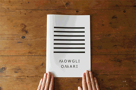
With this, we have come to the end of my third project for 2D. For the project, we were supposed to come up with a total of 12 pictures. They are sorted into 4 rows, with each row having three pictures representing ourselves, a scenario or situation, and then the outcome when we put these two things together. In a way, it is supposed to show who we are as individuals, placed in scenarios and how we would “react” to it. For this project, I wanted to show the simple things in life that I feel I cannot live without. They are my “addictions”. Thus, from my first post, I have decided to represent them in the way like they are drugs. I feel like when you take any one of these elements away from me, I am lost, I feel a withdrawal. Without further ado, let’s get into it.

img_5913

img_5912

For my first row, I wanted to show how sleep is very important to me. Ever since stepping into university, I have been suffering from a lack of sleep in a bid to finish my assignments and do them well. As such, I often sleep late, or even not sleep at all, falling sick and missing lessons. It was a sacrifice that I never imagined myself making, hence suffering because of the lack of it.r6dk8

Here we have my three compositions from this line.

img_5908 sleep1 sleep2

sleep3

Here, in the first picture you can see me feeling the brunt of my nightly sacrifices in my facial expression. The one below is the same, just the digital file before I layered the transparency. This picture is supposed to represent my exhaustion from the semester. The paint symbolises me being pulled away, like half of me is gone. It shows how I’m only half the person I am at any given point of time, half my attention, half my being.

I then show the temptations of the bed in the second picture, showing how enticing the bed is when it’s late in the night, but I’m still completing my assignments.

The third is me when I can finally sleep, trying to readjust my sleep cycle. When I do, I take hormonal pills to coerce my body to fall asleep at regular timings. Hence, here I show how I “forcefully” inject sleep inducing drugs into myself, showing how addictive I find sleep. (No, I did not really inject myself for the picture, though I pricked myself several times. Yes, that is an actual drug in the syringe. It’s a liquid panadol.) For the third picture, because I didn’t really talk about it in my previous posts, I wanted to recreate the drug-induced high / psychedelic effect, hence I layered several pictures together and played around with the colours, staying true to my theme of layers. I believe that there are many complexities to people and layers beneath the surface, who is to say we cannot embrace them and present them in art?tumblr_this-is-the-thyme

tumblr_lbatl

For my next line, I did it on coffee. As I am very reliant on coffee to get me through the sleepless nights, I wanted to show just how addicted to caffeine I really am.

img_5909

coffee1 coffee2 coffee3

In my first and second picture, I show a composed face, which is what I feel when I do my work. I focus on getting the work done, as efficiently as possible. Here, I don’t use paint in the layering because I wanted to keep the doodle as pure as possible, without ruining the effect. The geometric design over my face is supposed to show how I strive for perfection. I am structured. I am constructed. I am constructed to do so.

The second is the scenario, I am working hard late into the night and sleepiness begins to set in. I am feeling the tiredness and I am slowly overwhealmed by it.

In a bid to fight it off, I take coffee. I take lots of it. Sometimes I feel it’s not enough I need to snort it.

giphy-1

Ok, I am only joking. I just drink my coffee. (But in all seriousness DO NOT accidentally snort coffee. It hurts and you will hate the smell of it for awhile.) In the picture I show the “buzz” from the caffeine from “consuming” it. However, I did not take that into overdrive, but I instead mellowed it down a little as well in the “lighter” more muted colours. This is to show how you have a caffeine crash after.

giphy-2 tumblr_nsfxu9mwwn1riv7swo1_500

In my next line, I show how often at times, I feel bored, I feel depressed. Sometimes, I feel both. This sense of ennui plagues me often, hence I look towards my friends to always bring a smile upon my face.

tenor

Ok. Here we go.

img_5910 pills1 pills2 pills3

For my first and second photos, I wanted to show how I was extremely bored, yet with the underlying tone of feeling depressed and listless. Thus, in combination with my facial expression, I used dark, cool hues to show the feeling of sadness and boredom. It is almost as if it surrounds me, creeping in, ready so swallow me whole.

The next is the scenario. I’m out with friends, having fun and laughing. it doesn’t matter what we do, but it’s the company that matters. (This is a candid by the way. It was on the way to lunch in school and my friend happened to capture the moment. We were laughing so hard I can’t even remember why.)

The last shows me consuming my “happy pills” (my friends). I wanted to show how I am very dependent on them, like a druggie on his pills. This picture is a little more light hearted then the other “outcomes”, as you can see with me cropping the faces of my friends in, making me literally consuming them as my happy pills.

giphy

For my final line, I wanted to express how I am a shopaholic at heart. Actually, no, not even shopaholic. I just spend money like no one’s business. I guess I am willing to spend on things that will make me happy. Whoever said that money can’t buy happiness, clearly didn’t know where to shop.

img_5911

money1-1 money1-2 money2 money3

So, this time, for my first picture of the row, there are three layers (technically). First would be me smiling, but my hands are covering it up as a representation of my unhappiness with my appearance. The second would be the paint, with the strokes appearing as though it’s trying to cover it up, in anger and dissatisfaction. Lastly, my smiling face, only drawn on top of my hand covered, paint laced face. This picture is supposed to show how I am not happy with the way I look, thus giving me a reason to spend money. (If only this was the only reason, then my bank account wouldn’t look like the Great Depression.)

The next photo symbolises the lures of online shopping, and holding my own debit card. These are the banes of my bank account, as it makes it so much easy to spend and shop. It is a test and call to my will-power.

But alas, I succumb to the lure of it, for it is too great. This last photo shows how I spend money, for it burns fast like the ember on a lit cigarette. The $50 note on it represents how my money just burns away from me. The mirrored effect shows how I think I’m spending $50 but in reality I don’t even know I have spent 4 times as much.

giphy

With this, I conclude my 2D journey for this semester! I hope you have enjoyed yourself on my page, following me in my artistical (is this even a word) journey so far! I hope to see you next sem! Oh, and below will be a TL;DR (Too long; Didn’t read) for you lazy people out there.

giphy-1

TL;DR – In summary, each of my lines represent an “addiction” in my life. The first photo of each line is always a portrait of myself, represented in different manners via facial expression and layering of transparency, depending on what I’m feeling. The second is the scenario which I am put in. It is often the “lure” to me taking my ” drug. The final picture is my ” drug”, my addiction. I use photoshop to make it seem as though you are on a psychedelic trip from taking drugs to make you feel what I feel when I have my addictions.

My Line Is Emo – Emotion 18: Alienation

Alienation

/eɪlɪəˈneɪʃ(ə)n/

alienation

Alienation is when you feel left out. When you feel you don’t belong. When you are outcasted and you are ostracised.

I used a simple spray bottle to achieve the pokerdotted effect, representing the people who shun, while I smudged ink to show the vibes of sadness, creating one dot to represent the shunned.

alien

My Line Is Emo – Emotion 17: Horror

Horror

/ˈhɒrə/

horror

Horror is the intense feeling of fear and shock. When you are scared, when you don’t know what’s coming for you, what is after you. You are petrified and you cannot stop thinking. Too much.

I created this emotion by first using lino to create a grainy and unclear background. I then used a thin, flat surface with white ink to create the lines, smudging them and masking what lurks behind, to create that feeling for the viewer.

horror-008

My Line Is Emo – Emotion 16: Distracted

Distracted

/dɪˈstraktɪd/

distraction

Being distracted is the lack of focus during a task. Being unable to concentrate means you cannot accomplish the task properly.

I used a flat, thin surface together with black lino ink to create the effect of the lines. First, they are properly spaced like somone concentrated would do, before eventually “messing up” the lines from losing focus, getting bored, being distracted.

creativity3

My Line Is Emo – Emotion 15: Pity

Pity

/ˈpɪti/

pity

The feeling of pity is emotional sympathy for someone else. You want to reach out and help, but you don’t know how, and they won’t see it as an act of kindness.

I used chinese ink and dripped it onto one side to create the effect of “reaching out”. The colour black symbolizes the way the person you pity views you as. I then used a .38 ink pen to draw out the “barriers” that the people you pity shut you out with. I then used chinese ink and shaving cream to create a vidid marble effect, whereby the poor soul, as represented by the doodle, basks in their sad state.

1d0c41b09725e6e7eff2553c54e1c49e

My Line Is Emo – Emotion 14: Jealousy

Jealousy

/ˈdʒɛləsi/

jealousy

Jealousy is the feeling of resentment, of anger at someone else for their accomplishments, of their attention they’re getting, or if you feel like you are being cheated in love

Jealousy begins slowly at first, as a suspicion, as a little envious. Here I used a brush with plastic bristles with chinese ink to create the sharp pricks of jealousy within oneself. I made the lines to grow to be more and more violent and outrageous, as jealousy grows to the point where one cannot think clearly within the mess of their minds.

black-and-white-classic-jealousy-modern-art-favim-com-2650101

My Line Is Emo – Emotion 13: Hypocritical

Hypocritical

/hɪpəˈkrɪtɪkl/

hypocritical

Hypocritical is when you believe you are better than someone else. It is when you are two-faced and you don’t mean what you say. It sometimes feel like you are fractured as a person, like you are broken because of this horrid behavior.

I wanted to achieve the multi-faceted look to create the aspect of being two-faced, of playing from different angles. Hence, I crushed the paper before carefully spray painting it from a single direction, allowing me to bring forth the different sides of the crushed paper, creating the many surfaces.

two_face_6711