my 18 emotions:
1. neutral –
a. not supporting or helping either side in a conflict, disagreement, etc.; impartial.
b. having no strongly marked or positive characteristics or features.
– i relate to this the most because i’m always in a constant state of neutrality. i’m neither genuinely happy nor sad, but always in the middle. it’s a lot less emo than it sounds. f
–


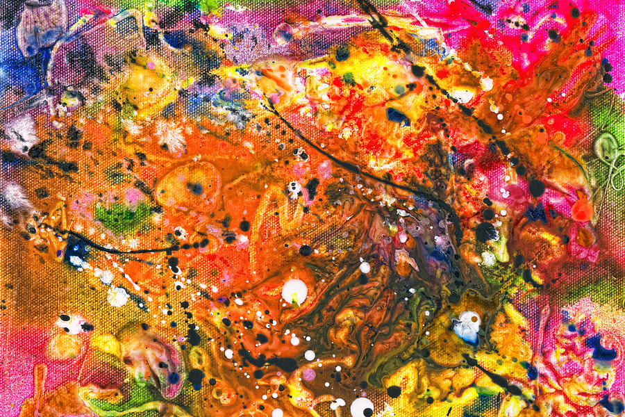
2. angry –
feeling or showing strong annoyance, displeasure, or hostility; full of anger.
–
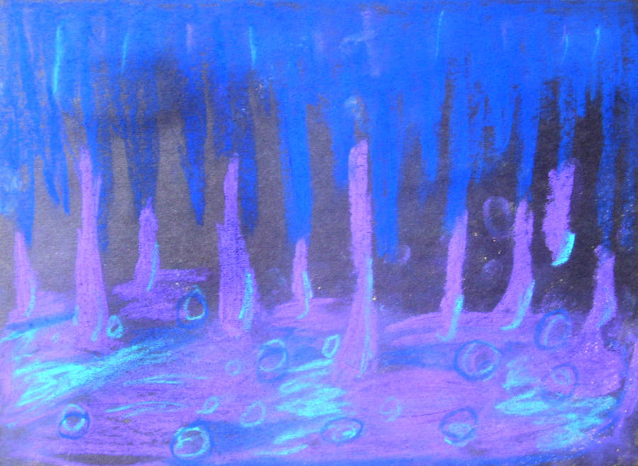
3. calm –
adjective: not showing or feeling nervousness, anger, or other strong emotions.
noun: the absence of strong emotions; calm feelings.
verb: make (someone) tranquil and quiet; soothe.
– my favourite emotion. is it an emotion? it’s something i wish i was – the more pleasant sister of neutral. when all is calm, it paves the way for greater things to manifest themselves.
–
4. frustration –
the feeling of being upset or annoyed as a result of being unable to change or achieve something.
– probably the most common feeling i’ve felt throughout my life, especially as someone who is never satisfied with herself or her work.
–
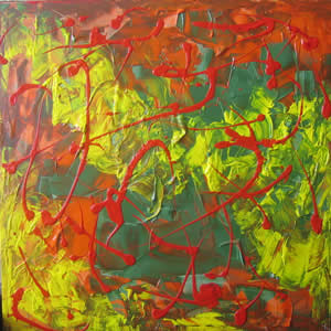
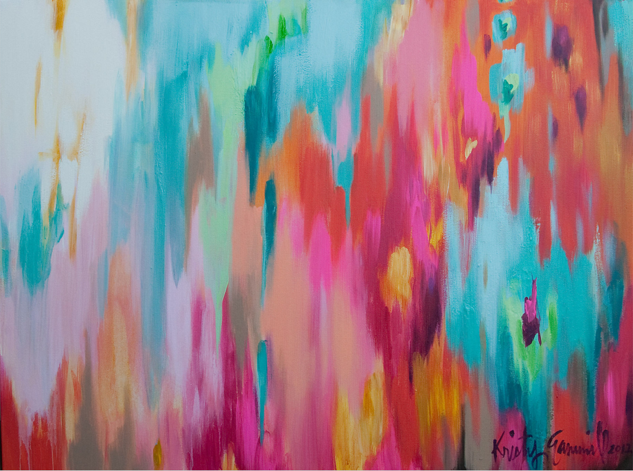
5. excitement –
a feeling of great enthusiasm and eagerness.
–
6. disappointment –
a. sadness or displeasure caused by the non-fulfilment of one’s hopes or expectations.
b. a person or thing that causes disappointment.
–
7. relief –
a feeling of reassurance and relaxation following release from anxiety or distress.
–
8. shock –
a sudden upsetting or surprising event or experience.
–
9. confusion –
a. uncertainty about what is happening, intended, or required.
b. the state of being bewildered or unclear in one’s mind about something.
– me all the time in ADM.
–
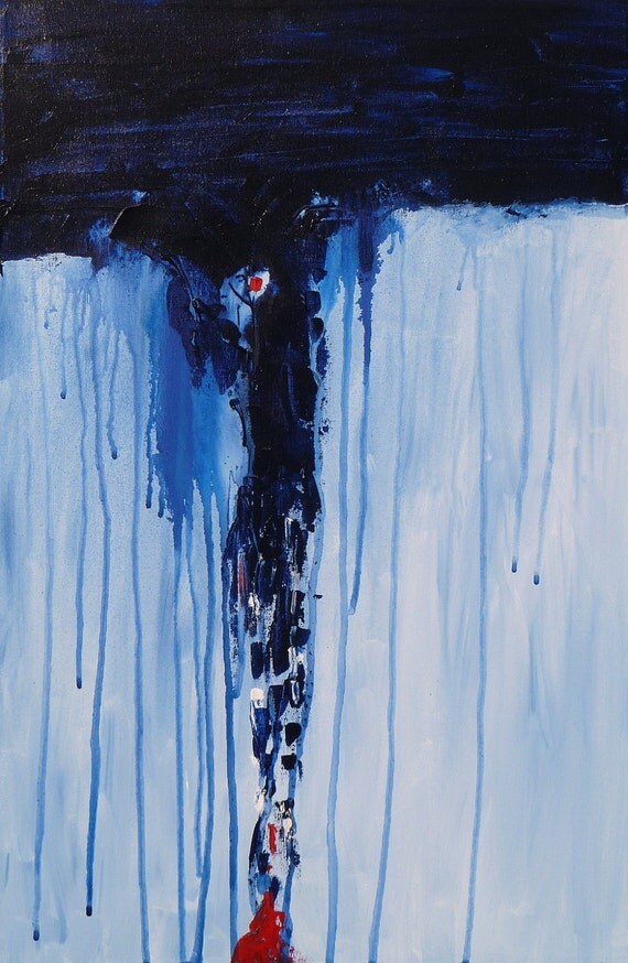
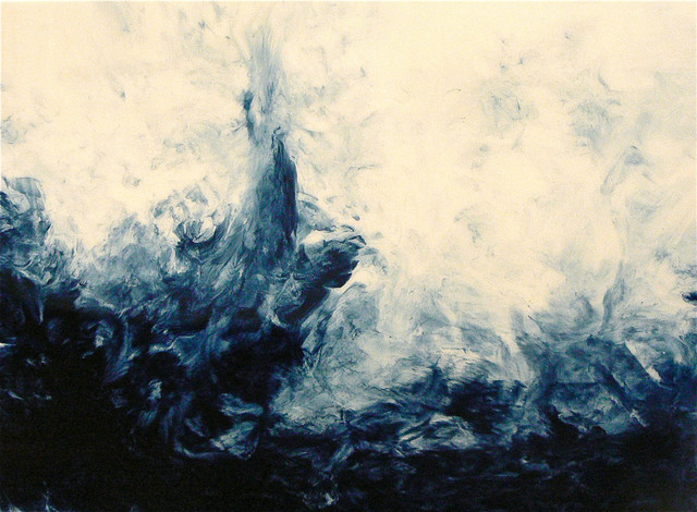
10. gloom –
a. partial or total darkness.
b. a state of depression or despondency.
–
11. exhaustion –
a. a state of extreme physical or mental tiredness.
b. the action of using something up or the state of being used up.
– again, me in ADM. and MJC. and CGSS HAHAHA this is me 24/7.
–
12. sadness –
the condition or quality of being sad / lack of happiness and enjoyment.
– i don’t think i’ve felt serious sadness in a long time so i’m not sure how to interpret this well.
–
13. happiness –
the state of being happy.
–
14. anxiety –
a. a feeling of worry, nervousness, or unease about something with an uncertain outcome.
b. strong desire or concern to do something or for something to happen.
–
15. fear –
an unpleasant emotion caused by the threat of danger, pain, or harm.
– “i ain’t afraid of no ghost!”
–
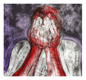
16. shame –
a. a painful feeling of humiliation or distress caused by the consciousness of wrong or foolish behaviour.
b. a regrettable or unfortunate situation or action.
–
17. guilt –
a. responsibility for a crime or for doing something bad or wrong.
b. a bad feeling caused by knowing or thinking that you have done something bad or wrong.
–
18. doubt –
a. a feeling of uncertainty or lack of conviction.
verb:
a. feel uncertain about.
b. [archaic] fear; be afraid.
all inspiration images are from google.