Monthly Archives: April 2017

final product: the macrowave

Microwaves are kitchen appliances that almost everyone owns in their home. They heat and cook food quickly and efficiently by exposing the food to microwave radiation and thereby altering the molecular structure of the item. We are basically consuming irradiated food items with altered molecular structures that – due to said exposure to radiation – has it’s health benefits reduced and instead is detrimental to our health especially in large doses, which is why we are advised not to use microwaves too much in our daily lives. However, despite knowing this, we continue to use these appliances frequently because of the ease and convenience of it. Coupled with our busy lifestyles, it provides us with a more convenient excuse to use it even further. Perhaps, since the effects do not manifest immediately, we don’t see the extent of which our body is being damaged. Through this experience, we want to get the people thinking about the damage that microwaves are causing to our body.

Continue reading

process post #MTLGA

This is the process post for my 4D final project: a game about learning (it’s more fun than it sounds here) ALSO SIDENOTE @OSS PEOPLE: THE YEAR KEEPS SAYING 2018 SO MY POSTS ARE JUMBLED UP AND OSS WON’T LET ME EDIT THE DATE SO PLEASE FIX THIS IT’S REALLY FRUSTRATING AND THE ORDER IS ALL MESSED UP SO I CAN’T SEE MY POSTS IN THE RIGHT ORDER THANKS

Continue reading

assignment 03: zine – sembawang: a journey up north

technique: digital manipulation

colour scheme: mono, blue. originally wanted to do riso but too ex and nobody answered from the printer.

paper: A4 glossy white, 120gsm

digital manip (distortion):

the focus isn’t the original photos but the warping. this zine is focused on the technology-obsessed millennials, which is why this zine takes what they know and uses it to push across a message.

explanation:

the cover page is as such because, in an exaggerated sense, it was an “out of body” experience because going there i felt really overwhelmed by the fact that i was underwhelmed.

the first page, the background is actually an image in the form of binary numbers. the black is meant to be jarring because this zine isn’t about showing you what you can see, but rather telling you what you should be seeing because you haven’t been paying attention to these subtle things that you’re missing out on.

again, this next page emphasises what’s not there that we should be appreciating. narrow sidewalks, lots of greenery as compared to normal districts where you see trees only in certain parts of the roads and such. the “error 404” again follows the same overarching message of emphasising what you’re overlooking.

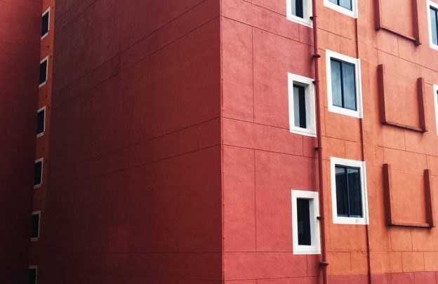
there are a lot of windows as if to say there are a lot of files open, in this case the files are photos, so it’s subtlely saying that there are a lot of beautiful landscapes that you can capture. there’s also a small writeup that’s a bit more passive, talking about how we only think of the hot spring and the beach but we gloss over what’s all around us that we don’t see elsewhere either.

this page brings the tension right back up because while we should appreciate what sembawang has to offer, we also have to realise that it’s not going to be there for long (as seen by the “state land sign”) and the purpose of this sign is to show that the government is taking away land for – you guessed it – condos. so this is warped because our strong feelings against monopolising open land for more condos is being displayed as such. the breaking of this small frame is like breaking a frame in anger. i personally also feel this way because 5 years ago we had open lands and people used to fly kites, have picnics and it was nice, scenic and windy. now it’s all condominiums, not even affordable HDBs, which is why i feel so strongly against all this.

this is a recommendation from me to the reader, before it’s all reverted to the default schematics of every other neighbourhood. it’s like a distorted hand-scroll/map for the reader to observe and be intrigued by. the trees and nature are highlighted in blue for emphasis, and the wideness of the road is emphasised by the distortion (because it’s uncommon i.e a distortion of reality) and the traffic light, which is normal, isn’t distorted.

the final page is a softer ending. the mood went up and down and up and slowly went back down, sort of to stimulate the reader. this ending page is to get them to think about what is being lost – not only in sembawang! yes there are parks being built but they are allocated places. what about where we live? are they aiming for all streets to just be grey pathways? this polaroid film-style of photo gives a nostalgic feeling as if to make them miss what is almost gone for good. the handwritten “it’s just temporary” is a personal touch, to show a more personal side to this zine.

hopefully this zine managed to convince the reader that this neighbourhood up north actually has something to offer, and the same can be said with other unknown areas. there is beauty in everything and this serves as a reminder/wake-up call to open our eyes and minds to look for things beyond attractions and activities, and just to appreciate what’s around us.

zine-bawang (process)

this post will be about the first 2 drafts i made for the zine:

this was my first draft. i wanted to model it after the Kinfolk magazine.

– CHANGING COLOUR SCHEME TO PASTEL (more calming, less rugged) + pink tinge (warm, welcoming, loving)

Kinfolk is known for it’s minimalistic page design coupled with personal touches that are shown largely through their content (text). i liked the cleanliness of the entire book and the subtlety of the personal anecdotes that weren’t too overly emotional. but Mimi said that this looked like a real estate magazine and wasn’t personal enough for a zine, so i decided to go back to my initial idea that i presented during the first presentation.

then i did a second draft, with the intention to do risograph. i didn’t end up doing that because it was too expensive & the printers didn’t email me back :”-) and i did a combination of digital manipulation, found images and drawings to create a cohesive black-and-blue themed zine that illustrates my feelings towards the area. although the methods used differ, they are all the same in terms of manipulating the original image in different ways. i added more personal text and really put my personality and experiences into the zine this time. but Mimi said that the digital manipulation wasn’t uniform enough across the zine and looked like it was jumping from one style to another. so, i stuck solely to digital distortion of the images and scrapped about 5/8 of the pages that didn’t fit.

but i did like the colour palette so i stuck to it even though i wasn’t doing riso anymore. i also changed my mood for the zine, because while the blue may be a calming colour, the black and white evoked something else. but it still was appropriate for my location. all in all i managed to edit the images to work for the magazine and at the same time hold some form of uniformity throughout the booklet.

all in all, i really liked this project because it was zine making (which is my fav) and involved digital manip (also something i enjoy) but there was an added challenge of restricting the content to sembawang – my old hood that i remembered for having absolutely nothing (i used to live in yishun so by comparison it was pretty boring)(but after that i moved to hougang and if you see phoebe’s zine you’ll understand why i was a bit more optimistic about sembawang). so it was hard to clear my mind and go into the area because even though it was over 10 years ago, the memories of the area, namely sun plaza, were pretty vivid. but the first thing i saw that i remembered so fondly was itself completely different, so it became easier to see everything with fresh eyes. it also got me to stop looking for traditional forms of entertainment e.g. attractions, and got me to see the inherent beauty within the regular things.

sure, my zine may not follow the mood of the place, but that’s just it. i don’t want the zine to embody the atmosphere of the place because i want the reader to go out and experience it for themselves. the new design aims to instigate the interest into the reader and sort of drill it into their head that such beauty is rare in such times, and it won’t last for long because singapore needs to maximise their space – this means taking over open areas for living spaces. sounds intense right? that’s exactly what i aimed to do with the distorted images. it’s sort of like scaring you into submission, and making you curious enough to make plans to see for yourself what’s it all about. and of course, we all love technology, so how else can i grab the attention of my T.A than to use what they love.

a more detailed explanation will be included in my final post – this post is just to explain the changes and the reasons for them.


2d research/design references

(journal scans tbu)

content page: https://www.behance.net/gallery/47847955/Soma-Festival-sonoro-experimental

overlaying (img): https://www.behance.net/gallery/40190829/Sudario-Due

cool yellowzine: https://www.behance.net/gallery/47663231/HELLO-FROM-THE-CHILDHOOD

overlay (text): https://www.behance.net/gallery/44163537/Bam-(concept)

blocking: https://www.behance.net/gallery/33811022/Daemmerung

tracing paper: https://www.behance.net/gallery/49024035/Politicos-Polidos-Polite-Politicians

glitchy effect: https://www.behance.net/gallery/24409609/Anatema-Zine

texture: https://www.behance.net/gallery/18025937/Pixel-Perfect-a-screen-printed-zine

mixing materials: https://www.behance.net/gallery/47616875/Titanomaquia

authentic “ziney” feel/collated: https://www.behance.net/gallery/46278361/Boiler-Room-Zine

scanner: https://www.behance.net/gallery/16274613/Experiments-GIF-vs-Zine

text overlay on photos: https://www.behance.net/gallery/31584047/Je-men-bats-les-koons

colour palette sample: https://www.behance.net/gallery/2133518/B-O-L-O-print-magazine-contributor

raw text (markers): https://www.behance.net/gallery/2133518/B-O-L-O-print-magazine-contributor

print-making: https://www.behance.net/gallery/48698985/Litography-zine

minimal usage of text: https://www.behance.net/gallery/10885673/C-D-L-Fanzine