Queries about final project

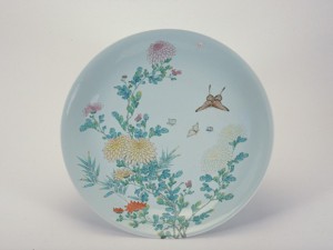
So my group (Ziyu, Chenyue, Fern and I) have chosen this particular ceramic as our main object.

1999-00448_ChrysanthemumDish

This is a Chinese ceramic that was produced in the JingDeZhen kilns during the Qing dynasty, and was probably made for people higher up the social ladder such as emperors.

After researching, we found 4 main characteristics about this ceramic that we can come up with concepts for.

  1. Christian influences on the development of this ceramic, mainly on the technological side
  2. That it was catered to emperors in the Qing dynasty
  3. Western-influenced designs such as the slight pink enamel
  4. That it was later imitated by European countries

However we are unsure if these are suitable for this project and if suitable, how to come up with a thesis for it.

Essay proposal (rough outline and some thoughts)

Draft thesis/claim : the evolution and rise of Chinese ceramics, especially aesthetics, was to a large extent influenced by other countries

Paragraph 1: introductory information such as uses of early ceramics in native China, brief info about processes involved, importance placed on various types of ceramics (dominant color was black, designs were geometric and simple ones depicting animals or human faces), and from there introduce main thesis. Will also contain basic definition of ceramics and how China is famous for such goods, which acts as a transition to my main argument.

Next few paragraphs will be chronological with events such as opening of trade routes slowly exerting their influence on Chinese ceramics. Point to consider: early ceramics were entirely functional, meant for cooking/storage/carrying water etc and later on became a decorative item/symbol of status/diplomatic gift etc.

I will then compare 2 ceramics found on shipwrecks, either between one used by Chinese crew and one for export OR between one before opening of trade routes/silk road and one after. Assess presence of handles etc to indicate functionality. Chinese began glazing in Shang period, thus more aesthetic options. Early lead glazed wares had figures that were linked to ‘Taoism’ and other native beliefs, later wares had images of other cultures etc.

Porcelain could possibly be a good example as it was only produced in China until the late 18th century due to kaolin existing there, thus if there are signs that porcelains were produced to cater to other cultures it would really strengthen argument.

Sorry for the messy structure but I was just noting down important points to use here while researching. So essentially I plan to argue that even though China is renowned for their ceramics, they owe a large part of their success to other countries.

Looking forward to your comments on my draft.


Project 1 final (plus discarded ideas and progress)

A plea for comments

Okay if you’re reading this I would like to ask a small favour of you, which is leave a constructive comment/critique of my work on this post. And if you do I’ll leave one for you as well. On thursday as I laid in bed trying to summarise my first presentation/critique of the semester, I realised that the only comments I got were that people  liked my work (thank you Vimal, ZT and Jo!) and the feedback on my crossword puzzle one (thank you Joy!) and felt that something was missing. I’m not saying I didn’t put in effort for this project nor am I implying that I handed up half-assed work, but as someone with almost no formal design training and a freshmen at ADM my work is almost by definition bound to be really shitty. My work has to suck, and it is through countless critique sessions that I can learn and become a better designer/artist. I’m not saying the ones that liked my work were insincere (I hope not) but I feel that people are either too nice, too shy or just really sleep deprived (which I was too but I still gave some comments). So yeah I hope I get some comments (even if you outright hate street-art and it’s just a personal thing I want to hear it too as it contains insight which can contribute to my growth as an artist, just be tact) and we can all grow through commenting on our ideas! 🙂

On that note I would like to thank Siqi, Eugene, June and Junyuan for giving me feedback, which I will post at the end. I would also like to thank everyone that helped me while I was working on these ideas (like Xinyi Charlimae, Jacob and Kuangjun) and giving tips on how to improve them (more notably Charlene and Zhouyang who really helped develop the Hollywood star idea)


The first 2 compositions are traits of myself (using common objects with minor and non-drastic changes to their original nature for reflection) and the last 2 are goals and ambitions which I project onto the world (thus using street art)


Hi my name is Andrew and I’m interested in many things but not enough to be an expert on them

interest

My interests define me to quite an extent, be it my taste in music or books, and I have a wide range of them. However even though I am interested in things ranging from martial arts to philosophy, I am only casually interested in them and don’t know enough about them to be a expert/die-hard fan. This composition aims to let viewers experience what I mentioned above by recreating a messy poster wall, but this time with nicer aesthetics and almost zero meaning/content (using dummy text). I chose posters/a wall of them because they are things that were made specifically for attracting attention even though they contain quite little information, and that middle ground between initial interest/hesitation to find out more is what I wanted viewers to experience here. Thus the posters and their colours are more eye-catching/appealing to people, but the dummy text/lack of information will give them even less of a reason to find out what they’re about. Misalignment of alphabets hints at how various topics don’t really ‘fit’ together.

Hi my name is Andrew and I’m still finding myself

finding

Pretty straightforward idea, act of finding ‘ANDREW’ is highlighted by numerous pencil strokes on paper and eraser dust at the side. Was debating between using the picture above or this

20160216_230708

but stuck to the above one as it showed more of the eraser dust.

Hi my name is Andrew and I’m a rebel that doesn’t know when to be serious

retarded
this picture looks really ugly in thumbnail so please click on it to enlarge

Graffiti breaks the law and thus expresses rebellion, and the color pink/playful font/diagonal alignment is used to make fun of the very serious intentions of the sign (caution sign to stay away from high-voltage equipment). New spray painted text also gives the symbol of a man getting electrocuted a different meaning when viewed together, a sort of retarded dancing/behavior for example.

Hi my name is Andrew and I want to be remembered for being different

different

Originally wanted to use obituary/tombstone/honorary signs but then Zhouyang suggested Hollywood walk of fame as most notable marker of a person’s legacy. Intentional misspelling of name and contrast between formal font/placement of star in toilet (hence the shoes and pulled down shorts) highlights need to be different from everyone else. Original idea was simply my misspelled name on normal Hollywood boulevard, but lacked contrast thus I thought of informal places where nobody would expect to see such a thing.

Comments/feedback

  • throughout my work there is a theme of playing with personal and public spaces, as most evidently seen in the Hollywood star one, and crossword puzzle didn’t really follow that theme with the plain brown background (which was just a cardboard sheet) and thus could have been places at public spaces such as an MRT station for example
  • presentation could have been more ‘street’ by sticking printouts on wall, crumpling them, picking them up from floor etc
  • crossword puzzle one doesn’t really fit in with the rest
  • graffiti on could have used a more zoomed-out picture to show more of the ‘WARNING’ sign below or where this place was
  • not everyone knew what a Hollywood star was, could have used something more universal like a tombstone
  • poster wall one looks too digitally altered (it’s not, I pasted them on the wall of the 2d computer lab but good point) and could have been on some public space for example
  • toilet one was the strongest/most easily understood, good use of context

Discarded ideas

grbreakrules
My name in Hebrew
Screen Shot 2016-02-20 at 2.56.20 pm
Original posters

obituary

authority

graffitti
my name in Tajik

Screen Shot 2016-02-20 at 3.00.17 pm

20160217_030322
Discarded idea: Hi my name is Andrew and I pay too much attention to detail/Hi my name is Andrew and I get distracted easily

20160216_220136

20160216_154331

20160216_223835

Project 1 reference artists/research/updates/visual journal part 2

You know one of my biggest issues with posting these updates on OSS is whether to write the entry in a formal manner or simply ‘vomit’ everything out as I do when consulting Joy but I guess at this point it’s pretty evident which option I have chosen.

Also I find the categories very annoying (I have ocd sorry) so I’m just going to create one called ‘PROGRESS’ which include the four main types of information you probably want to see.

So after settling on the ‘2d text in 3d spaces’ theme/style I went on to find similar pictures.

02b7fe2b4bf12e0ae7ea3dc2623d916f 6c19b464886f11868e86e2fa33cab18b 6ce9609a9b5b981c72445870f028a336 7ff67958ffb0c267ef94e22867b15733 8ad029f85cf14382caea32b280ea9163 14c4c8105247046ebe1ef90f674aff7b 0813b249eee5b57a7f502b2c17e96c3b 5774f67c9b9e809e89ee9608de61427b 87622f2e1ab054eeb4aa84ccfbb32c3b 953320315b55d8a6450ee600c5d8494e b46d6fe310404bec776683aa2f08234c cc33f249e582ee007b4462ea9d1ae50e cd69db9b8a51c3e65cc5ed679e2c2545 e0615f88a1a99619d2dd747e962ba668

Reference artist 2

I also came across a typographer Nathan Levasseur who had works that is very similar to the idea I have in mind. The following pictures rely both on typography as well as a certain amount of photography/set-up to convey it’s message which I will elaborate on for each picture.

8c95b599169f139f18991786d968a7a2
Very nice play on the words morning/mourning, hints at dread of waking up early, plight of having to be up so early is possibly made better by coffee (thus the bright orange-red background colour), not too sure what the slab of marble beside represents
BedFinal
Not too sure what this object is but I would guess it’s a bed, text placed on what I assume to be a comfy bed shows that perhaps lazying around alone here isn’t such a bad thing, not sure if the word ‘feel’ is in italics to highlight that particular emotion
Honey+Club+Edits2
Object is possibly a rock, or more suitably a large chunk of clay placed on a sturdy board, text looks handwritten, a little skeptical about the use of colour/type/object in this picture
tumblr_o1xs26w9kJ1slt6wpo1_500
Not really sold with this idea but the use of plastic wrap is pretty interesting, will probably float around at the back of my head for awhile but I think can churn out some ideas from this

Some trials

print
Original idea for ‘Hi my name is Andrew and I like knowing more than reading’. Had this brief idea, decided to try it out but not really sure if it conveys the intended message.
20160212_205516
Another idea I had for ‘Hi my name is Andrew and I like knowing more than reading’ where 2 flyers form my name, preferably at a place where people won’t stop to read (thus the picture being taken from such a distance). So in a sense people walking by will probably only see (and thus KNOW) the word ‘Andrew’, but won’t actually stop to READ what is on the individual flyers. Takeaways from this: could probably form a misspelling of my name instead like AENDRW, find a better location with more flyers (mrt stations/bus interchange?)

20160212_205547

20160212_205554

20160212_205952
Here my name is edited onto a DANGER! sign and the background of high voltage equipment bolsters that message, don’t really know what this is for though was just experimenting

20160212_210046

20160212_213613
Name photoshopped onto SALE signs and yellow tape used to cordon off areas, just experimenting.

After 4 February consultation

I think consultations in small groups is quite a good idea as essentially there are more people to comment on and bounce off ideas, and seeing my classmates put in so much effort exploring also gives me extra motivation to work harder! I really think there’s a lot of potential in Abraham’s idea of playing with Chinese characters and Madeline’s concept of world-building, which if properly executed, would really blow everyone away. All the best to them! The feedback I got from that session was that a recurring theme in my ideas is they all seem to contain a call to action, be it the danger signs or the name in toilet bowl (previous post), they sort of make people want to act on it somehow (by flushing the toilet bowl etc).

That idea is really interesting and after thinking about it I might use that as an underlying/subtle theme in my works to express a comment from Joy in exercise 1 where I seem to invite/welcome people in, but only to hint immediately after that what they find might be repulsive.

During consultation I also showed a mind map of another idea I had where I would use really nondescript/boring traits such as ‘Hi my name is Andrew and I have 2 eyes’ and come up with really creative interpretations for them. This was in response to my concerns about the feasibility of ‘2d text in 3d spaces’ and also to challenge my creativity since I had such critical views of text made with bread etc.

20160212_210454

I have since scrapped this idea.

Stay tuned tooney loones!

Project 1 reference artists/research/updates/visual journal part 1

So after coming up with many concepts/ideas (as listed in last week’s post) and many days of doodling I decided to chose a few I thought had potential and come up with ideas for it.

The first idea I settled on was ‘Hi my name is Andrew and I think a lot’ and here are some thoughts that immediately sprang up:

  • image of messy bedsheets (late-night anxious worrying/pointless reflections)
  • crease of messy bedsheets forming alphabets that make up ‘ANDREW’
  • messy bedsheets with a piece of paper with my name typed out on it (preferably crumpled)
  • bedsheets with name written on it with permanent marker, and made messy/creased
  • substitute above bed ideas with pillow?
  • close up image of hands scratching back of head, maybe with ‘ANDREW’ written on individual fingers/hand
  • biting fingernails

The above ideas had photography as a common theme/element and it didn’t take long for me to realise that I was probably inspired by a work from Stefan Sagmeister which I didn’t include in last week’s post.

drugs-comp

DrugsAreFun3

DrugsAreFun1

This is a campaign to discourage drug use with the main tagline of ‘Drugs are fun in the beginning but become a drag later on’, and coupled with the disturbing/weird imagery I would say the message has been communicated pretty effectively. The chosen images had nothing to do with drugs nor were they carefully selected, but instead were from an old tv show that Stefan had seen, and decided to replicate the 6 ‘scenes’ as best as he could. What struck me most about these 6 images is the very creative use of text, namely that they are on the objects in the pictures rather than typed out in photoshop during post-production. I couldn’t quite put my finger on where a campaign like this stands in the art-design spectrum nor could I quite articulate what I liked about it, but I felt it was a good direction to head in.

To elaborate on that last point, I decided to explore this particular ‘genre’ as I promised myself to do something different (other than plain graphic design) but also to avoid projects like these:

artistic-typography f6e402cdbd75fc60dd76fcc139b910e3 Screen-Shot-2014-11-17-at-9.46.25-AM tumblr_mvn7p7hWDu1sqanmmo1_1280 typography_real_life_photo_by_cherryberry153

No offence to anyone but I think real-life typography like the above are not only really cliche but don’t actually communicate anything other than the large amount of time spent shaping mashed potatoes or whatever chosen medium. It looks cool and probably will be really popular on sites like designspiration.com but okay enough ranting #positivevibes #enoughnegativeenergy #youhavedistractedfrommycreativeprocess #wizwearscoolpants

So I printed out my name in various fonts and went on to explore what I call 2d text in 3d spaces and its resulting meaning.

20160126_235415
rolled around in bed for 30 mins, paper wasn’t crumpled enough
20160126_235628
crumpled
20160126_235826
wet paper, and proceeded to stick it on wall
20160126_235946
watercolour (super cheap ass one, not the $40 van gogh one that Don loves so much oh hell no)

20160126_235958

20160127_000028

20160127_000539 20160127_000618

20160127_001144
plastic bag
20160127_001217
wiped off ink

20160127_00145820160127_002105

20160127_001645 20160127_001837

Reference artist 1

I also discovered the artist/graphic designer Marco Ugolini, and to be perfectly honest I have no idea what exactly he does, but I kinda like it. Marco’s works explores the interrelation between graphic design and visual art and “readjusts objects within a context for reflection”.

You can check his work out here: http://www.jesuismonreve.org/about/

I think what ties all of Marco’s works together are the strong concepts, and one particular project that stood out to me was ‘removed posters’.

removed_poster04

Marco took a picture of a wall with many leftover pieces of flyer paper, printed the image out and pasted it on the same wall, only to remove it later. I like how Marco ‘contributes’ to the wall’s meaning, and I wonder how the end result might be affected if Marco pasted a regular flyer for example. Still not very sure what to call this particular type of art/design, so I went on to instagram to look for inspiration/similar images.

Screenshot_2016-01-27-15-16-58 Screenshot_2016-01-27-16-03-02 Screenshot_2016-01-27-16-03-39 Screenshot_2016-01-27-16-03-54 Screenshot_2016-01-27-16-04-11

So my choice of medium/theme/style (you get the point) will be experimenting with 2d text on 3d surfaces and the resulting meaning. Within these dimensions I have lots of variables to play with such as:

  • design of text (font, kerning, leading, upper-case etc)
  • material used to form text (ink, charcoal, paint, unconventional ones etc)
  • type of paper/thing/object that text will be on (normal paper, newspaper, tape)
  • placement of text and supporting object (dustbin, carpark, tree etc)
  • camera effects like lighting/angle

I am also really leaning towards using all 6 rectangles to express 1 single trait of myself.

Or not.

Stay tuned looney tunes!


One take film script (draft)

Noises at night

-film begins with side view of man sleeping in bed, background is dark and quiet

-camera begins to slowly zoom in to man’s face, who is calm/expressionless

-a sudden loud noise wakes the man

-man sits up on bed to with face right in frame, extreme close up

-camera slowly pans to other side of room to reveal other man sleeping, presumably his roommate

-loud noise is coming from roommate, camera zooms in for an uncomfortable diagonal close shot of roommate/s face

-roommate appears to be grinding teeth

-camera pans back to man sitting on bed

-low, side view of man walking across the room, leaves the frame

-back view of man standing over roommate’s bed

-awkward 15 seconds or so of man slowly pacing back and forth beside roommate’s bed, scratching head and inaudible grumbling

-camera slowly circles man, zooming in to his face and revealing a strained expression

-man walks back to bed, exiting frame

-camera slowly returns to original side view of man in bed

-door opens/lights are turned on to mark the arrival of day

-a sudden scream pierces the room, camera moves to other side of room to show roommate sitting up in bed, a bloody hand covering his mouth

-roommate is in shock/pain

-camera turns back to original mal

-extreme close up of man’s face with a surprised/blank expression

-film cuts just as man appears to break into a grin

Project 1 research/reference artist

Reference artist

The reference artist I researched on for this week was Stefan Sagmeister, a famous graphic designer/typographer who is known for his playful approach to typography.

stefan_sagmeister_poster

Stefan Sagmeister has always been a name that appeared when reading about famous graphic designers and I thought his works were really innovative in their use of unexpected materials to form words, thus I borrowed his book “things I have learned in my life” to hopefully understand his creative process.

I was not impressed.

Here are 4 of his works and the story behind the respective taglines.

7d8c1b71f427c427a300ccad1a97d1d1 sva_corporate_poster

‘Thinking life will be better in the future is stupid. I have to live now.’

This is a billboard created for a visual arts school using images of butterflies in their various life stages which complements the warm, autumn vibe of the brown background. The text is skilfully made out of sticks, and the main words ‘stupid’ and ‘now’ being bigger from the others really helps to emphasise it’s message. The word ‘now’ also seems a little bolder than ‘stupid’, thus driving home the importance/urgency of living in the present.

Long story short, the tagline was a quote from an acquaintance in a backpacking trip Stefan made to Austria in his early days, where the group got robbed of all their belongings one night. Stripped of their possessions, the group decided that this is where their trip/fun would officially start, and eventually Stefan made it back home with a sleeping bag that the aforementioned acquaintance gave to him.

In my humble freshmen-in-design-school opinion I think that the chosen imagery/style is completely random and has no link to the tagline, and it actually contradicts the school’s aim, which is to provide an education for a better future.

stefan-sagmeister-16-728 lisbon-first

‘Complaining is silly, either act of forget.’

This was done for a Portuguese brand of beer, and was done using large pieces of newsprint with stencilled alphabets. The newsprints were left in the sun for 3 days, and the un-stencilled parts turned yellow, resulting in the typography seen above.

Again, I think the choice of font/materials used was pretty random/arbitrary and the layout could have been done better.

d5a51f175961505799615e99b5029b3e

c72d6a0454e21be36b2fd22b2fb12060

ps96_mural_everybody

‘Everybody who is honest is interesting’

This quote came from writer/gay icon Quentin Crisp at a press conference. Quentin initially told reporters that everybody is interesting, only for the reporters to claim that they knew many people who were simply boring. Quentin thought for a few moments before updating it to the quote used here.

The quote is represented in 5 different posters, each decorated with childish/fantasy-land characters and unique typography made out of things like ladybirds. Overall the colour scheme is pleasing, and there seems to be a certain narrative throughout the 5 layouts, but perhaps Stefan could have made words like ‘honest’ bigger than less important ones such as ‘is’.

The reason behind this choice of style seems to be influenced by the location of these posters, which is in a non-profit library for young kids in poor neighbourhoods.

What I hope to learn from researching Mr Sagmeister’s work is to have a concrete link between the text and chosen imagery/style in this upcoming project.

Typographic inspiration

I also borrowed a book on typography by Emil Ruder which was very informative.

20160119_165419 20160119_165525 20160119_165529 20160119_165553 20160119_165557 20160119_165748 20160119_165752

These last 2 pictures interest me the most as this current project will be focusing more on designing/expressing a single word rather than entire paragraphs, which is what the majority of Emil Ruder’s book was about.

20160119_165829

20160119_165846

I really like these posters done for D&AD’s 2013 award ceremony which uses simple manipulation of a letter to express something entirely different.

BCMH_595px_D_AD_assets-04 BCMH_D_AD_DEAD_7 BCMH_D_AD_DEAD_14 D_AD_6_comp

Here the ampersand has been slightly tilted/edited to create an entirely different word ‘dead’ from the original ‘d&ad’. I’m really inspired by this and am still trying to see how I can incorporate this into my work.

A poster done for the following year’s award ceremony is also really nice in it’s use of yellow umbrellas to enhance the text.

canvas-720x400

Posters with nice use of layered text.

1f1155_b2c5e4369b3b4c27add41ba4e618e16b DAD-div_guinness


Alphabet design by Greek fashion designer Mary Katrantzou.

0da82c0552e70f336bb56f7c88e910bf

8a58eb76d8548e2a8f9a64bc198ca49c

b5a3f70e8c174b3fc858299ead95f9be

ddbb1316e588a0ed4330d5672be3b6c1


Thoughts on attributes.

I spent some time writing down a list of potential attributes and I realised that the things people say about themselves can be further classified into 3 main groups: plain/everyday facts or characteristics (as seen by others), deep hopes and aspirations (as contemplated when alone), and quirky views on almost anything.

Plain/everyday facts or characteristics about me (as seen by others):

  • I am funny (at least to some)
  • I don’t take many things seriously/ like to joke around
  • I don’t often try out new foods
  • I am weird
  • I like walking/exploring different places
  • I am indecisive
  • I procrastinate
  • I tend to do/say the wrong things at the wrong times
  • I am a student/live in the east/favourite sport is MMA and blah blah all that boring stuff which I probably won’t use

Deep hopes and aspirations (as contemplated when alone):

  • I don’t actually know who I am ( due to loss of identity in a postmodern world, which I explained in last semester’s project Ego, so if you’re interested you can go have a look )
  • I am constantly changing/never the same person
  • I am composed of contradictory aspects
  • I want to be remembered for being different/breaking stereotypes
  • I am obsessed with concepts
  • I am a pessimist
  • I like to think (maybe a little too much)
  • I like knowing more than reading
  • I want my work to change society
  • I like to break stereotypes
  • I have more interests than hobbies
  • I rarely construct/reinforce my identity ( links to postmodernity again)

Quirky views on almost anything

  • I think handshakes are a little too formal when meeting someone new
  • I am starting to not like coffee as it gives me the jitters


Rhymes progress update

I’m trying to keep it alive and not compromise the feeling we love. 

So I basically just played around with creating designs using the 200+ dingbats from the class and here are the results.

playing around 1 playing around 2

My theme is based on the relationships I perceive between nursery rhymes and several hip hop songs, but have yet to decide on the exact rhyme/song. But what is ‘fa sho’ is that you will see the chosen rhyme in a totally different way after seeing the graphics.

And to those of you that didn’t halftone your images I don’t know whether to thank you or not but i def feel sum type of way mannnnnnnnnnnnnn

And when the lights shut off and its my turn to settle down, promise that you will sing about me.