Zine – Locale Part 2

Based on my research in Part 1, I decided to design my Zine as a guide to a one day trip around Kranji Farm Area. Seeing as how many visitors are families with young children, and also the fact that majority of the survey respondents said that they would bring their children to Kranji Farm if they were parents, I decided to make my Zine’s target audience to be families with young chilren. The content of the Zine would be a guide for families who wish to visit Kranji Farms. The Zine will include things like what to bring, what activities are there, what to eat etc, it will be a complete guide to Kanji Farm. As for the aesthetics, I wanted to make it appealing to young children, almost like a kiddy handbook.

For my zine, I wanted to design it in such a way that it starts with the preparation of going there, the activities while being there and it ends off with leaving the place.

Cover Page:

For my cover page, I decided to included things of what to bring there. The items I have included are insect repellent, an umbrella and a water bottle.


                                   

Of course, we will need a bag to put all of these items. I chose bright primary colours for the bag to make it more attractive to children.

I wanted to inform the readers why these times are chosen but I don’t want to do it too directly. Hence, I decided to do it in the form of danger signs, which also goes with the idea of a road trip/outing.


             

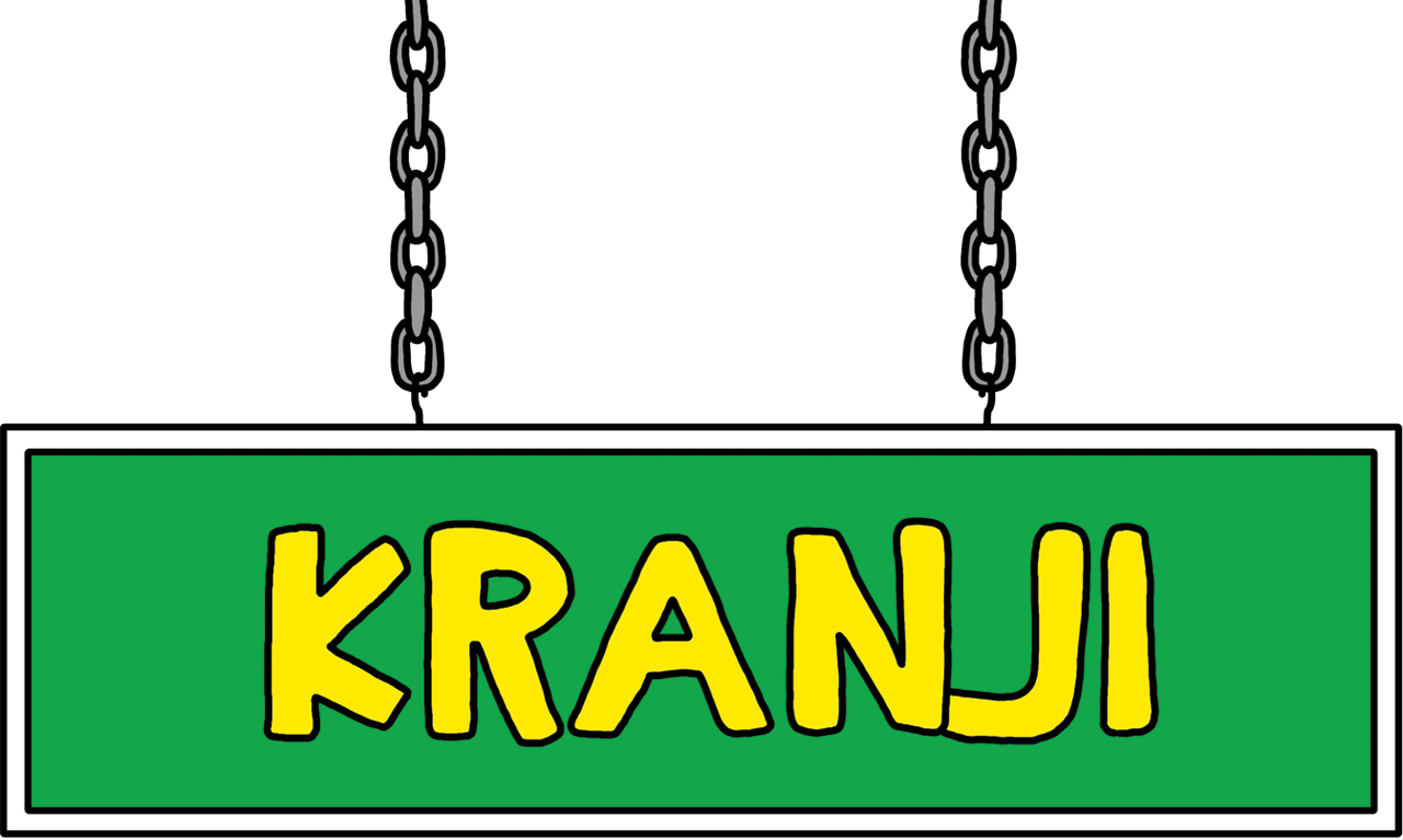
Going with the idea of a road trip, I designed the Kranji sign interns of a road sign hanging from the top. I chose the font that is more adventure like, almost like that of “Jumanji”.
 

Second Spread (Activities):

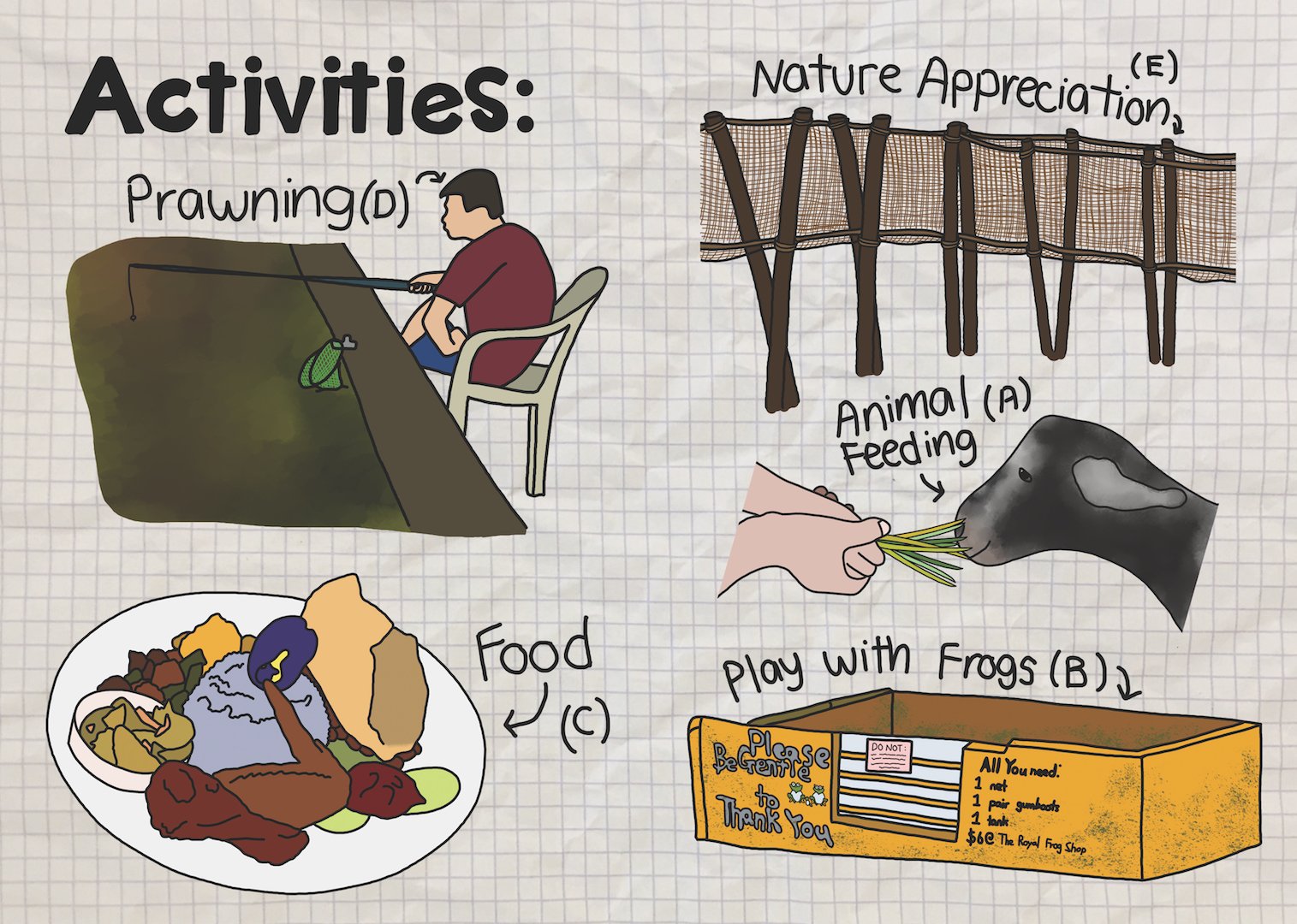
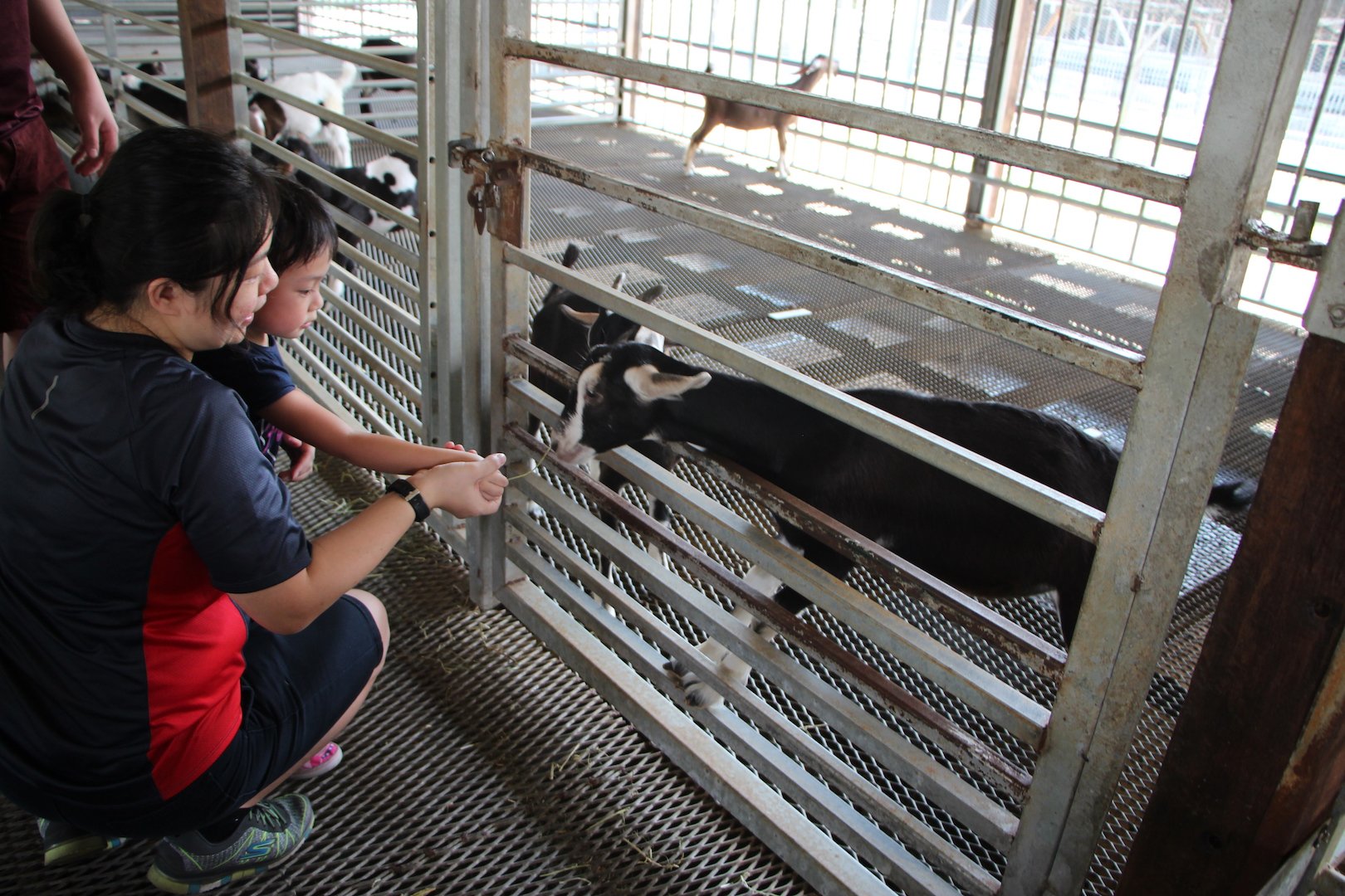
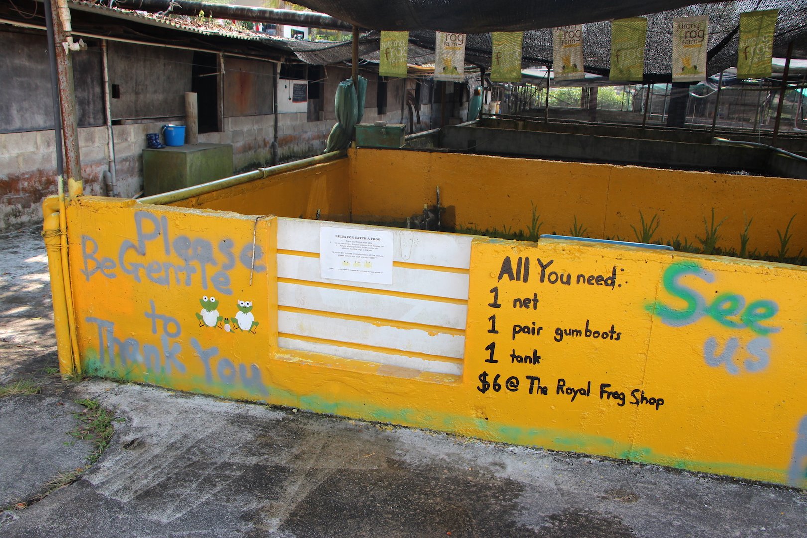
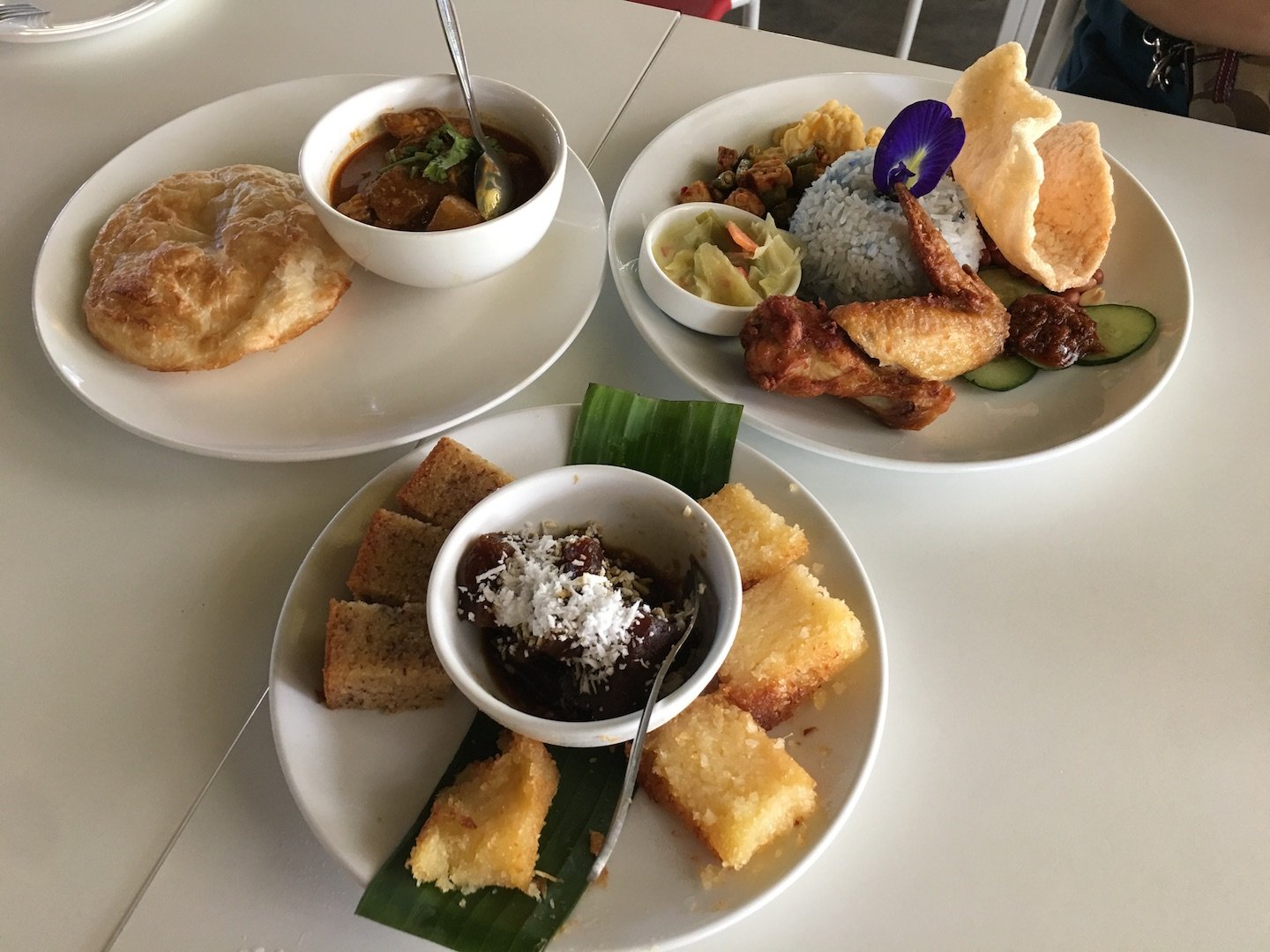
I chose 5 activities, one from each place/farm. These activities are chosen because they provide a variety of things to do and also they are activities I think which are more suited for children.

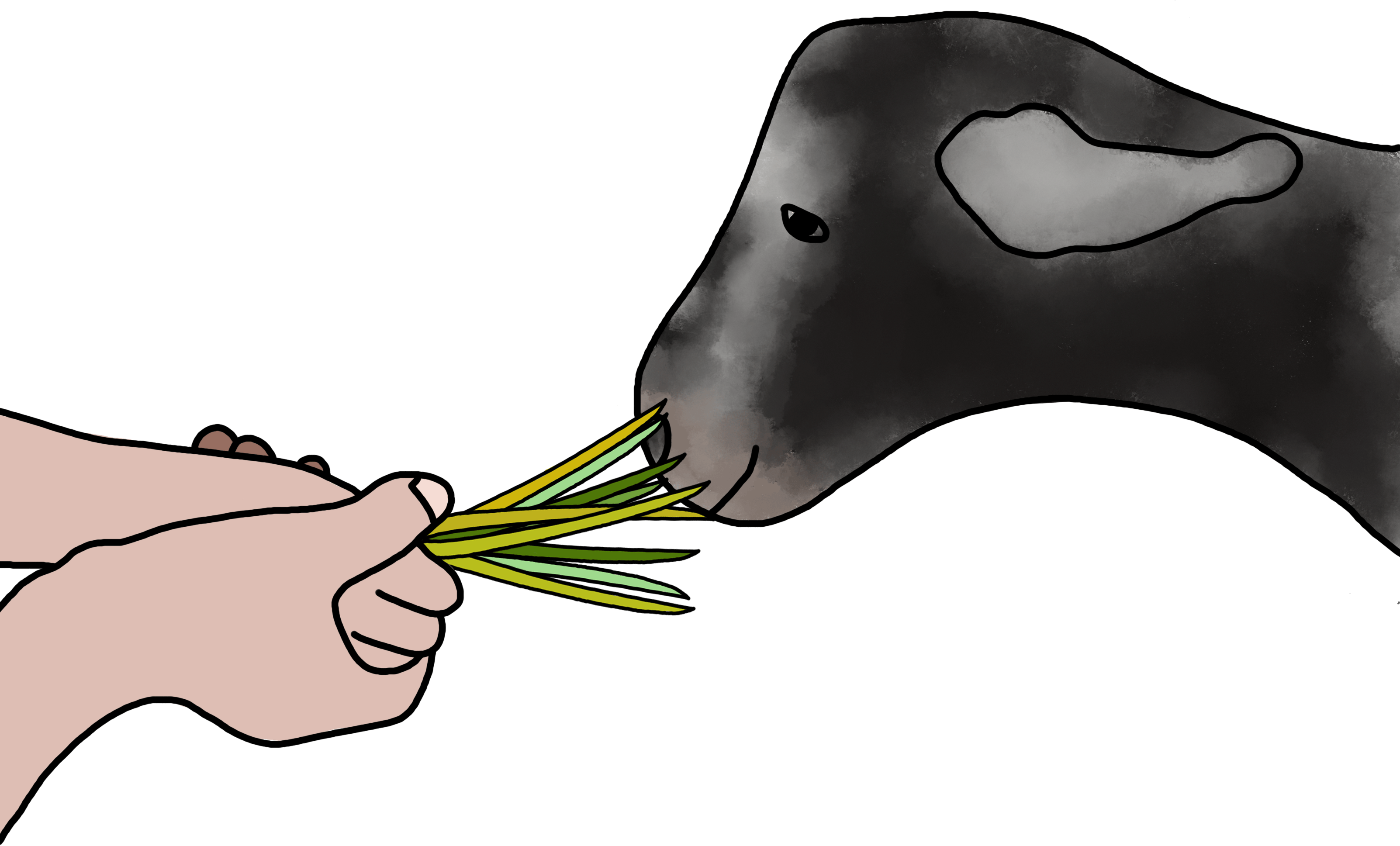
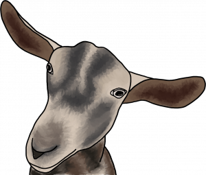
Goat Feeding at Hay Dairies
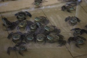
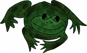
Frog Catching at Jurong Frog Farm
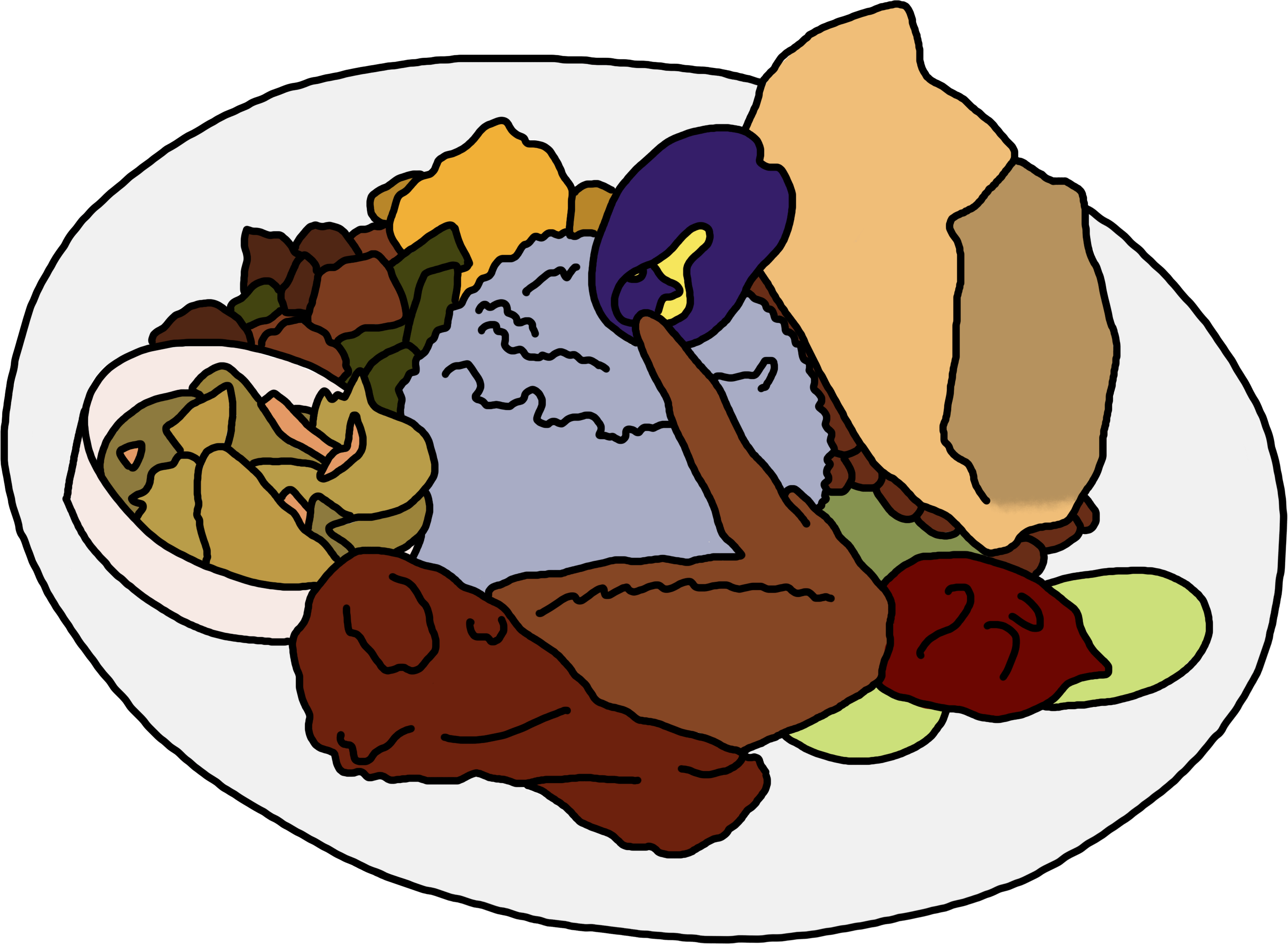
Breakfast/Lunch/Dinner at Poison Ivy Bistro in Bollywood Veggies
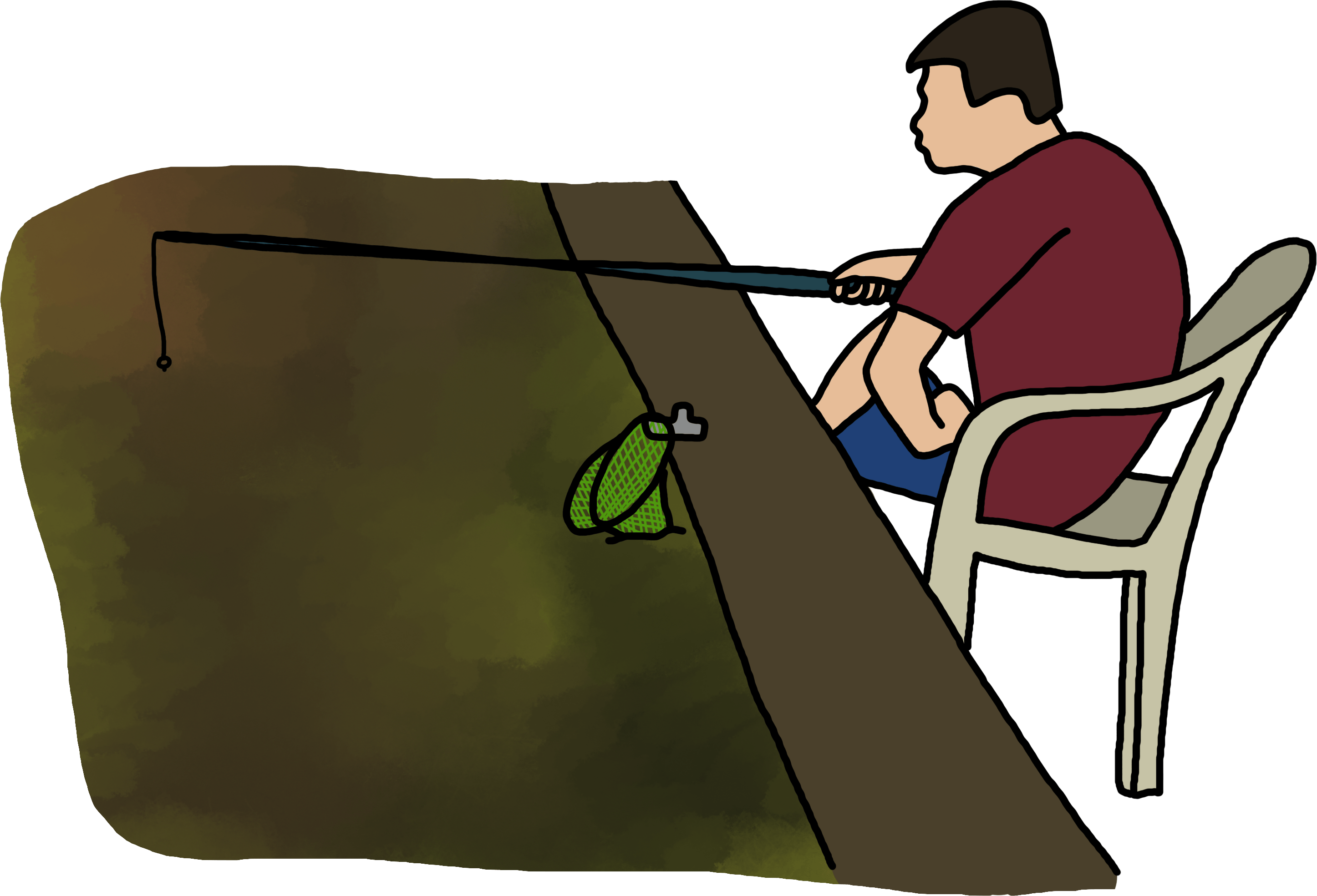
Prawning at Kranji Farm Resort
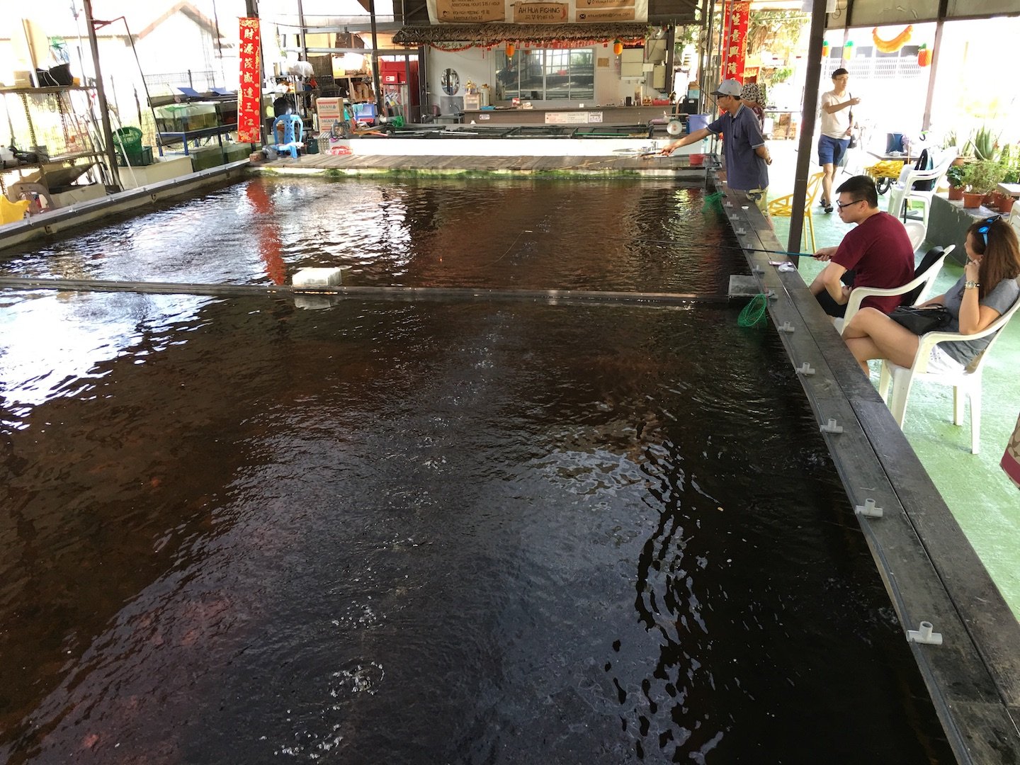
Nature Walks at Sungei Buloh Wetland Reserve
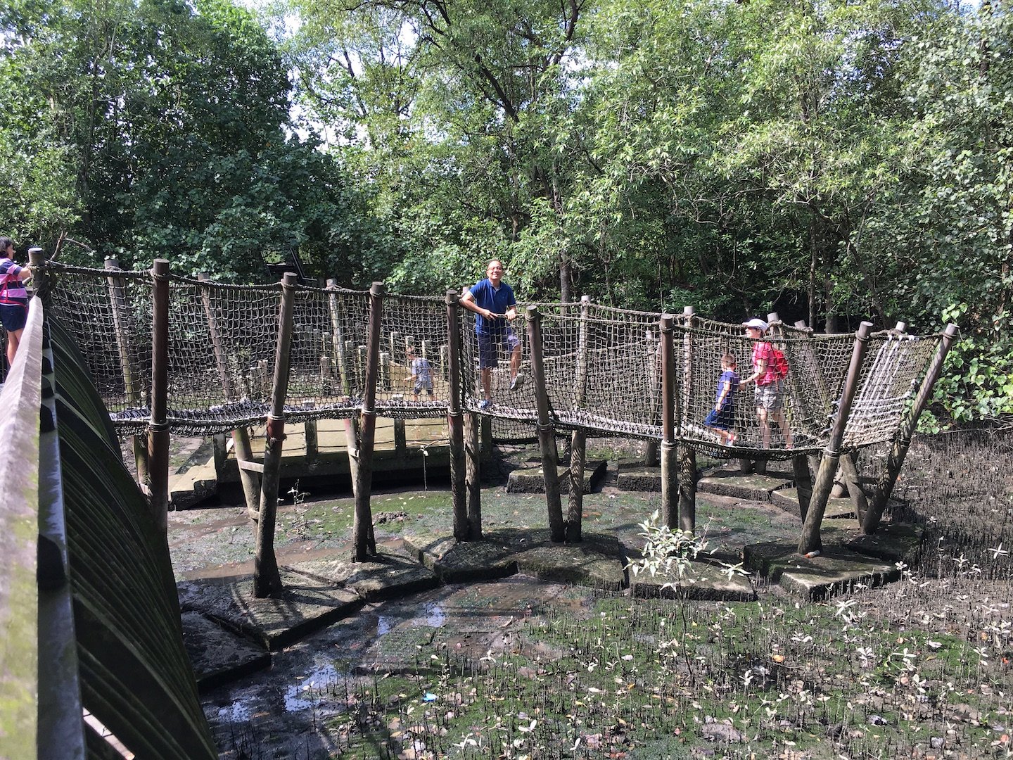
 

Second Spread (Map):

My original thought was to create a map with the actual route lines as follows:
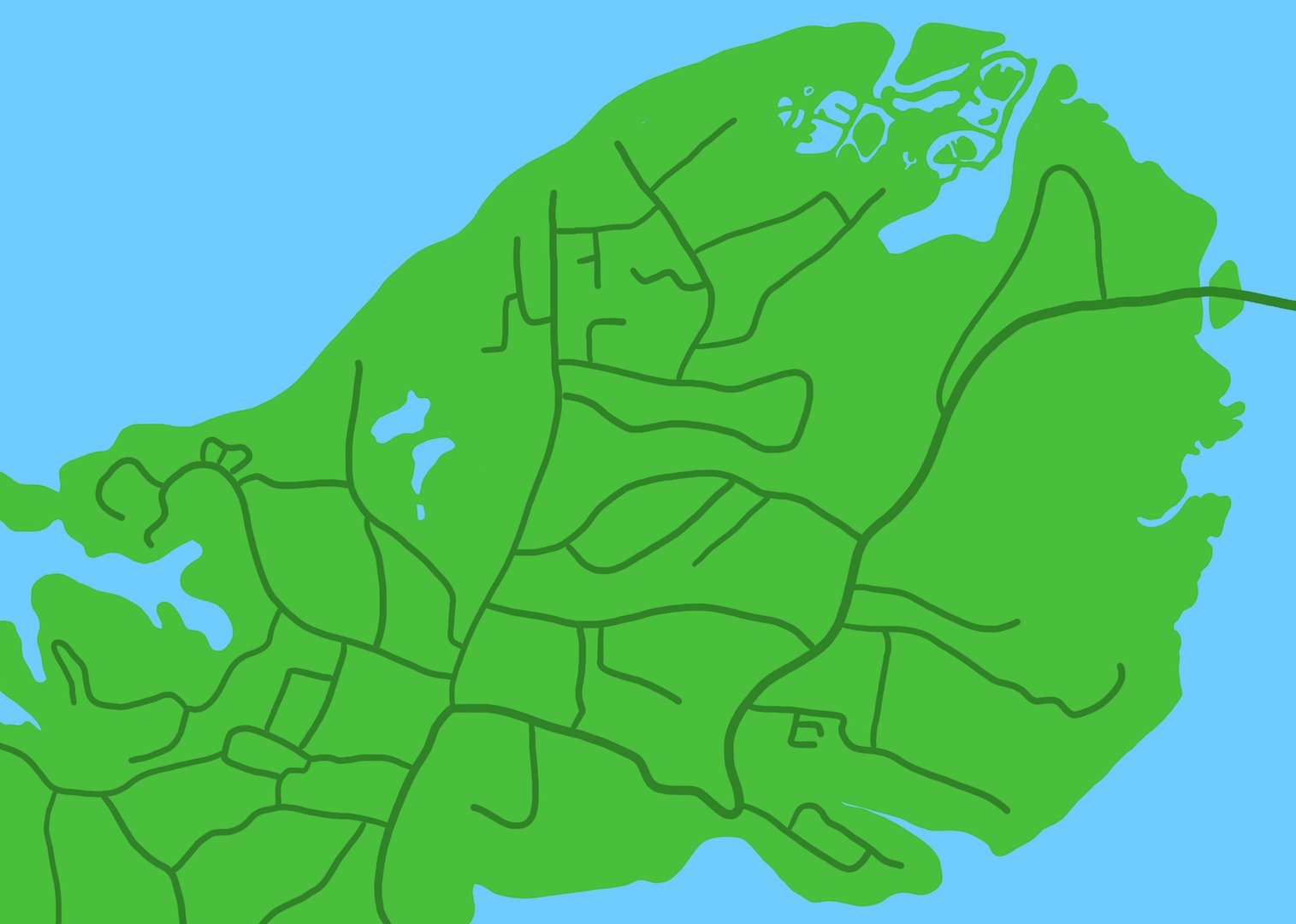
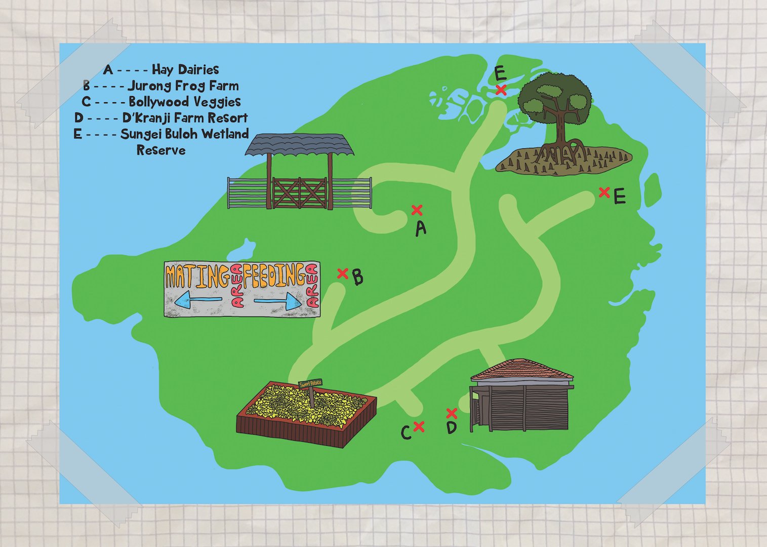
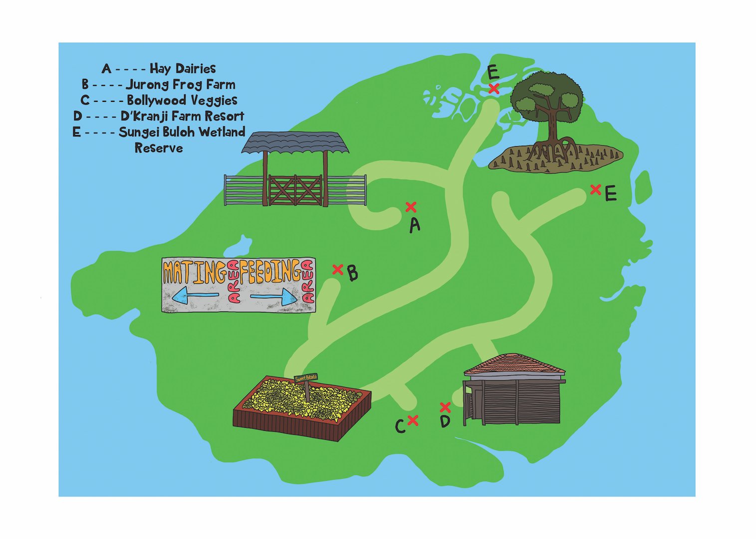
However, seeing as how this is a friendly guide for families with the aim of appealing to young children, I decided to keep the basic shape, but design the map like a treasure map for children. The lines are simplified and more kid-friendly, and relevant.
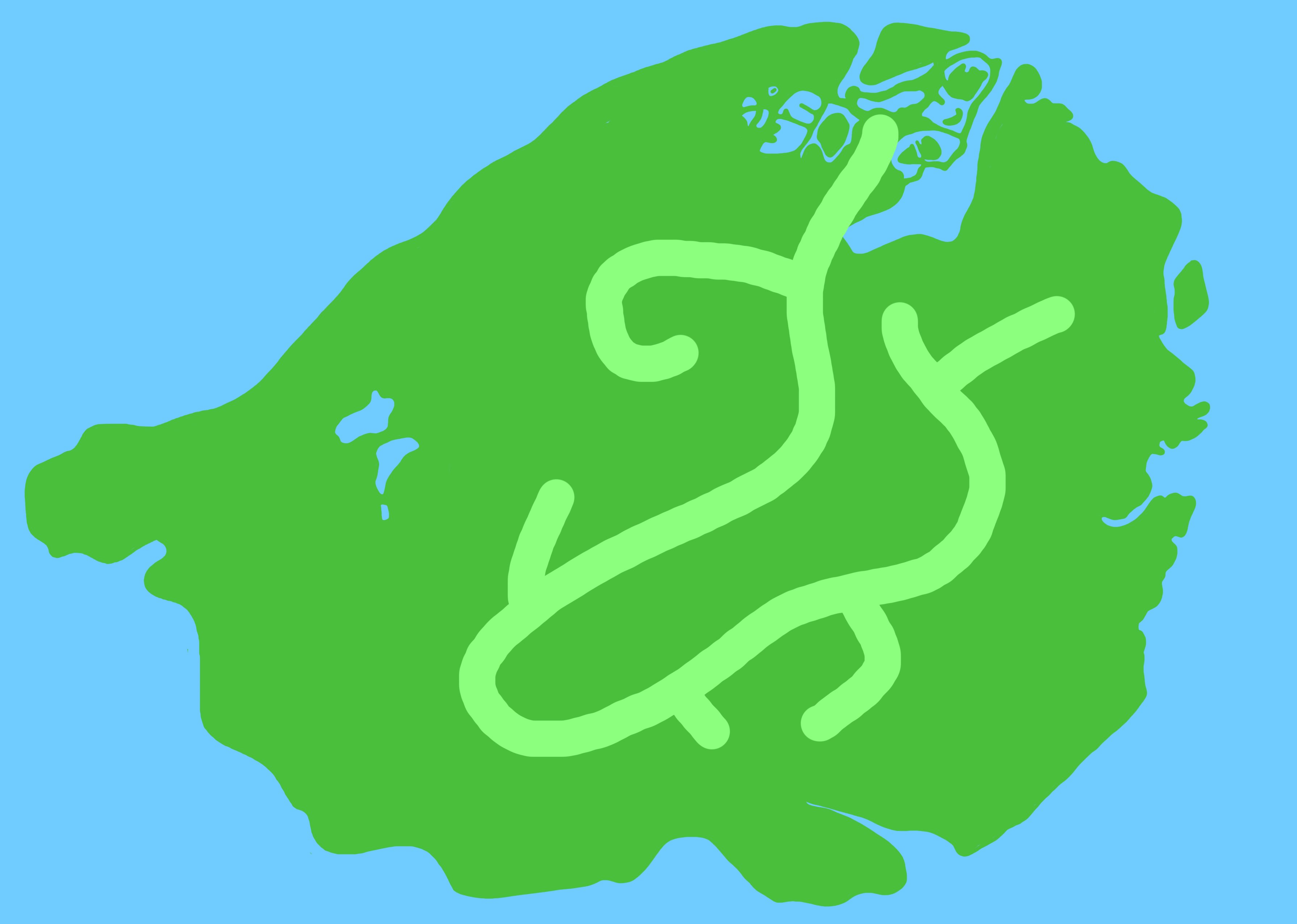
I wanted to mark each place with a simple landmark.
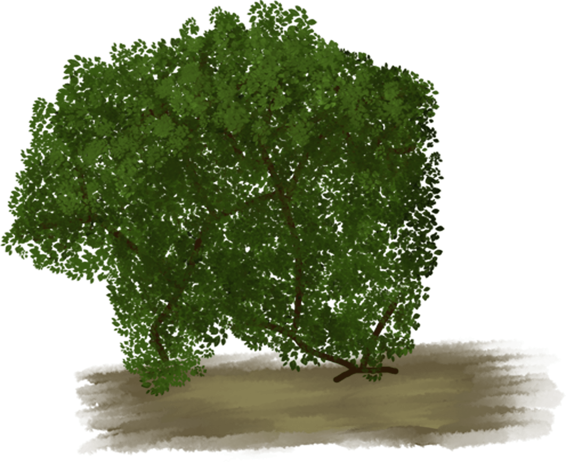
Initially, my drawings were drawn like the tree above. However, keeping to the kiddy style and to make sure that the aesthetic is consistent throughout, all my following designs have a black outline and as much as possible, filled with solid colours.

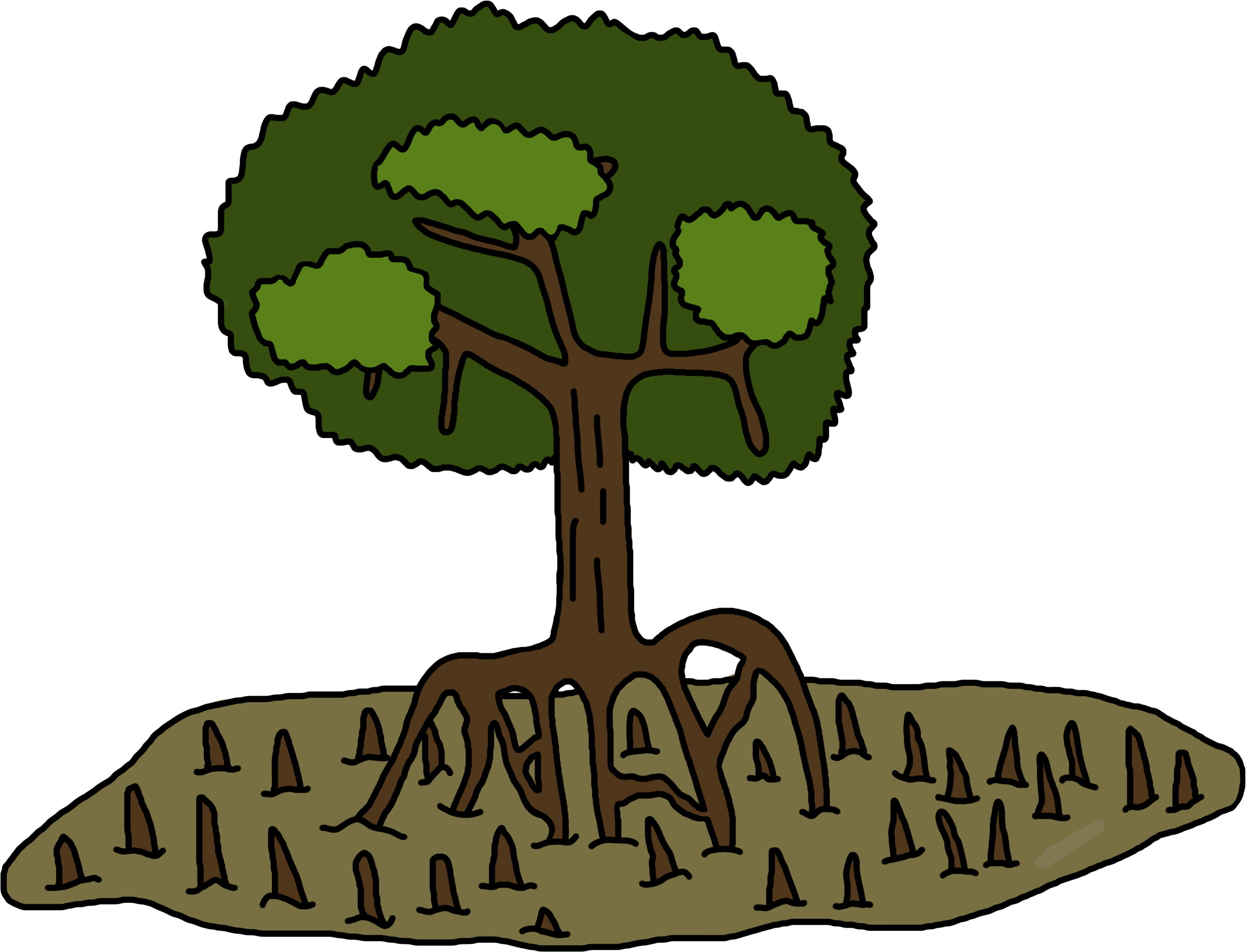
Sungei Buloh Wetland Reserve – Marshes/Swamp
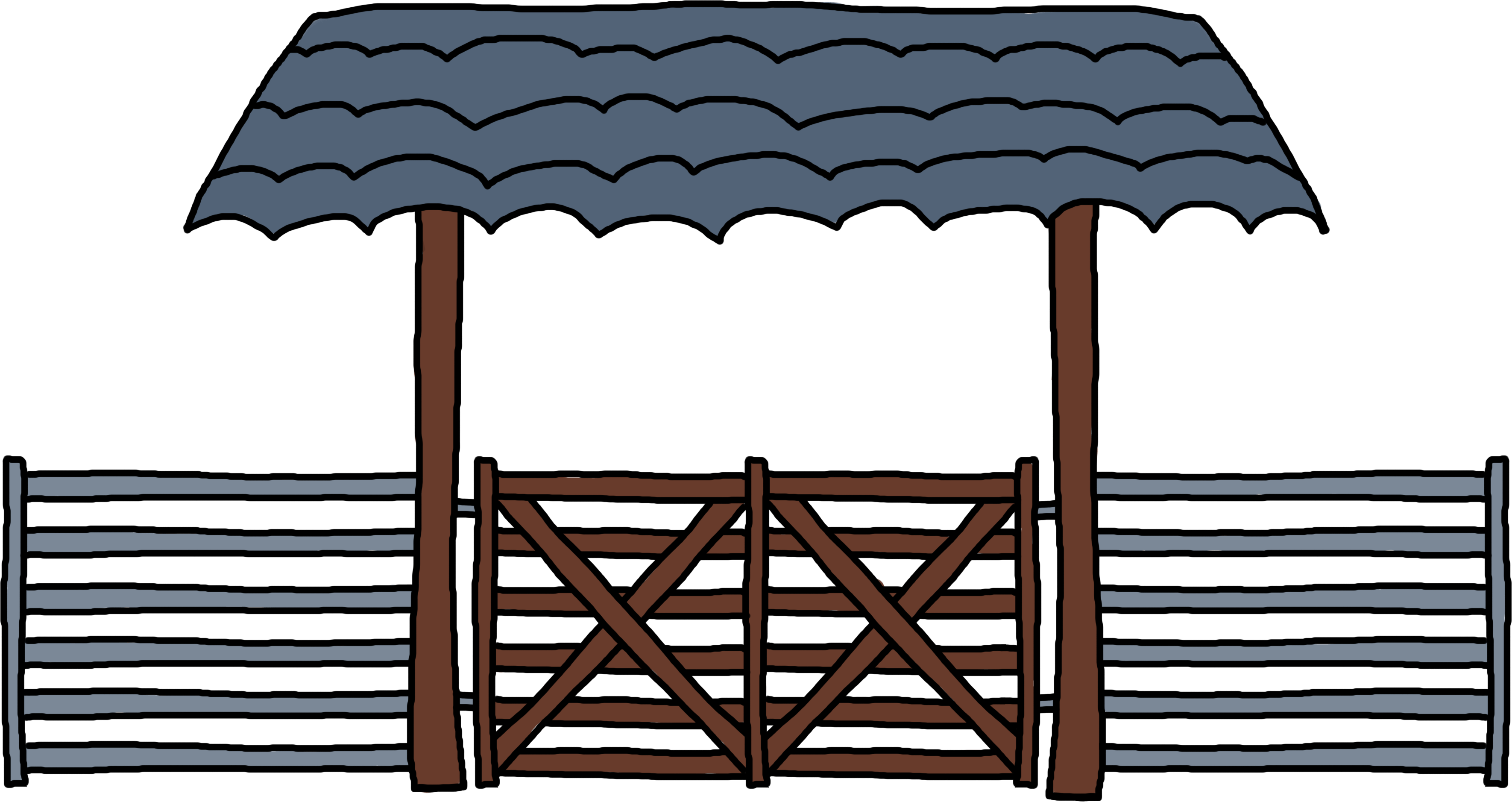
Hay Dairies – Farm Gate
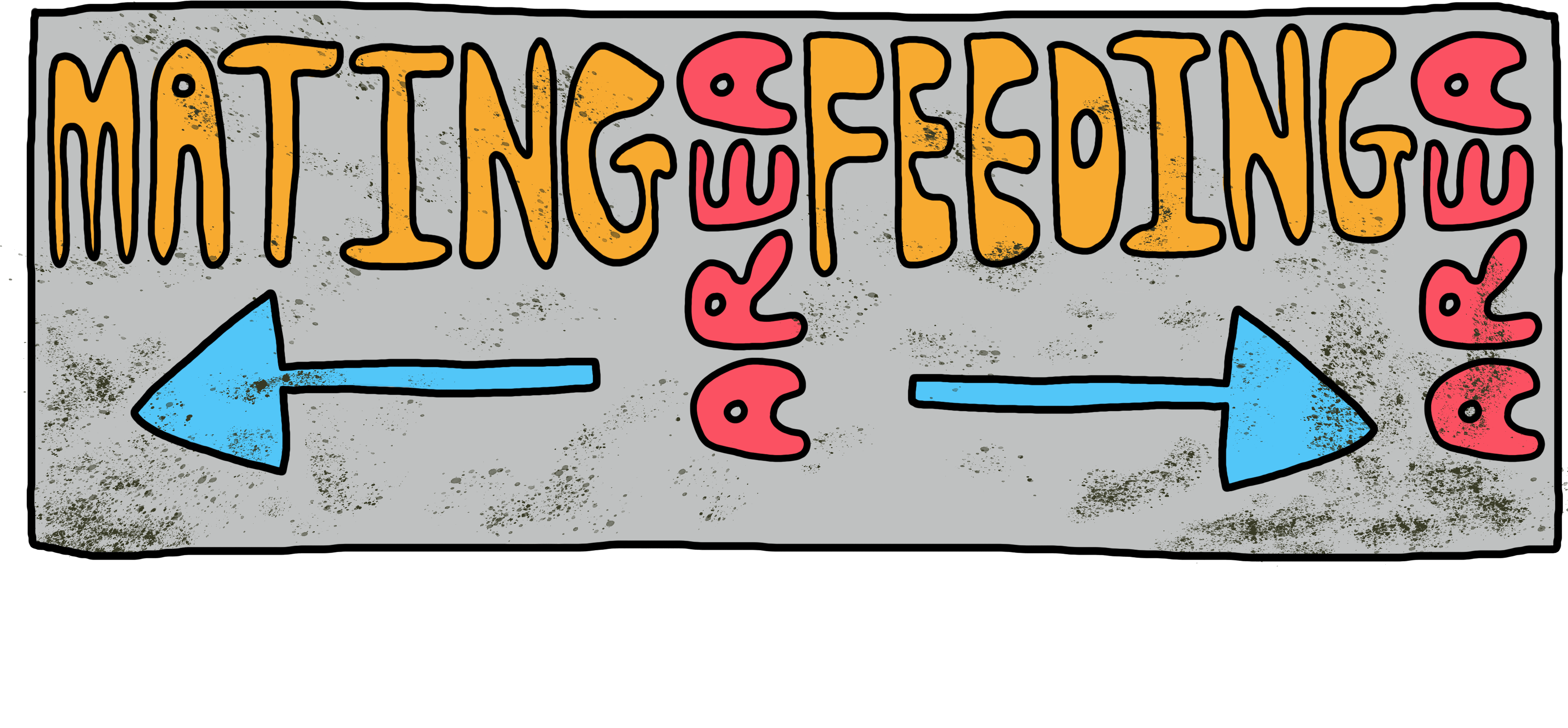
Area Signs – Jurong Frog Farm
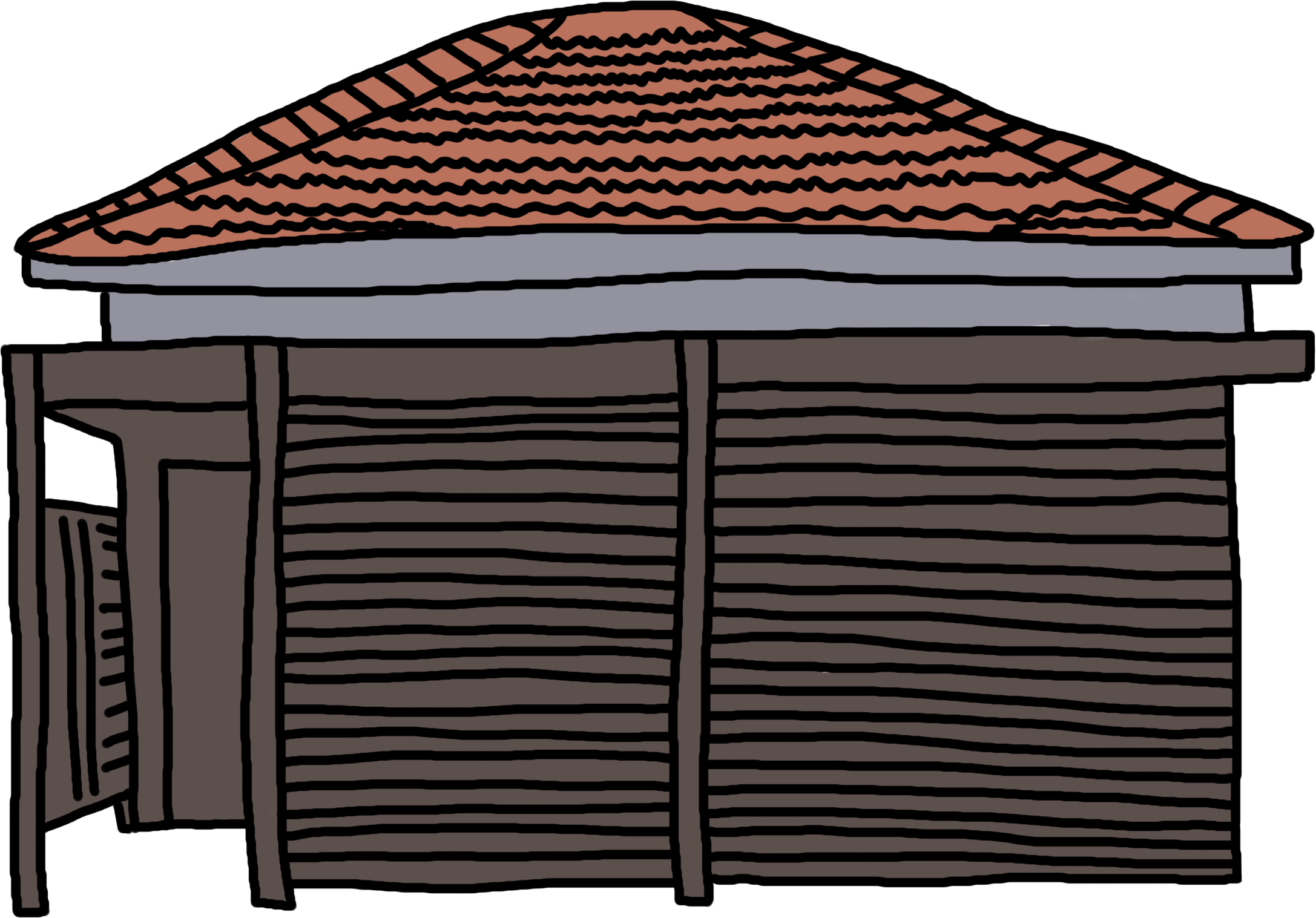
Kanji Farm Resort – Resort
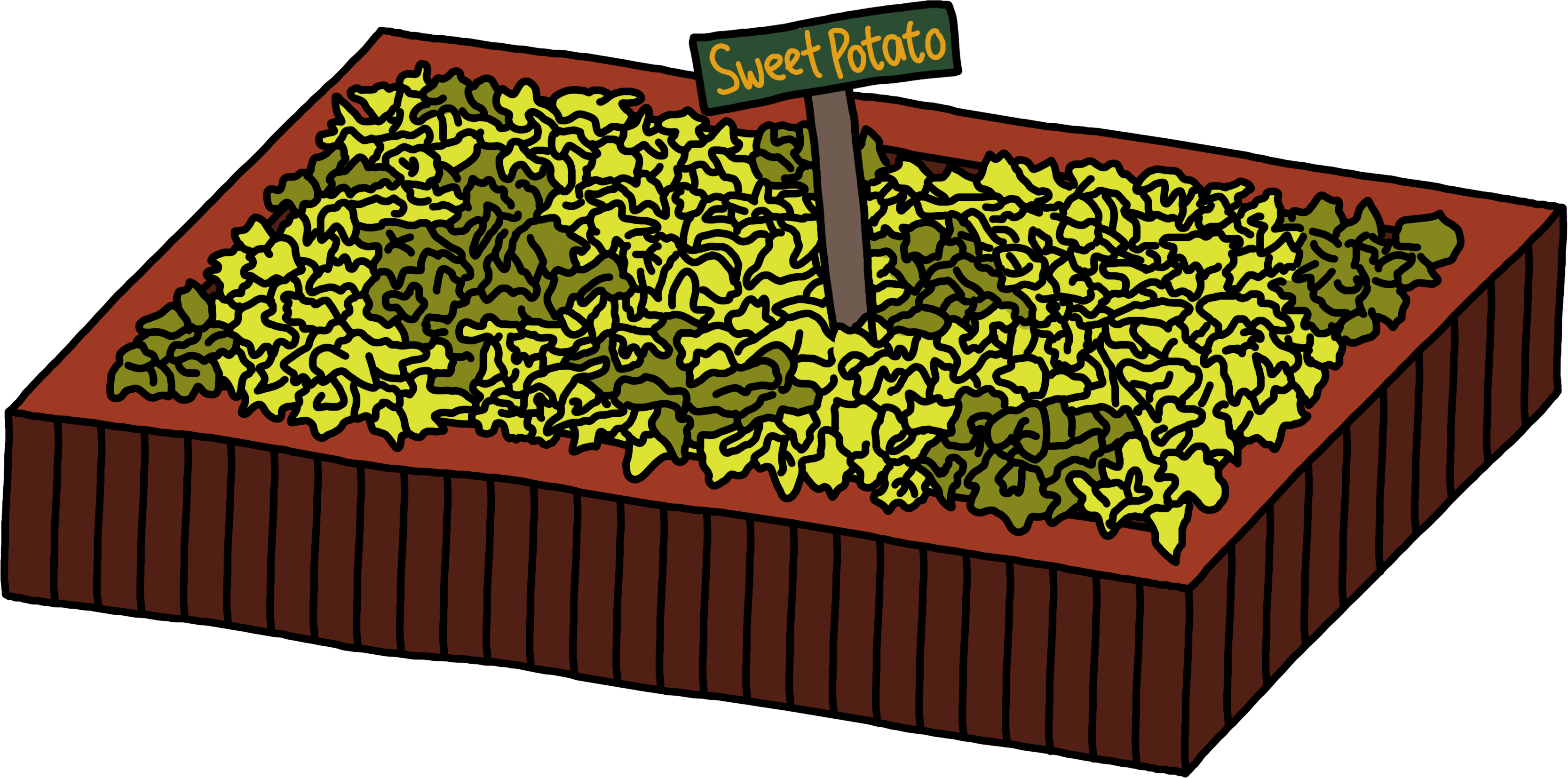
Bollywood Veggies – Plantation
I put the landmarks together on the map with “x” on the place (going with the treasure map style). I also put alphabets for easy reference when introducing a place or item.
 

Third Spread (Animal):

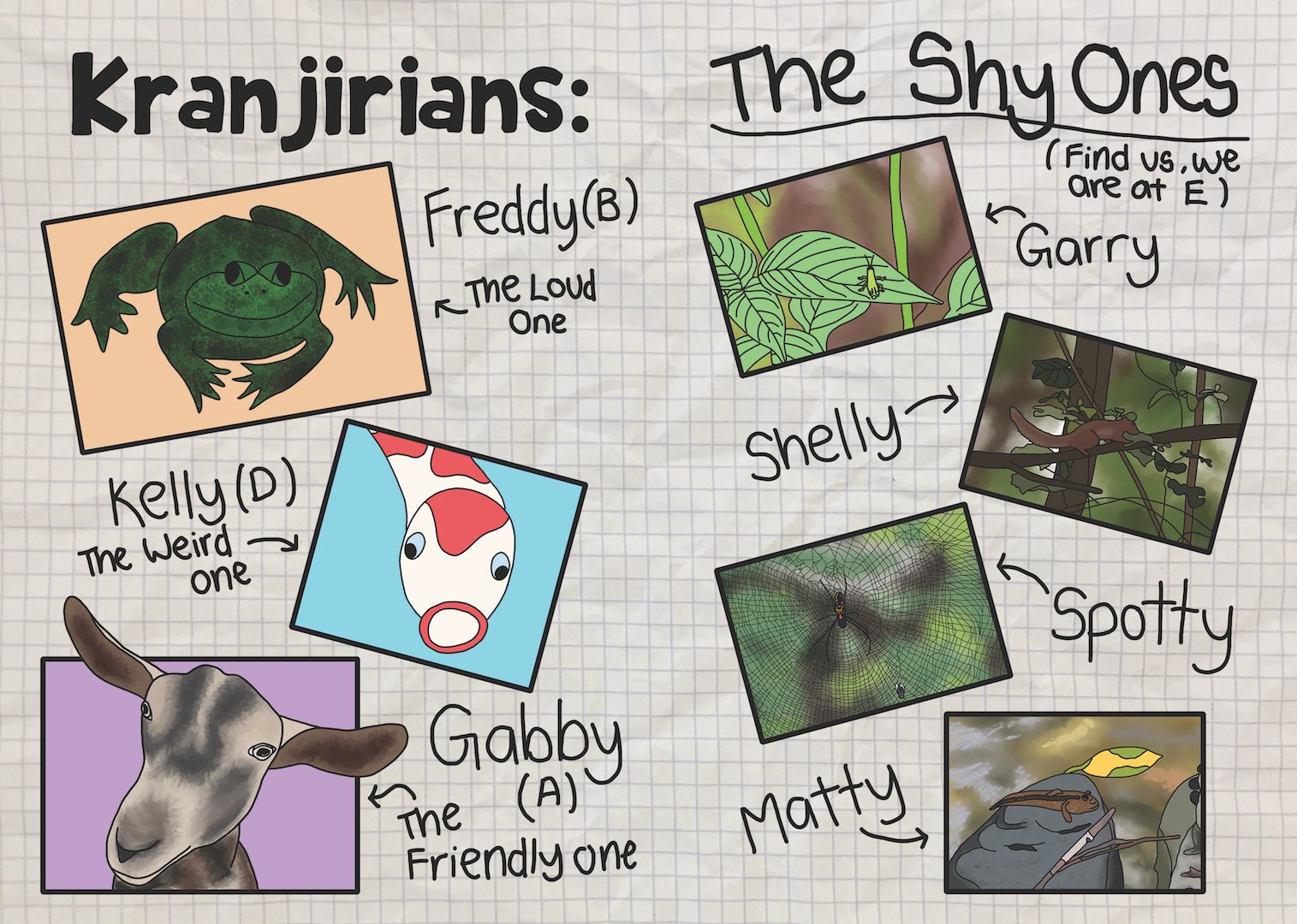
I decided to dedicate a page to introducing the animals because I thought that animals will appeal to children. I split the animals into 2 groups, the featured animals of each place like the goats, and the animals that need to be looked for in Sungei Buloh.

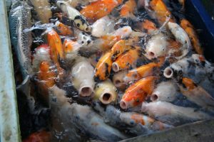
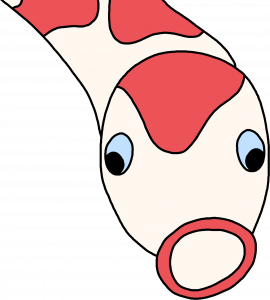
Featured Animals: Goat, Frog, Koi
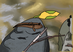
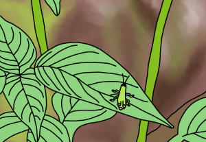
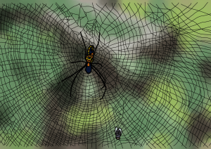
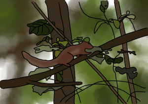
Shy Animals: Spider, Squirrel, Grasshopper, Mudskipper

I wanted to design a little activity where as the children walk through the Wetland Reserve, they can try to spot these animals around them. I think it will make a fun activity. Hence, the design of the animals in this part are made to look like they blend in with the surroundings.
 

End Page:

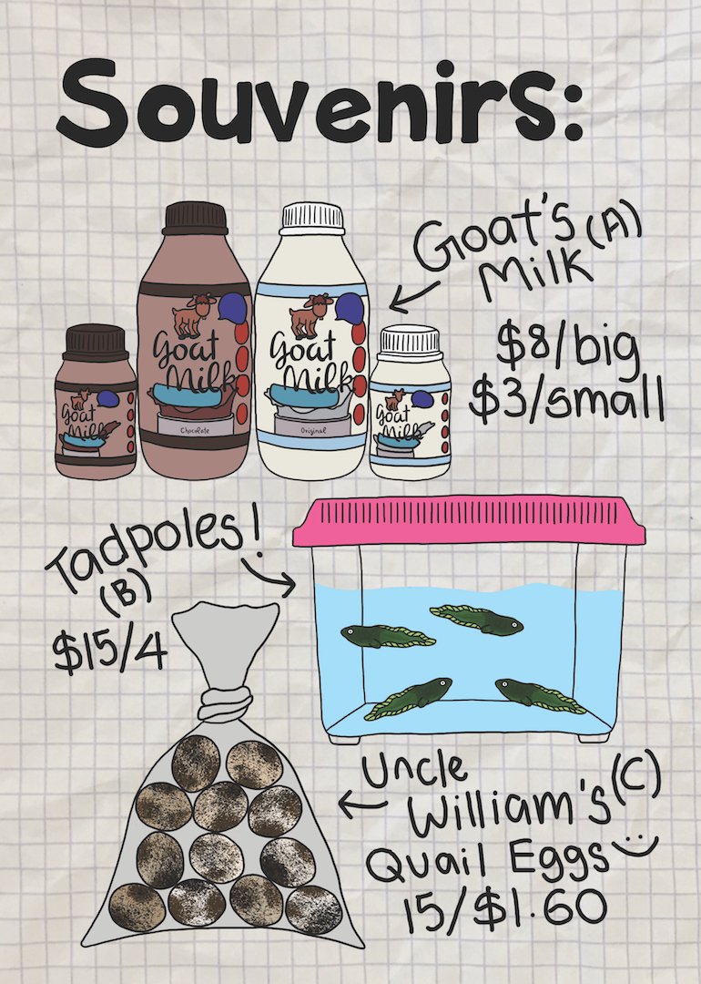
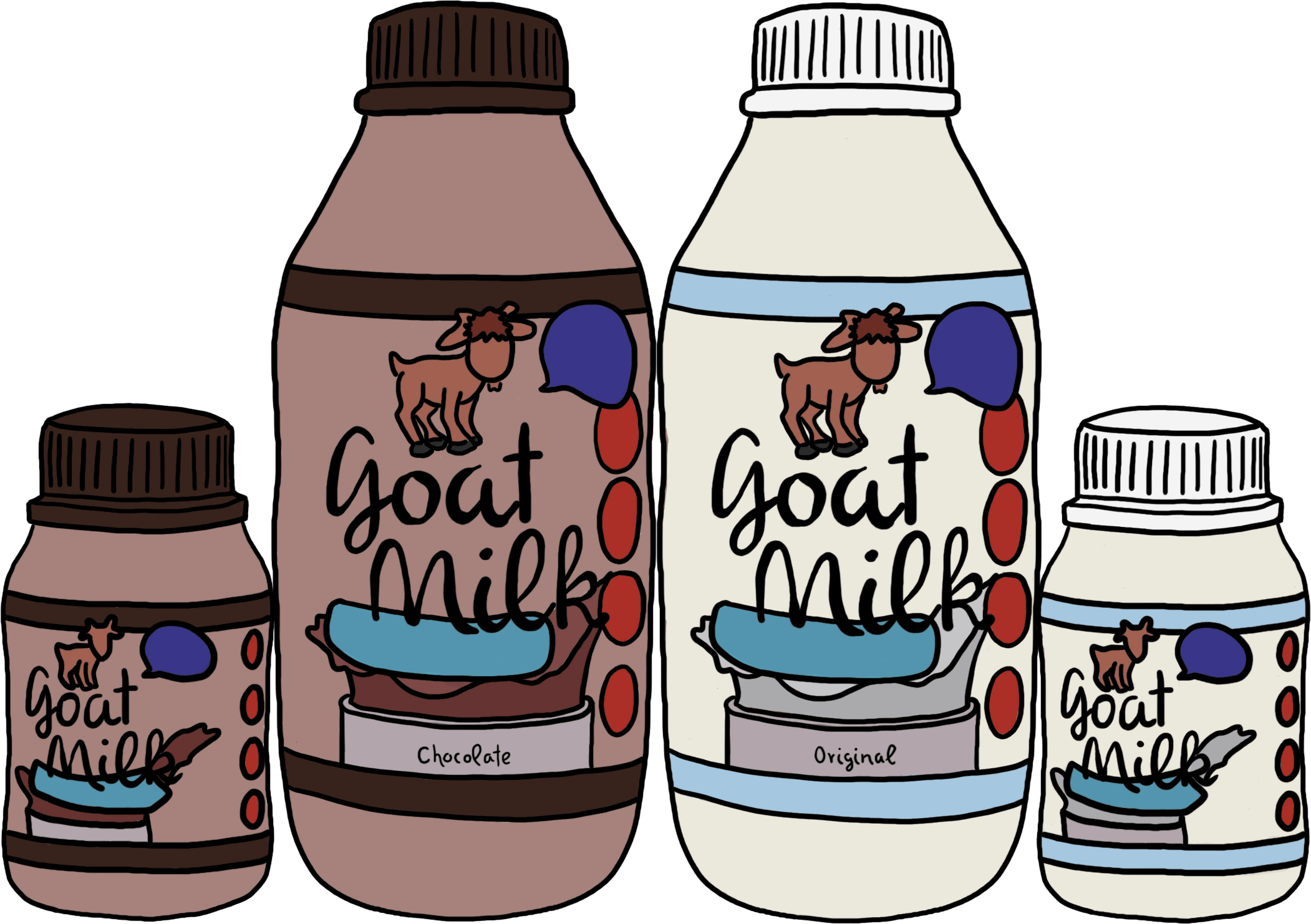
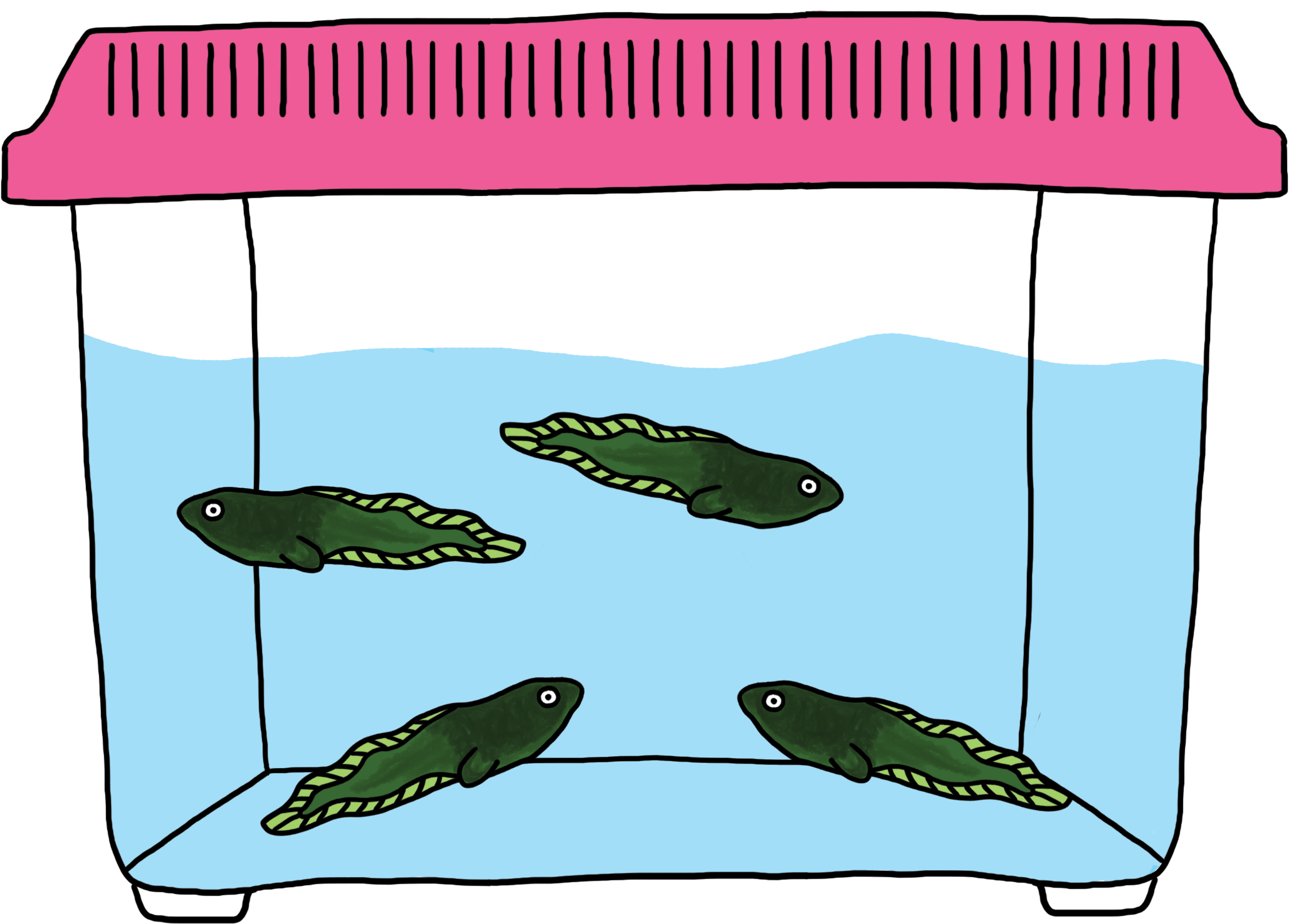
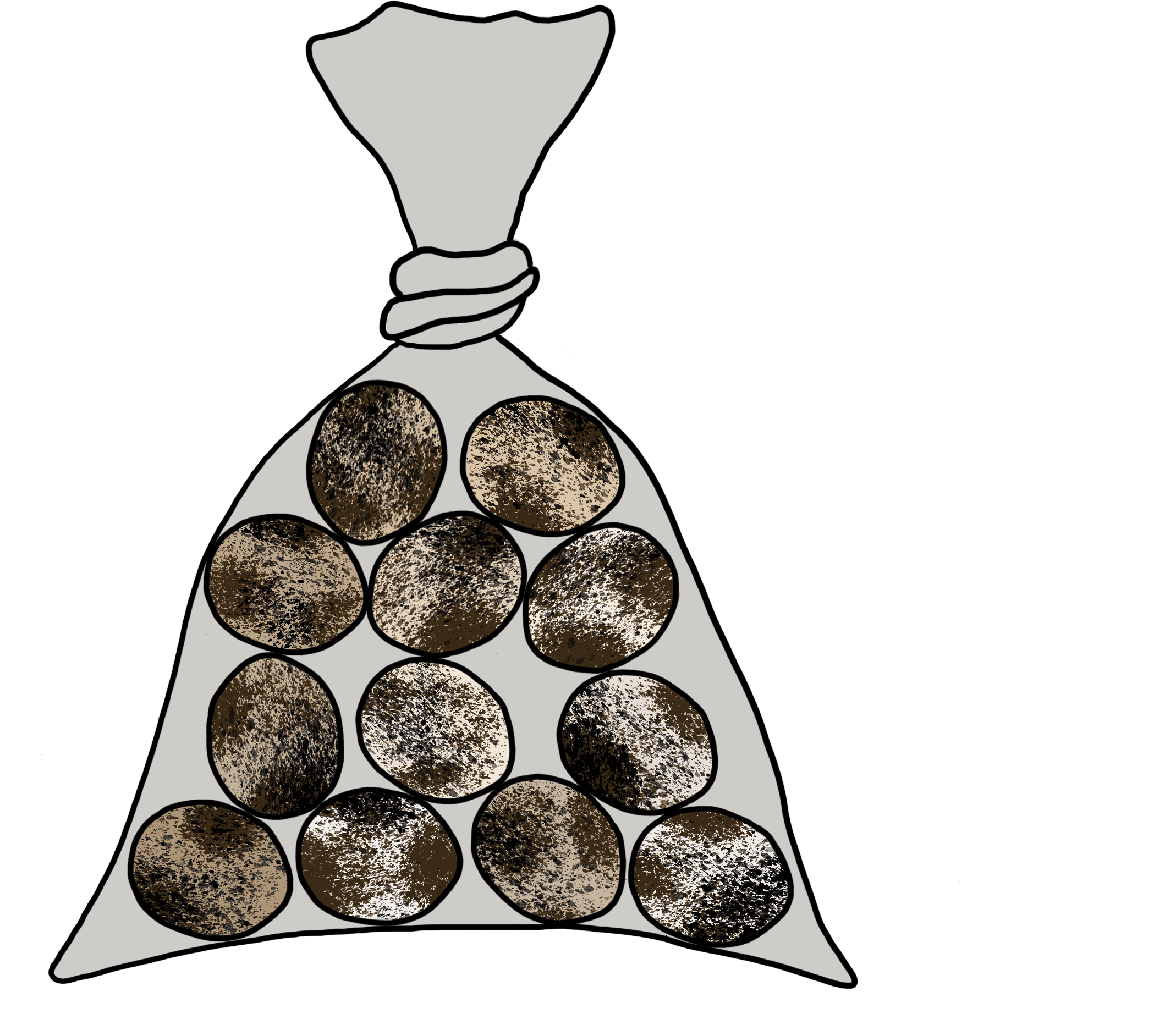
I wanted to end off with leaving Kranji Farm. Hence, for my last page, I decided to feature some of the products which can be brought back from the farms

Goat Milk
Tadpoles
Quail Eggs
 

For the overall style I decided to do it in the form of a kid journal. Instead of a solid background, I decided to go with a notebook background. I printed a grid paper and crumpled it to make it looked used and textured. I scanned it in as the background.
Overall Spreads:

I combined everything together and decided to hand write the words to make it more journal-like.
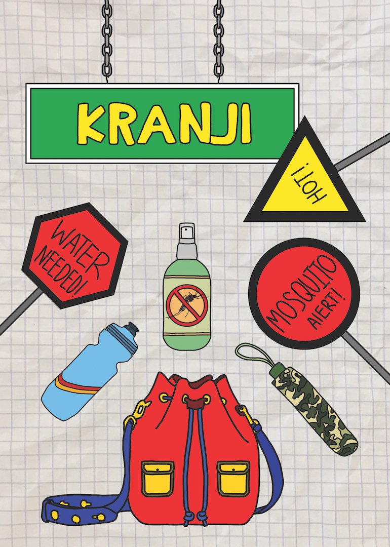
 

Image Making Through Type

The 4 jobs that I have chosen are all imaginary jobs. Due to the many shows I watch, I become interested in taking up different kinds of weird jobs. The final 4 jobs are:

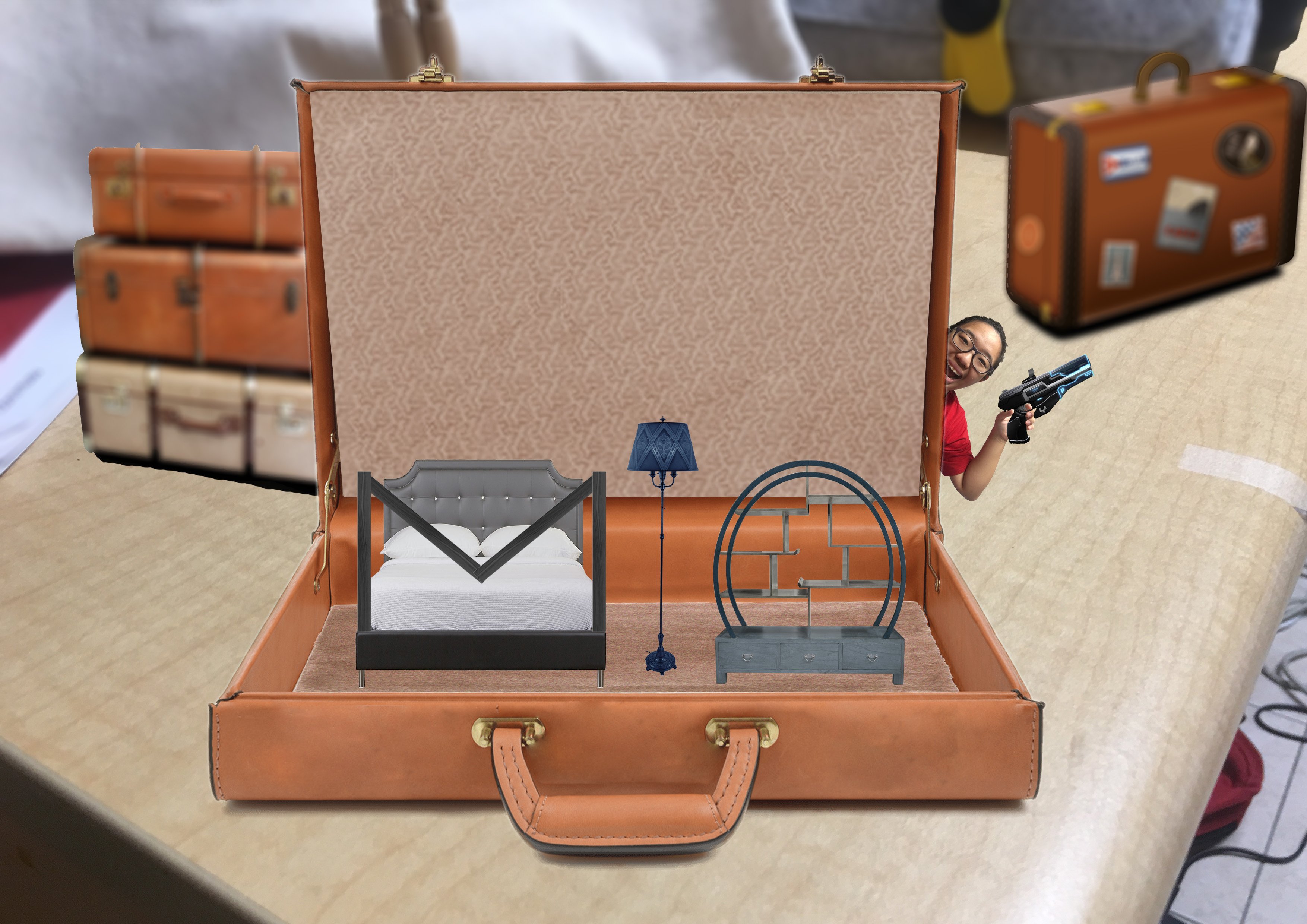
  1. Shrinker – Due to my love for miniatures, I have always thought how nice it would be to be able to shrink things and people
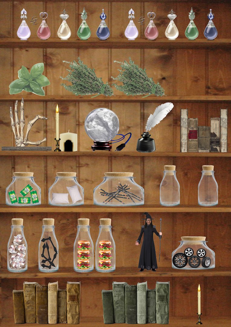
  2. Warlock – Inspired by a tv show I watched and my fascination with magic
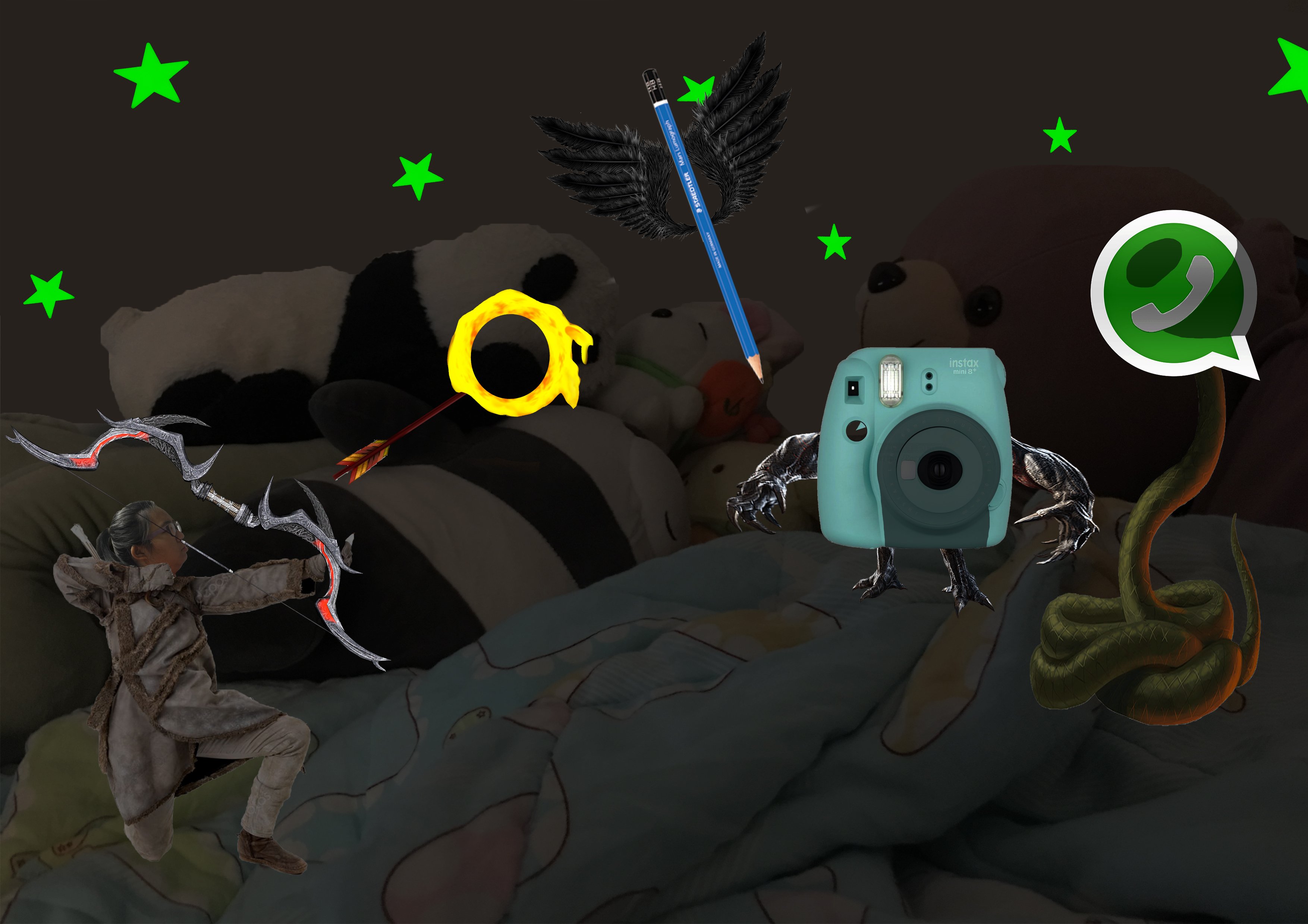
  3. Demon Slayer – Also inspired by a tv show I watch and also because I like mythical animals
  4. Time Traveller – Inspired by a movie I watched and also my love for period dramas

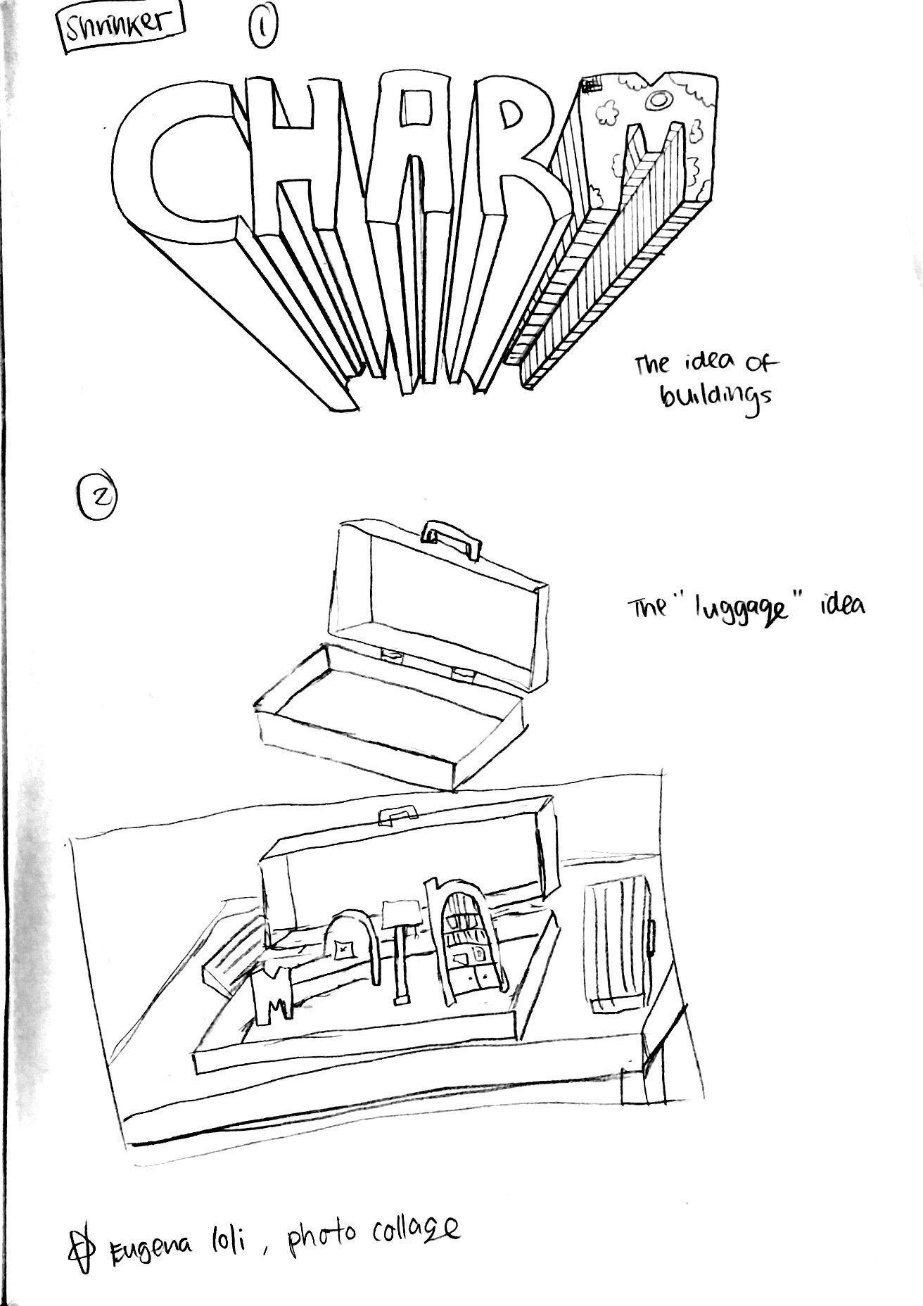
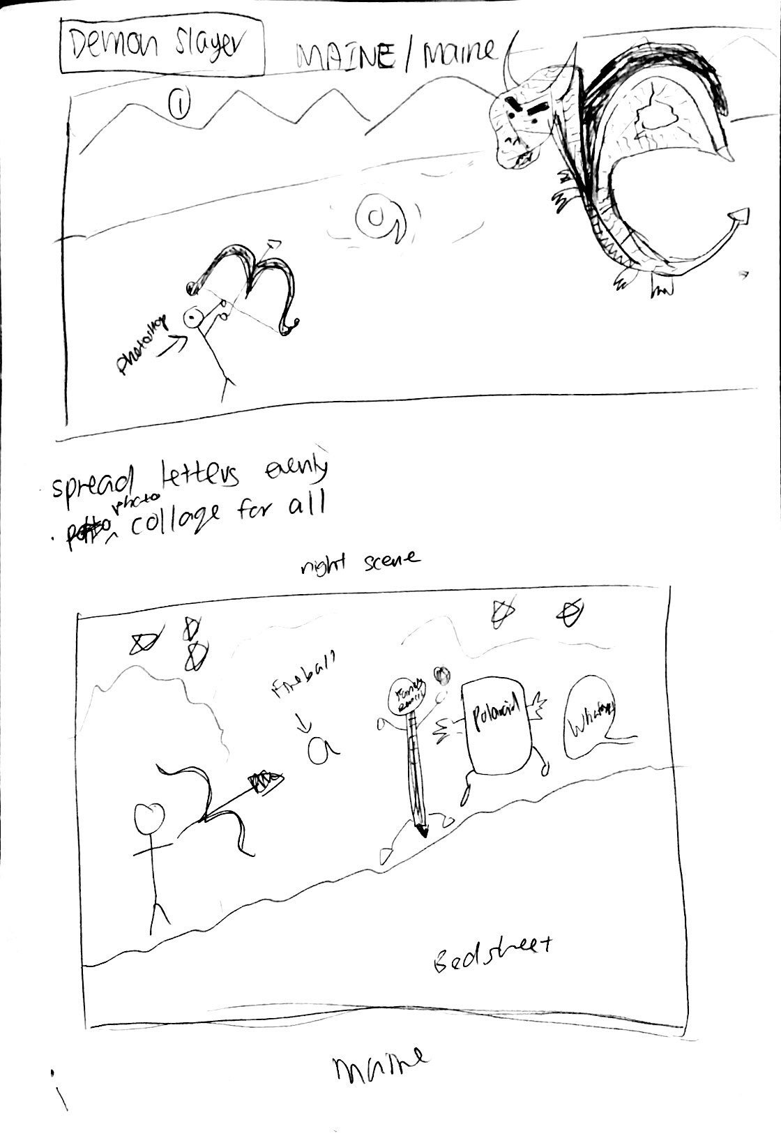
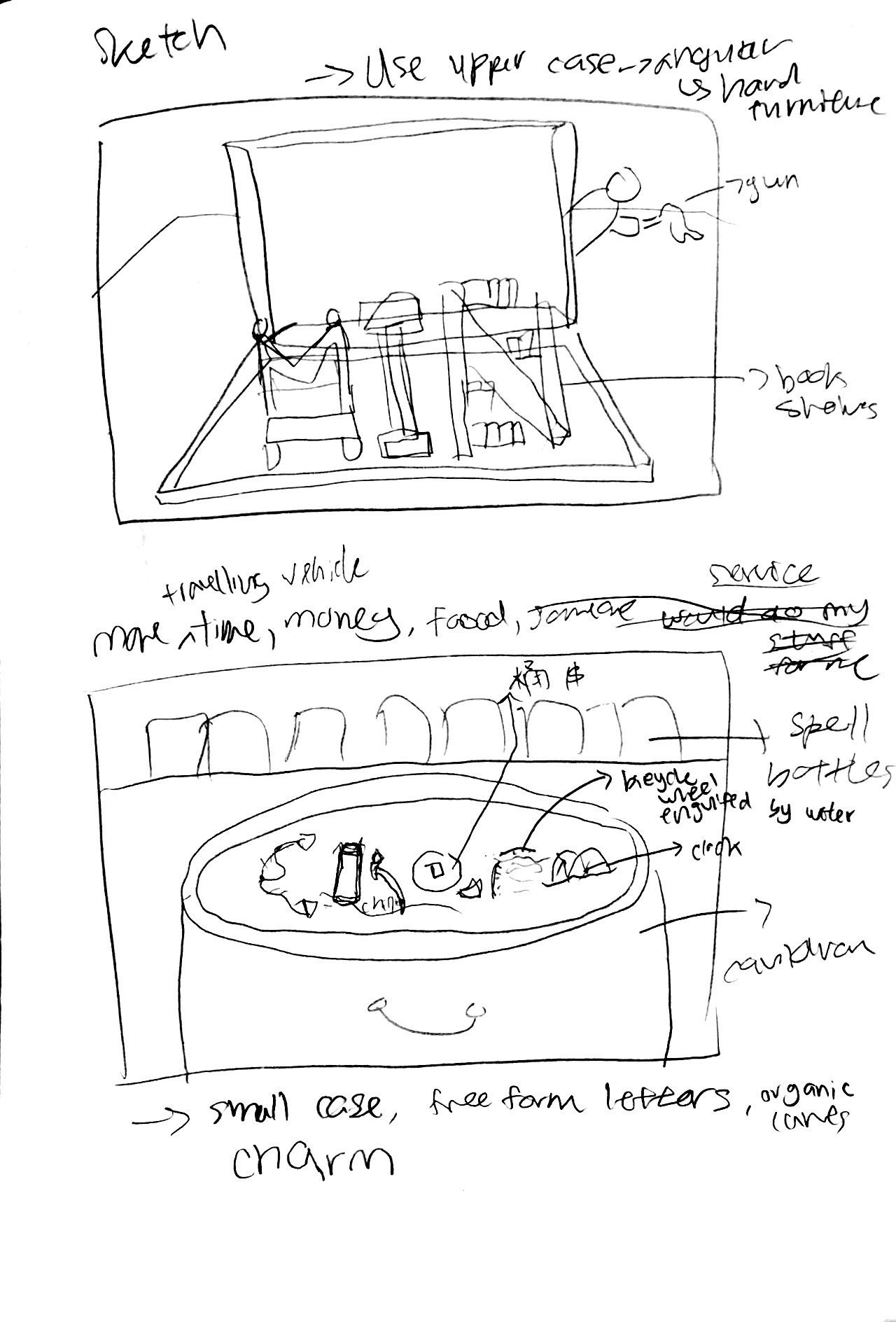
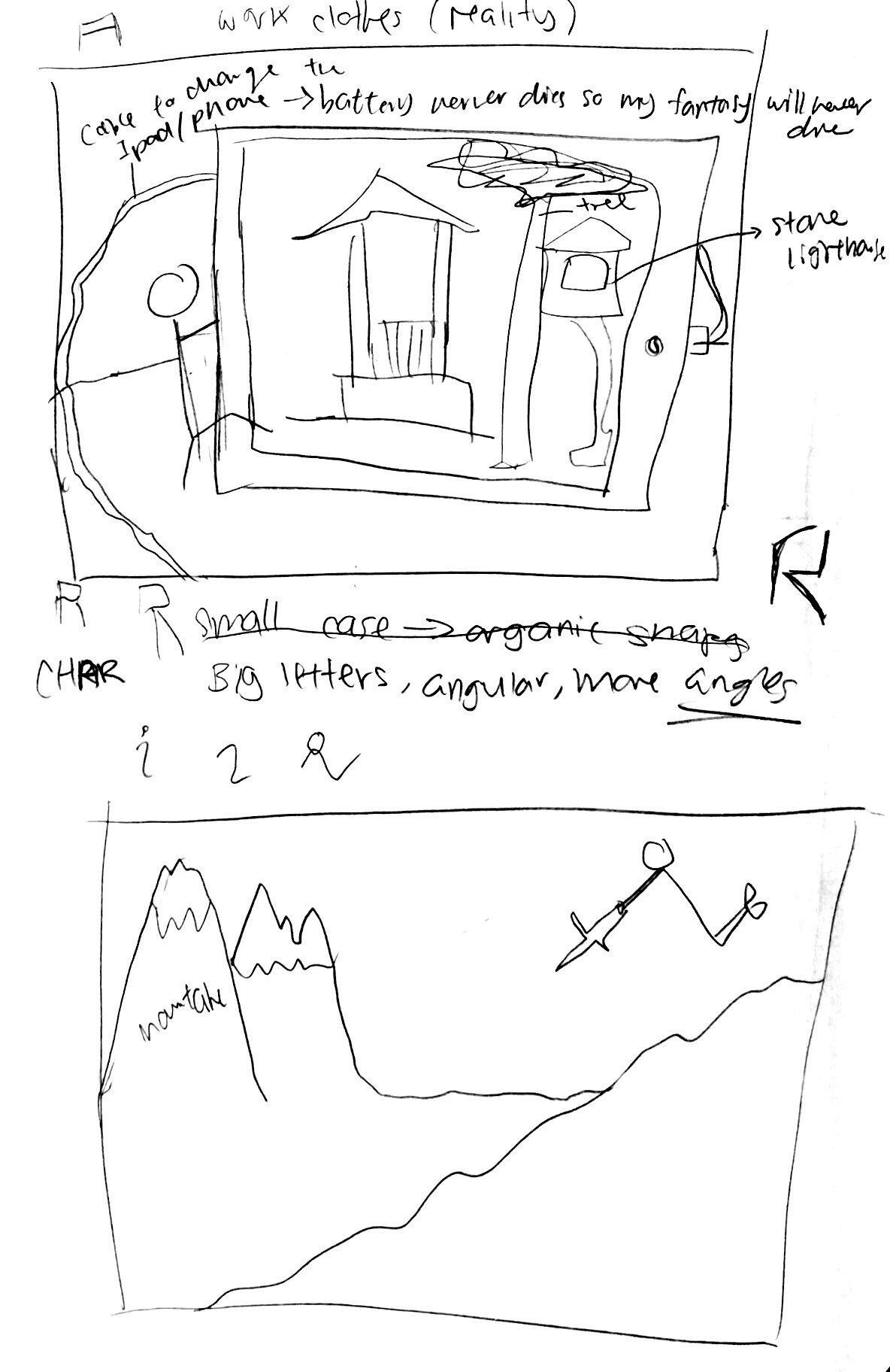
Original sketches for the shrinker and demon slayer job:

Initial compositions:

The concept behind this is that my job is a Shrinker. I like to shrink people and things. The name spelled in this composition is Min. Putting into context, I always wondered how nice it would be to be able to shrink my room and my house. That way, when going on a holiday or somewhere far from home, I will still get to sleep in my own bed and also store my things in my room. For every composition, I decided to put a mini me in the composition to give sort of an adventure feel. Also, I feel that the reason why all my jobs are imaginary is because I feel that by imagining such jobs, I can escape from this ordinary real world for a while. It helps me to relax and also I find such jobs fun. Also, since all my jobs are imaginary, non-existent, I wanted to bring out the unreal feeling, hence the mini me. Overall for all the compositions, I am going for a more fun and playful look.

For the second composition, my job is a demon slayer. I wanted to put it into context so I decided to use my everyday struggles as a student to represent these demons. The pencil to signify school work, the camera to represent responsibilities ( because I am in my hall committee), and a WhatsApp icon to represent socialising. Me as a demon slayer in this context would be that everyday I am always engaging in one or more of these events and it can’t tiring because there is just so much to do, almost like a battle. I chose the battlefield to be my bed because these activities take up most of my sleep time and it is like I am battling to save my home ground (basically me wanting to sleep but also have to handle other stuff). The name in this piece is Maine.

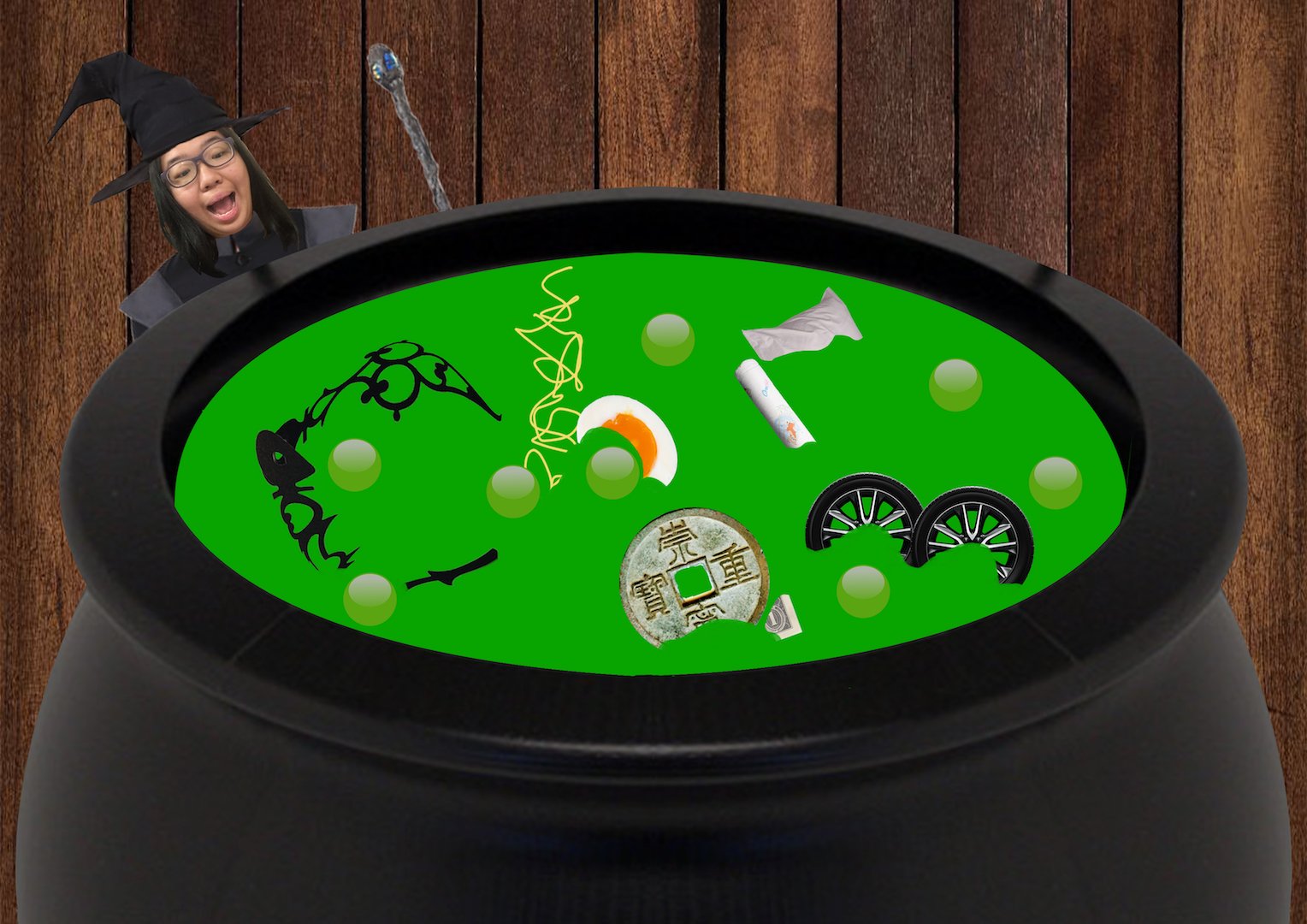
In the third composition, the name is Charm and my job is a warlock. I have always thought how nice would it be to be able to conjure things out of nowhere. For example, if I wanted food, I can just make it appear. Following this thought, I decided to put some everyday items into potion bottles to represent ingredients for potions and spells. For example, the clock hands for a speed to extend time, burgers for a spell to conjure food. Also continuing the thought on the first composition of a fictional job, I also put a mini me in this composition.

However, after consultation, I realised that the compositions did not make use of each letter’s unique characteristics and the letters are quite forced. Also, the message of the job and the job scope are not clear enough. hence, I decided on new compositions. The order of the jobs are as follow: Shrinker, Warlock, Time Traveller, Demon Slayer.

Overall, these jobs are imaginary, which means that they do not exist in real life. These compositions are supposed to look unreal, to bring out the idea that this is a fictional job. It is like me in my own world, I want to illustrate this idea by putting a mini me in every composition. After revision and turning the sketches into actual compositions, these are my final compositions.

Shrinker:

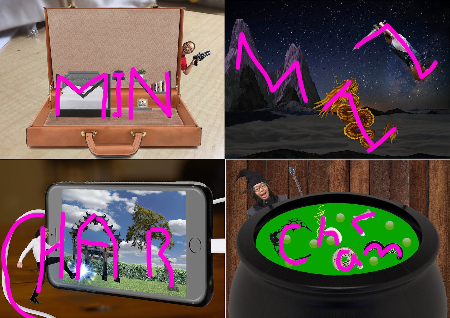
The first one is I am a shrinker. The words are MIN. The main idea is to shrink things and put them into boxes for convenience and to carry around. I choose to depict a room because I have always hoped of shrinking my bedroom so that I can carry it around. Hence I chose capital letters for all because the rigidity and angular properties of the letters fits in with the idea of furnitures.

Demon Slayer:

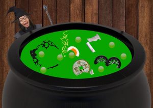
The second one is that I am a Demon slayer. The words are MIN. This job arise because of me wanting to escape the mundane reality and go on a thrilling unimaginable adventure. For this, I chose to use cap for the M because the angular tips resemble and can act as the mountains. The capital I is because I wanted a continuous long line to form my monster and the curvy part of the dragon can help to act as the spine of the I. For N, I chose to use capital N also because it resembles the action of someone raising a sword and jumping in mid air. In this case, it helps to show me jumping and taking a plunge at the creature.

Warlock:

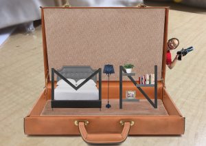
For the third job, I am a warlock. The words are charm. This job stems from the idea of me being able to make potions/spells that will grant me the things I want. Hence using regular normal things like food and clock hand stop represent the ingredients. The scene is also that of the potion being in the midst of cooking. I chose to use the small case letters because they are more free form and organic, more natural looking for ingredients.

Time Traveller:

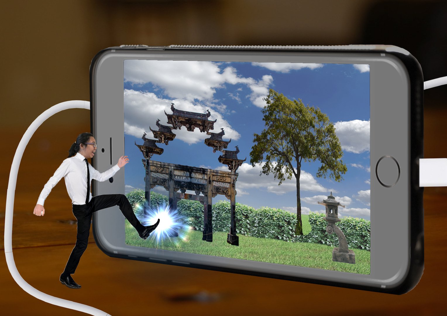
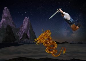
For the forth job, I am a Time traveller. The name is CHAR. This job arise due to the fact that I want to escape from the mundane , busy, hectic reality and also explore life in other time periods. Since this idea stems from my love of watching shows, I want to show the time travelling into the phone instead of a time machine. The letter C is represented by the organic shape of the charging cable, which is suppose to represent the idea of everlasting battery, because I don’t want this time traveling fantasy to stop. H is represented by me stepping into the phone and the line of the phone screen. A is represented by the building entrance and the angular rigidity of A allowed me to use architecture in my composition. R is formed half by the tree and half by the stone lantern.

I AM CHARMAINE. And these are my jobs.