Graphic Design so Far:
Ang Sang Soo:
He is the “godfather of Korean typography”. He uses Hangul, the Korean alphabet, to create very interesting designs. Much more than a typographer and graphic designer, he is a multi-faceted cultural producer who transmits his poignant philosophy through various mediums from visual design to poetry, photography, and installation. With about 40 years of innovative contributions under his pen, this designer has reinvented and championed the field of linguistic illustration.
The Hangul is written with many geometric shapes, giving him a lot of room to be playful with his typography designs. It is founded on five basic elements: vertical, horizontal, and diagonal strokes, the dot, and the circle.
He was the first to “step out of the box,” so to speak, exploiting the graphic flexibility of Hangul and removing it from its incommodious square-framed structure.

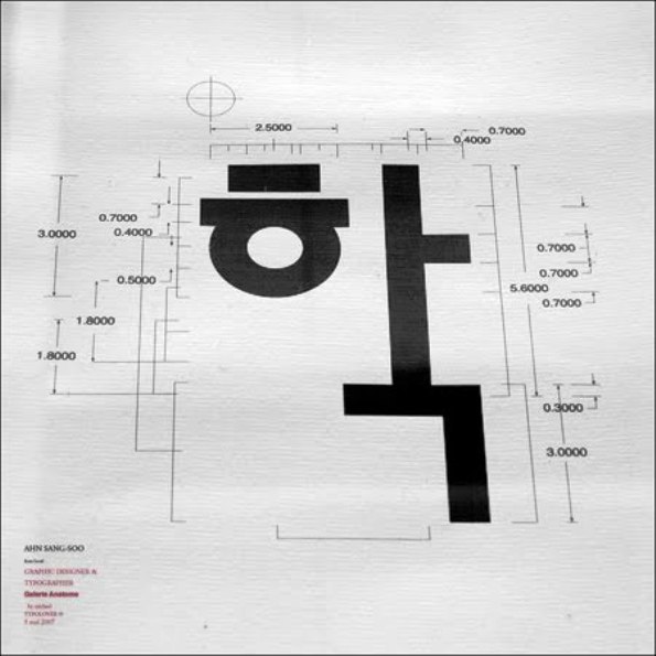

I personally think that Hangul is very cute and interesting as a writing system. It is regarded as one of the easiest writing systems in linguistics and people can learn it in less than 15 minutes. Ahn approaches Hangul less in terms of language, but more as shapes. He pays much attention to the detail of Hangul, drawing out interesting elements from each letter form.