After putting together the first draft of my zine, one major obstacle I faced was the lack of pages for this assignment. I did not want my narrative to seem rushed and I still wanted to retain the minimalist quality to my work so this will be an ongoing challenge.
These were some of my design inspirations going into my first draft:


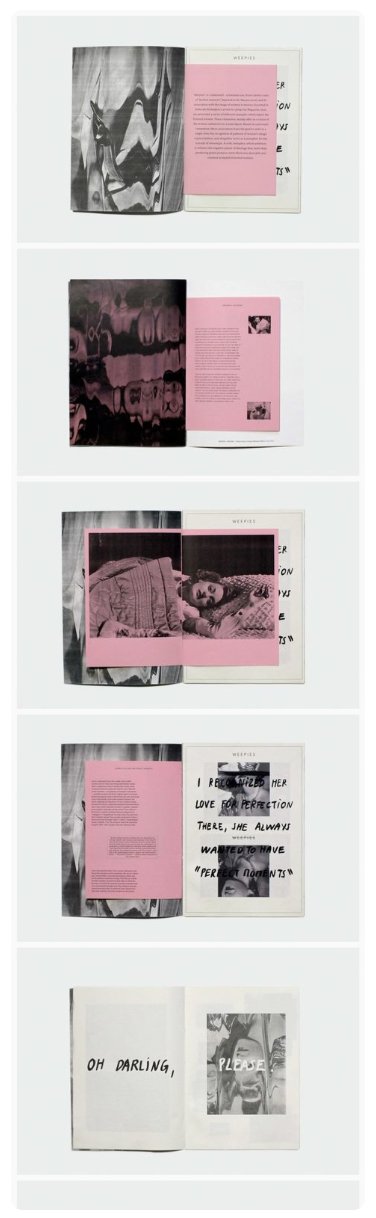

Here is my first draft with Mimi’s general comments below:


I decided to go with hand-written typography to give my text a more authentic and personal feel. I also tried to give the whole zine a more open look limiting my spreads to having not more than two photographs. Here are the main points I gathered from today’s consultation:
- Mimi felt that I should explore on using fonts instead of handwriting because she loved the font used on the back page.
- The photos are not being given enough airtime because of their size so perhaps I could explore letting some of them bleed to the edges.
- The cover image could be stronger and we discussed doing a swop of images that will be applied to my next draft.
- Mimi was not here for the centre spread on pages 3 to 4 so I will rework that.
Stay tuned to the next update! 🙂
Thank you, Duane! Looking forward to layouts that break new grounds!