Moving Image: Assignment 3 – Framing

For the third exercise for this class, we were tasked to create a storyboard that explored traditional film framings and the 16:9 film resolution. I decided to create a fictitious and no-holds-barred short narrative on a guy with an interesting fetish –

I am satisfied with what I managed to come up with. Although the weather has been rainy and cloudy the past week, I’m glad I managed to find a short window of time to shoot when the sun was still out at the SRC. All in all, it was an interesting assignment and a great learning experience.

Moving Image: Assignment 2 – Timelapse Photography

For our second assignment, we were tasked to create a timelapse as part of an exploration of time. Timelapse photography and videography had always been something I was intrigued by but I never got the chance to learn more about it or try it firsthand. As such, I was very excited about this assignment.

With my camera and tripod in hand, I proceeded to the overhead bridge just outside NTU to take a timelapse of the cars on the road. I had previously shot here for an exercise for DP2001 and thus knew that the vantage point from this bridge was fairly good.

I decided to try two different methods to make my timelapse video. For the first, I took a 15-minute long video and sped the footage up in Premiere Pro.

Over on Premiere Pro, I increased the speed of the video to the maximum of 10,000%. The downside of shooting using the video function of my DSLR were that I had to keep my shutter speed to a comfortable 1/50 in order to prevent any slowing down of frames. To combat the dark exposure, I had to crank up my ISO to 800 and even so, the blacks in my footage were still crushed and created a rather flat image.

Decent but not the look I was going for. The light trails were also missing which defeated the purpose of shooting a timelapse at night.

The next method required some research before I headed out to shoot and with the new information ready, I proceeded to embark on my first interval timelapse photography experience. With more leeway now to exposure settings, I was able to set my camera to a 2-second exposure to capture just enough light trail details. I also preset my interval settings to shoot 375 photos.

The key to getting a smooth motion in Premiere Pro was setting the ‘Still Image Default Duration’ to 1 frame.

And with that, this was the result I got

With this method, the benefits were a more fine-tuned exposure setting that retained a higher dynamic range. The photos could be shot on a low ISO, slower shutter speed, and open aperture and as such did not compromise on overall image quality. The blurring of movement also fully translated the idea of a timelapse and did not make the cars look so static as compared to the first video.

In conclusion, I am very happy with the outcome of my video and can finally understand and see how this method of making a moving image is both interesting and visually appealing. I am also glad I took the time to explore a feature of my camera that I had never used prior. The possibilities are endless and I would very much like to continue working with interval photography.

Moving Image: Assignment 1 – Cinemagraph/GIF

For the first exercise of this class, I decided to try my hand at making a cinemagraph. During the first lesson, I had successfully created a simple sequence using a clip from the movie A Single Man.

By creating a simple mask, I was able to isolate movement to only a single part of the image. After the first export, I realized that my GIF was a tad ‘jerky’ because, after the last frame, the sequence immediately jumped back to the first.

As such, I decided to ‘loop’ the GIF by adding reverse frames such that the action became seamless:

Taking what I had learned from the first class, I decided to make another GIF, this time using my own video footage. I wanted my next cinemagraph to be more subtle and contain much less movement but still draw the viewer in. Initially, I began by importing a whole sequence as frames into Photoshop. This resulted in many frames just for the simple movement of my subject blinking her eyes.

After showing this in class, Prof Elke reminded me that since there was no movement at the beginning of the sequence, I could just use one frame and increase its duration. This would make the whole GIF much cleaner and also reduce unnecessary file sizes.

Breaking up the sequence with an 8-second pause, I was able to loop the GIF and make the pacing somewhat believable as well:

In conclusion for this exercise, I experienced firsthand how moving image can create an interesting response as compared to a still image. In the example above, the simple blink of an eye added life into what would have been a static shot. In the original project, this girl was the protagonist and she spent her days waiting for her husband to come home and yearned for his attention. This feeling and emotion was thus amplified by taking this shot from the film and deliberately making viewers wait for something to ‘happen’.

Design Artefact 1 & 2 (Process)

Introduction

Through primary research, I discovered that Singaporeans are aware of the issue of hypermasculinity with 52.9% of respondents stating that it may be a problem. The aim of The Purple Cloud Project is to, therefore, educate and inform target audiences on the existence and impact of hypermasculinity and eradicate hypermasculine discrimination and behavior in today’s society. The secondary aim of this project is to redefine what it means to be masculine.

I hope to highlight hypermasculinity as a problem by engaging in open conversations with participants, allowing them to gain perspectives from each other and form a community of voices.

Design Artefact 1:

I started my thought process for my logo by doing some quick sketches. I wanted there to be an obvious cloud form but also integrate something personal like hands, a heart or even the male sex symbol.

Clouds are something that has been used in logo forms and corporate branding so there was a challenge in creating something fresh. I also decided to incorporate a speech bubble in my form because it suggested the idea of a conversation which was in line with the objectives of my campaign.

Visualising a muscular arm as a cloud but this seemed to perpetuate the existing stereotype of what masculinity is about. Also the use of arrows to suggest restarting or reviewing the concept of masculinity.

Hands forming a cloud. The cloud didn’t look like one so I scrapped this idea.

The final three iterations using the cloud to also form a heart which I felt perfectly tied into the reason for running this campaign – a matter of the heart. After multiple consultations, I finally simplified the logo’s form paying close attention to detail and how it looked when up or downscaled.

Moving on to the application of the logo. I wanted to place it on something that would be taken around and used in public so awareness would be raised. I went through options like mugs, tote bags, t-shirts, and pins but decided on creating a mobile phone case. Conversation nowadays is done a lot on the phone. Texting, calling and even social media and as such, I felt the phone would be a perfect form to place my logo on. It would incite solidarity and also be a visual reminder to be conscious of the hypermasculine things we may say.

CLICK HERE for the final outcome.


Design Artefact 2:

Moving forward, I wanted to think of a strategy to create awareness for the Purple Cloud Project. This would be the first step towards spreading the message and since it would be the campaign’s debut, it had to be impactful.

It all began with a sketch. I wanted to invite the idea of how one cannot understand masculinity nor define himself as a unique individual if we continue bombarding media and men all around us with stereotypes and ideal versions of masculinity.

A mirror is something that reflects our image and I wanted to disrupt it by filling it up with ideas of what masculinity is currently portrayed as. These definitions were as honest and raw as possible, as gathered from the survey I conducted. I also decided to fill one cubicle with hypermasculine slurs on stickers and also flood it with purple light to suggest that this personal space was now the ‘purple cloud’ inviting you to think about this matter and join the conversation.

Setting up the space was a challenging task as I wanted to transfer text on the mirror. This took a lot of time and patience. I also decided to create a mirror decal to tie in with the Purple Cloud’s branding.

CLICK HERE for the final outcome.


Reflections

All in all, I thoroughly enjoyed VC2 and how the projects were a build-up relating to each other. I also felt it was a good idea that we were allowed to pick a cause we resonated with as this really made me push myself to think of the best solution the problem I highlighted. I am also glad Michael guided me in a good direction with regards to Artefact 2  and made me think of how I could approach it in a different method as opposed to something very corporate or over-done. I also appreciated the idea of how playing with scale could make a huge difference in how the message is perceived. In a nutshell, LESS IS MORE! Looking forward to see what the next VC mod has in store!


Typography I Project 4: Personal Creation

And just like that, we approach the end of the first semester and first typography module. It’s been a crazy journey and I had to carefully weigh out my options before deciding which project I wanted to expand on for my final assignment. After thinking about it, I decided to do narrative photography with an accompanying prose that would incorporate typography rules to fully convey emotion.

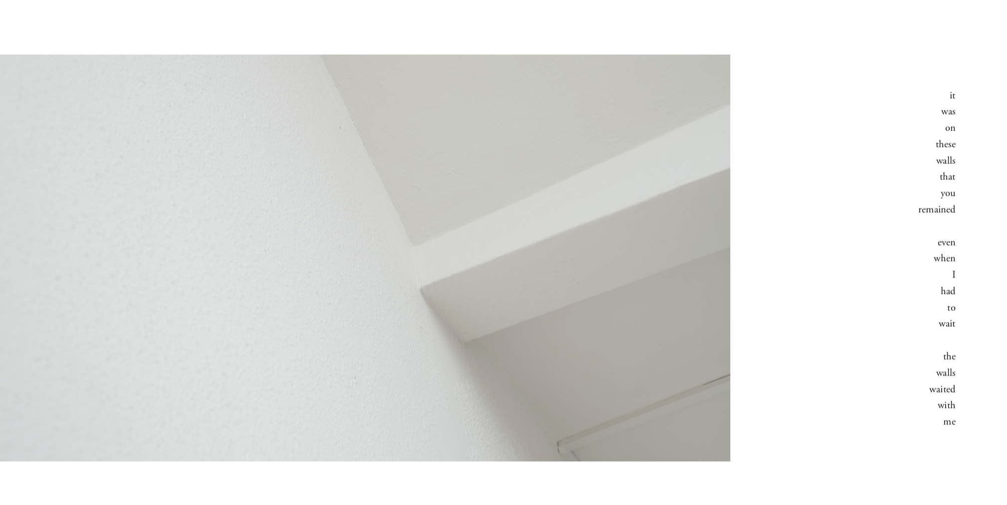
For a start, I had to come up with a short-story / prose that my typography and photography would be inspired by. Following the creation of my zine done in Year 1 where I shared a personal story of heartbreak, I wanted to continue the story (that was in sync with my personal journey of healing ) and talk about something that I’ve been feeling for awhile: the feeling of alienation in a home and rejecting spaces because of the memories attached to them.

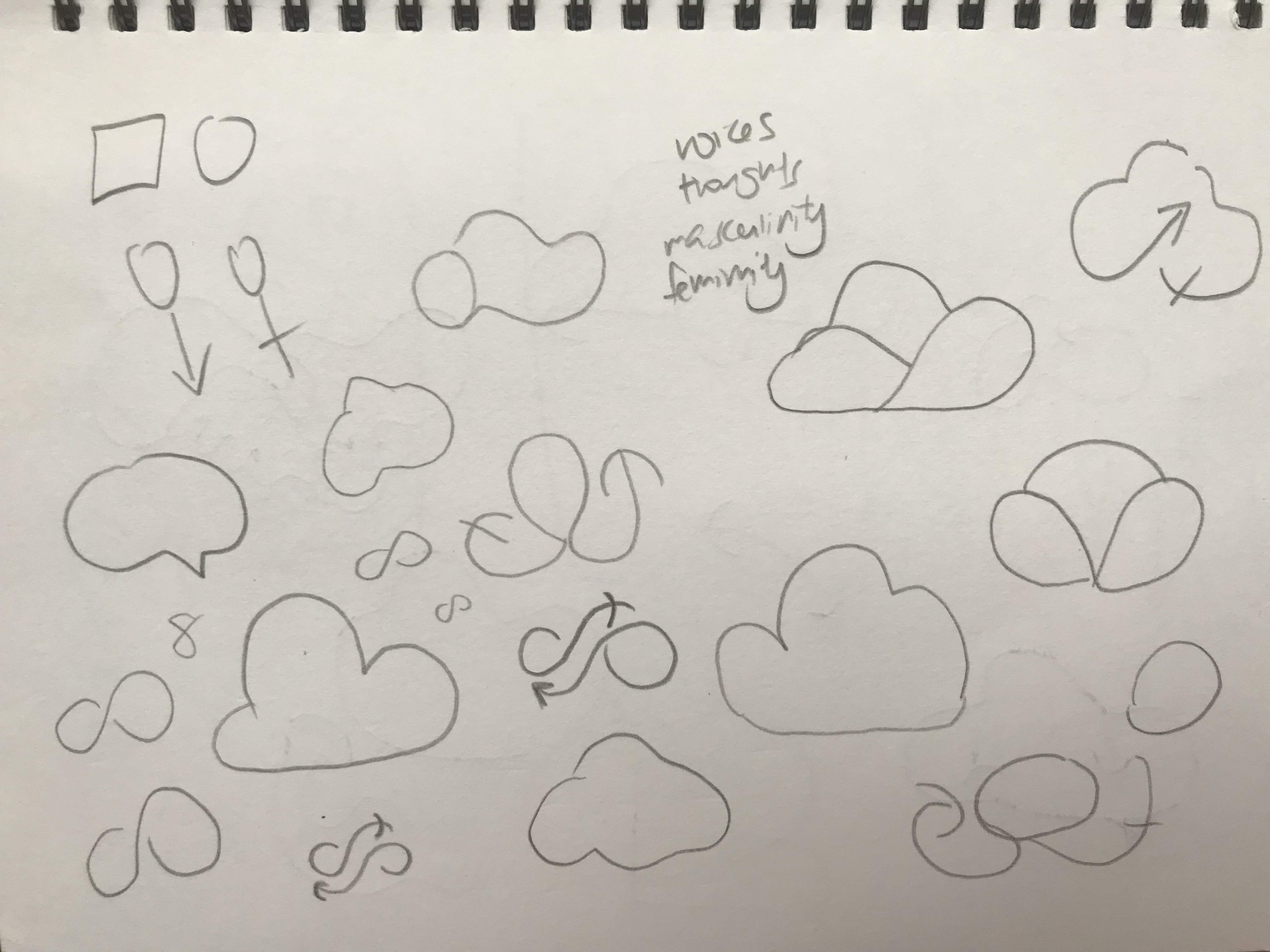
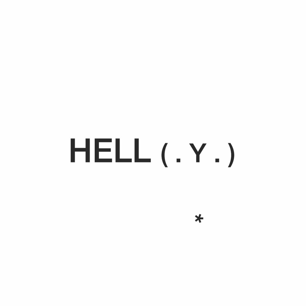
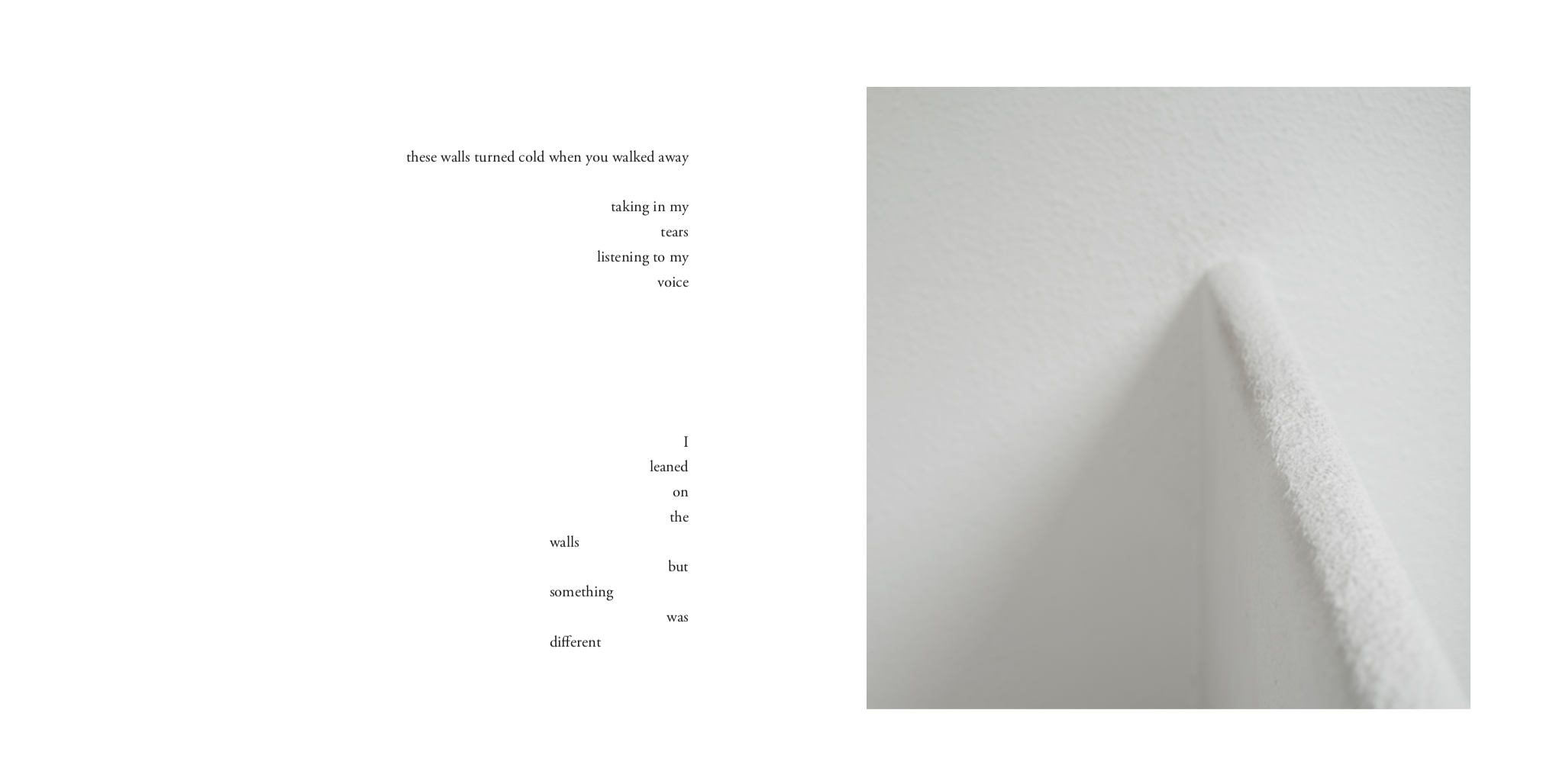
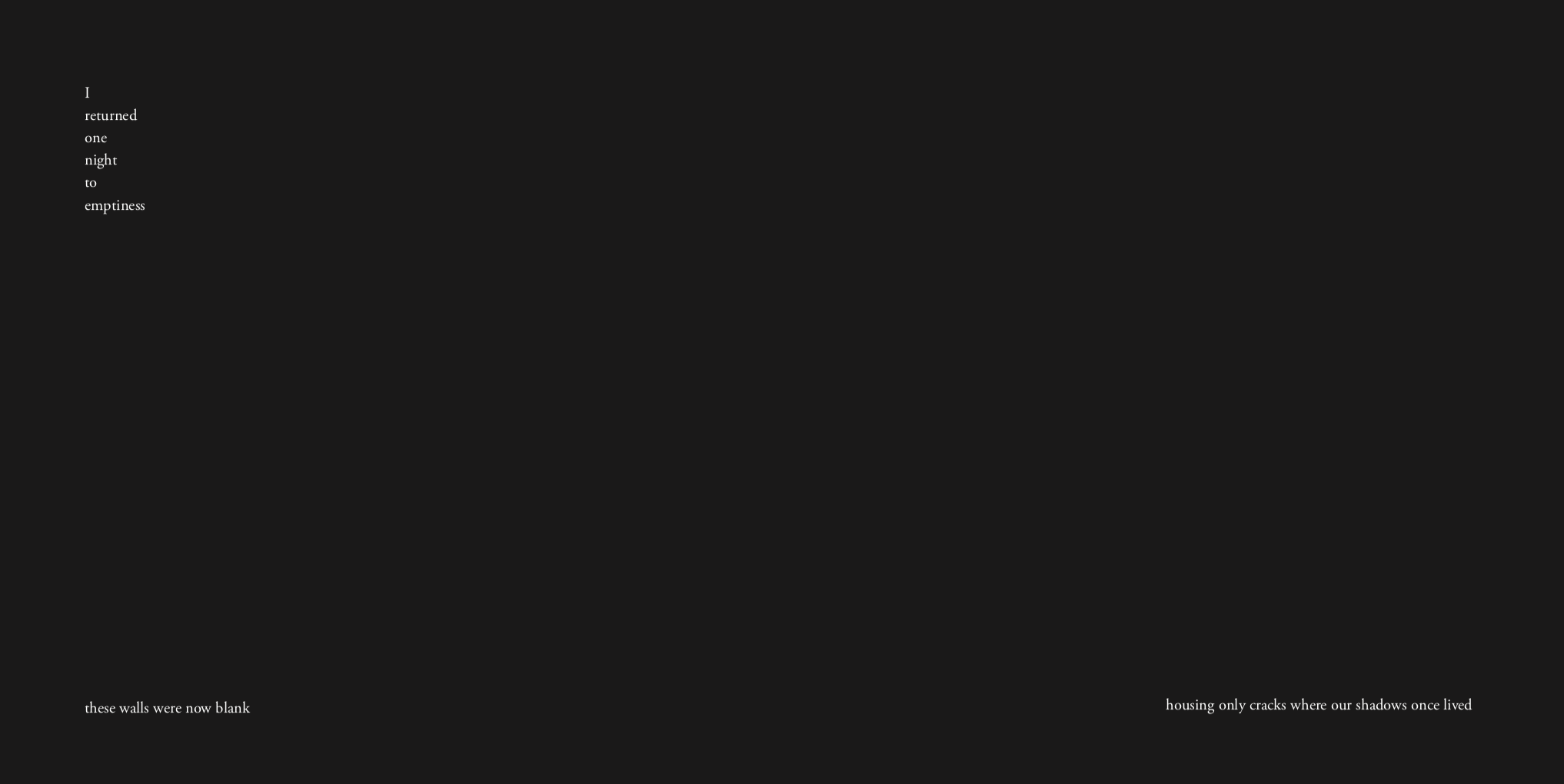
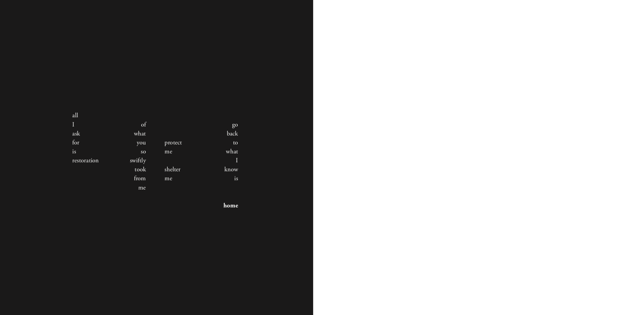
I sat down one Saturday, plugged in to my favourite sentimental (emo) songs and poured my heart out. It was emotional session that left me in tears to say the least. As I wrote, I decided that I didn’t want my words to rhyme too much like a poem but instead I wanted to incite thoughts through personifying my room at home. This was the outcome:

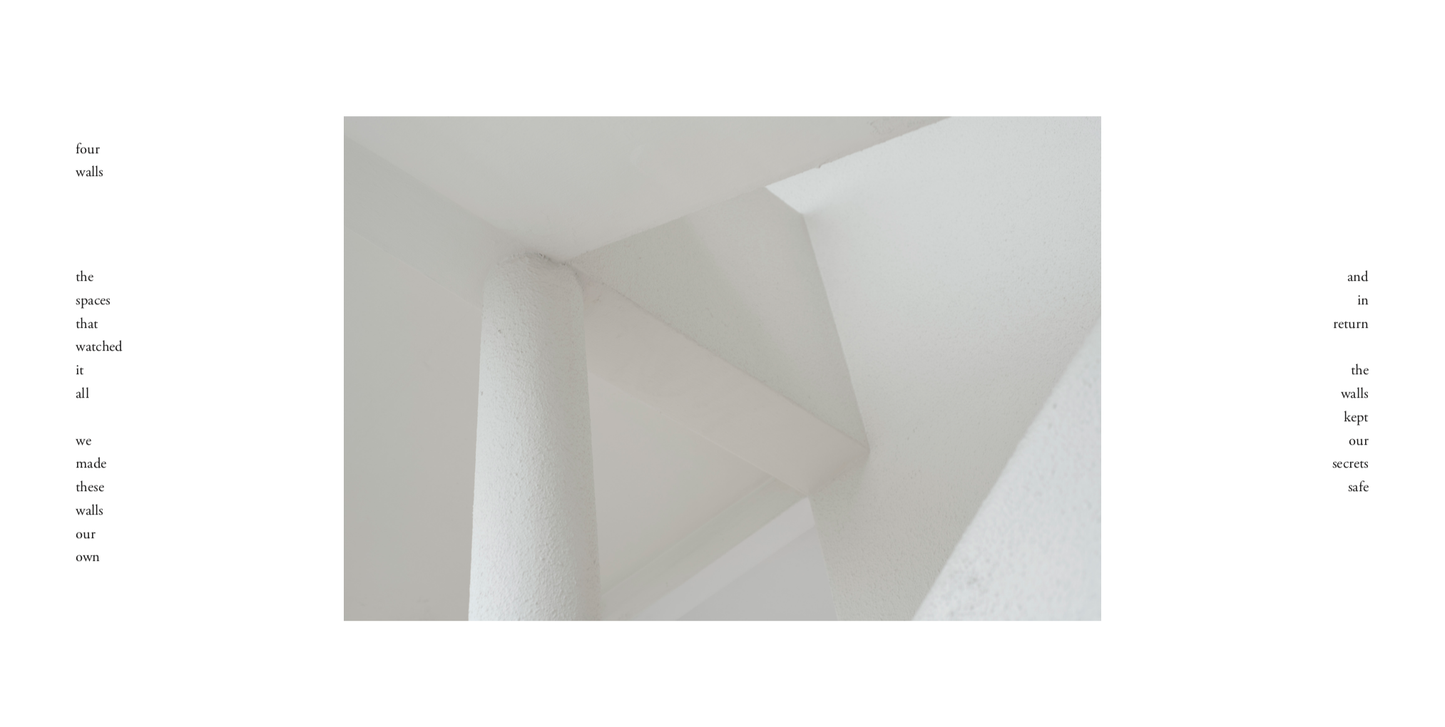
By giving character to the walls in my room / house, I managed to create a narrative that I felt gave a clear picture of the state I am in.

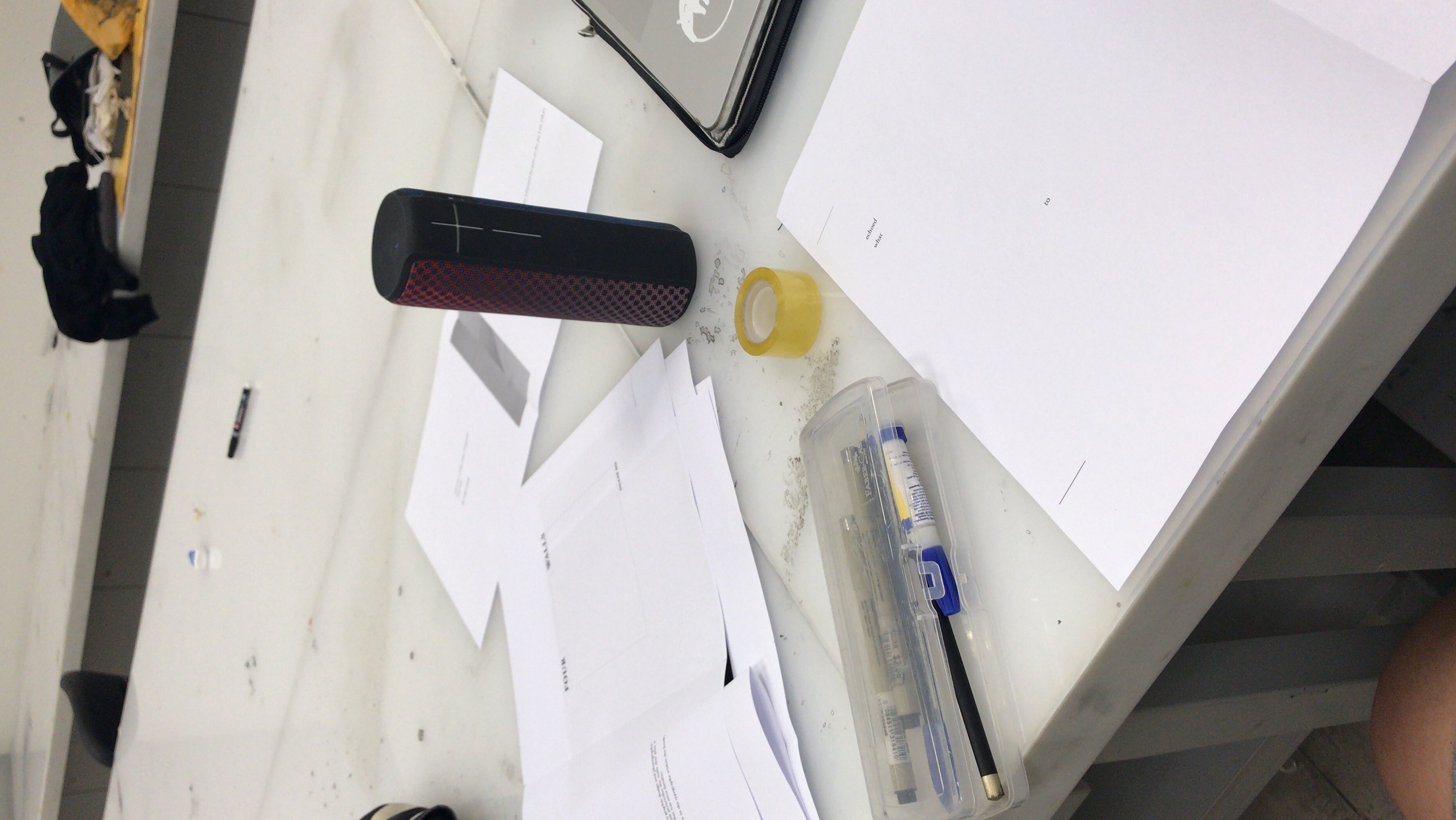
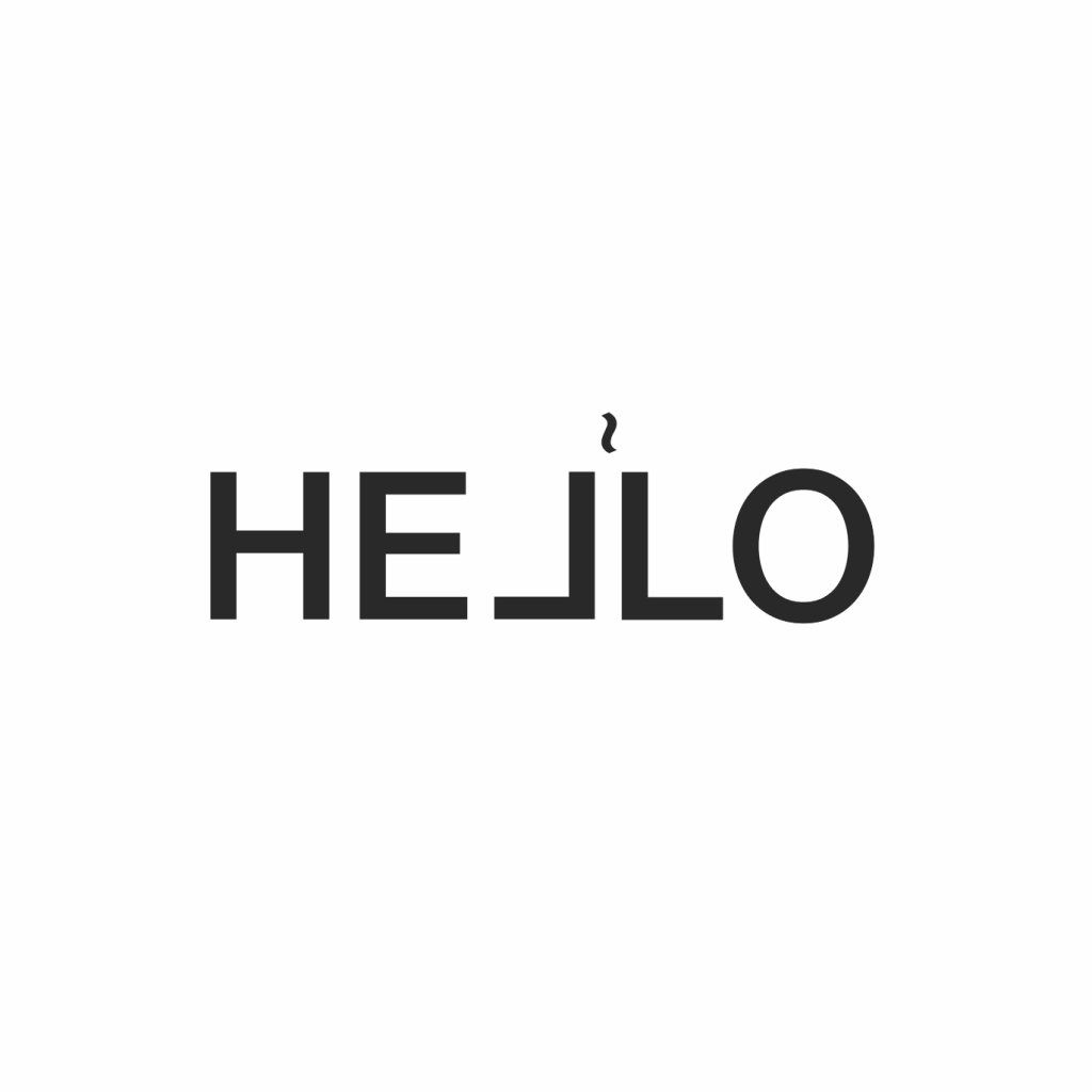
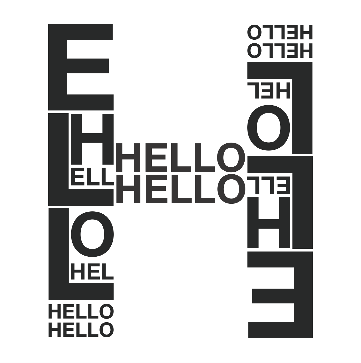
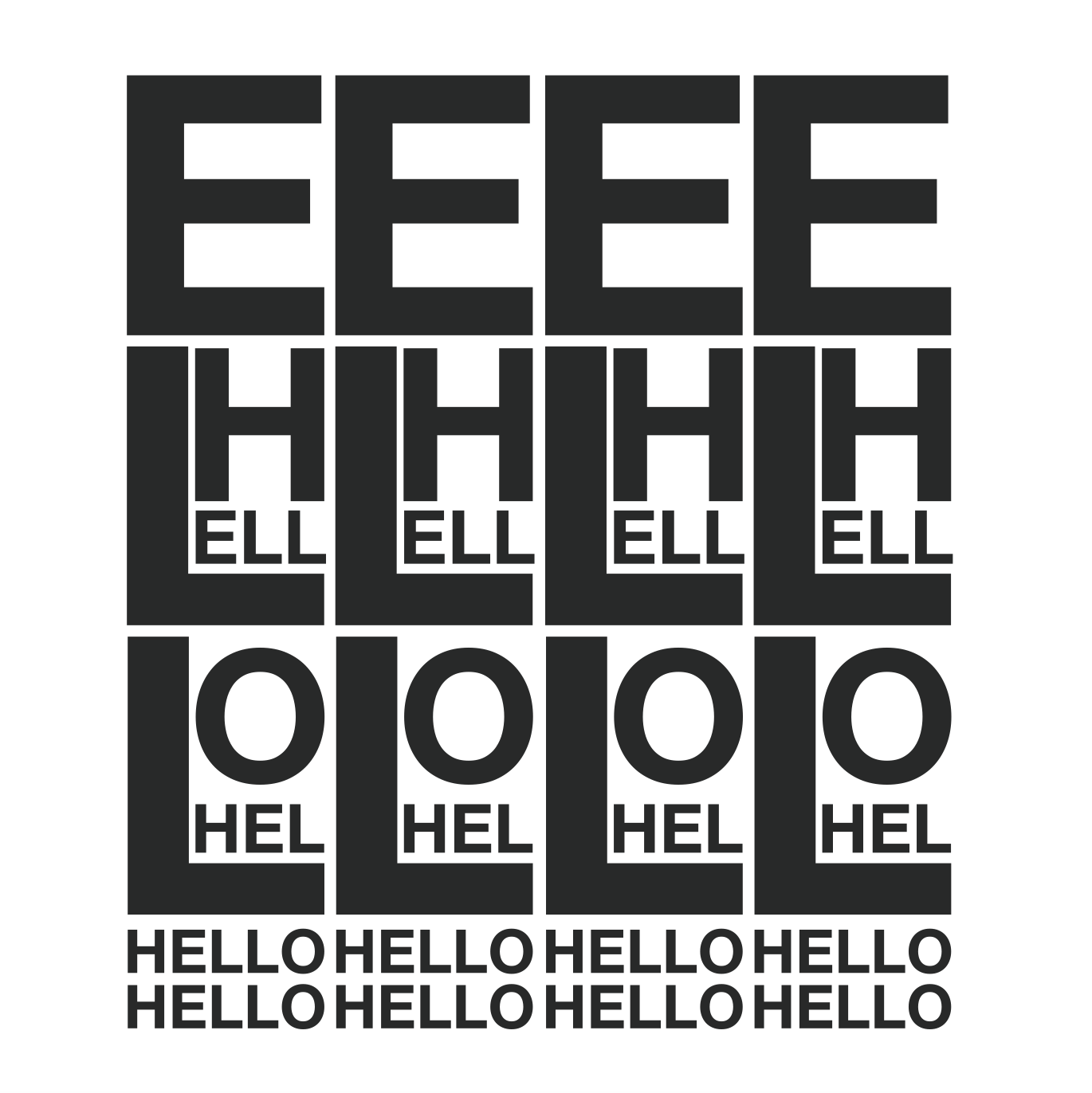
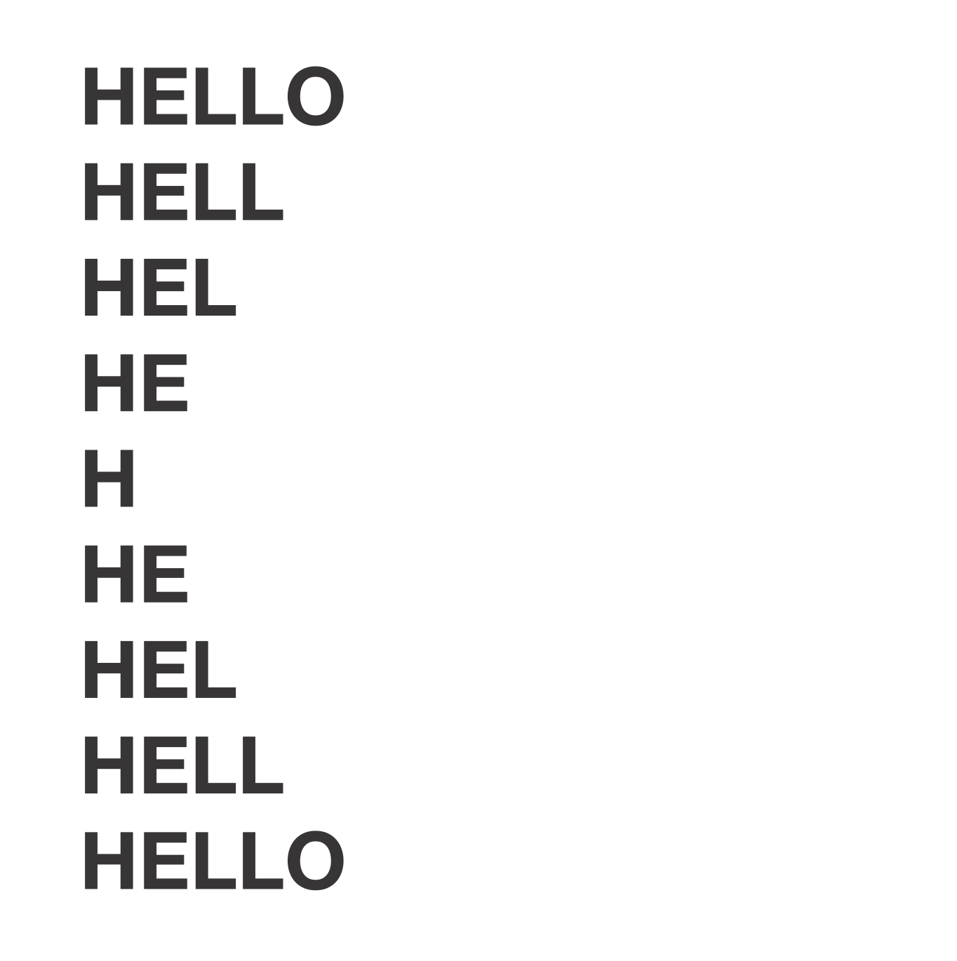
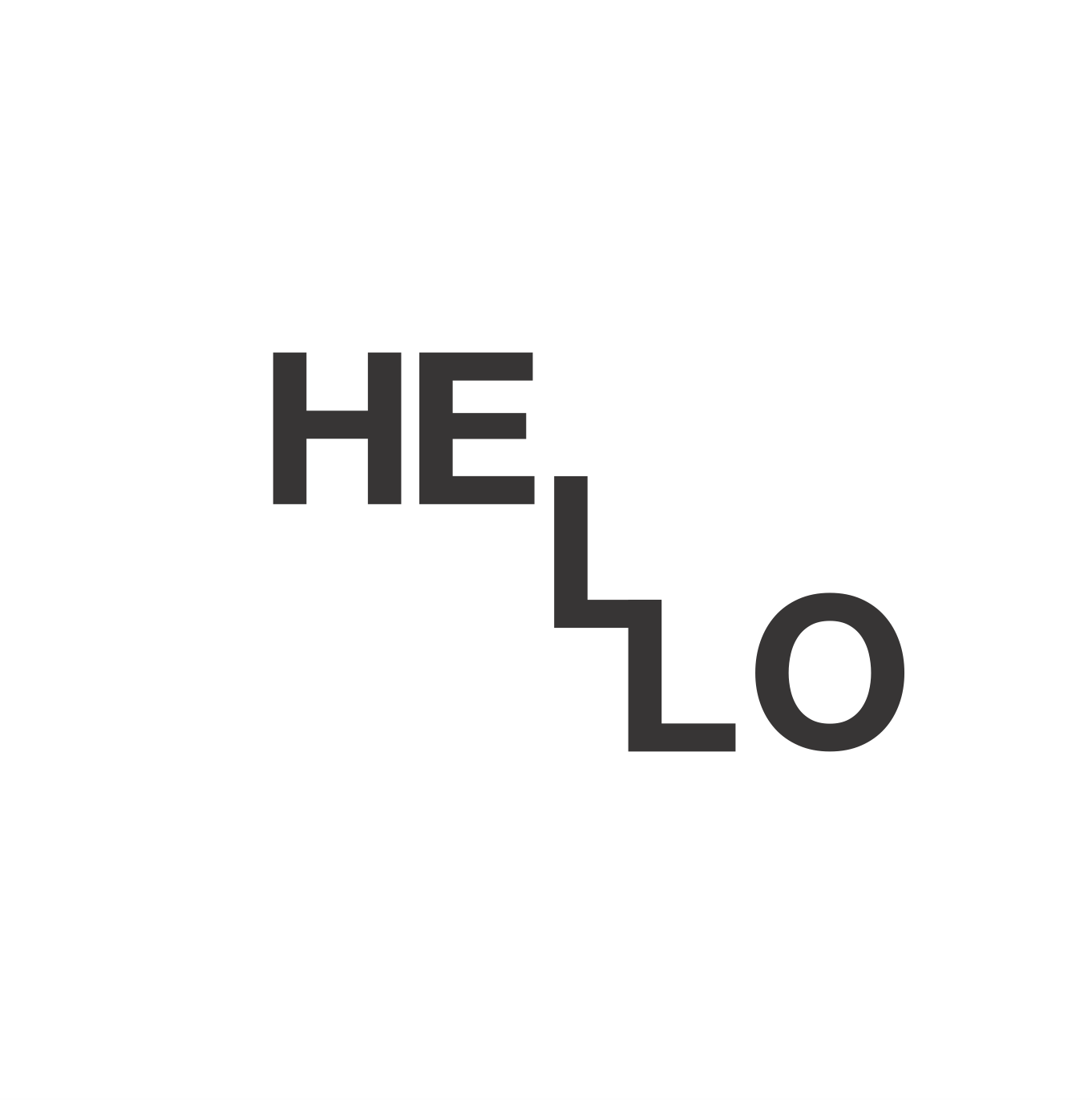
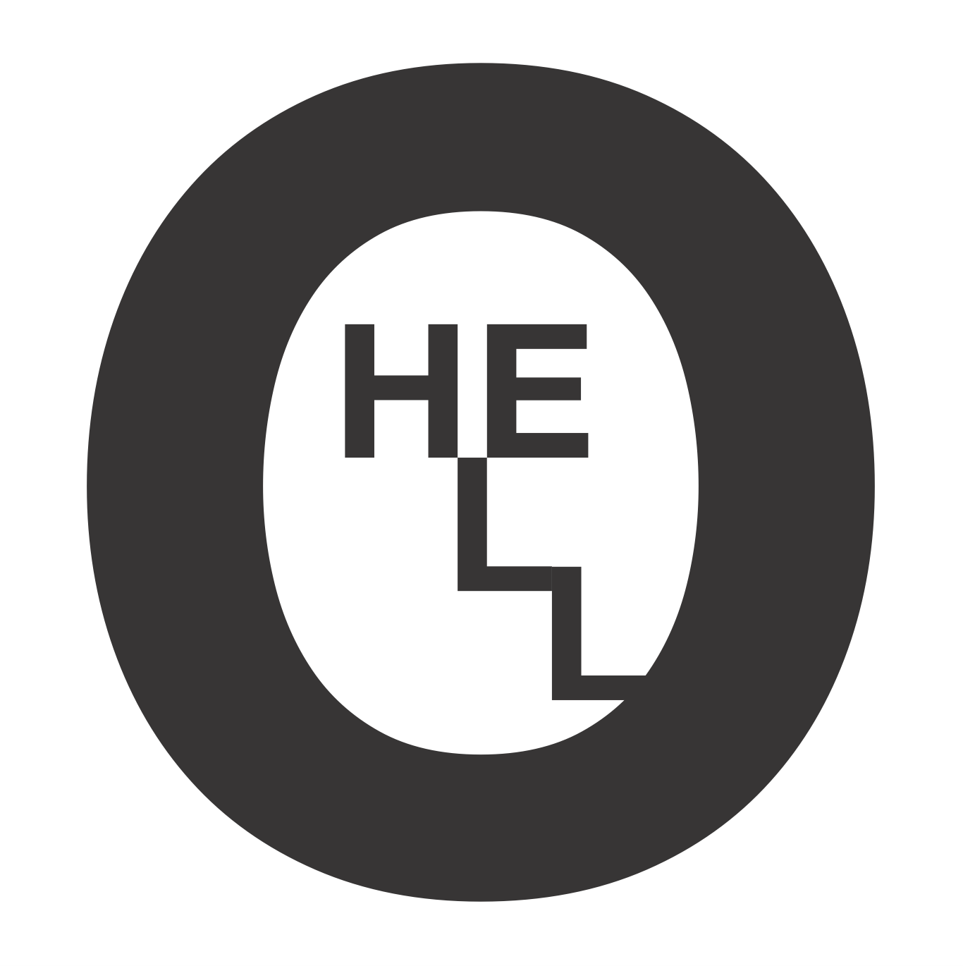
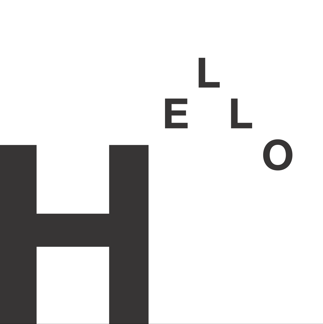
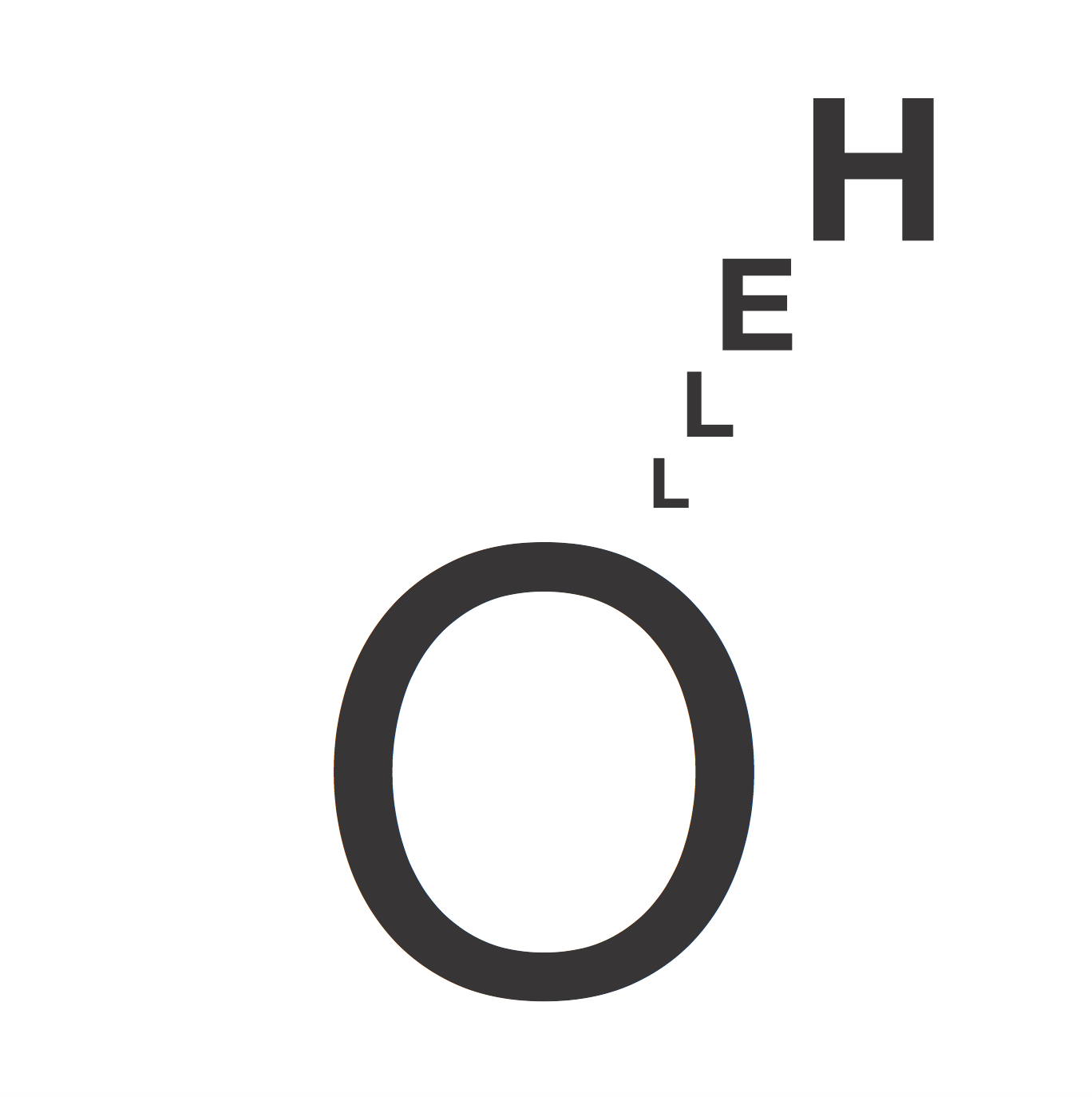
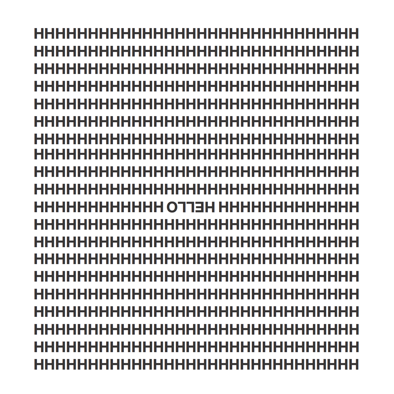
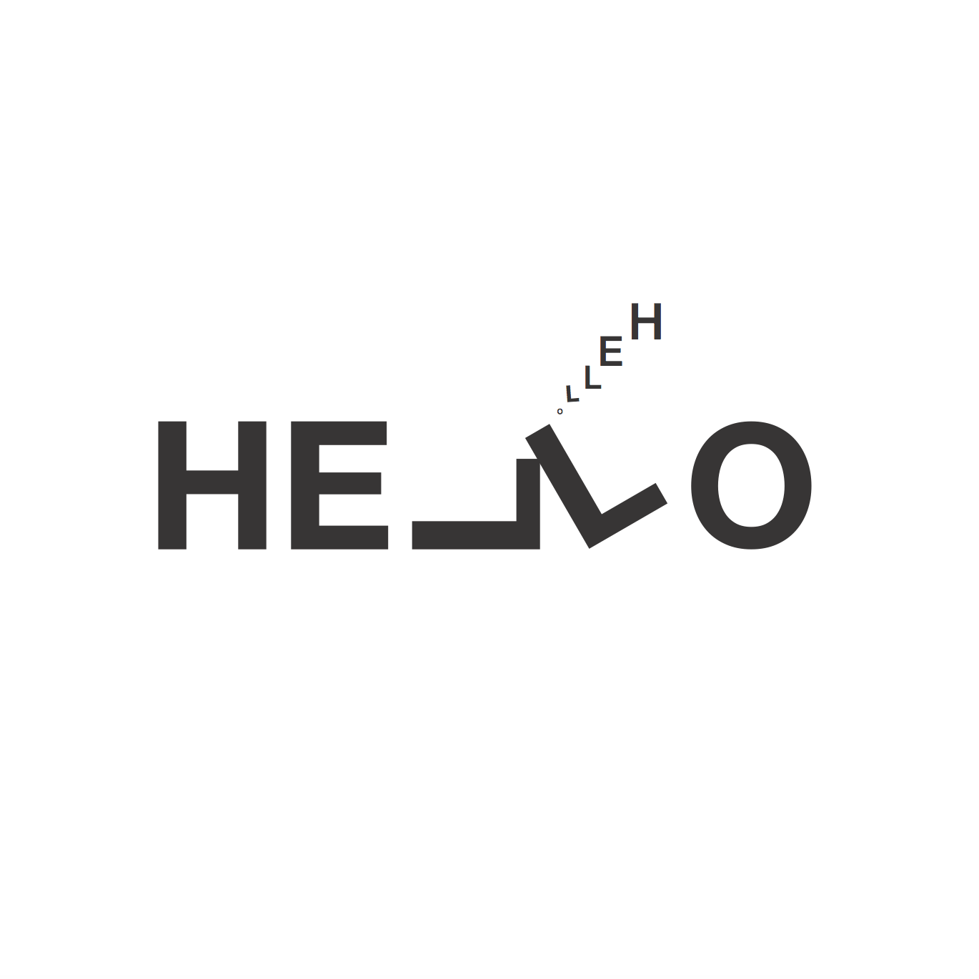
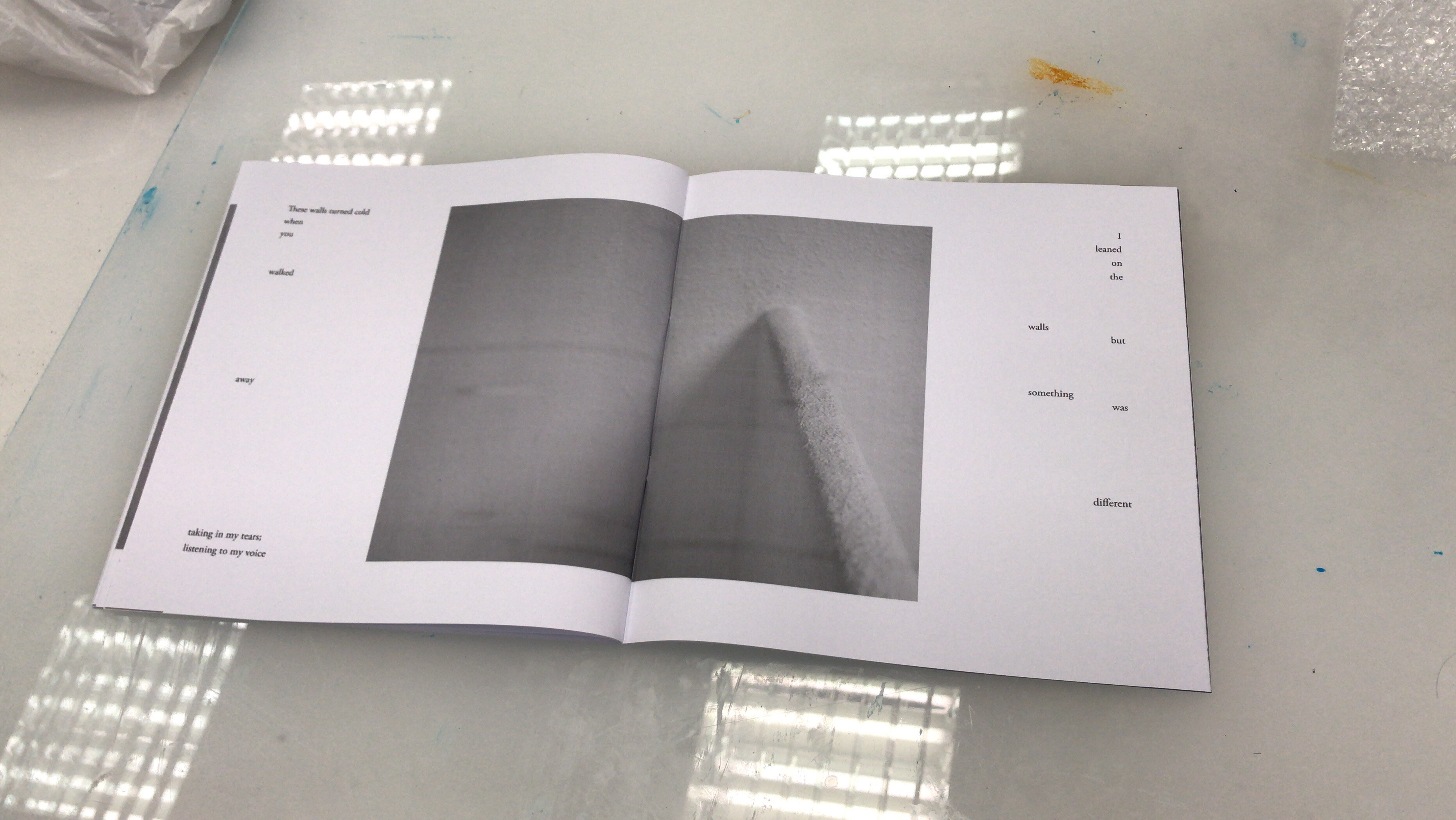
The next step was translating them into layouts and spreads. I aligned my text based on the flow of my story. To explain it concisely, I took notice to:

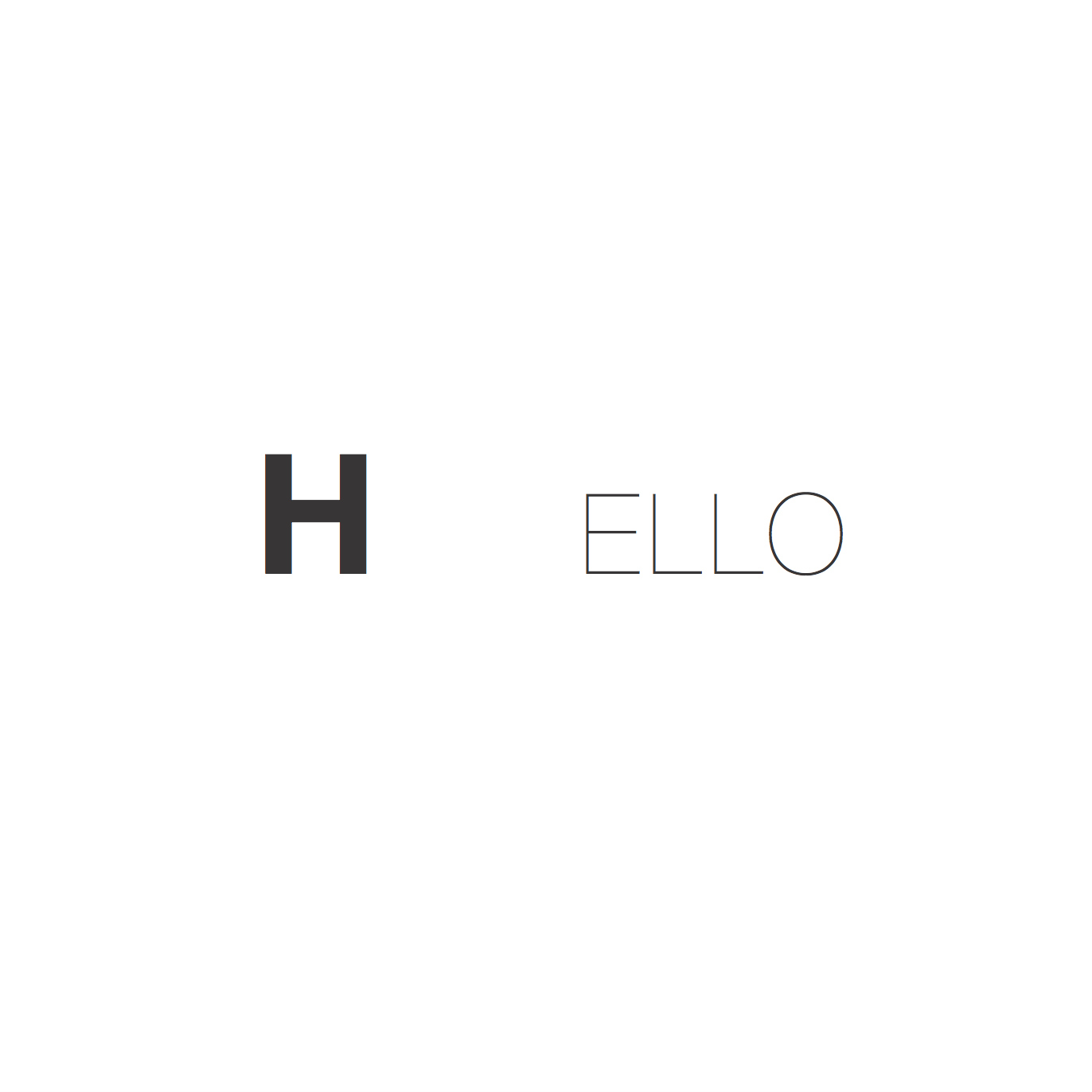
  1. More structured paragraph placements at the start
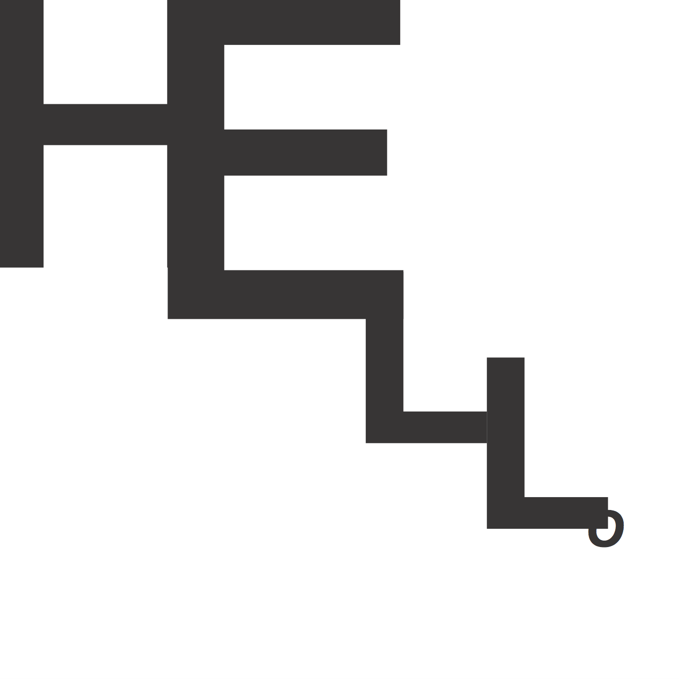
  2. Gradual dispersal and more space between text units as the story reached the climax
  3. Opposing structures by the end of the story
  4. Conscious altering of only leading, kerning and negative space. (no alterations of scale, form and opacity

The reason behind #4 is because I strongly believe typography need not be literal representations of words. As such, I want reader to feel the narrative through the image and text.

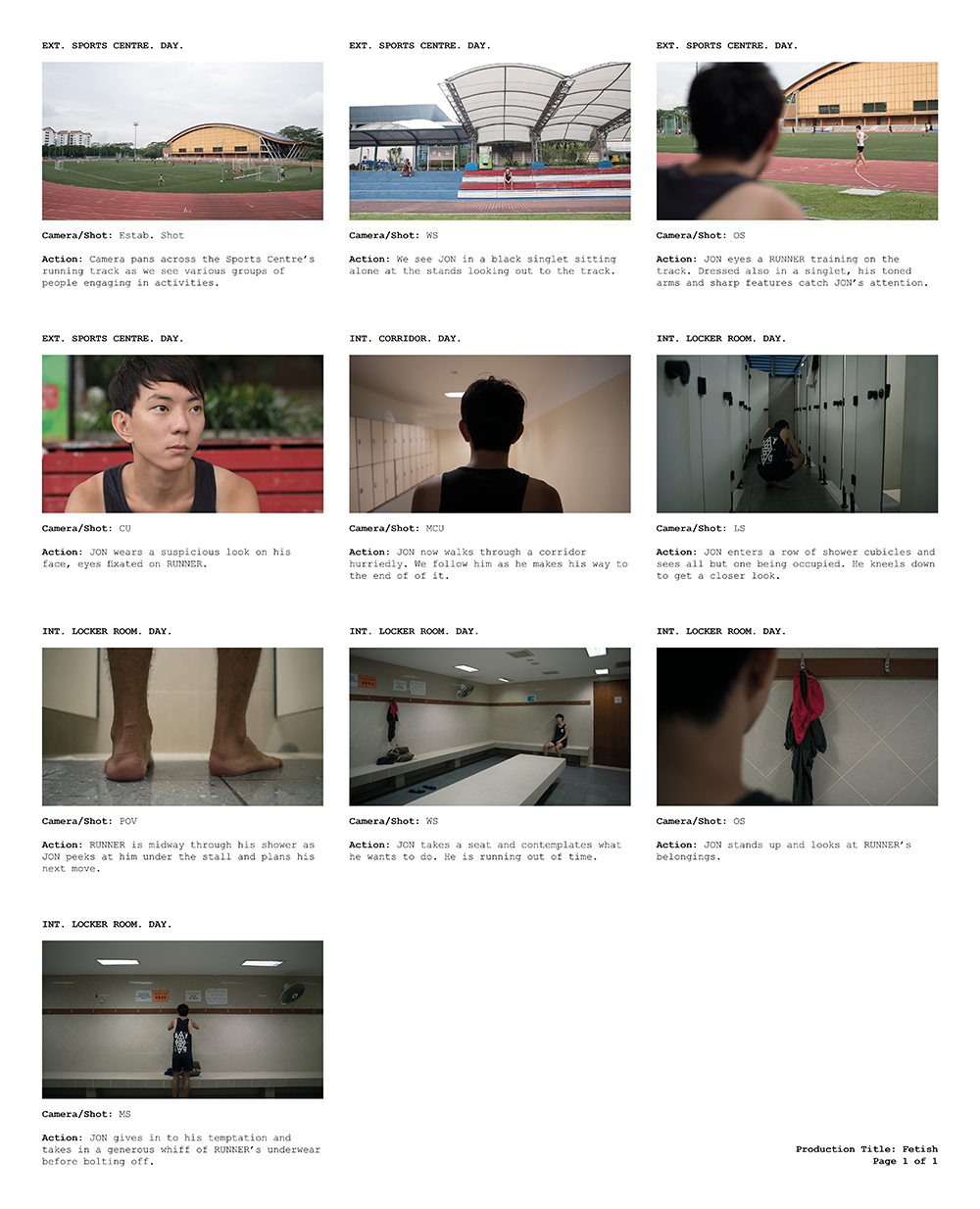
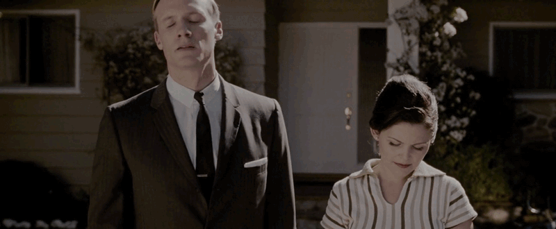
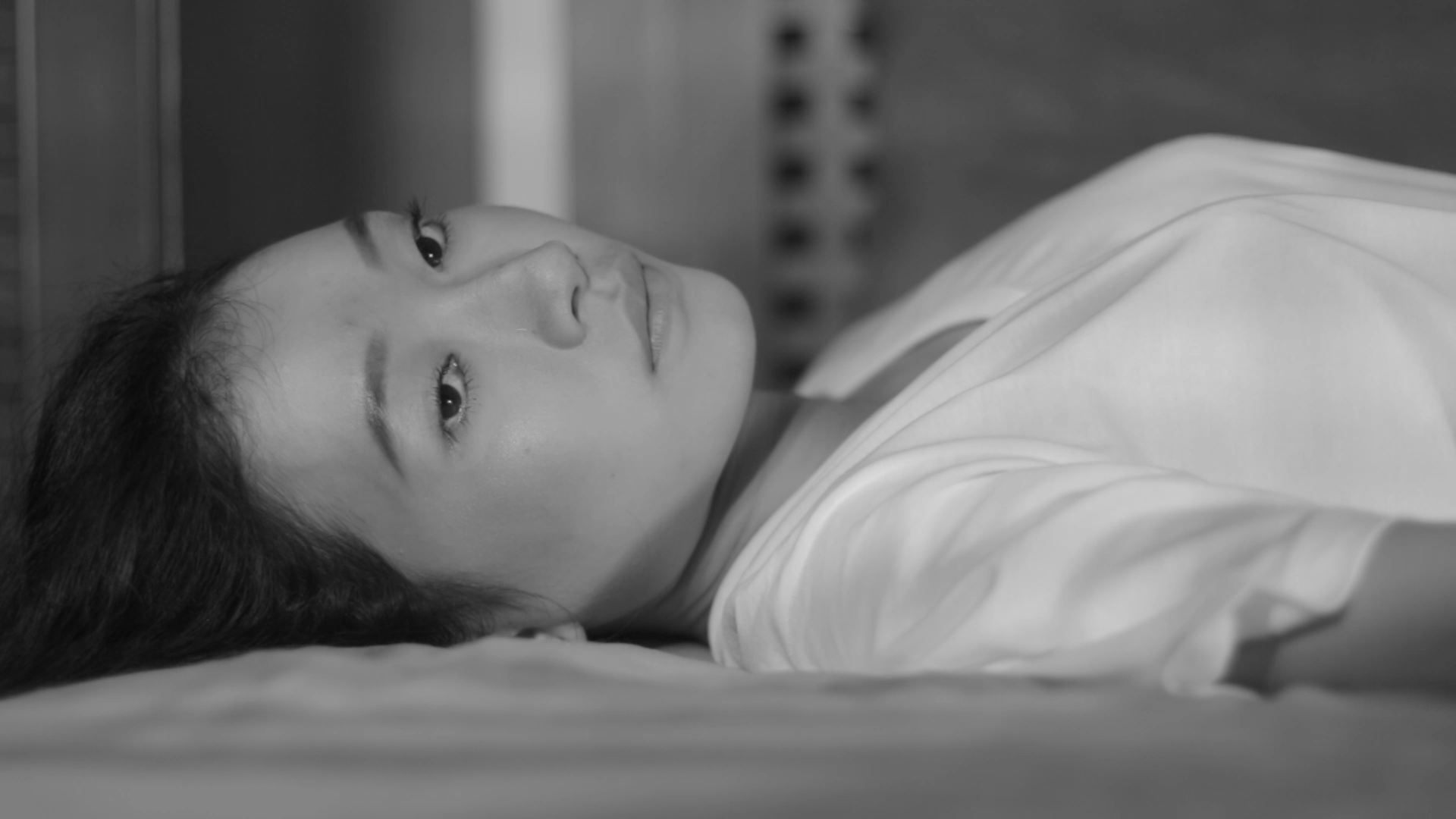
My next task required me to take photos that would complement the narrative. In the beginning, I had the concept of going around my hall (NTU Hall 2) to take photographs simply because I wanted amplify my feeling of alienation by portraying walls / a home that was not even mine. I wanted to push the idea of how I surround myself now with a different setting but try to make myself a home within it anyway. The first batch of photos were sadly very uninspiring:

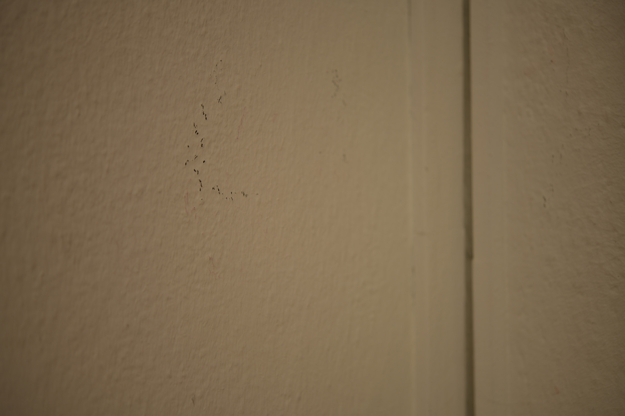
I reflected after my first shoot and reasoned with myself that perhaps I was having trouble visualising interesting frames because I was too familiar with my hall’s surroundings. On the next day, a rainy, cloudy Monday, I decided to venture out to Hall 1. Just next door to mine, I was suddenly very inspired and finally got excited by what I was seeing and shooting.

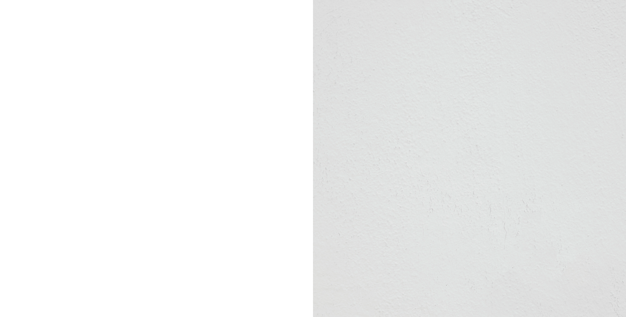
My artistic vision behind the photo series stemmed from the a few basic rules I set for myself:

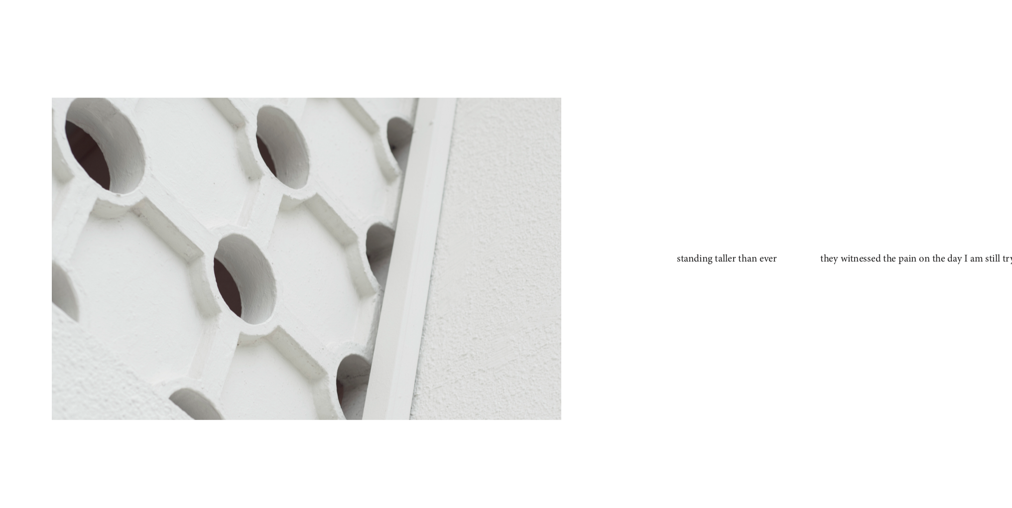
  1. Elimination of objects or external motifs that were present on the walls
  2. An exploration on shapes, shades and tones and texture
  3. An overall cohesive colour scheme / colour grading during post-processing

I put these rules in place to ensure that the images didn’t fight for too much attention from the text and its typography.

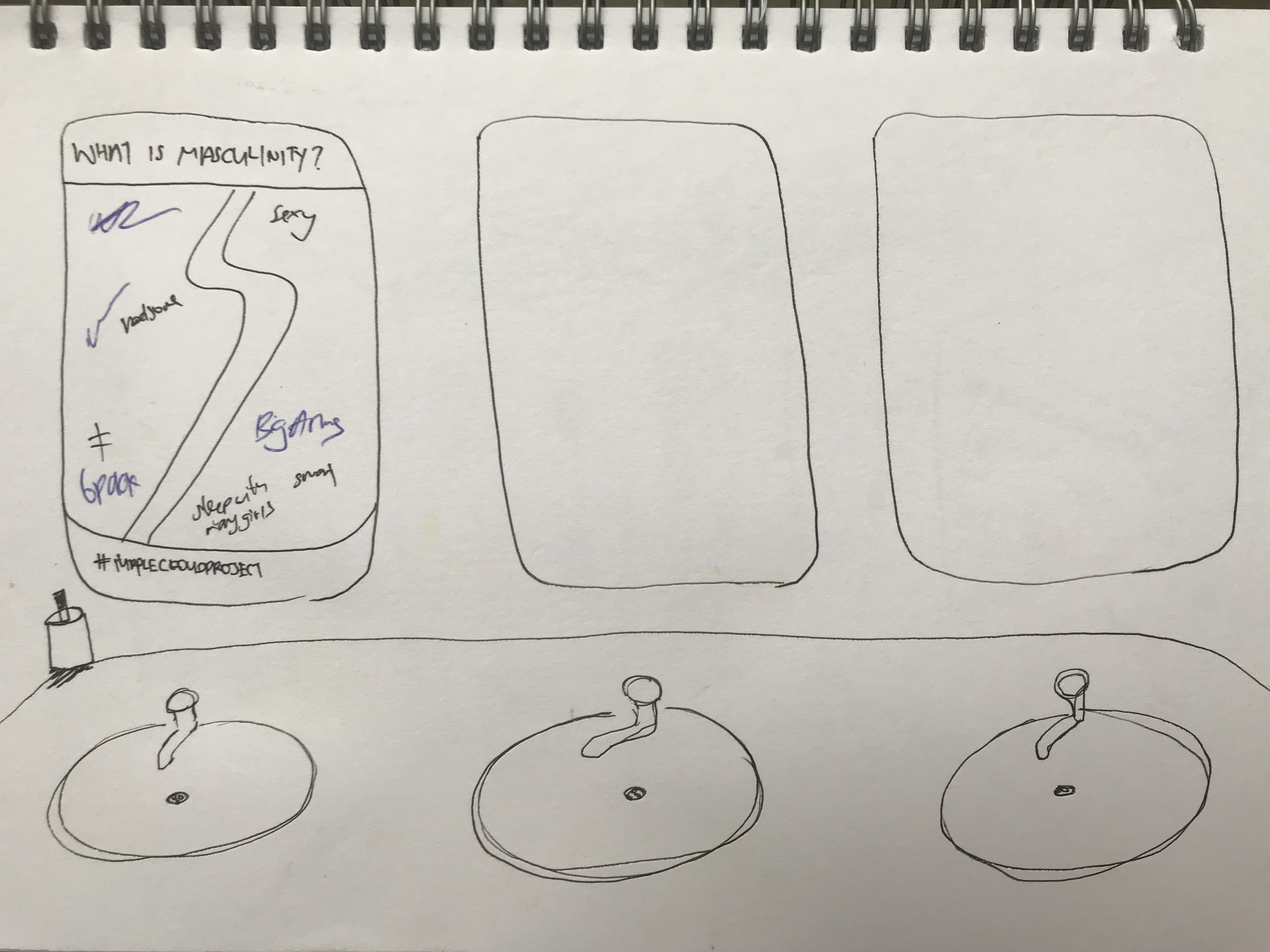
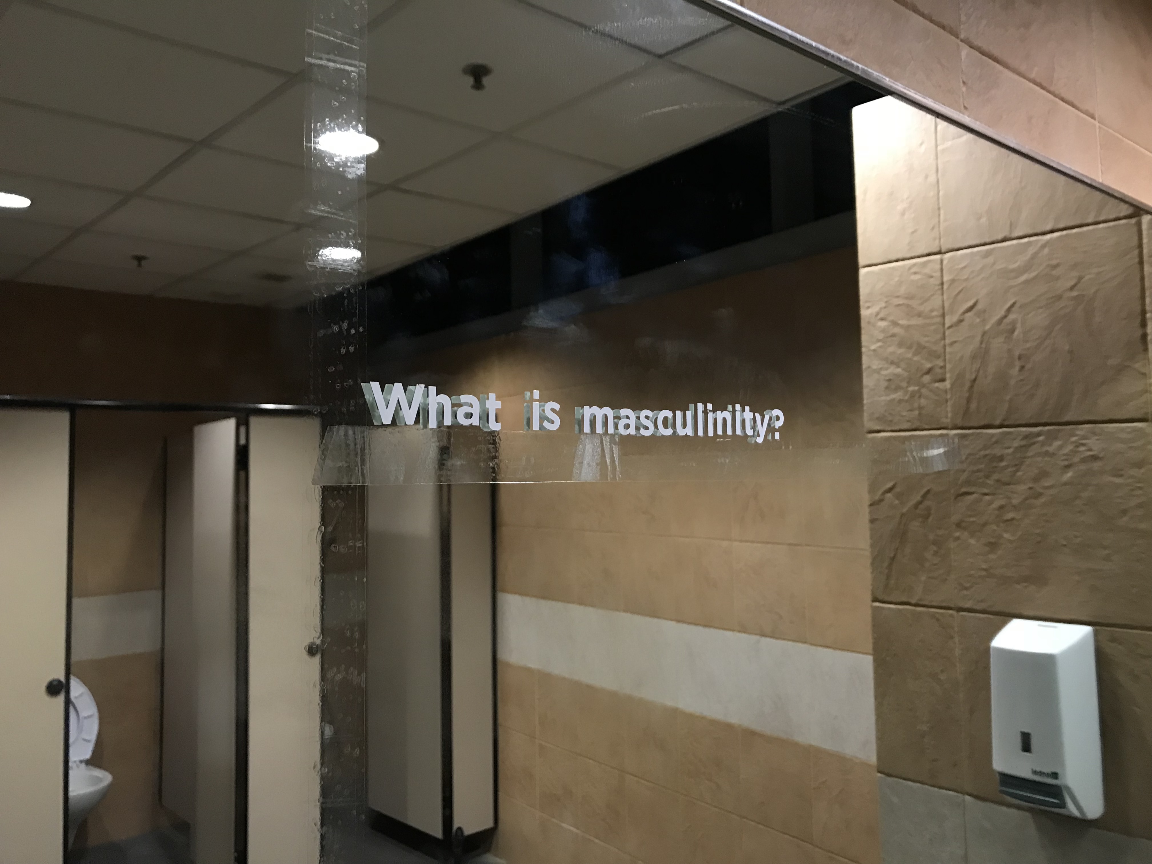
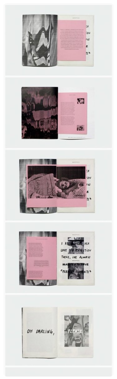
This was my first layout of text and image:

\

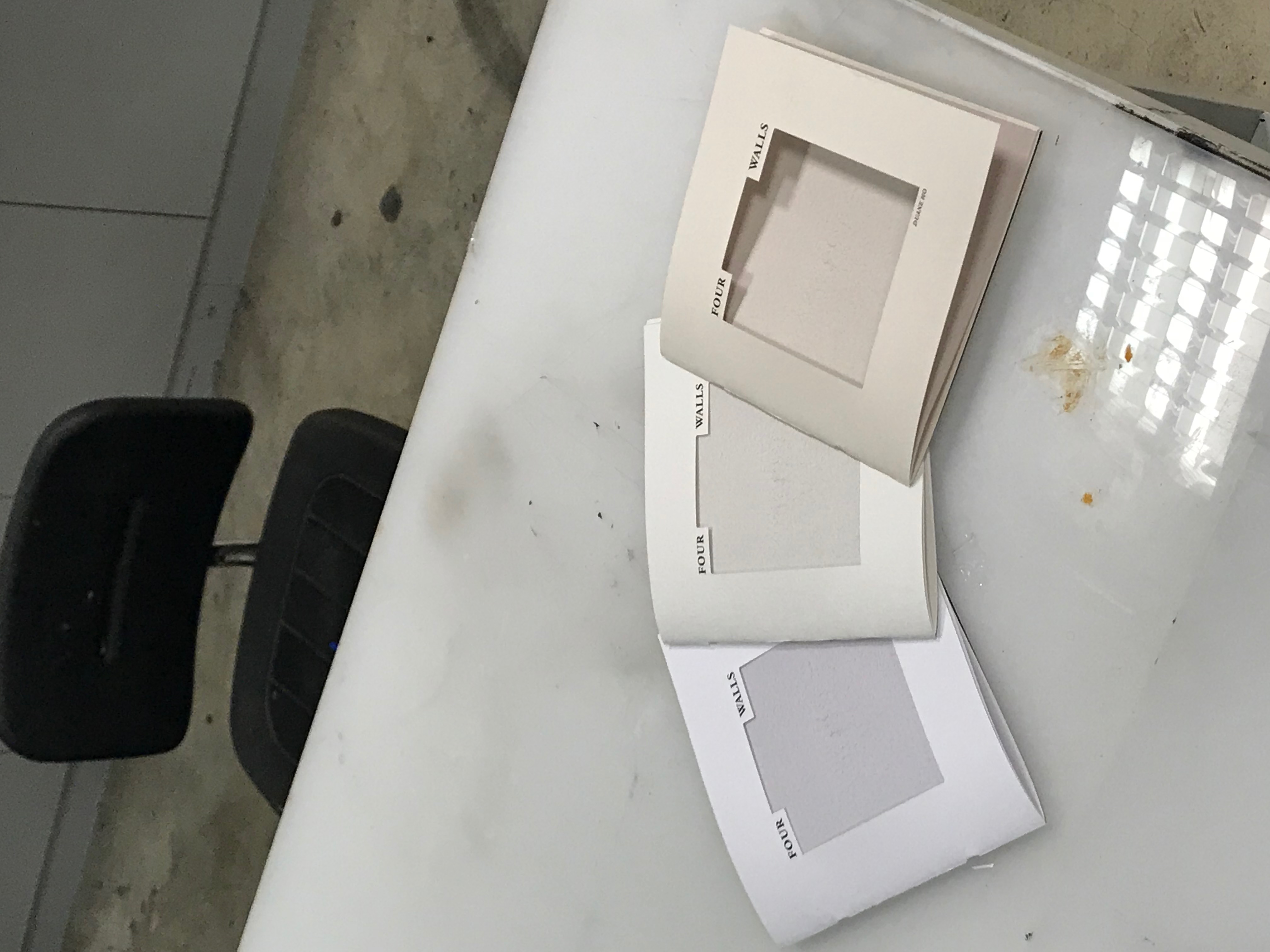
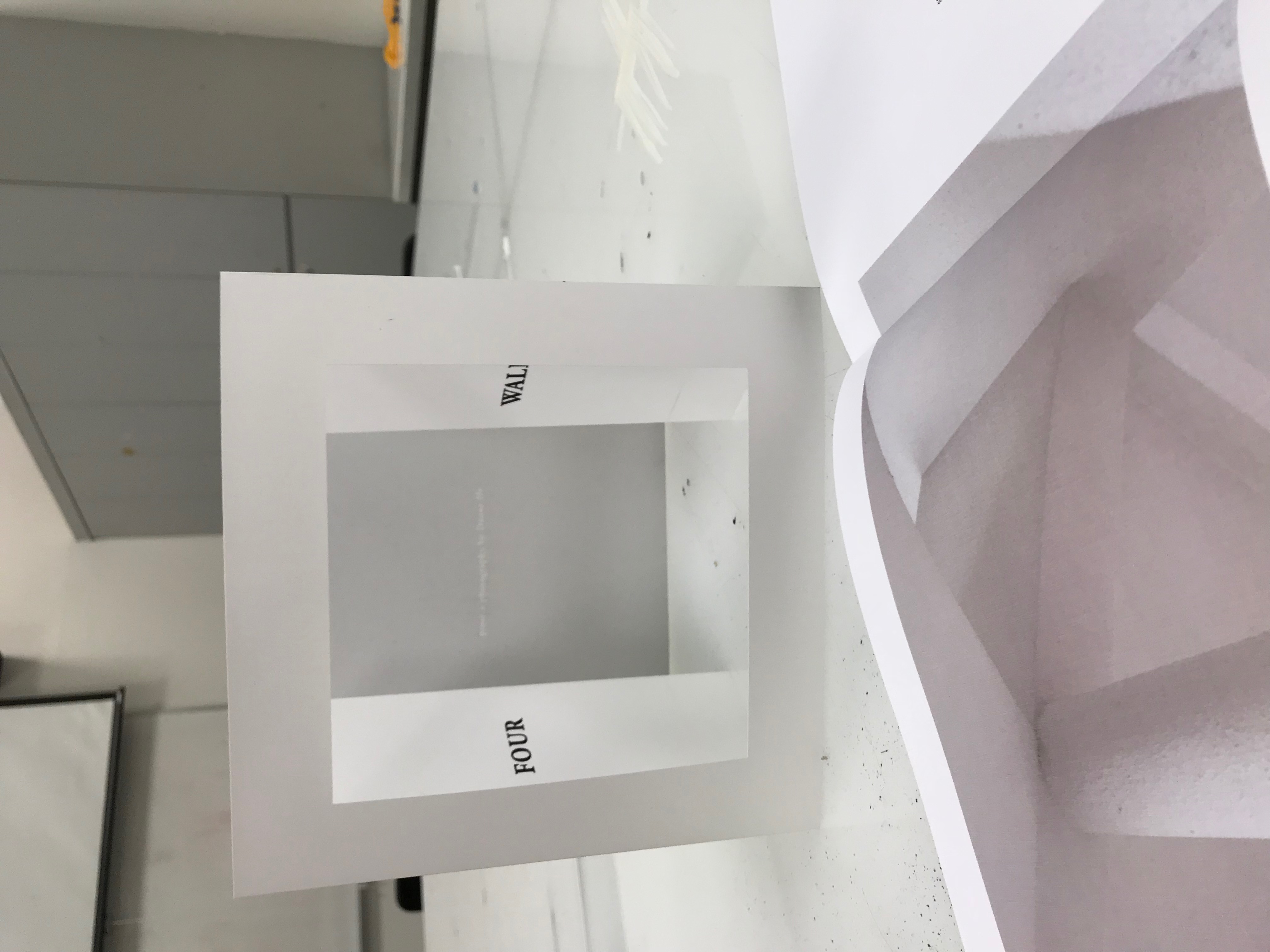
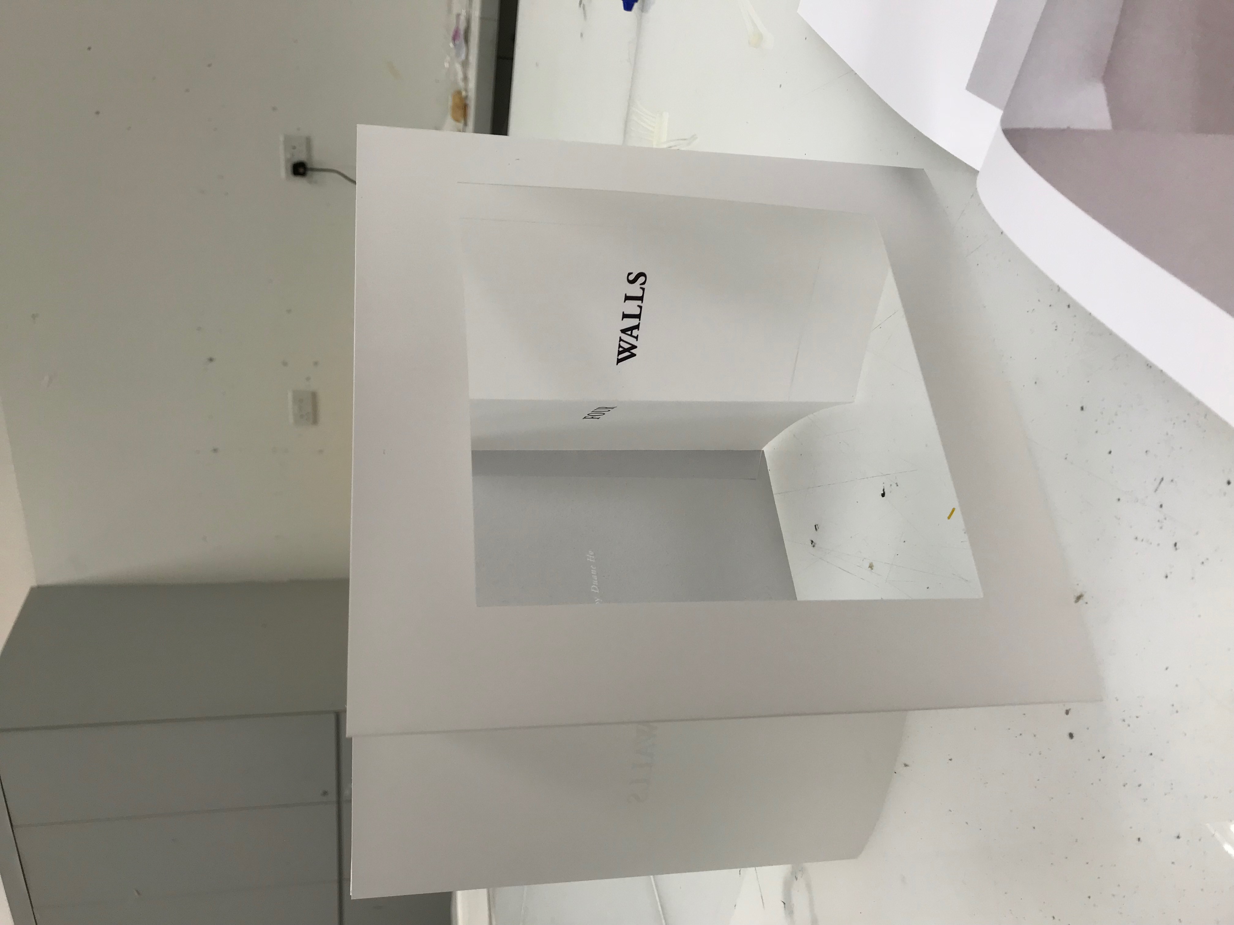
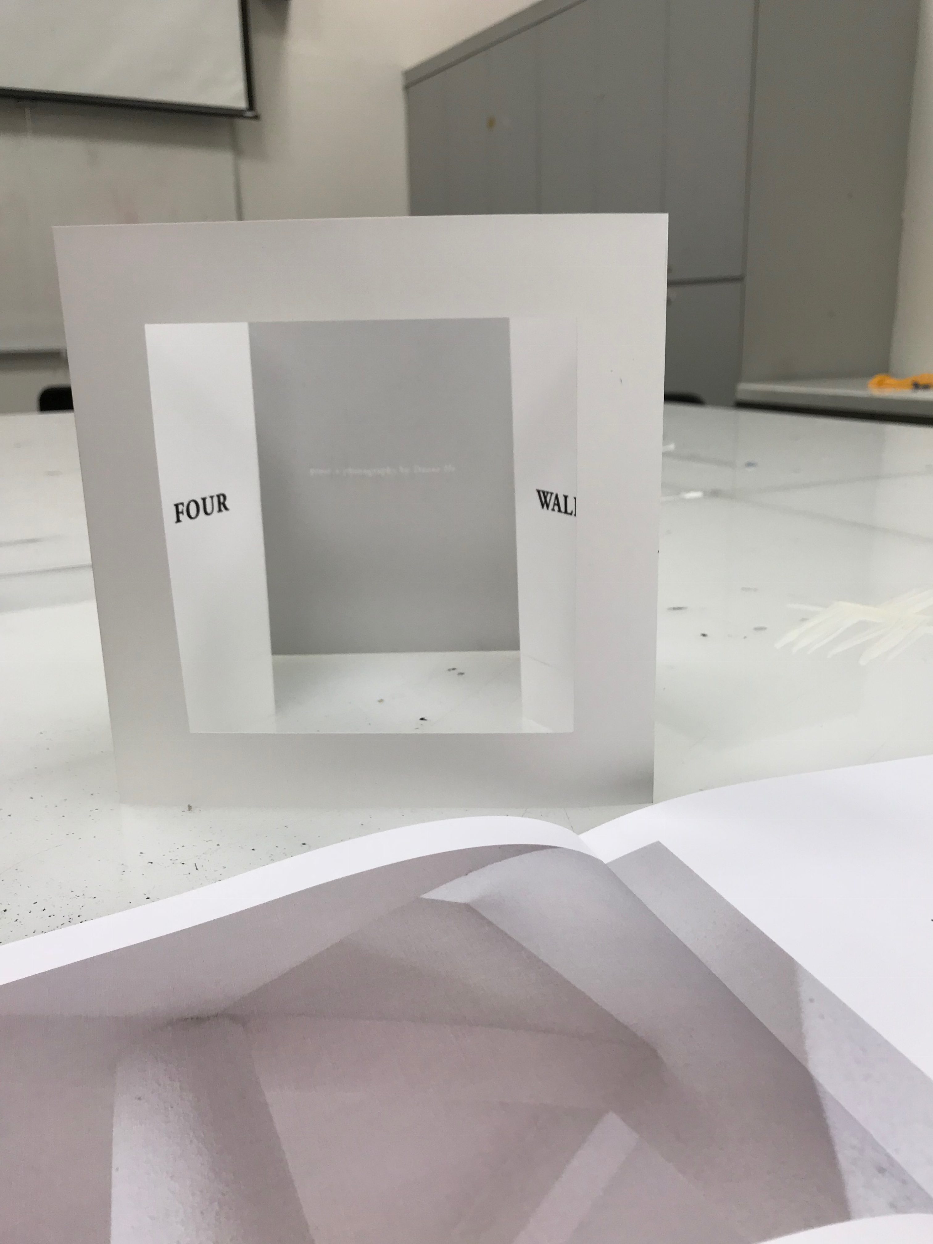
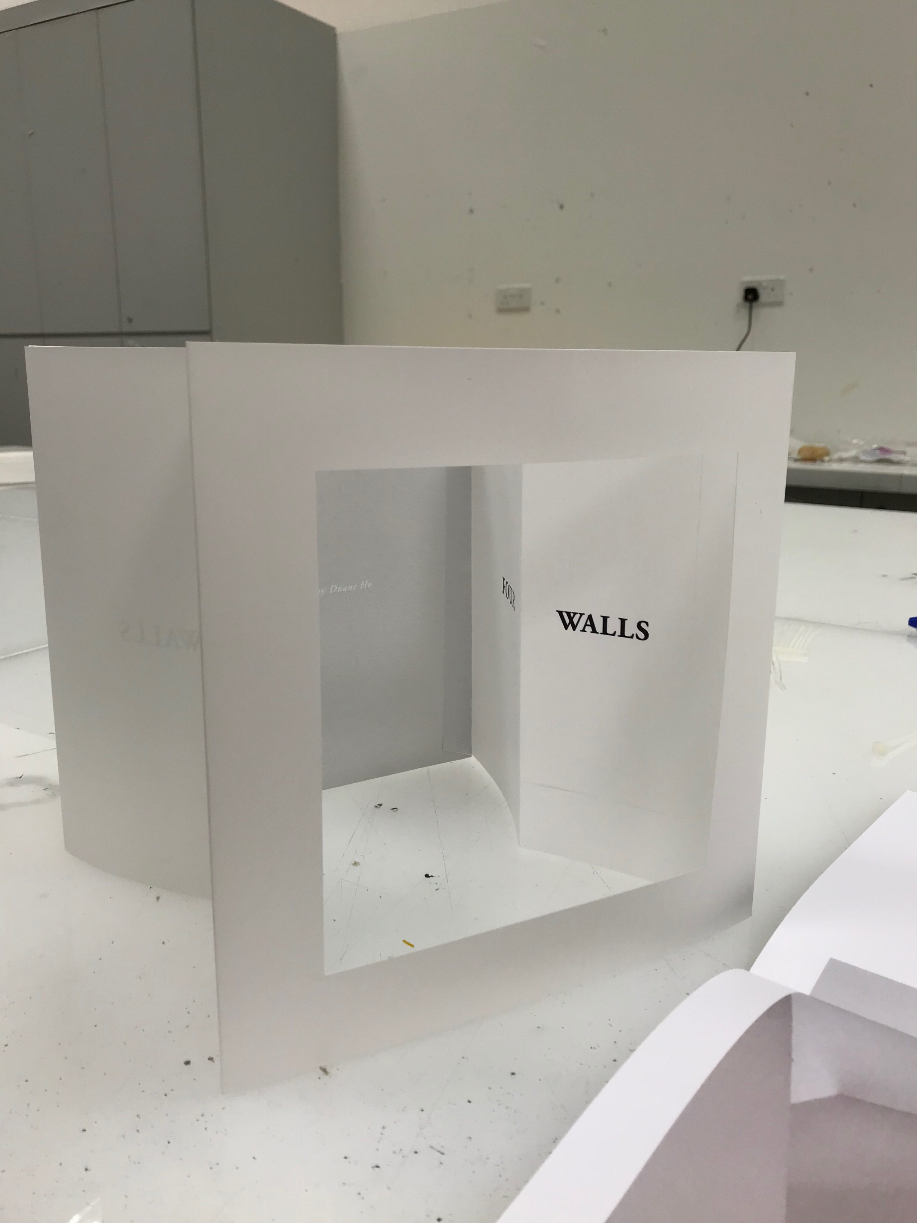
After the first consultation, I made some changes. For example, I edited the shape of the die cut on the front cover. I wanted the text to be more immersive and I also took the advice of my tutor to make the margins bigger to support the die cut more. I also stretched out the picture on the second spread. Other changes included changing the space between the different parts of the story to further invoke more meaning.

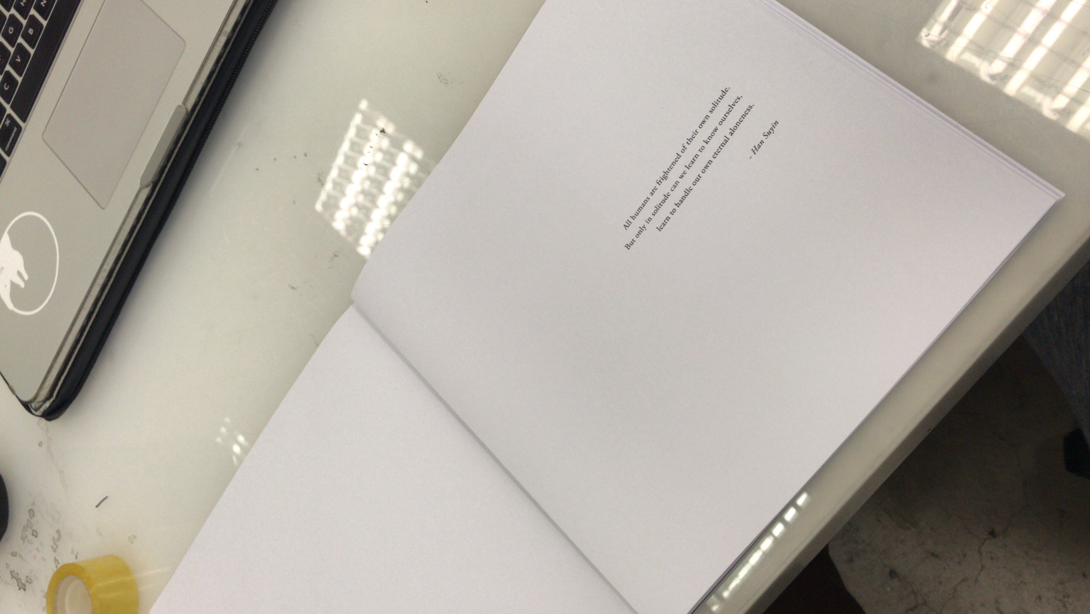
Another challenge I faced before print was figuring out that I had designed too little pages. Forgetting the rule where saddle-stitched booklets needed to have a number of pages divisible by 4, my existing book had only 22 pages. Because of this, the pagination didn’t add up and I had to add on 2 more pages.

It was a blessing in disguise however because now I had extra space before my story started to add something. As I wasn’t about to add a liner that “dedicated” this book / photo series to anyone (much less my ex), I decided to add a quote that fir perfectly as a primer and interlude before my own prose. The quote was by author Han Suyin, which you will see below in my final layout.

This is my final layout with all changes and suggestions by my tutor added in:

Four Walls (Small PDF)

Before proceeding to print it on quality paper, I did a black and white test print to ensure that the point size was suitable and pagination was correct.

I was super satisfied with how everything turned out and was confident to carry on with the printing.

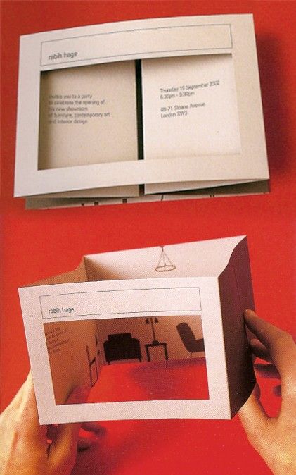
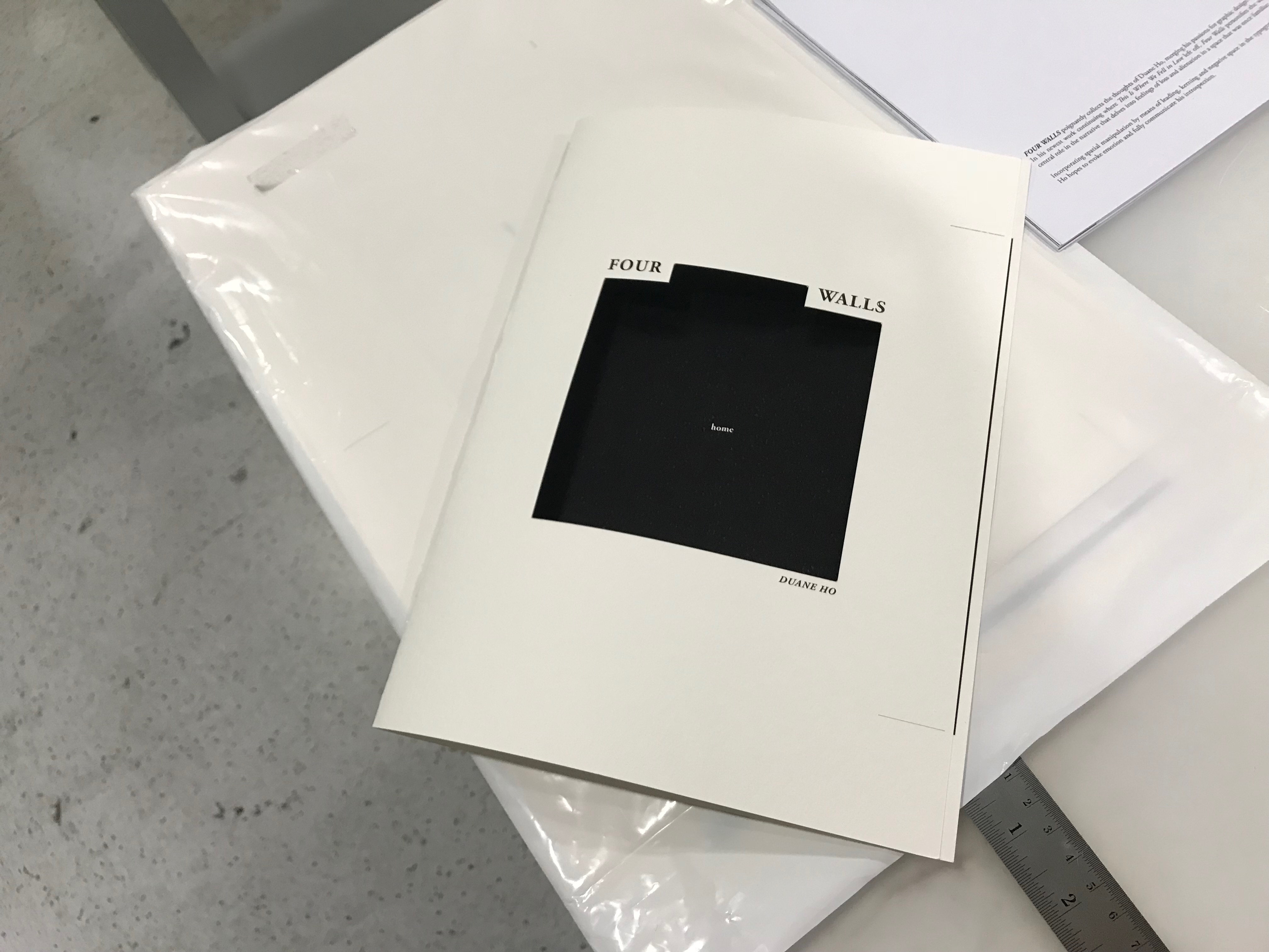
Before printing, I decided to come up with a sleeve for my book to tie everything together. I had toyed with the idea of making posters or postcards to accompany my book but after considering it, I realised that they were merely afterthoughts and did not add anything to my concept and artwork. I wanted to further amplify my four wall-ed narrative and after coming across this image on Pinterest, I was inspired and decided to make my own keyline and layout:

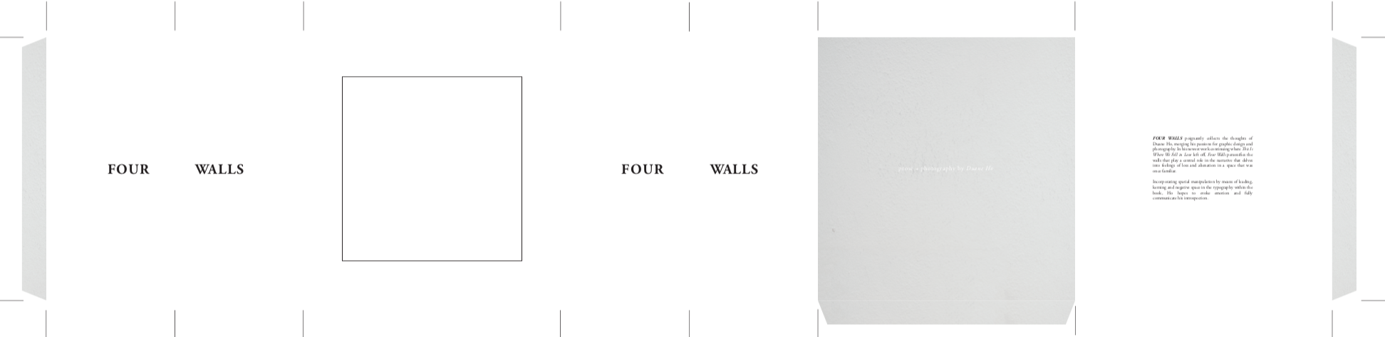
I was very pleased with the result but the challenge was finding a store that would print my very long single-sided print in A0. At last I found the suitable printers that would print all my collaterals and I also bought 3 different types of papers of varying whites to print on.

Reflections

All in all, I am very happy with the outcome of my project. I was happy that I followed my heart and did not use a typography style that I didn’t personally like. I was also thankful that I managed to merge my two passions together and create a body of work that I am very proud of. Truly, typography is a powerful tool to convey emotions and factoring the read-pause-read effect into the design was crucial in helping the whole design make sense.

Typography I: Project 3 – Type as Image, Pattern & Emotion

For the first part of our third project for Typography I, we were tasked to create image using type. I first began by trying to make human faces:

After doing this for abit, I realised that it was indeed difficult to successfully create a human face because of the large amount of shapes and contours of a face that form it. I was not satisfied and tried creating other objects:

This was supposed to be a car that wasn’t completed. I was unispired and did not find this rendering successful as well. Finally I decided to work on cartoons. Made with compound lines and shapes, they would make the perfect candidate for a typography image:

And after a few hours, these were my final results that I was very pleased with:

These were made using broken up parts of the font Helvetica Neue. I used a variety of weights to accentuate certain features of the image. Examples would be Spongebob’s pockets and Homer Simpson’s eyes.

The next part of the project required us to make a pattern using type. At first I began with serif fonts and did not completely understand how I should go about approaching this assignment. I was simply placing letters and not allowing them to truly create a pattern:

After doing more research, I gained the courage to break the grid and create more dynamic patterns. One thing I also discovered was that I much preferred sans serif fonts with fixed heights and widths because I’m someone who still appreciates a sense of order and neatness. These next patters were made without over-thinking form:

The main feedback I got after consulting with Shirley was that I was too fixated on repetition and I should pay attention to possible creating depth and rhythm by making use of density. I reworked some of my patterns and these were the final 2 I came up with:

The first one made use of the letter ‘K’ from the font family Modum Regular. This pattern made use of repetition but still was interesting because in it were rounded edges, straight edges, line work and overall still had some rhythm to it. I was inspired by the retro wallpapers and window grills / gates.

My next pattern was made using ‘X’ of the same font. By playing with density and scale, I was able to create more depth and texture and this reminded me of snakeskin leather. My classmates saw more of a matrix digital effect which was apparent too.

On a whole, I was happy with my patterns and was happy I managed to break my own ruled and think outside the box (no pun intended).

The final part of the assignment was creating emotion using type. Using the word ‘HELLO’, we had to conjure up 4 emotions. I first approached this part of the assignment trying to use one emotion and creating multiple versions of it. This resulted in a very forced exploration for the emotion ‘SEDUCTIVE”:

After these attempts, I realized that maybe the best way was to reverse engineer. This first method made me feel very restricted and I was not working creatively. I thus went ahead with creating layouts first and tagging the emotion onto them later. These were my explorations:

This was indeed better for me to create without overthinking and stunting the creative process. I decided to stick to Helvetica Neue for all of my emotion pieces because it was such a diverse font with many weights.

Finally after consultation, I came up with my four emotions that I went with:

CONFUSED

I see confusion as seeing double and not knowing where to look. I liked that with this effect, your eyes really do get confused until you realise you’re supposed to read a ‘hello’ that’s upside down.

EXCITED

I view excitement as an uncontrollable amount of emotions which explains the floating letters followed by a huge burst of excitement. Varying the weights of the ‘O’s’, I created a bubble/water droplet effect.

BORED

I see boredom as being so dismal to the point of falling asleep. To show this I made one ‘L’ lie down and the other lean on it in slumber. I also incorporated my other idea from above of making snoring icons using another ‘hello’ form.

ANGRY

This final piece was a fun one. I was playing around on Illustrator when suddenly this imagery become so clear – a middle finger. I tagged ‘angry’ into this piece because it was such a physical representation of the word.

Reflections

As usual, this project was difficult for me at first because I was unsure at many points where exactly to begin. The key to this project was ti simply let go and let everything come naturally paying less attention to order. All in all, it was an interesting assignment that once again demonstrated the endless possibilities of type that go beyond just conveying information in the form of text.

Foundation 2D (II) Project 2: Zine – First Draft & Consultation

After putting together the first draft of my zine, one major obstacle I faced was the lack of pages for this assignment. I did not want my narrative to seem rushed and I still wanted to retain the minimalist quality to my work so this will be an ongoing challenge.

These were some of my design inspirations going into my first draft:

Here is my first draft with Mimi’s general comments below:

I decided to go with hand-written typography to give my text a more authentic and personal feel. I also tried to give the whole zine a more open look limiting my spreads to having not more than two photographs. Here are the main points I gathered from today’s consultation:

  1. Mimi felt that I should explore on using fonts instead of handwriting because she loved the font used on the back page.
  2. The photos are not being given enough airtime because of their size so perhaps I could explore letting some of them bleed to the edges.
  3. The cover image could be stronger and we discussed doing a swop of images that will be applied to my next draft.
  4. Mimi was not here for the centre spread on pages 3 to 4 so I will rework that.

Stay tuned to the next update! 🙂

Foundation 4D (II) Project 2: Sound & Image – I DO

Our second 4D assignment proved to be one of the most tiring projects yet! Over two weekends, my team and I worked tirelessly to come up with a concept and script, shot/equipment list, cast actors and even do a re-shoot as we were unable to capture everything we needed during the first filming date.

Here’s a look behind the scenes (filled with some shots/locations that were not used in the final cut):


In case you were wondering why there was a need for a character in drag (although who wouldn’t want a character in drag?), we felt it provided some subtext. The character was distraught and left to wonder what his ex (Isaac) saw in Isabel that he could not provide or embody. He therefore ‘get pretty’ and dolls himself up for the big day and is in search for some sort of resolution.

In the end, he decides to let go and walks away.

After production came post where my teammate Vanessa and I went through the tedious task of recording foley for our film. Here are some snippets from the night:

Dripping water onto a plate to create the sound of water dripping from Isaac’s face (0:15-0:16)

Overlaying the sound of the makeup brush being taken out of a jar (0:41-0:43)

Wetting the rim of a plastic container to make the sound of the tap squeaking shut (0:14-0:15)

To see a full list of the foley sounds we recorded click here

For the full production script click here

And finally, I present to you the final film:

Foundation 2D (II) Project 2: Zine – Research/Recce

ANG MO KIO

“The name Ang Mo Kio in Hokkien literally translates to “red-haired man’s bridge”, where ang mo is a colloquial term for a Caucasian person. The maps showed John Turnbull Thomson’s bridge over the Kallang River, near what is now the junction of Upper Thomson Road and Ang Mo Kio Avenue 1. With the clearing of the land, several villages sprung up, which eventually became known as Ang Mo Kio.”

– an excerpt from Singapore Infopedia http://eresources.nlb.gov.sg/infopedia/articles/SIP_230_2005-01-25.html

After doing much research on Ang Mo Kio, I decided on my angle:

Pursuit of a New Ang Mo Kio

This title ignited thoughts of finding the modern-day bridge that tied the people of AMK together and also possibly discovering a bridge that has stood the test of time and can link us to the past.

Bridges bear so many meanings in today’s context. In this zine, we will explore the various bridges that have connected and continue to connect the people of Ang Mo Kio, both to one another and with the rest of Singapore.

Bridge Symbolism: Connector, transition, bridging a gap / gaining new information


I had shortlisted four places to go to, namely:

  1. AMK’s famous dragon playground – one of the two left in Singapore
  2. The AMK junction where the original ‘Ang Mo Kio’ once stood
  3. An old underpass that connected Ang Mo Kio to Hougang/Serangoon Gardens
  4. AMK Town Centre

However, because of my busy schedule and having the bad luck of recent rainy days, I only managed to go to the dragon playground but that got me super inspired.

In terms of zine content, I decided I wanna go with a photo-oriented zine that interplayed between imagery and poetry (that I intend to write). I feel the bridging theme coupled with images of the past and the many mysteries they conceal or reveal is an interesting concept that i would like to work and develop on. Stay tuned for the next update 😉

Foundation 2D (II) Project 1: Que Sera, Sera – Process

It’s me checking in again to what I think has been –

*cue dramatic music* THE TOUGHEST FOUNDATION 2D ASSIGNMENT THUS FAR

So last week in class, things were very interesting for me because my work was ‘put on blast’ and I felt really vulnerable letting the whole class judge my work-in-progress pieces. Nonetheless, I appreciated the input and thoughts on my work and the assignment brief seemed to become more clear after the critiques from my classmates.

As I’ll also stress when I present my final work to the class on Friday, my central focus and direction will be to deliver TYPOGRAPHY eliminating the need for excess backgrounds and unnecessary elements and basically letting the created TYPE / FONT speak for itself. This should mean by eliminating the the background, viewers should still be able to get an idea of the job I’m trying to put across.

Let’s get down to the process:

I decided to use a flat-styled graphic execution as it has been in trend for quite some time now and it fits perfectly with my personal minimalist style that I’m drawn to. As someone who doesn’t identify as a ‘drawer’ (I was hopeless during Foundation Drawing class), I somehow found it useful to sketch out potential ideas and doodle as a method for brainstorming. I have attached some pages from my sketchbook throughout this post just to show a bit of my thought process.

Barista

This was what I had come up with in class so far:

The main comments that I acknowledged were that the light coloured circle at the top did not look like coffee foam. The coffee mug also lacked depth that could’ve added more clarity to the layout and concept. Mimi felt that it was a creative concept but as I also admitted, the idea of a barista did not come through. Was it a coffeeshop owner? Was this a bowl? I proceeded to create more variations and tried to add elements to make the coffee cup and job clear.

I tried to add on to the coffee with elements like refections and bubble but it looked rather messy and disrupted the clean and minimal aesthetic of my personal style.

I started thinking about what could bring the idea of a barista across and in the end I researched on common items baristas use. A thermometer still seemed unclear and a milk jar did not look good from the top-down view. I decided to go with a Portafilter. A quintessential tool that is required to brew fresh coffee, I felt this was a recognisable element that could fit into the layout.

Here was another layout for ‘HO’ where I wanted to be a sniper:

Stay tuned to my next post for the final layout.

Dentist

My inspiration for ‘DUANE’ being a dentist came after my first failed attempt. At first, the job I wanted to portray was an astronaut but the way I executed it looked very ‘childish’ and unprofessional and simply did not fit into the whole look of my pieces.

It was the same night that I completed the above piece that I suddenly had the inspiration for my dentist piece. I did it in 90 minutes and both Mimi and I were pleased with the outcome. It was a complete relief and I only made the cavities in the teeth darker and changed the colour of the background.

Check it my final layout in the next post.

Conservationist

Reaching the job of conversationist took a little time. Because ‘RUSSELL’ contained so many characters, I wanted to do something even more minimal and possibly play with the orientation of letters to create a story and illustrate a job. This was my feeble attempt that got heat from my classmates during our in-class critiques.

The ‘L’s were meant to symbolise a babysitter carrying a baby and the feedback was also that the font did not carry a maternal/motherly vibe. As such, I decided to tank the idea and start over.

My next idea was to create a river using the two ‘S’s.

The job I initially wanted to tag to this was a geologist but I realised the implied letters were not clear and beyond that, I was relying on a separate element to convey the message.

Russel as a writer –

Finally I got to thinking of my last idea, I tried turning the letters into trees and this was how I came up with my final rendering.

More will be explained in the next post.

Jewellery Designer

This was another challenging name for me. The shortage of laters made it simpler but also harder because I needed to come up with something smart. As you know, I first started with the sushi idea in mind but the presence of chopsticks made in unclear if I was a sushi chef or just a (Japanese) food critic.

My next idea was to turn me into a pizza chef. I tried to make use of negative space to create a font series. In the end I felt the ‘A’ lacked clarity and so did the implied ‘N’. This was what it looked like

For my final outcome, I decided to form my own type face and make the letters round. I toyed with the idea of wheels and spectacles but in the end came up with a less common subject matter.

Please see it in my next post!

Till next time!