Foundation 2D (II) Project 2: Zine – Final Outcome

I made a trip down to the very ulu RJ Paper on Monday and was highly impressed by the wide variety of papers that were available. Alas, I picked three to do my print on, Munken Polar, Monet and Maple White.

These were the outcomes:

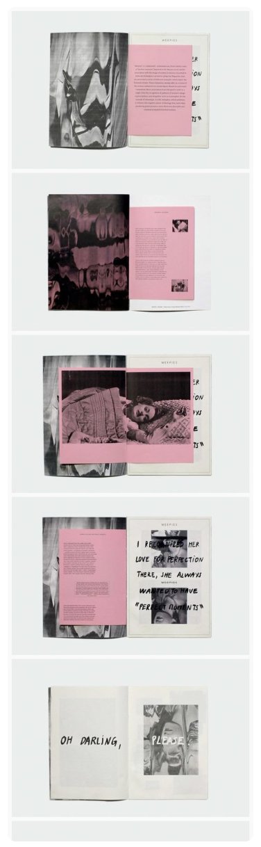
The Maple White and Monet were similar in off-white colour and in the end I will submit the Monet copy cause the lower grammage of 115gsm felt more organic.

The Sunken Polar was simply too white but I bought it just for variation.

This is the final layout I went with: 2D Zine (FINAL Demo)

Reflection:

The was a fun project and I couldn’t be happier with the brief and how this was the closing assignment for 2D Year 1. I enjoyed doing photography and stand by my design choice of the zine. By wanting to put a focus on the narrative and photography, I felt that any more design elements would simply by adding more ‘noise’ to the message and weaken it.


Foundation 2D (II) Project 2: Zine – Second Draft & Development

This post has been long overdue.

So after my first consultation I had some changes to make, the most important one being a change in font from hand-written to something more clean. These were my variations for my cover design as Mimi said she wanted to see more bleed and less borders to fully appreciate the photography.

Indeed Mimi was right and a fully bled picture made more sense and I liked the way the title of the zine was subtle and did not overpower the front cover. I also like how the photograph kinda drew the eye into the zine and thus I felt it made a powerful cover photo.

This was my spread at a glance:

But it still felt like I was cramping too many photos into the zine and it felt that each photo was not getting enough time to shine. After the next consult Mimi suggested that I cut down the images and, you guessed it, enlarge and let the photos bleed to give it a more open feel. I decided to also let the photos go past the centre margin so the layout didn’t feel so rigid.

I also shifted one of the photos from the centre spread to the back page and I think it worked perfectly.

The photographs in my zine maintain a washed out look with a pink hue and this is done on purpose to match the pink tiles on the dragon playground.

The next step would be to go to print so stay tuned for the final print out and submission!

Foundation 2D (II) Project 2: Zine – First Draft & Consultation

After putting together the first draft of my zine, one major obstacle I faced was the lack of pages for this assignment. I did not want my narrative to seem rushed and I still wanted to retain the minimalist quality to my work so this will be an ongoing challenge.

These were some of my design inspirations going into my first draft:

Here is my first draft with Mimi’s general comments below:

I decided to go with hand-written typography to give my text a more authentic and personal feel. I also tried to give the whole zine a more open look limiting my spreads to having not more than two photographs. Here are the main points I gathered from today’s consultation:

  1. Mimi felt that I should explore on using fonts instead of handwriting because she loved the font used on the back page.
  2. The photos are not being given enough airtime because of their size so perhaps I could explore letting some of them bleed to the edges.
  3. The cover image could be stronger and we discussed doing a swop of images that will be applied to my next draft.
  4. Mimi was not here for the centre spread on pages 3 to 4 so I will rework that.

Stay tuned to the next update! 🙂

Foundation 2D (II) Project 2: Zine – Ang Mo Kio Revisited & Concept Development

Today’s Sunday, 19th March 2017, and I finally made my second trip to AMK. The purpose of my trip was to find more interesting photos and angles I could take of the dragon playground and boy was I inspired.

For starters, I found a piece of cake someone had irresponsibly disposed beneath the playground:

This gave me inspiration for more narratives and dialogues about letting something/someone eat away at something that mattered. The destroying of something once perceived as beautiful or perfect.

I took out my macro lens and got to work. I haven’t decided yet however if these new photos will fit into my zine’s concept.

Which brings me to my next point:

CONCEPT

Based on my previous post, I decided to do a narrative on a relationship going sour which will be accompanied by images from the playground which will act as a motif or juxtaposed and symbolic scene where it all takes place.

After coming home with my new photos, I tried to begin writing my narrative but somehow it all sounded very forced. I did however come up with a title:

This is Where We Fell in Love

Here is a concept I came up with for my previous 3D assignment which was shelved completely due to a lack of resources. The text in this document came from authentic message exchanges and I decided to use these to form my narrative. This was way more personal and bore more meaning to me.

[CANCELLED] Installation Concept: The Beauty of a Broken Heart

I will continue to work on my layout and weave the copy into the images I have of the dragon playground. I have begun the process tonight and it truly is a very slow and reflective process that I find is mildly therapeutic.

Till the next update!

Foundation 2D (II) Project 1: Que Sera, Sera – Final Layouts

And so we have made it to the end of the first project of Foundation 2D (II). Here are my final designs:

Reflection

The amount of time I spent on revisions and changes was crazy but overall, I can safely say I’m proud of my work and proud of how much I was able to develop, adapt and improve on my designs. THIS is why I came to ADM. To push myself, stress myself out and ultimately enhance my thought processes to produce work that I am proud of. I feel that I managed to tackle issues like legibility and clarity and am satisfied with what I came up with. Looking back at my first few designs, all I can say is I can’t wait to see how much more I will grow over the next 3 years and can’t wait to expand my portfolio while I’m at it.