EGO

Standard


__________ + __________ = ME

__________ – __________ = A BETTER ME

__________ x __________ = AN IDEAL ME

__________ +/- __________ = ME IN 5 YEARS


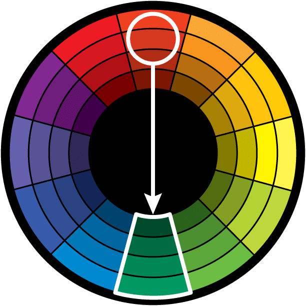
My main focus on this project was mainly the application of the colour harmonies; while still focusing on producing interesting ideas that best represents me. This project is unusually challenging for me as I have a fear of using colour in my works as I have had no prior experience with coordinating colours in my work.

Project 3 Submission Template


Urban Animal + Love for Nature = ME(@home)

I jumped at this opportunity to showcase my love for both the urban environment as well as nature. And growing up in Singapore; a small urban playground, there is this constant crave to get out. My love for nature grew from the opportunities and experiences I have from exploring the nature parks/reserves as a kid. And although small, I wanted to show how at home I feel being just 20 minutes away from both sides of the fence.

Urbananimal

Urban animal. Through the use of  strong monotone contrast of the sky to the buildings, I wanted to bring across the mood of how the city can actually be quite a dull environment to br in. Accompanied by the lighting from the back on the bear; which is a representation of myself, I wanted to create two layers in the composition. The use of colours of on the bear also brings the attention of the viewer from the background first and then to the bear itself.

+

lovefornature

Nature lover. Using a similar picture of the bear , I also wanted to create two layers between the composition. However, the back ground is different. I wanted to bring out the colours of nature (surprisingly complimentary), shades of browns (including the bear) which are in complimentary to the greens that I have picked .  The use of stripes to show layers as well as “negative” stripes to bring out and showcase the sky.

=

unityMe(@Home). Through using a photo collage style, I wanted to create a balance of both nature and urbanscape in the composition. Through a manipulation of the Singapore CBD skyline that I have manipulated, I wanted to create a nest like representation to show that feel comfortable and at home, here in Singapore.


Play – Procrastination = More Play ( Better me ) 

For this series of 3 frames, I retook the persona of the bear, using a style of vector illustration to explore the use of the colour scheme properly. moreplay1

Play. Through the use of a picture of a bear playing basketball, I tried to create a sense of play as well as to work on colour harmonies. By using a play of cool colours in the composition .

PROCRASTINATION

Procrastination. Through the use of the passing of time by the clock faces, i wanted to showcase procrastination by using a simple task of typing “1,2,3” in laptop in which takes almost 2 1/2 hours just to accomplish this act.

 =

MORETIME

More fun. Less procrastination means that I am more focused in my work , less fearful and taking up less time as well, it leaves me with more time for play. The final frame in this series hopes to bring across two meanings  by showcasing the bear playing with time, it means more time for play as well as to play with time . Through the us of complimentary colours to the colour of the bear, it is to my regret that have chosen this colour combination . This is a cooler and darker blue and does not carry across the emotions of fun that I have planned to show.


Teleportation X Immortality = Space Traveler  (Ideal Me)

I approached this equation with a take of iconism is this series of 3 frames. While also sticking to a similar vector style to keep simple shapes and intentional colour harmonies.

timetravel

Teleportation. Taking reference from Apple’s shopfront displays I wanted to recreate how high profile commercialised products are bring displayed in shop fronts.

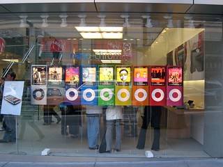
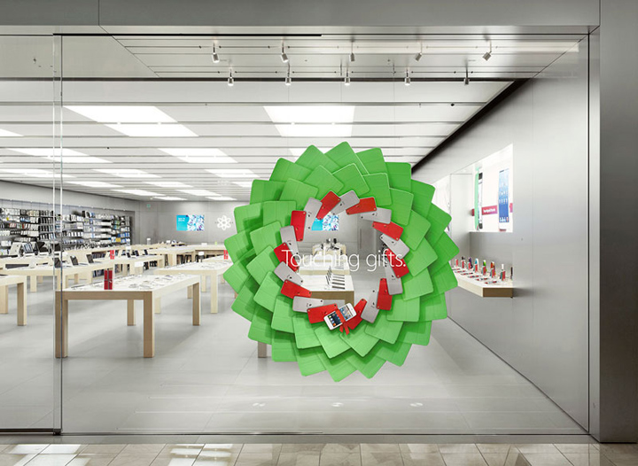
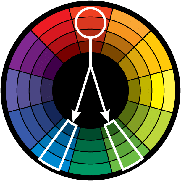
While imagining that in the future, teleportation would be in the form of a button. Teal , Light green and red tones are used to create a triadic relationship in this frame.

x

IMMORTALITY

Immortality. I wanted to create a fun take on immortality by showcasing the grim reaper being out of work, due to no deaths happening as we have discovered the secret to being immortal.  This is thus bring recreated by using popular stock image of people looking for jobs in their uniforms.

By using the contrasting gold on purple background, i tried to create strong contrasts in the composition as well as to create the feel of the grim reaper sitting on heaven’s steps.

=

space travel1

Space Traveler. With both teleportation and immortality, one can then hope to travel in between worlds, visiting them and to be a space travelers. Our next holiday destination would not be on earth.

space travel

My initial frame was to depict space travel through the use of the iconic astronaut suit. But it did not fit the whole theme and so i decided to change the style and entire composition of the frame.

space traveller with box The final frame includes a clickable box that once pressed, the viewer will be able to ” travel anywhere he pleases”. This whole series also showcases the need and want to space travel. The whole frame was to create an experiential take on space travel. By closing your eyes and imaging the planets you want to visit, press the button and it’ll take you there.


Hard Work + More Travel = Make My Mark on the World ( Me in 5 years)  

I wanted to approach this 3 frames in a fun manner , by using brighter colours in my composition as compared to the rest of the frames.

HARDWORK

Hard Work. By using my favourite soft toy to represent the products of my hard work. I used  a factory production line to replicate the idea of hard work. In which is not about your ideas but of repetitiveness of work in which may seem robotic even. By using a shade of bright pink, i then proceeded to create my frame in which the background stands out from the conveyor belt itself.

+

more travel

More Travel. To simply put , it is a reflection of my lust to travel. By using bring contrast between the yellow and the pink , I composed this frame to show my need for travel through the plane as well as the world map in which is purposely made unrealistic in scale and shape to show the entirety of how wide i would want to travel the world.

=

MARKTHEWORLD

Make My Mark on the World. My plan in 5 years is to see my own products or works being enjoyed around the world. And with my need for constantly wanting to travel alongside with being proud of my work and sharing it with the world, this is where I see myself in 5 years. This idea is thus replicated through the use of the airdrop of the fruits of my hard work , which is the soft toy. Through the use of a contrasting bright orange background the the chutes,  I tried to complete this series of 3 frames which showcases my experimentation with brighter colours.

20151109012404

I thoroughly enjoyed the whole process of this project that was presented to us and look forward to taking 2D next semester.

COLOUR HARMONIES

Standard
MONOCHROMATIC HARMONY

The use of different variations in lightness and chroma of a single colour. This result looks clean and elegant. Monochromatic colours go well together, producing a soothing effect.


Direct Harmony

color-wheel-direct

The use of two opposite key or complementary colour on the wheel.  It is why colours are arranged on the wheel exists as opposed to a chart or scale.The high contrast creates a vibrancy , especially when used at full saturation.Thu direct harmony works well when your  intention is for something to stand out.

color-wheel-split

Split Complementary

As opposed to the opposite the key colour on the wheel, the split complementary takes the two colours directly on either side of the complementary colour.

This colour scheme has also high visual contrast as the complementary colour scheme, but has less tension.  The split complimentary colour scheme is a safe and easy choice for any composition.


color-wheel-triadic
Triadic Harmony

 Also called the Triads. This refers to the three colours chosen equally distanced from each other on the colour wheel.

As such, you’re stretching the basic idea of colour harmony and thus this harmony is best used with equal weight in the composition.


color-wheel-analogous
Analogous Harmony
 Picking colours directly on the sides of the key colour. They usually complement well and create a comfortable compatibility. While this colours can be pleasing to the eye, it can also come across as flat.  If you are going for a design that’s primarily simple, this is a good choice.

Colours

Picking my favourite colours, I broke them up into half, splitting them into white and black backgrounds.

blacksample  BLACK
goldsample GOLD
MAGENTA sampleMAGENTA
maroon sampleMAROON
navybluesampleNAVY BLUE
olive sampleOLIVE GREEN
pumpkinorange samplePUMPKIN ORANGE
violet sampleVIOLET
Through covering one half of the colours, one can observe that colours when placed next to different colours will evoke a different sense of feelings.
These feelings evoked although may be similar to everyone based on experiences, may still be different based on individual memories. What’s yours?:)

4D Project 1B

Standard

F&I

Some say the world will end in fire,
Some say in ice.
From what I’ve tasted of desire
I hold with those who favor fire.
but if it had to perish twice,
I think I know enough of hate
to say that for destruction ice
is also great
and would suffice.
 
– Robert Frost
concertadbiausbd couple-sitting-away-from-each-other IMG_07111111
This series of photographs were conceived on a very personal interpretation of the poem itself, and the feelings I would have expressed if it had been written by me.
The message I am trying to convey is the desired to be loved and accepted by the rest of the world , and the use of the paradox feeling alone in the crowds and feeling loved even thou you are alone is this world.
The concert photograph signifies loneliness and lack of companionship. Concerts are usually attended by like-minded people and are often outlets for social gatherings.  However the photo brings out the gloominess of being alone through the use of color and that all of the crowd seems to be standing alone. Taken with phone camera, no edits.
The middle photos shows the controversy of being loved and vice versa being a very big part of your personal actions. And that in all personal and intimate situations, one can feel loved and yet also may choose not to.  (Source: http://witsmag.com/wp-content/uploads/2015/04/couple-sitting-away-from-each-other.jpg)
The final photo for the series is to show inclusiveness of the immediate environment you are in , one can feel accepted and almost at home in a familiar place even thou they are alone. This photo although in greyscale would have a very downcast tone , but however through the use of color signifies warmth. Taken with phone, edited with color overlay of the red tint from the streets.
Overall the photos are very personal and that it should be accompanied by text to show certain aspects of the what I was trying to convey .

. FOR A WALK

Standard


To take a . for a walk


BOARD4 BOARD3 BOARD2 BOARD1

ANXIOUS

ˈaŋ(k)ʃəs/

qqqq

To feel worry , jittery , uncertain about the present situation

  • To show the jitters through the use of space as well as the lack of by using space.

Final line was created with paper cutouts with earthquake-like similarities. But however, the cracks are shown not to match the opposite side, but rather showcase a different characters.

.


EMBARRASSED

ɪmˈbarəst,ɛm-/

pppp

To feel uncomfortable , to hide from situations.

  • To create the action of an object  hiding and yet still have a have presence in the line

assdasdASadsEarly sketches used black on black over dark circles , however was modified to use reverse the color scheme as it gave the circles more presence on the black background.

Final line was done with white paint as well as different layers of tapes as the mask over the “eyes”, showing its obvious presence through the slightly translucent tapes.


Exhausted

ɪɡˈzɔːstɪd/

mmmm


Spent, consumed, Drained.

  • Line required to show contrast between having a wealth of energy to eventually using it up.
  • Wanted to show that energy can also be influenced by your surroundings.

IMG_20150912_172931

Initial sketches were raw solid blocks to represent energy included lines to make them seem like mountain ridges.

Final line was created using paper, included some spikes that laid behind the main show how the influence of others can affect your energy levels.


Fragile

ˈfradʒʌɪl/

kkkk

Delicate, frail, vulnerable.

  • Create a line that show both strength and fragility

FRAGILE001Initial lines were pen soft pen lines in which spiraled like DNA strands with stronger links on the outside as compared to the inside.

However although the initial concept may convey also the fragility of a species, I’ve redone the line to use an old piece of crunched up tissue with glue and water to create the final piece.

The old tissue looked thin and wrinkled, to give a greater sense of fragility , and even thou it seemed weak. The piece was hard to the touch, giving the idea of strength that comes with fragility.


Turbulent

ˈtəːbjʊl(ə)nt/

ggg

Choppy, Unstable, Raging.


  • To recreate the choppy nature by having cycles of varied intensities.
IMG_20150914_024539 IMG_20150912_172808
 Initial lines were conceptualized using the pen and paper, but however moved on to layers of paper punched out by the hole puncher to create depth as well as the choppy nature of turbulence.
It however did not convey the sense of sudden change in forces of what I feel turbulence should be and thus I changed the shape to varied triangles and layered them similarly for the final line.


BIZARRE

bɪˈzɑː/

eee

Unexpected, out of this world, sensually unpleasant, strange.

  • Approached the concept with a motive to evoke an eerie feeling .
  • Rubber bands as a suitable medium as it provided the necessary elasticity and textures when knotted and jointed together.

IMG_20150912_172443


Limitations was that the final piece had to only be in black and white. Therefore I experimented with different inks and paints ( Markers , Chinese ink, Acrylic paint , enamel paint) and their prints .

Decided on using enamel paint due to the glossy and hard finish that it produced.

IMG_20150912_170654

Final line was produced on pieces of paper dripped with paint, hand torn with the rubber band glued on to it.

To evoke an alien-like contrast to the black paper, forcing the viewer to look closer to the details of the rubber band.


lyrical

ˈlɪrɪk(ə)l/

jjjjj

Chorus of a song, poetic magic, wave sync.

  • Concept was to play on the musicality of songs and bring out the waves, curves and repetition, things that we always relate to in a song.
  • To feature your favorite section.

IMG_0720

Lines and curves were tested out different using print, to see play around with the core concept. However, like to many lines of the same origin, its like songs of an album and I further played on what “lyrical” meant to me.

IMG_20150908_052730

The final piece was made to exemplify what a main single of an album would be like. How it stands out, and my favorite section was carefully cut out from the piece.


NONSENSICAL

nɒnˈsɛnsɪk(ə)l/

ffff

Lack of reason, spurred on by mixed emotions, random, unrestricted.

  • Concept is to bring out the most random of shapes and lines.
  • Conceptualized during periods restlessness and boredom.

IMG_20150913_205455


Initial sketches were to create a sort of tendril and octopus leg mix.


Final line was created from random lines initially placed on the paper before working on the design and had the use of torn and not only curves to bring out the different emotions.


PSYCHOTIC

sʌɪˈkɒtɪk/

iiii

Internal conflict, deranged, loss of control.

  • To create a sense of deranged fit with scratch-like strokes.
IMG_20150914_025026

Initial sketches are “U” shaped scratches with smaller random lines accompanied with white lines as well to create depth.


IMG_20150912_172510IMG_20150912_172526

Experimented with paint and printing with the same concept of scratches to show the psychotic state.  However , the initial different colored pens and combination of pencil markings proved to give off the raw feel , instead of the controlled paintings that were done.


AMBIGUOUS

amˈbɪɡjʊəs/

ccc

Undecided, debatable, perplexing.

  • Motive is to evoke a sense of undecidedness to the viewer.
  • Use of black and white spaces to show ambiguity of which color has more presence in the line.

IMG_0719


Similar prints created by using monoprint . Use of the negative space between two different prints to show inability to decide and yet keep two prints.


DISTRACTED

dɪˈstraktɪd/

lll

Unfocused, Distracted, distant.

  • Concept was to force the viewer into be distracted through the use of different lines and dots.
  • Experimented with different strokes and line ends.
IMG_20150913_205541
Final line was decided through the use of the spacing of the middle sections to create a ridge like effect as well as different line distances between the two adjacent sections to create depth. Different dots sizes were placed to further distract the viewer.

SENSUAL

ˈsɛnsjʊəl,-ʃʊəl/

sssssExpression of senses, sexual, curves, tease.


  • To create varied curves, to show sensuality of different widths.
  • Flower petal like patterns to signify reproduction and attraction as it is the basis of the existence of a flower.
IMG_20150914_024526


Initial sketches stuck the confines of the paper, it did not represent the emotion properly . Lack expressiveness of the emotion. Following drafts were larger and unrestrained.

IMG_20150914_024508

Final draft was a smaller mock up of the larger sketch, drawn slightly larger then the given workspace to show elegance and the unrestrained characteristic of sensual.


SLOVEN

ˈslʌv(ə)n/

rrr

Lack of effort, untidy.

  • Idea was to conceptualized the essence of what a line is , to be broken down to its simplest form.
  • To show lack of effort to the view even thou accomplishing the simplest of tasks.

Final sketch was drawn with broken pencil guides, lack of ability to even use tools such as the ruler properly, failure to draw clean lines and pencil guides to left behind to show laziness.


SPONTANEOUS

spɒnˈteɪnɪəs/

bbbb

Unrestrained, impulse.

  • Concept was to create a piece In which was spontaneous quick and involved a certain technique in which I had understanding of but have not attempted.
  • To leave out blanks to show that being spontaneous is however still very much random

Final line was created using a mix of white and black paint and my attempt to create a marbling pattern with the paint. Paper was cut out along the curved edges to reveal the back-card.


AGGRESSIVE

əˈɡrɛsɪv/

nnnnHostile intent, uncontrolled rage, provoked, emotion fuelled

  • To create a graffiti like expression of uncontrolled sprawl of scratches.
  • Varied lines to show different intensity of aggression.

IMG_20150913_205514

Tried to use different mediums such as markers and brushes, but does not give the crisp edge that shows the edginess of aggression.

Final line has one connected line of aggression that sprawled throughout the line with accompanying smaller scratches .


AWKWARD

ˈɔːkwəd/

hhhh

Stand-out, different, unable to fit in to the majority.

  • To create a stark differences between the use of unregulated smooth shapes and one straight regulated shape.
  • Show avoidance, inability to blend in and attempted to use the one-third rule to bring more focus to the awkward shape.


IMG_20150914_074836

IMG_20150912_172846Initial lines did not show the closeness of the majority and well as lack of distance from the out casted shape.

Final model also shifted the object from bottom right corner to the top left to distract the eye.


INDECISIVE

ɪndɪˈsʌɪsɪv/

aaaa

  • Multiple plans but unable to focus on one, lack of insight to see the bigger picture, commitment issues.
  • To create a sense of plans through the use of straight lines and sudden jerks in the opposite direction from each stroke.
  • Overlapping paths, to show indecisiveness and lack of commitment. however still showing progression.

IMG_20150912_172831

Use of the monoprinting method. Experimented with different weights of the line as well as darkness of the borders/shadows.

Final line expressed softer border and lost lines to evoke a sense of a lack of general direction and focus.