Hello world
Welcome to the world of color, cries a voice in the distance as Fendi steps into the unknown world.
Can Fendi draw? No.
But does this mean Fendi struggles with art? … Well yeah.
BUT, will Fendi breeze through this assignment? … uhm … no.
BUT !!!
There is hope, WITH RESEARCH.

Behold the almighty color wheel.
In the innermost layers, we have our primary colors.
In the second layer, we have our secondary colors, which is achieved by mixing two primary colors: Orange through mixing red and yellow, purple through mixing red and blue, and green through mixing yellow and blue.
In the outermost layers, we have our our tertiary colors. Where we include the element of value to achieve a lighter green, or a darker green (though one might argue “it’s not just light green, it’s artichoke’)
Why is it so important to understand the color wheel?
The color wheel helps us understand colors in respect to it’s relationship with each other. It also helps us define the half between cool and warm colors. When we put the colors on the same image it creates different results, for example two colors across each other put together evokes a certain mood, colors next to each other, put together evokes another mood. This is known as Color Harmony and this is just one of many of an artist’s tools in creation.
What are the types of Color Harmony?

First, we have Complementary Colors. They are colors opposite each other on the color wheen, for example green-red or blue-yellow. This creates a strong contrast resulting in vibrant, high impacting images especially at full saturation.
Though it is important to practice control in using complementary colors as too much of contrasting colors might result in a eye sore as the colors will appear to ‘fight’ against each other for attention, tiring our eyes. It is also not recommended in large doses or for text.
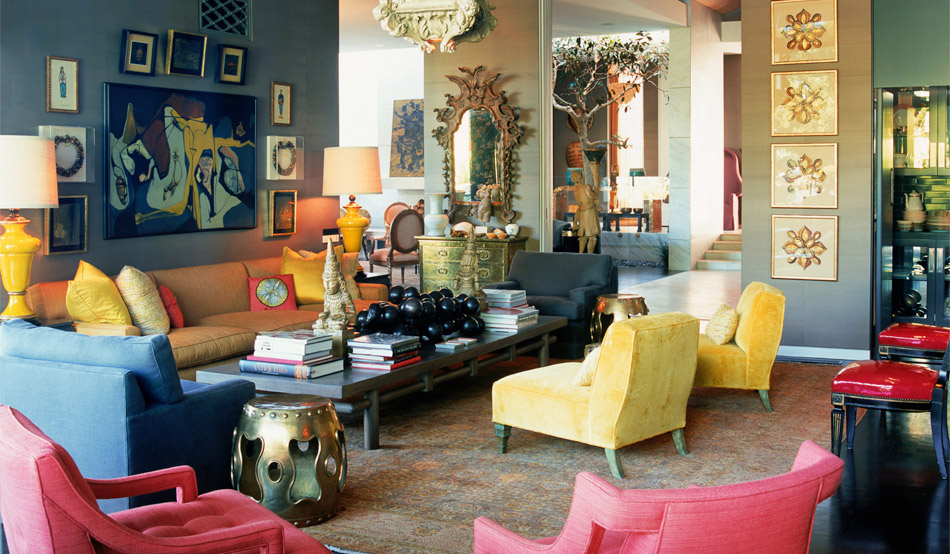
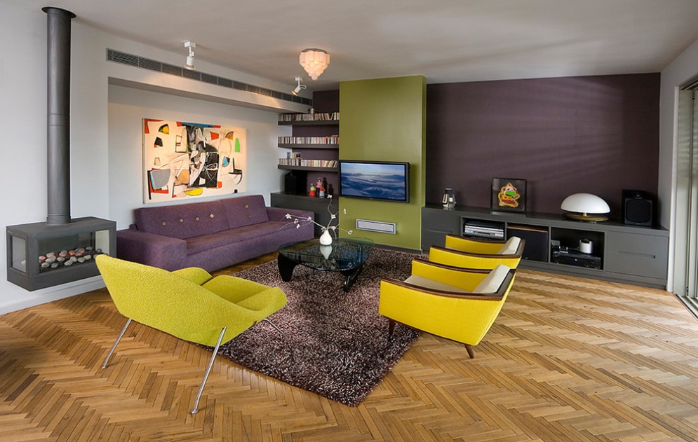
However with control, you can create contrast and bring emphasis to and make elements stand out! For example in interior decoration where we use complementary colors…

… we first start to see the blanket popping out and slowly we notice various other orange items stand out – the curtain, the lining on the pillow and even the wooden photo frame. This appears more ‘dynamic’ in nature as it utilizes different cones in the eyes.
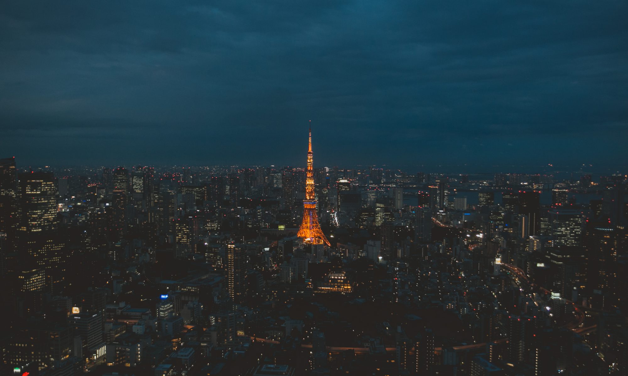
 Next, we have Analogous Colors. They use colors next to each other in the wheel. For example, Green-Light Blue-Light Green or Red-Purple-Orange. It tends to be one primary, one secondary and one tertiary. These create ‘comfortable and soothing’ designs.
It is important to note that one should consider each color purposefully – one should dominant, the other to support and the last as an accent (oooh 3D’s dominant, subdominant and subordinate echoes in the distance) This creates a rich monochromatic look and is normally used to create a warm or cool tone.

 Next we have Triadic Colors, which uses colors that are evenly spaced out through the color scheme, normally creating an equilateral triangle if connected. Some examples of Triadic color schemes includes purple-orange-green or red-blue-yellow. This results in usually 3 primary colors, 3 secondary colors or 3 tertiary colors.
When triadic colors are used, it is usually vibrant and contrasting. But like complementary colors, one must note to create a balance between the colors – one to dominant and the other as accents. It is important to see triadic colors as both contrasting and supporting – one as a dominant color and the other two as a complmentary.
 Next, we have Split-complementary Colors. It is a variation of complementary colors as it in a way combines the concept of complementary colors and Analogous colors, creating a sort of isosceles triangle.
It retains the strong visual contrast of complementary colors but appears less harsh/tense as it is not directly opposite to each other on the color wheel. Some consider is a less harsher alternative to complementary colors.

Through understanding color harmony, we start to see how colors affect, contrast, complement or support each other – it is important to consider what mood, tone and vibe we want to convey, before picking the harmony we would like to work with.
When picking the colors – it is also important to identify what color is dominant and what colors are supporting to avoid creating too much contrast and confusion.
Okay bye.