Updated!
These are my drawings and process for ‘Figure Transformation’.
–
Full res photos here
–
1)
The concept for this character is a bootleg superhero. He just a normal dude, nothing remarkable, no special skill, just wearing a costume that vaguely resembles another hero.
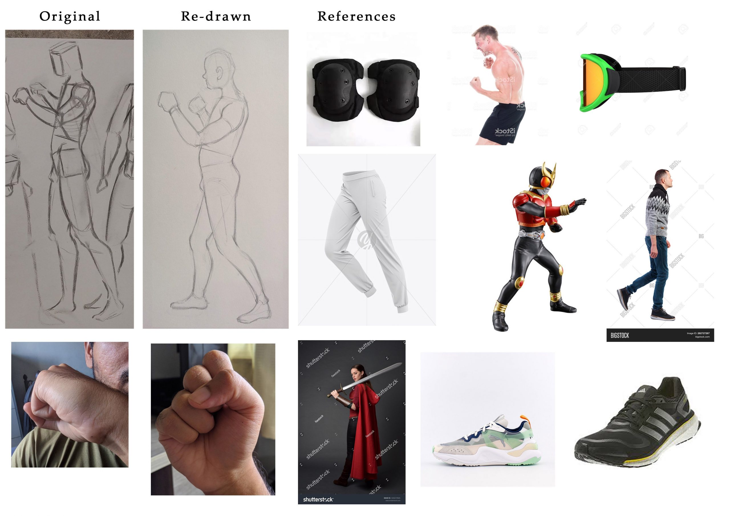
Character 01
I tweaked the original pose a little by shifting the weight a little back. I wanted this character to have a weaker fighting stance since the character I was going for had no fighting experience. Not my most favorite design considering he looks more generic than a supposed knock-off. Hence in my next design, I try to do something more wacky.
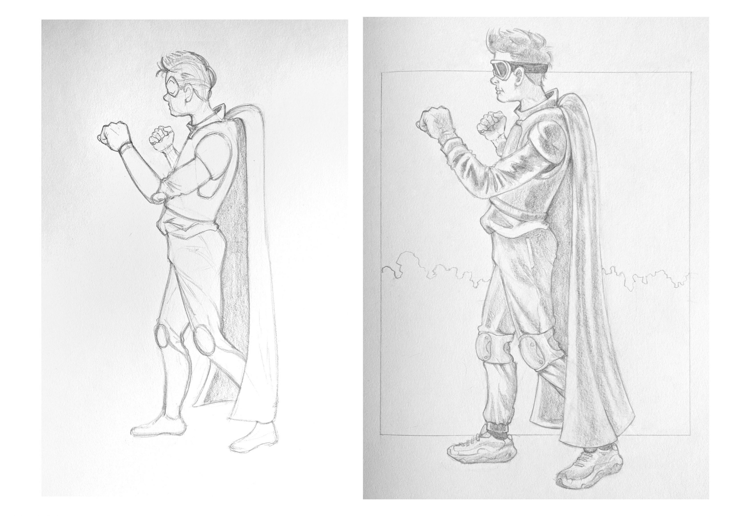
2)
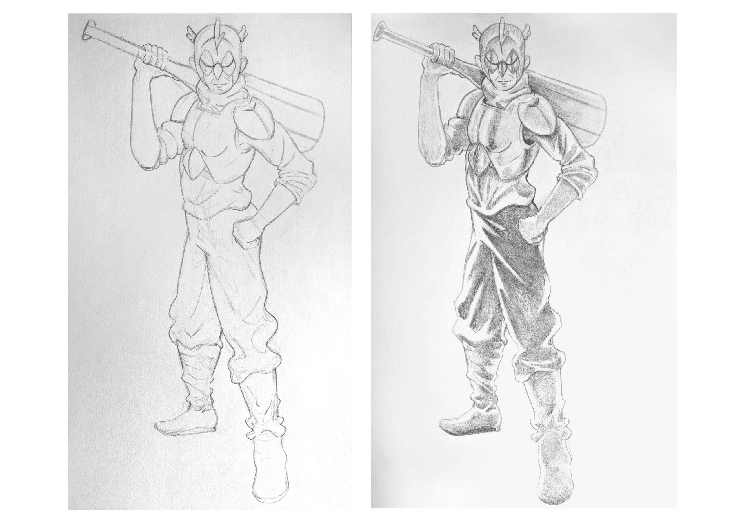
Character 02
I tweaked this pose as well. I wanted to show the front a little more since the angle is a little similar to the first pose. This character’s costume is inspired buy Cockatiels. I wanted this character’s costume to be something he threw together hence the loose clothing.
The shading of the pants could definitely use more work (especially his left leg).
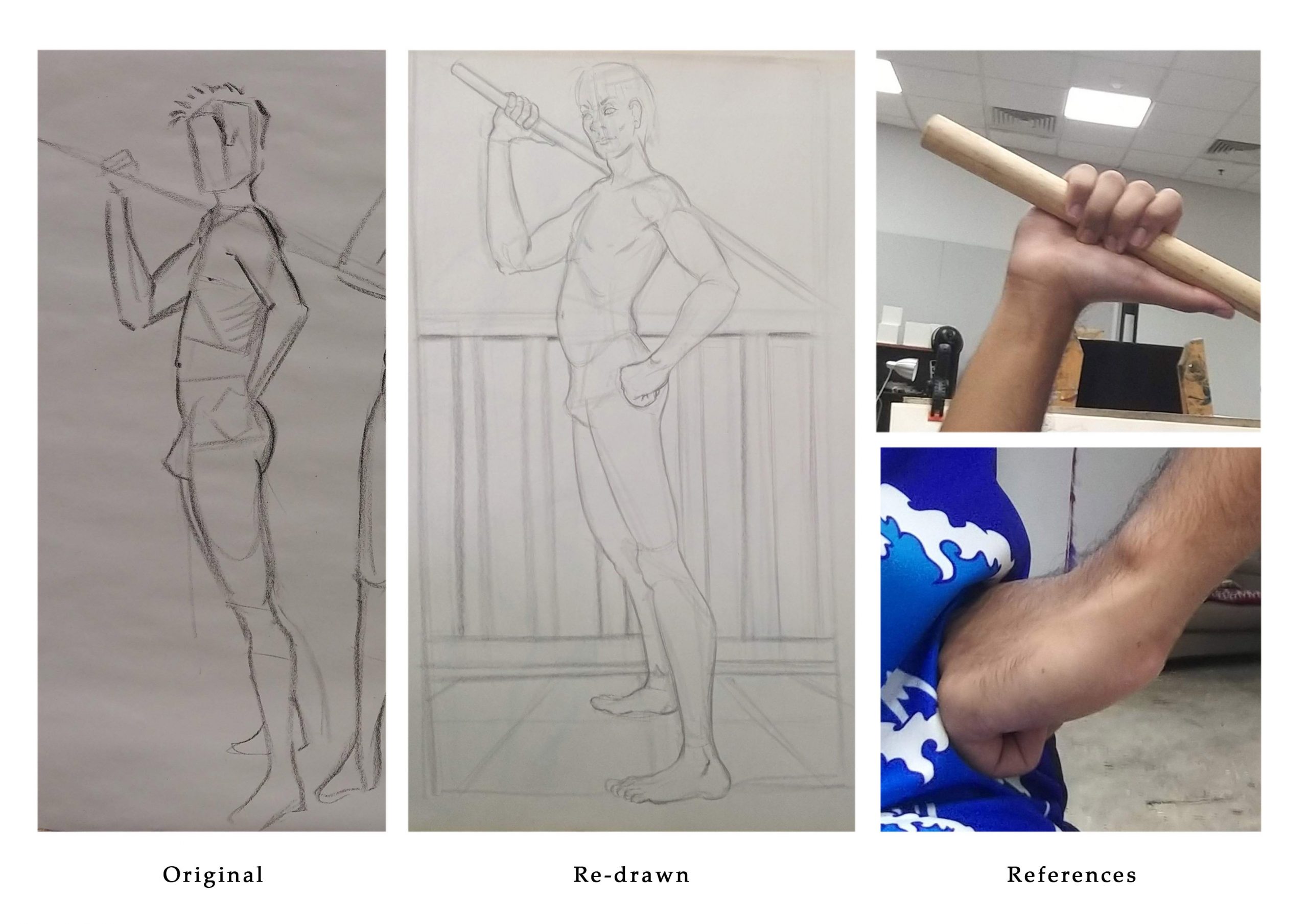
3)
Since my past 2 characters is based on normal people dressing up as hero, I decided to twist this concept a little, that being a normal person dressed up as another normal person. Which sounds strange now that I type it out because how can you tell if the person is dressed as someone else? In this context, I’m taking an office attired man, dressed in a farmer’s overall (The overalls the main theme of all 3 characters since they kind of all have it). The point of this character is to poke fun at our desire to go outdoors ever since we were advised not to.
I’ve also rendered this character because I felt that it would make it more dramatic.
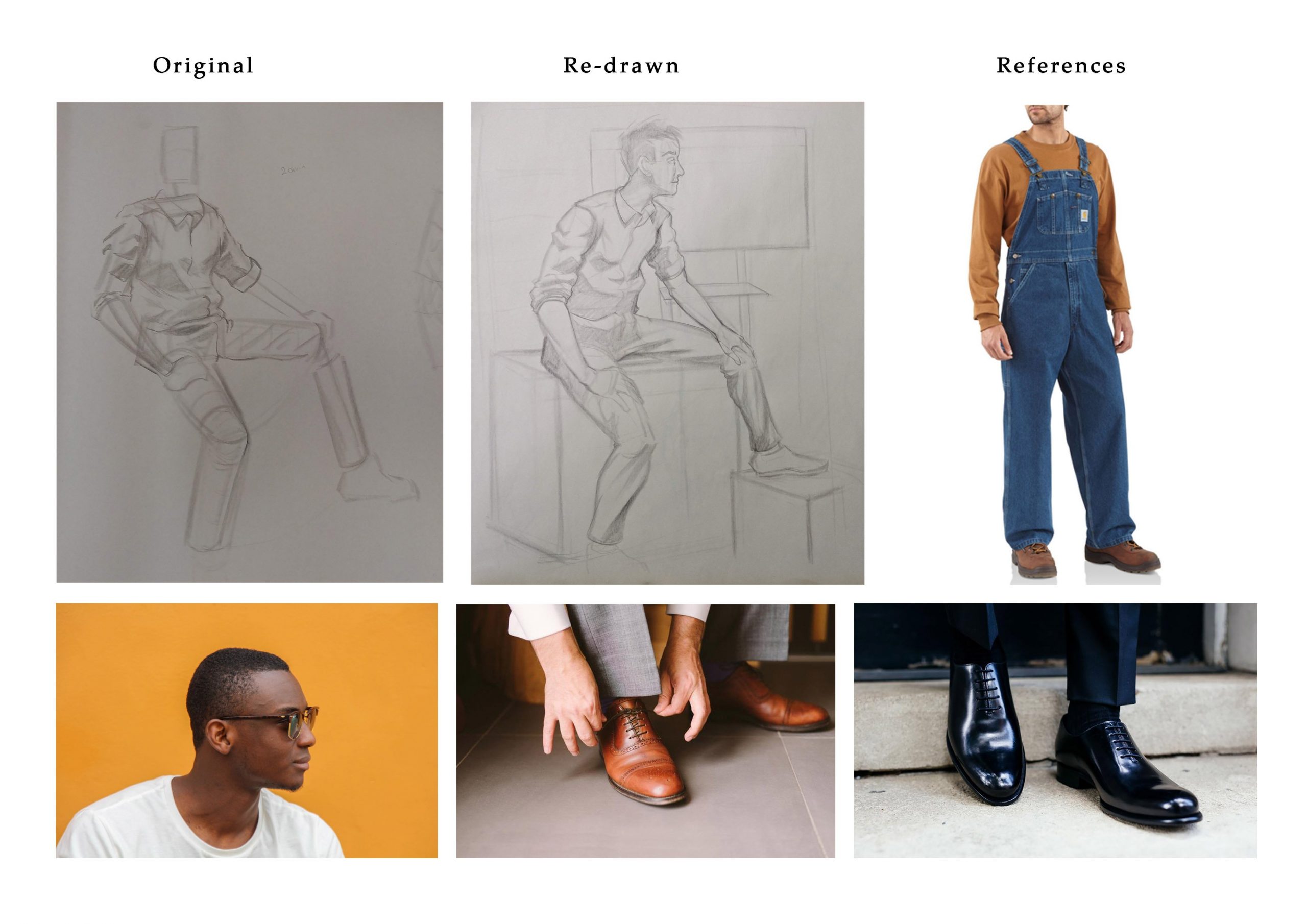
^After consulting with Prof Jesse, we both agreed that the feet and head is out of proportion.
Character 03
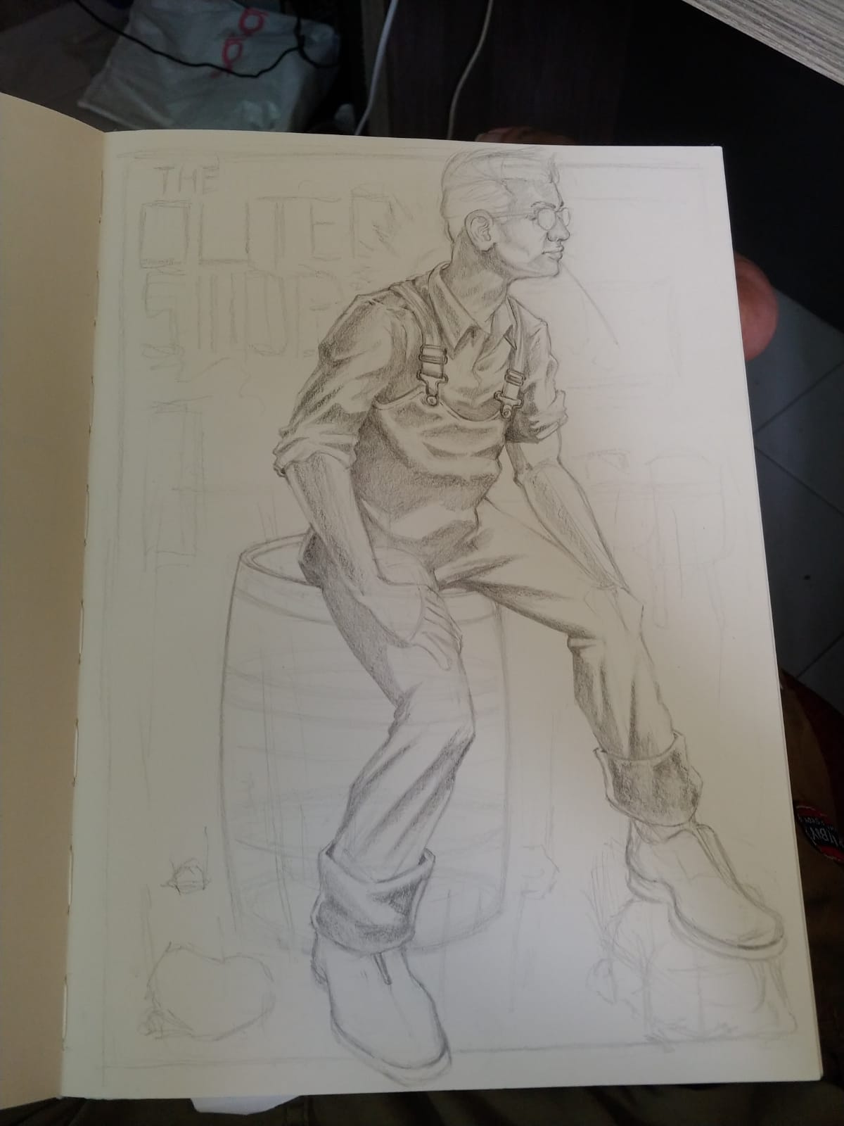
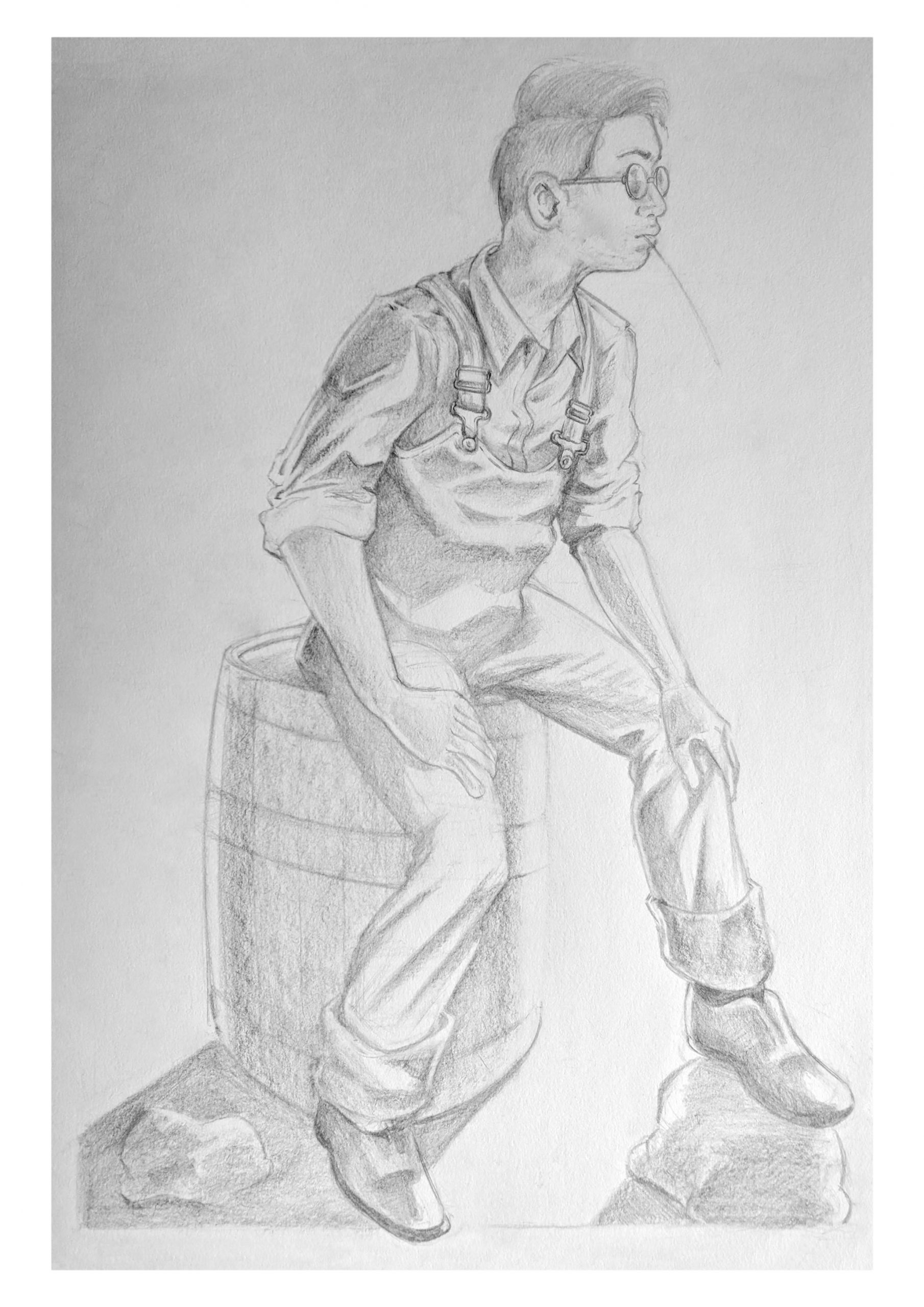
I’ve actually updated this drawing as well but I felt it would’ve been more fitting to talk about it in my final submission.
really big improvement in the re-sketch of the third (farmer) drawing! that proportional difference means a lot! you are getting a lot better at designing fabric and anticipating how it folds. I think in number 1 you have to thing the fabric through more – not sure its making sense as is (but no.1 seems the least developed of them all?)n good use of context in the 3rd, but I think the barrel is kind of unconvincing, and probably needs better ellipsis and better structure (shouldn’t be just a single line for the bands!)