To Bauhaus & Beyond: Sach Plakat

It’s pretty funny how everything comes back in a full circle. Just like fashion, the trends come and go, often making appearances or renaissances (ie. Matching clothing sets and Birkenstocks) in later years. Similarly, in the advertising industry, product messaging recycles its messaging in a cyclical fashion. Product promotion can take on the emphasis on an association with a product, be it lifestyle, societal status, historical or cultural. Messaging in product promotion can also go the other way and to take on a product-based messaging.

This was a poster published by Coca-Cola in the 1890’s as a cough medicine. In the poster, a well-dressed lady who seems to be living comfortably (as seen from the blooming, decorative flowers in the pot on an embellished table lined with cloth) and is seen to be consuming the “ideal brain tonic”. This gives the subtle messaging that if one drinks coca-cola, he or she will be healthy and will fare well in life.

Likewise, in this poster that is promoting a liqueur, attests that the liqueur is so good that it can entice a monk to drink from it and to even get him addicted, despite his religious beliefs.

Whereas, in the 1910s, advertising seemed to have pared on the messaging and to focus solely on the product as seen from Lucien Bernhard’s “Manoli’ Sach Plakat poster. Perhaps, this was information fatigue at the end of the consumer, in which consumers have been bombarded by so much advertising tactics that in turn, they opt for brands are that straight-to-the-point and no-frills hence the production of object-based posters created by Bernhard.

Evidently, today advertising is back to product messaging uses association. Perhaps, in a couple of decades to come, consumers would opt for messaging that is less flamboyant and straight-forward.

Graphic Design So Far: Wes Wilson’s Psychedelic Posters

I was drawn to Wes Wilson’s psychedelic posters almost immediately, given the clashing colours or lack of white space in the composition. Born in of a time of wild experimentation with layout and type, Wes Wilson’s posters definitely stretched the utility and composition of a poster.

One of Wilson’s most renown posters was “Are We Next?” in which he makes a commentary on the political tussle between the democrats and communists, and questions the resilience of the democratic political supremacy.

He regards the viewing of a poster an adventure that “visually performs psychedelic awareness and identity”. This is conveyed through the bright colours, “fluid” type and layout, culminating in a “visual acid trip” for the viewer. His handwritten/drawn typefaces generally take up any space there is in the layout, often resembling Art Nouveau-like curves and almost liquid-esque forms. He uses human figures or close-ups of facial features and often makes them the central subject of his posters while embellishing the surrounding white space with information, which contributes to many of his posters being centre aligned.

Bibliography

Psychedelic Poster Pioneer Wes Wilson on The Beatles, Doors, and Bill Graham

When Posters Went Psychedelic

Reflective Essay: Question 2

Aesthetics

The tenet of creating a cohesive and all-together immersive experience with art, has got long running roots in the history of design. It’s birthed from the philosophy, “Gesamtkunstwerk” which is a German word for “total work of art”. Owing its origin to Richard Wagner, an opera composer, the philosophy of creating all-consuming art is equated to that of a musical composition, “pieced together by sensory stimulants” to “inspire imagination” and evoke “emotional fluctuations” (Finger). Today, this design principle stay rooted in design-thinking today. In graphic design, branding is used to communicate a coherent brand’s story and values to its audience. In interactive art, creating an immersive and interactive physical or psychological environments is more often than not, used to transport its audience to another dimension. While in product design, part of spatial design requires the construction of a cohesive and uniform visual theme within a physical space. This collection of works, titled Aesthetics, aims to reiterate the spirit of putting up an all-consuming performance for the audience through design. 

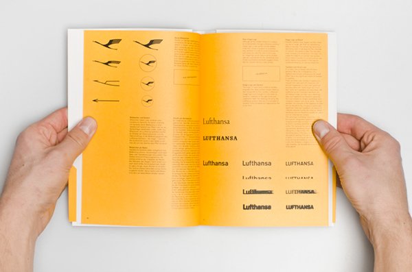
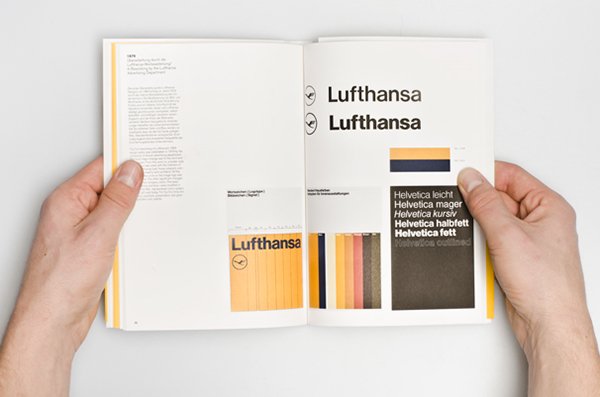
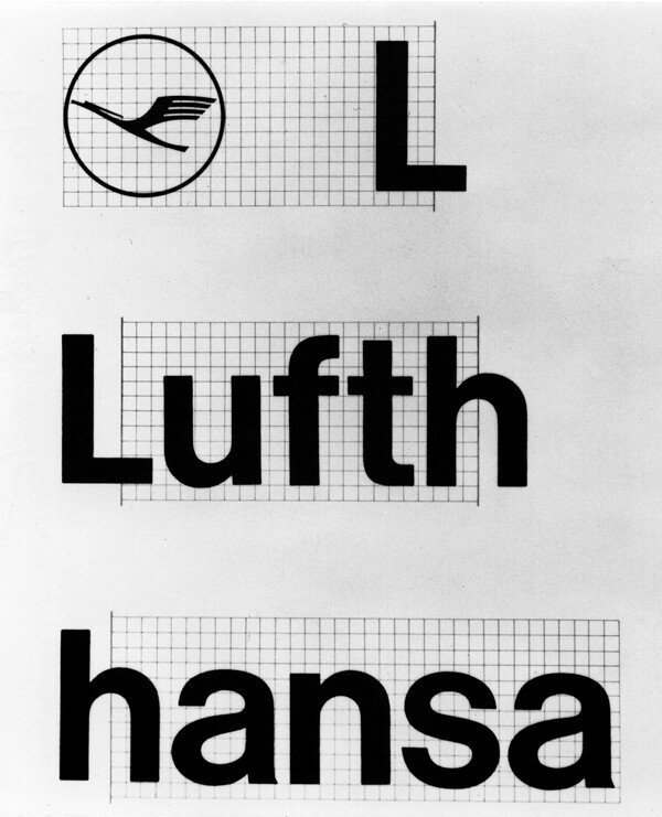
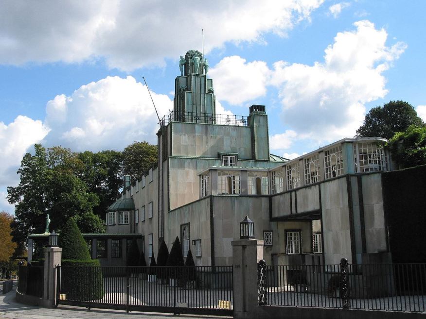
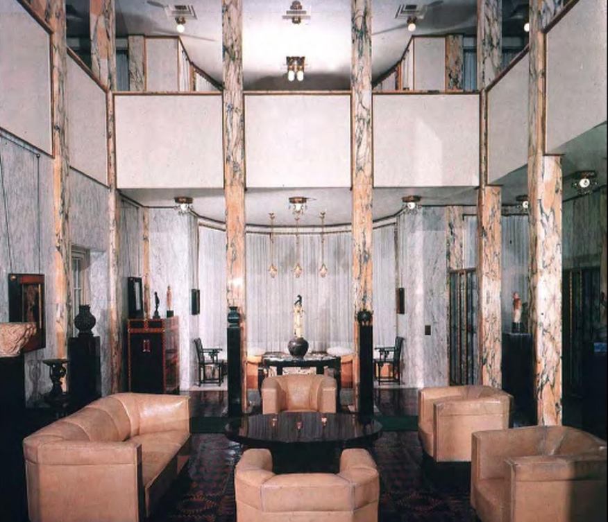
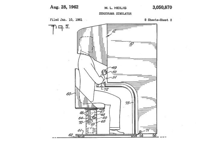
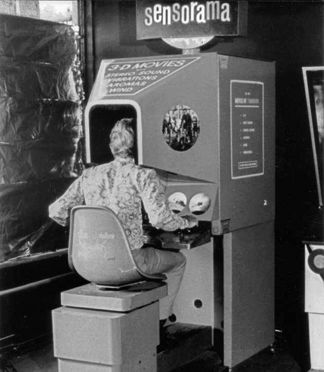
This collection, titled Aesthetics, features Lufthansa corporate identity, developed by Otl Aicher from the Ulm School of Design in 1962, Stoclet Palace, built by Josef Hoffman between 1905 to 1911, as well the Sensorama by created Morton Heilig, 1957. 

https://www.behance.net/gallery/4888087/A505-Lufthansa-Graphic-Design

https://www.behance.net/gallery/4888087/A505-Lufthansa-Graphic-Design

https://www.flickr.com/photos/rmit/14646813799

When Aicher was commissioned to develop the corporate identity for Lufthansa, this included the “airplane livery, crew attire, display systems, printed materials, and numerous other items” (Airline Visual Identity 1945–1975). This meant that whenever passengers interacted with anything Lufthansa, it meant the immersion into the world of Lufthansa. As such, when Aicher introduced the iconic yellow and blue for the airline, not only did the passengers associate these colours with Lufthansa. These colours differentiated Lufthansa due to the lack of colours in an age when airlines were typically “one colour with white, or a combination of red and blue”. Hence, Aicher had successfully created a whole new meaning to the iconic in the public’s eye.


https://www.architectmagazine.com/design/the-palais-stoclet-seduces_o

https://www.architectmagazine.com/design/the-palais-stoclet-seduces_o

https://www.architectmagazine.com/design/the-palais-stoclet-seduces_o

The Stoclet Palace was built by Josef Hoffman as a thesis to achieve Gesamtkunstwerk”. Inheriting the principle of good craftsmanship from the Arts and Craft Movement, visuals of the signature whiplash and sinuous lines from the Art Nouveau movement and strong, geometric forms from the Art Deco Movement, the Stoclet Palace sought to create a total work of art in every nook and cranny of the space; from the furniture to the murals and to the lights. No details were spared. As such, Josef Hoffman was able to create a whole new fiscal dimension of luxury with the Stoclet Palace.


https://www.digitaltrends.com/cool-tech/history-of-virtual-reality/

https://www.engadget.com/2014/02/16/morton-heiligs-sensorama-simulator/

Created by Morton Heilig in 1957, the Sensorama is a hallmark of the immersive experience as it was one of the very first entertainment machines that employed total sensorial engagement. Tracing back to his film-making roots, the Sensorama machine stimulated sight, hearing, smell and touch and transported its audience to a whole new space altogether. This was achieved with a “bucket seat for a single viewer, a set of handles and viewing holes that were surrounded by a series of vents” (Turi). The 3D film was then “viewed through a set of ocular portals” that filled the user’s peripheral vision. This immersive experience effectively rendered passive entertainment passé and paved the way for what we know today as, virtual reality. 


Bibliography

Finger, Anke. “The Death And Life Of The Total Work Of Art”. 2015, https://www.researchgate.net/publication/280935380. Accessed 17 Nov 2019.

Airline Visual Identity 1945–1975. Callisto, 2019, pp. 174-175, http://www.garciamedia.com/assets/uploads/blog/Airline_Visual_Identity_1945-75_FINAL_VERSION.pdf. Accessed 17 Nov 2019.

Turi, Jon. “Engadget Is Now A Part Of Verizon Media”. Engadget.Com, 2014, https://www.engadget.com/2014/02/16/morton-heiligs-sensorama-simulator/.

Writings to Typography Reflection

Regular script, c. 200–700

Given the many hours being taught type attributes and characteristics, learning more about the history and hosts of impacts/roles that type plays in our life/heritage is, undoubtedly, refreshing.

I appreciate the rich history behind this regular Chinese script. Its origin dated back to the rule of Qin Shi Huang, who was the very first emperor to unify the raging fragments of China.

Owing to the evolution of Chinese calligraphy, the small seal script or the Seal script or Qin script, evolved into clerical, semi-cursive, cursive and finally, standard/regular script. Under his leadership, the Chinese writing was made standardised for the very first time, such that all words with the same meaning in the country’s varied languages would be represented by the same characters. By doing so, he was able to regulate the level of dissent in the country, thereby allowing him to keep a tight grip on his political rule and clout. He also rewrote history, both figuratively (by unifying China) and literally, by ridding of all politically-critical writing/literature.

This simply illustrates the core principle and purpose behind text, script or type (for that matter), communication. Communication with current and future generations.

This is an apt quote by Dan Brown and it says,

“History is always written by the winners. When two cultures clash, the loser is obliterated, and the winner writes the history books-books which glorify their own cause and disparage the conquered foe. As Napoleon once said, ‘What is history, but a fable agreed upon?”

Sources:

https://www.nationalgeographic.com/culture/people/reference/qin-shi-huangdi/

https://www.goodreads.com/quotes/148791-history-is-always-written-by-the-winners-when-two-cultures

IM Class Notes

Interactivity: Ability of user to manipulate and affect one’s experience of media directly and to communicate with others through media 

The advent/invention of the computer

Vannevar Bush

  • Ideas are non-linear, idiosyncratic
  • A device that operated directly “as we may think

Relevant articles:

  1. https://www.theatlantic.com/magazine/archive/1945/07/as-we-may-think/303881/
  2. https://blog.acolyer.org/2018/02/23/as-we-may-think/


JCR Licklider

  • (1968) “The Computer as a Communication Device” illustrated his vision of network applications and predicted the use of computer networks for communications, instead of sole mathematical devices
  • “Man-Computer Symbiosis”: Creative collaboration, Tool to increase intellect and efficacy of man

Alan Kay

  • Dynabook: Personal computer used for communication as much as work (only came to actualisation 20 years after paper)
  • Computer to be Meta-Medium/Total Art Work

Cybernetics & History

  • The essential goal of the broad field of cybernetics is to understand and define the functions and processes of systems that have goals and that participate in circular, causal chains that move from action to sensing to comparison with desired goal, and again to action.


  • Reciprocal exchange: User can change/manipulate the medium and vice versa, intuitively and with immediacy


  • Indirect contact/control of the machinery; steerman/governor
    • Communication
    • Control

Roy Ascott: Human-Computer Interactivity (HCI)

  • 2 way exchange between the art and the viewer; feedback loop
    • Open-ended
    • Spectator engages in decision-making; participational

Marshall Mcluhan, ”Medium is the Message”


  • For McLuhan, it was the medium itself that shaped and controlled “the scale and form of human association and action.”


Hypermedia: The linking of separate media elements to one another to create trail of personal association. 

Reason for rise of hypermedia

  1. Growth of research/knowledge after the war
  2. Lack of a platform that collates/organises/provides information

→ INTERNET/COMPUTER

  • Emulate the brain that processes thoughts/stimulants simultaneously
    • Ideas are non-linear, idiosyncratic
  • Tool to increase intellect and efficacy of man

COMPUTER/”DynaBook”: Utilises Meta-Medium

  • To dissociate the computer with a work-machine by introducing play into the use of computers
  • Accompanied by the innovations in the gaming industry → proliferated recreational use of the computer

Hyper-text/Hyper-link: “I link therefore I am” → tells of one’s history and association


Immersion: experience of entering simulation or man-made 3d environment

Ivan Sutherland : “Father of computer graphics”

  • Interest in pioneering/advancing cybernetics
    • earlier contribution to computer graphics →  Sketchpad
    • Sensorama
    • Existing “VR” in 1950s: flight simulator → Link Trainer

Scott Fisher

  • Media tech & first-person simulation
    • Sensorama, Morton Heilig (1960) is a hallmark of the immersive experience – total sensorial engagement/ Meta-Medium → interactive, interactive
    • Similar projects are Deep Contact by Lynn Hershman, Aspen Movie Map at MIT, Cinerama (1960)
      • Commentary on internet dating, communication online
    • Suspension of disbelief
  • Evolution of Virtual Environments
    • Videoplace, Myron Krueger,  1975
  • Osmose, Char Davies, 1995
    • Deep-diving, control position through breathing/ immersant
    • reaffirm the role of the subjectively experienced, giving the immersent a sense of presence in cyberspace
  • Virtual Environment Application — applications of Cybernetics
    • ‘Telepresence’ — presence at a distance
    • Dataspace — Advanced data display/manipulation of information
  • Personal Simulation
    • Telesurgery
    • Pokemon go
    • Jewel
  • Tele-collaboration through 
    • Communication on the digital space
      • SKYPE, CAVE