I have identified the six attributes of myself that I want to explore for this first project: my introversion, rationality, and my love for science, world-building, games, and my indulgence in escapism.

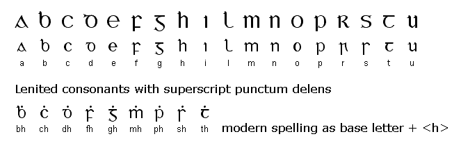
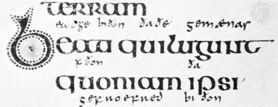
As in introvert, I place a strong emphasis on personal boundaries. I am also not very social, and will almost never take the first step in a new friendship by initiating conversation. In large social gatherings and situations, I withdraw into myself even more, becoming tired, irritable, and even a little hostile. As such, I wanted to use a font that depicts this self-contained nature of the introvert, a font that obtains its form by going inwards, rather than outwards. I rejected the first two subtractive fonts I tried, as the circular one looked too cute and bubbly whereas the square one looked too bold. I then considered other normal fonts that looked subtractive, and settled on insular script. Insular script also has additional pun points because insular->insulate implies my desire to hide away and insulate myself from social situations. I also considered using the representation of a fence as a symbol of a literal barrier between myself and others. I rejected the initial idea of a picket fence because it brings to mind an American suburban neighbourhood which felt too homely and normal and neighbourly for my purposes. When I thought about barriers and impenetrable places, I thought of looming stone walls and ornate wrought iron fences. I hence chose the wrought iron fence design as it’s usually topped by what looks like sharp spear-tips, and the swirling repeating designs easily incorporated the roundness of insular script letters.

I value rational thought, by which I mean I don’t enjoy nor empathise with people who enjoy acting on impulse or emotion. I also hate it when people attempt to justify their actions by saying things like “because it’s the law”, “because I’m your authority and I say so”, “because God said so”, “because magic”, “because it’s the done thing”, “because rules are meant to be broken”, “because everyone else is doing it”. Considering the sheer number of people who think that way, I feel like I’m constantly surrounded by weirdness, stupidity and/or borderline insanity (although I do recognise that I’ve fallen into such traps myself). I wanted to represent this by showing a ludicrous mess of unnecessarily decorative fonts in the background while my name is written simply and cleanly in black.

I enjoy learning science, especially the moment where things finally begin to come into focus and make sense. The joy of deriving meaning or connection between seemingly disparate elements, of discovery and learning, is what I wanted to convey. I made it look like a page of a field journal of a biologist, as biology is my favourite science, to bring across the moment where the scientist first sees something new out in the field and spontaneously records their excitement and observations. In the text and illustration, I plan to subtly incorporate the shapes of my initials ‘M’ and ‘T’, so that the viewer too can have a moment of revelation and discovery when they do manage to find the letters and understand. I will also use a script font as old field journals typically were written in the common cursive handwriting of the time.

One of my hobbies is creating imaginary worlds (as evident by the bio section of my OSS profile). More than directly telling the story set in it, I enjoy creating the setting, about figuring out what languages exist, what dialects there are, about trade and currency, about social and economic strata, about flora and fauna and the ecosystem, etcetera. Thus I tried to show this by having a progression from 2D to 3D, to bring across the idea of bringing a world to life. The initial half of the 2D card is mostly clean, and has colour. Any images added there are complete and whole. The letters have depth to them by adding jumping clay (an air-drying clay), which can be painted to look like mountains or buildings or trees or large animals. The latter half of the 2D card becomes increasingly more sketchy, with erasures and half-formed animals and random notes as that world-creator (me) continues to puzzle out how the rest of the world should function.

My other hobby is playing video games. While I play a wide variety of video games, my favourite are role-playing games (RPGs), likely because it ties in to my above appreciation of world-building. In an RPG, your character interacts with the world the game designer has created, thereby impacting the world and progressing the story. Some of my favourite RPGs are Dragon Age and Undertale, where players are given many choices and scenarios with the non-player characters (NPCs) and environments reacting differently to you depending on what you did. I wanted to convey that idea of agency and interactivity, hence I chose to design a game interface, specifically the character-naming screen, as this is the screen that usually marks the end of character creation and the start of player influence on the game world. Many players also spend ages on this screen thinking of a name for their in-game avatar, while others choose to name the character after themselves to play the game as a literal self-insertion. The font itself can be something pixel-y such as 8bitoperator to complement the old Gameboy design. By building it out of cardboard, I can include a real interactive element where pressing the A-button causes the ‘e’ to slide into place, completing the name ‘Madeline’. Pressing the B-button will slide the ‘e’ out and replace it with a blank, giving the appearance of backspacing (on a Gameboy, A is the button to press to insert or accept an option while B is to reject or remove an option). The challenge is in getting the measurements correct so that the interactive mechanism can function smoothly.

Escapism refers to the tendency to seek distraction and relief from unpleasant realities, especially by seeking entertainment or engaging in fantasy. Although I typically scorn those who wilfully believe in fantasies, especially about themselves and the role they play in society, I also enjoy indulging in fantasy from time to time. More often than not, they are not fantasies that involve myself, but rather my favourite characters. I spend a lot of time viewing and creating fanworks (art, stories, games, videos, etc) about these characters in increasingly bizarre and fantastical situations, about utopias and dystopias and magic and dragons and court politics and so on. Rarely do my imaginings involve regular real-world scenarios or day-to-day drama. So it seems like I indulge in power fantasies and reject the capabilities of normal people, including myself. I tried to depict this in a number of ways, most involve trying to break, or escape, from the framing device (such as the box, or the shape of the letters). The parts that break out include words like “strong, smart, cunning, power” and so on, as I am fully aware that I am not really any of those things in any significant way, hence they are clearly fantasies I escape to. Also, my is MADeline and many people have called my by the short form MADdy or even just MAD, so I tried to do something with the first three letters of my name, including the quote by the cheshire cat “we’re all MAD here”. I am still uncertain about what to do for this attribute.

 vs
vs


