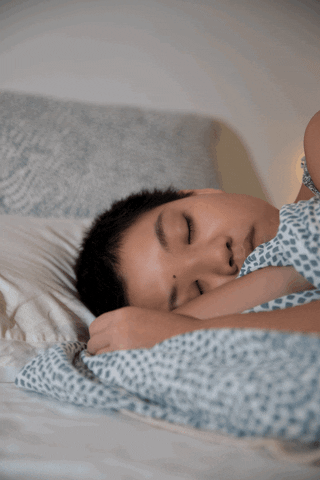
Project 3 – Final Project Pt. 1

Quiet Moments

This photo series aims to portray the beauty of quiet moments in my household. Growing up in a family of assertive and dominant individuals, I tend to withdraw and give in to my family members. This has caused an emotional barrier between me and them and sometimes I come across as cold and unbothered. Capturing my family members in the candid is something I’m not used to especially since I see them most of  the time, and I feel that I’ve taken them for granted somehow. I hope for this series to show how much I treasure these quiet moments regardless of how I behave around them.

Inspiration – Nan Goldin

Nan and Brian in bed, New York City, 1983

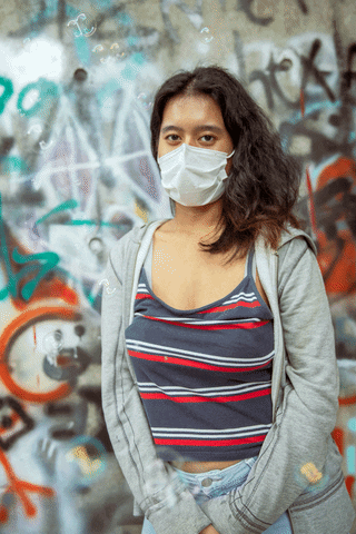
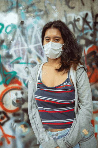
“Amanda in the Mirror”, Nan Goldin

I was inspired by the documentation style of Nan Goldin’s portraits. While it is clear that artificial lights were used in these images, there was still a sense of candidness and rawness to them as a whole, and everything appeared relatively authentic and true to what it is. I wanted to make use of analogue film to further bring out that “candidness” of my family members, as well as give it a style that suits me.

Before and Afters

First Image

BeforeAfter

Second Image

BeforeAfter

Third Image

BeforeAfter

Camera Processes

This entire series will be shot on analogue film. For this first part of the series, I shot my photographs on Fujifilm Superia Premium 400 film.

Digital Processes

First Image

As the first image didn’t show my mother’s face, I skipped on separation frequency and jumped straight into cleaning. I cleaned out the reflection and smudges on the mirror that I found were distracting, as well as a few other minor details on the cupboard. I found the original image too reddish to my liking, hence I decided to go with a warm, sepia-like tone for this photo series. Most of the colour corrects were tweaked with the Hue/Saturation adjustment layer. I also made use of the Blue channel to adjust the exposure of the highlights and the shadows. Last but not least, I decided to add a few more colour gradient overlays of yellow to better suit the style I was working towards.

Second Image

I didn’t feel that there was anything in particular I had to clean up with the healing brush and the clone stamp tool unlike the first picture. It wasn’t necessary to use the separation frequency here as well so I didn’t do it on my brother. I wanted the colour scheme to look similar to the first image, so similarly, I reduced the reds hues using the Hue/Saturation adjustment layer. I used Colour Balance to reduce the redness and and some green hues to it to balance the contrast nicer. I found the original image a tad bit too saturated so I ended up reducing the vibrance of the photo and added a gradient overlay to create a vignette effect after.

Third Image

I used the healing brush and the clone stamp tool to clean up the glass door in the background as well as a few more minor details on the clothes rack. As my mother’s face is seen this time round, I did a little bit of cleaning up of her face using separation frequency. However, since analogue film includes a grain overlay, there wasn’t much of texture I had to even out. The original photo had a really intense green hue to it so I toned it down using the Hue/Saturation adjustment layer to fit the theme. I made used of the Blue Channel to adjust the exposure of the highlights and shadows so it wasn’t too overexposed and too contrasted. I made use of colour balance, selective colour and hue/saturation to adjust the reds, neutrals and the whites. This was to create that warm tone effect I was going for. Lastly, I added colour gradient overlays of yellow and oranges as a finishing touch, along with a radial gradient overlay for the vignette effect.

Drive

https://drive.google.com/drive/folders/1JgKxBMQDPx41RuUa4JAN9cDRQzx8yd87?usp=sharing

Photographer Research – Part 2

Nirav Patel

Nirav Patel shot by Kristina Kashtanova

The photographer I have chosen to research on is Nirav Patel, an editorial and portrait photographer based in San Francisco. What first drew me to Patel’s photographs was the portrait of a woman facing a mirror (Figure 1). It gave me a sense of comfort in a way I could not explain, but after reading more about Patel, most of his works seemed to portray the calm stillness and quiet moments in a turbulent world; a concept that I find myself very drawn to. The body of works that I was particularly interested in were the silhouettes of models standing in front of what appeared to be a projector (Figure 2). I was fascinated at how he made use of light to frame the subject, as well as to set a mood to the images. There is also something very intimate and vulnerable about these models in the portraits, and I also find this to be very comforting given that it was shot himself – a male photographer – in a day where women are still objectified in commercial photography practices. As someone who enjoys taking portraits out in broad daylight, I would like to attempt to play around with artificial lighting in my final assignment and see how I could make use of light to tell a story in different ways. I think it would be an interesting experience to see the difference a light source in a dim room could make when capturing the scene.

Works

Figure 1

Figure 2.1

Figure 2.2

Figure 2.3. Photos taken from http://www.niravpatelphoto.com/

Project 2: The Landscape

Boy on the Prairie

After

Before

Breaking the gender norm

This project aims to capture an alternate reality of what life could be like if society welcomes the concept of breaking gender norms. There are some gender roles that I personally abide to, but at the same time, I embrace others who steer clear from them. I believe that there is no one such rule as to how a certain gender should look or behave, hence the idea of a male model in a skirt.

Infrared Photography

A vintage Lincoln car sits in the driveway of an Indian Canyons residence

Seven Lakes Country Club

The landscape image was partially inspired by infrared film, as well as the infrared photographs of Kate Ballis and her photo series Infra Realism. I wanted to explore how colour can be used to invoke certain emotions in people, and the science behind infrared rays ties in well with my concept of an alternate reality; where there is so much more we have yet to discover just as there are many more colours we have yet to see.
Science bit!

“Visible light” spectrum

Our eyes can only see a quite narrow wavelength of light. Often referred to as the “visible light” spectrum, this usually spans the wavelengths between 380 and 700 nanometers. Above 700 nanometers is a spectrum referred to as infrared, and most infrared photography is concerned with capturing the narrow band of wavelengths between 700 and 1000 nanometers – usually dubbed “near-infrared”, so as to separate it from the longer infrared wavelengths more associated with thermal imaging.

Rich Haridy, New Atlas

Technical Decisions

Camera Set-up

ighLighting schematic

The camera set up was simple; me with the camera, except that this time I decided to make use of artificial light. I placed the speedlite on a tripod and angled it towards my left. It was a lot of trial and error, especially since I took my photos in a park during the golden hour sun, where the sun occasionally came and went.

Editing Processes

Healing Brush, Frequency Separation, Dodge and Burn

As my subject has a model in it, I decided to attempt to perfect his complexion using the healing brush, frequency separation and dodge and burn.

Masks

Mask of sky

Mask of trees and grass

Mask of model

I created three different masks so that I could individually work on each subject and avoid overlapping filters over them.

Clouds Rendering

Lasso cutout; flipped horizontally and vertically

Mask and smudge tool; additional clouds render filter

I found that the clouds in the original image were cluttered to the right, so I rendered in some clouds on the left using clone stamp and the clouds render filter to balance out the image better.

Colour processes

With the idea of infrared photography in mind, I decided to go a little crazy on the colours. I attempted to change my grass and land a violet colour using the colour selection tool and the sky a much deeper blue using the colour balance tool. To me, this was the colour scheme that best suited my concept around embracing new norms. I found that the masks I created weren’t the cleanest, especially along the outlines of the grass and trees, hence I tried my best to clean it up by using the smudge tool. To make it look more realistic, I tweaked some colours on his skin tone as well as his outfit using the colour selection tool to make it look like he’s apart of the image.

After a little more experiments, I attempted to create an orange glow from the direction of the light source, and was quite pleased with how it made the photo pop.

Sharpen/Grain

I sharpened the photo in the end and added grain not only to the model, but to the entire picture. (I love grain)

Colour Variations

I wanted to see if the image worked on a different colour scheme. This variation is something I’m more comfortable with, however, I found the first colour scheme to be a lot more fitting to the theme.

Full Process (GIF)

Animated GIF

Revised Version

After critique, I decided to touch up on the areas that I feel needed a bit more cleaning and refining. I lowered the opacity of the frequency separation to show the contrast of the skin against the light. I also cleaned the trees up a little bit as I felt that it was obviously rendered to appear pink. I made use of the Hue/Saturation adjustment to better show the shift in colour.

Before Revision

After Revision

Google Drive

https://drive.google.com/drive/folders/1fKYw7OqREGSy3JxzJRbOf7PzbuG9wt3t?usp=sharing


Project 1: The Portrait

Sleeping Beauty

“Beauty is in the eye of the beholder” – Margaret Wolfe Hungerford

We are constantly pressured by society to think that beauty has a certain look and style. While I’m glad that many of us are challenging societal norms, I still think it is an important reminder that there is no specific template for beauty, as beauty is more than just what we see externally. This project attempts to portray how I as an individual personally see my loved ones; beautiful and flawless on the outside and the inside, even when they are in their most vulnerable state; like when they’re sound asleep.

After

Before

Concept & Inspiration – Philip-Lorca diCorcia

Catherine, 1981

I was personally inspired by the Philip-Lorca diCorcia, a photographer who is popular for capturing “candid” portraits on analog film. What I really admire about his photographs is how simple his compositions are yet they are still so beautiful to look at; it could be as simple as a person sleeping or just gazing into the camera. I wanted my portrait to be raw and candid so as to capture the vulnerability of the model while she’s asleep.

Marilyn; 28 years old; Las Vegas, Nevada; $30

I noticed that although diCorcia’s portraits look extremely candid, the flash and lighting suggests that he could’ve staged the shot as well, which impressed me. While I did not use any studio lighting, I decided to make use of my phone’s torchlight to my portrait.

Camera Set-up

I had a simple set-up in my dorm room. I wanted the room to be rather dim, however I found that my iPhone torchlight helped illuminate my setting better. For the artificial lighting, I experimented with different angles from propping my phone on the table to holding my phone high up with my hand. I lowered my tripod to the model’s eye level and took a picture with it.

Digital Process

Healing Brush/Clone Stamp Cleaning

I started off with a simple clean up of anything that were not a part of the model’s skin. This includes mascara smudges on her eyelids, a bit of dirt and an eyelash. I made used of the healing brush tool as well as the clone stamp tool to achieve a cleaner base.

Before and after cleaning

Frequency Separation

I proceeded to apply the frequency separation technique on the model’s skin. I found that the model’s skin was actually rather blemish-free, however there was an obvious shine on her face that brought out a bit of texture, as well as some unevenness in skin tone. Hence, I made use of frequency separation to smoothen all that out.

Before and after frequency separation

Dodging/Burning

After working on the frequency separation, I still realised that she still had a bit of unevenness in her skin tone. Hence, I made use of dodging and burning to fix it. To do so, i added a 50% gray layer in the soft light blending mode and used the black and white brush to burn and dodge her skin.

Animated GIF - Find & Share on GIPHY

GIF of dodging/burning

Grain and Sharpening

I realised that the frequency separation technique had a downside; skin looks too perfect. To create a more natural and realistic looking skin, I made use of fine grain to mimic the textures on her face. To finish it up, I created a stamp visible layer and used the high pass filter to sharpen the entire image.


Before grain and sharpening

After grain and sharpening

Final

Link to Photoshop file: https://drive.google.com/drive/folders/1IevJIMyeF3TcM7XbXUTvmk1Z2uDTlwzu?usp=sharing


Moving Images – Time-based Technique

A Lazy Afternoon – Timelapse

Set-up

  • Made use of a single tripod and a single camera and placed it facing my bed
  • No artificial lighting, just made use of ambient lights
  • Used “timelapse mode” on Canon 6D to create the timelapse video. The settings were 3 seconds per frame and lasted a total of 750 frames.

Post-production

  • Transferred it over to Premiere Pro to export it as H.264
  • Played around by adding in lo-fi jazz music to see how it flowed along with the timelapse

Final

*to be continued

Artist Presentation: David Claerbout

David Claerbout

Highway Wreck, 2013

David Claerbout is a photographer and a video artist, most widely known for his creation of moving images. It seems that a lot of his works include the element on time, where he conducts experiments on different time-based techniques to create his moving images. Unfortunately, many of Claerbout’s works are only displayed in the form of photographs, and his video art pieces, if available online are only displayed in short snippets.

the “confetti” piece

“Antwerp-based artist David Claerbout’s video and digital photography projects intervene in our sense of linear time by slowing down, speeding up or even stopping time in filmic narratives. In his first solo exhibition in Canada, currently on view at Vancouver’s Belkin Art Gallery, a selection of Claerbout’s video installations from 1996 onwards mine our slippery relationship to duration. Presenting mysterious and compellingly incomplete storylines—such as a female figure emerging from a home, turning towards the camera and waving goodbye to the viewer in slow motion in Long Goodbye—in ways that separate narrative time from viewing time, Claerbout’s actors and dialogue quickly become the backdrop for the real subject of his work: the shifts in light and movements in environment that mark the passing of both hours and eons.”

– canadianart

Long Goodbye, 2007

“The Long Goodbye” is a silent video piece created and showcased in 2007. It was a video study between time and movement, and it features a female protagonist who makes her way around the house and eventually waves goodbye to the camera. From this 1 minute clip, it was obvious that Claerbout was trying to defy time by capturing the woman waving in slow motion while the sun sets quickly.

Long Goodbye, 2007

Shadow Piece, 2005

“Shadow Piece” is a 31-minute one-take video that features strangers looking through a large glass door over a long period of time. It seemed that in this piece, Claerbout made use of a lengthy video to gather anticipation in the viewers, as if wanted to create and evoke certain emotions in them as they watch strangers attempt to make it through to the other side.

In Shadow Piece, what is at stake is the modern promise of a clean, orderly and brightly lit future. In a partially digitally composed film (which actually is black-and-white archival photograph) we see people trying to enter a modernist building in vain. Over the course of 31 minutes, the balance and cleanliness of the composition gradually degrades into feelings of failure. The impossibility of accessing the building functions as a metaphor for photography and video as a time machine into which the spectator is unable to enter, as well as the utopian modernist dream that was never fulfilled.

-David Claerbout

Shadow Piece, 2005

Photographer Research – Part 1

Hollie Fernando

10,000 Days of Earth – Hollie Fernando

The photographer I have chosen for this assignment is Hollie Fernando, a photographer and director based in London. She is often inspired by paintings, music and passionate people that drives her to create her works of art and prefers shooting on analog film. What stood out to me about her works were the vibrant colour palettes, as well as the raw and dreamlike quality that extend across all her photographs. Her photo series titled “W” stood out to me the most, which portrayed nude women in various indoor and outdoor settings. I’ve always been fascinated at the idea of capturing nudity in a non-sexualised way, and I find it very comforting to know that there are photographers like Hollie who have successfully captured the essence of nudity in a beautiful and liberating way. I also realised that she makes use of ambient lighting to her advantage as well, like in her photo series “12”, where she captured her brother and father in her home with sunlight peeking in from the windows. I think the use of ambient lighting adds to the dreamlike quality of her work, and given that she took it within the boundaries of her home was impressive to say the least. As someone who prefers shooting in scenic places, shooting indoors especially in familiar places (eg. my home) is something that’s quite out of my comfort zone. I think it’s because I’m more used to making use of a particular “scenic location” to make up my photograph. Hence, I’d like to challenge myself by doing what Hollie does; making full use of ambient lighting to capture beautiful portraits within familiar walls without the use of a “scenic location”.

Works

W – Hollie Fernando

12- Hollie Fernando

12- Hollie Fernando

References

https://holliefernando.com/

Meet Painterly Photographer Hollie Fernando

Moving Images Homework – Stereoscopic GIFs

For homework, I attempted to create a stereoscopic GIF out of multiple burst photos of my friend. I attempted this through Photoshop where I overlapped the photos over each other and created a sort of a “photo montage” video.

Original photos

I took some burst shots of my friend using the Sports mode on my camera. I made sure to pan the camera a little as I shot it so as to create some form of movement.

Edited photos

I edited the photos in Lightroom and re-exported them as JPGs.

Photoshop Process

I then uploaded them onto Photoshop to create the GIF.

Timeline Settings

I played around with the timeline settings and found 0.1 seconds per frame to work the best .

Aligning the subject

To create the “3D effect”, I aligned my subject towards the center for each frame and cropped out the blank parts later.

Saving as GIF format

Final

Slower variation