< Research & Process >
Through Project 2a, I have decided to focus on YELLOW COLOUR as the element of my zine.

Back cover (left) and cover (right) tryout
/ Initial idea /
Foodie adventure photozine
- Empty stomach on page 1 (cover) to indicate the state before feasting the good food from Bedok
- Filled tummy on page 8 (back cover) with checkpoints (food places intro) to indicate state after going through the recommended food places in Bedok

Reference (left) and Spread 1 tryout (right)
- Initial spread 1 layout was referencing towards pop art cover layout instead of spread layout. Therefore, spread did not look appropriate.
- Barely any visual hierarchy as the images appear to be of similar sizes.
- Use of split complementary colors to make the spread look more harmonious.
/ Comments /
- Zine is about food so cover page should include the food that will be featured instead for anatomy.
- Photo angles can be limiting when shooting food stores, like the bakery. Illustrations of more interesting angles can be included.
< References >


Spread Layout References

Cover Layout Reference

Illustration Style
< Spreads and Cover Sketches >


Sketches for spread


Sketches for cover
< Spread 1 >


Versions 1 (left) & 2 (right)
Ver. 1 – Illustration of waffle look relatively flat and did not look very appetizing. Salted egg yolk sauce did not look like one and was more of an orange hue instead.
Ver. 2 – Illustration style derived from drawing lines over a vectorized image (using 6 Colours image trace function) to keep it similar to my original style while keeping the illustration look less flat. Played around with the layout more; less centralized layout and gestalt law of closure indeed made the spread more interesting to look at.


Versions 3 (left) & 4 (right)
Played around elements of different stores (bakery & ice cream bar)
- Gestalt law of proximity grouped the pastries of the bakery together as one element.
Ver. 3 – making the tray of pastries of higher visual hierarchy than waffle resulted in little scale difference between small pastry elements and waffle. Visual hierarchy was therefore less prominent.
Ver. 4 – Very huge waffle vs very small pastries gives the prominent visual hierarchy. Body text was also added into the columns to allow for visualization of the overall final layout.


Versions 5 (left) & 6 (right)
Decided to add in a quote for type hierarchy within the spread.
Ver. 5 – “416” was lying on both pages so it was moved towards the right a little more.
Ver. 6 – Quote was tilted to make the spread look more dynamic.
Purple, being a complementary colour for yellow, was used for “bold” to contrast against the yellow used for “gold”; black used in ver. 5 felt less interesting. Colour of body text was changed to make it harmonize with the overall colour scheme. QR code of google map location added for viewers’ ease of locating.
Background texture from ver. 6 was decided as as the dots used in ver. 5 was used in spread 2 as well. This gives more variety of textures across my zine.
< Spread 2 >


Versions 1 (left) & 2 (right)
Ver. 1 – Use of gestalt law of closure but no visual hierarchy present. Looks relatively incomplete.
Ver. 2 – Scale of the bowl of noodles increased to give better visual hierarchy. Complementary colour rectangle and yellow dots texture was added to balance with the body text within the entire composition.


Versions 3 (left) & 4 (right)
Ver. 3 – Illustration of the oyster omelette was changed to make the illustration style look more coherent. The squarish plate also contrasted well with the circular bowl.
Ver. 4 – Colour of body text was changed to make it harmonize with the overall colour scheme. Greens (Spring onions) was added to the noodles so food looks more appetizing as they are split-complementary colours.
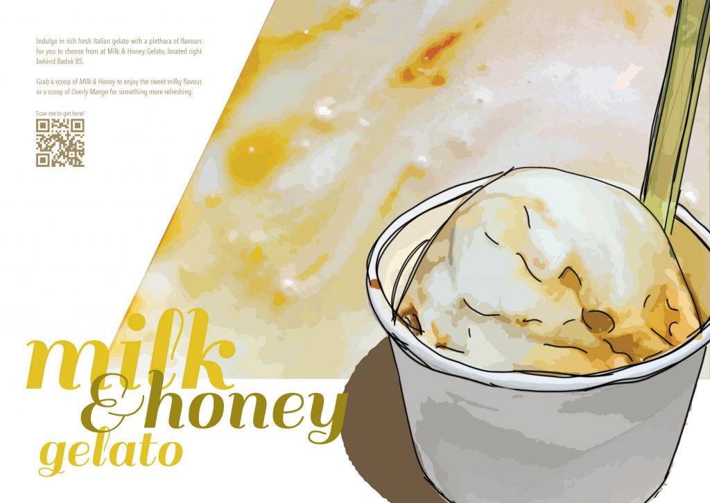
< Spread 3 >


Versions 1 (left) & 2 (right)
Ver. 1 – Riceballs & ice cream are placed in the same spread to be categorized as desserts around the same area. Viewers’ eyes were led everywhere due to bad layout used.
Ver. 2 – Tangyuan was eventually eliminated to prevent repeated use of two-elements layout in all three spreads. Lines for ice cream texture was removed as it looked disturbing. Scale of ice-cream was increased to bring attention to it. “& honey” text used yellow of a darker value to give variety within the entire composition filled with bright yellow.


Versions 3 (left) & 4 (right)
Ver. 3 – Ice cream texture was cut diagonallyto create a more dynamic layout.
Ver. 4 – Colour of body text was changed to make it harmonize with the overall colour scheme.
< Cover and Back Cover >


Versions 1 (left) & 2 (right)
Ver. 1 – Layout was lacking texture.
Ver. 2 – Controlled food splatter added to give an exciting emotion. Legend of buses from DT30 and EW5 was added to give more clarity.


Versions 3 (left) & 4 (right)
Ver. 3 – Scale of map reduced for some visual hierarchy. Bigger food splatter extended to the back cover for a continuous layout instead of a 2 separate front and back cover layout. Splatter also helps to bring attention to designer’s contact.
Ver. 4 – Illustration style of map changed to harmonize with the entire zine. Squarish/linear shapes used in this layout did not bring across the excitement this zine should bring out.


Versions 5 (left) & 6 (right)
Ver. 5 – More splatter on graphic elements to bring attention to them. Brush texture was included to highlight the designer’s contact and “YUMMY”. Made the legend of buses vertical, the movement within the composition could not work well as such.
Ver. 6 – Brush texture for “YUMMY” was removed to give the contrast between a “clean” area for text and “messy” area for textures. Scale of brush texture behind designer’s contact was reduced tofit the size of type better. Legend of buses moved above the map and placed horizontally for ease of reading top-down.
< Reflection >
Through this project, it made me realize how important is it to find the right references at the beginning. It helps to anchor my direction of approaching the project and made me improve as a designer. After looking at everyone’s final zine, I also noticed how different people made use of different techniques to show the same design element. That actually motivated me to explore more to further develop my creativity.
< Final Zine >