Honestly, the main point for this presentation is to highlight the use of traditional painting in interactive art. For example the work done below by the Salvador Dali Museum:
More information and other virtual resources can be found on their website.
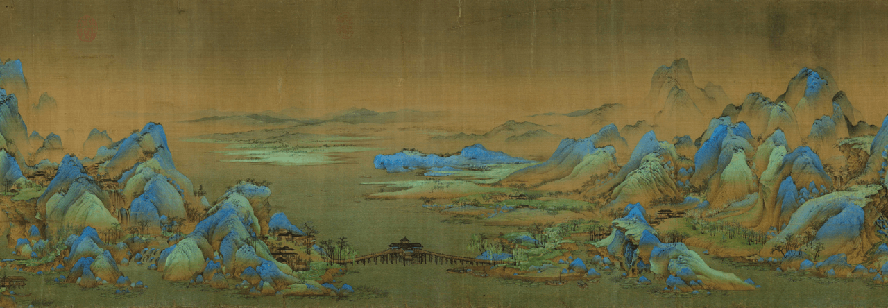
The reason why I chose the game though is due to the lack of appreciation( I feel) for Chinese or Asian art styles when it comes to learning art.
The game aims to gives life to the painting. The animations I admit it is not that good but they tried to promote and achieve app for Chinese paintings.
A rpg indie horror game developed in 2012 by a Japanese artist Kuori . Not much is known about the game as the Japanese artist is pretty mysterious. The game took flight in 2014 when its download numbers soared. This was also made in the period whereby indie horror games were becoming more and more popular. It was one of the games that sparked the gaming community’s Interest in games of this genre. Since then, it has garnered a huge fan base and allowed for the development of fan art and modifications that added on to the endings, increasing the number of endings even more.
Rhizome structure:
The affinity you have with the characters in the game affects how you would interact with them eventually also the ending that you have. the affinity changes depending on your choices in the dialogues of the game also with what you do in the game(e.g. discovering different areas in the game helps you progress the game in different directions. you may also end the game without discovering some of the in game elements. This allows for a flexible ending. Moreover the main character’s (Ib) personality also changes in the game according to your choices thus the narratives also differ in the game. The game is really complex and has many possible storylines thus this makes for an interesting gameplay experience.(people like to see their choices actually making a difference)
The “Fear” factor:
Being a horror game, visual prompts are used widely throughout the game to make people afraid and single colours are commonly used in each zone. The sound effects, though old school, offer an even more scary experience. Each painting in the game has a meaning or function that is related to the story itself or the progression of the story.There is a wikia page explaining the meanings of each painting.
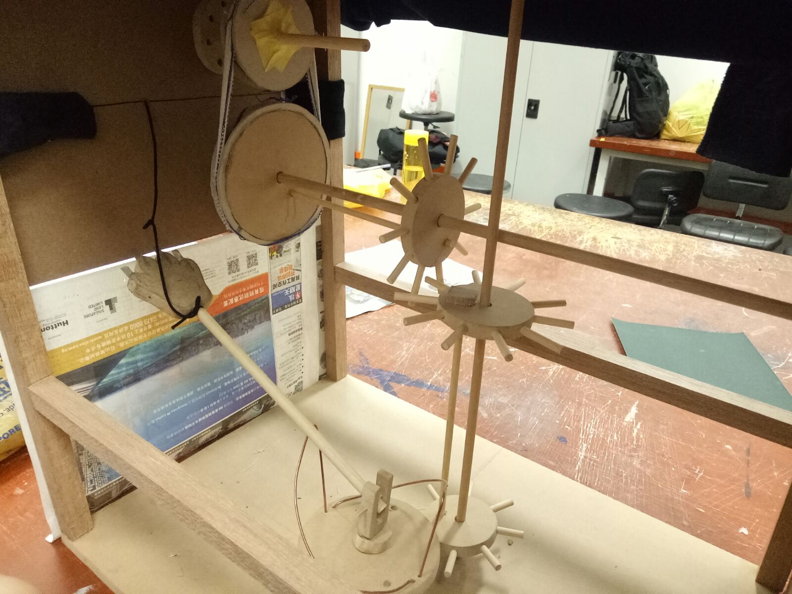
For the final we wanted to used cylinders for connection but didn’t do it as we thought that using the stick was enough. but it wasn’t. so I think one improvement we have to make is that we could use a cylinder to connect the two gears together instead.
The problem with the bicycle gear concept was that the sticks did not stick properly no matter how hard we tried so i think that maybe instead of using glue, we could us the wooden stick to pierce through the stopper so that it won’t succumb under weight.
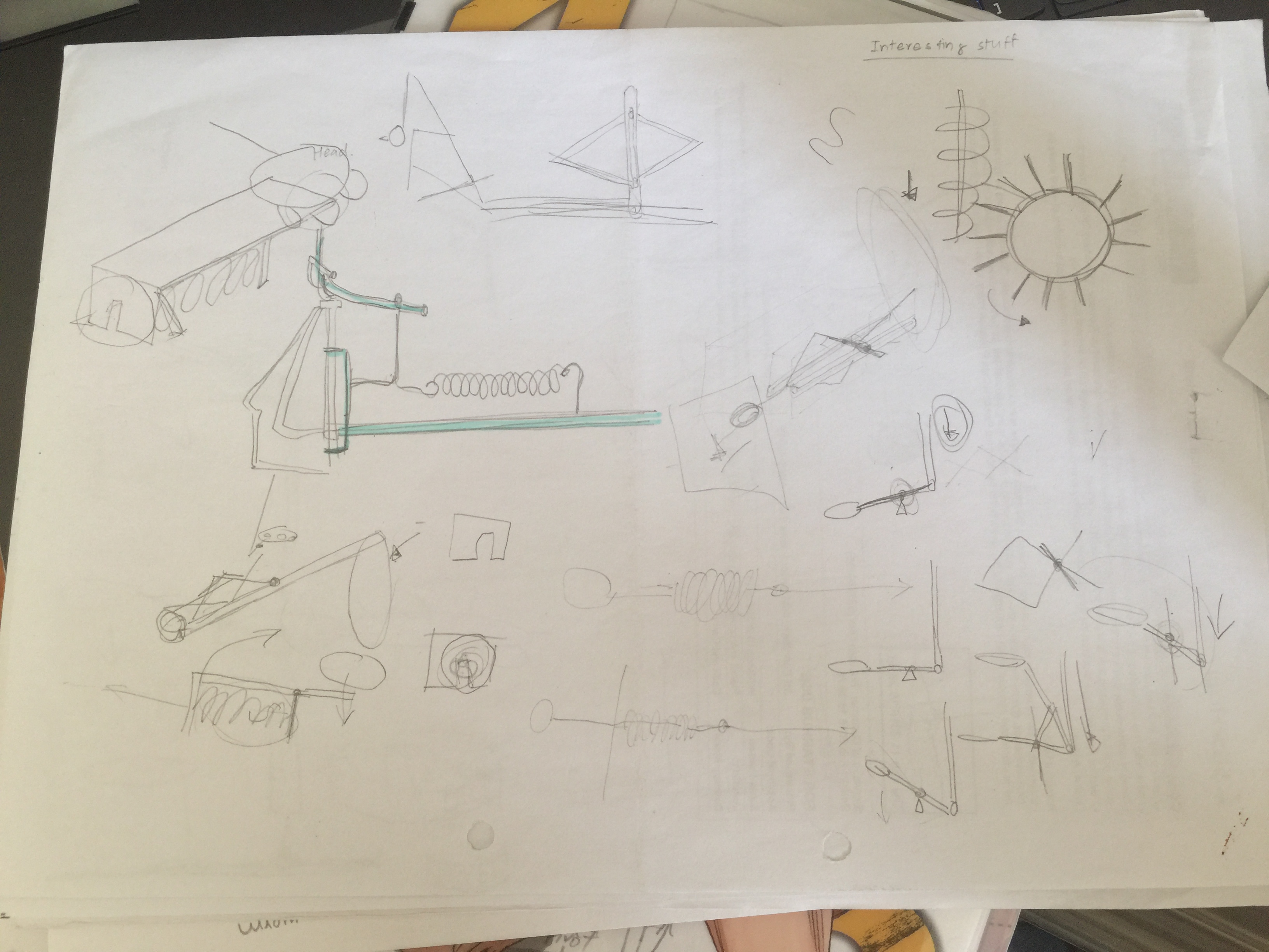
This is one of our initial sketches to make a rotating object that pierces through the paper.
Initially we wanted to make a bird that pierces through the paper, tearing it.
the video of the final. this was after the sticks spoilt so it’s not exactly working.
Ps sorry for uploading this so late, I had problems with the upload of pictures and some pictures i don’t really know for what reason, would not upload at all. so these pictures are only a fraction of what I want to show.
Over the holidays Ill continue working on it and making a better model.
I have considered many options for what I wanted to do.
Horticulturist:
A plant expert who could be a landscape designer too but focus more on the plant aspect.
https://www.sokanu.com/careers/horticulturist/
At first, I thought of using this type of terrarium to create some shapes of the letters.
Game designer:
There is this game about puzzles called the room and there are these intricate wooden puzzles in the game. that’s why I have decided to use the concept to design my letters but Mimi had told me to use more common and popular examples.
Below are some pictures of
That’s why I decided to base my drawing on monument valley instead, with the bright colours and weird perspectives.
Children book illustrator:
Jimmy Liao has an art style that I admire, that’s why I decided to include him. but my design is partly based on his whimsical style.
Sculpture:
this idea came later when I saw a video online:
I had wanted to do on 3D modelling before but I thought it would be fun if I could play around with the shadows of a 3d object.
Process:
I did most of my things in school as my photoshop keeps crashing on my computer, making me lose all my progress which is why I do not have a record of my peer feedback, nor the teacher’s feedback. :'(
These are my initial designs:
I emailed mimi and she replied this:
I would concentrate on making sure the letters are visible through the transformation of the images into letterforms.
Also, take note that the kerning/spacing in between the letters does affect legibility. You should first type the letters using
a typeface and adjust the kerning, then layer over it with your design once you feel it reads nicely.
She told me that she can’t read the letters at all because she’s distracted by the hands. There are a lot of different ways
to transform a typeface, and she did see it in my first design.
she gave me this link to the timeface typeface. It is an interesting font which gives the anatomy of the alphabets in a different manner.
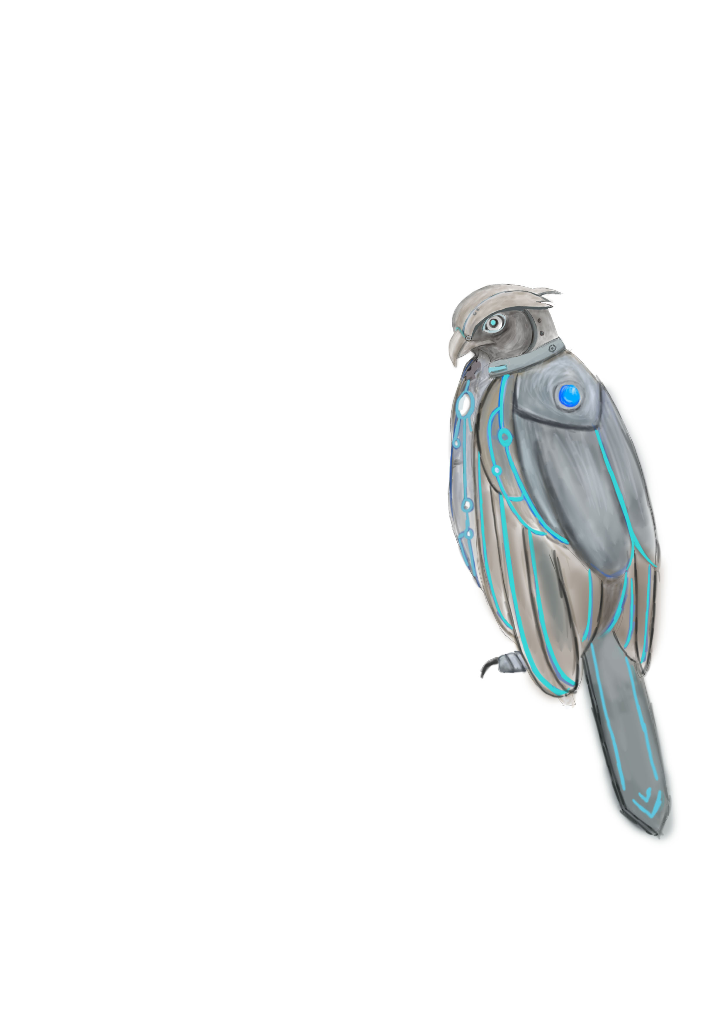
Today is my birthday. I went out into the ocean, through the escape tunnel I found yesterday which seemed to be abandoned by the army. As soon as I opened the airlock and swam out, what met my eyes was the scene that the GSA has kept from us. The city that we lived in was covered by a huge glass dome, keeping the water out. I still have a hard time believing that it was the same city that I have grown up in, but there is no doubt about the GSA submarines patrolling the parameter. The tunnel led to a shallow trench far from the city dome, that’s why I wasn’t discovered by the authorities. I swam slightly further from the city, and I made another discovery…… CORALS! I was met with an entire coral reef, of which I have only seen in books. I have never seen something so beautiful in my life. The ecosystem that was said to be destroyed a long time ago was right in front of my eyes. I swam above the coral reefs just to get a good view of the natural beauty. A spark in the middle of the coral reef caught my eye. I swam down to see what it was. It was a pendant lying on the rocks. I thought it was weird that the metal on the pendant didn’t corrode due to the sea, so I bought it back with me. After that my oxygen was running out so I headed back home. I think I’ll tell Rose about my encounter tomorrow in school, she likes this kind of stuff.
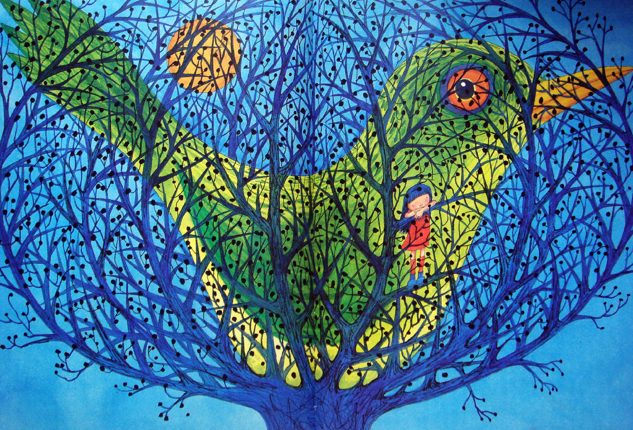
Jimmy Liao is a children’s book illustrator. His colour schemes are able to bring out the mood of his drawings very well. He uses a combination of ink, watercolour and pen.
In this picture, he uses blue and yellow as the main colours and also a slight tint of orange to create the contast.
This was my inspiration for the cage in the final work.
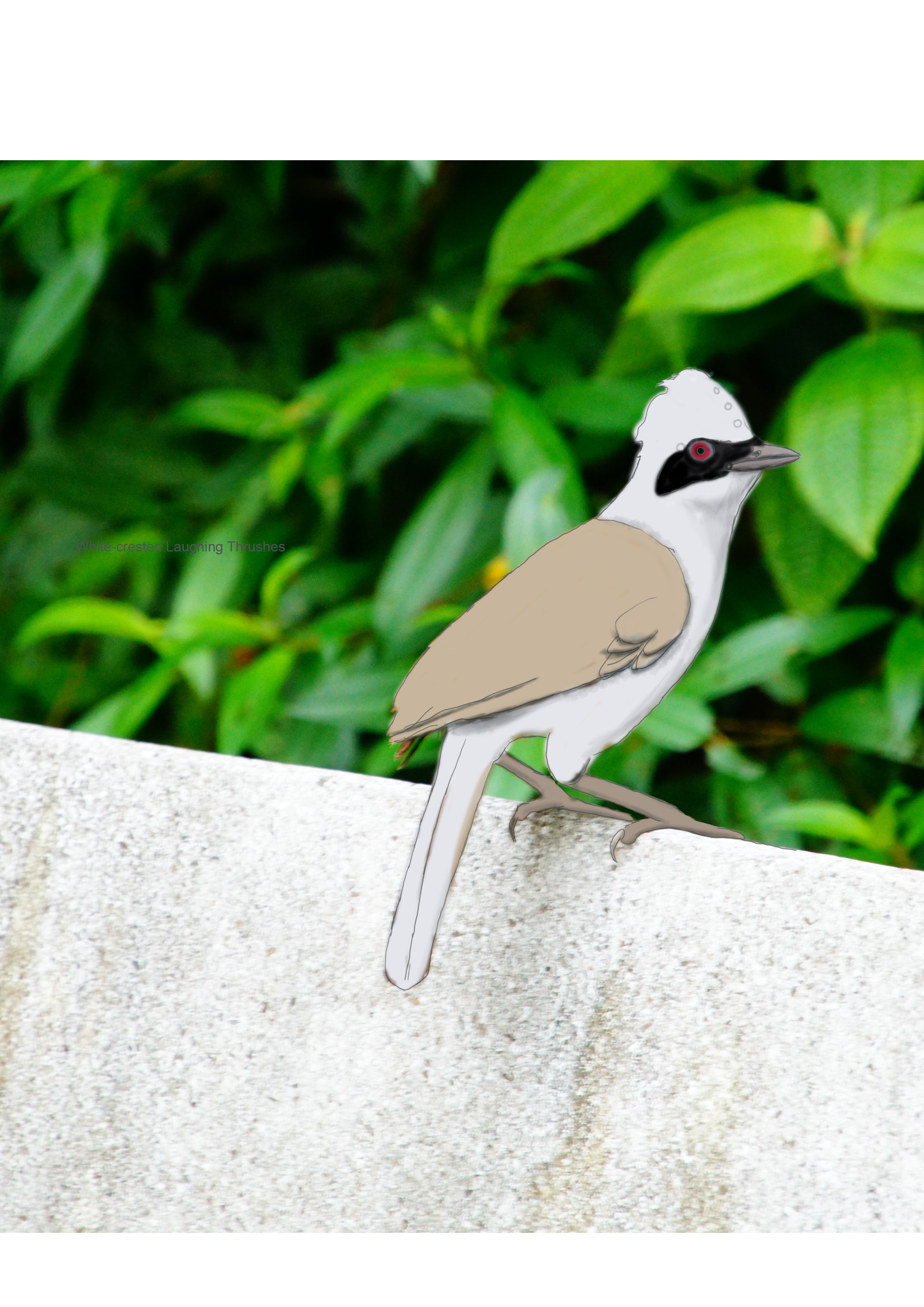
At first I wanted to use fish to represent school but mimi had told me it was inconsistent so I had used a flock of birds instead to add the tree in.
The design was changed as I thought that it was strange that the food went sraight to the stomach not the mouth.
At first, I wanted to use complementary colours in separate pictures the combine them in the last picture but I realised it couldn’t work. It made the thumbnails become separate so, in the end, I used the same colour scheme for all the pictures.
i had a hard time deciding which colour I wanted to use for the last one in the end I chose green and vermilion which gave a huge contrast to the mood and I had also changed the design to yin yang because it symbolised patience.
Stenberg Brothers’ Poster for Buster Keaton’s 1926 film ‘The General’
they have this realistic yet retro style to their work. the way they put the images together is also interesting.
Crafting ideas:
The drafts were first done on paper. I wasn’t very inspired by some of the quotes so there were some designs that I felt weren’t creative enough.
I then recreated some designs on my computer.
We don’t discuss the future here we enjoy living in the good old here and now.- ms peregrine’s
this design was rejected since when I went to consult Mimi she said It does not look very eye-catching and interesting.
there was one design I had wanted to do but it was quite difficult.
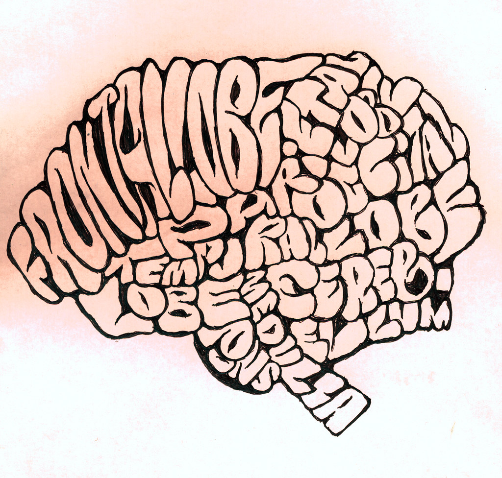
I wanted to recreate something like this:
but the end product didn’t turn out well.
It did not turn out looking like a brain. This was for the quote “I’ll show you how valuable Elle woods can be” but in the end, I didn’t use the quote at all.
the four quotes I chose, in the end, were this four:
Silk screening:
I had to redo it a couple of times since the ink smudges and the eye of the turtle couldn’t be seen but other than that I was quite successful and only wasted one tote bag.
Shown below is the final outcome for the mark making project. Most of the artworks are made using newspaper and all of them describe how I feel about newspaper articles.
The first one is about the guy who got bitten by the bear. I was a questioning why people keep ignoring the safety procedures of safari parks as this is not the first time that happened but my first impression was that of disbelief as I didn’t think that after the incident where a tiger bit a woman to death, something like this would happen again. I’m also disgusted by the article but amazed/ surprised that the bear could be so fast as to bite a person from a moving car.
The third one is done on a cut out of the stock page. My brother is very into stock recently, so I was worried that he would get addicted. and when you’re worried you feel like you have strings tied in your heart so I used strings to make the pattern.
For this second board, I wanted to shine a torchlight through it and show the different textures of the plastic and the uhu glue I had used to secure the last piece. For the first one, I used the leaf of a herb. and as my grandfather is a farmer, this is quite nostalgic to me as my dad had transplanted this herb from my grandparents’ garden. For the second one, I don’t like any articles talking about the economy and finance so I tore it to fine pieces at a fast speed to make it look like agitation. the difference between the third and the second one is the speed of tearing, the third one I tore it slowly to show more sadness rather than rage.
 F
F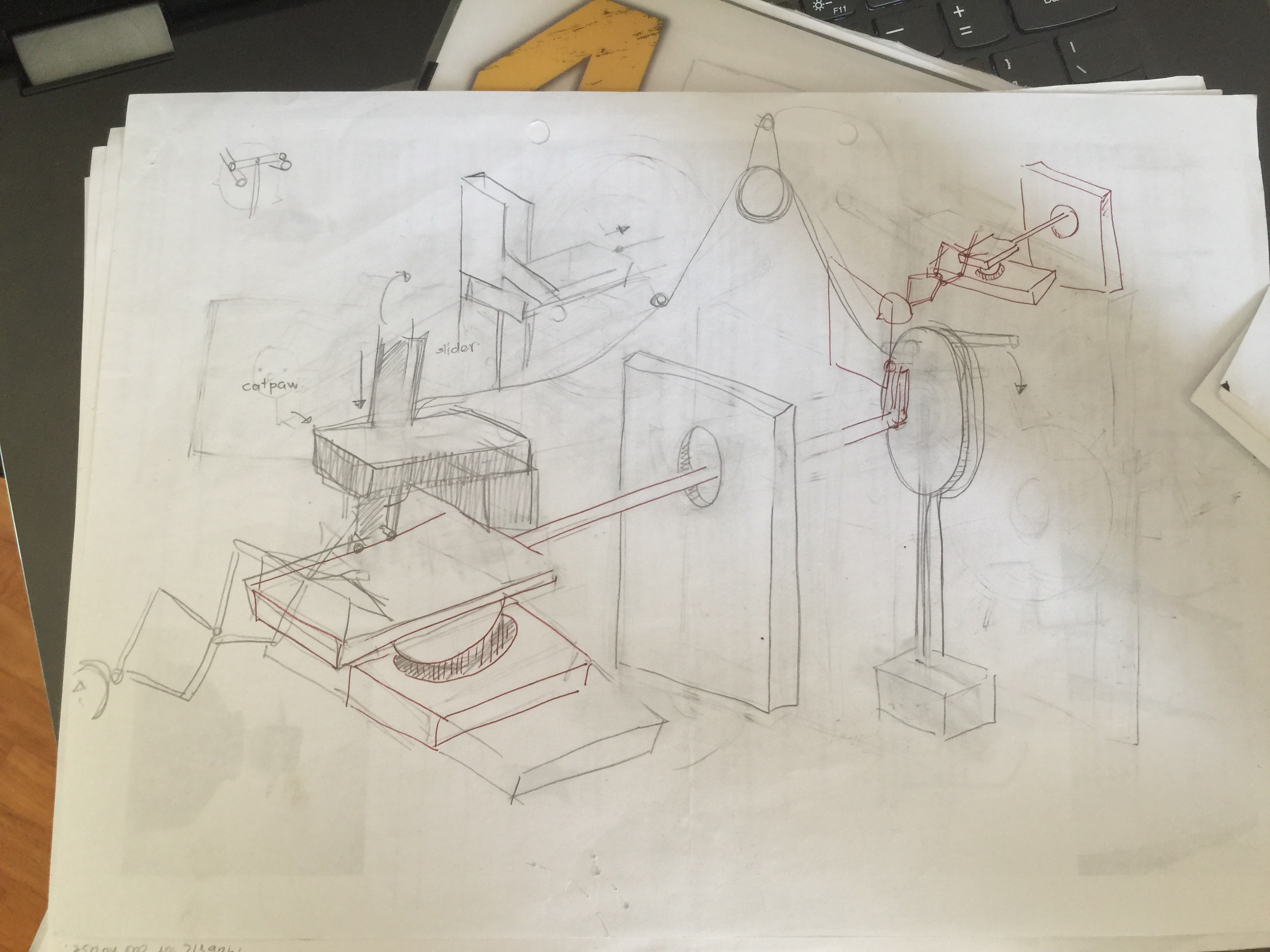

/cdn.vox-cdn.com/uploads/chorus_image/image/45224546/monument_valley_hero.0.jpg) Children book illustrator:
Children book illustrator:


 For this second board, I wanted to shine a torchlight through it and show the different textures of the plastic and the uhu glue I had used to secure the last piece. For the first one, I used the leaf of a herb. and as my grandfather is a farmer, this is quite nostalgic to me as my dad had transplanted this herb from my grandparents’ garden. For the second one, I don’t like any articles talking about the economy and finance so I tore it to fine pieces at a fast speed to make it look like agitation. the difference between the third and the second one is the speed of tearing, the third one I tore it slowly to show more sadness rather than rage.

