What is typography?
Typography – the visual representation/ reinforcement of the written word.
Hence
- Typography is primarily utilitarian;
- Focus: On effectively conveying/ reinforcing the message portrayed by type
- Effective typography > Typography that is aesthetically pleasing but ineffective
Methods:
- Using visual image/ symbols that echo the message
- Unconventional mediums/ presentation
- Playing with colours, shape, scale etc.
Research
Hannah Hoch
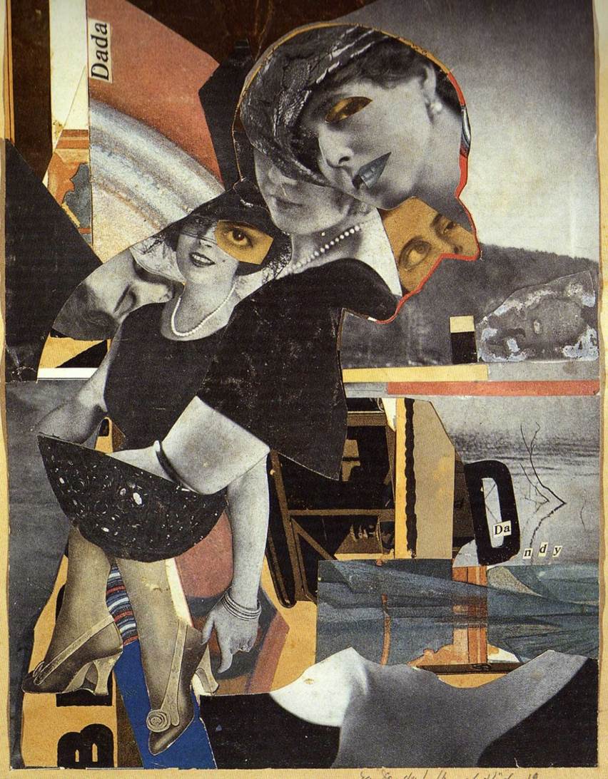
Hannah Hoch is one of the few rare female artists from the Dadaist movement, and as a German artist created many prominent works in response to the the horrors of WW1 and the discrimination she faced as a female in the Dadaist artist community. To me, I like how she pieces together disparate images from various different sources (often bearing no semblance to each other) to convey her message in a unique way.
Having experimented with digital collage last semester, I really liked the process of selecting and assembling images, as well as the end product – hence this might be a possible direction to take for my Project 1.
Handmade Typography
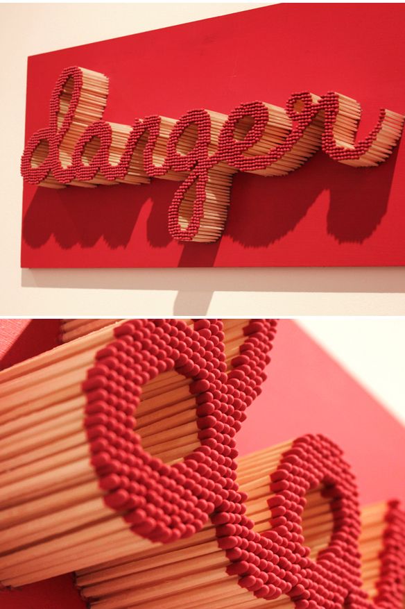
Out of all the different examples of handmade typography I saw online, these few examples stood out to me as the presentation of the type (i.e. typography) was not only interesting, different but also really effective and successfully reinforced the message portrayed by the type.
Hence I feel that for my project 1 to be successful, a clear message needs to be defined, with the presentation of the type streamlined to fit the message – so that the typography does not become a mere gimmick.
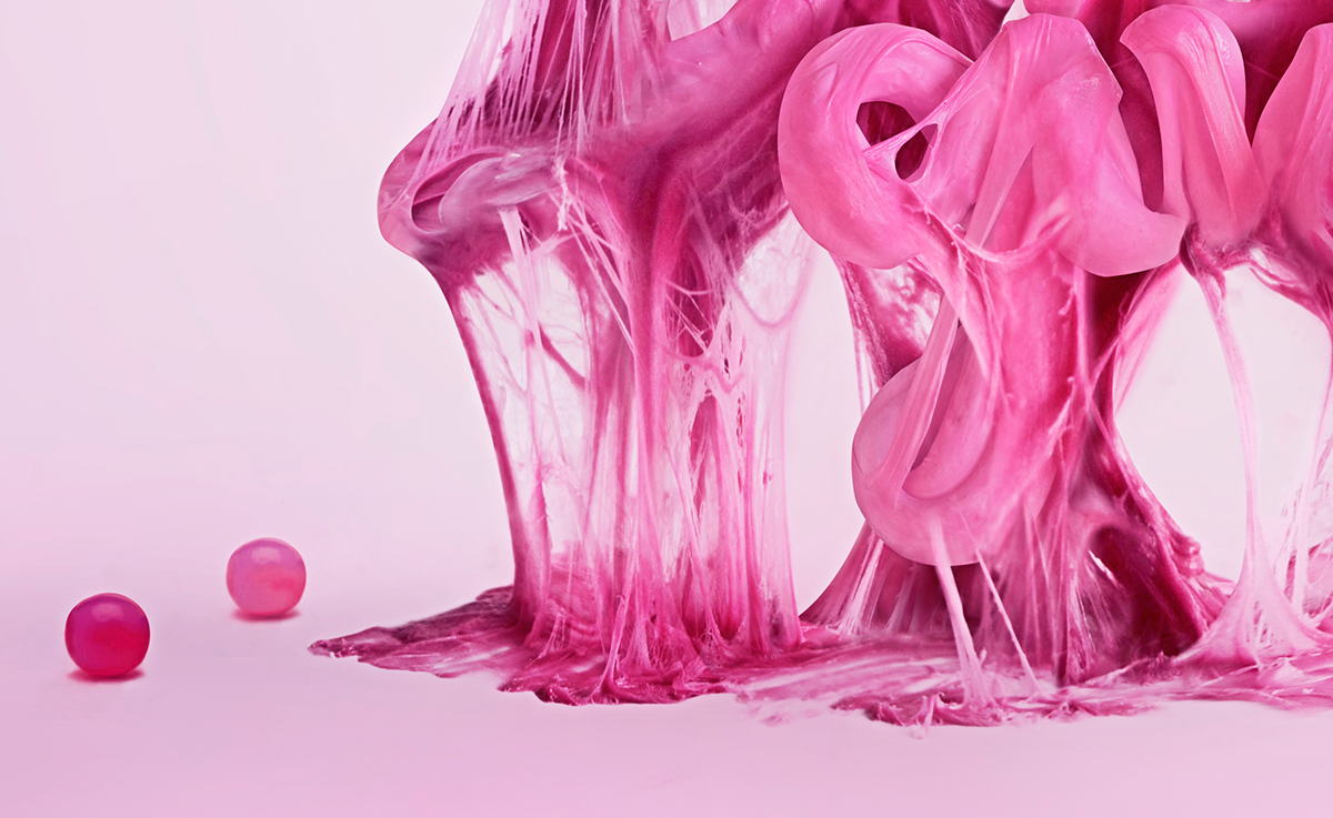
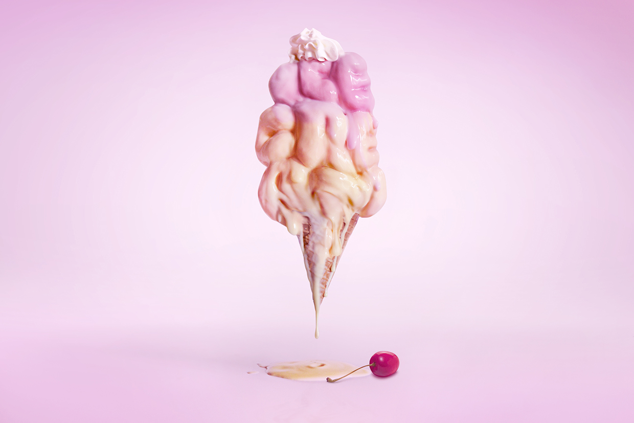
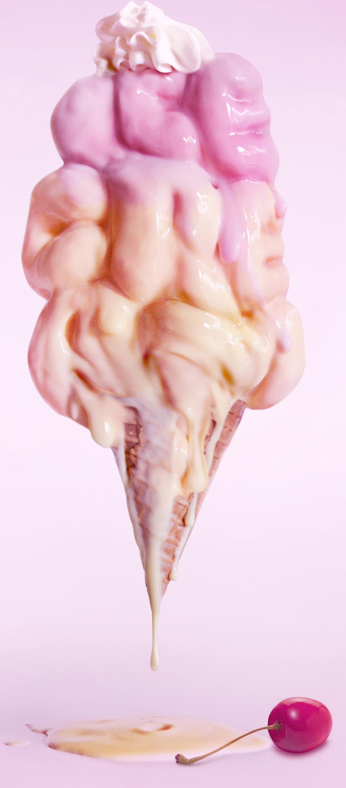
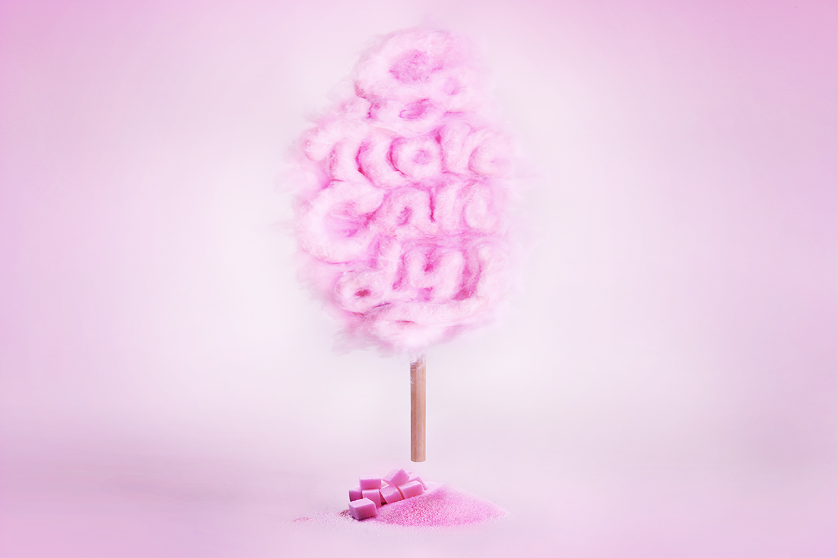
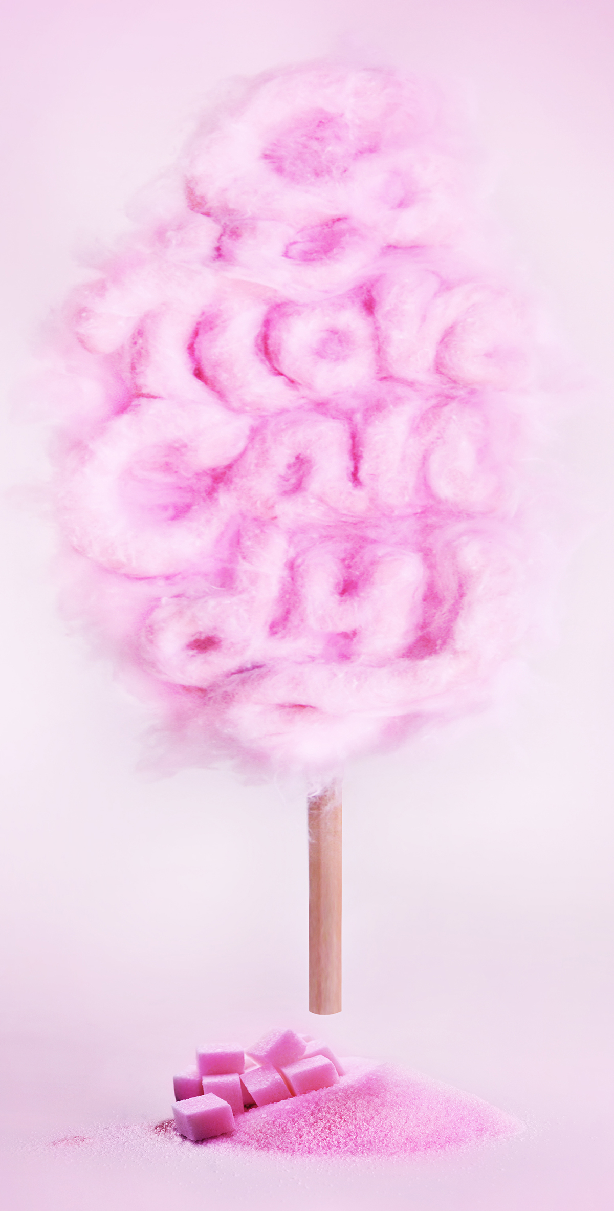
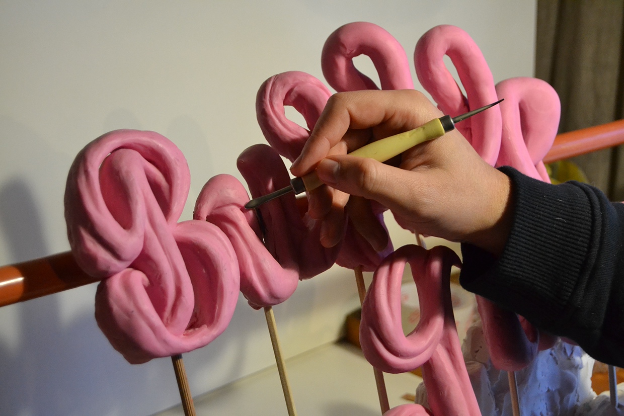
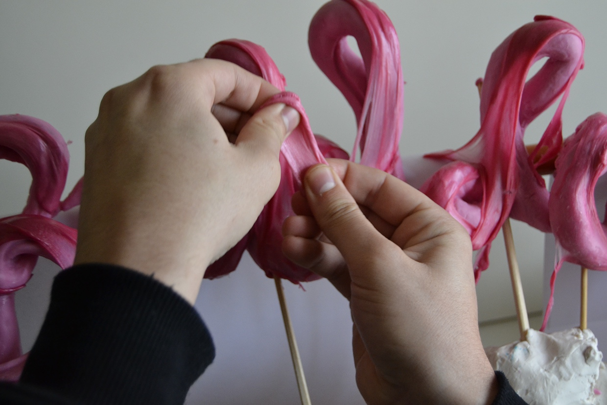
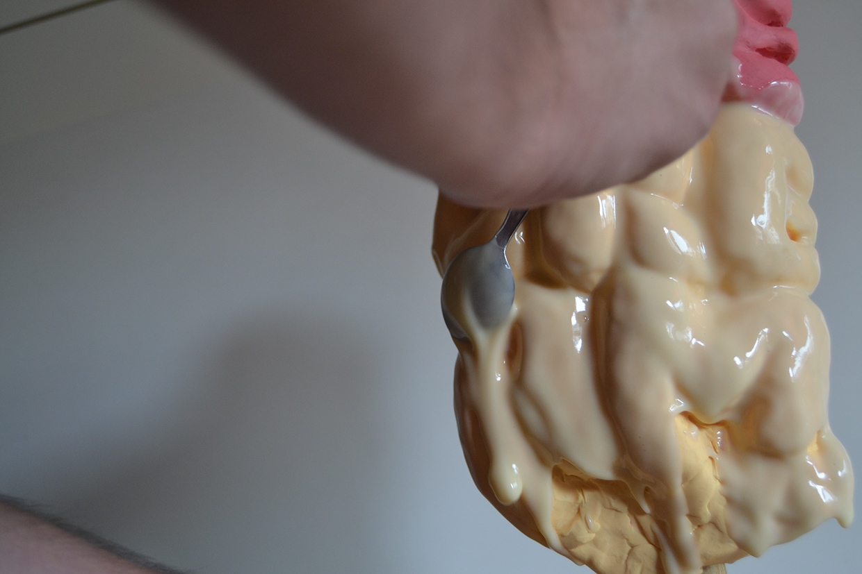
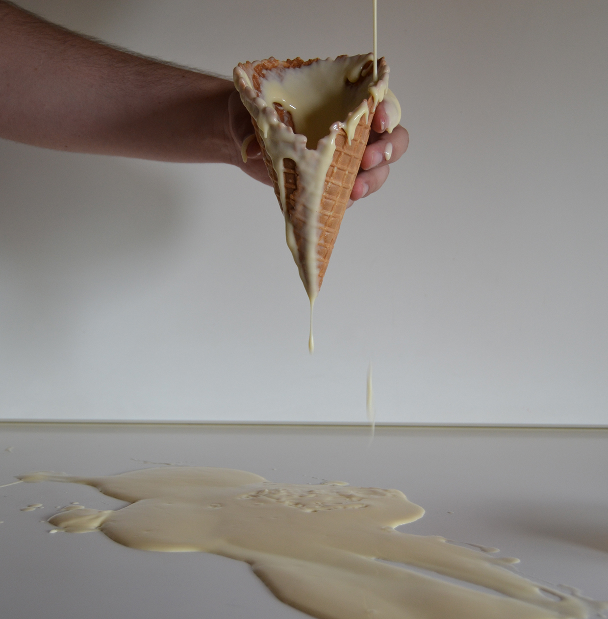
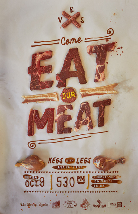
“Do not play with your food” #1 SWEETS AND CANDY by Alex Palazzi
Personally, I really liked this project as the focus on recreating the textures and look of the foods in the typography made the text more tangible and real to the viewer instead of being mere words. At the same time, the studio setup style of the typography background with the very consciously chosen colours makes the typography look unreal and fantastical. This creates a very interesting contrast in the portrayal of the words.
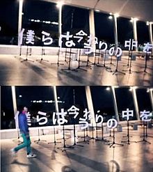
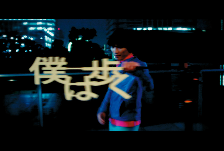
Personally this is one of my favourite examples of typography in video – the joining of seemingly random elements to form the characters creates a constant sense of surprise and suspense for the viewer, and it actually helps to create movement and flow throughout the entire music video. Hence, not only was the typography effective in conveying the song style and lyrics, it was able to adapt to the video format and add to it.
I found it interesting too how the director chose to add various elements of the type together, instead of cutting away (additive vs subtractive) as seen in the meat poster above. Hence, possible exploration can be done in this area to see how it affects the viewer(s)’ impression of the message portrayed.
You must be logged in to post a comment.