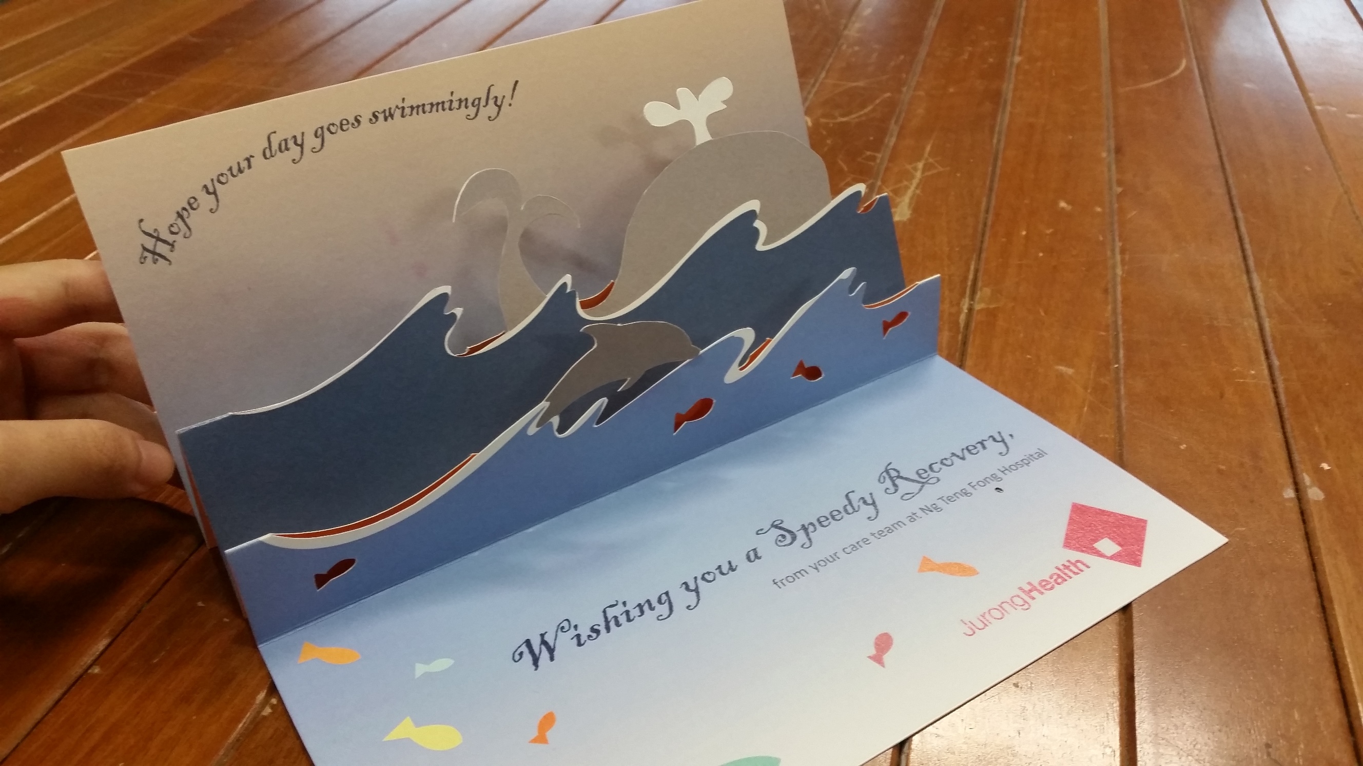
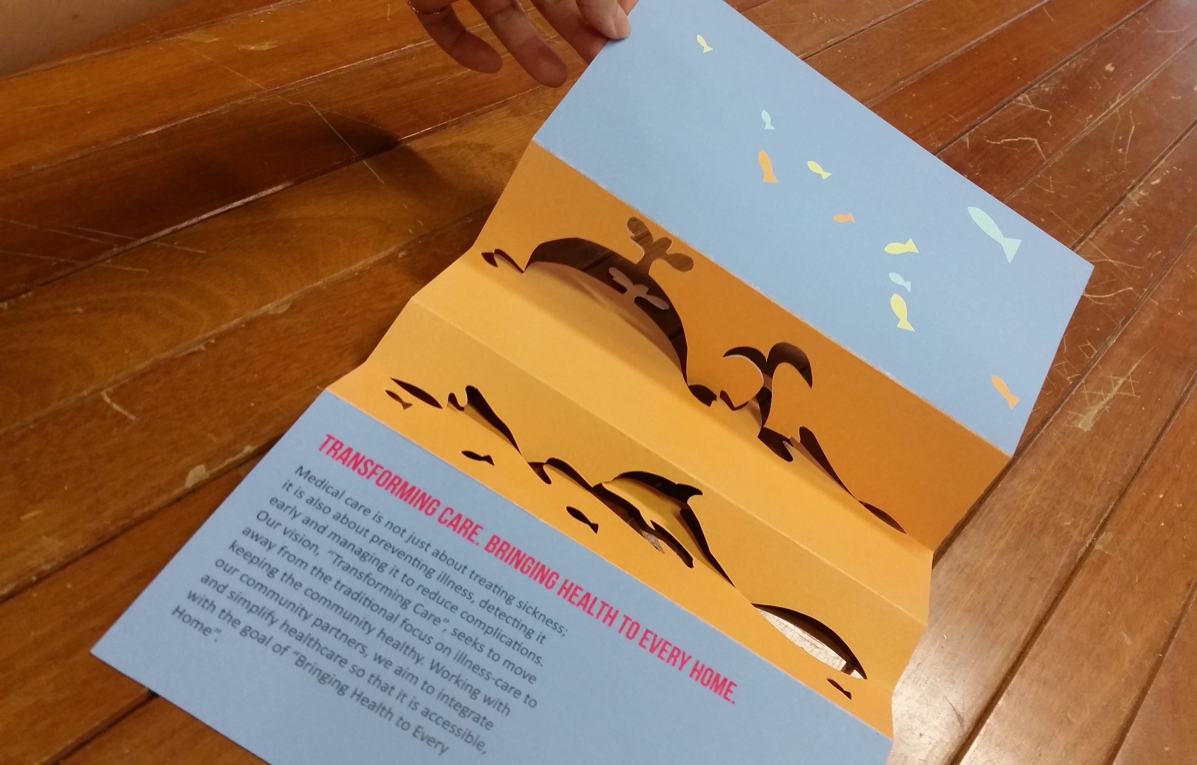
After the second rounds of feedback, I mainly worked on tweaking the graphic elements e.g. the position to keep the mechanism secure, the colour to ensure proper contrast in printing, text kerning, placement and size to ensure higher readability. For the paper stock, I went with a slightly textured, matte card as I like how the paper created a warmer and more homely feel to the design, (hopefully) making the viewer feel more at home and happy.
front
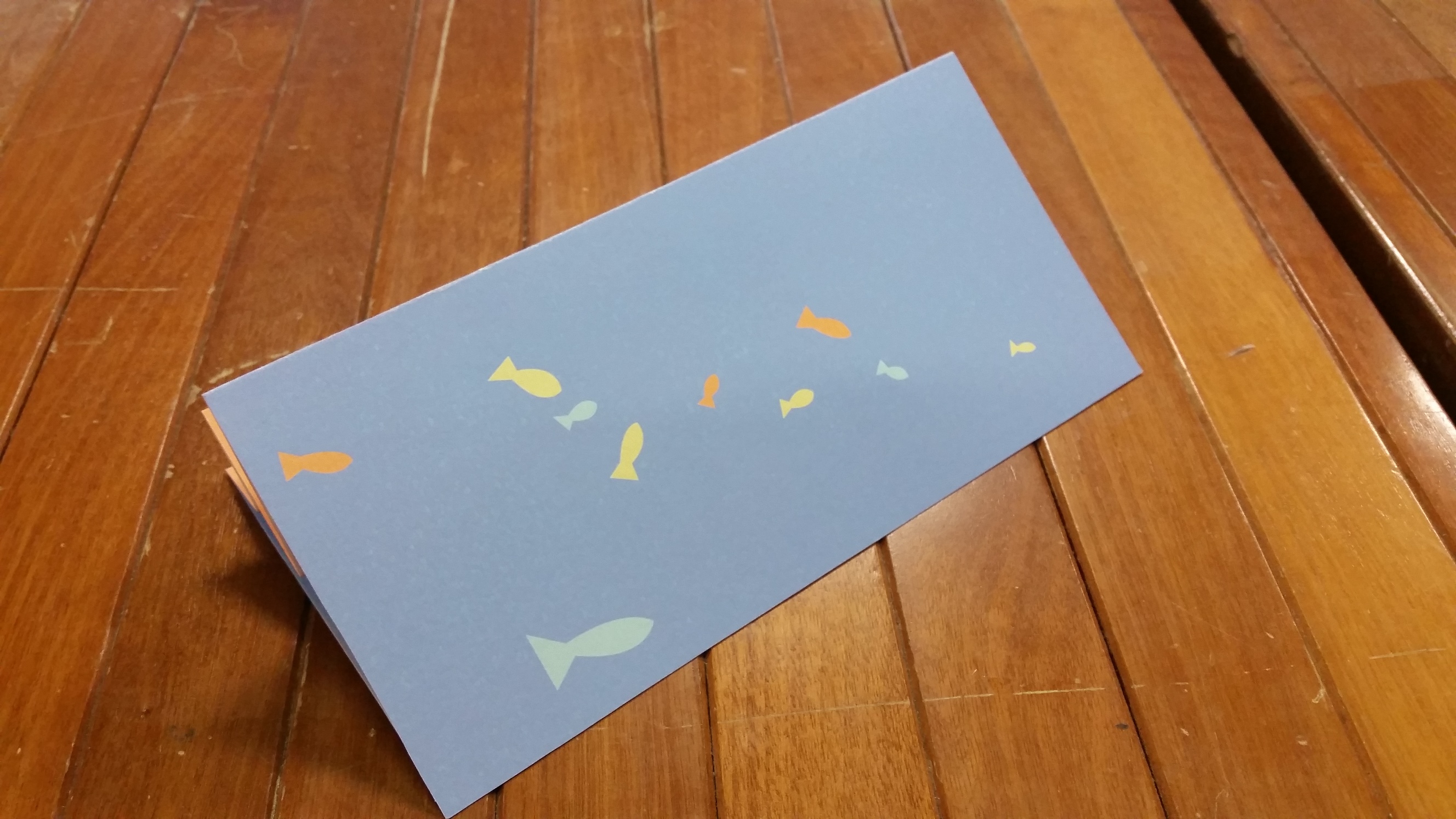
back
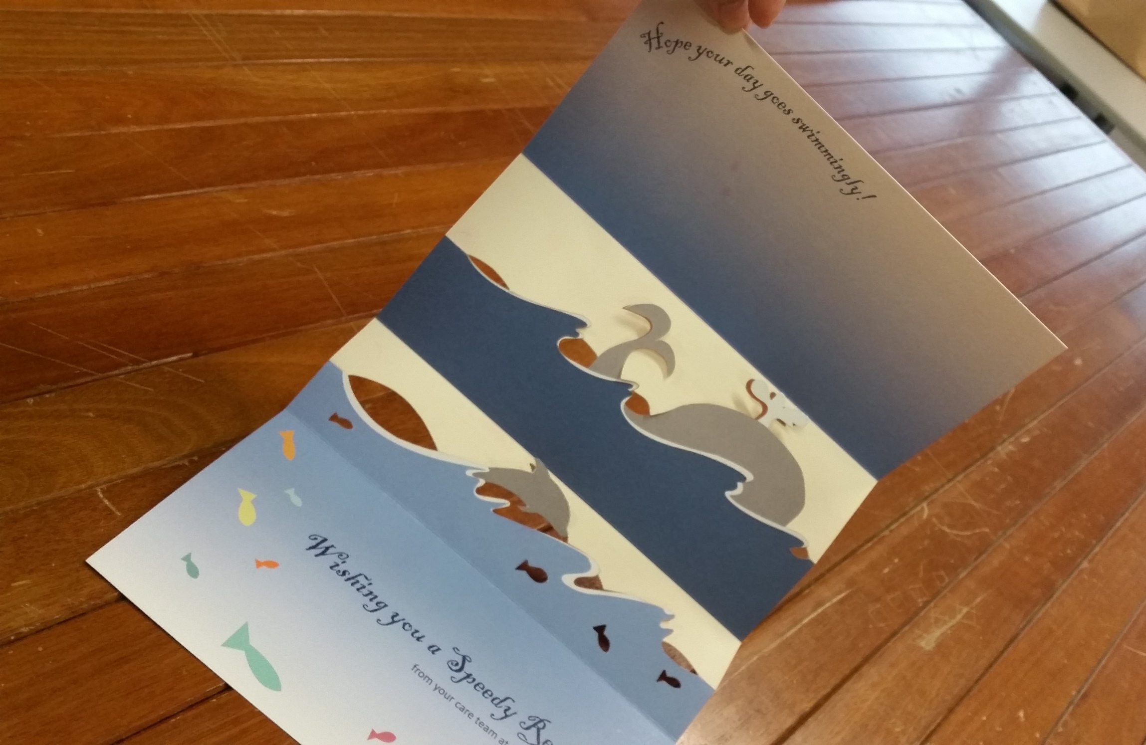
inside (fully extended)
outside (fully extended)
Opening mechanism:
You must be logged in to post a comment.