EGO
Final Designs

Inspiration
To start off this project, I first took inspiration from Pop-ups. They were something like this.
Pop – Art


This really sparked my interest for the project but over time, i realised that it was tedious and was not that feasible after all. As such, i looked at digital manipulation.
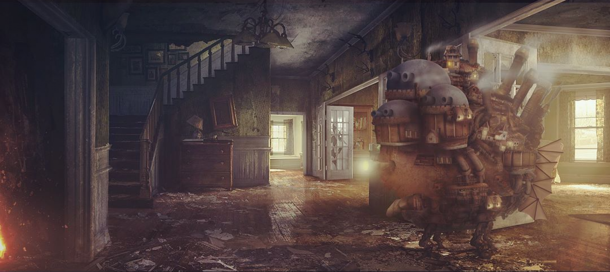
Digital Manipulation
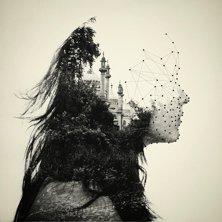
Dan Mountford
Based on a series of camera exposures, Dan manages to create the blending of several images into a figure of a woman. In addition, the vector graphics help tie the structure together.
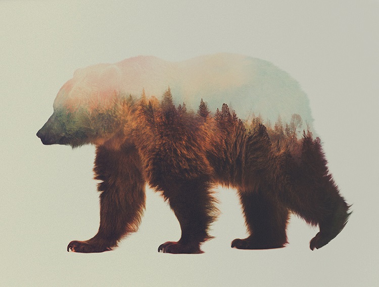
Andreas Lie
Andreas Lie uses double exposure landscapes to add unexpected texture to the bodies of animals, inspiring a sense of adventure and travel.
With that…
Some of the earlier images i produced…


But i didn’t really like the result as i felt that something was lacking. As a result, i turned to something more fun and interesting.
Flat Design/ Minimalist

I tried out a few a and i really liked like this style due to it being my first time using illustrator to create an artwork and the fact that flat design style created a sort of whimsical and Tim-burtonques feel in which is suited to my style.
In addition, i wanted my theme for the entire project to revolve around flat design. This is quite a challenging thing for me as usually, i love to jump around mediums and just end up with a lot of variations.
To simplify, my theme is to keep it simple and effective…
Colour Harmonies
Analogous Harmony color palettes: 


I really like the usage of pink and blue so i decided with those two being the main colors for my project.
Mood Boards

Did not really go for this color style in the end…

I felt that this mood board really fitted the Christmas mood.
Following the concept of simple and effective
Concept
Me + Setting = Outcome/Desired Me

LINE 1

A flat design self- portrait of myself

GOING ON A HOLIDAY
I really loved Paris when i visited her as a kid. Up to today, the memories i spent over there still lingers in my mind. To convey the message of holidays, i wanted to illustrate a place which i treasure and hold dear.
LARK
As happy as a lark, is what i am when i hear that i’m going overseas for my holidays.
LINE 2

ME
A illustration of myself wearing the Kinja drawstring bag that i always carry around.

NATURE
The great outdoors.

AN ADVENTUROUS ME
When i step into the world of nature, i feel that there is a need to explore such a beautiful and vast space. Trails and small pathways that lead to somewhere always intrigues me in a way that i am unable to comprehend. Following a random path to the end brings me great satisfaction as to whatever lies at the end of it.
LINE 3

ME
An illustration of me reading a book.

STUDYING
My studying workspace.

This just happens most of the time whenever i study. I zone out while concentrating and i enter a state of dreaminess. Thoughts just whisk across my head while i stare into the marvels of the empty space which lies before me.
LINE 4

An illustration of myself as a character similar to an epitome of a drained and angry person. It’s nearing the end of the semester and I’m and grumbling and rumbling about work and the hole in my stomach. Money seems to disappear whenever i hold that magic pink bag.

CHRISTMAS SEASON
Do not fear, Christmas season is here!

With so much food and presents, how could someone stay sad after Christmas? It’s the time of the year whereby you get filled to the brim, Christmas carols brighten up your day and the snow just brings you to another dimension of joy and comfort.
Reflections
It’s been a fun and enjoyable project i must say. Colors are an important aspect of design and it plays a huge part in making the picture.
As simple as the designs are, i actually feels kinda satisfied that I’ve stuck to the goal that I’ve set for myself which is to be simple, effective and follows the same theme in general. However the printing didn’t come out as expected as the pictures now run a tad green.
I believe that this project has allowed me to explore into the way colors work and as well as to obtain illustration experience.
Thanks for reading!
I think you did a great job in making it graphic piece of work because it isn’t easy to do that and awesome use of colours too!
Thanks emma!