THINKING PROCESS:
- What name? –> Natalie Sim Tzyy Chyn, Nat, Natalieszqx, STCN, 沈子勤
- Sans serif or serif? What font? WHY
- 4 illogical jobs. Characteristics of the jobs/ imagery?
- Medium used –> Digital or Traditional? Mix? Attention to background detail
SOME ILLOGICAL JOBS:
- Time keeper
- Planet Curator
- Upside downer
- Cotton Candy Topiarist
- Shadow Traveler
- Dragon Tamer
- Cat’s Servant
- Witch
- Snake Skin peeler
- Skin Parachuter
- Rainbow roller-coaster architect
- Android counselor
- Fruit Puncher
Some Questions: Should I approach it on a more typographic style or illustrative (like subtle letterforms)
 ANSWER: Typography assignment, so the typo should be obvious and the main focus. The typography should be fonts that adopt the characteristic/elements of another thing, instead of being a direct image of the warped thing.
Below: rough scribble of what I learnt from first consult

———————-
TYPOGRAPHY RESEARCH:
url: https://www.youtube.com/watch?v=wOgIkxAfJsk
WHAT I LEARNT:
backletter- first ever typeface, modelled after scribes. thick vertical lines, thin horizontal connectors. V dense and squished when printed
roman type- Straight lines, regular curves-> clear and legible
Old style- thick serifs, low contrast btwn thin and thick strokes
Transitional- thinner serifs, higher contrast btwn thin and thick strokes
Modern- very thin serifs, extreme contrasts btwn thick and thin strokes
Sans-serif:
Futura- geometric sans
Gill sans- gentler more natural curves, humanist sans
helvetica- has simple curves, available in many diff weights
computer now allows ppl to create their own unique typeface
JOB SELECTION AND BREAKDOWN:
((PLEASE RIGHT CLICK AND OPEN IMAGE IN NEW TAB TO SEE BETTER ! ))


CONSULT 1:


After consult, I realised that my design ideas were not exactly what was expected. They were
too illustrative, and not all elements of my job would be encompassed in the font itself.
Or it was placing things ontop of my typeface/ placing it in things.
CONSULT 2:


Now that I better understood what I was supposed to do, I identified the elements related to the job and
tried synthesizing them onto the font. Brainstorming composition of elements to present my final font design.
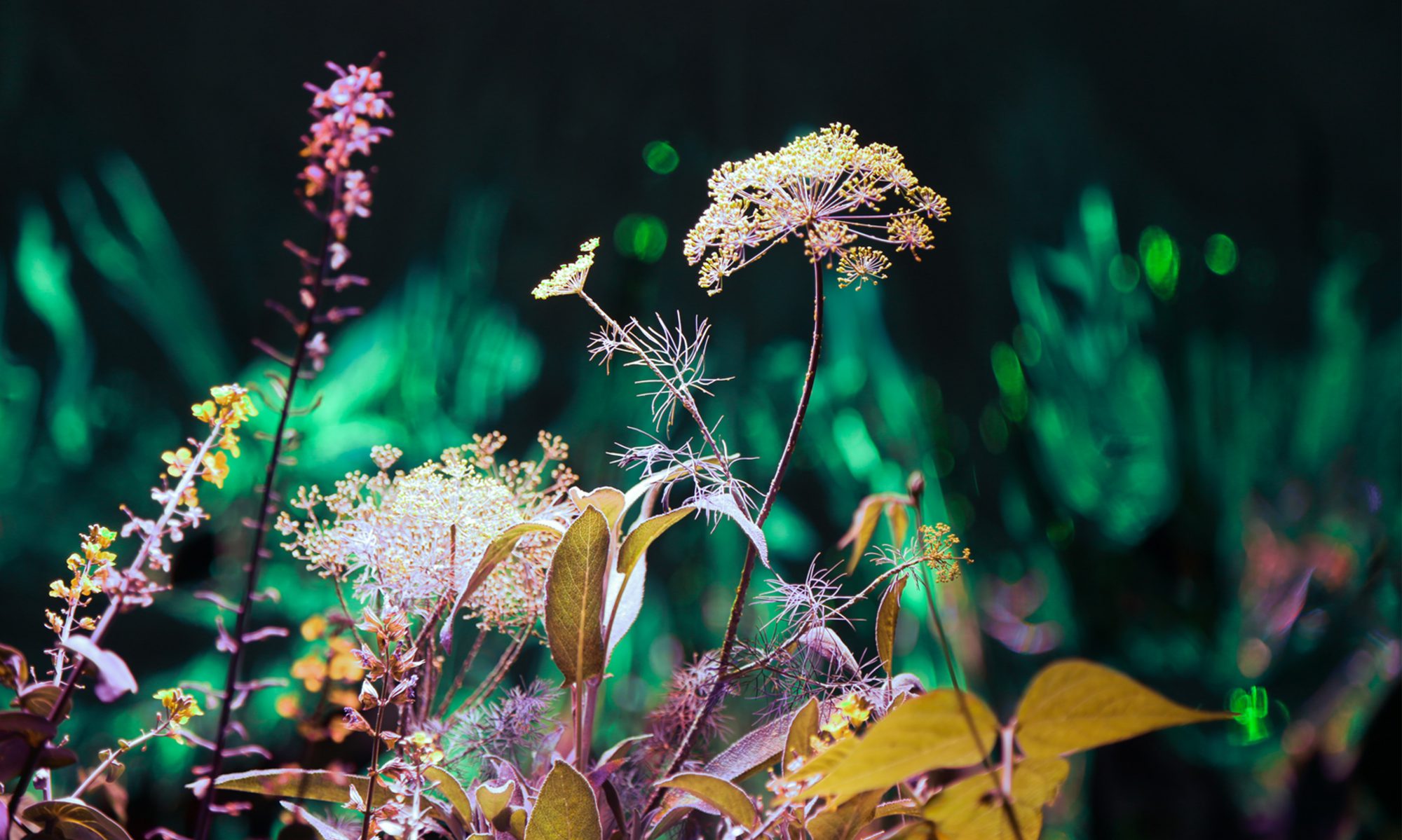
DESIGN #1 – JELLY SWIMMER :


Tried using Photoshop 3D extrusion, but I think self drawn typeface was nicer in the end

choosing an appropriate background. Perspective of font on plates would fit
the second bg better, but I decided to go with the first as the swimming pool
tiles are more subtle than the pool itself. Suggestion from Shirley: make the
tiles smaller, so its less distracting


Playing around with the composition of the objects in the jelly, and then
editing it so they look like they are inside the jelly. Finally, adding highlights
to the jelly to make it more shiny and smooth, important elements of jello.
FINAL:

Final design's (2nd image) background slightly darker to bring more emphasis to the words.

DESIGN #2 – TIME KEEPER:


Trying out different ways to position the alphabets and make them interact with each other.
Last image is me realizing that I didn't leave enough breathing room for my font, and it
was just an awkward slight crop, so I decided to zoom out a bit


Trying out different backgrounds
FINAL:

Playing around with the composition of the side cages to
find a more balanced composition to reach my final (2nd one)

DESIGN #3 – SNAKE SKINNER :


Initial background idea- silhouettes of snakeskin products, mainly shoes and bags. Last image is trying out a darker bg instead of white


Printed the grey NS then drew scales over it (Letter S), and
scanned. Then redraw digitally. Or could just do a masking
(Letter N)

ARTIST REF:

Okay, this isn't really artist ref, but I was kinda inspired
by peel to reveal stickers. So my presentation would be peel
to reveal more snake layers under.

Initially wanted to use a crumpled/folded and torn piece of tracing paper as snake shed, but scrapped the idea as there was too many layers


Bought like mounting tape, so that I could make the first layer
popped out from the last layer, but in the end I didnt really like
the effect it gave. So I stuck to just sticking the papers directly
onto each other without any elevation


Physical cut out product and the individual digital layers (flesh and bone)
Thinking back now, I'm uncertain if Shirley will accept my element of peel
(action) as being part of the typeface. But I would personally think it is
acceptable as if I didnt present it as such in the different layers, I would
have just combined the peeling and layers into one plane/frame, and just like
digitally draw the first image. So its the same thing? Like showing multiple
photoshop layers versus merging them into one ahahahah
FINAL:
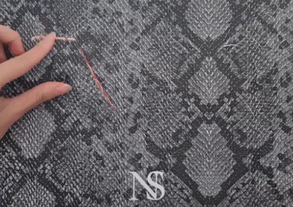
Finals (first image physical presentation). Second image is
just to clearly show the different layers.

DESIGN #4 – DRIFTWOOD MUSHROOM URBAN PLANNER:


I liked how Z and N can be used interchangeably, so I was trying to incorporate that into my composition
 (some experiments when my original idea was driftwood mushroom shaker)


Initially wanted a more subtle show of the element mushroom
by using the gills of a mushroom,and trying to tie it to
urban planning as the gills also looked like the lines on town
plans, but to be honest, due to time constrains I was unable to
develop this route more, and I thought that it might be a bit
too forceful and too abstract for people to guess my job.
ARTIST REF:

Adopted Samjith Samz's matte painting style typography.
He uses realistic texture on his typeface, and realistic imagery
on the face of the font, coupled with dramatic lighting to create
this fairy tale looking design.


ZQ and Nat


Trying out a background. I think the first image, my gif
is not working, but its supposed to show how I made the wood
have a yellowy hue, so the last background matches with my
colour palette more. But I thought it was a bit too
distracting there, so I shifted the colored part to the top
left (Final below).
FINAL: 

OVERALL:
|
What was the difficulties you have faced during the thinking and making of this project and what did you “take away“? |
Thinking: It was really hard to grasp what was the “correct” approach to dealing with this project. The forcing an obj into the shape vs applying elements of the shapes were super similar to me at first, but the more Shirley explained, and the more I tried different designs and ideas, I eventually got it in the end! And I’m glad I was understand this method in the end, because its a much more unique way to present your typeface, and it can also be applied to other forms/works of art too! A beneficial skill.
Another difficulty during thinking is deciding the elements of the job to put in. Should I be literal and use the thing itself, or should I be more vague and use objects associated with but not represent the thing. I think that although I tried to have a balance of both, my works were leaning more to the literal end as I was afraid it would be difficult to convey the message of an illogical job to the viewers.
Making: I think that the process of making my works was relatively more smooth sailing then the conceptualization process. But because my elements were quite literal, the hardest part would be trying to make them look realistic or capture the essence of the object properly (my jelly, the showcase, mushrooms, flesh, etc..). But with more practice and experimenting around on my own, I was able to get the hang of photoshop 3d extrusion and like illustrator as well.
Takeaway: Honestly, I think looking back is also one of the most difficult things of any project. Like I think I like the works I’ve produced for this project, and I am a little proud of them. However, I’m always worried that I may have strayed from the project brief, and I notice all the “wrongs”, that I couldve worked better on. Looking back, I’m afraid that my designs might be considered a bit too complicated? especially for my backgrounds as well.. But overall, I learnt a lot about typography and image making to convey a message through this project and hope to do better on my next!! 🙂
Thanks for reading !
PDF of my writeups incase the images above are not clear enough: TYPO