Foundation 4D — Dérive

Foundation 4D — Dérive

Our second assignment for Foundation 4D is to create a psychogeography map using images from the location allocated by our classmate, showcasing it together with a 3-minutes audio clip to enhance the experience of the audience.

Psychogeography and Dérive

Psychogeography was a term invented by Guy Debord in 1955, with inspiration from a French nineteenth-century poet and writer Charles Baudelaire’s concept of the lâneur – an urban wanderer. With this, Debord suggested playful and inventive ways of navigating the urban environment to examine its architecture and spaces. Psychogeography is also defined as the “specific effects of the geographical environment on the emotions and behaviours of individuals”.

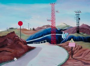
Hence, the dérive was invented as a critical tool for understanding and developing the theory of psychogeography. It continued to be a critical concept in the theories of Situationist International, an international movement of artists, writers and poets who aimed to break down the barriers between culture and everyday life. dérive explored ways of unleashing the subconscious imagination of the individuals. An early example of this concept could be La Route des Alpes,1937,  a painting of Tristam Hillier.

Tristam Hillier, La Route des Alpes, 1937


Dérive: “A mode of experimental behavior linked to the condition of urban society: a technique of transient passage through varied ambiances.”  Situationists used “ambiance” to refer to the feeling or mood associated with a place, to its character, tone, or to the effect or appeal it might have; but they also used it to refer to the place itself, especially to the small, neighborhood-sized chunks of the city they called unités d’ambiance or unities of ambiance, parts of the city with an especially powerful urban atmosphere.

Wood “Lynch Debord.”

Artist Reference & Inspiration

Yellow Menace

Yellow Menace is a Japanese-Canadian art vlogger who based in Canada, Korea and Thailand.


Marie Korjaz

A project by Marie Kojar to explore how human and nature can blend together in a landscape, merging into a new genetically engineered ‘natural factory’ for luxury goods, masqueraded as a revamped ‘eco-industry’.


Revisiting My Childhood Location – Sembawang Park

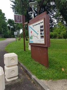
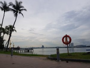
This is the park I have been going to since young, however, I have stopped going there when it started to renovate in 2012. Sembawang Park is located away from the city, which also has a beautiful beachside and also a popular fishing ground.


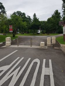
As I have not visited the park since it renovated, I chose to follow the path from the entrance of the park. As I went to the park around 4pm in the evening, I did not expect the park to be crowded with people. Many people are gathering at the fitness corner and playground, while some of them are setting up at the barbeque pit.

Ideation Of Concept

In my memories, Sembawang park used to a park with lots of trees, animals and a windy place. However, during this visit, I realised how things can change just with a single renovation. There are now wider roads for people to jog and walk their dogs, all the trees are carefully aligned along the path. Throughout the whole trips, the park felt too perfect for me. Everything is perfectly placed, there are fitness facilities, toilets, benches and table designed for people all around the park.

Even though I understand it is a park, I am sometimes annoyed by all the human noises when I am immersing myself into nature. Sembawang Park felt like a perfectly planned park, with a blend of nature, history and human. But to me, I felt that the park was contradicting and all the elements are invading each other within the park.

Concept 1:

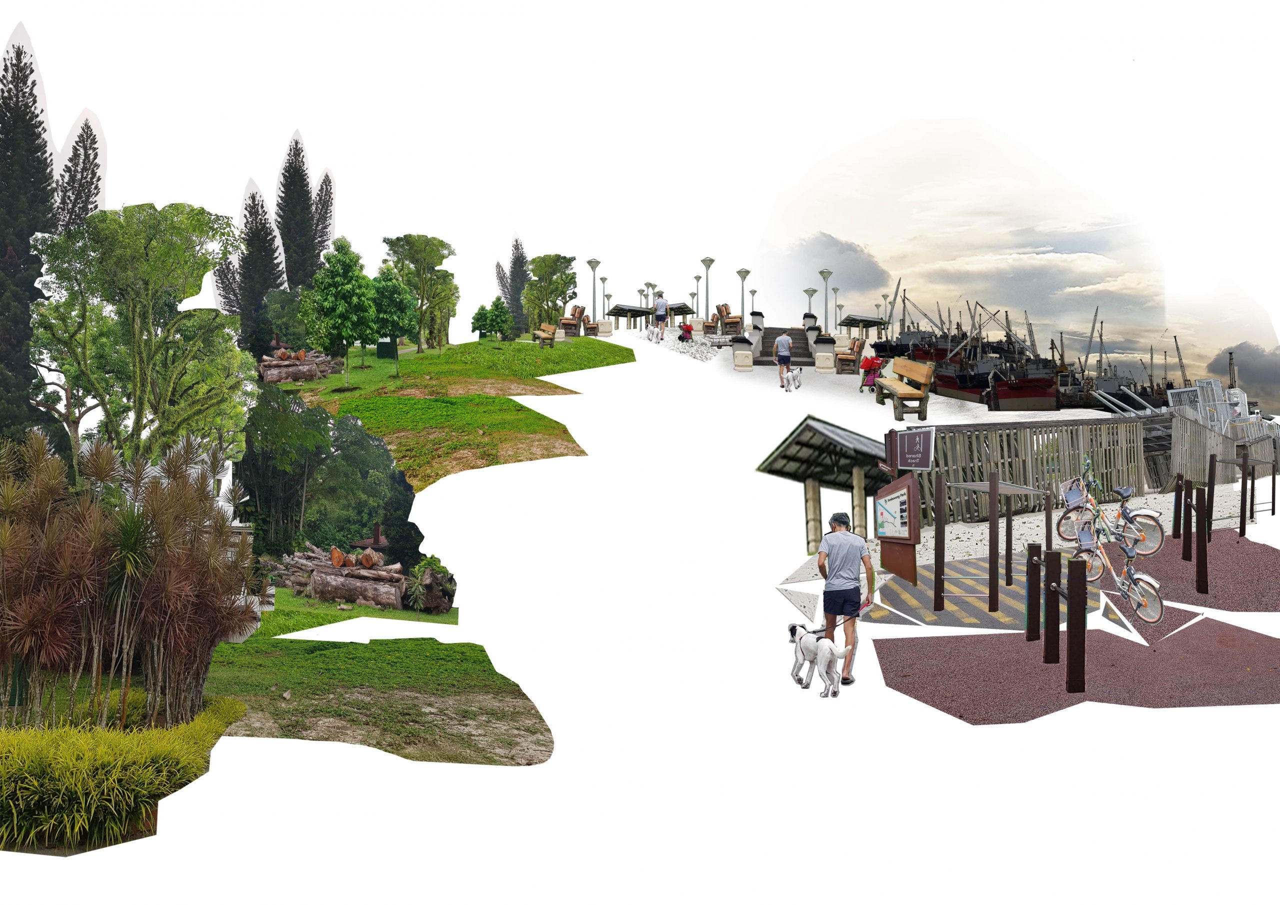
Thus I wanted to showcase in my psychogeography map how manmade structures or elements and nature could collaborate to make a balance within the park. For my first concept, I printed out what interests me at the park and laying it out with some text to describe it.
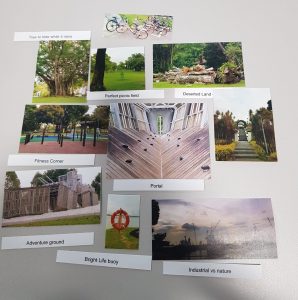
 

Concept 2:

After the consultation with Prof. Yue Han and comment given by my classmates, I decided to go deeper into the concept of how human activities and manmade structures and facilities and nature correspond to each other in the park. I tried to bring out this idea using a spectrum structure for my derive. The picture of a playground section is used as a middle point of my spectrum for its symmetrical balance composition and helping the other pictures to branches out from there.

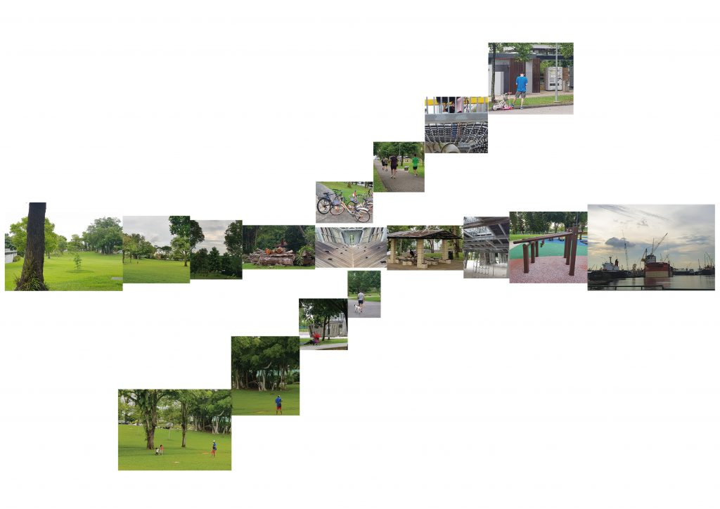
I tried to achieve a gradient spectrum effect in the middle of the paper by arranging the photos according to its size. The left side of the spectrum is the nature side of the park, whereas the right side is leaning towards human activities and manmade stuff. I also showcase how human interacting with both sides. However, I checked with my friends to see if they understand what I tried to portray in this map. Most of them cannot understand the interaction of human and nature in a park and also pointed out how the map is quite confusing to look at as they do not know which part to look at.
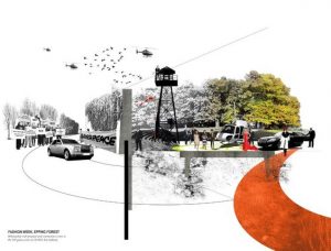
Final Design

Invader of Park

The park is a place designed for the human to spend leisure tie, exercising, playing and relaxing. However, when you talked about a park, the only thing that came to your mind is always green, the trees, the grass, the bins and more So why a park exists? Is it made for human, or is it to contains nature? Who is the invader of the park?

A park always contains manmade facilities designed for human activities and we, as a human, has also mostly only enjoy using these facilities at a park. The fitness corner, the playground, the toilet, shelter and more. To think about it, isn’t it just a ‘nature theme for all these facilities?

We killed trees and grass to build a park, and we planted trees and grass again to create a ‘park’. Now, do we invade the park?


Explanation

In the beginning, I only wanted to portrait how human and nature interact with each other in a park. However, I felt that it is quite a shallow idea and it did not really express how I felt when I visited the Sembawang Park. Even though I appreciate the presence of manmade facilities, I hated it when I was interrupted by the noises made for all the human activities while immersing myself into nature. So I was thinking, why can’t I design a park to this problem. So I created my psychogeography map to consist of two areas, one side which is mostly nature, and another side with all the facilities and human activities area. The park is designed in this way so people can make their choice to go to the side which suits their mood on the day. You are able to immerse yourself in nature, with all the birds chirping, cricket sound and wind gushing through the trees. Whereas if you are going with your family and friends, you can definitely enjoy yourself on the right side where all the facilities are at!

Reflection

One thing that I have learnt doing the derive is to think deeper while creating my artwork instead of only going with the first idea. It is great that I have the time to work on another concept and idea before deciding which one I want to drill in for final. I think I also need to create a mindmap and have an idea before going blindly into my work.

After the presentation, Prof. Yue Han pointed out that I can try pushing my derive map to be more “commercialize” so to give a deeper impression that it will look more like a commercial board of a park concept. Also, he commented on the confusion and lacking in my artist statement. As the artist statement failed to give the audience an impression that the derive map is supposed to be urban planning for a park, thus making the audience lack in linking the map and artist statement together.


Reference

https://www.tate.org.uk/art/art-terms/p/psychogeography

mappingweirdstuff.wordpress.com/2009/06/14/mapping-weird-stuff-psychogeography/

Foundation 2D – Forrest Gump

Foundation 2D: Forrest Gump

Artist Reference

Artush Voskanyan

A surrealist artist who uses his artwork to create an optical illusion for his audience. He took his inspiration from famous Italian artist of the 16th century, Giuseppe Archimboldo, who is known for using objects such as fruits, vegetables, flowers, fish and books to create imaginative heads portrait.

Artush Voskanyan/S. Daly’s portrait 60x80cm, oil painting, surrealistic artwork. Source from Saatchi Art.
Artush Voskanyan’s surrealistic artwork, The Cat. Source from Saatchi Art.

Roy Lichtenstein

An American pop artist who works defined the premise of pop art through parody. His works are greatly inspired by popular advertising and comic book style.

Crying Girl (1963), Roy Lichtenstein, lithograph on lightweight, off-white wove paper, 16 by 24 inches (40.6 cm × 61.0 cm)
Whaam! 1963, Roy Lichtenstein

Collage Art

Collage is pasting different photography or pictures from magazines, newspaper clipping, paint and more objects on another piece of paper or canvas. It is a technic where artist mixed different mediums, texture and pictorial images sticking together to create new artwork.

Collage artwork from Pinterest.


Collage artwork, Naughty Angel from Pinterest

Tattoo Sketch

tattoo is a form of body modification where a design is made by inserting ink, dyes and pigments, into the skin layer to create a permanent marking on the body. A tattoo can be with just black outline and with black shading, or it can be colourful tattoo as well.

Tattoo design from Pinterest.
Tattoo sketch design from Pinterest.
Tattoo design from Pinterest.

Quote #1:

Sometimes it’s better to keep the genie in the bottle.

– Ed Warren, The Conjuring

The Conjuring is an American supernatural horror film of a paranormal investigator couple, Ed and Lorraine work together to help a family who was haunted by a dark presence in their farmhouse.

Concept Ideation

Final Concept


This concept is about how the wife is a genie to the husband, who can magically keep the house tidy and clean and always prepare warm and tasty food for the family. However, there is another different meaning for the wife. To the wife, being a housewife signified their life being locked up at home. They are like genie, who need to obey their ‘master’s order’.

Images Used In Composition

Progression

Using this picture in my composition as the background as I wanted to create an impression of the husband being a working businessman.
Experimenting with different bottles


Experimenting with bottle design and house icon


I also used the hair of another picture to blend in and made the man more united with the style of the background. I also used some line shading from the same picture to give the man a bit shading.
I found this bottle matches the style and I added an outer glow effect to make it looks more magical.

Final Outcome

This picture portrays a man showing off and boosting his wife to his colleague. The wife is kept in a bottle with a house and her child.


In this composition, I applied the design principle of proportion between the two men so to make an interesting visual composition, as well as creating depth in the composition. The principle of unity is also achieved by using a bottle that is more linear that fit in the picture as well as duplicate a similar pattern for the suits.

The meaning behind this composition is inspired by how society depicts the role of a wife and mother, especially the husband. To the husband, the wife is like a genie who is to be kept at home, worrying and planning for the family. Man always like to boast about how well behaved their wife is, how well they are managing the house, but I find it contradicting as the wife is the one who gave up their jobs and careers for the family. However, to the husband, the wife became their possession instead of an individual human being. To the man, especially those with traditional thinking, believes that once the woman is married and with children, it is better for them to resign and stay at home to care for the family. Thus, I arrived at this composition of “keeping the genie in the bottle”, where the genie is represented by the wife and bottle that contained and locked them up is her house and family.

Quote #2:

He was gonna violate me with a duck foot!

– Mob Member, The Lone Ranger

Adventures of a masked hero, who is an idealistic lawyer, and his Native American partner.

Final Concept

I chose this design because it is interesting and I am going towards a more pop art style for this composition.

Reference Image

Images Used In Composition


Fonts used – Shaka Pow

Progression

At first, I tried using the same composition of “Jaw” poster as a reference. However, I realised the shark’s and the diver’s style do not unify with each other, thus I worked on another composition design.
Instead of following the center composition of the “Jaw” poster, I shifted both the shark and diver to 2 corners opposite each other.
I also changed the shark image to a more comical style to make the pop comic style more. The expression of the shark also looks more similar to the grievance after being slapped by the diver’s duck feet.
After consulting with Zel, she said that there is lack of element that shown the shark was slapped and I can add in the sound bubble like the comic. Thus I added this “slap” bubble element in after doing some research on how comic depicts sounds and action.
Later, I also used this zoom effect to create an emphasise to the slapping event that had happened
Lastly, I added a white border to the “Slap” by applying the outer glow effect

Final Outcome


A fun and interesting approach to the keyword of “Duck foot” and “violate” as I interpreted it as the shark feeling “violated” after getting slapped by the “duck foot” of the diver. I also inspired by the poster of “Jaw”, which is a 1975 American thriller film about a man-eating shark. Thus using these elements, I created my composition referencing to pop art and 90s comic style. I included many 90s comic and pop art elements such as sharp and clear lines, large patches of black and white as well as polka dots. I also applied the design principles of balance by placing both elements at each opposite ends of the composition. The radical line border is also used to emphasise on the shark and the “slap” bubble.

Quote #3:

I’m just a musical prostitute

– Freddie Mercury, Bohemian Rhadsody

The film is about the story of the legendary British rock band Queen and lead singer Freddie Mercury, leading to their famous performance at Live Aid.

Bohemian Rhapsody (film) - Wikipedia
Timeline – 1:30

Final Concept Design

Images Used For Composition


Progression

First digital composition of the concept, however, the middle finger do not blend into the composition with it pointing down. Thus after consulting with Zel, I decided to remove the middle finger.
Changing the image used for the rock hand sign and also collating 3 different images of lips and tongue to create the licking mouth. Colour halftone effect is also applied to both the lip and the hand sign to make it blend in with each other.
Guitar element is added to push the keyword of “musical” more and also to correspond to the rock hand sign.
A triangular geometry design is used as the background to bring out the idea of “as above, so below” rule of composition for tattoo design.

Final Outcome

This composition is created as a tattoo design as well as a front cover design of a musical album. The rules of balance are applied while placing the guitar at both left and right of the hand sign as well as the triangular geometry design at the back. The triangular geometry at the back also creates a movement for the audiences’ eyes to look from top to bottom or bottom to top.

This tattoo is simple with the licking lips representing the “prostitute” and the rock hand sign and guitar to represent “musical”. The licking lip not only to represent the meaning of prostitute but also to signify the meaning of “musical prostitute’ being used as a term to mock the music industry nowadays. As the musicians are like a prostitute that did the music for money, fame and sex instead of music and talent.

I chose to go with a lot of images with splash effects as this element brings out the crazy and rebellion feelings of rock music. I also included a crown at the top of the hand to pay tribute to the one who said this famous quote, the lead singer of Queen, Freddie Mercury.

Quote #4:

My father used to say: plant your feet and stand firm. The only question is where to put your feet.

– Mary Todd Lincoln, Abraham Lincoln: Vampire Hunter

A film which talked about the 16th president of the United State as a vampire hunter. He set his mission to eliminate all the vampire when he discovers that the vampires are planning to take over the United State.

Final Concept

I decided to go with the idea of a “human-plant” planting feet. However, according to lecturer Zel, my concept is a lack on “father” element as well “where” to plant the feet.


Images Used In Composition

All images from Pixabay.com

Progression

Forming a tree with human body parts, mainly focusing on feet. The brain is used to represent the soil and heart as the branches to form the trees up.


Repeated the trees to form a small hill. This will be used as the background.
I used a human photo as a reference and collage with different flowers and plants. I also took some line shading from other artworks to create some shadows and shading on the Father.
I did another small girl to emphasise on the “Father” element.
I added a sky in the background.
I thought of how the quote sounds like someone is saying a story to their child. Thus I make it looks like a page from a children storybook.

Final Outcome


I used repetition of the trees to create a background of a hill. The “Father” and the girl are also placed proportionally to create an interesting composition. So in my attempt, it is a literal interpretation of ‘plant your feet’, which I takes the word ‘plant’ as an action of planting as well as the creature that is planting. As I am using feet to represent the plant, I I collage many different types of plants and flower into the ‘human’ in this composition, while using human parts as the ‘plant’ as a contrast.

Reflection

At the beginning of this project, I have challenges breaking through the normal interpretation of the quotes with more literal meaning that still tie closely with the quotes. However, after consultation, I am able to pick some keywords from individual quote, breaking it down and use of to create interesting compositions and concepts.

I enjoyed this project as it helps me break through the boundaries of thinking inside what is given. With this saying, I have also master the skills of breaking bigger information up to smaller bits and pieces and start branching out from there. I have also push my limit to try collaging a composition with more than 10 images and harmonize it in the whole pictures with different Photoshop effects and blending layers.

Reference

IMDb https://www.imdb.com/?ref_=nv_home

Rotten Tomato https://www.rottentomatoes.com/

https://en.wikipedia.org/wiki/Roy_Lichtenstein

Foundation 4D – Self Portrait

Foundation 4D – Self Portrait


Definition Of Self Portrait

According to Ina Loewenberg, a self-portrait “is an artist’s presentation of self”. ( Loewenberg, 1999, p. 399 )

Vivian Maier, Self Portrait, October 18, 1953. Photo from Vivian Maier

Self Portrait To Me …


Self Portrait helps me to express the feelings that I am not able to voice out in words through photos or pictures. I classified self-portrait into two categories, abstract or performative. Abstract self-portraits are more of expressing the feelings or emotions through more abstract elements such as lightings, shadows etc, whereas performative self-portrait is where the “object” will be placed in an act or situation, creating a reaction based on the circumstances.

Photographer Reference

Alan Warhol

Andy Warhol’s self-portraits are mostly screenprint with a bright colour onto a black canvas. A comment made by Warhol in 1967 supports mentioned to only look at his work at the surface instead of looking behind it. He seems to ask the viewer only to examine the surface of his features rather than what they carry or represent.


Andy Warhol 1
Andy Warhol (1928-1987), Self-Portrait. Photo: Christie’s Images Ltd 2011. From Alain.R.Truong
Andy Warhol (1978), Self-Portrait. Photo: Artsy


Vivian Maier

Vivian Maier used photography as an escape from her daily routine as a nanny. Throughout her life, she has taken more than 150,000 pictures and in the majority of them, interesting self-portrait photography ideas are implemented. Vivian’s portraiture often used the reflection of windows or mirrors to capture the shots. By looking at her photography, you can tell the way how she wanted to be represented rather than her true self in reality.

Vivian Maier (1954), Self-Portrait. Photo: Vivian Maier Gallery
Vivian Maier (undated), Self-Portrait. Photo: Vivian Maier Gallery
Vivian Maier (1956), Self-Portrait. Photo: Vivian Maier Gallery


Kyle Thompson

Kyle Thompson is a surreal self-portrait photographer. He always inspired bu deserted locations such as macabre forest or abandoned buildings. Besides that, as a true nature lover, his self-portrait mostly carried some natural elements. Kyle also loves to emphasise his bias towards surrealism and often uses effects which are typical for this style: smoke, water, mirrors and balloons to help him show abstract concepts.

Kyle Thompson (2013), Pause. Photo: Kyle Thompson
Kyle Thompson (2013), Carcass. Photo: Kyle Thompson


Conceptualization

Theme

Views And Labels

In the beginning, I was thinking of working on a theme about how views or labels work on me. I listed out the difference between how people view me and how I view myself, making a contrast between each different views or labels.

Ideation_1


Changes In Concept

However, after much consideration, I feel that the concept of “Views And Labels”, three self-portraits make it hard to bring out the contrast and thus I venture into exploring a more emotional concept which is something I have been through not long ago.

I decided to work on the topic of “Adulting”, using self-portrait to express the strong emotions and significant event that happened throughout my adulting journey. I venture into exploring the different phases/ stages of my adulting journey and grouped it under three categories: Beginner, Intermediate and Advanced stage.


Stage #1 – Beginner 

Dilute

I want to use different glass with ink dropped into the water and diffuse to signified the dilution of society. To me, as I start growing up, I receive more and more opinions and views from outsiders, these opinions and views actually slowly diluting my thoughts and how I act and see things. During adulting, I think it is really how you find yourself in this diluting society.


Mariamne used glasses and reflection to express the fragility and complexity of human souls. From Exploring Concealed Beauty: Mariamne Photography, by Bailey St Design, n.d.

Loneliness 

I realised I am maturing into an adult when I start to feel lonely when I am within a group of friends. Even though I am also participating in the conversation, laughing my lung out, but deep down,  I kept holding to the thoughts of how no one really understands me. 

I want to use a long exposure and the depth of photo to capture other people with movement around me but I will be to the only person who is in still and sharp. This makes a contrast between the outside world which is constantly moving and without my participation, life still goes on, thus expressing the loneliness I felt deep down in my heart. 


Stage #2 – Intermediate

Stress

Stress is one of the things that will constant drown me during the adulting period. The stress may be about something that has happened, the uncertainty in the future and of all the desire that I have. It is due to all of the stresses, I am constantly in an insecure state.

Thus, I want to portray this state of stressful emotion with a backdrop shadow of myself, troubled by all these thoughts that only appeared in the dark. 

Reflection Time

Using the reflection of MRT window

During the time when I commute, I feel like it is the time for me to reflect and think of things or event that has happened. As during this time, I am Alone and I do not need to accomplish or work on any tasks. I have all this time by myself and to myself only, which is why it is a good time to think. 

Using the reflection of Office Window

During my working days, I will always reach office 30 minutes early so I am able to be alone in the office. I really treasure these times as I am able to stay quiet and focus, planning my goals and objective I wanted to achieve for the day. 

Walker took the photo of this man smoking, however, he also finds the multiple reflections on the window interesting. From Street Shot Sundays Photo of the Week: “Train Reflection”, by F.D Walker on Shooter Files
Stage #3 – Advanced

Three Wise Monkeys

I heard about the three wise monkeys since young, but I didn’t really understand why is so ‘wise’ about the monkey as I don’t see the need of following the rules of “see no evil, hear no evil, speak no evil”.

It is only when I started to work, maturing myself in the society, I learnt that there are times when I need to ‘not see’, ‘not hear’ and ‘not speak’. The more complex social circle you are in, the harder you will learn about these rules. I think this is one of the “adulting’ rules I learnt and follow in heart, helping me to be a mature and responsible adult. 

Camouflage

Eyes are the window to emotions and thoughts of a person, and that works for me as well. During my working period, I have always tried my best to hide the emotions in my eyes, and also control the words that flow out of my mouth. I also pay extra attention to this when I am communicating with my friends and people around me. 

I am planning to play with a long exposure, creating with a blur motion of hands covering the eyes and mouth to symbolise the restriction and controls that I had to have for my mouth and eyes.

Self Portrait Production

Loneliness

I wanted to express loneliness with the reflection of my office window at night. Thus to make a contrast, I stood alone at the corner of the room when everyone is gathered at the side of the table to chit chat and playing game. Due to the lighting of the office, I am not able to create a bright and dark contrast with my raw photo, thus I edited it slightly with Photoshop.

Playing with lighting indoor and outdoor. This photo is taken when there is still some natural light outside, but it looks too dark for indoor reflection.
Trying with horizontal composition, however, this makes the photo looks flat with even lighting and big space.
I wanted to create more depth and contrast lighting between my group of friends and my corner, thus I titled the window with a slight angle and it creates a depth between the space.


Stress

For stress, I used my house toilet as the stage, it is a place where I think and reflects a lot, especially during my shower. There is a period of time where I shower in the dark with little lighting as I do not want to disturb my family as they are already in sleep. To me, darkness gives me a sense of security, it feels as if I am able to put everything under control and have a clearer mind to reflect on what is going on. I am someone who is good at hiding my emotions, especially the more negative side. I do not usually cry or shed any tears, but sometimes when I am really nearing the edge of stress and could not contain it anymore, I chose to release my stress and fear in the shower where I can do it alone and prepare myself again to face the world later.

The lighting is not strong and not able to emphasis the details and there is also a white reflection that distracts the audience’s attention.
However, with too harsh lighting, it makes it looks too much in focus like a spotlight.
I tried with softer lighting and added in more colour elements, this makes the photo feels more steamy and really looks like I am showering. Also, the lighting and blurry shadow formed a dreamy feeling.


Camouflage

I have tried to use a long exposure to create an effect of me covering my eyes and opening it. This signified how I am able to have control of how I view the world and what I want people to see me as.

I tried it over a white background to keep the audience to focus on me only. The photographs were taken with spectacle and without spectacle to see which one create a greater impact. Also, I edited the photo into a monotone tone to express how I want my world to be more simple, either black or white, good or bad.

At first, I tried with a black t-shirt, however, I want the audience’s attention to focus on my face instead. The shirt making it harder for it to happen.
I changed to a white shirt, but with a blue blazer so I do not blend in with the white walls. For this shot, I tried to take with spectacle to see how the effect work. I think the spectacle makes it harder to grab the attention to the eyes at first glance.
I am quite satisfied with this shoot as the hands are clear and define on my face and the shadow is working the way I liked.


Final Presentation – Self Portrait & Artist Statement

Artist Statement

Adulting

Why do you not smile as bright when you grew up? 

Where is your voice? Why do you stop asking questions? 

What stops you from having fun? 

Do you still enjoy the company of your friends? 

Why can’t you sleep at night? 

When do you learn to cry in your shower? 

Is the weight on your shoulder growing? 

Do you stop trusting people? 

Do you still sing the songs that you used to sing? 

Do you start making choices on what you want to see? 


I chose to arrange the photo in this arrangement to represent the time in an in the 3 stages. The beginner stage – Loneliness is the stage that I have stuck the most in the journey of adulting. I have been trying to surround myself with people, trying my best to occupy my life so I will not overthink. Whereas for stress, this is a small but significant portion of my adulting life, thus I am placing it at the top. In the end, I placed “Camouflage”, to signify how I accepted the society as an adult and is able to have control of how I view the world and what I want people to see me as.

Critique & Reflection

Questions Asked During Critique

Why do you to have yellow lighting in your stress/ shadow photo? What does it signify?

Yellow is the colour of happiness, however, I used yellow as a juxtapose against how my mental health is feeling negative and stressful instead of its positive meaning.


Why is there a transformation from using reflection to shadow and yourself?

I am someone who is not good with facing problems and when I encountered them, I usually occupied myself so I will not have time to stop and think about it. I think the reflection and shadow also signify how I do not want to face the first two stages of adulting directly and hence finding ways to escape from it. Even at the last photo, even though I am present, but I still choose to cover my eyes. This also means that even with the acceptance of growing and maturing into an adult, I still sometimes chose not to face my problems directly.


Reflection

This assignment helps me to explore my deeper emotions and face problems that I have always choose to escape and forget. Throughout this assignment, I have also learned some photography skills on how I can use different tools to enhance photography. I think if I have more times, I would actually like to try to use reflection on the MRT to create a more impactful self-portrait to emphasise the idea of ‘personal time’. I believe with passengers on the trains, it will form layers or depth in the photo more easily, helping to shape the idea.

I would also like to explore more themes such as My roles, responsibility and struggles. For example, what is the role of being eldest at home affects my views on things, what responsibilities do I carry.


Reference List

Loewenberg, I. (1999). Reflections on Self-Portraiture in Photography. Feminist Studies, 25(2), 399–408. https://doi.org/10.2307/3178687

Tate. (1986, January 01). ‘Self-Portrait’, Andy Warhol, 1986. Retrieved September 03, 2020, from https://www.tate.org.uk/art/artworks/warhol-self-portrait-t07146

Official website of Vivian Maier: Vivian Maier Portfolios, Prints, Exhibitions, Books and documentary film. (n.d.). Retrieved September 03, 2020, from http://www.vivianmaier.com/

Portfolio. (n.d.). Retrieved September 03, 2020, from http://www.kylethompsonphotography.com/fine-art

FixThePhoto.com, T. (n.d.). 15 Best Self Portrait Photographers Who Are Famous Nowadays. Retrieved September 03, 2020, from https://fixthephoto.com/self-portrait-photographers.html

Walker, F. (2015, November 02). Street Shot Sundays Photo of the Week: “Train Reflections”. Retrieved September 03, 2020, from http://shooterfiles.com/2015/11/street-shot-sundays-photo-of-the-week-train-reflections/