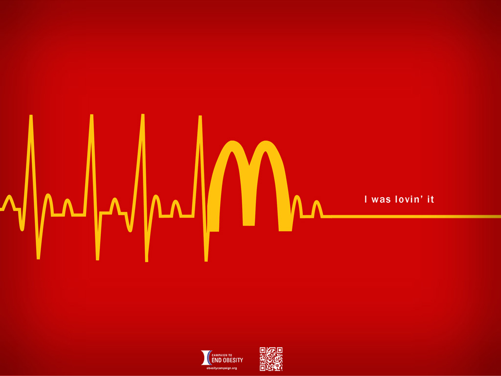
Today in class we discussed visual components such as hierarchy and shape. Looking at various health campaigns by different ad agencies and governments, I noticed that the main element is not usually the type but a compelling image. It attracts attention easily and pulls the audience to read more information about the cause the poster is about. The image must also be straight to the point but witty enough to make the average target audience to feel good for figuring out the ad at first glance.
The slogan is usually less than ten words and is more impactful if there is a hint of a social commentary. If the poster focuses on call-to-action, the type is bigger. An example below would be the NHS poster about hygiene to prevent diseases from spreading. The graphic of the hand is almost an afterthought. The more important message is the instruction.
A great image is a good base for a poster. The first image for an anti-passive (secondhand) smoking awareness ad below by Lee Howell sends the message through visual without the need for words. In this case, a logo that represents the health board/hospital/foundation could be easily added along with a short blurb about anti-smoking and one would already have a brilliant poster.


thumbs up!