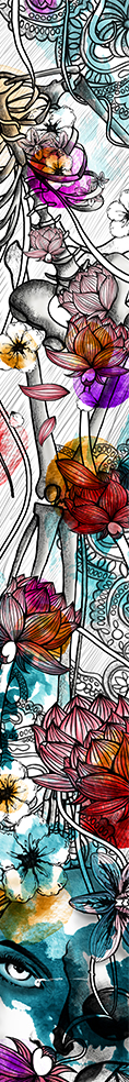
The difference with the previous design is the presence of multiple colors. Thanks to Ina’s guidance, the banner looks more alive than it was initially :). I always had this fear of using too much colors, because I tend to use too much colors, so I preferred to reduce the number of colors used to keep it not too ‘noisy’ or disturbing. However, Ina used color theory and yeah, color works!
Click here to see previous design